Trend Chart Visualization
The Trend Chart visualization displays metric values over a selected time period using a line graph. It is designed to help users monitor trends, identify patterns, compare multiple metrics, and detect anomalies in time-series data. Trend Charts are particularly useful for performance monitoring, capacity planning, service health analysis, and operational observability use cases where understanding how values change over time is important.
Trend Chart visualizations can be configured using the Query Builder, which allows users to define the data source, aggregation logic, filtering criteria, grouping fields, and result limits.
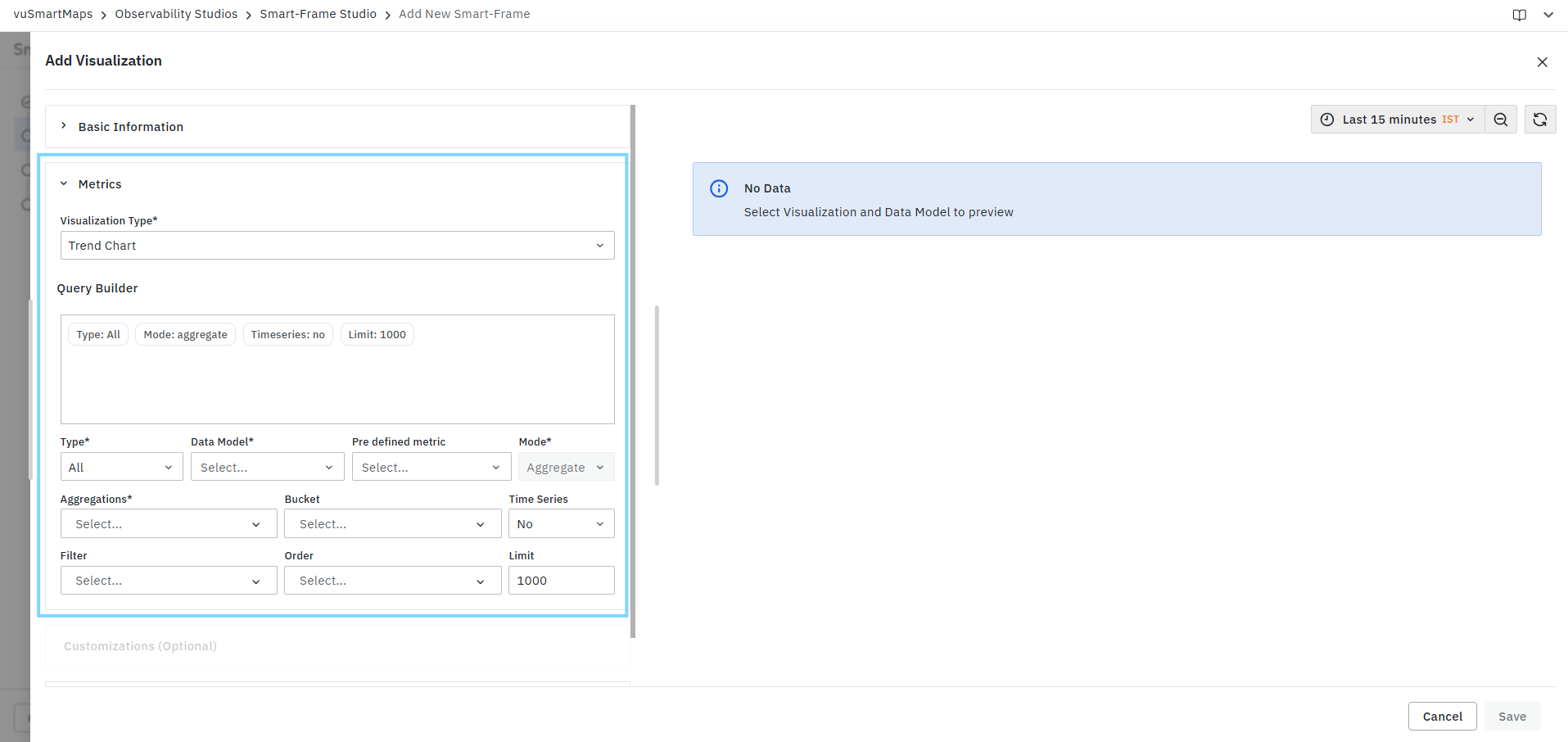
Creating a Trend Chart Visualization
To create a Trend Chart visualization:
- Select Trend Chart from the Visualization Type drop-down.
- Configure the query using the Query Builder.
- Select the required time-based aggregation field.
- Choose one or more metrics to display.
- Review the generated query summary.
- Validate the results in the Preview panel.
- Configure optional customization settings if required.
- Click Save.
Query Configuration
Trend Chart visualizations use the standard Query Builder framework available in Smart-Frame Studio. The Query Builder allows you to:
- Select the data source.
- Choose a data model.
- Configure aggregations.
- Apply filters.
- Define grouping criteria.
- Configure sorting and result limits.
- Review query summaries before execution.
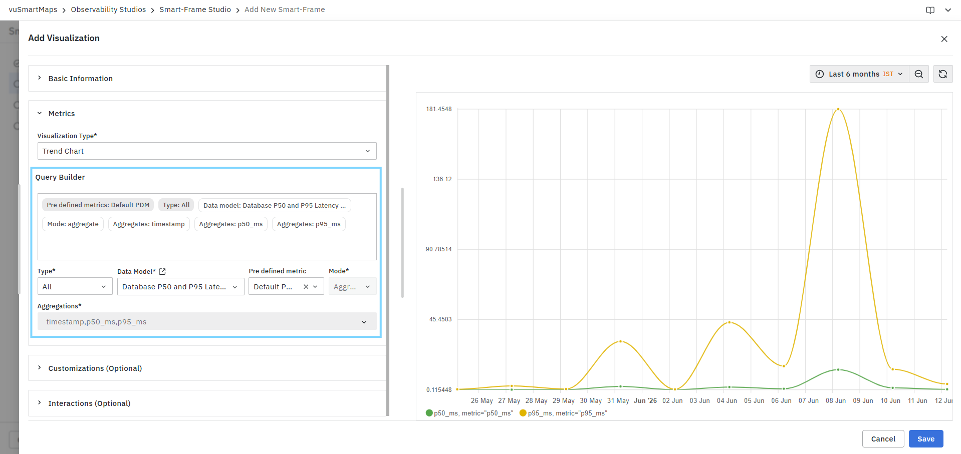
For detailed information about all Query Builder fields and configuration options, see Query Builder.
Preview Panel
The Preview Panel displays the output generated by the configured query. As configuration changes are applied, the preview updates automatically to reflect the latest query settings.
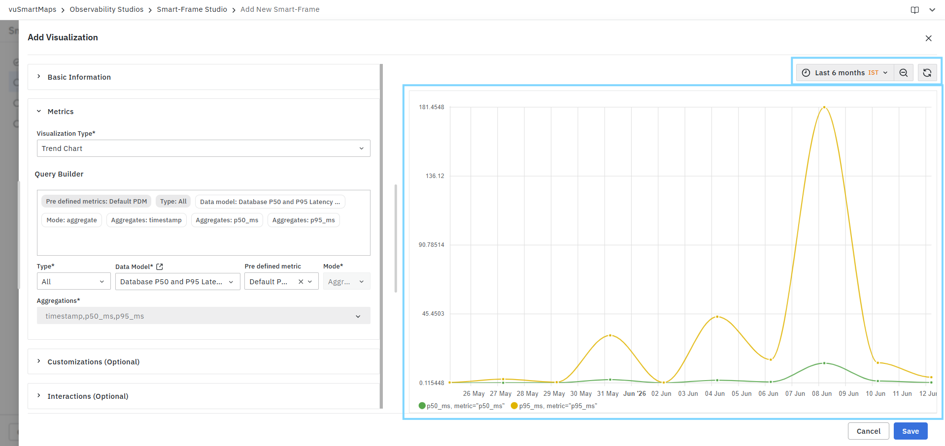
The preview can be used to:
- Validate query results.
- Verify selected metrics and aggregations.
- Confirm filtering criteria.
- Review trend patterns over time.
- Compare multiple metric series before saving the visualization.
If no data is returned, the preview displays a No Data message.
Trend Chart Characteristics
Trend Chart visualizations are designed to display:
- Time-series data.
- Historical metric trends.
- Performance patterns.
- Multiple metric comparisons.
- Aggregated values across time intervals.
- Operational monitoring data.
The chart plots data points along a timeline and connects them using continuous lines, making it easy to visualize increases, decreases, spikes, and recurring patterns.
Common Use Cases
Trend Charts are commonly used for:
- Application performance monitoring.
- Response time and latency analysis.
- Request volume tracking.
- Error rate monitoring.
- Infrastructure utilization monitoring.
- Service health and availability tracking.
- Capacity planning and forecasting.
- Operational observability dashboards.
- Historical trend analysis.
- KPI monitoring and reporting.
Example
A Trend Chart may be configured to display:
- p50_ms (Median Response Time)
- p95_ms (95th Percentile Response Time)
over the last 30 days, enabling users to compare normal service performance against higher-latency response patterns and identify performance degradation trends.
Customizations
The Customizations section allows you to control how metric values are displayed and formatted within the Trend Chart visualization. These settings affect the presentation of data without modifying the underlying query results.
The Manual customization options are grouped into the following sections:
- Units and Formatting
- Locale and Formatting Style
Each configuration can be applied to individual metrics using the Add Column option.
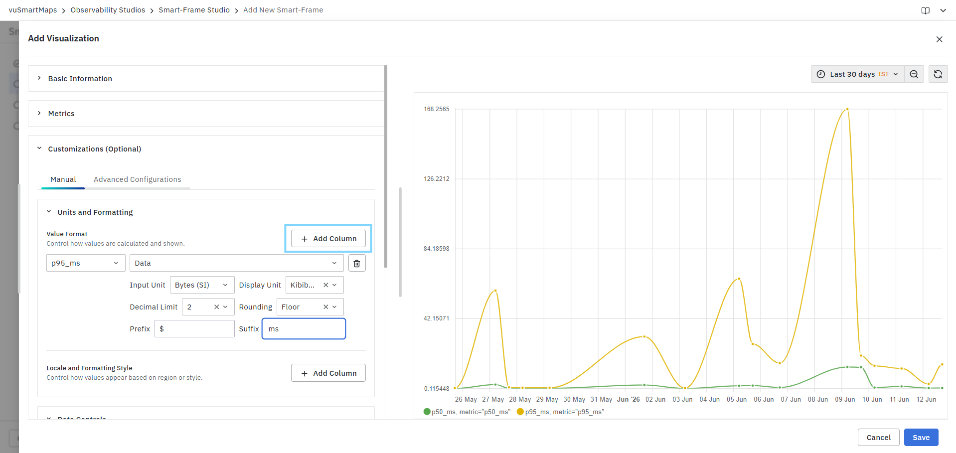
Units and Formatting
The Units and Formatting section controls how metric values are calculated, converted, rounded, and displayed in the Trend Chart.
Value Format
The Value Format configuration allows you to select a metric field and define how its values should be presented.
Field Selection
Select the metric column that requires formatting. Available fields are based on the metrics returned by the query, for example:
- timestamp
- p50_ms
- p95_ms
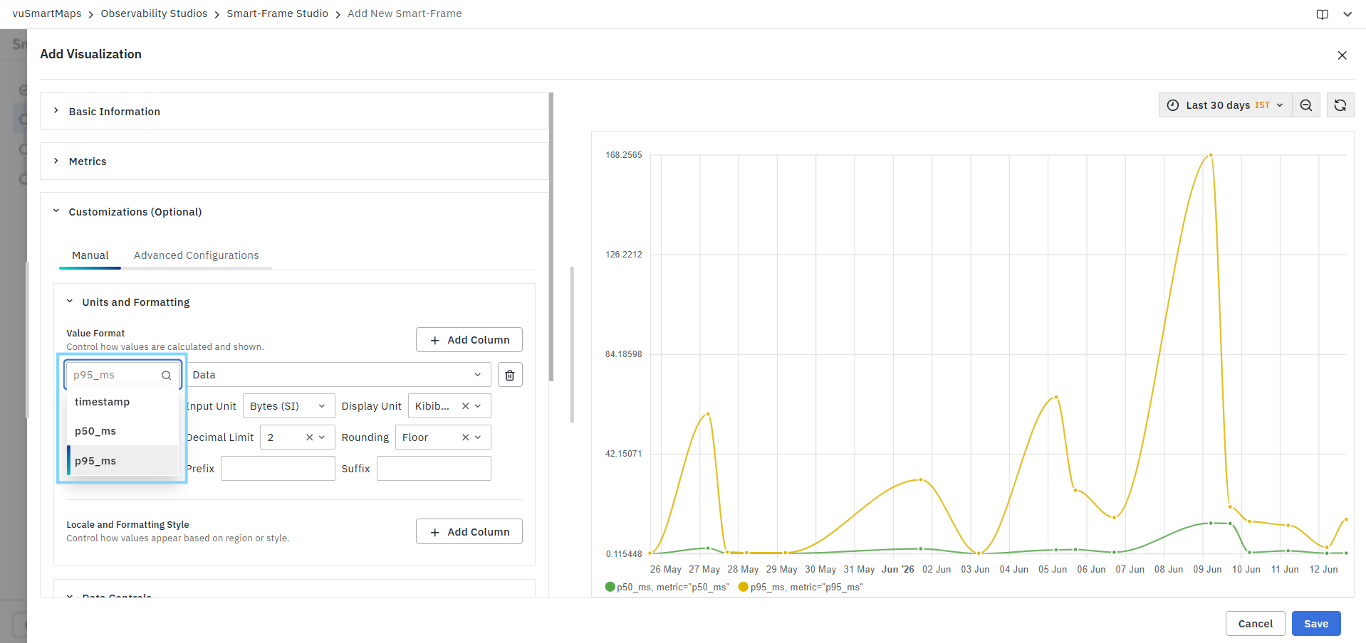
Each selected field can have its own formatting configuration.
Format Type
Defines the data category used for formatting the selected metric.
Supported format types may include:
- Numeric
- Data
- Data Rate
- Date & Time
- Time
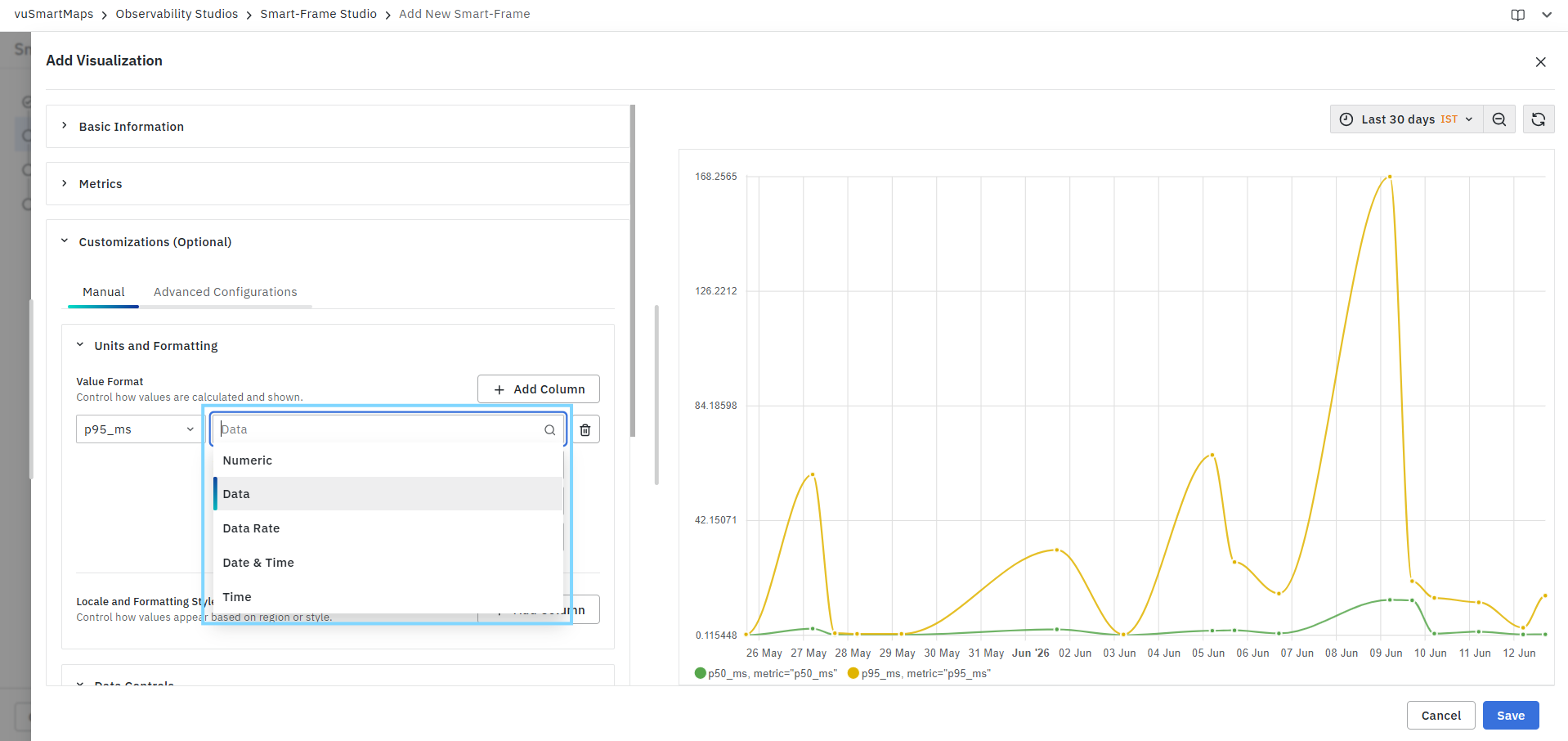
The selected format type determines the available formatting options.
Input Unit
Specifies the unit in which the source data is stored.
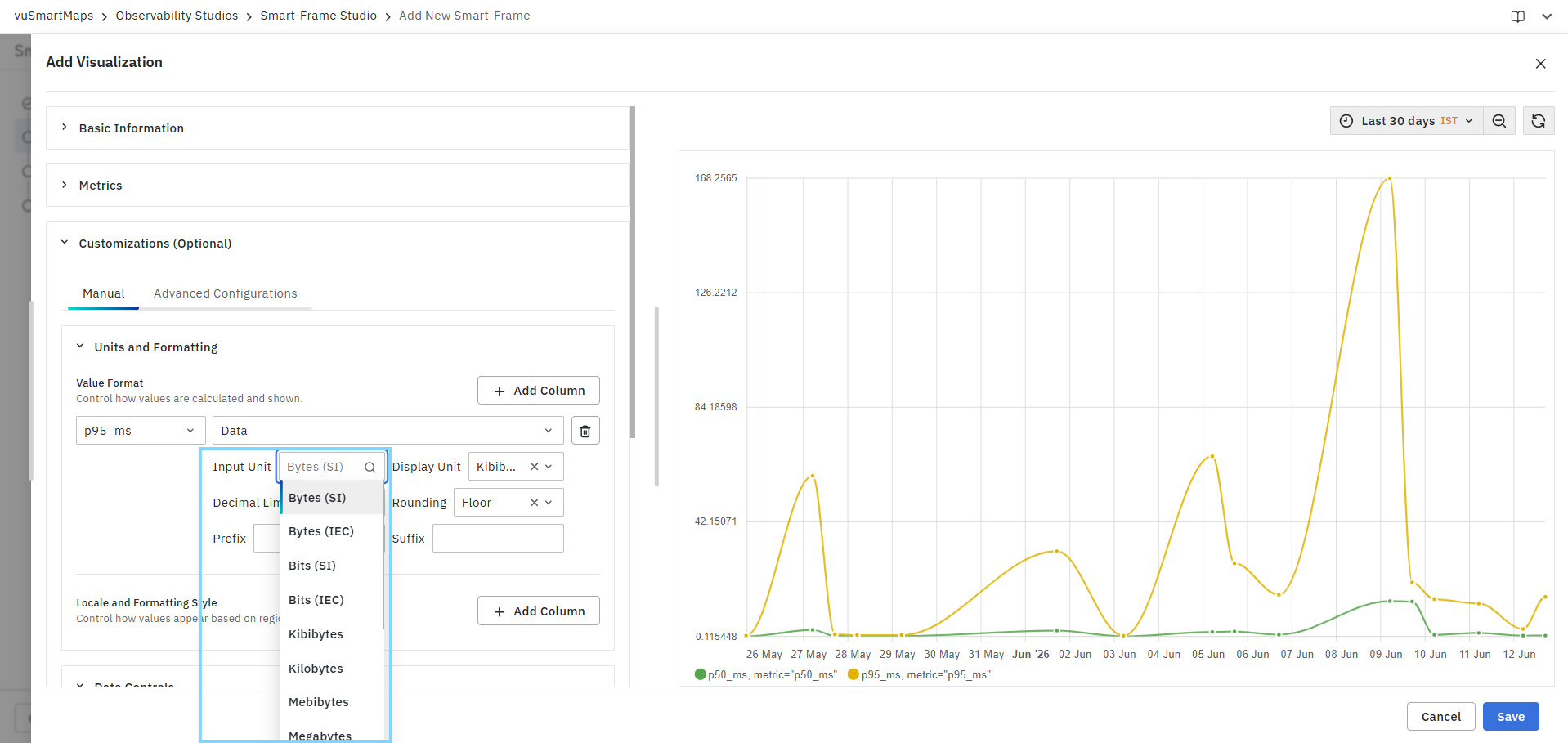
The system uses the Input Unit as the source value when performing unit conversions.
Display Unit
Defines the unit used to display values in the visualization. Available options depend on the selected format type and input unit.
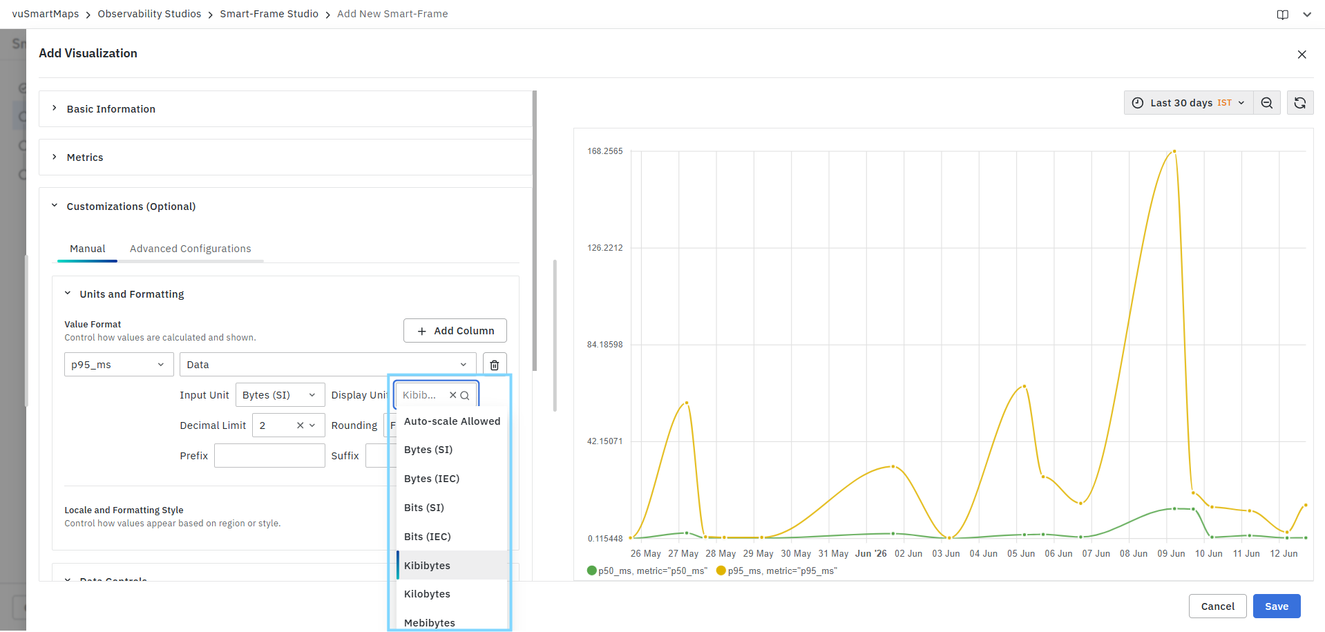
When Auto-scale is enabled, the system automatically selects the most appropriate display unit based on the value magnitude.
Decimal Limit
Controls the number of decimal places displayed for metric values.
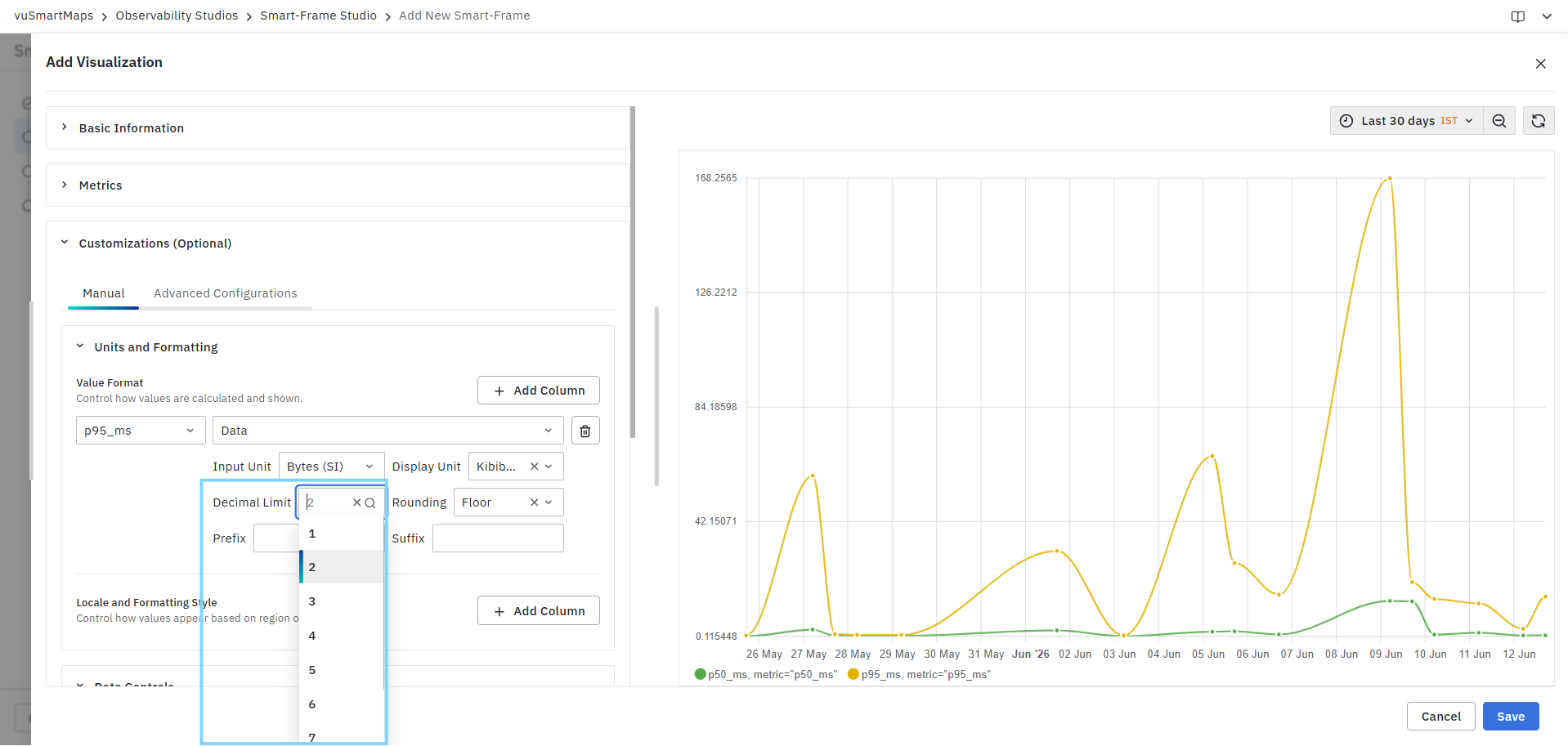
Examples:
| Decimal Limit | Example Output |
|---|---|
| 1 | 125.5 |
| 2 | 125.56 |
| 3 | 125.567 |
This setting affects only the displayed value and does not modify the stored data.
Rounding
Defines how values are rounded when decimal precision is applied.
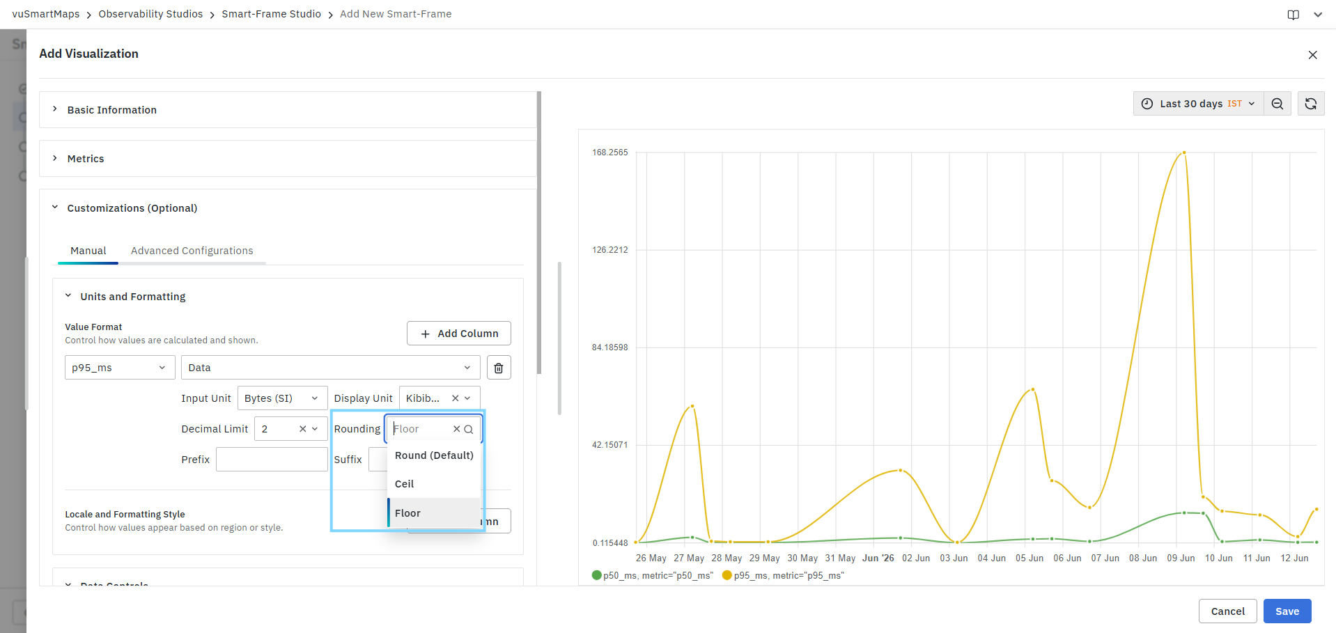
Available options include:
Round (Default)
Rounds values using standard mathematical rounding rules.
Example:
- 10.56 → 11
- 10.44 → 10
Ceil
Always rounds values upward to the next whole number.
Example:
- 10.01 → 11
- 10.99 → 11
Floor
Always rounds values downward.
Example:
- 10.99 → 10
- 10.25 → 10
Prefix
Adds custom text before the displayed value.

Examples:
| Prefix | Displayed Value |
|---|---|
| $ | $125 |
| ₹ | ₹125 |
| Avg | Avg 125 |
Suffix
Adds custom text after the displayed value.
Examples:
| Suffix | Displayed Value |
|---|---|
| ms | 125 ms |
| % | 125 % |
| req/s | 125 req/s |
Add Column
The Add Column button allows additional metric fields to be configured independently. This enables different formatting rules for different metrics displayed within the same Trend Chart.
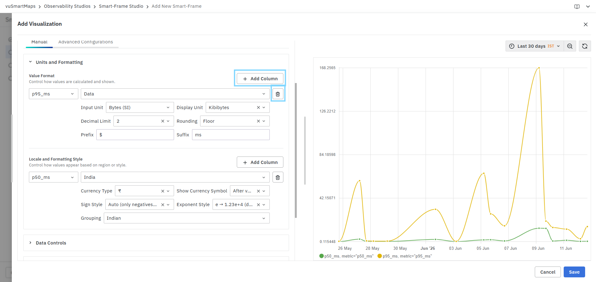
Example:
- p50_ms displayed in milliseconds
- p95_ms displayed with custom precision
- Throughput displayed in requests per second
Remove Configuration
The delete icon beside a configuration row removes the formatting rule for the selected metric.
Locale and Formatting Style
The Locale and Formatting Style section controls how numeric values, currency values, grouping separators, and regional formats are displayed. These settings are useful when dashboards are viewed by users from different countries or regions.
Metric Selection
Select the metric field to which the locale formatting should be applied. Available fields are based on the metrics returned by the query.
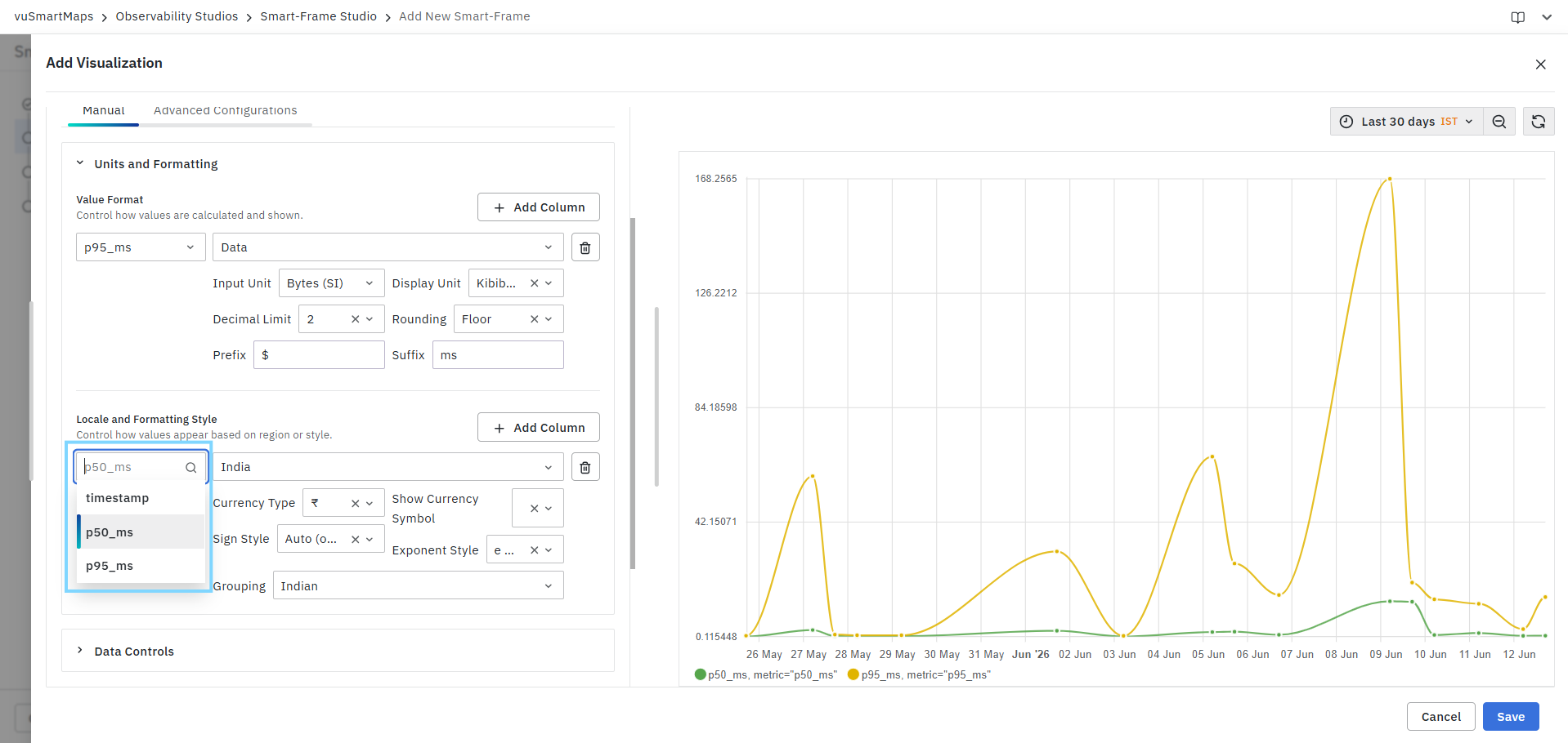
Examples:
- p50_ms
- p95_ms
- timestamp
Locale
Defines the regional formatting standard used for displaying values. Available locales may include:
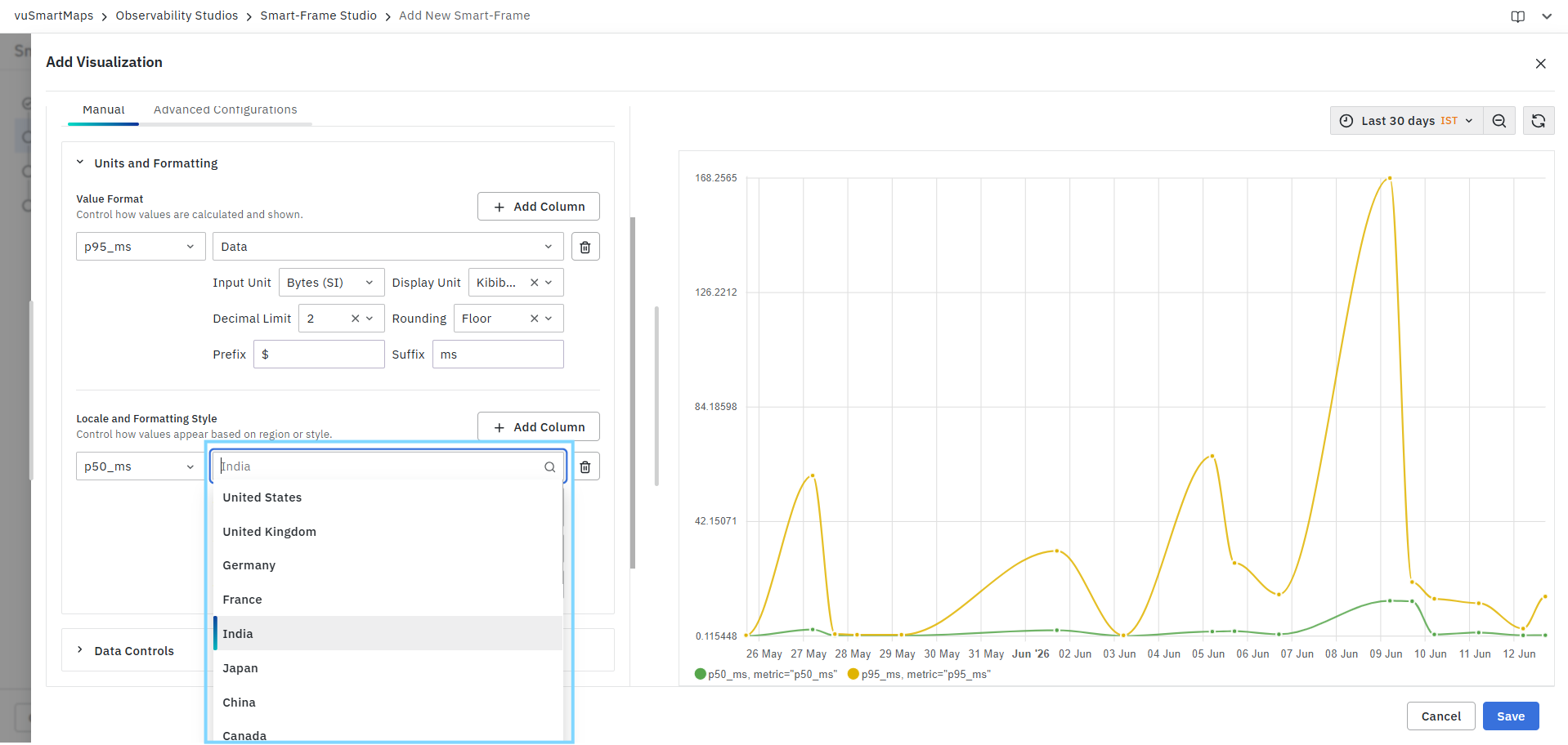
The selected locale determines:
- Number formatting
- Currency representation
- Digit grouping style
- Regional display conventions
Currency Type
Defines the currency symbol used when currency formatting is enabled.

The available options depend on the selected locale.
Show Currency Symbol
Controls where the currency symbol is displayed.
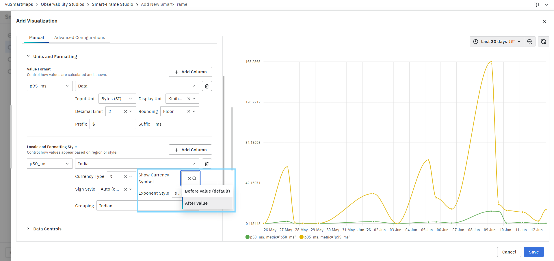
Available options:
Before Value (Default)
Displays the symbol before the value.
Example:
- ₹100
- $500
After Value
Displays the symbol after the value.
Example:
- 100 ₹
- 500 $
Sign Style
Controls how positive and negative values are displayed.
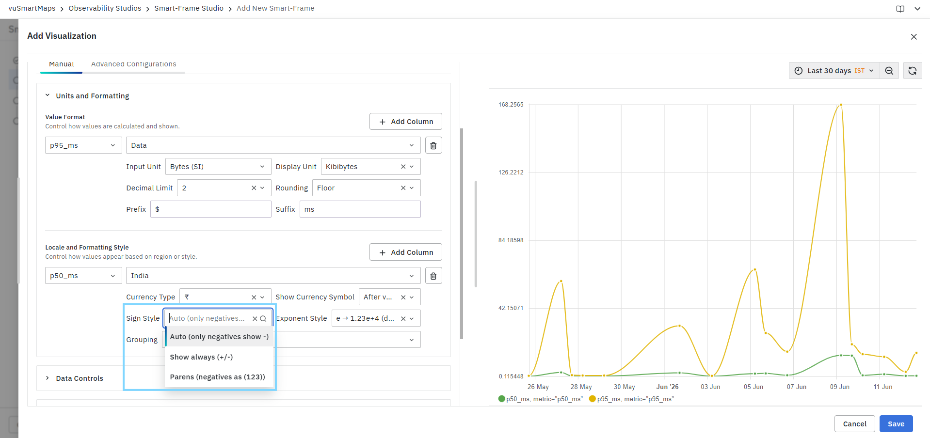
Available options include:
Auto (Only Negatives Show Sign)
Default behavior.
Examples:
- 100
- -100
Show Always (+/-)
Displays a sign for both positive and negative values.
Examples:
- +100
- -100
Parentheses for Negatives
Displays negative values using parentheses.
Examples:
- 100
- (100)
Exponent Style
Controls how large numbers are displayed using scientific notation.
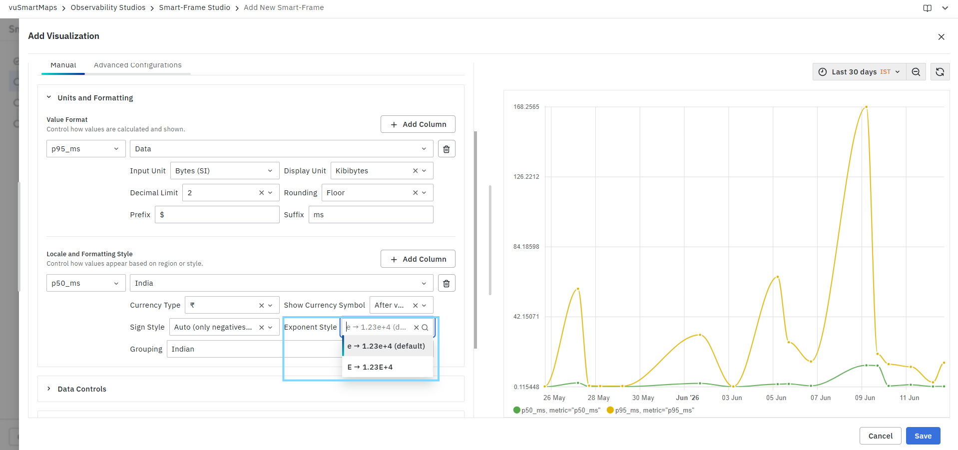
Available options include:
e Notation (Default)
Example:
- 12300 → 1.23e+4
E Notation
Example:
- 12300 → 1.23E+4
Grouping
Defines how digits are grouped when displaying large numbers.
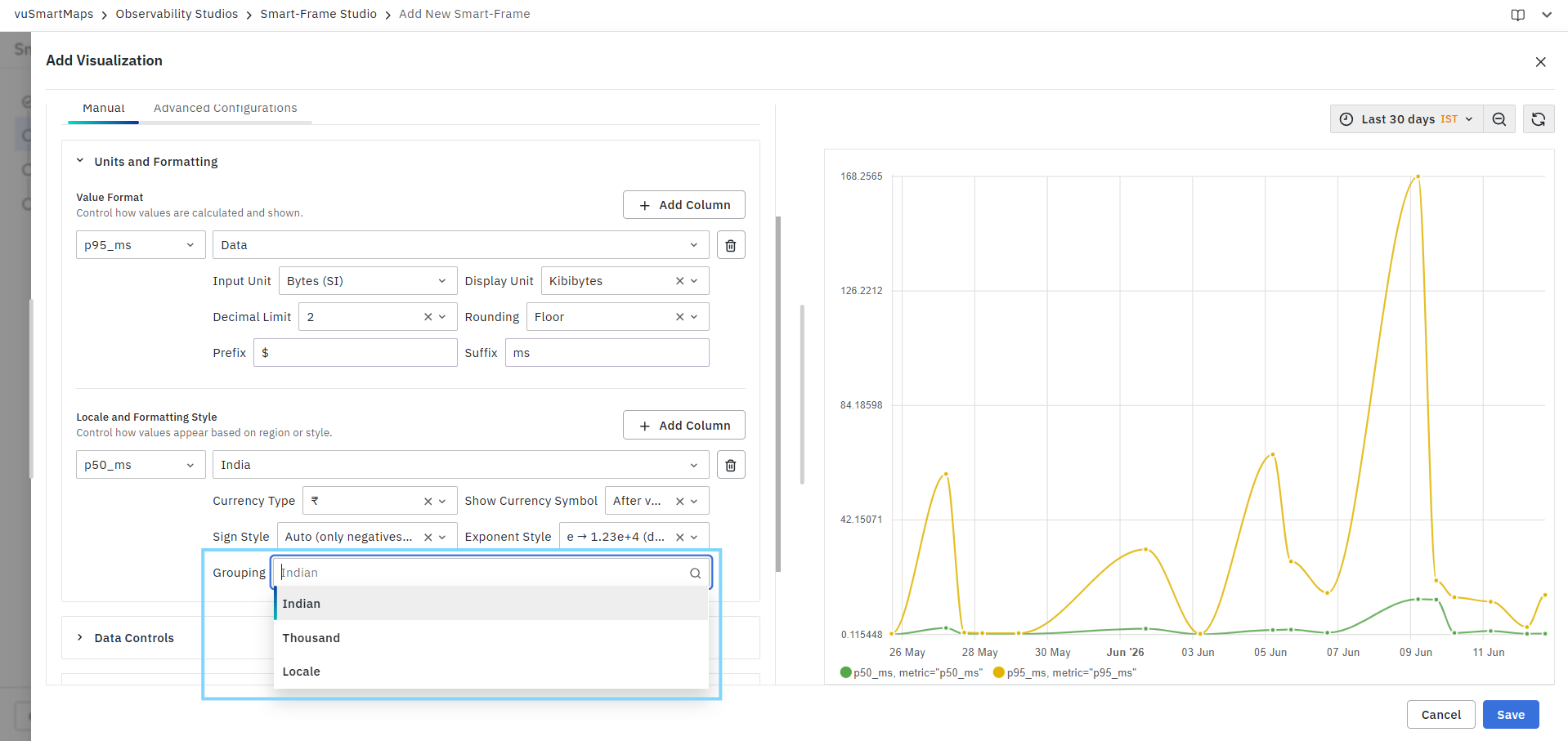
Available options include:
Indian
Uses the Indian numbering format.
Example:
- 10,00,000
Thousand
Uses standard international grouping.
Example:
- 1,000,000
Locale
Uses the grouping style defined by the selected locale.
Example:
- United States → 1,000,000
- Germany → 1.000.000
Add Column
The Add Column button allows locale and formatting settings to be configured separately for multiple metrics. This is useful when different metrics require different display conventions.
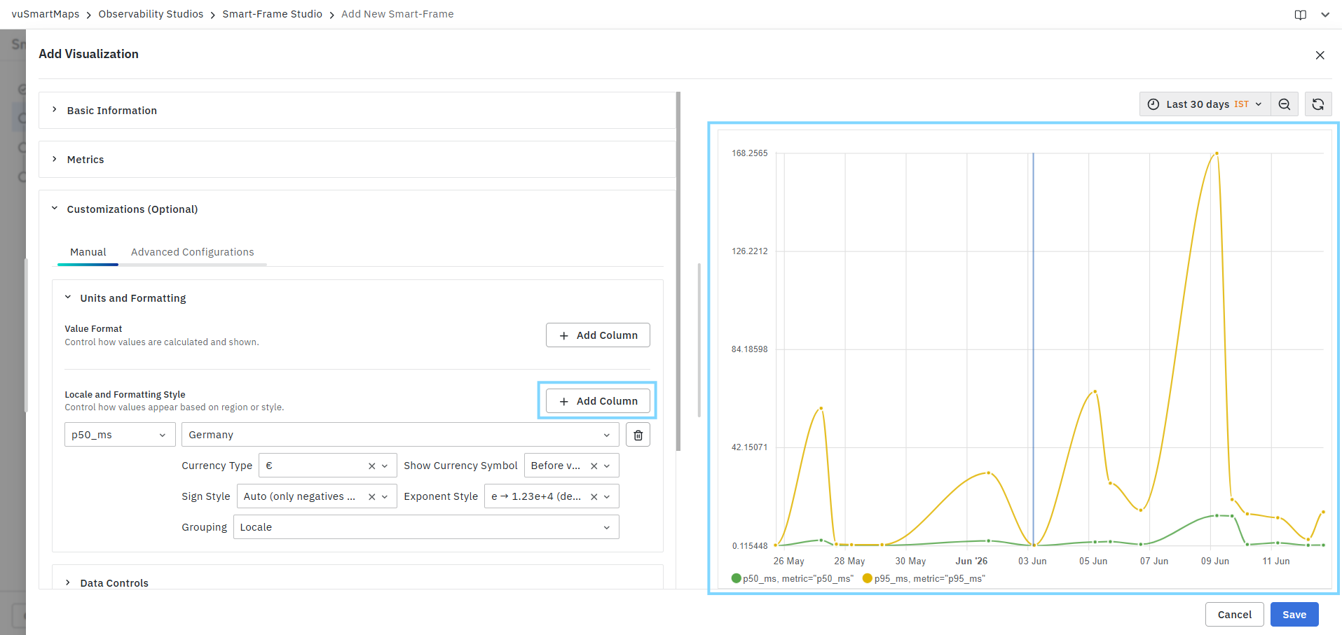
Customization Preview
All formatting changes are reflected immediately in the Preview panel. This allows users to validate:
- Unit conversions
- Decimal precision
- Rounding behavior
- Currency formatting
- Locale-specific display styles
- Prefix and suffix values
before saving the Trend Chart visualization.
Data Controls
The Thresholds option in Data Controls enables you to define visual threshold indicators for chart metrics. Thresholds help identify critical values, performance limits, or operational boundaries directly within the visualization by applying colored lines or highlighted regions based on specified conditions. Thresholds can be configured for individual metric columns and displayed as lines or shaded regions on the chart.
- Select the threshold inheritance mode:
- Custom Threshold – Define thresholds specifically for the current visualization.
- Data Model Defined – Use threshold configurations inherited from the underlying data model.
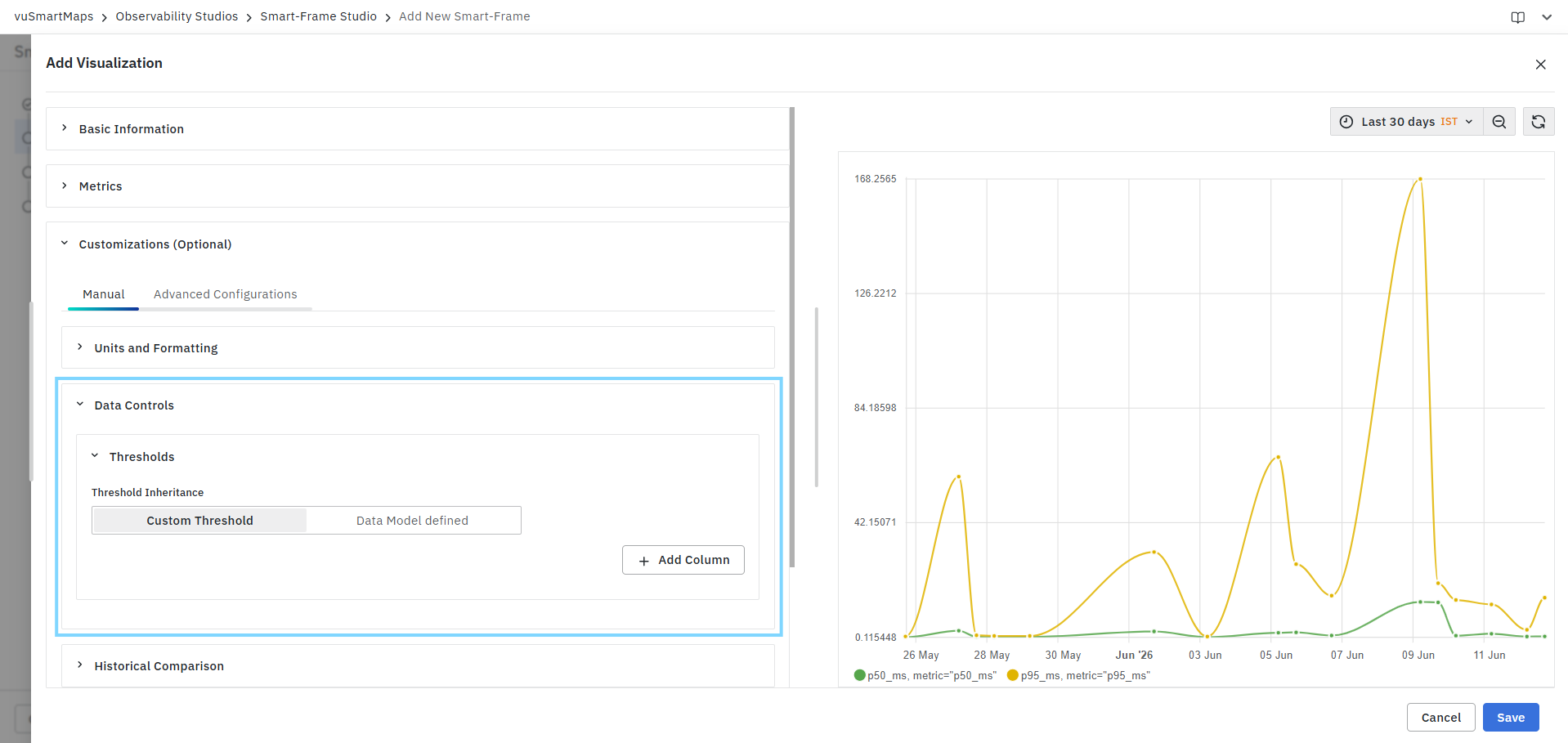
Threshold Inheritance
Custom Threshold
Select Custom Threshold to manually configure threshold rules for the visualization.
This option allows you to:
- Select specific metric columns.
- Define threshold display styles.
- Configure threshold conditions and values.
- Apply custom colors for threshold indicators.
Data Model Defined
Select Data Model Defined to automatically inherit threshold configurations from the associated data model. This ensures consistent threshold definitions across multiple visualizations using the same data source.
Configuring a Custom Threshold
Add a Metric Column
- Click Add Column.
- Select the metric column for which thresholds must be configured.
- Choose the threshold display type.
Available metric columns are populated based on the selected visualization query.
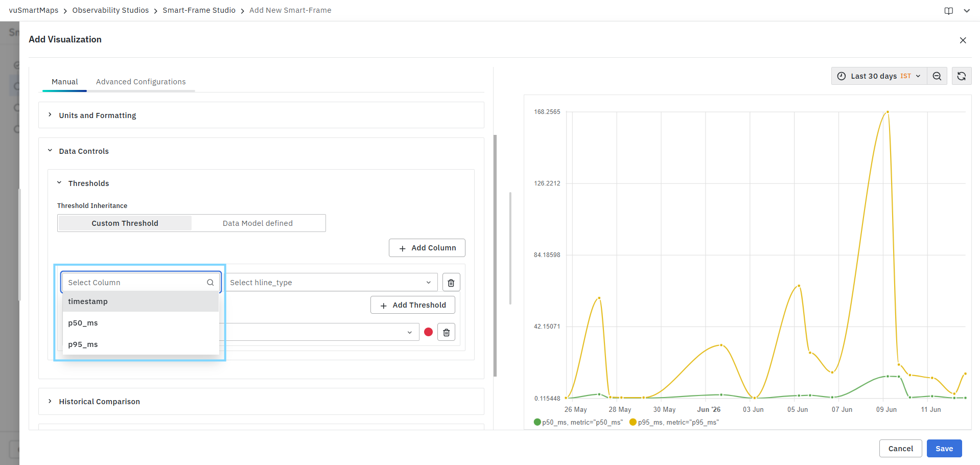
Example:
p50_msp95_ms
Threshold Display Types
The Display Type determines how thresholds appear on the chart.

| Display Type | Description |
|---|---|
| Full Line | Displays a continuous threshold line across the chart. |
| Dashed Line | Displays the threshold as a dashed horizontal line. |
| Filled Region | Highlights the threshold area using a shaded region. |
| Filled Region (Solid Line) | Displays a shaded region with a solid boundary line. |
| Filled Region (Dashed Line) | Displays a shaded region with a dashed boundary line. |
Adding Threshold Conditions
After selecting the column and display type:
- Click Add Threshold.
- Configure the threshold rule.

Threshold Parameters
| Parameter | Description |
|---|---|
| Type | Defines the threshold type. Currently supports Static thresholds. |
| Color | Specifies the threshold color displayed in the chart. |
| Operator | Defines the comparison condition. |
| Value | Specifies the threshold value. |
Threshold Type
Static
A static threshold applies a fixed value against the selected metric.
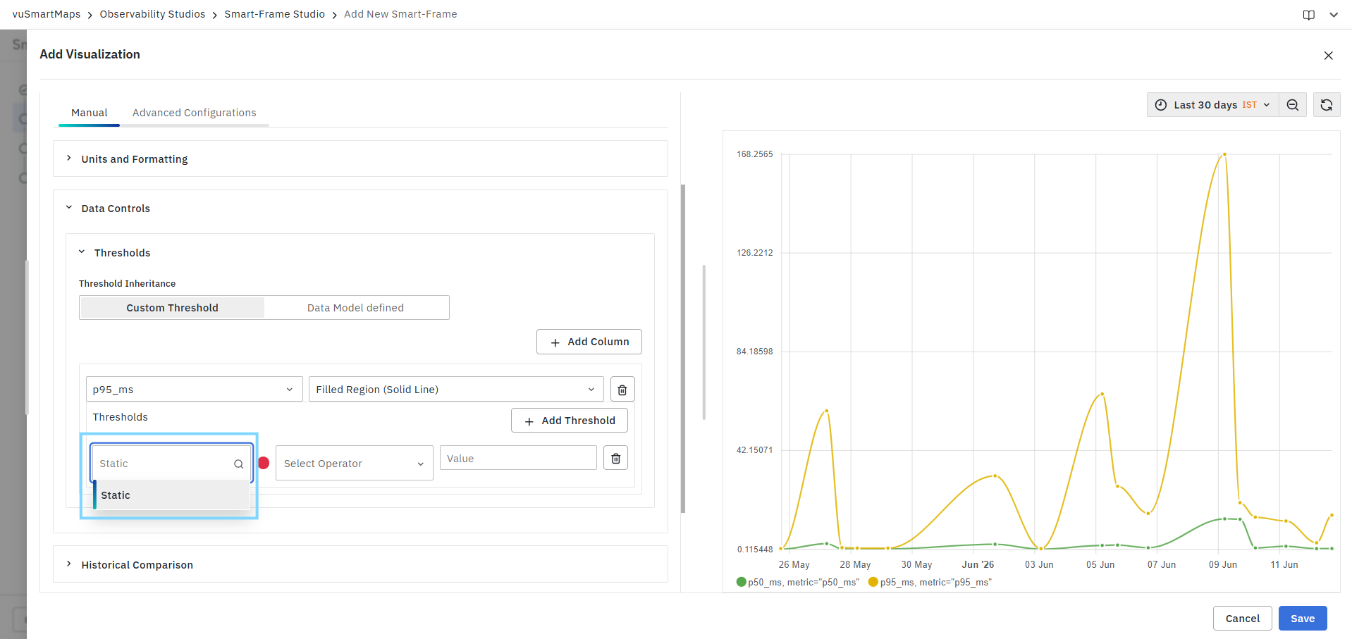
Example:
- Highlight values greater than 100 ms.
- Mark values below 10%.
- Define acceptable operating ranges.
Threshold Colors
Select a color to visually represent the threshold.
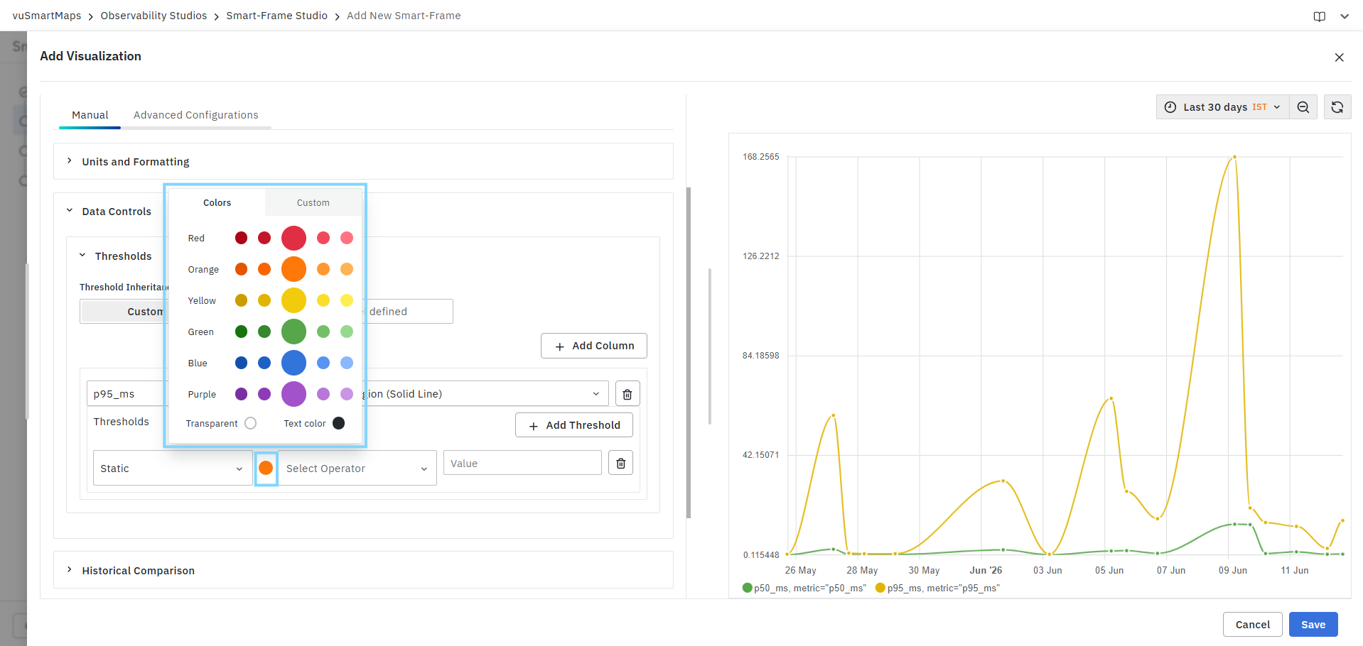
Colors help distinguish warning, critical, and acceptable value ranges.
Example:
- Red → Critical
- Orange → Warning
- Green → Normal
Threshold Operators
Select the condition used to evaluate metric values.

Examples
| Configuration | Result |
|---|---|
> 100 | Highlights values greater than 100 |
<= 50 | Highlights values less than or equal to 50 |
Range 50–100 | Highlights values between 50 and 100 |
Managing Thresholds
You can configure multiple threshold rules for a single metric column.
To modify thresholds:
- Update the operator, color, or value.
- Add additional threshold rules using Add Threshold.
- Remove a threshold using the Delete icon.
To remove an entire threshold configuration for a metric column, use the Delete Column option.
Example Use Case
A latency chart contains the metrics p50_ms and p95_ms.
You can configure thresholds as follows:
| Metric | Condition | Color | Display Type |
|---|---|---|---|
| p95_ms | > 100 | Red | Filled Region (Solid Line) |
| p95_ms | 50–100 | Orange | Filled Region |
| p95_ms | <= 50 | Green | Filled Region |
This configuration visually distinguishes normal, warning, and critical latency ranges, making it easier to identify performance degradation directly from the chart.
Threshold visualization behavior may vary depending on the selected chart type and metric configuration. Multiple thresholds can be applied to the same metric to create layered visual indicators.
Historical Comparison
The Historical Comparison option allows you to compare current metric values against historical data from previous time periods. This helps identify trends, detect anomalies, measure growth or decline, and evaluate performance against past behavior directly within the same visualization. Historical comparisons are displayed as additional series on the chart, enabling side-by-side analysis of current and historical metric values.
- Expand the Historical Comparison section.
- Click Add Metric to configure a metric for comparison.
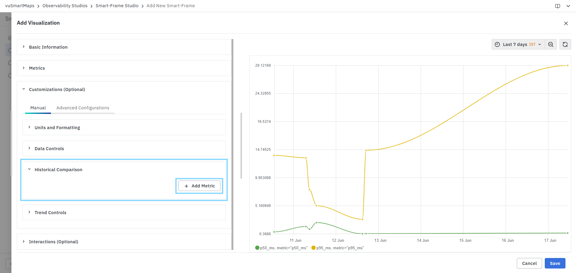
Adding a Historical Comparison Metric
A historical comparison can be configured for one or more metric columns used in the visualization.
To add a metric:
- Click Add Metric.
- Select the required metric column from the available list.
Available metrics are populated from the selected visualization query.
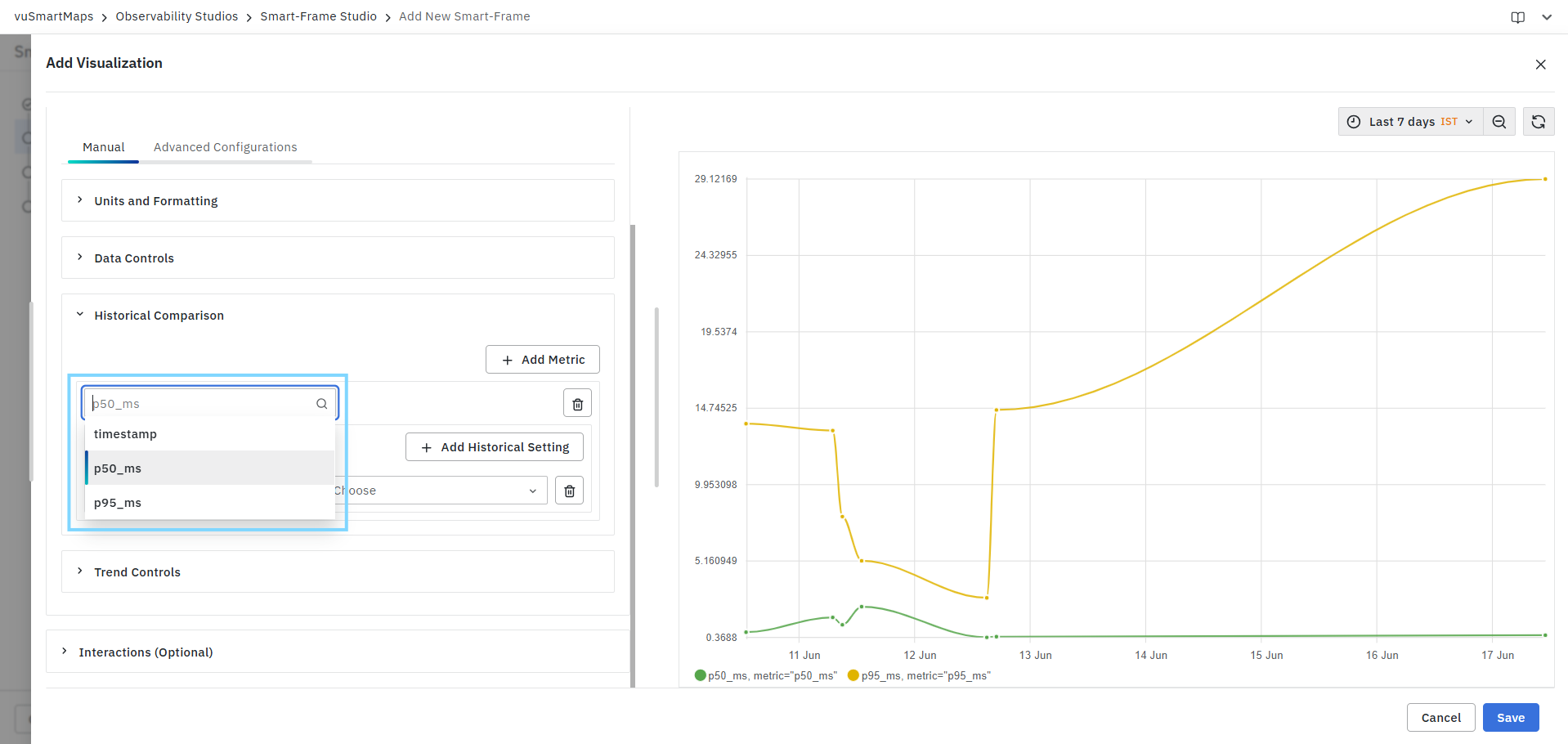
Example:
p50_msp95_ms
Once selected, the metric becomes available for historical comparison configuration.
Configuring Historical Settings
Each metric can contain one or more historical comparison rules.
To add a historical setting:
- Select the metric.
- Click Add Historical Setting.
- Provide the required configuration details.
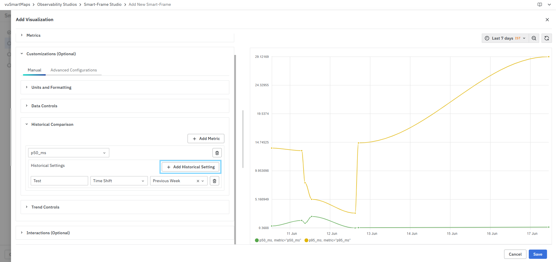
Historical Setting Parameters
| Parameter | Description |
|---|---|
| Title | User-defined label displayed for the historical comparison series. |
| Comparison Type | Defines the historical comparison method. |
| Comparison Value | Specifies the historical time period used for comparison. |
Title
The Title field allows you to assign a meaningful name to the comparison series.
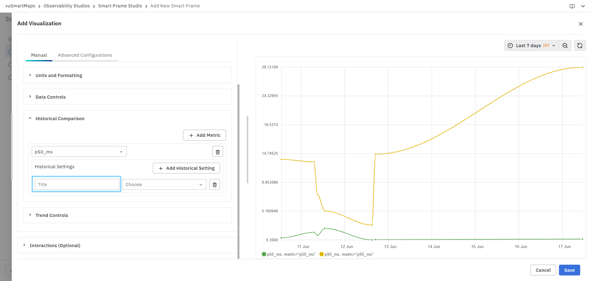
Example:
- Previous Week Comparison
- Last Month Trend
- Year-over-Year Comparison
The title helps distinguish multiple historical comparison series displayed on the chart.
Comparison Type
Currently, Historical Comparison supports the following comparison type:
Time Shift
The Time Shift option compares current metric values against the same metric from a previous time period.
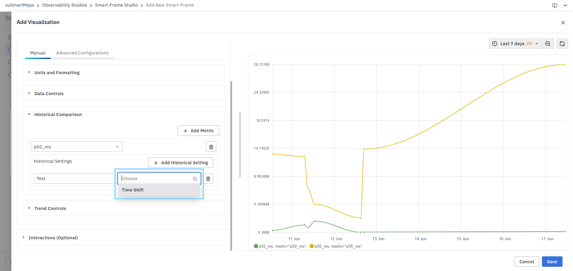
For example:
- Compare today's values with yesterday.
- Compare this week's performance with last week.
- Compare the current month with the previous month.
Time Shift Options
When Time Shift is selected, you can choose one of the following historical periods as Shown in the Sceernshot below.
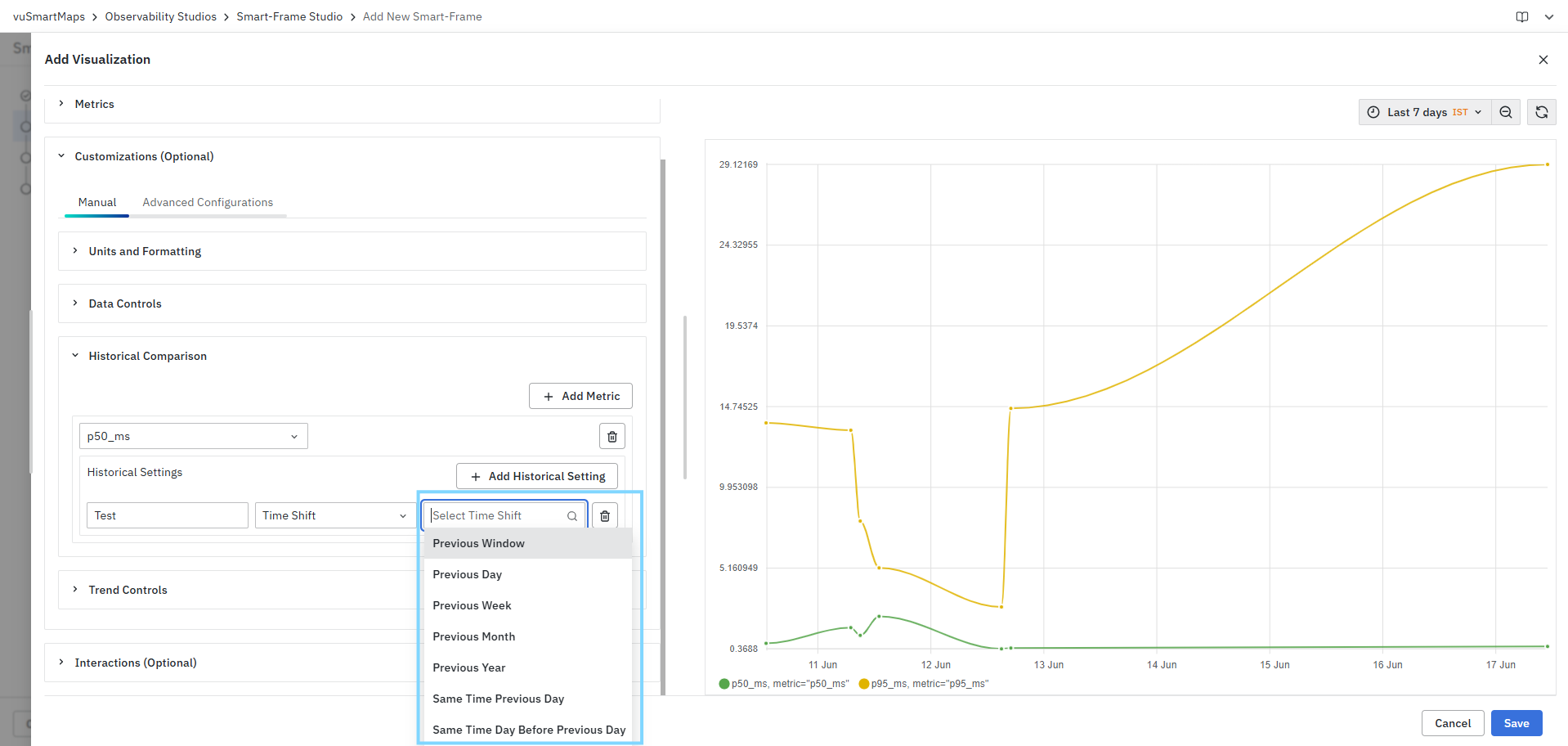
Adding Multiple Historical Comparisons
Multiple historical comparison settings can be configured for the same metric.
Example:
| Metric | Historical Comparison |
|---|---|
| p95_ms | Previous Day |
| p95_ms | Previous Week |
| p95_ms | Previous Month |
This allows users to evaluate short-term and long-term performance trends simultaneously.
Managing Historical Comparisons
You can manage configured comparisons using the available actions:
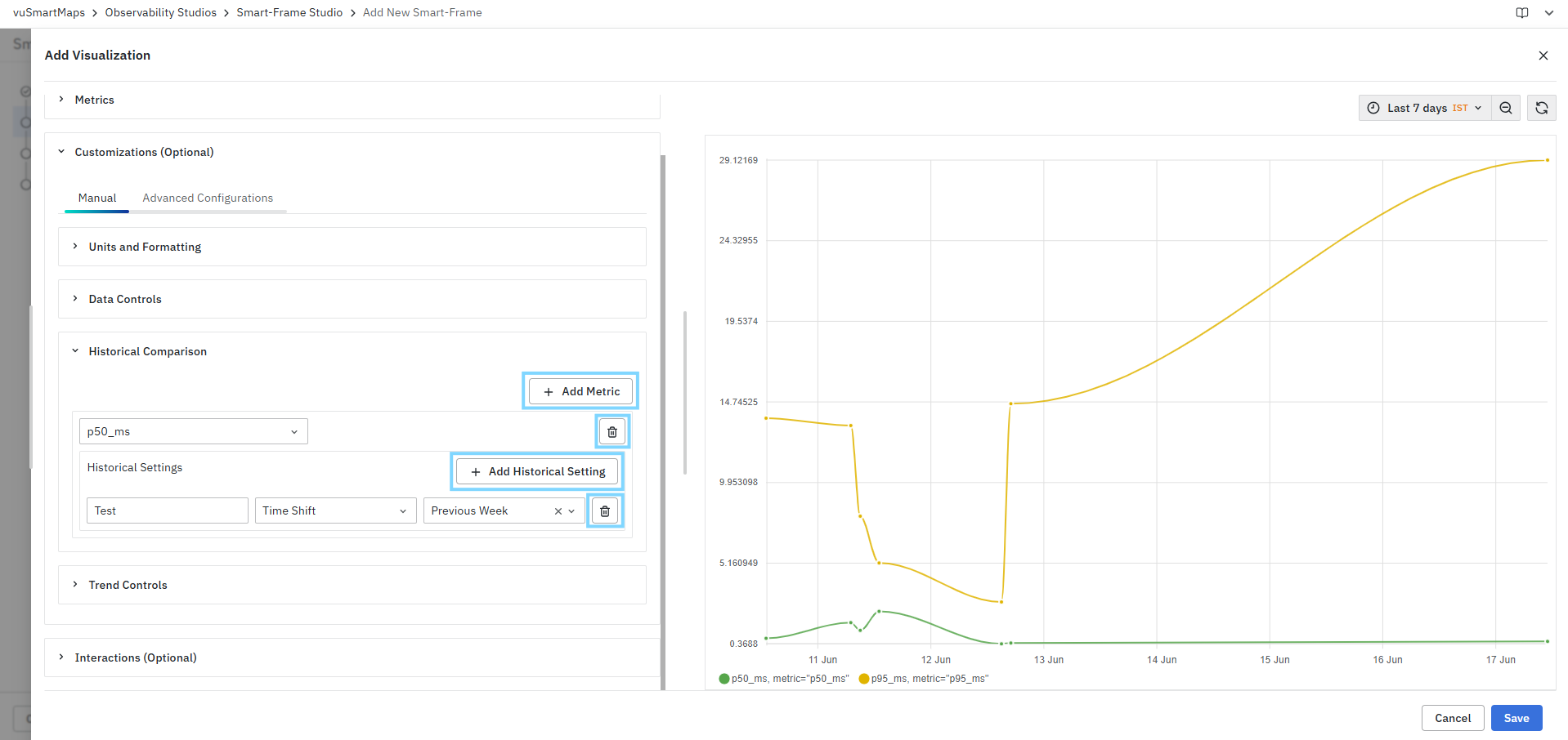
Add Historical Setting
Adds an additional historical comparison configuration for the selected metric.
Delete Historical Setting
Removes a specific historical comparison rule.
Delete Metric
Removes the entire historical comparison configuration for the selected metric.
Example Use Case
Consider a latency visualization displaying the p95_ms metric for the last 7 days.
You can configure the following comparison:
| Title | Type | Value |
|---|---|---|
| Previous Week Comparison | Time Shift | Previous Week |
The visualization displays the current week's latency values alongside values from the previous week, enabling quick identification of performance improvements or degradations.
Trend Controls
The Trend Controls section allows you to customize the appearance, behavior, and presentation of trend-based visualizations. Using Trend Controls, you can configure axis mappings, labels, legends, tooltips, chart appearance, colors, and scaling options to improve readability and analysis. Trend Controls consists of the following sections:
- Axis
- X-Axis Controls
- Y-Axis Controls

Axis
The Axis section allows you to define the metrics used on the X-axis and Y-axis and configure chart-level display settings.
Configuring Axis Metrics
Select X Axis Metric
Choose the field that will be plotted along the X-axis.
Example:
timestampdatetime
The selected field determines how data is distributed across the horizontal axis.

Select Y Axis Metrics
Choose one or more metrics to be displayed on the Y-axis.
Example:
p50_msp95_mscpu_usagememory_usage
Multiple metrics can be plotted simultaneously for comparative analysis.
Show Grid Lines
Enables or disables chart grid lines.
When enabled:
- Horizontal and vertical grid lines are displayed.
- Improves readability and value estimation.
When disabled:
- The chart appears cleaner with fewer visual elements.
Enable Legend
- Displays a legend that identifies the plotted metrics.
- The legend helps users distinguish between multiple series displayed on the chart.
Legend Placement
Defines the position of the chart legend.
Available options:
- Top
- Bottom
- Left
- Right
Select the appropriate placement based on available dashboard space and visualization requirements.
Enable Tooltip
Displays detailed metric information when hovering over chart data points.
Tooltips typically include:
- Metric name
- Metric value
- Timestamp
- Additional contextual information
Values Display
Controls how metric values are displayed within the tooltip.
- All: Displays values for all available metric series at the selected point.
- Single: Displays only the value of the selected metric series.
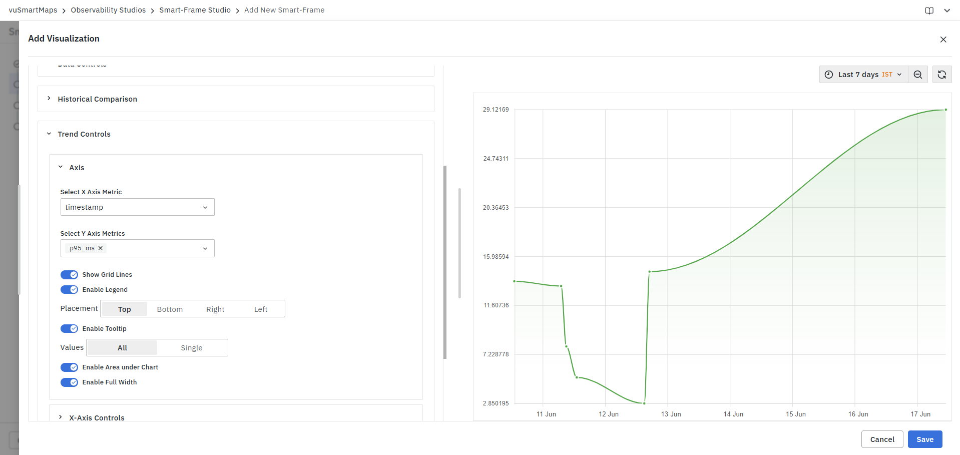
Enable Area Under Chart
Fills the area beneath the trend line.
When enabled:
- Creates an area chart appearance.
- Improves visual representation of volume and magnitude.
When disabled:
- Displays only the trend line.
Enable Full Width
- Expands the visualization to utilize the available chart width.
- This option is useful when displaying long time-series data or large datasets.
X-Axis Controls
The X-Axis Controls section allows you to configure labels displayed on the horizontal axis.
Enable Label
- Enables or disables the X-axis label.
- When enabled, a custom label can be assigned to the selected X-axis metric.
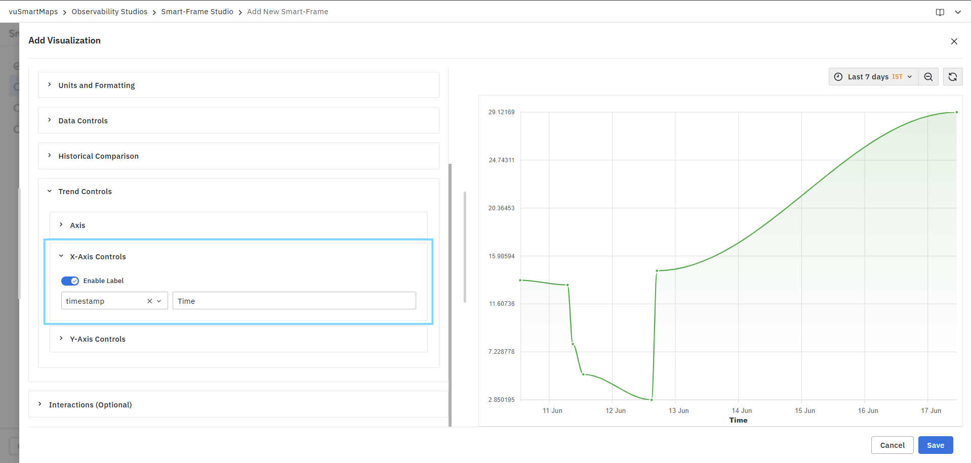
Parameters
| Parameter | Description |
|---|---|
| Metric | X-axis field selected for labeling. |
| Label | Display name shown on the X-axis. |
Example
| Metric | Label |
|---|---|
| timestamp | Time |
Result:
The X-axis displays Time instead of the raw field name.
Y-Axis Controls
The Y-Axis Controls section allows you to customize the appearance and behavior of Y-axis metrics.
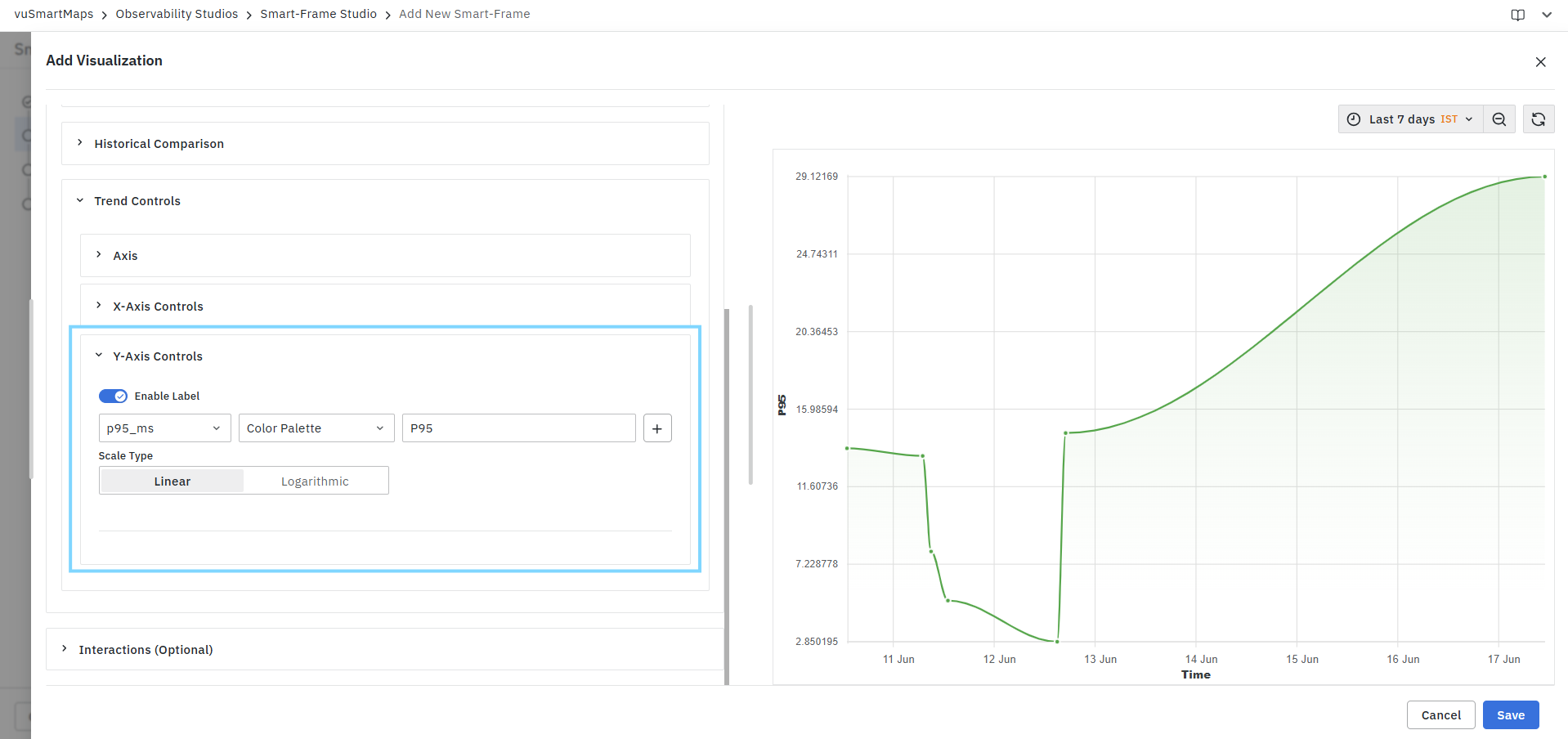
Enable Label
- Enables custom labeling for Y-axis metrics.
- Once enabled, you can configure individual metric labels and styling options.
Metric Selection
Select the metric that should be displayed on the Y-axis.
Example:
- p50_ms
- p95_ms
- CPU Usage
- Memory Usage
Color Configuration
Controls how metric colors are displayed in the chart.
Available Options
Color Palette
Applies colors from the predefined visualization color palette.
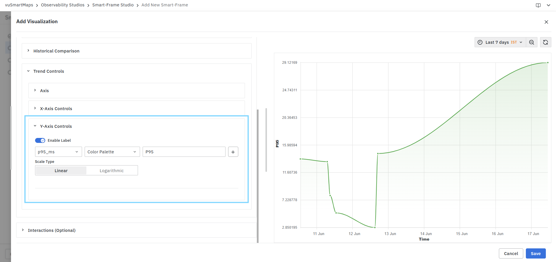
Single Color
Applies a fixed color to the selected metric, Supported color groups include as shown below.

Users can select from multiple shades within each color group.
Metric Label
Specify a custom display label for the selected metric.
Example:
| Metric | Label |
|---|---|
| p95_ms | P95 |
| cpu_usage | CPU Usage (%) |
The configured label is displayed in:
- Legends
- Tooltips
- Axis labels
Add Additional Metric Configuration
- Click the + button to add additional Y-axis metric configurations.
- This allows independent styling and labeling for multiple metrics displayed on the same chart.
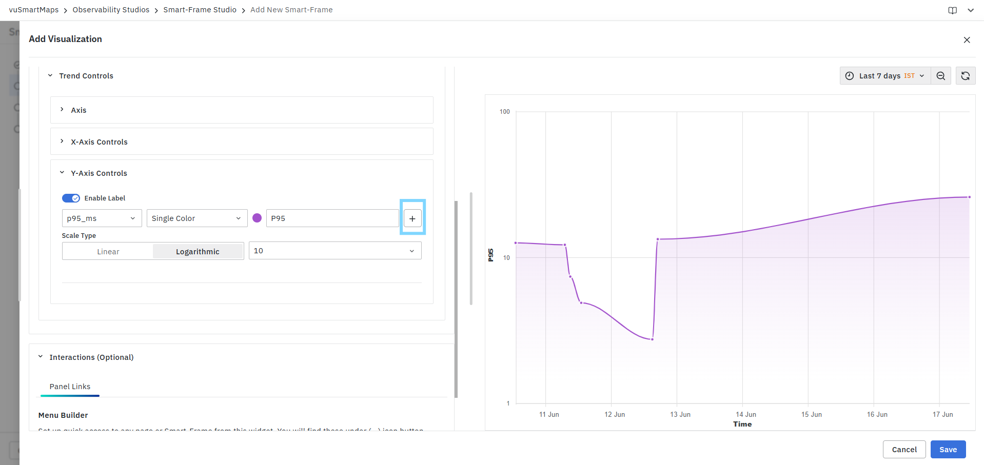
Scale Type
Defines how metric values are represented on the Y-axis.
Linear
Displays values using a uniform scale.
Characteristics:
- Equal intervals represent equal value changes.
- Suitable for most datasets.
Example:
10 → 20 → 30 → 40
Logarithmic
Displays values using a logarithmic scale.
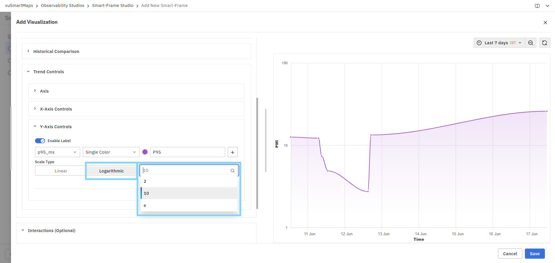
Characteristics:
- Useful when values vary significantly in magnitude.
- Helps visualize both small and large values on the same chart.
Available logarithmic bases:
- 2
- 10
- e (Natural Logarithm)
Example:
1 → 10 → 100 → 1000
instead of a linear progression.
Trend Controls affect only the visual presentation of the chart and do not modify the underlying query results or metric calculations. They are intended to improve readability, interpretation, and dashboard presentation.
FAQs
What is a Trend Chart visualization?
A Trend Chart displays metric values over a selected time period using a line graph. It helps monitor trends, compare metrics, identify patterns, and detect anomalies in time-series data.
How do I create a Trend Chart visualization?
Select Trend Chart from the Visualization Type drop-down, configure the query using Query Builder, select the required time-based aggregation field and metrics, review the query summary, validate the results in the Preview panel, optionally configure customizations, and click Save.
What can I configure using the Query Builder?
You can select the data source and data model, configure aggregations, apply filters, define grouping criteria, configure sorting and result limits, and review the query summary before execution.
What can I use the Preview Panel for?
The Preview Panel lets you validate query results, verify selected metrics and aggregations, confirm filtering criteria, review trend patterns, and compare multiple metric series before saving. If no data is returned, it displays a No Data message.
What customizations are available for Trend Charts?
Trend Chart customizations include Units and Formatting and Locale and Formatting Style. These settings control how metric values are displayed without modifying the underlying query results.
Can I configure thresholds for Trend Charts?
Yes. Thresholds can be configured for individual metric columns using Custom Threshold or Data Model Defined settings. Thresholds can be displayed as lines or shaded regions on the chart.
Can I compare current metrics with historical data?
Yes. Historical Comparison allows current metric values to be compared with previous time periods. Multiple historical comparison settings can be configured for the same metric.
