Service Map Visualization
The Service Map visualization provides a graphical representation of service dependencies and communication flows within an application or distributed environment. It enables users to visualize relationships between services, identify upstream and downstream dependencies, and analyze service interactions using operational metrics such as request volume, latency, and error rates. Service Map visualizations are configured using separate query definitions for nodes and links, allowing users to define both service entities and the relationships connecting them.
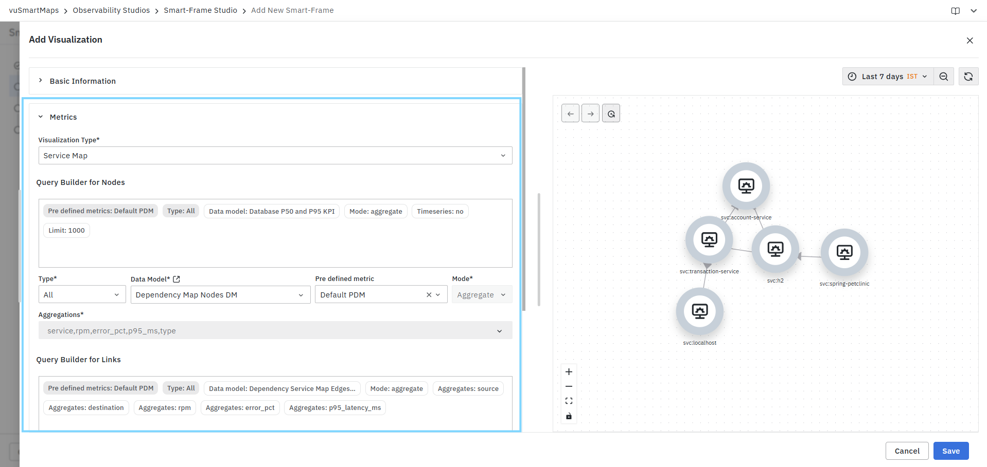
Creating a Service Map Visualization
To create a Service Map visualization:
- Select Service Map from the Visualization Type drop-down.
- Configure the Query Builder for Nodes.
- Configure the Query Builder for Links.
- Review the generated query summaries.
- Validate the service topology in the Preview Panel.
- Configure optional customization settings if required.
- Click Save.
Query Configuration
Service Map visualizations use a specialized Query Builder framework available in Smart-Frame Studio. Unlike other visualization types, Service Maps require separate query configurations for nodes and links to accurately represent services and their dependencies.
The Query Builder allows you to:
- Configure service nodes that will be displayed in the Service Map.
- Define relationships and communication paths between services.
- Select data models for nodes and links.
- Choose predefined metrics.
- Configure aggregations required for dependency mapping.
- Review query summaries before execution.
- Validate the generated service topology before saving.
The Service Map query configuration consists of the following sections:
Query Builder for Nodes
The Query Builder for Nodes is used to define the services, applications, or components that appear as nodes in the Service Map. This configuration determines which entities are discovered and displayed in the visualization.
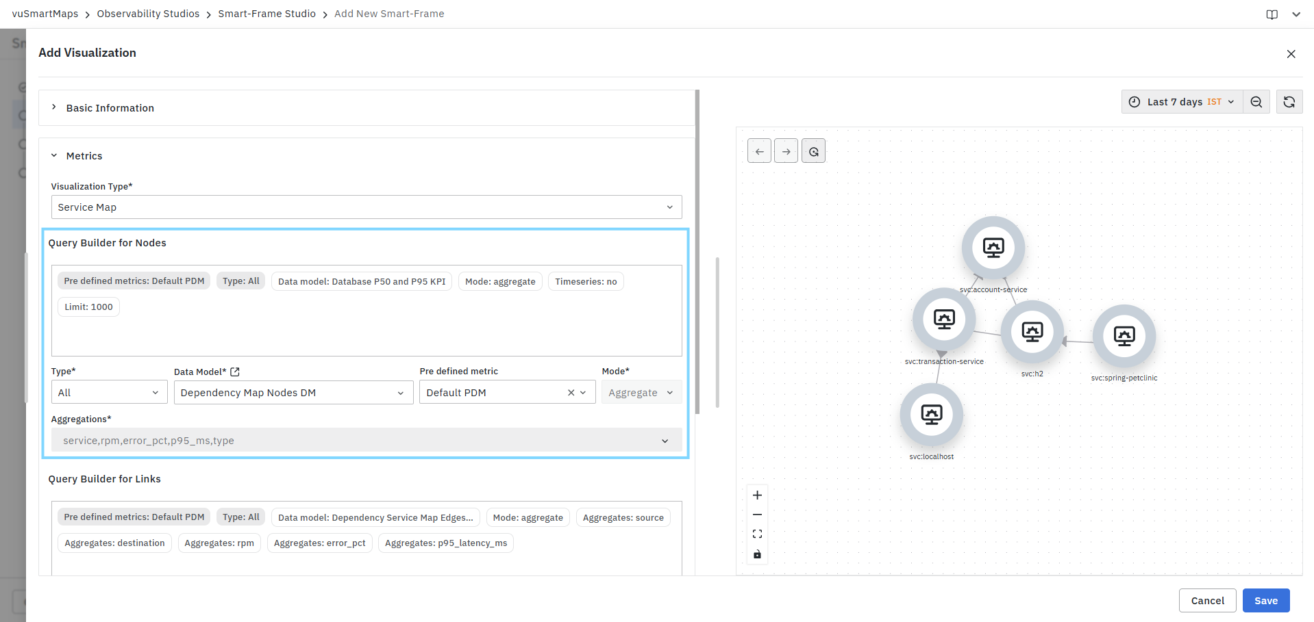
Node queries allow users to:
- Select the data model containing service information.
- Configure the metrics used to identify services.
- Define aggregation fields that represent service attributes.
- Populate nodes with operational metrics such as request volume, latency, error percentage, and service type.
Each record returned by the node query is represented as an individual node in the Service Map.
Query Builder for Links
The Query Builder for Links is used to define the relationships and communication paths between services. This configuration determines how nodes are connected and how dependencies are represented within the visualization.
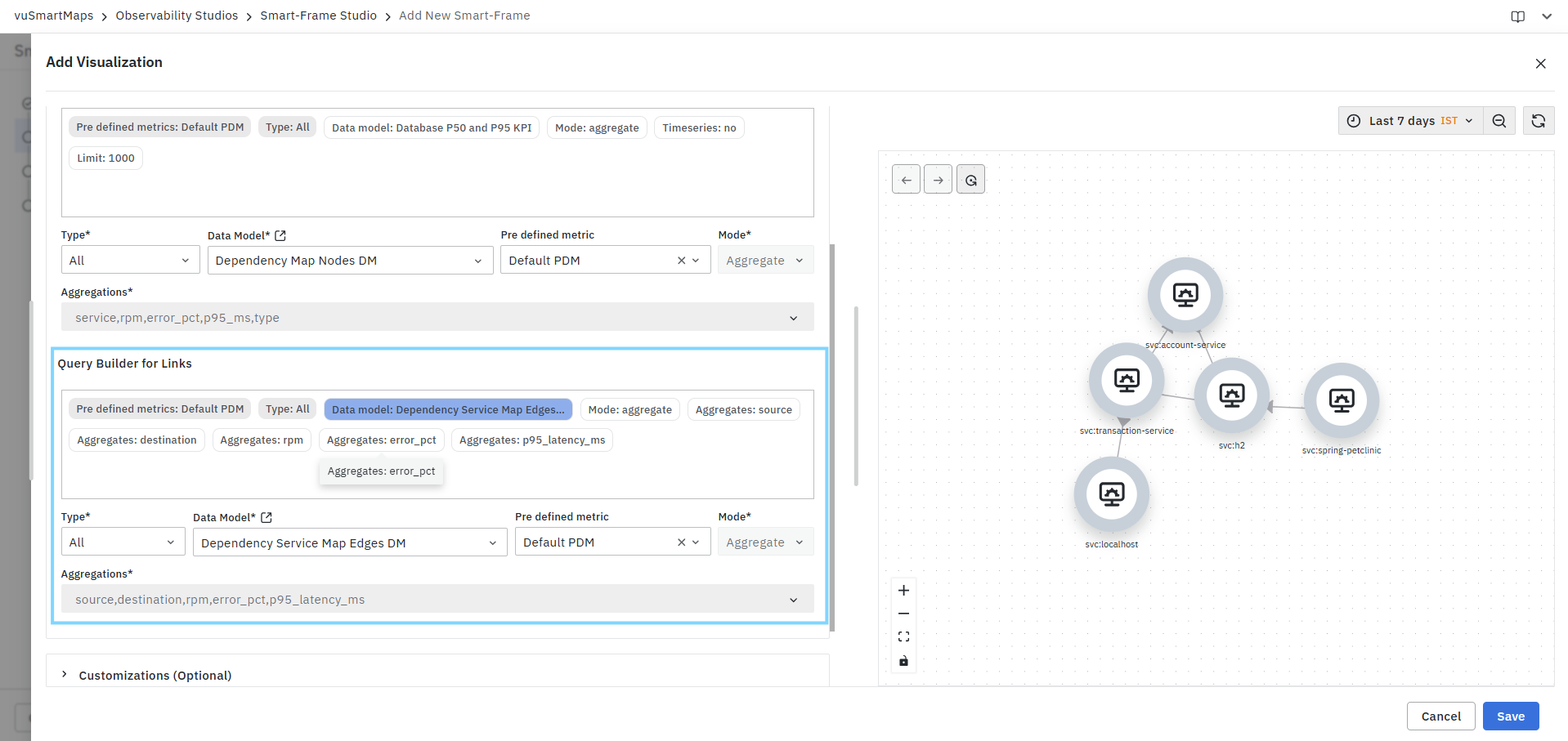
Link queries allow users to:
- Select the data model containing dependency information.
- Define source and destination service relationships.
- Configure aggregation fields used to establish service connections.
- Associate operational metrics such as requests per minute (RPM), error percentage, and latency with service interactions.
Each record returned by the link query is represented as a connection between two nodes, enabling users to visualize service dependencies and communication flows across the application landscape.
For detailed information about all Query Builder fields and configuration options, see Query Builder.
Preview Panel
The Preview Panel displays the Service Map generated by the configured node and link queries. As configuration changes are applied, the preview updates automatically to reflect the latest query settings.

The preview can be used to:
- Validate service discovery.
- Verify service dependencies.
- Review node relationships.
- Confirm aggregation selections.
- Analyze service topology before saving the visualization.
If no matching data is returned, the preview displays an empty Service Map.
Service Map Characteristics
Service Map visualizations are designed to display:
- Service-to-service dependencies.
- Application communication flows.
- Upstream and downstream relationships.
- Distributed service topologies.
- Service performance context.
- Operational dependency mapping.
- Real-time and historical service interactions.
Each service is displayed as an individual node, while communication paths and dependencies are represented as links between nodes.
Common Use Cases
Service Map visualizations are commonly used for:
- Application dependency mapping.
- Microservices architecture visualization.
- Service relationship analysis.
- Root cause investigation.
- Performance bottleneck identification.
- Error propagation analysis.
- Service impact assessment.
- Infrastructure dependency monitoring.
- Operational topology visualization.
- Distributed system observability.
Example
A Service Map visualization may be configured to display service dependencies using metrics such as:
- Requests Per Minute (RPM)
- Error Percentage
- P95 Latency
for the selected time range, enabling users to understand how services communicate and identify performance issues across the application landscape.
Similarly, Service Map visualizations can be used to display:
- Application service dependencies
- Microservice communication paths
- API interaction flows
- Service performance relationships
- Infrastructure service mappings
allowing users to obtain a clear view of service topology and operational dependencies.
Customizations
Service Map visualizations provide customization options that allow users to control how metric values are displayed, formatted, and rendered within the topology view. These settings help improve readability and ensure that operational metrics are presented in a meaningful format.
The customization options are available under:
- Units and Formatting
- Data Controls
- Service Visualization Controls
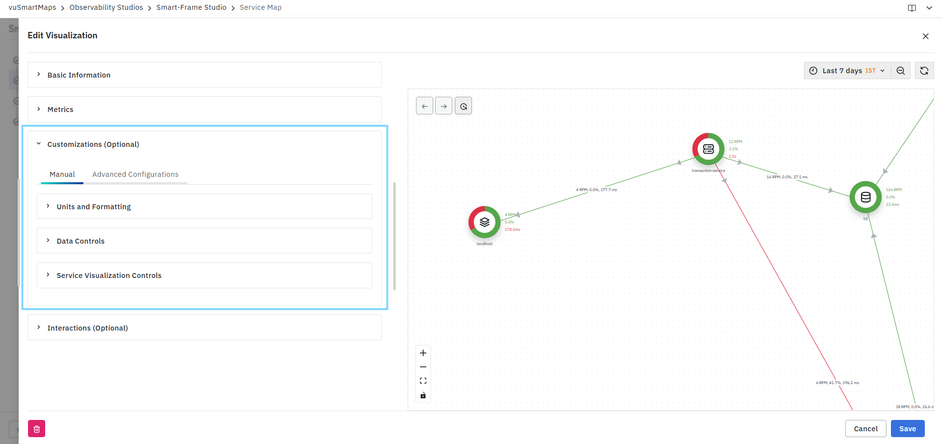
Units and Formatting
The Units and Formatting section allows users to configure how metric values are displayed on service nodes and dependency links.
Users can define:
- Metric-specific display formats.
- Unit conversions.
- Decimal precision.
- Rounding behavior.
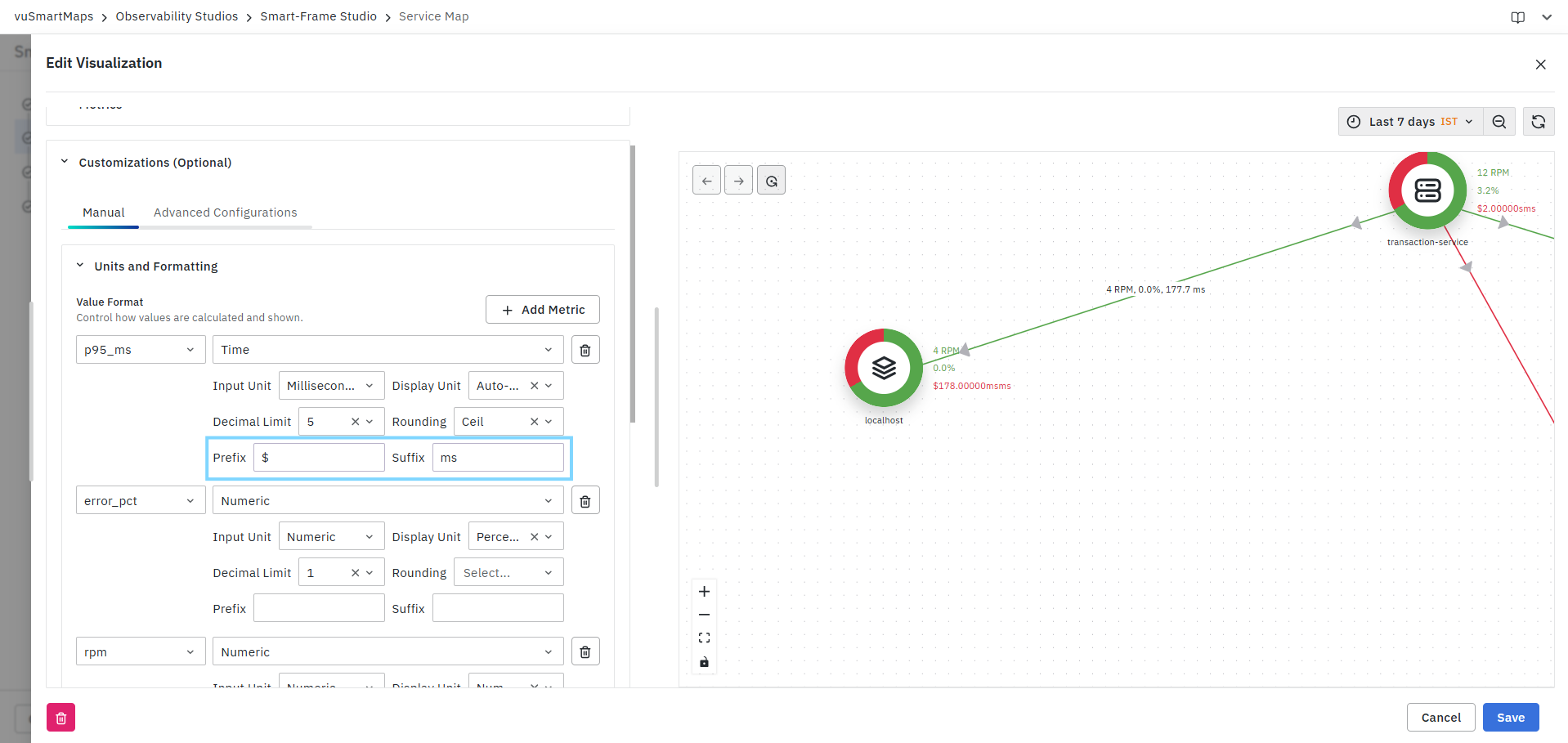
- Prefix and suffix values.
- Locale-based formatting rules.
Value Format
The Value Format section allows users to configure formatting settings for individual metrics displayed in the Service Map.

To configure a metric:
- Select a metric from the metric drop-down list.
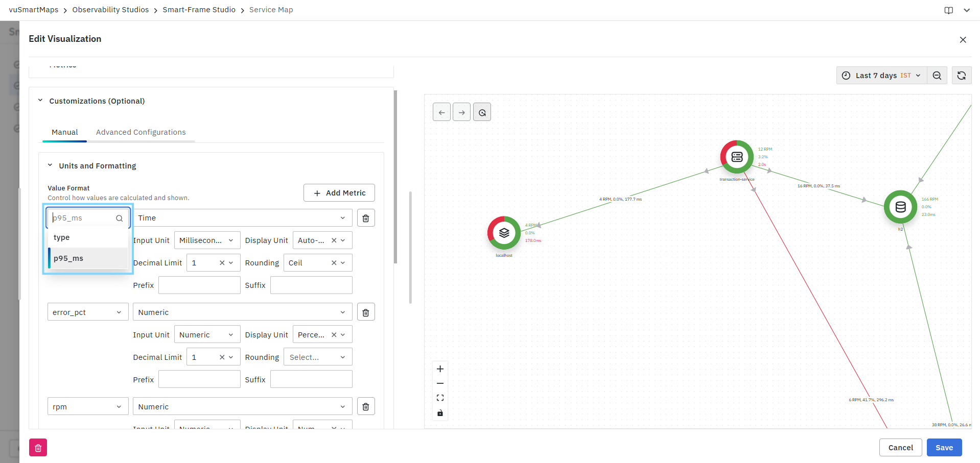
- Select the appropriate data type.
- Configure formatting settings.
- Preview the changes in the visualization panel.
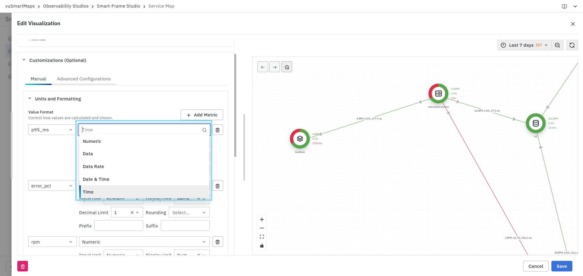
The available data types include:
- Numeric
- Data
- Data Rate
- Date & Time
- Time
Add Metric
Click Add Metric to create formatting rules for additional metrics displayed in the Service Map. Each metric can have its own independent formatting configuration.
Input Unit
The Input Unit defines the original unit of the selected metric.

Display Unit
The Display Unit defines how the metric value is displayed within the visualization.

Users can:
- Display values in their original unit.
- Convert values into another unit.
- Enable Auto-scale mode to automatically select the most appropriate display unit based on the metric value.
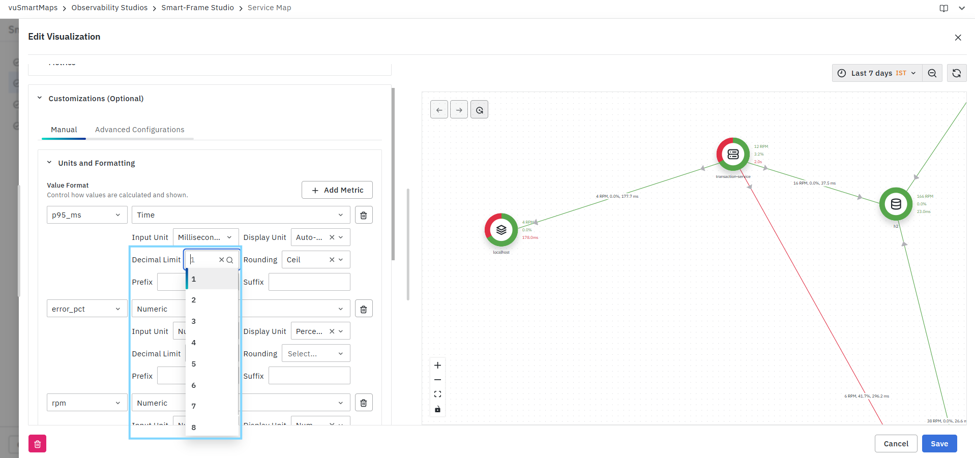
Decimal Limit
The Decimal Limit setting controls the number of decimal places displayed for metric values. This helps improve readability and maintain consistent formatting across the visualization.
Rounding
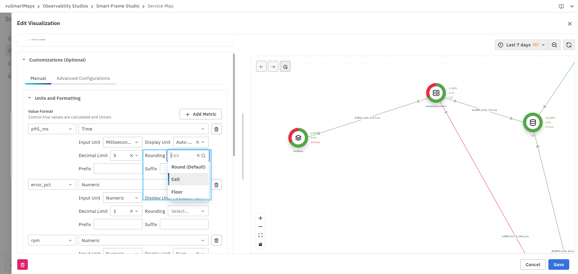
The Rounding option determines how decimal values are rounded before display.
Available options include:
- Round (Default)
- Ceil
- Floor
Prefix
The Prefix field allows users to add text before a metric value.
Example:
$100₹500
Suffix
The Suffix field allows users to append text after a metric value.
Example:
150 ms75 %
Locale and Formatting Style
The Locale and Formatting Style section allows users to apply region-specific number and currency formatting rules. This ensures that values are displayed according to local conventions.
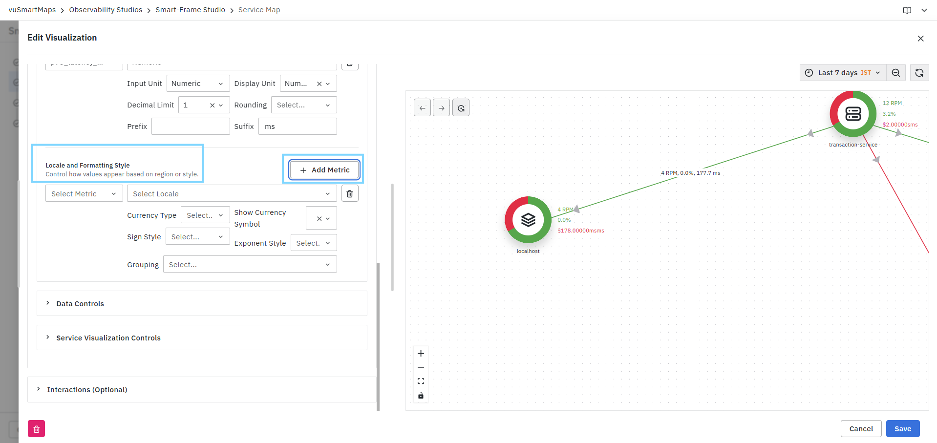
Metric Selection
Select the metric for which locale-based formatting should be applied.
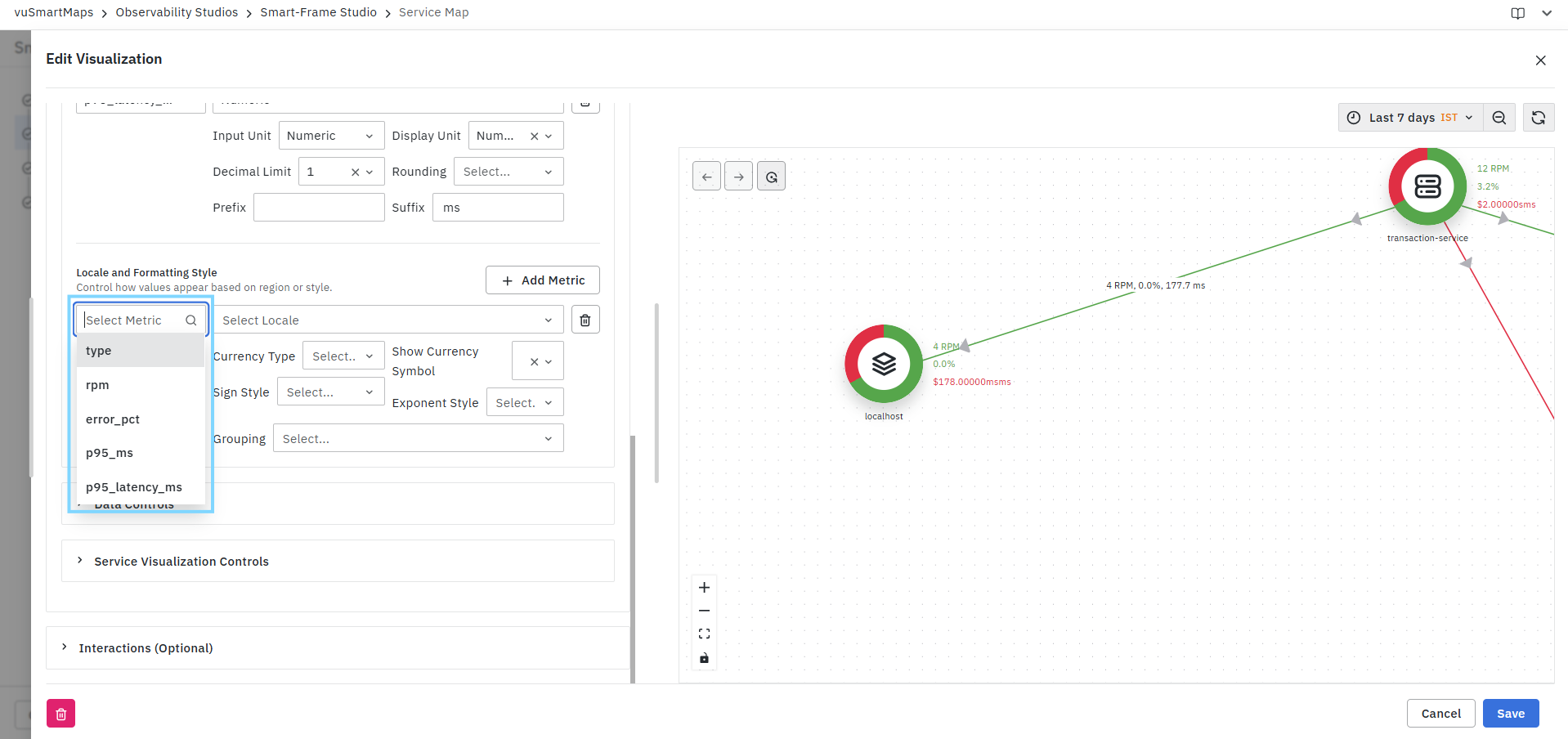
Locale
Select the locale used for formatting values.

The selected locale influences:
- Number grouping
- Decimal separators
- Currency formatting
- Sign conventions
Currency Type
Specifies the currency symbol used when formatting currency values.
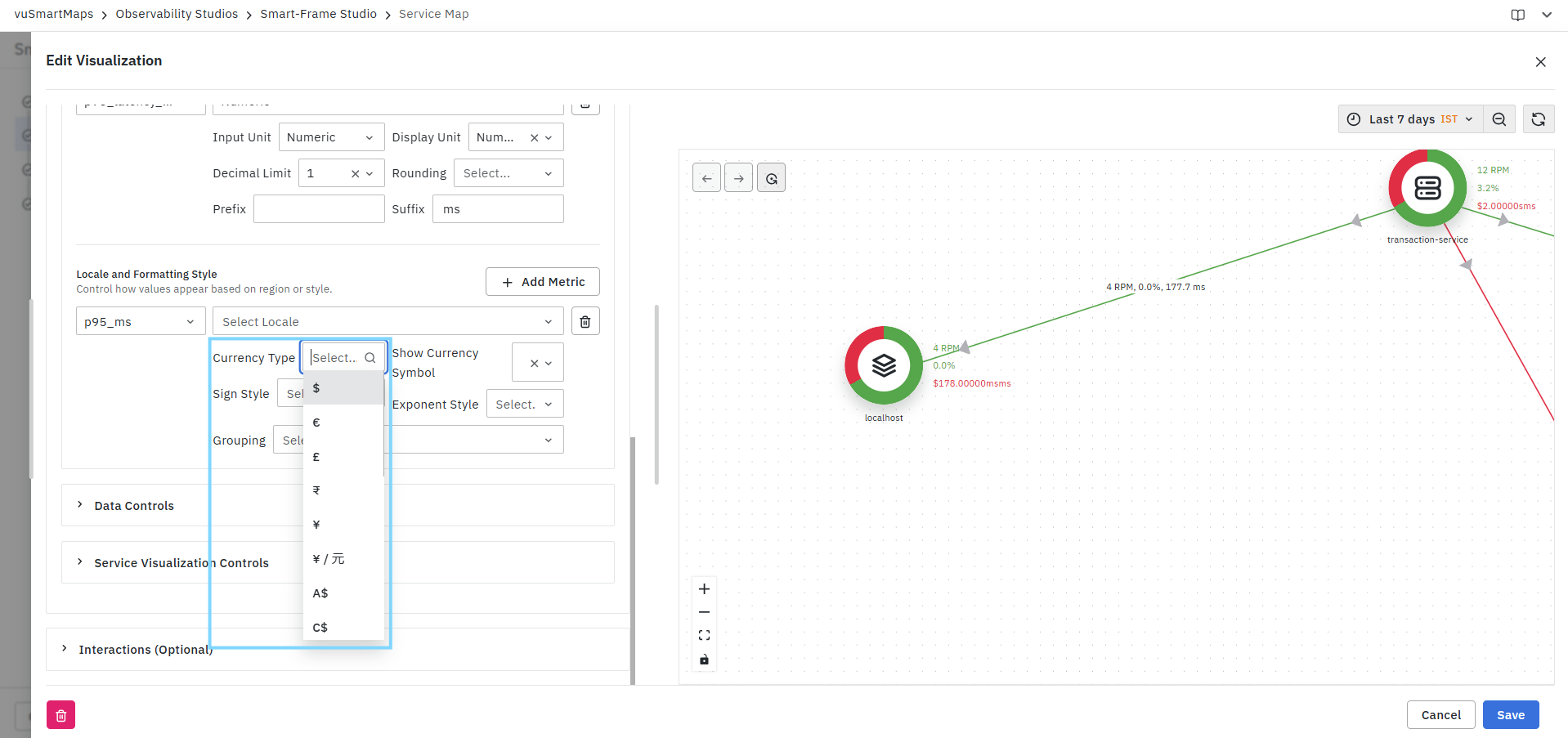
Show Currency Symbol
Controls the placement of the currency symbol relative to the value.
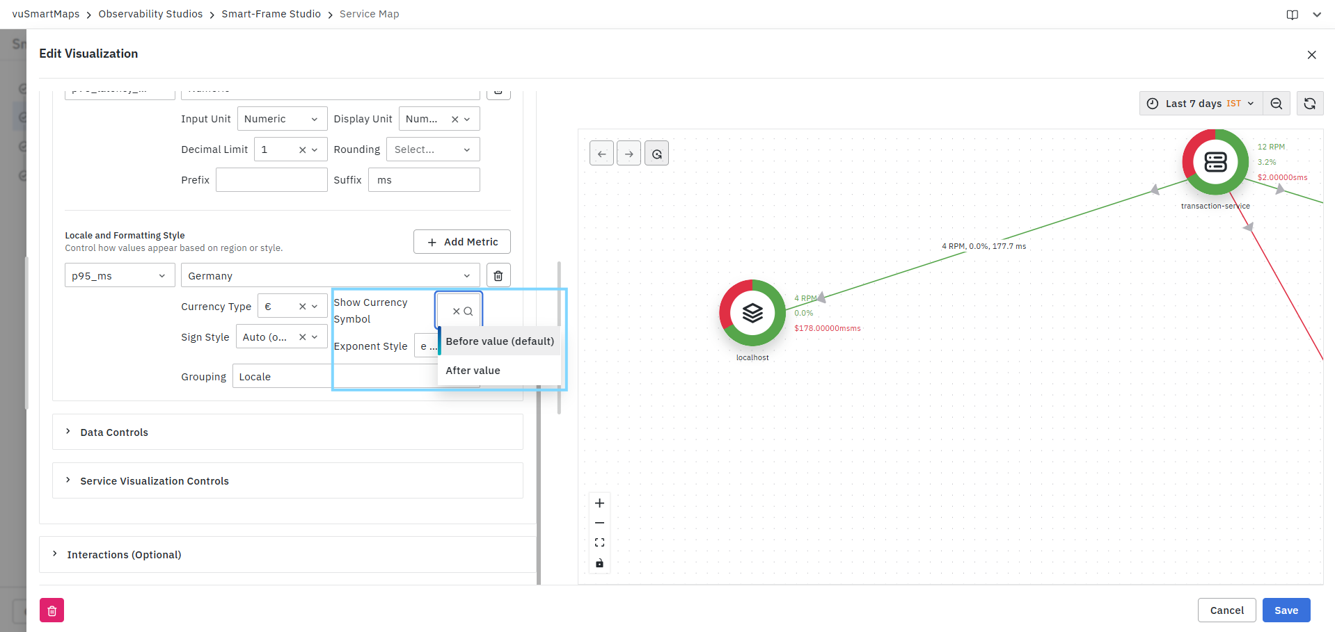
Available options include:
- Before value (Default)
- After value
Sign Style
Defines how positive and negative values are displayed.
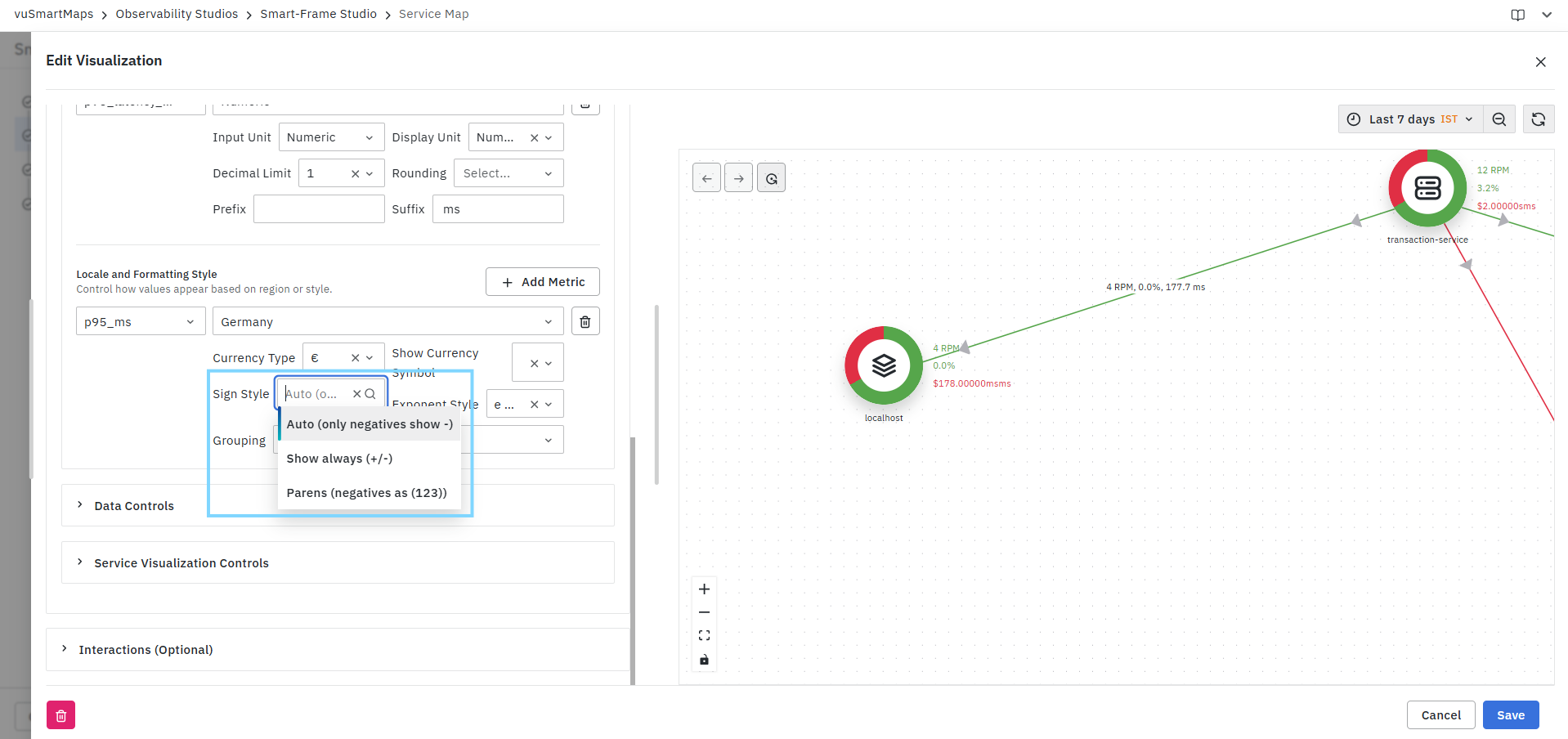
Available options include:
- Auto (only negative values show signs)
- Show always (+/-)
- Parentheses for negative values
Example:
- -100
- +100
- (100)
Exponent Style
Controls scientific notation formatting for large numeric values.
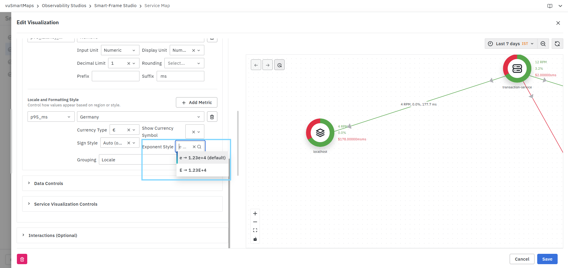
Available options include:
- e notation (1.23e+4)
- E notation (1.23E+4)
Grouping
Controls digit grouping behavior for large numbers.
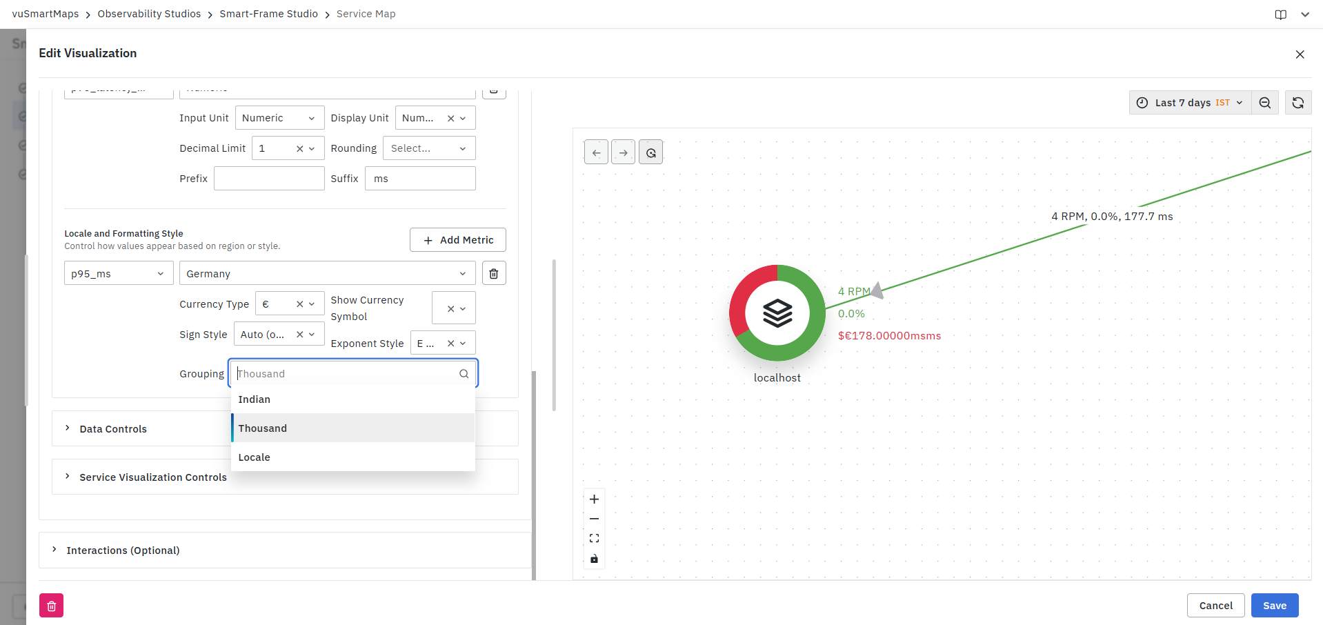
Available options include:
- Locale
- Thousand
- Indian
Examples:
- Locale: 1,234,567
- Thousand: 1,234,567
- Indian: 12,34,567
Data Controls
The Data Controls section allows you to define threshold rules for nodes and links displayed in the Service Map visualization. These thresholds help visually identify healthy, warning, and critical entities by applying color-coded indicators based on metric values. Data Controls consist of the following sections:
- Node Thresholds – Configure threshold rules for service nodes.
- Link Thresholds – Configure threshold rules for communication links between services.
Node & Link Thresholds
Node Thresholds allow you to define threshold conditions for node-level metrics such as RPM, Error Percentage, Latency, and other available metrics.
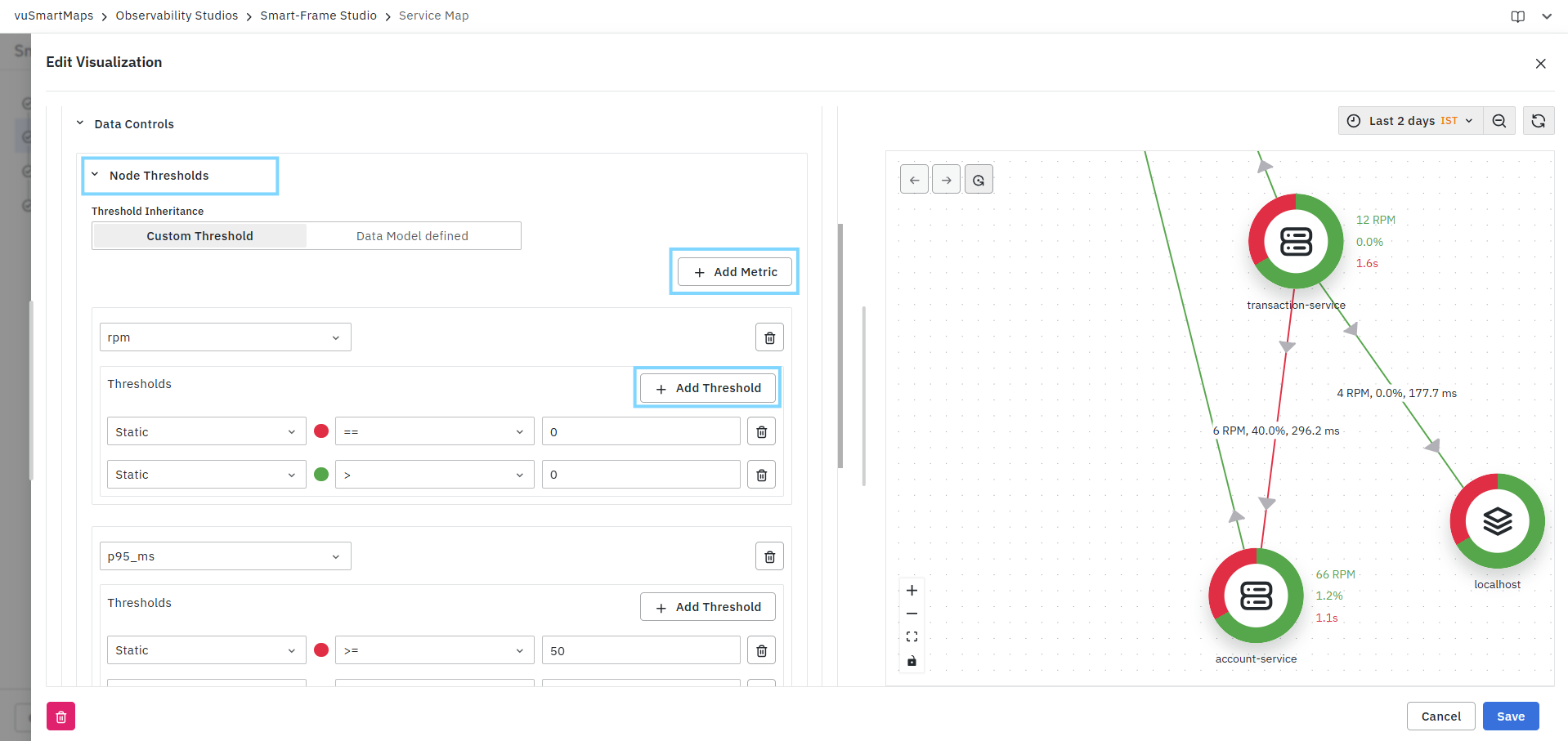
Configure Node/Link Thresholds
- Expand the Node/Link Thresholds section.
- Select the threshold inheritance mode:
- Custom Threshold – Define thresholds specific to the visualization.
- Data Model Defined – Use threshold definitions configured in the associated Data Model.
- Click Add Metric.
- Select the metric for which thresholds must be configured.
- Click Add Threshold.
- Define the threshold condition.
- Save the visualization.
Threshold Inheritance
The Threshold Inheritance option determines how threshold values are applied.
| Option | Description |
|---|---|
| Custom Threshold | Allows you to create visualization-specific threshold rules. |
| Data Model Defined | Uses threshold configurations inherited from the selected Data Model. |
Add Metric
Use Add Metric to create threshold rules for one or more metrics.

Available metrics depend on the selected Data Model and may include:
- RPM
- Error Percentage
- P95 Latency
- Response Time
- Custom Metrics
Multiple metrics can be configured independently.
Threshold Types
Each threshold can be configured using one of the following types:
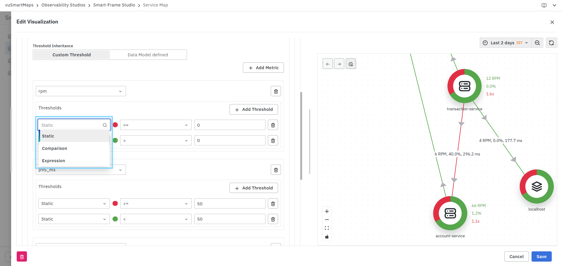
Static
Defines a fixed threshold value.

Example
| Condition | Result |
|---|---|
| Error % >= 10 | Critical |
| RPM > 0 | Healthy |
Range
Defines a threshold between two values.
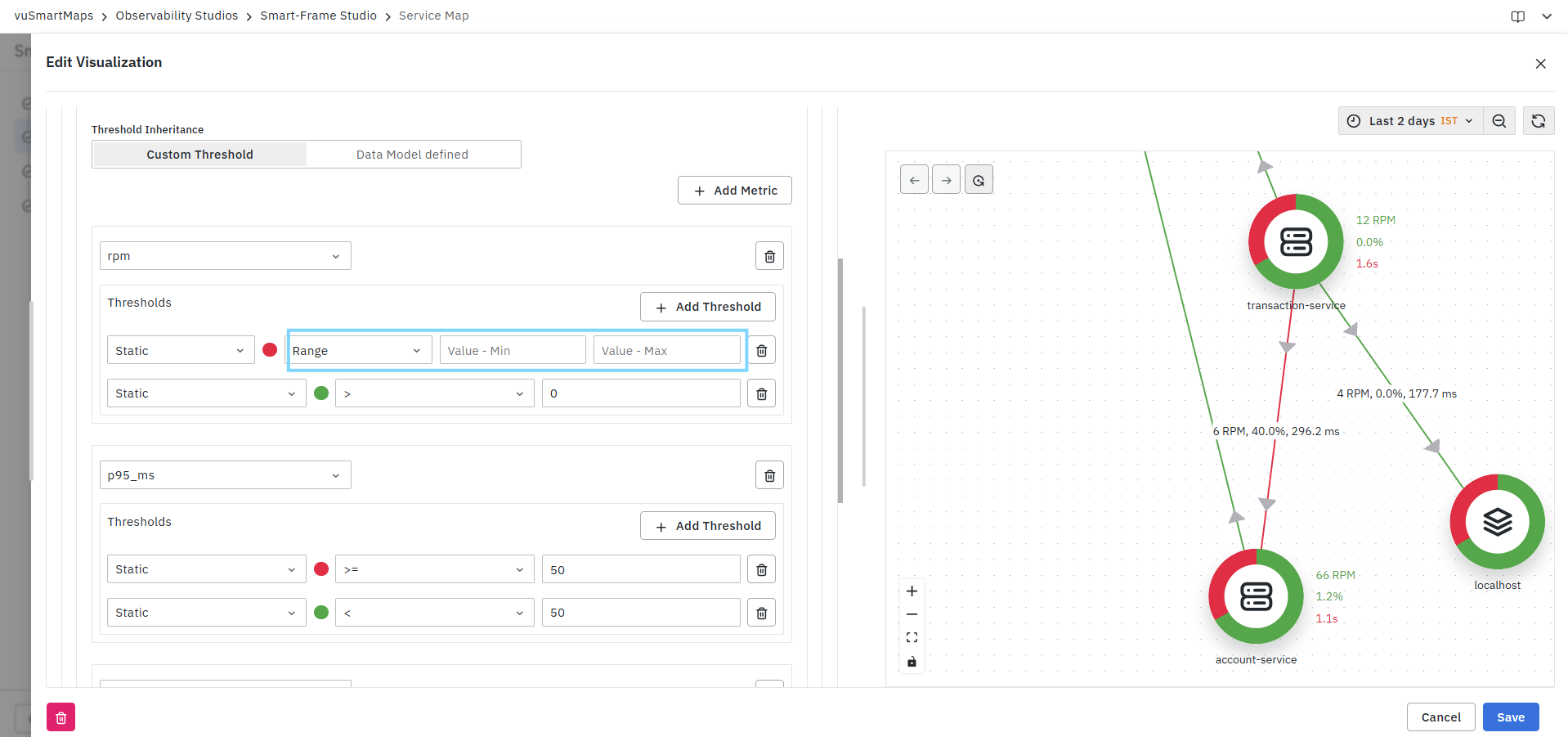
Example
| Min Value | Max Value | Result |
|---|---|---|
| 50 | 100 | Warning |
| 100 | 500 | Healthy |
When Range is selected, the system displays:
- Value - Min
- Value - Max
Comparison
Compares one metric against another metric.
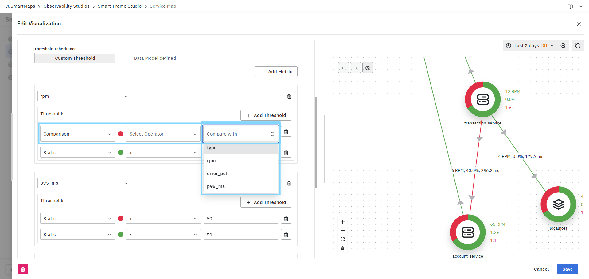
Configuration Fields
| Field | Description |
|---|---|
| Compare With | Metric to compare against |
| Operator | Comparison operator |
Example
error_pct > rpm
The threshold is triggered when the Error Percentage exceeds the RPM metric value.
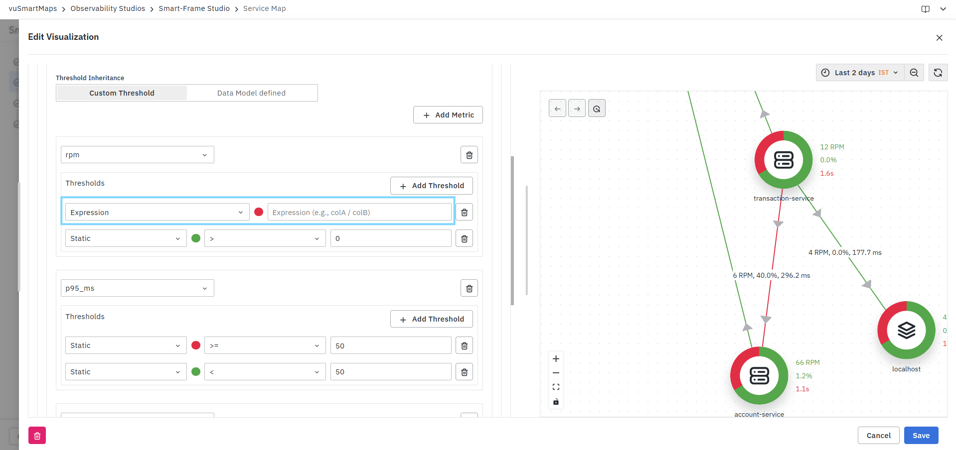
Expression
Allows creation of custom logical or mathematical expressions using available metrics.
Example
error_pct / rpm > 0.5
or
colA / colB > 10
Use expressions when threshold evaluation requires multiple metrics or calculations.
Delete Metric
To remove a configured metric:
- Locate the metric block.
- Click the Delete icon.
- Save the visualization.
Service Visualization Controls
The Service Visualization Controls section allows you to customize the appearance, layout, icons, and metric display behavior of the Service Map visualization. These settings help improve readability and provide a more meaningful representation of services and their relationships.
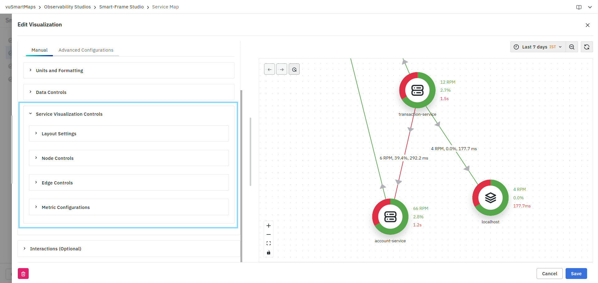
The following configuration categories are available:
- Layout Settings
- Node Controls
- Edge Controls
- Metric Configurations
Layout Settings
The Layout Settings section controls the spacing and positioning of nodes within the Service Map.
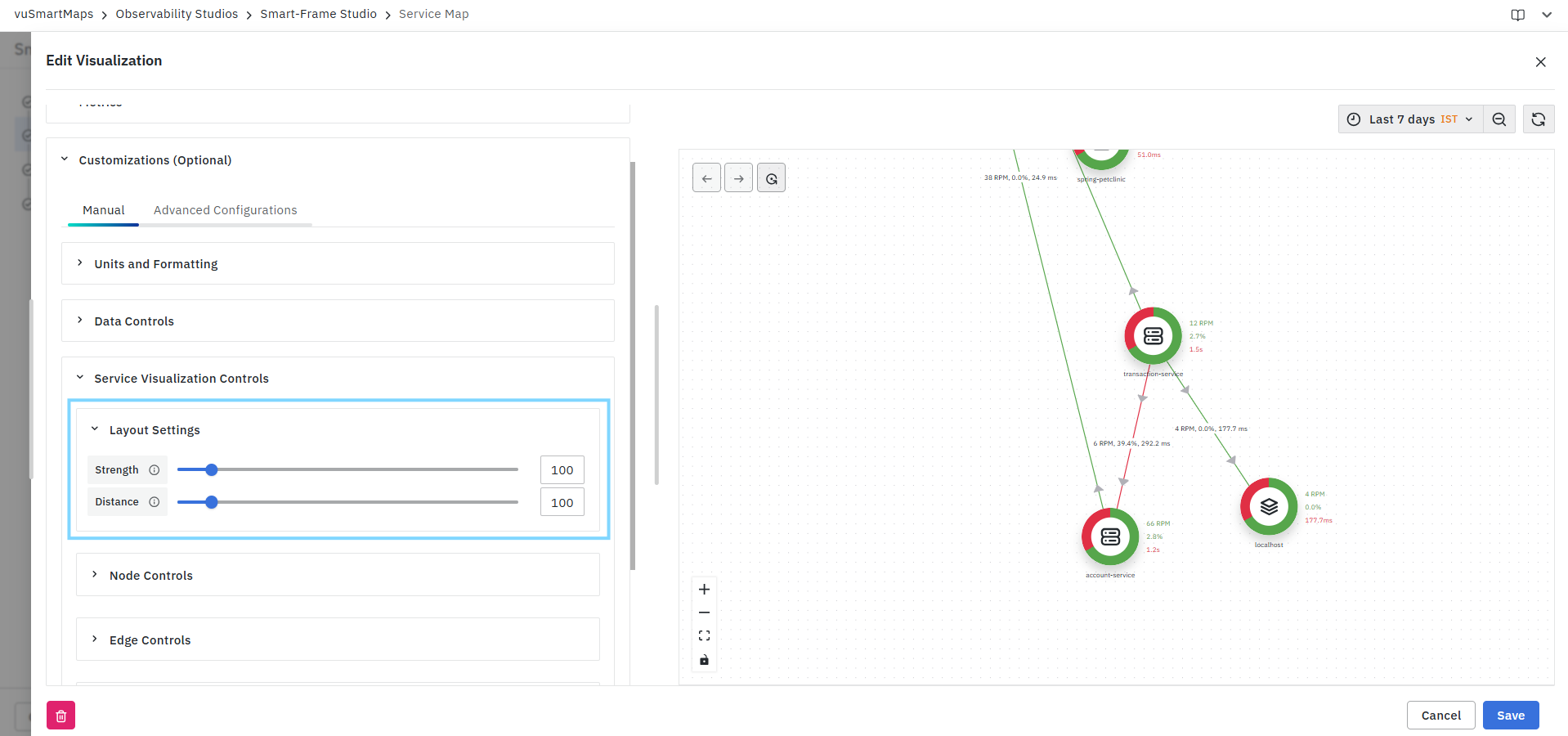
Strength
Defines the force applied between connected nodes during layout generation.
- Higher values place greater emphasis on maintaining node relationships.
- Lower values allow nodes to spread more freely.
Distance
Controls the spacing between nodes.
- Higher values increase the gap between services.
- Lower values position services closer together.
Adjusting these values helps optimize map readability for small or large service landscapes.
Node Controls
The Node Controls section allows you to customize the information and icons displayed on service nodes.
Display Metrics
Select the metrics that should be displayed directly on each node.
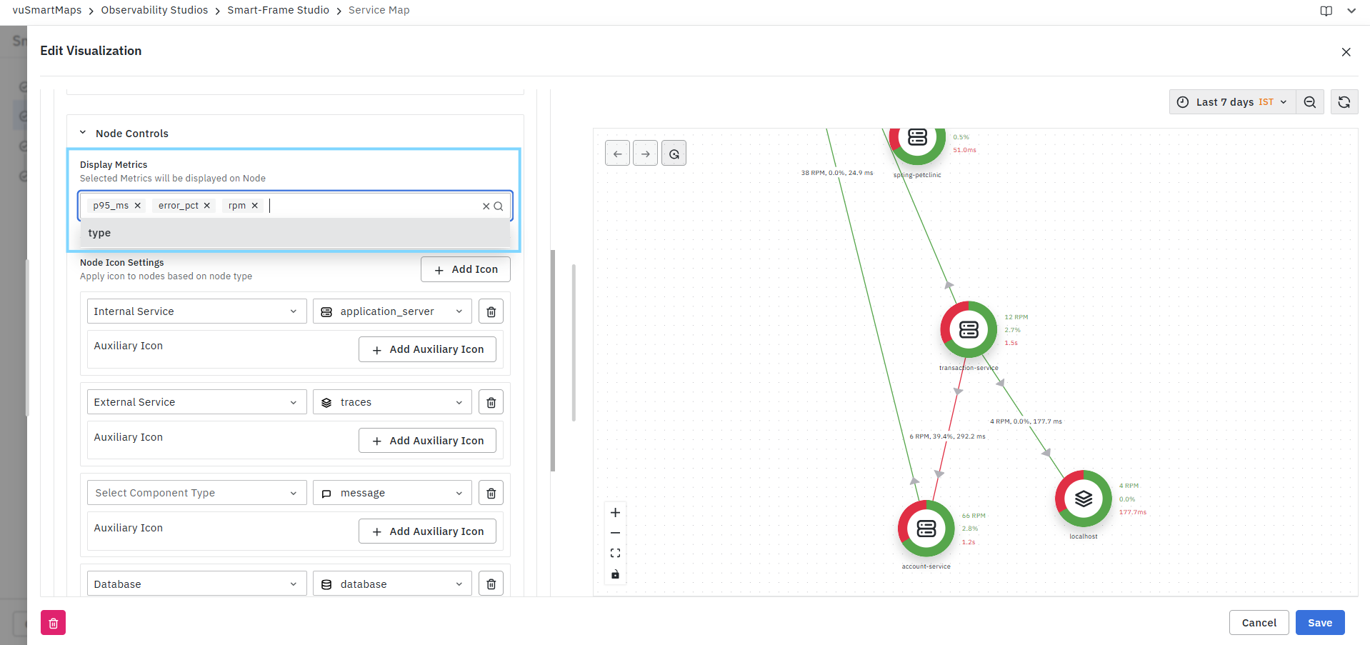
Examples include:
- RPM
- Error Percentage
- P95 Latency
- Response Time
- Custom Metrics
Multiple metrics can be selected simultaneously. The selected metrics are displayed alongside each node in the Service Map.
Node Icon Settings
Node Icon Settings allow you to assign icons based on service or component type.
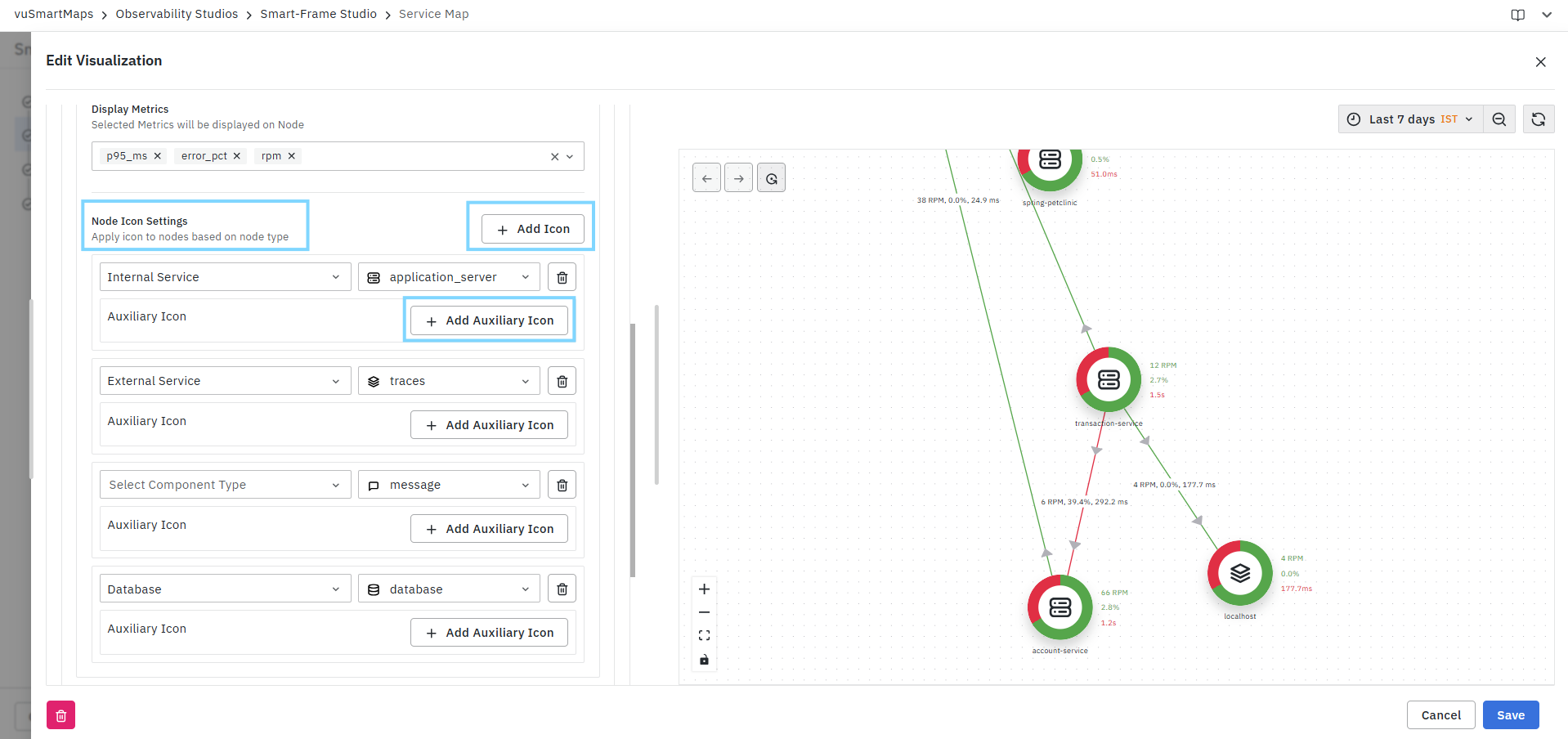
Configure Node Icons
- Click Add Icon.
- Select a component type.
- Choose an icon from the available icon library.
- Save the configuration.
The selected icon is automatically displayed for nodes matching the chosen component type.
Supported Component Types
Depending on the Data Model, available component types may include:
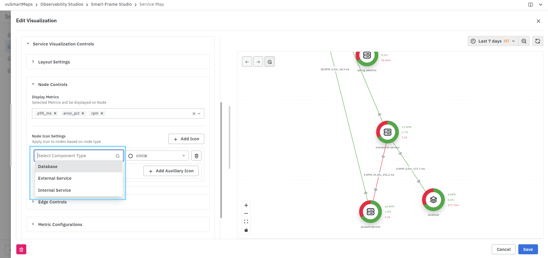
- Internal Service
- External Service
- Database
- Message Queue
- Cache
- API Gateway
- Custom Components
Icon Selection
A large icon library is available for visual representation of services.
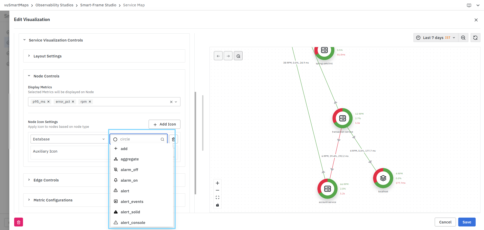
Icons help users quickly identify service types within the topology.
Auxiliary Icons
Auxiliary Icons allow additional indicators to be displayed on nodes.
Configure Auxiliary Icons
- Select a component type.
- Click Add Auxiliary Icon.

- Enter the auxiliary icon identifier.
- Select an icon.

- Save the configuration.
Auxiliary icons can be used to represent:
- Service roles
- Special classifications
- Environment indicators
- Custom business identifiers
Multiple auxiliary icons can be configured for different component types.
Edge Controls
The Edge Controls section allows you to configure which metrics are displayed on the connections (edges) between nodes in the Service Map. These metrics provide visibility into communication characteristics between services, helping users analyze traffic flow, latency, and error conditions across service dependencies.
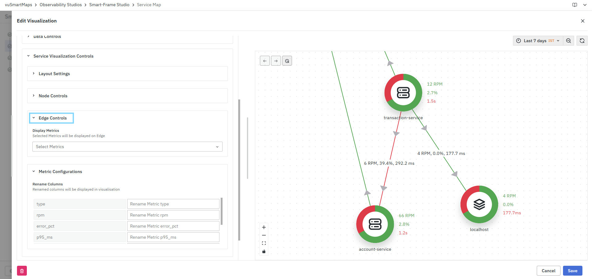
Display Metrics
Use the Display Metrics field to select the metrics that should be displayed on service connections.
- Expand the Edge Controls section.
- Click the Display Metrics drop-down.
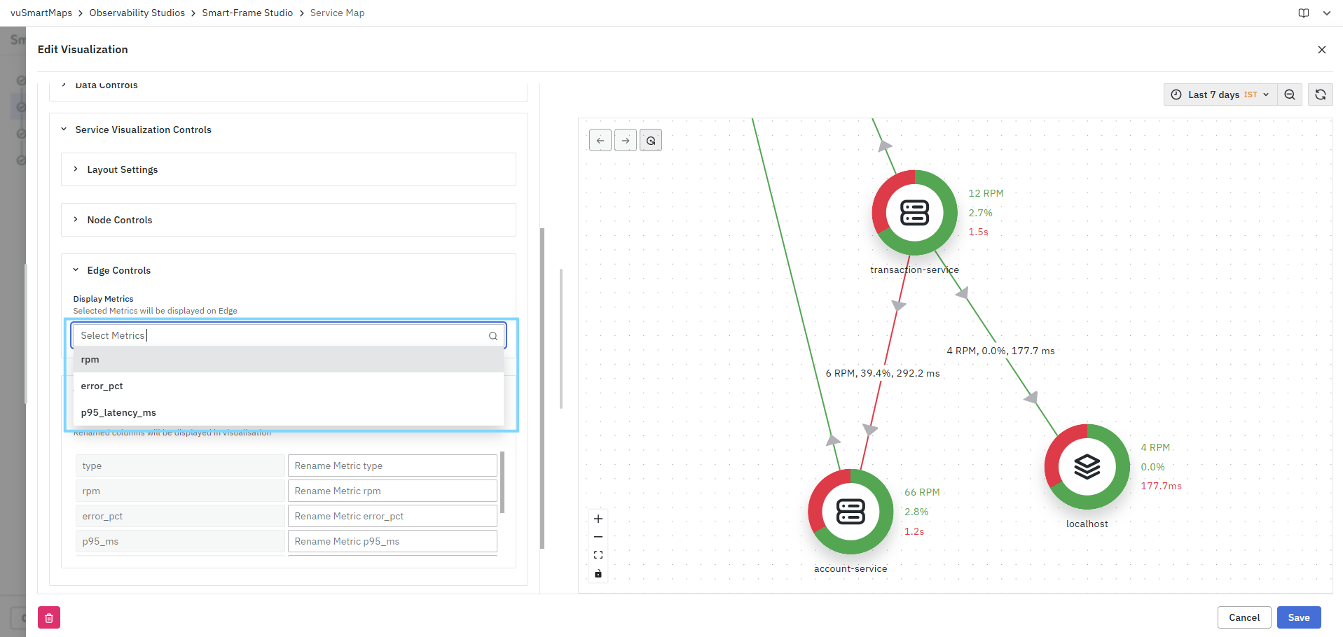
- Select one or more metrics to display on edges.
- The selected metrics are rendered directly on the corresponding service connections in the visualization preview.
Example
- If RPM, Error Percentage, and P95 Latency are selected, edge labels may appear as:
- 6 RPM, 39.4%, 292.2 ms
- This provides immediate visibility into the performance and health of service interactions without requiring users to drill down into detailed views.
Metric Configurations
The Metric Configurations section allows you to customize the display names of metrics shown in the Service Map visualization. Renaming metrics helps improve readability by replacing technical column names with business-friendly labels.

Rename Columns
The Rename Columns table displays all available metrics and attributes retrieved from the selected data model.
For each metric:
- Locate the metric in the left column.
- Enter a custom display name in the corresponding text field.
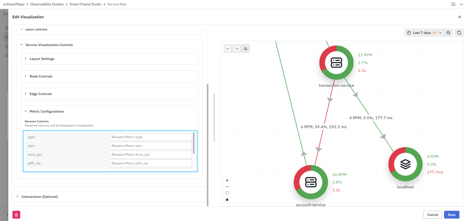
- Save the visualization.
The updated label is used throughout the Service Map visualization wherever the metric is displayed.
Example
| Original Metric | Custom Label |
|---|---|
| rpm | Requests/Min |
| error_pct | Error Rate (%) |
| p95_ms | P95 Latency |
| type | Service Type |
After applying these changes, the visualization displays the custom labels instead of the original metric names.
FAQs
What is a Service Map visualization?
A Service Map provides a graphical representation of service dependencies and communication flows, helping users visualize upstream and downstream relationships and analyze service interactions.
How do I create a Service Map visualization?
Select Service Map as the Visualization Type, configure the Query Builder for Nodes and Links, review the query summaries, validate the topology in the Preview Panel, configure optional customizations, and click Save.
Why are separate queries required for nodes and links?
Service Maps use separate query configurations to define the services displayed as nodes and the relationships or communication paths represented as links.
What can I configure using the Query Builder for Nodes?
You can select the data model, configure metrics and aggregation fields, and populate service nodes with operational metrics such as request volume, latency, error percentage, and service type.
What can I configure using the Query Builder for Links?
You can select the dependency data model, define source and destination service relationships, configure aggregation fields, and associate metrics such as RPM, error percentage, and latency with service interactions.
What can I use the Preview Panel for?
The Preview Panel allows you to validate service discovery, verify dependencies and node relationships, confirm aggregation selections, and analyze the service topology before saving.
What customization options are available for Service Map visualizations?
You can configure Units and Formatting, Data Controls, and Service Visualization Controls, including metric formatting, thresholds, layout, node and edge metrics, icons, and metric display names.
