Pro Charts Visualization
The Pro Charts visualization displays data in a chart-based format, enabling users to view and compare aggregated metric values visually. The Pro Charts visualization is used to represent exception count data across exception source categories. Pro Charts visualizations can be configured using the Query Builder and the Pro Charts Configuration section, which allow users to define the data model, predefined metric, aggregation fields, and chart rendering logic.
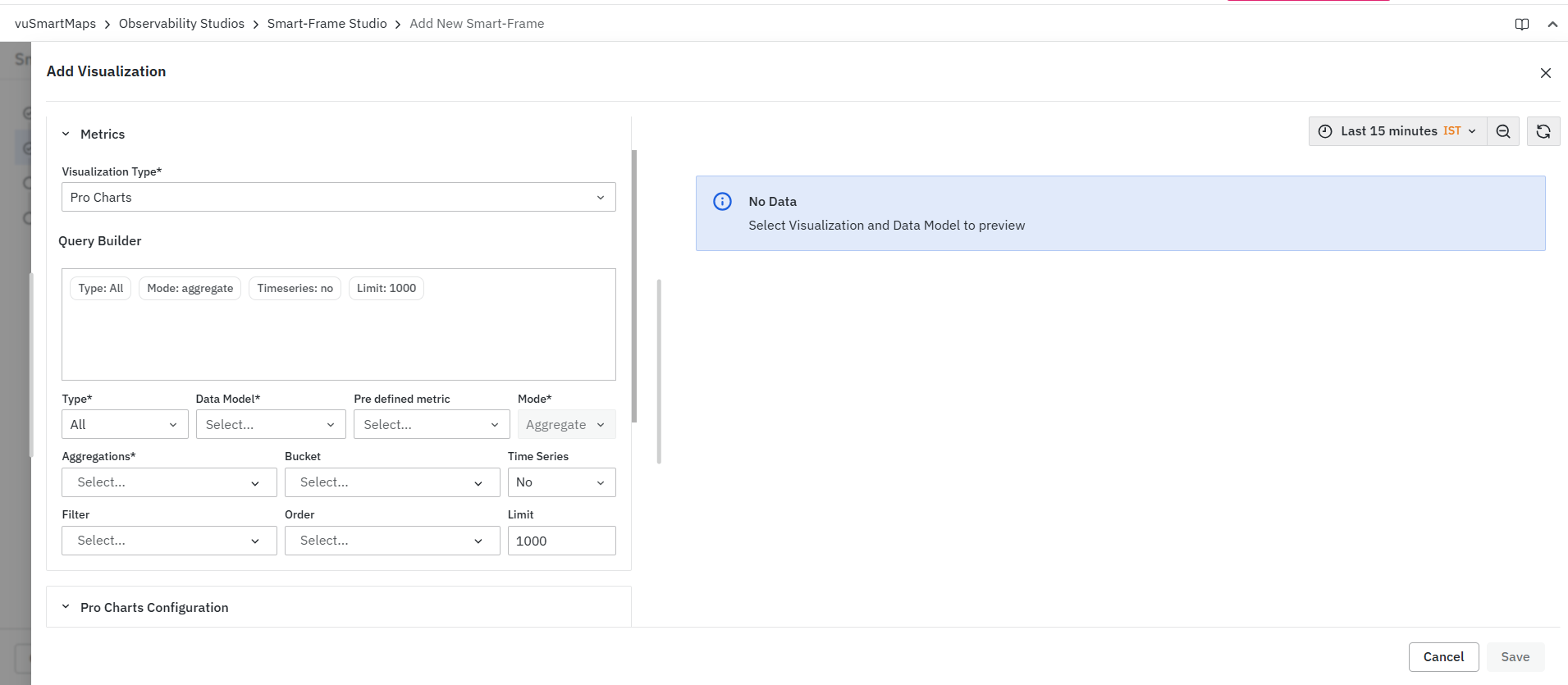
Creating a Pro Charts Visualization
To create a Pro Charts visualization:
-
Select Pro Charts from the Visualization Type drop-down.
-
Configure the query using the Query Builder.
-
Review the generated query summary.
-
Configure the chart using the Pro Charts Configuration section.
-
Validate the results in the Preview panel.
-
Configure optional interactions if required.
-
Click Save.
Query Configuration
Pro Charts visualizations use the standard Query Builder framework available in Smart-Frame Studio. The Query Builder allows you to:
-
Select the data source
-
Choose a data model
-
Select a pre-defined metric
-
Configure the mode
-
Configure aggregations
-
Review query summaries before execution
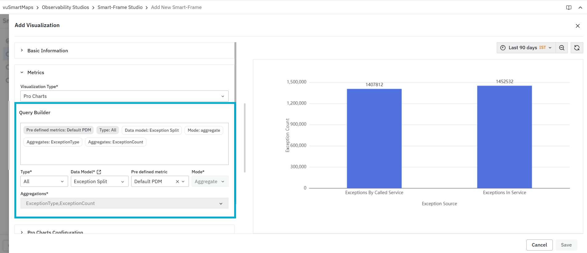
For detailed information about all Query Builder fields and configuration options, see Query Builder.
Preview Panel
The Preview Panel displays the output generated by the configured query and Pro Charts configuration. As configuration changes are applied, the preview reflects the latest chart output based on the selected query settings.
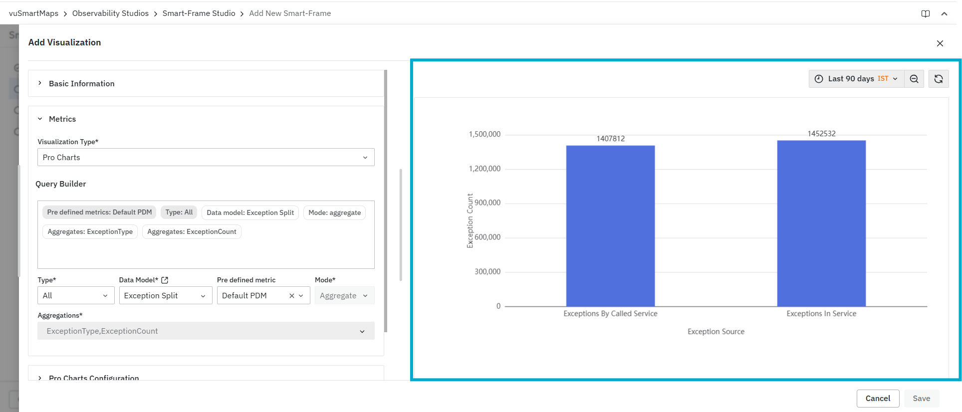
The preview can be used to:
-
Validate query results.
-
Verify selected aggregations.
-
Confirm that the chart is generated using the selected data model and metric configuration.
-
Review the chart output before saving the visualization.
The chart displays:
-
Y-axis: Exception Count
-
X-axis: Exception Source
-
Categories: Exceptions By Called Service and Exceptions In Service
-
Values displayed above each bar
If no data is returned, the preview displays a No Data message.
Pro Charts-Specific Characteristics
Pro Charts visualizations are designed to display:
-
Aggregated metric values.
-
Category-based chart output.
-
Visual comparison of values.
-
Axis-based metric representation.
-
Chart output generated from the selected query configuration.
Common use cases include:
-
Comparing exception counts across exception sources.
-
Reviewing aggregated exception metrics.
-
Identifying categories with higher exception volume.
-
Validating chart output before saving the Smart Frame visualization.
Pro Charts Configuration
The Pro Charts Configuration section is used to define the JavaScript function required for configuring the Pro Charts output. The Function editor allows users to access the visualization data and return the required parameters and data for setOption(). The context object provides access to the data and properties available for the chart. Users can use context.panel.series to access column-wise data and context.panel.data to access row-wise data generated from the Query Builder.

For example, context.panel.series can be used when chart fields need to be mapped for displaying values such as Exception Source and Exception Count. context.panel.data can be used when the chart configuration needs to refer to row-level query results. The commented console.log() statements can be used while configuring the chart to inspect the available context, column-wise data, and row-wise data in the browser console. This helps users understand the available data structure before writing or modifying the chart configuration. For more information on supported Pro Charts configuration options, refer to the Apache ECharts Cheat Sheet.
FAQs
What is a Pro Charts visualization?
Pro Charts is a chart-based visualization used to visually compare aggregated metric values and analyze category-wise trends or exceptions.
How do I create a Pro Charts visualization?
Select Pro Charts as the Visualization Type, configure the query, review the query summary, configure the chart, validate the output in the Preview panel, optionally configure interactions, and click Save.
What can I configure using the Query Builder?
The Query Builder allows you to select the data source and data model, choose a pre-defined metric, configure the mode and aggregations, and review the query summary before execution.
What can I use the Preview Panel for?
The Preview Panel allows you to validate query results, verify aggregations, confirm the selected data model and metric configuration, and review the chart output before saving.
What is the Pro Charts Configuration section used for?
The Pro Charts Configuration section is used to define the JavaScript function required to configure the Pro Charts output and return the required parameters and data for setOption().
