KPI Visualization
The KPI visualization displays key performance indicators (KPIs) in a summarized format, enabling users to quickly assess the health, status, and performance of monitored systems, applications, services, and business processes. KPI visualizations are designed to present important metrics as individual values, making it easy to identify current performance levels without analyzing detailed charts or tables. KPI visualizations can be configured using the Query Builder, which allows users to define the data source, metric selection, aggregation logic, filtering criteria, and result limits.
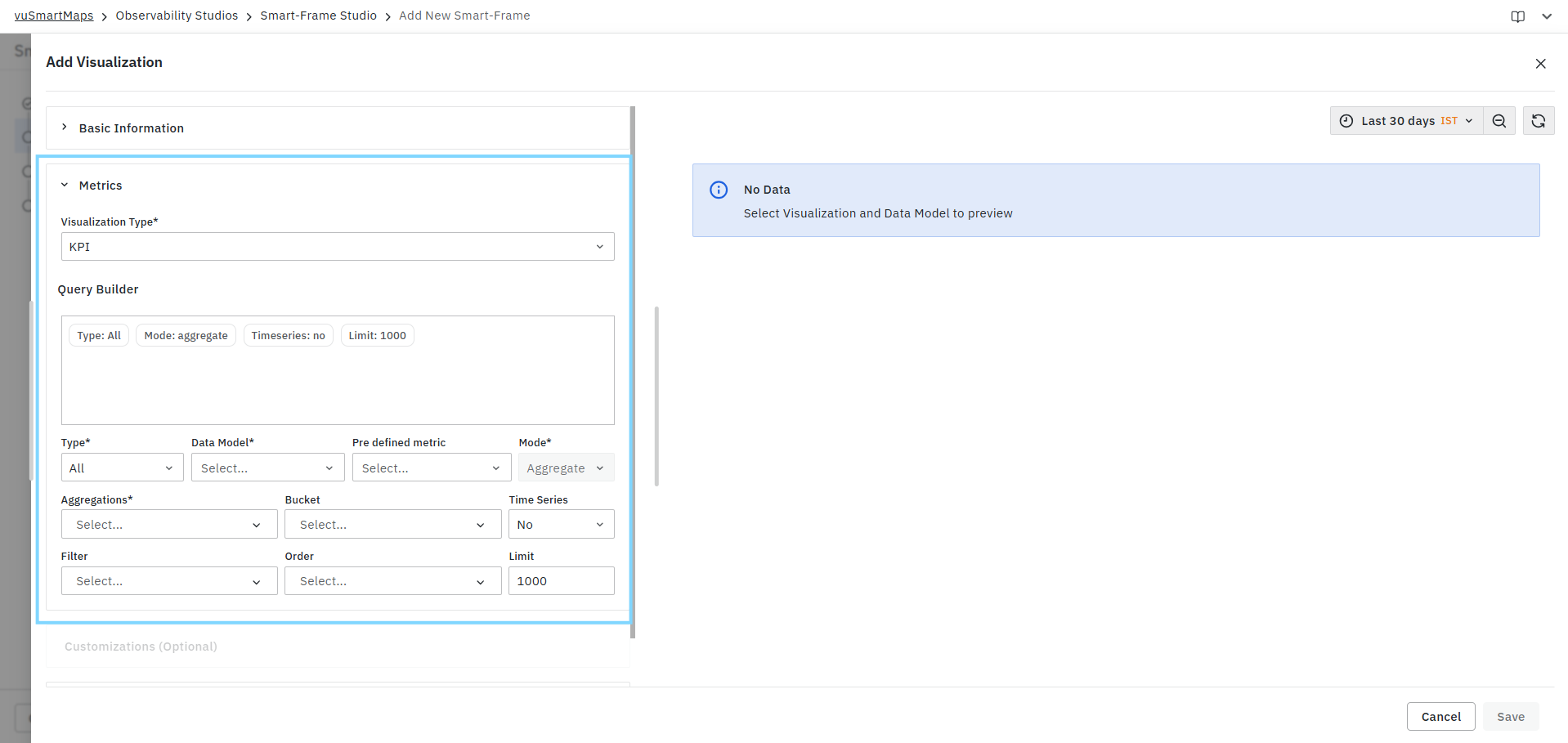
Creating a KPI Visualization
To create a KPI visualization:
- Select KPI from the Visualization Type drop-down.
- Configure the query using the Query Builder.
- Select the required KPI metrics to display.
- Review the generated query summary.
- Validate the results in the Preview Panel.
- Configure optional customization settings if required.
- Click Save.
Query Configuration
KPI visualizations use the standard Query Builder framework available in Smart-Frame Studio. The Query Builder allows you to:
- Select the data source.
- Choose a data model.
- Select predefined metrics.
- Configure aggregations.
- Apply filters where applicable.
- Review query summaries before execution.
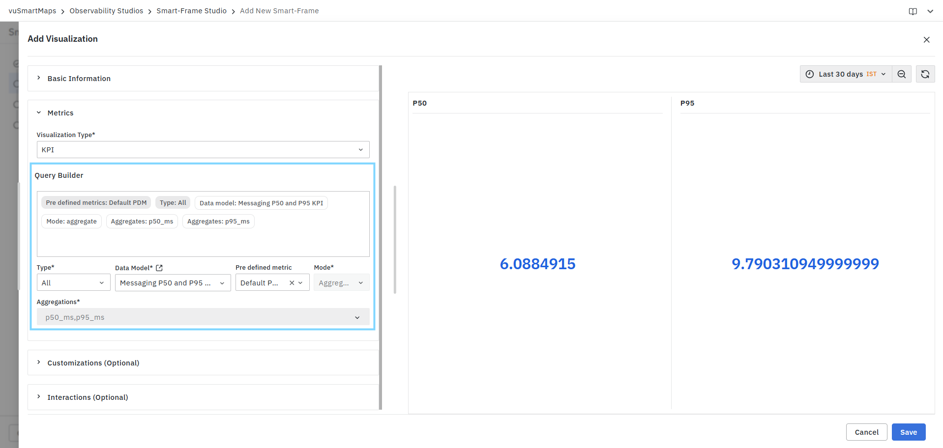
For detailed information about all Query Builder fields and configuration options, see Query Builder.
Preview Panel
The Preview Panel displays the KPI values generated by the configured query. As configuration changes are applied, the preview updates automatically to reflect the latest query settings.
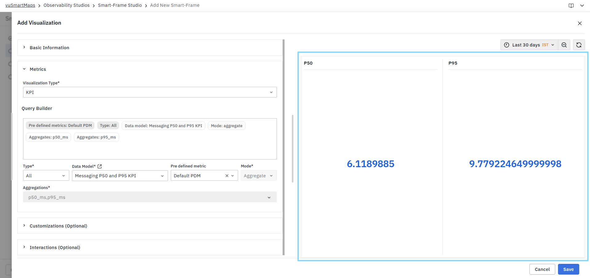
The preview can be used to:
- Validate KPI results.
- Verify selected metrics and aggregations.
- Confirm the displayed values.
- Review KPI output before saving the visualization.
If no data is returned, the preview displays a No Data message.
For KPI visualizations, KPI values are displayed in the Preview Panel only after the required KPI display settings are configured under Customizations > KPI Controls. If KPI Controls are not configured, the preview may not display the expected KPI output. For more information, see KPI Controls.
KPI Characteristics
KPI visualizations are designed to display:
- Single-value performance indicators.
- Aggregated metric values.
- Business and operational KPIs.
- Service health indicators.
- Application performance metrics.
- Infrastructure monitoring metrics.
- Real-time or historical summary values.
Each selected metric is displayed as an individual KPI card, allowing users to quickly evaluate important operational data.
Common Use Cases
KPI visualizations are commonly used for:
- Application response time monitoring.
- Error rate tracking.
- Service availability monitoring.
- Transaction volume reporting.
- Infrastructure utilization monitoring.
- Capacity management.
- SLA compliance monitoring.
- Business performance tracking.
- Executive dashboards.
- Operational overview dashboards.
Example
A KPI visualization may be configured to display:
- P50 Response Time
- P95 Response Time
for the selected time range, enabling users to quickly compare median and high-percentile response latency values without reviewing detailed trend charts.
Similarly, KPI visualizations can be used to display:
- Total Requests
- Error Percentage
- CPU Utilization
- Memory Usage
- Active Alerts
- Service Availability
allowing users to obtain an immediate view of system health and performance.
Customizations
KPI Controls
The KPI Controls section allows users to customize the appearance and presentation of KPI metrics displayed within a KPI visualization. These settings help provide meaningful labels, descriptions, and visual identifiers for KPI values, making dashboards easier to understand and interpret.
KPI Controls enable users to:
- Configure display titles for KPI metrics.
- Add descriptive information for KPI cards.
- Associate icons with KPI metrics.
- Display multiple KPI cards within a single visualization.
- Improve dashboard readability and business context.
Each KPI metric can be customized independently.
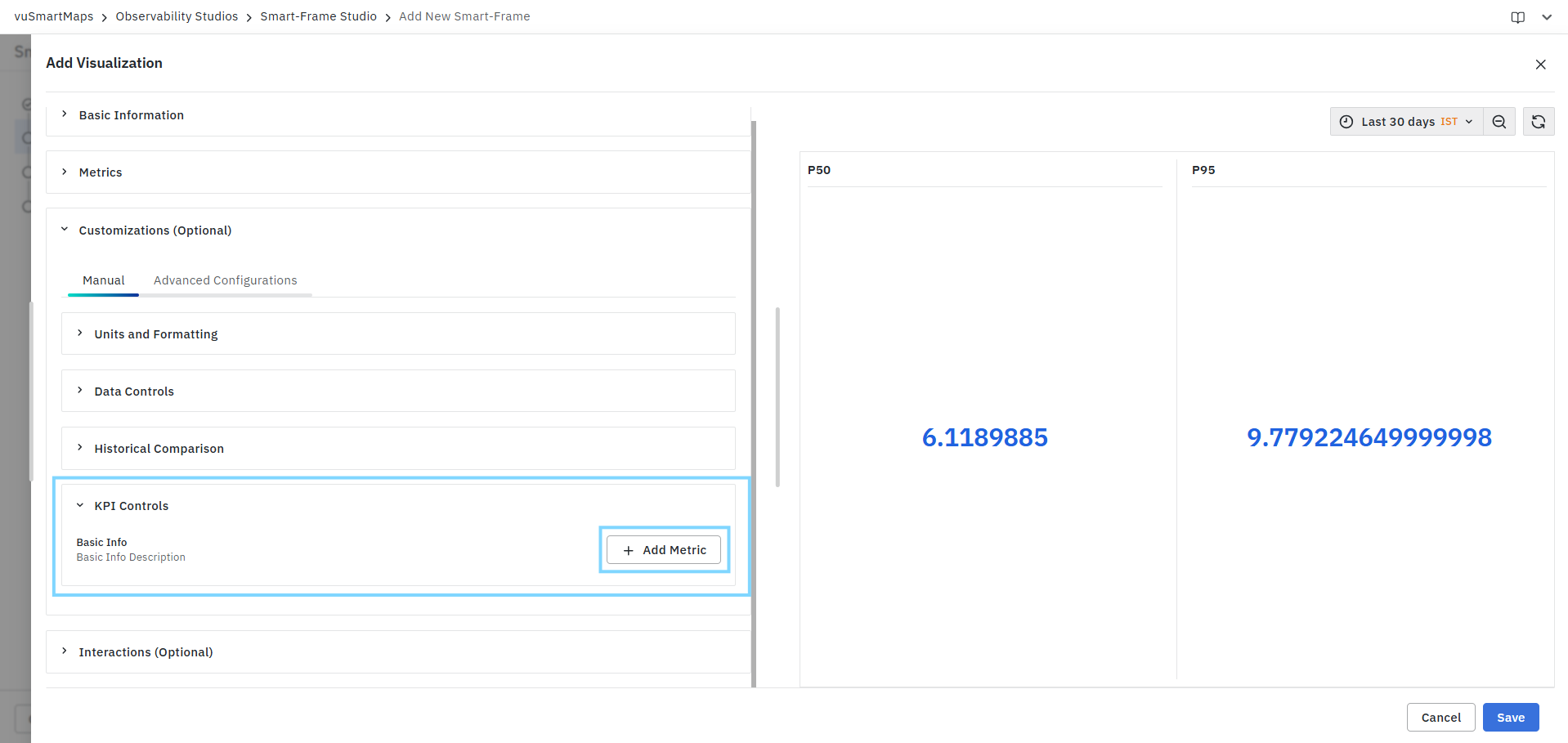
Configuring KPI Controls
To configure KPI Controls:
- Expand the KPI Controls section.
- Click Add Metric.
- Select the metric to configure.
- Provide a title for the KPI.
- Optionally enter a description.
- Optionally select an icon.
- Repeat the process for additional KPI metrics if required.
- Save the visualization.
Metric Selection
The metric selector determines which KPI value will be customized. Only metrics configured in the Query Builder are available for selection.

Examples:
- p50_ms
- p95_ms
- error_pct
- rpm
Each selected metric creates an independent KPI card within the visualization.
Title
The Title field specifies the display name shown for the KPI card. The configured title appears above the KPI value in the visualization preview.
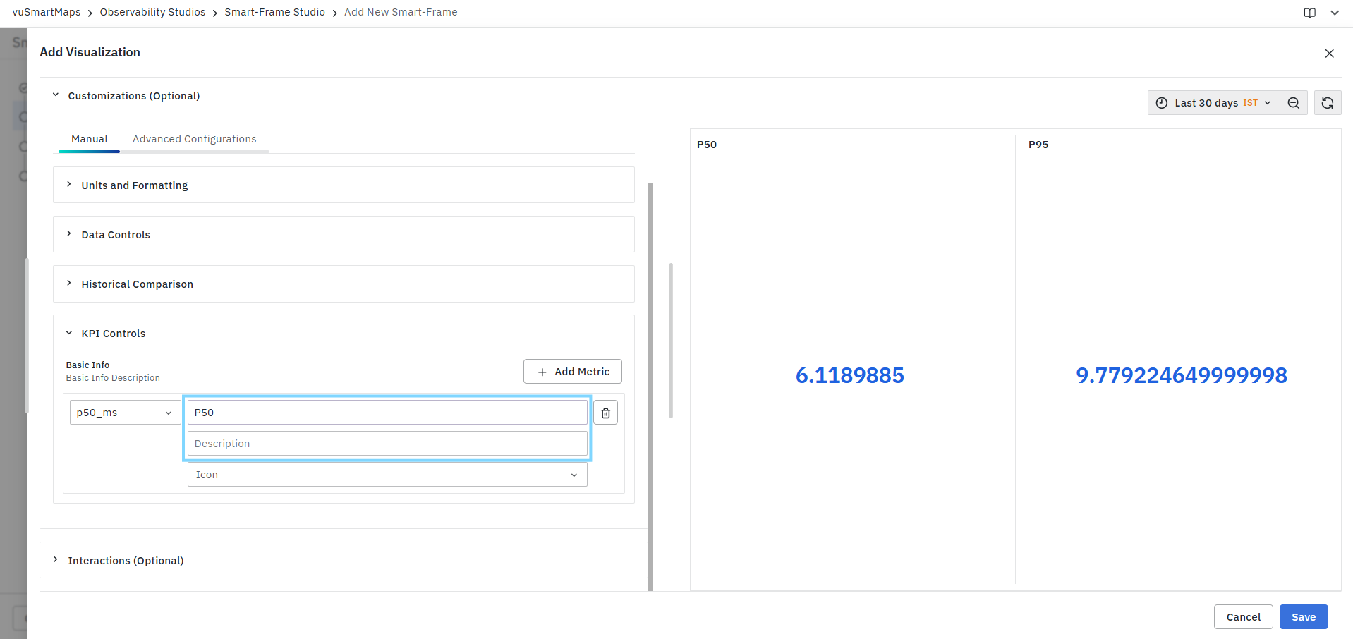
Example:
| Metric | Display Title |
|---|---|
| p50_ms | P50 |
| p95_ms | P95 Latency |
| error_pct | Error Percentage |
Custom titles help make KPI values easier to understand for dashboard consumers.
Description
The Description field allows users to provide additional information about the KPI metric.
Descriptions can be used to:
- Explain the purpose of the KPI.
- Provide business context.
- Clarify metric calculations.
- Improve dashboard usability.
The description is displayed wherever KPI metadata is supported.
Icon
The Icon field allows users to associate an icon with a KPI metric. Icons help visually distinguish KPI cards and improve dashboard readability. Users can select from the list of available system icons. Common examples are shown below:
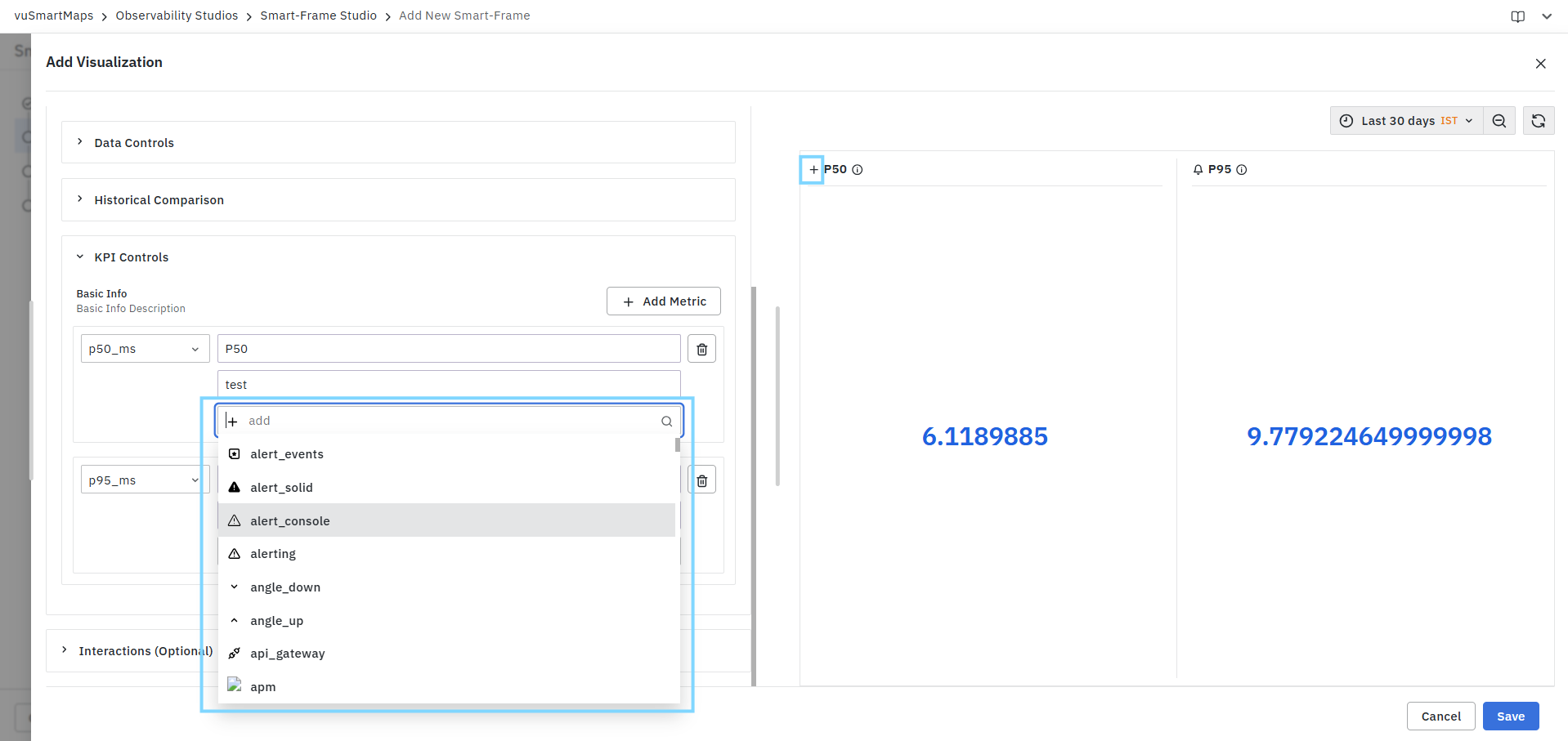
The selected icon is displayed alongside the KPI information where supported.
Adding Multiple KPI Metrics
A KPI visualization can display multiple KPI cards simultaneously.
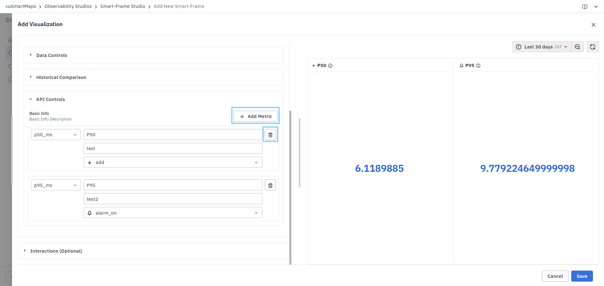
To add additional KPI cards:
- Click Add Metric.
- Select another metric.
- Configure the title, description, and icon.
- Save the visualization.
Each configured metric is displayed as a separate KPI card in the visualization.
Removing KPI Configurations
To remove a KPI configuration:
- Locate the KPI configuration row.
- Click the Delete icon.
- Save the visualization.
The selected KPI configuration is removed immediately.
KPI Controls define how KPI metrics are presented in the visualization. At least one KPI metric should be configured in KPI Controls to properly preview KPI cards and validate the final visualization layout.
Units and Formatting
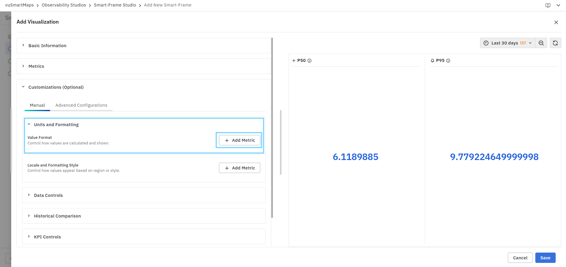
Value Format
The Value Format section allows users to control how KPI values are calculated, formatted, and displayed within the visualization. These settings improve readability and help present metric values in a meaningful format without modifying the underlying data. Users can configure formatting rules independently for each KPI metric included in the visualization.
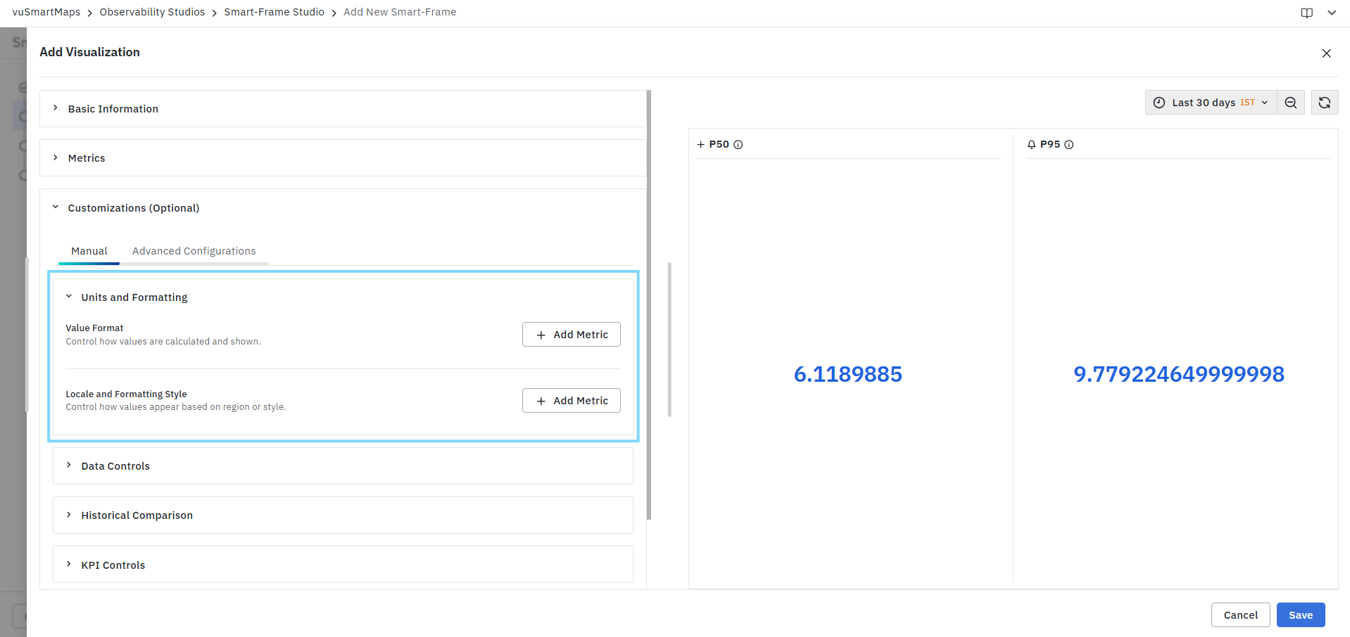
To configure value formatting:
- Expand Units and Formatting.
- Under Value Format, click Add Metric.
- Select the required metric.
- Select the appropriate formatting type.
- Configure the available formatting options.
- Preview the changes in the visualization.
- Repeat the process for additional metrics if required.
Metric
The Metric field allows users to select the KPI metric to which the formatting configuration will be applied. Only metrics configured in the KPI visualization are available for selection.
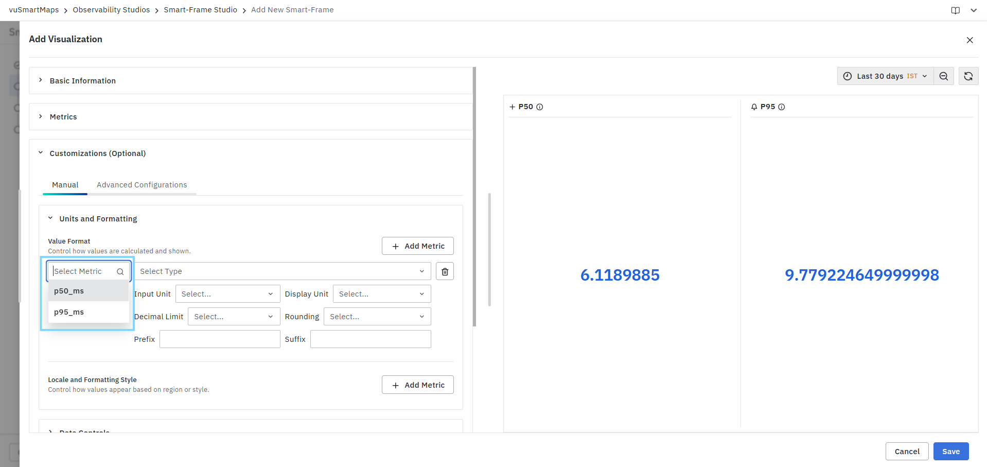
Example metrics may include:
- p50_ms
- p95_ms
- error_pct
- rpm
Each metric maintains its own formatting configuration.
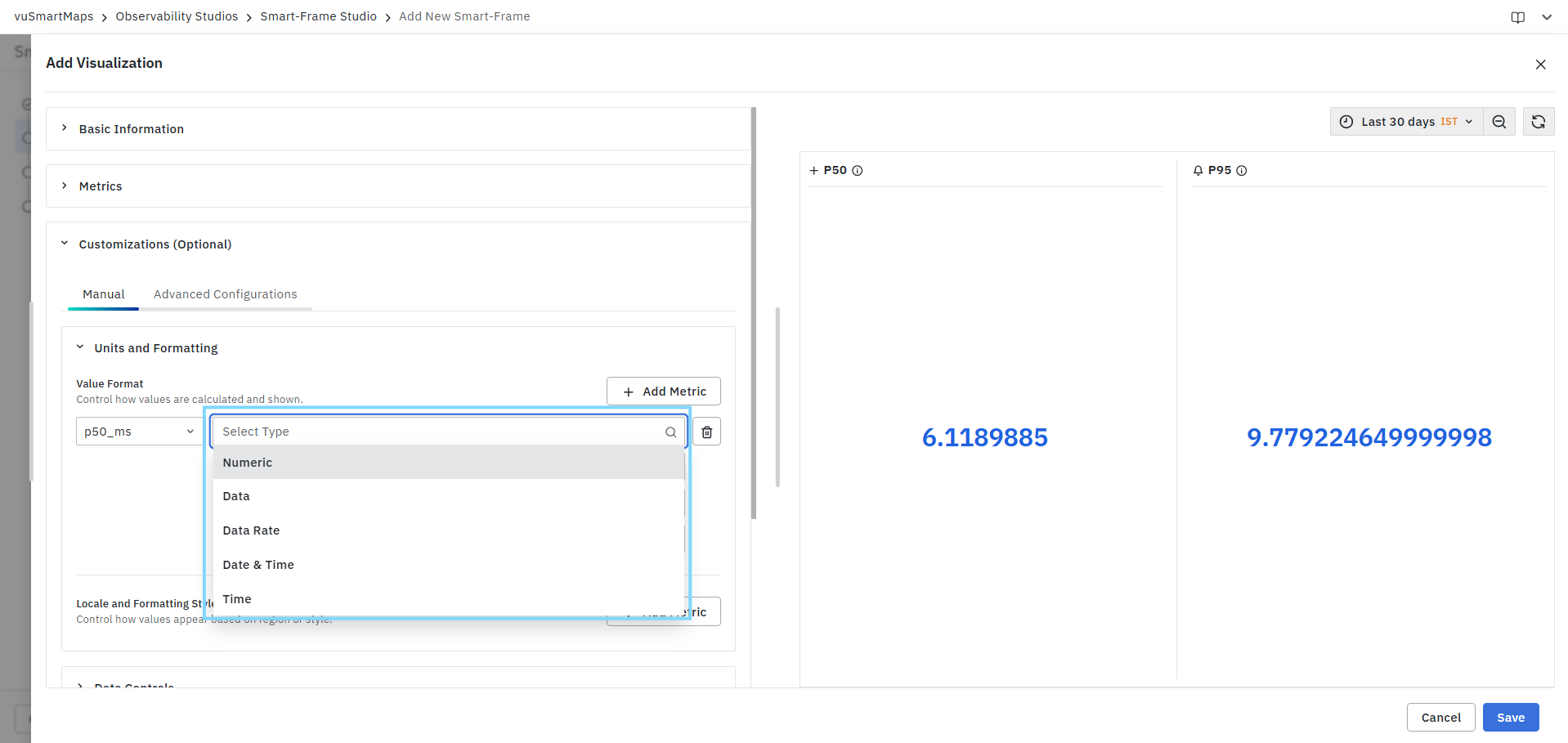
Type
The Type field determines the formatting category applied to the selected metric. The available formatting options may vary depending on the selected type.
Input Unit
The Input Unit field specifies the original unit of the selected metric. Available units depend on the selected formatting type.
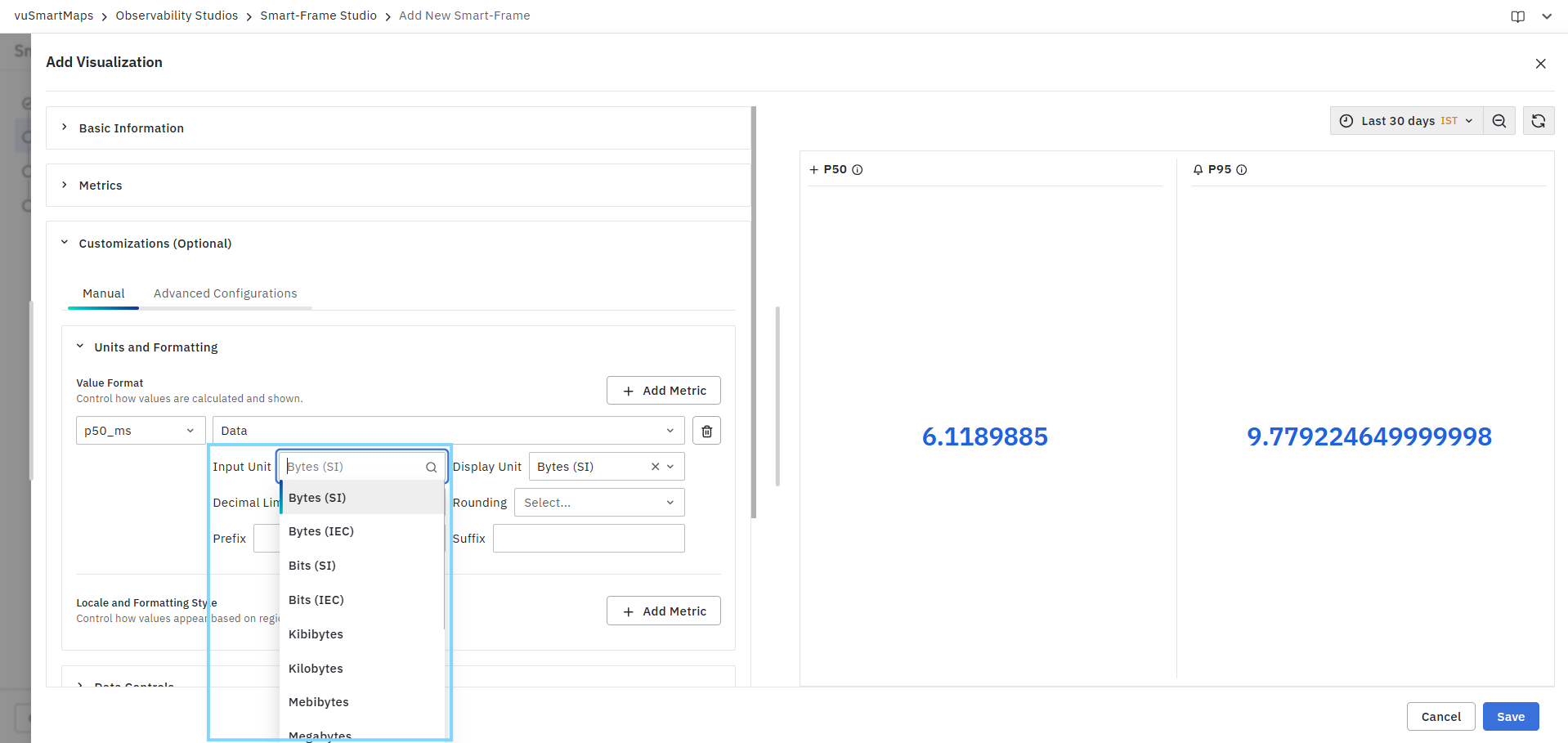
The selected unit is used as the source value for formatting calculations.
Display Unit
The Display Unit field determines how the metric value is displayed in the visualization.
Users can:
- Select a specific display unit.
- Enable automatic scaling.
- Convert values to a different unit for presentation purposes.
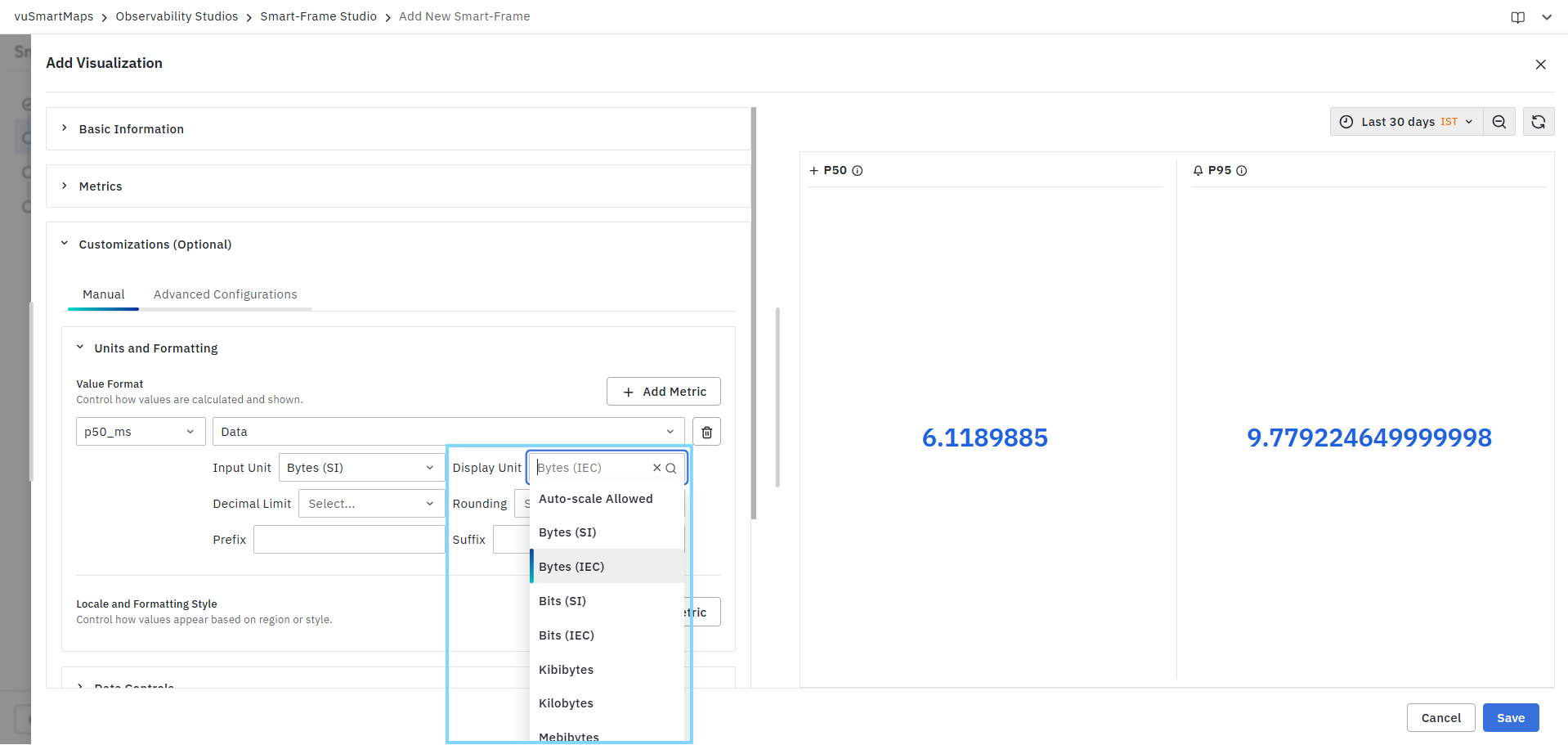
This helps improve readability when working with large or small values.
Decimal Limit
The Decimal Limit field controls the number of decimal places displayed for the selected metric.
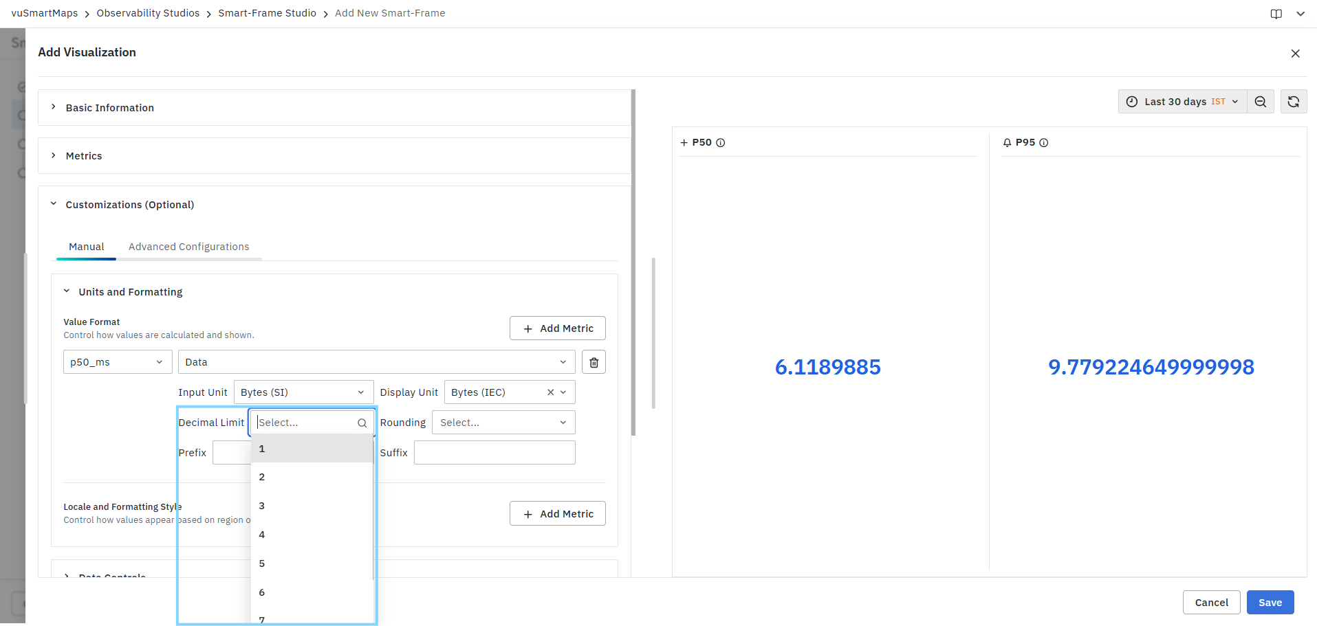
Example:
| Decimal Limit | Output |
|---|---|
| 1 | 10.5 |
| 2 | 10.54 |
| 3 | 10.543 |
Reducing decimal precision can improve dashboard readability while maintaining the required level of accuracy.
Rounding
The Rounding field determines how decimal values are rounded before being displayed.
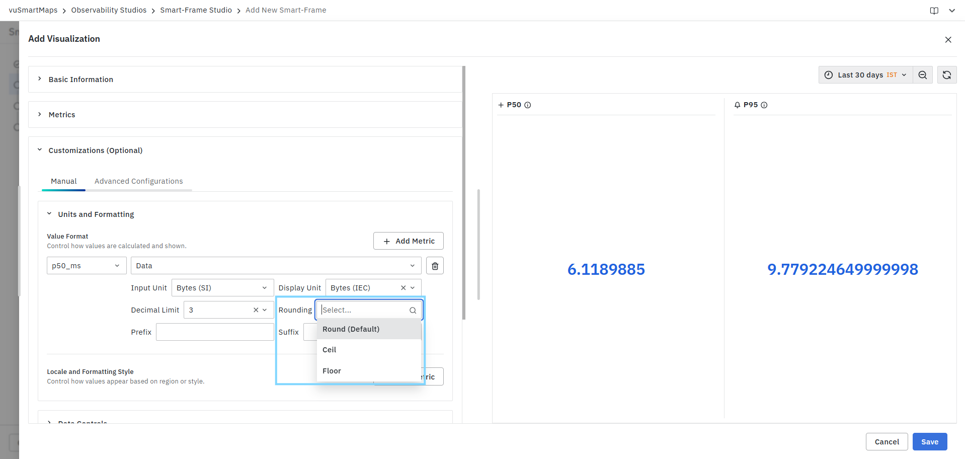
Available options include:
| Option | Description |
|---|---|
| Round (Default) | Rounds values to the nearest decimal. |
| Ceil | Always rounds values upward. |
| Floor | Always rounds values downward. |
The selected option affects only the displayed value.
Prefix
The Prefix field allows users to add custom text before the displayed KPI value.
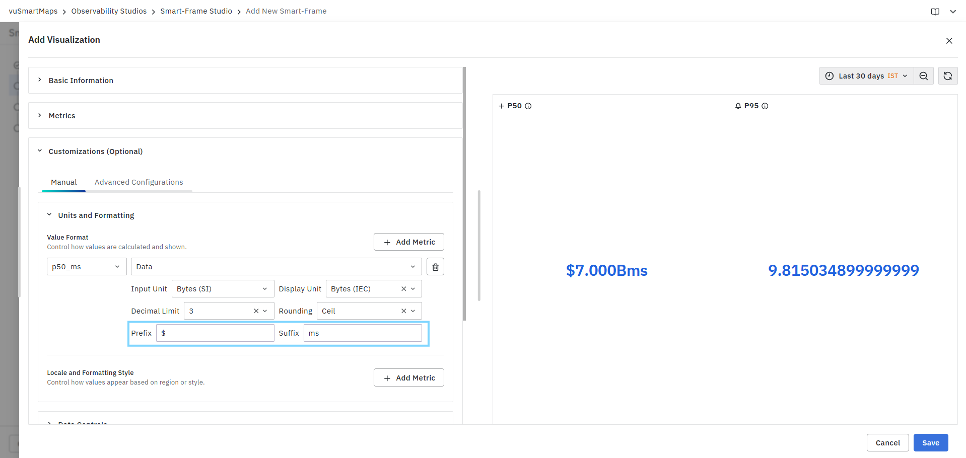
Example:
| Prefix | Output |
|---|---|
| $ | $100 |
| ₹ | ₹500 |
This is useful when displaying currency values or custom labels.
Suffix
The Suffix field allows users to append custom text after the displayed KPI value.
Example:
| Suffix | Output |
|---|---|
| ms | 250 ms |
| % | 95 % |
| req/s | 120 req/s |
Suffixes help provide additional context for KPI values.
Managing Multiple Value Format Configurations
Users can configure value formatting for multiple KPI metrics within the same visualization.
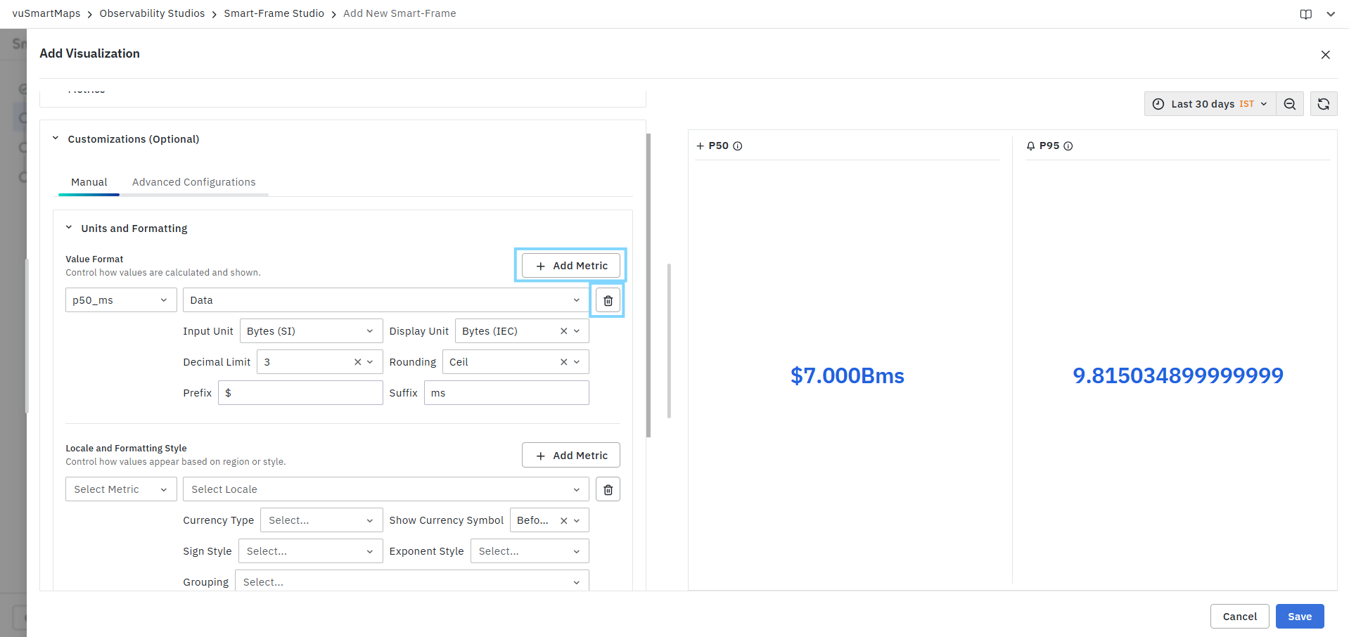
To add additional formatting configurations:
- Click Add Metric.
- Select another KPI metric.
- Configure the required formatting options.
- Save the visualization.
Each metric can maintain its own unit conversion, decimal precision, rounding behavior, and prefix/suffix settings.
Removing a Value Format Configuration
To remove a value formatting configuration:
- Locate the configured metric.
- Click the Delete icon.
- Save the visualization.
The selected formatting configuration is removed immediately.
Changes made in the Value Format section are reflected immediately in the KPI preview panel, allowing users to validate formatting before saving the visualization.
Locale and Formatting Style
The Locale and Formatting Style section allows users to control how KPI values are displayed based on regional formatting standards. These settings influence the appearance of currency symbols, number grouping, sign representation, and exponent notation without changing the underlying metric values. Users can configure locale-specific formatting independently for each KPI metric.
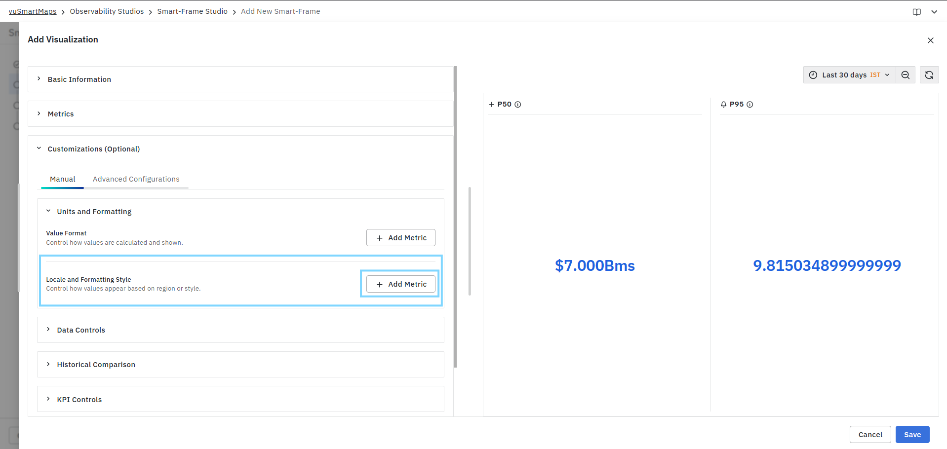
To configure locale and formatting settings:
- Expand Units and Formatting.
- Under Locale and Formatting Style, click Add Metric.
- Select the required KPI metric.
- Choose the desired locale.
- Configure currency, sign, exponent, and grouping options.
- Verify the changes in the Preview panel.
- Repeat the process for additional metrics if required.
Metric
The Metric field allows users to select the KPI metric to which locale and formatting settings will be applied. Only metrics configured in the KPI visualization are available for selection.

Example metrics may include:
- p50_ms
- p95_ms
- error_pct
- rpm
Each metric can have its own locale and formatting configuration.
Locale
The Locale field determines the regional formatting standard used when displaying metric values.

The selected locale influences currency symbols, number separators, grouping conventions, and other regional formatting preferences.
Currency Type
The Currency Type field specifies the currency symbol used when displaying KPI values. This setting is primarily used when KPI values represent financial metrics.
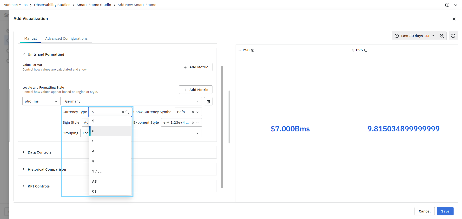
Show Currency Symbol
The Show Currency Symbol field controls the position of the selected currency symbol.
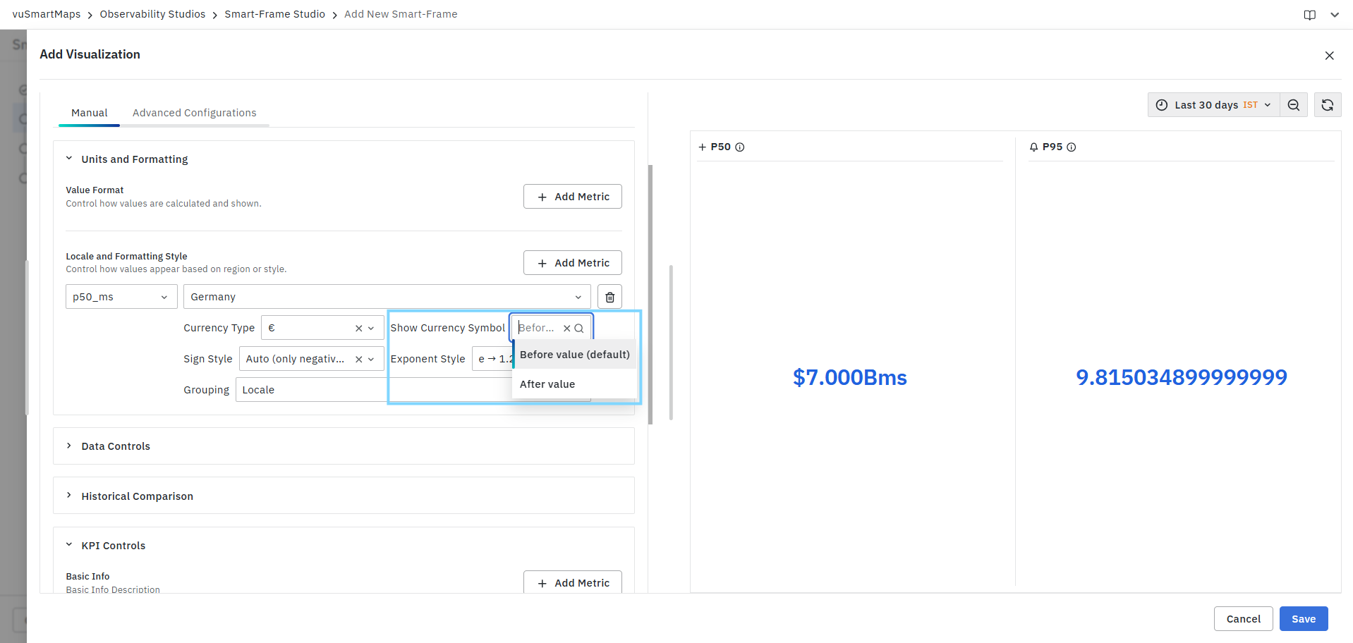
Available options:
| Option | Description |
|---|---|
| Before Value | Displays the currency symbol before the value. |
| After Value | Displays the currency symbol after the value. |
Examples:
| Configuration | Output |
|---|---|
| Before Value | €100 |
| After Value | 100€ |
Sign Style
The Sign Style field controls how positive and negative values are displayed.
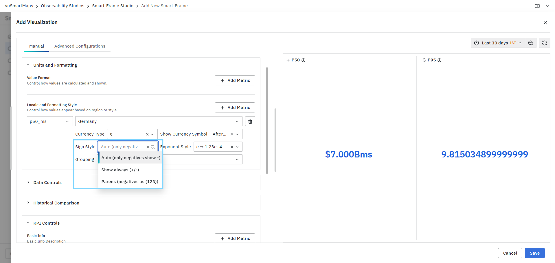
Available options include:
| Option | Description |
|---|---|
| Auto (Only Negatives Show -) | Displays a sign only for negative values. |
| Show Always (+/-) | Displays a sign for both positive and negative values. |
| Parentheses (Negatives as (123)) | Displays negative values within parentheses. |
Examples:
| Style | Output |
|---|---|
| Auto | -100 |
| Show Always | +100 |
| Parentheses | (100) |
Exponent Style
The Exponent Style field determines how large numeric values are represented using scientific notation.
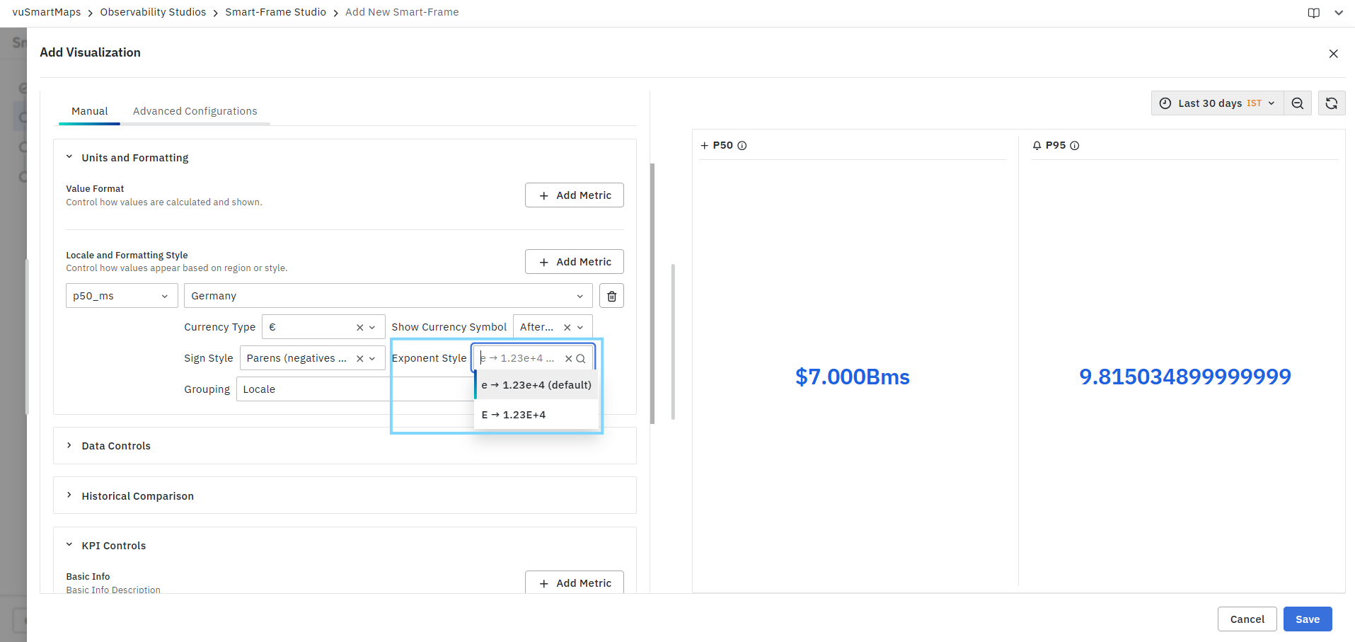
Available options include:
| Option | Example Output |
|---|---|
| e Notation | 1.23e+4 |
| E Notation | 1.23E+4 |
This setting is useful when displaying very large or very small metric values.
Grouping
The Grouping field controls how digit separators are applied to large numbers.
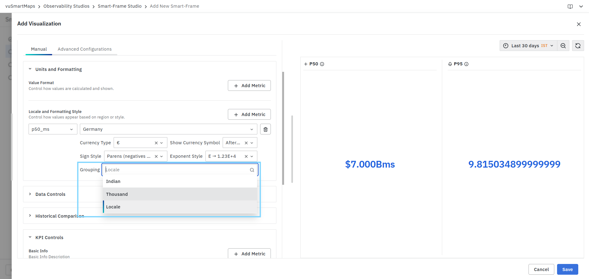
Available options include:
| Option | Example |
|---|---|
| Locale | Uses separators based on the selected locale. |
| Thousand | Displays numbers using standard thousand separators. |
| Indian | Displays numbers using the Indian numbering system. |
Examples:
| Grouping Style | Output |
|---|---|
| Thousand | 1,234,567 |
| Indian | 12,34,567 |
| Locale | Based on locale-specific conventions |
Managing Multiple Locale Configurations
Users can configure locale and formatting settings for multiple KPI metrics within the same visualization.
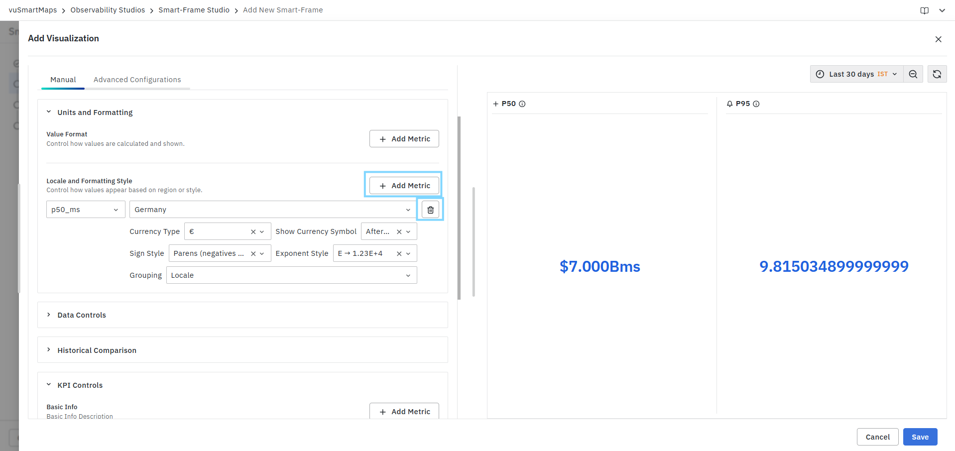
To add additional configurations:
- Click Add Metric.
- Select another KPI metric.
- Configure the required locale and formatting options.
- Save the visualization.
Each metric can maintain its own locale, currency settings, sign display behavior, exponent notation, and grouping style.
Removing a Locale Configuration
To remove a locale configuration:
- Locate the configured metric.
- Click the Delete icon.
- Save the visualization.
The selected configuration is removed immediately.
Changes made in the Locale and Formatting Style section are reflected immediately in the Preview panel, allowing users to validate regional formatting preferences before saving the visualization.
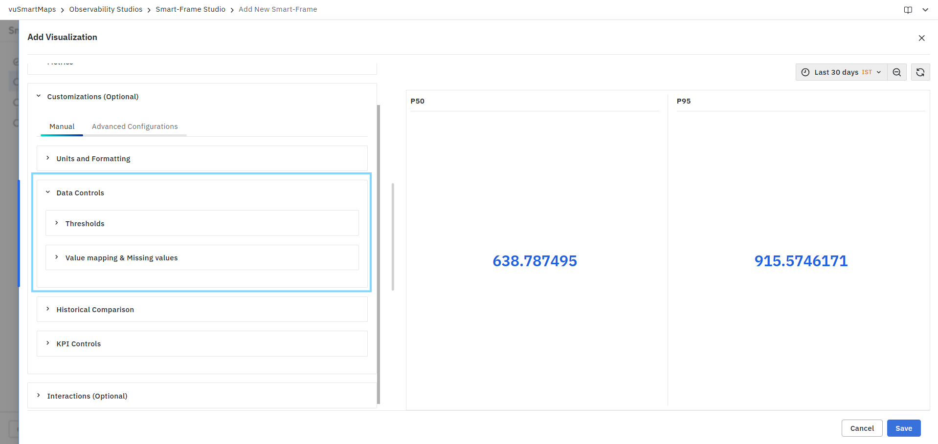
Data Controls
The Data Controls section allows users to define visual thresholds and configure value mapping rules for KPI values. These settings help improve data interpretation by highlighting critical values, applying conditional formatting, and displaying meaningful labels for specific values or missing data.
The Data Controls section contains the following options:
- Thresholds
- Value Mapping & Missing Values
Thresholds
Thresholds allow users to apply conditional formatting to KPI values based on predefined conditions. Thresholds can be used to visually distinguish KPI states such as normal, warning, or critical conditions. Users can apply threshold colors to either the KPI text or the KPI background.
Apply Color To
The Apply Color To option determines where the threshold color is displayed.
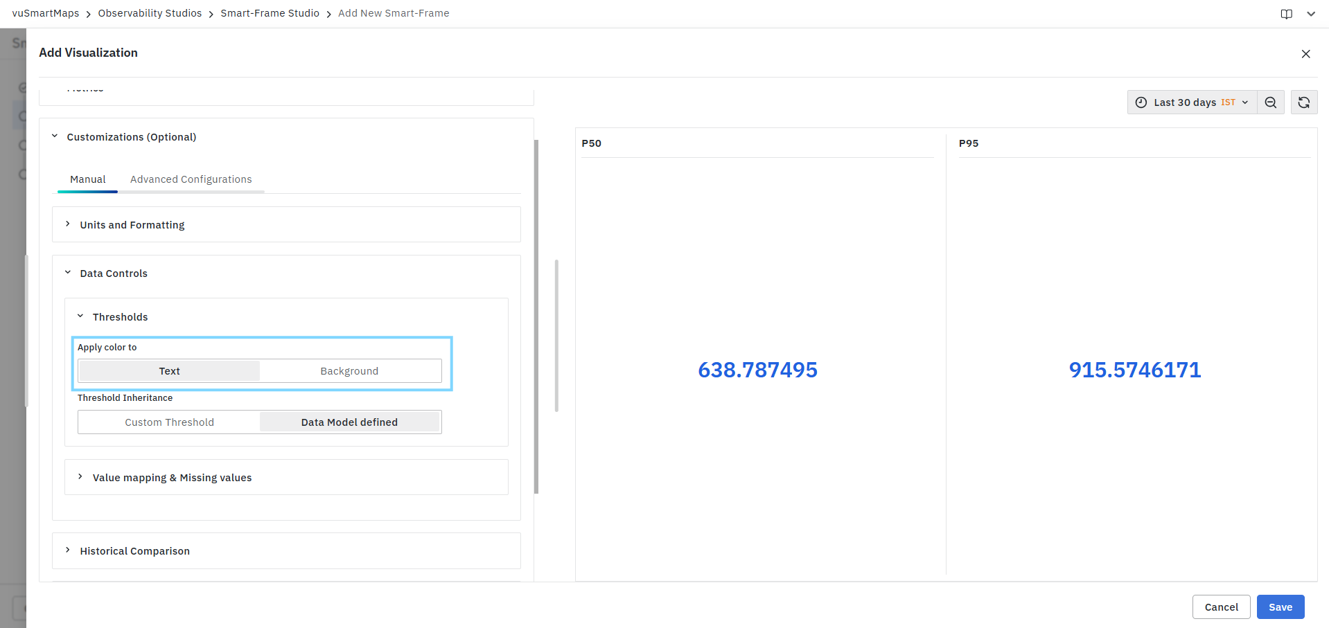
Available options:
| Option | Description |
|---|---|
| Text | Applies threshold colors to the KPI value text. |
| Background | Applies threshold colors to the KPI background. |
Threshold Inheritance
Thresholds can be inherited from the associated Data Model or configured directly within the visualization.
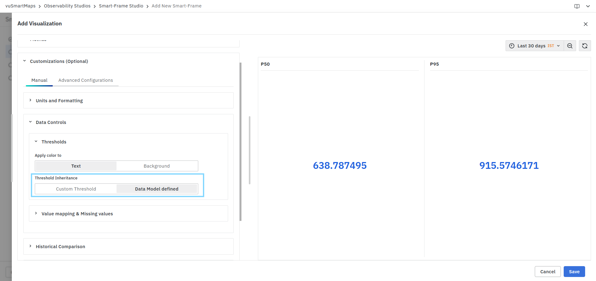
Available options:
| Option | Description |
|---|---|
| Custom Threshold | Allows users to define threshold rules specifically for the current visualization. |
| Data Model Defined | Uses threshold configurations inherited from the selected Data Model. |
Creating a Custom Threshold
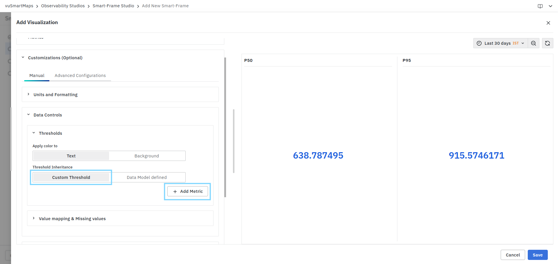
To create a custom threshold:
- Select Custom Threshold.
- Click Add Metric.
- Select the KPI metric.
- Click Add Threshold.
- Configure the threshold condition.
- Select a threshold color.
- Save the visualization.
Threshold Configuration
Each threshold rule consists of the following fields:
Metric
Select the KPI metric for which the threshold rule should be applied. Available metrics are based on the configured KPI metrics in the visualization.
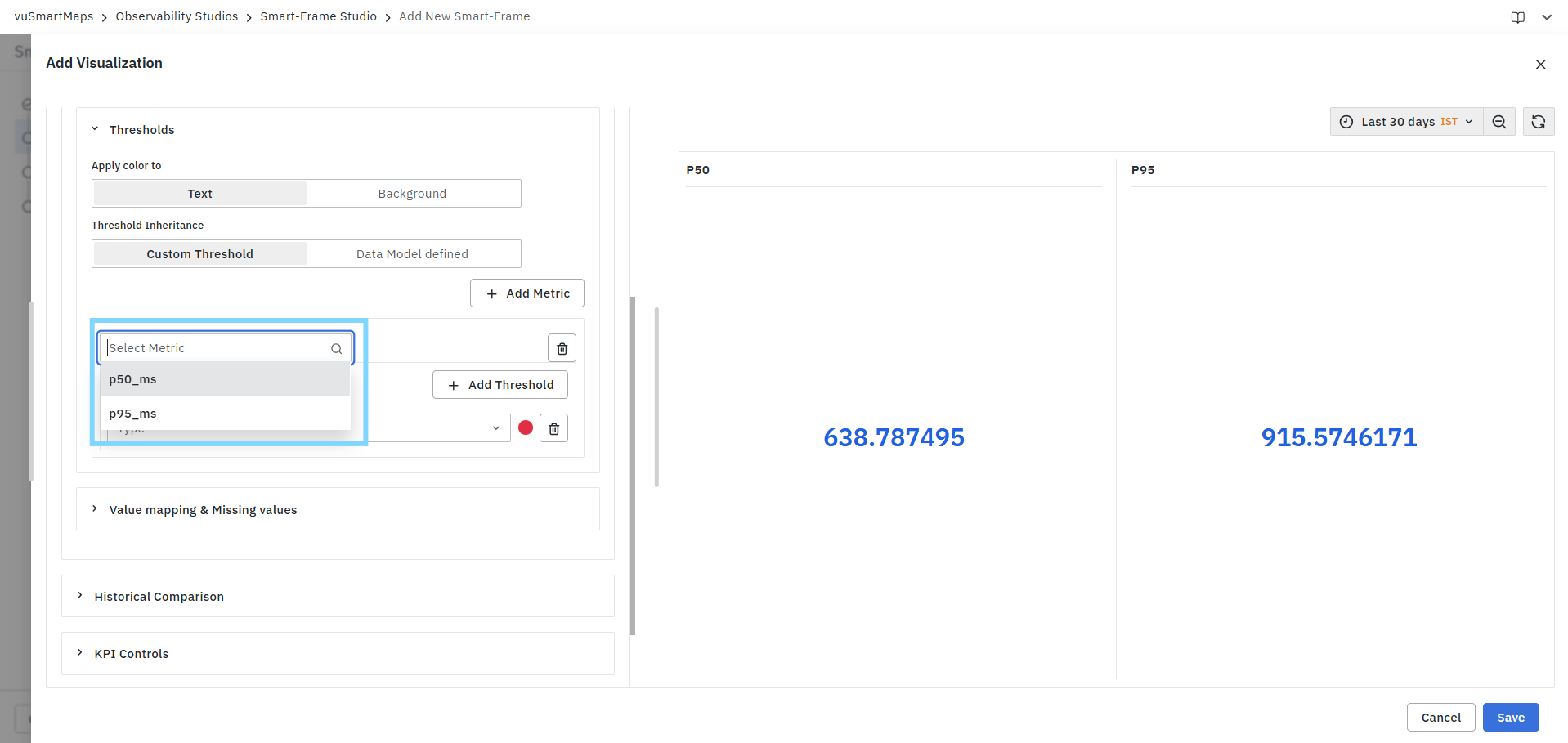
Examples:
- p50_ms
- p95_ms
Type
Select the threshold evaluation method.
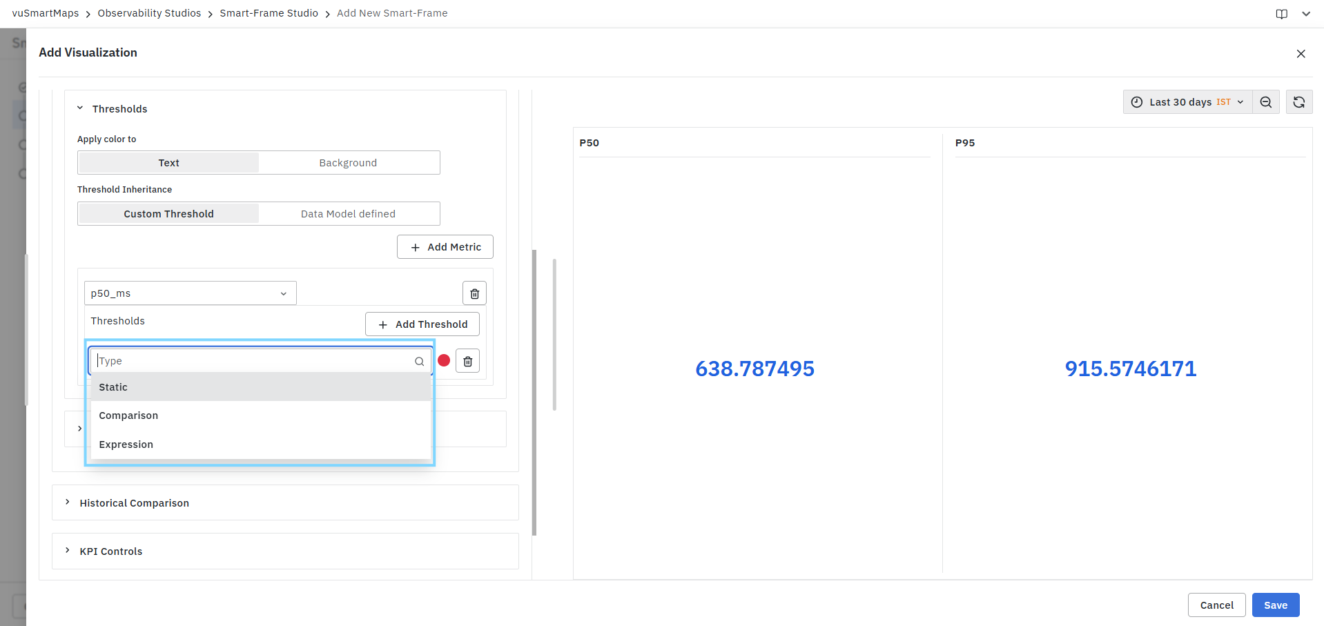
Available options:
| Type | Description |
|---|---|
| Static | Compares the metric against a fixed value. |
| Comparison | Compares the metric against another KPI metric. |
| Expression | Evaluates the threshold using a custom expression. |
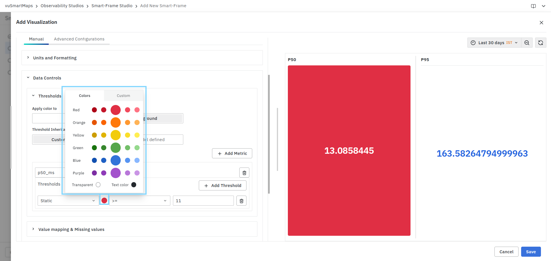
Threshold Color
Select a color that should be applied when the threshold condition is satisfied. The selected color is displayed either on the KPI text or KPI background based on the Apply Color To setting.
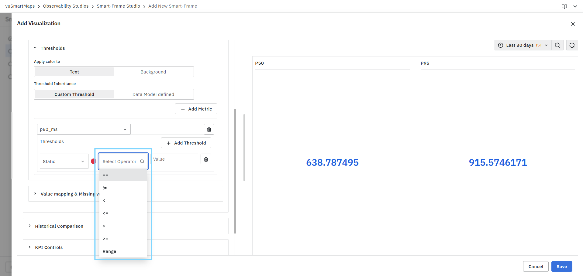
Operator
Defines the comparison condition used to evaluate the threshold.
Value
Specify the comparison value used by the threshold rule.
For example:
| Condition | Result |
|---|---|
| p50_ms <= 650 | Apply configured threshold color |
| p95_ms >= p50_ms | Apply configured threshold color |
Multiple Thresholds
Multiple threshold rules can be added for the same metric.
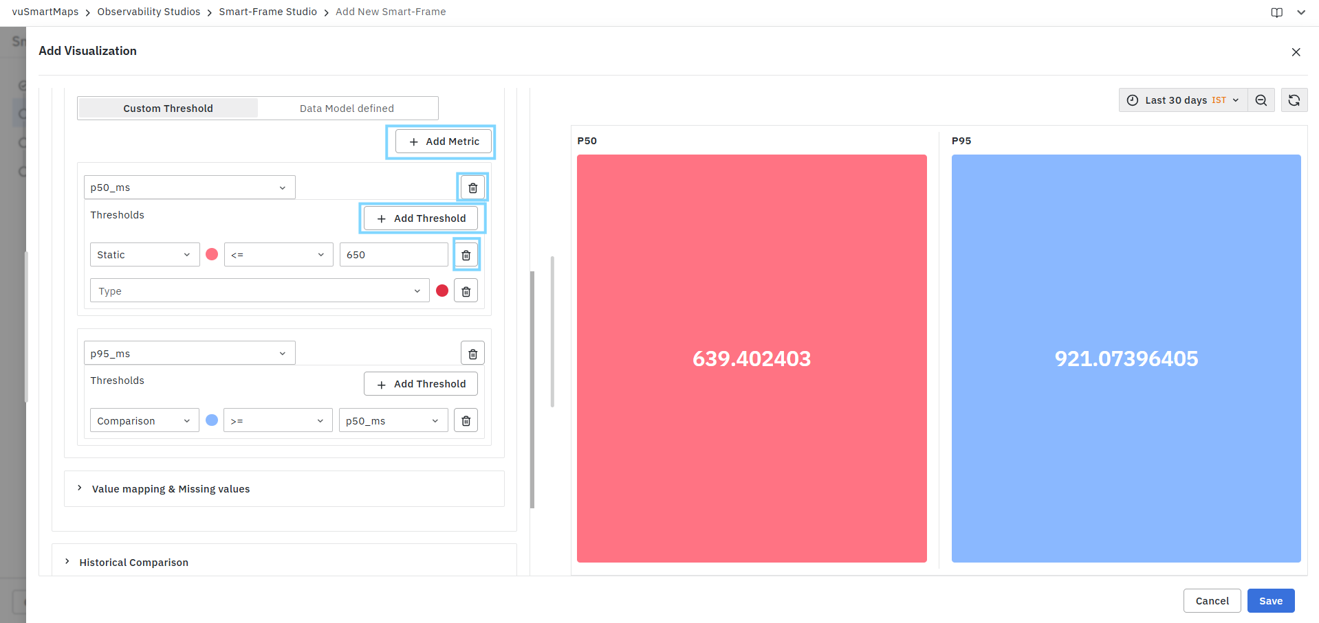
To add additional threshold rules:
- Select the metric.
- Click Add Threshold.
- Configure the new threshold condition.
- Save the visualization.
Thresholds are evaluated independently and reflected immediately in the Preview panel.
Removing Thresholds
Users can remove:
- Individual threshold rules using the Delete icon beside the rule.
- Entire metric threshold configurations using the Delete icon beside the metric.
Threshold colors are displayed immediately in the Preview panel, allowing users to validate threshold behavior before saving the visualization.
Value Mapping & Missing Values
The Value Mapping & Missing Values section allows users to customize how KPI values are displayed in the visualization. Users can define replacement labels for specific values or value ranges, configure colors, and specify how missing or unavailable values should be presented.This feature improves dashboard readability by converting raw metric values into meaningful business-friendly outputs.
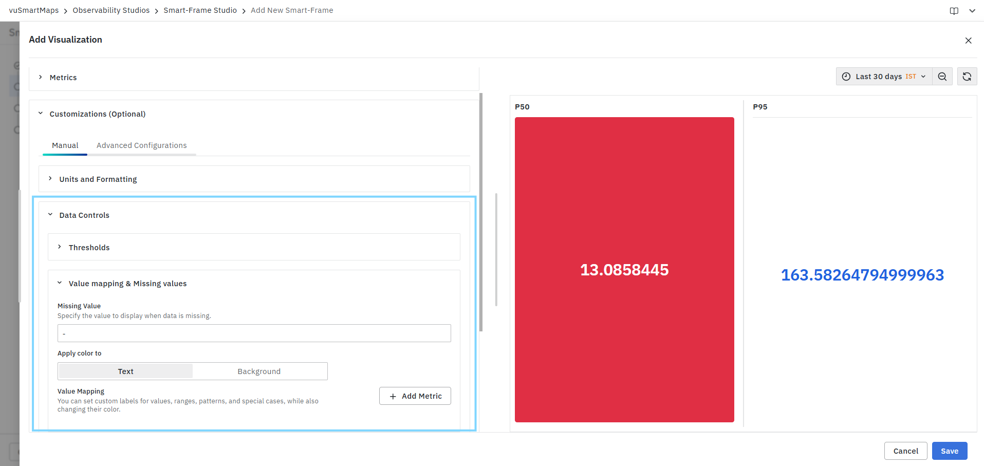
Missing Value
The Missing Value field defines the placeholder value displayed when the visualization does not receive any data.
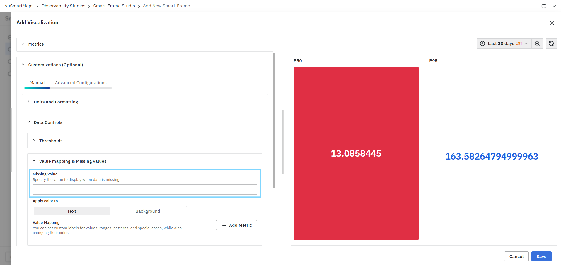
Users can specify a custom text or symbol to represent:
- Null values
- Empty results
- Missing metrics
- Unavailable data
For example:
| Input Condition | Display Value |
|---|---|
| No Data | - |
| Null Value | N/A |
| Empty Result | Not Available |
The configured missing value is displayed only when no valid data is returned by the query.
Apply Color To
Determines where the value mapping color is applied.
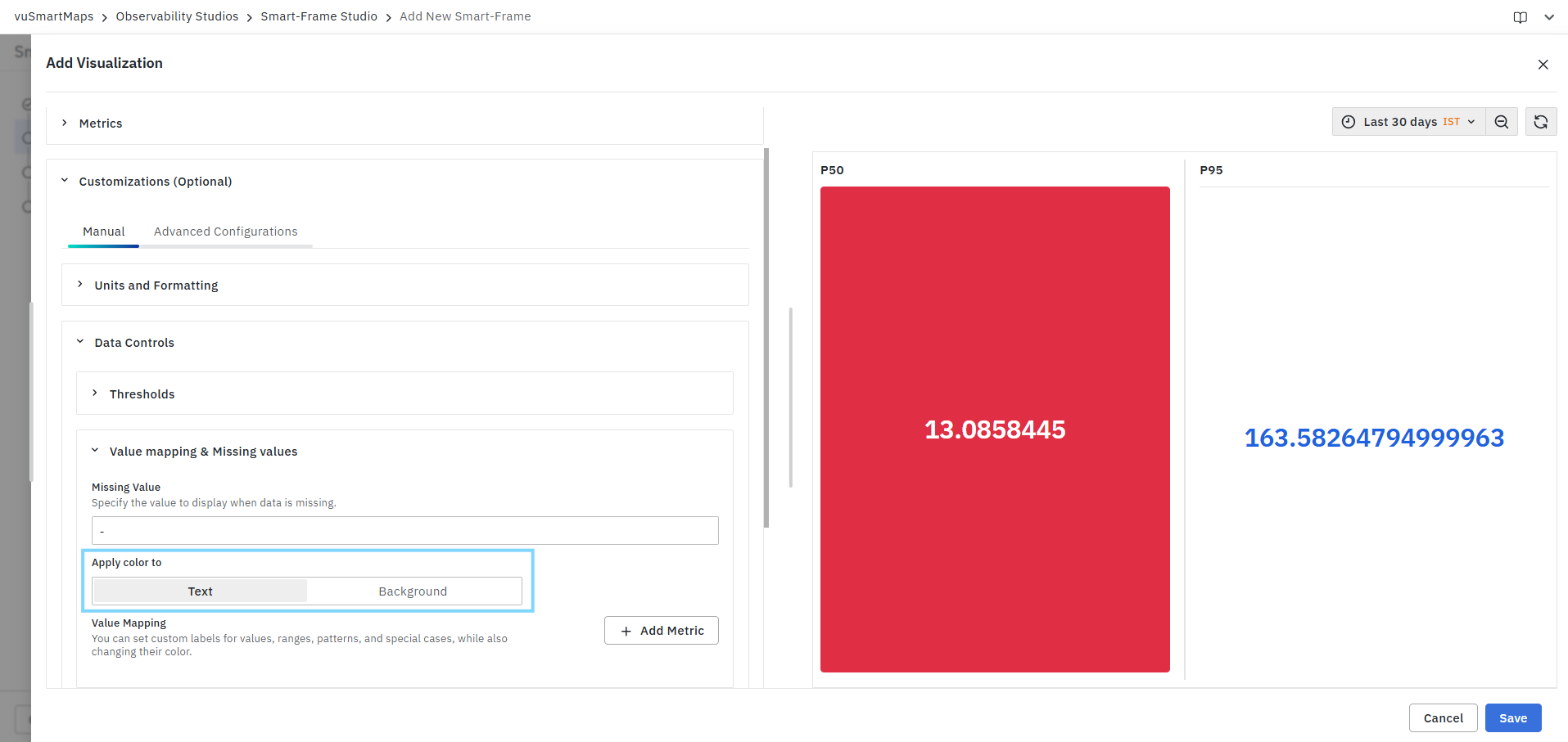
Available options:
| Option | Description |
|---|---|
| Text | Applies the selected color to the displayed KPI value text. |
| Background | Applies the selected color to the KPI background. |
Value Mapping
Value Mapping enables users to replace KPI values with custom display labels and apply visual formatting based on matching conditions. Click Add Metric to create a value mapping rule.
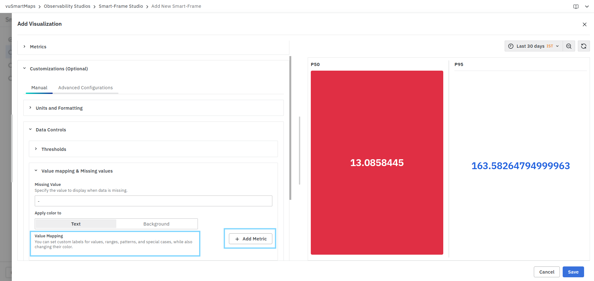
Metric
Select the KPI metric for which value mapping should be applied. Available metrics are populated from the configured KPI metrics in the visualization.
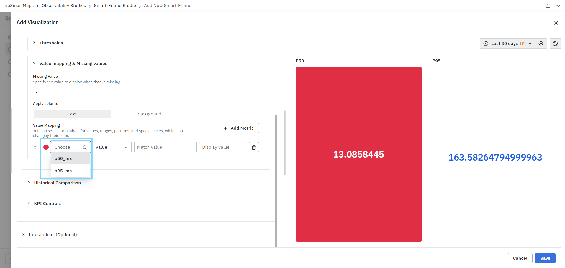
Examples:
- p50_ms
- p95_ms
Mapping Type
Defines how values are evaluated for replacement.
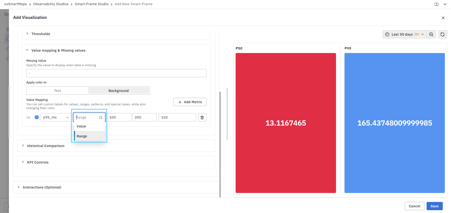
Available options:
| Type | Description |
|---|---|
| Value | Maps a specific metric value to a custom display value. |
| Range | Maps a range of metric values to a custom display value. |
Value-Based Mapping
Use Value mapping when a single metric value should be replaced.
Configuration fields:
| Field | Description |
|---|---|
| Match Value | The metric value to match. |
| Display Value | The replacement value displayed in the KPI. |
Example:
| Match Value | Display Value |
|---|---|
| 0 | Healthy |
| 1 | Warning |
| 2 | Critical |
When the KPI value matches the specified value, the configured display value is shown instead.
Range-Based Mapping
Use Range mapping when a range of values should be mapped to a custom display value.
Configuration fields:
| Field | Description |
|---|---|
| Start Value | Lower bound of the range. |
| End Value | Upper bound of the range. |
| Display Value | Replacement value displayed when the metric falls within the range. |
Example:
| Start Value | End Value | Display Value |
|---|---|---|
| 100 | 200 | Moderate |
| 201 | 500 | High |
| 501 | 1000 | Critical |
If the KPI value falls within the configured range, the specified display value is displayed.
Color Indicator
Each value mapping rule can be assigned a color using the color selector. The selected color is applied according to the Apply Color To setting:
- Text
- Background
This helps visually categorize KPI values and ranges.
Managing Value Mapping Rules
Users can perform the following actions:
| Action | Description |
|---|---|
| Add Metric | Creates a new metric mapping configuration. |
| Add Additional Mapping Rules | Configure multiple mappings for the same metric. |
| Reorder Rules | Drag and rearrange mapping rules using the drag handle. |
| Delete Rule | Remove an individual mapping rule. |
| Delete Metric Mapping | Remove all mappings associated with a metric. |
Value mapping changes only the displayed output in the visualization. The underlying metric value and query results remain unchanged.
Historical Comparison
The Historical Comparison section allows users to compare current KPI values with data from a previous time period or a specific historical time range. This helps identify trends, measure performance changes, and analyze how current metrics differ from past observations. Users can configure one or more historical comparison settings for each KPI metric.
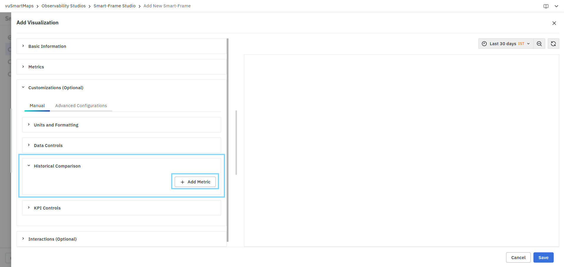
Add Metric
Click Add Metric to select the KPI metric for which historical comparison should be configured. Available metrics are populated from the metrics defined in the visualization.
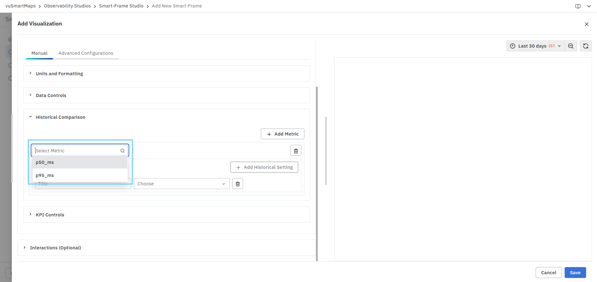
Examples:
- p50_ms
- p95_ms
Each selected metric can have multiple historical comparison configurations.
Historical Settings
The Historical Settings section is used to define comparison rules for the selected metric.
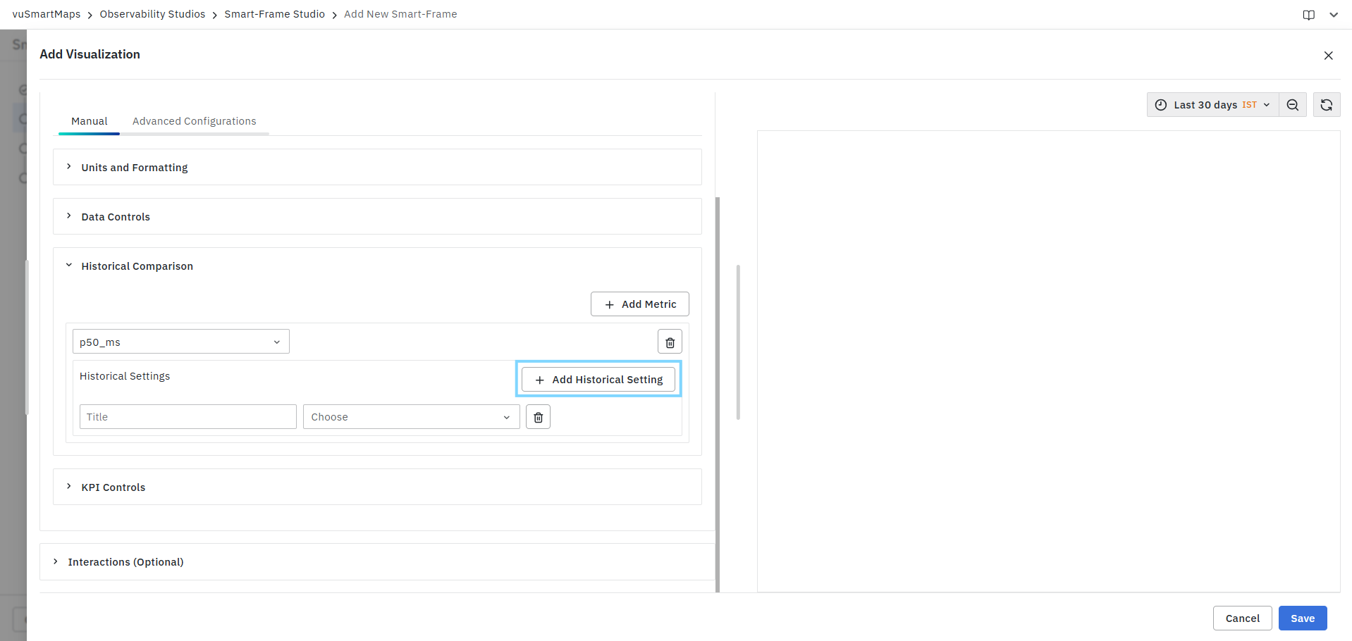
Click Add Historical Setting to create a new comparison configuration. Each configuration consists of:
| Field | Description |
|---|---|
| Title | Name displayed for the comparison configuration. |
| Comparison Type | Defines how historical data is selected. |
| Time Configuration | Specifies the historical time period used for comparison. |
Title
Enter a meaningful name for the comparison configuration.
Examples:
- Previous Hour
- Yesterday
The title is used to identify the comparison setting within the visualization.

Comparison Type
Users can choose one of the following comparison methods:
Historical Time
Compares the current metric value against a relative historical time period.When Historical Time is selected, users can choose a predefined time shift.

The selected time shift determines the historical period used for comparison.
For example:
| Current Time Range | Historical Time Shift |
|---|---|
| Last 30 Minutes | Compare with previous 30 minutes |
| Last 24 Hours | Compare with previous day |
| Last 7 Days | Compare with previous week |
End Time
Determines the reference point used for calculating the historical comparison period.

Available options:
| Option | Description |
|---|---|
| Global Time | Uses the dashboard or visualization time range as the reference point. |
| Current Time | Uses the current system time as the reference point. |
Absolute
Use Absolute when comparison must be performed against a fixed date and time range. When selected, users must specify:
| Field | Description |
|---|---|
| Start Time | Beginning of the historical comparison period. |
| End Time | End of the historical comparison period. |
Date and time values can be selected using the date-time picker. The current KPI values are compared against data collected during the specified historical period.
Managing Historical Comparison Settings
Users can perform the following actions:
| Action | Description |
|---|---|
| Add Metric | Add a KPI metric for historical comparison. |
| Add Historical Setting | Create additional comparison configurations for a metric. |
| Delete Historical Setting | Remove an individual comparison configuration. |
| Delete Metric | Remove all historical comparison settings associated with a metric. |
Example Scenarios
Compare Current Performance with Previous Hour
| Title | Type | Time Shift |
|---|---|---|
| Previous Hour | Historical Time | Last 1 Hour |
Compares the current KPI value against data from the previous hour.
Compare with Last Week
| Title | Type | Time Shift |
|---|---|---|
| Weekly Comparison | Historical Time | Last 7 Days |
Compares the current KPI value against data from the corresponding period in the previous week.
Historical Comparison provides contextual insights by evaluating current KPI values against past data. It does not modify the underlying metric values and is used solely for comparison and trend analysis.
FAQs
What is a KPI visualization?
A KPI visualization displays key performance indicators in a summarized format, allowing users to quickly assess the health, status, and performance of monitored systems, applications, services, and business processes.
How do I create a KPI visualization?
Select KPI from the Visualization Type drop-down, configure the query using Query Builder, select the required KPI metrics, review the query summary, validate the results in the Preview Panel, optionally configure customizations, and click Save.
What can I configure using the Query Builder?
You can select the data source and data model, select predefined metrics, configure aggregations, apply filters where applicable, and review the query summary before execution.
What is the purpose of KPI Controls?
KPI Controls allow you to configure display titles, descriptions, and icons for KPI metrics. They also allow multiple KPI cards to be displayed within a single visualization.
Can I display multiple KPI metrics in a single visualization?
Yes. A KPI visualization can display multiple KPI cards simultaneously. Each configured metric is displayed as a separate KPI card and can be customized independently.
Can I configure thresholds for KPI values?
Yes. Thresholds can be configured to apply conditional formatting to KPI values. You can define custom thresholds or inherit threshold configurations from the selected Data Model, and apply colors to the KPI text or background.
Can I compare KPI values with historical data?
Yes. Historical Comparison allows you to compare current KPI values with data from a previous time period or a specific historical time range. Multiple comparison settings can be configured for each KPI metric.
