Creating a Smart Frame Visualizations
To create a new Smart Frame, navigate to Observability Studios > Smart Frame Studio and click + Smart-Frame.

The Smart Frame creation workflow is divided into four steps:
- General Info – Define the Smart Frame name and description.
- Widgets – Add and configure widgets for the Smart Frame.
- Filters – Configure Smart Frame-level filters.
- Review – Verify the configuration before saving.
The General Info step is the starting point of the Smart Frame creation process and captures the basic details required to identify and manage the Smart Frame.
General Info
The General Info section lets you provide basic information about the Smart Frame, including its name and description. These details help users understand the purpose of the Smart Frame and make it easier to locate and manage later.
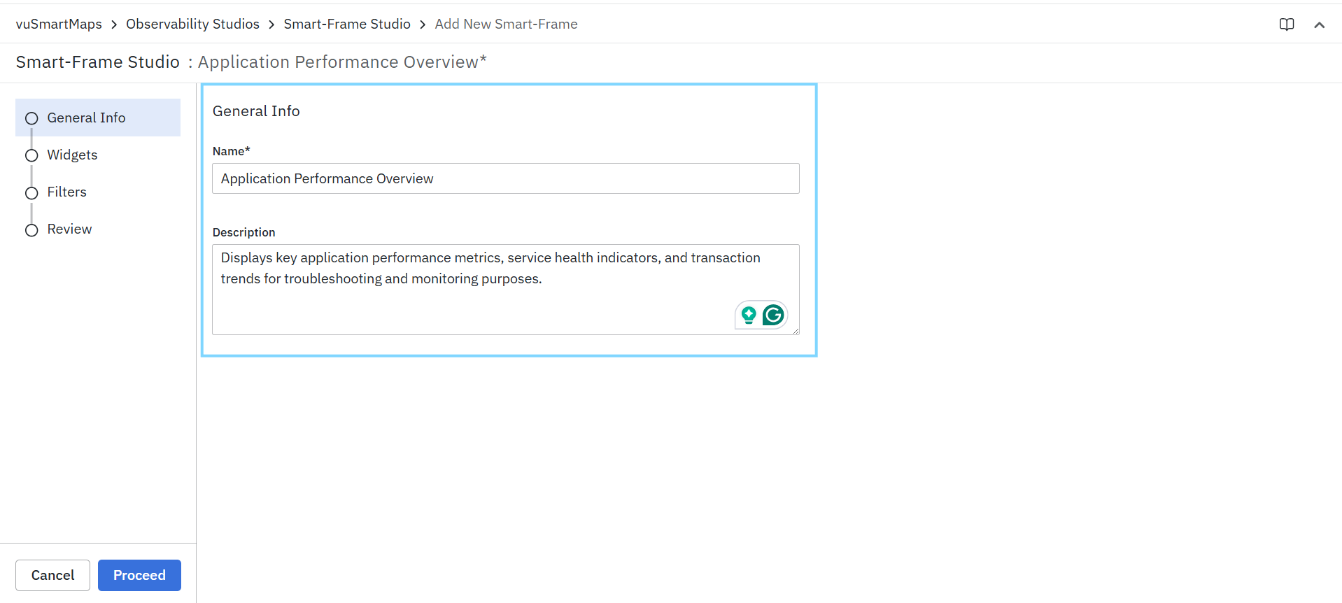
Name
Specify a unique name for the Smart Frame.
The name is displayed:
- In the Smart Frame Studio listing page.
- During Smart Frame searches.
- When selecting Smart Frames for drill-downs or integrations.
- In dashboards and other platform components where Smart Frames are referenced.
Example:
- Application Performance Overview
- Service Health Summary
Description
- Provide a brief description explaining the purpose of the Smart Frame.
- The description helps administrators and users understand the type of information available within the Smart Frame without opening it.
Example:
"Displays key application performance metrics, service health indicators, and transaction trends for troubleshooting and monitoring purposes."
To Configure General Information
- Enter a unique value in the Name field.
- Optionally enter a description in the Description field.
- Click Proceed to continue to the Widgets step.
- Click Cancel to discard the configuration and return to the Smart Frame Studio page.
Widgets
The Widgets step allows you to build the content of a Smart Frame by adding widgets that present information, visualizations, navigation links, or insights. A Smart Frame can contain one or more widgets, enabling you to organize related information into a single, reusable view.
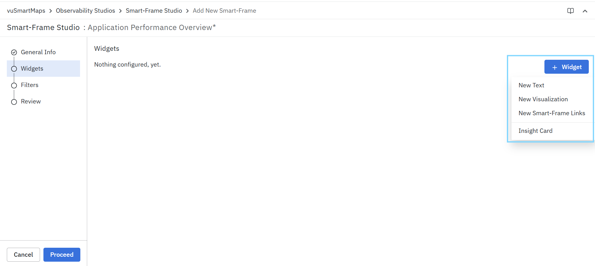
To add a widget, click + Widget and select the required widget type.
Available Widget Types
Smart Frames support the following widget types:
The Text widget is used to display static or dynamic textual information within a Smart Frame.
This widget can be used to:
- Provide contextual information.
- Display descriptions or instructions.
- Highlight important observations or recommendations.
- Present operational summaries and explanatory content.
The Visualization widget is used to display data-driven charts, metrics, tables, and other visual representations of observability data.
Visualization widgets help users:
- Monitor key performance indicators (KPIs).
- Analyze trends and patterns.
- Investigate operational issues.
- Explore metrics across applications, services, infrastructure, and other monitored entities.
Depending on the selected configuration, visualization widgets can display different types of charts and analytical views.
The Smart-Frame Links widget provides quick access to related Smart Frames. This widget helps users navigate between connected operational views without manually searching for them.
Typical use cases include:
- Linking application-level views to service-level views.
- Connecting overview Smart Frames with detailed investigation Smart Frames.
- Providing guided navigation workflows for troubleshooting.
The Insight Card widget is used to display important observations, findings, recommendations, or contextual insights within a Smart Frame. Insight Cards help surface critical information that may require immediate attention or provide additional operational context.
Common use cases include:
- Highlighting anomalies.
- Displaying generated insights.
- Presenting recommendations for investigation.
- Showing summarized operational findings.
Adding a Widget
To add a widget:
- Click + Widget.
- Select the required widget type.
- Configure the widget based on the selected option.
- Save the widget configuration.
- Repeat the process to add additional widgets as needed.
You can combine multiple widget types within the same Smart Frame to create a comprehensive observability view.
A Smart Frame must contain at least one widget before it can be reviewed and published.
Text Widget
The Text widget allows you to add descriptive content, contextual information, instructions, summaries, or other textual content to a Smart Frame. Text widgets help provide additional context for visualizations and guide users during analysis and troubleshooting activities. Unlike visualization widgets, a Text widget does not retrieve data from a data source. Instead, it displays user-defined content within the Smart Frame.
Configuring a Text Widget
To add a Text widget:
- Click + Widget.
- Select New Text.
- Enter the required content in the Text field.
- Optionally mark the text as a title using the Is this meant to be a title? option.
- Review the preview section.
- Click Save to add the widget to the Smart Frame.
Field Descriptions
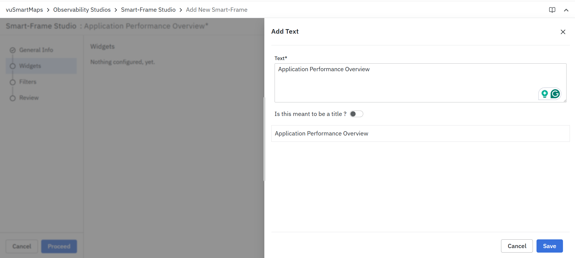
Text
Specify the content to be displayed in the widget.
The text can be used to:
- Introduce a Smart Frame section.
- Provide operational context.
- Explain metrics and visualizations.
- Display investigation guidelines.
- Highlight important observations.
Is this meant to be a title?
Enable this option to display the entered text as a title or heading within the Smart Frame.

Titles can be used to:
- Organize Smart Frame content into sections.
- Separate related groups of widgets.
- Improve readability and navigation.
Example:
Application Performance Overview
Preview
- The preview section displays how the text will appear within the Smart Frame.
- As content is added or modified, the preview updates to help validate the presentation before saving the widget.
Use Text widgets sparingly and focus on providing meaningful context that helps users interpret the information displayed in surrounding widgets.
Visualization Widget
The Visualization widget enables you to display operational and observability data within a Smart Frame using different visualization formats. It serves as the primary mechanism for presenting metrics, trends, relationships, and analytical insights collected from configured data models.
A visualization widget can be configured to display data in multiple formats depending on the analytical requirement. Users can define the widget metadata, select a visualization type, configure the underlying metric source, and optionally add interactive navigation actions.
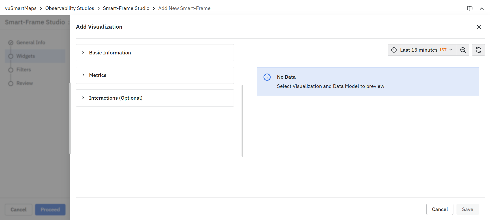
The widget configuration is organized into the following sections:
- Basic Information: The Basic Information section is used to define the core details of the visualization widget. These details help users understand the purpose of the widget and identify it easily within the Smart Frame.
- Metrics: The Metrics section is the primary configuration area of the visualization widget. It determines what data is displayed and how the information is presented to users.
- Interactions (Optional): The Interactions section allows users to add navigation and drill-down capabilities to the visualization widget, creating connected analysis workflows across the platform.
Basic Information
The Basic Information section captures the metadata associated with the visualization widget.
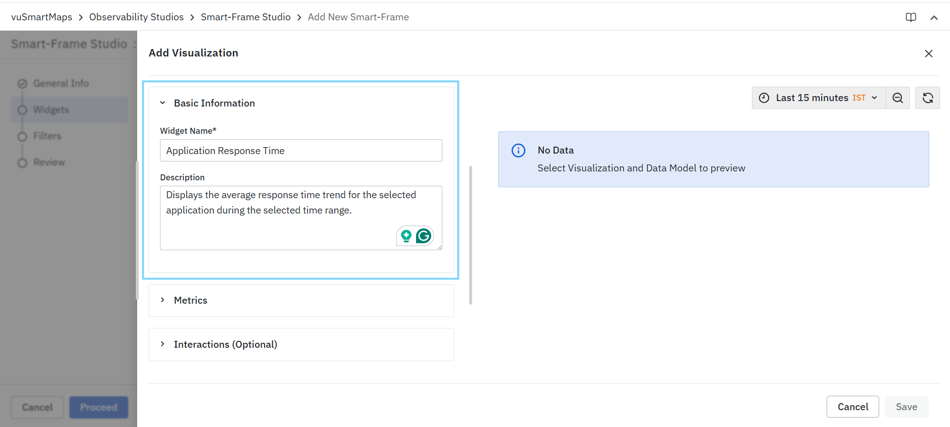
Widget Name
Specifies the display name of the widget. The widget name is displayed as the title of the visualization within the Smart Frame and helps users identify the purpose of the widget.
Example:
- Application Response Time
- Service Error Rate
Description
Provides additional information about the widget and its purpose. Descriptions can help users understand what data is being displayed and how it should be interpreted.
Example:
"Displays the average response time trend for the selected application during the selected time range."
Metrics
The Metrics section is the core configuration area of a visualization widget. It determines the type of visualization to be displayed and defines how data is presented within the widget. Using this section, users can configure the data representation best suited for their monitoring, analysis, or troubleshooting requirements.
The Metrics section allows users to:
- Select the visualization type for displaying data.
- Configure the data source and metric definition for the visualization.
- Present operational and observability data in different visual formats.
- Transform raw data into meaningful visual insights.
- Preview the configured visualization before saving.
- Customize the widget based on the selected visualization type.
Smart Frames support multiple visualization types, each designed for a specific analytical purpose.
Visualization Types
The Visualization Type field allows users to choose how data should be displayed within the widget. The available visualization types support a wide range of monitoring, analysis, and troubleshooting scenarios.
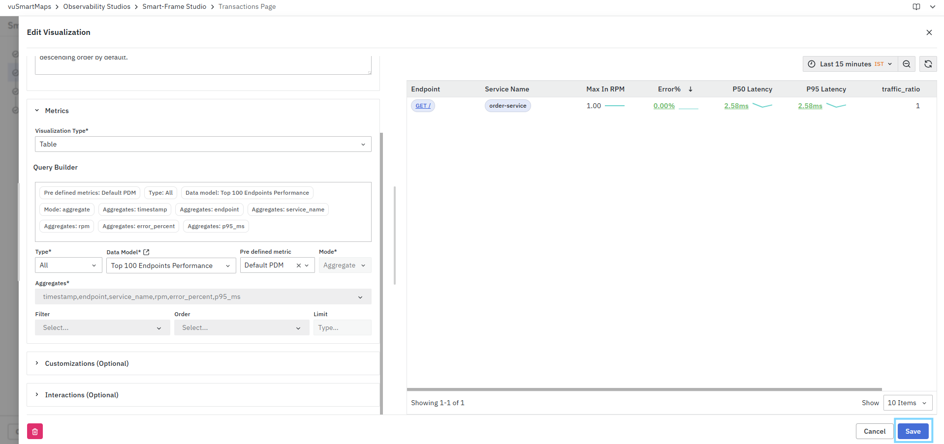
- Table: Displays data in a structured tabular format, making it suitable for reviewing detailed records, comparing values, and analyzing large datasets.
- Trend Chart: Displays time-series data to help users analyze trends, patterns, and changes in metric values over a selected time period.
- KPI: Displays key performance indicators in a summarized format, enabling users to quickly assess the health and performance of monitored systems.
- Pro Charts: Provides advanced chart visualizations such as bar, pie, line, and area charts for deeper analytical and comparative insights.
- Service Map: Visualizes service dependencies and relationships, helping users understand application architecture and service interactions.
- Service Flow: Displays the flow of requests and communications between services, enabling users to analyze transaction paths and identify bottlenecks.
- Dynamic Insights: Displays dynamically generated insights and contextual information to help users understand important observations and analytical findings.
Each visualization type provides its own configuration options, customization settings, and visualization-specific capabilities. Detailed information about each visualization type is covered in the subsequent sections of this guide.
Query Builder (Common)
The Query Builder is used to define the dataset and determine how data is retrieved and displayed within a Smart-Frame visualization. As query parameters are configured, a query summary is displayed at the top of the Query Builder, providing a consolidated view of the current configuration. The available fields and options may vary depending on the selected data model and visualization type.
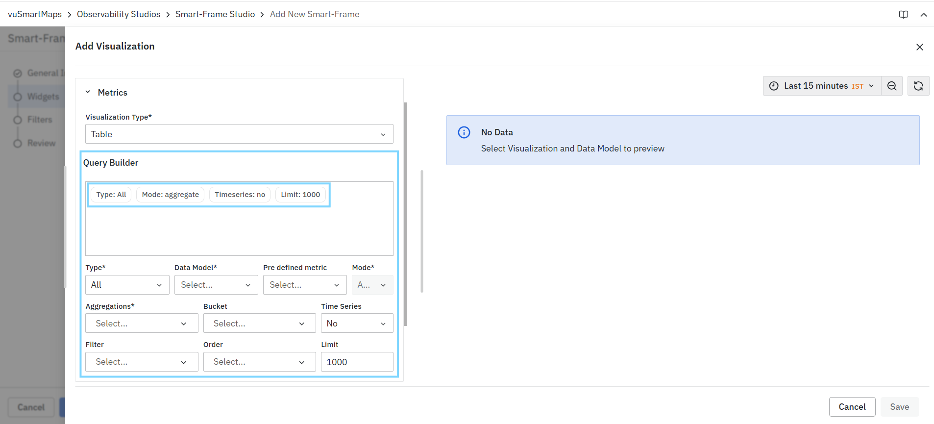
The Query Builder consists of the following fields:
- Type
- Data Model
- Pre-defined Metric
- Mode
- Aggregations
- Bucket
- Time Series
- Filter
- Order
- Limit
Type
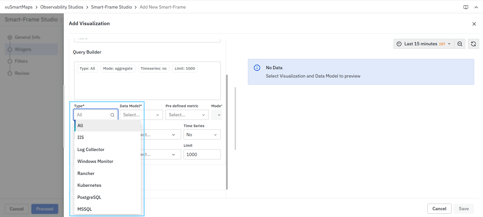
The Type field specifies the source category from which data will be retrieved. This is typically the first field that must be selected because the available data models depend on the selected type. The available options vary based on the observability sources configured in the environment.
Example
To analyze IIS-related metrics, select IIS as the Type.
Data Model
The Data Model field defines the dataset that will be queried. After selecting a Type, the corresponding data models become available for selection. A data model represents a logical collection of metrics and attributes that can be queried and visualized. Smart Frames supports both Standard and Custom data models.

Example
For IIS monitoring, available data models may include:
- Alert Active Count
- Alert Active Name Count
- Application Metrics
- Performance Metrics
The available data models vary depending on the selected Type.
Standard Data Models
Standard Data Models provide predefined query configurations for faster visualization creation.
When a Standard Data Model is selected:
- Aggregate mode is selected automatically.
- The mode cannot be modified.
- Aggregation settings are predefined.
- Additional query options such as Bucket, Time Series, Filter, Order, and Limit are not displayed.
Custom Data Models
Custom Data Models provide greater flexibility for query creation.
When a Custom Data Model is selected:
- Aggregation fields must be configured manually.
- Additional query options become available.
- Users can configure Bucket, Time Series, Filter, Order, and Limit as required.
The fields displayed in the Query Builder depend on the selected Data Model type. Standard Data Models provide a simplified configuration experience, while Custom Data Models expose advanced query-building capabilities.
Pre-defined Metric
The Pre-defined Metric field allows users to select an existing metric definition associated with the selected data model. Pre-defined metrics simplify visualization creation by providing ready-to-use metric configurations.
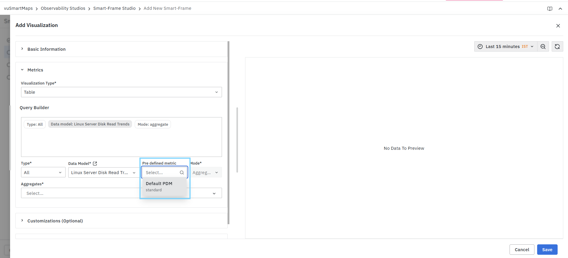
Benefits
- Faster configuration
- Consistent metric usage
- Reduced manual query creation
This field is available only when predefined metrics exist for the selected data model.
Mode
The Mode field determines how the selected data is processed before being displayed. Depending on the selected data model and visualization type, different processing modes may be available. For aggregate-based visualizations, the aggregate mode is commonly used to summarize and organize data.

Aggregate mode enables users to:
- Group records
- Calculate summarized values
- Reduce data complexity
- Generate meaningful visualization results
The selected mode is reflected in the Query Builder summary.
Aggregations
The Aggregations field is used to select the metrics or attributes that should be included in the query results. The available aggregation fields are populated based on the selected data model.

For Custom Data Models, users can:
- Search for available aggregation fields
- Select one or more fields
- Apply the selected fields to generate the visualization output
The selected aggregations determine the information displayed in the visualization.
Example
For an alert-related data model, available aggregation fields may include:
- timestamp
- Disk Name
- Target
- Read Bytes/Sec
After selecting the required fields, click Apply.
When a Standard Data Model is selected, aggregation settings are predefined and applied automatically. Manual aggregation selection is available only for Custom Data Models.
Bucket
The Bucket field groups query results based on a selected attribute. Bucketing organizes data into logical groups, making results easier to analyze and compare.

Common examples include grouping data by:
- Severity
- Service Name
- Application
- Category
- Status
The Bucket option is available only when a Custom Data Model is selected.
Time Series
The Time Series option determines whether the query returns time-based data.
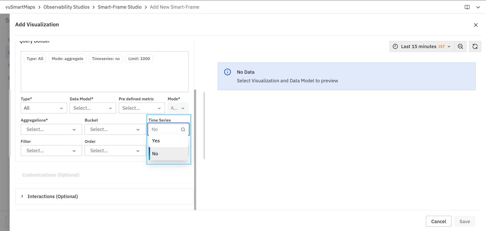
Available options include:
- Yes – Retrieves data as a time-series dataset.
- No – Retrieves data as standard query results.
The appropriate selection depends on the visualization type and reporting requirements.
The Time Series option is available only when a Custom Data Model is selected.
Filter
The Filter option allows users to refine the data returned by the query by defining one or more filter conditions. When a filter is added, the Add Filters dialog is displayed.
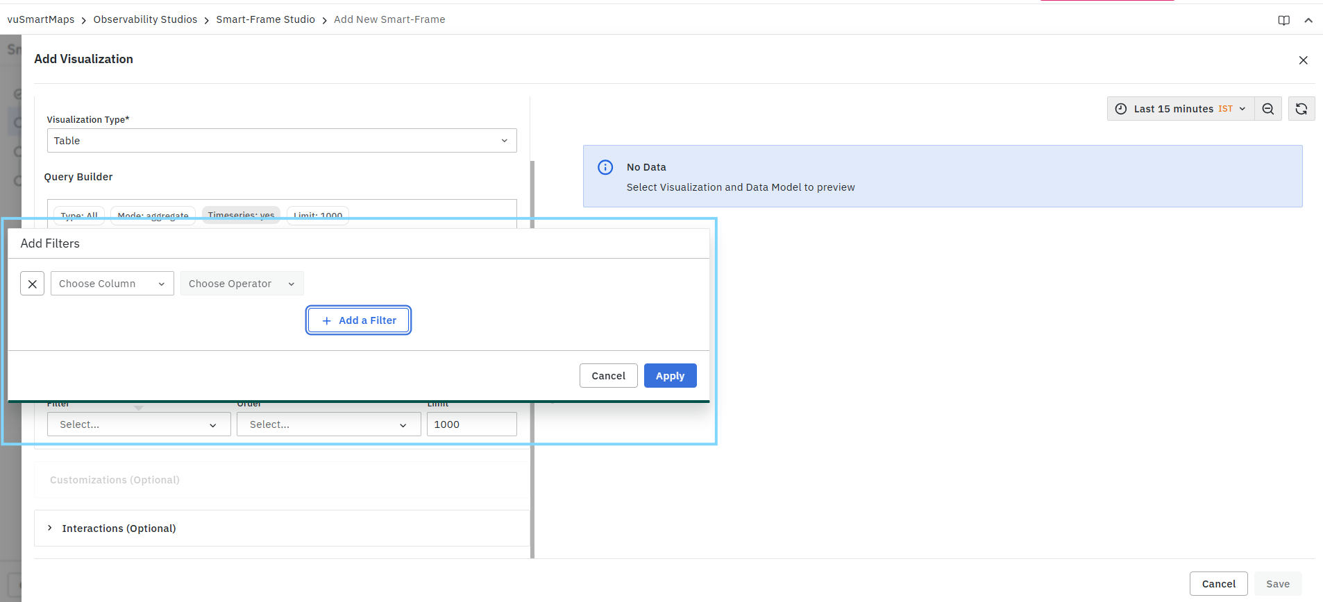
Users can:
- Select the column on which the filter should be applied
- Choose an operator
- Specify a filter value
- Add multiple filter conditions
- Remove existing conditions
- Apply the configured filters
Filters help narrow the dataset and ensure that only relevant records are included in the visualization.
Filter configuration is available only when a Custom Data Model is selected.
Order
The Order field determines how the returned records are sorted. Sorting can be applied based on selected metrics or attributes to organize query results in ascending or descending order.

The Order option is available only when a Custom Data Model is selected.
Limit
The Limit field controls the maximum number of records returned by the query.

Limiting results can:
- Improve visualization performance
- Reduce data volume
- Focus on the most relevant records
The default value displayed in the configuration is 1000.
The Limit field is available only when a Custom Data Model is selected.
Query Summary
As the query is configured, the Query Builder displays a summary of the selected settings.

The summary provides a quick overview of:
- Selected Type
- Selected Data Model
- Selected Mode
- Time Series configuration
- Result Limit
This allows users to verify the query configuration before reviewing the results.
Preview Panel
The Preview Panel displays the output generated by the configured query.
As configuration changes are applied, the preview updates automatically to reflect the latest query settings.
The preview can be used to:
- Validate query results
- Verify selected aggregations
- Confirm filtering criteria
- Review data before saving the visualization
If no data is returned, the preview displays a No Data message.
Interactions (Optional)
The Interactions (Optional) section allows users to configure additional navigation actions for a visualization widget. These interactions help users move from the current visualization to related pages, Smart-Frames, or detailed views for further analysis.

Interactions are organized into the following configuration modes:
-
Panel Links: Allows users to configure widget-level menu links for navigating to a Smart-Frame, external page, or other supported destination from the widget menu.
-
Data Links:Allows users to configure data-based links using selected fields or values from the visualization output.
Panel Links
Panel Links allow users to configure widget-level navigation actions from the visualization. These links are available under the (...) icon button within the widget and can be used to provide quick access to related pages, Smart-Frames, or other supported destinations.

Users can add up to 6 interactions.
To add a panel link:
-
Click Add Interaction.
-
Select the interaction type.
-
Based on the selected interaction type, choose the required Smart-Frame or enter the required external page URL.
-
Enter the display name.
-
Save the visualization.
Data Links
Data Links allow users to configure contextual navigation actions based on the data available in a visualization. These links help users navigate from a selected data element to a related Smart-Frame, external page, or other supported destination.
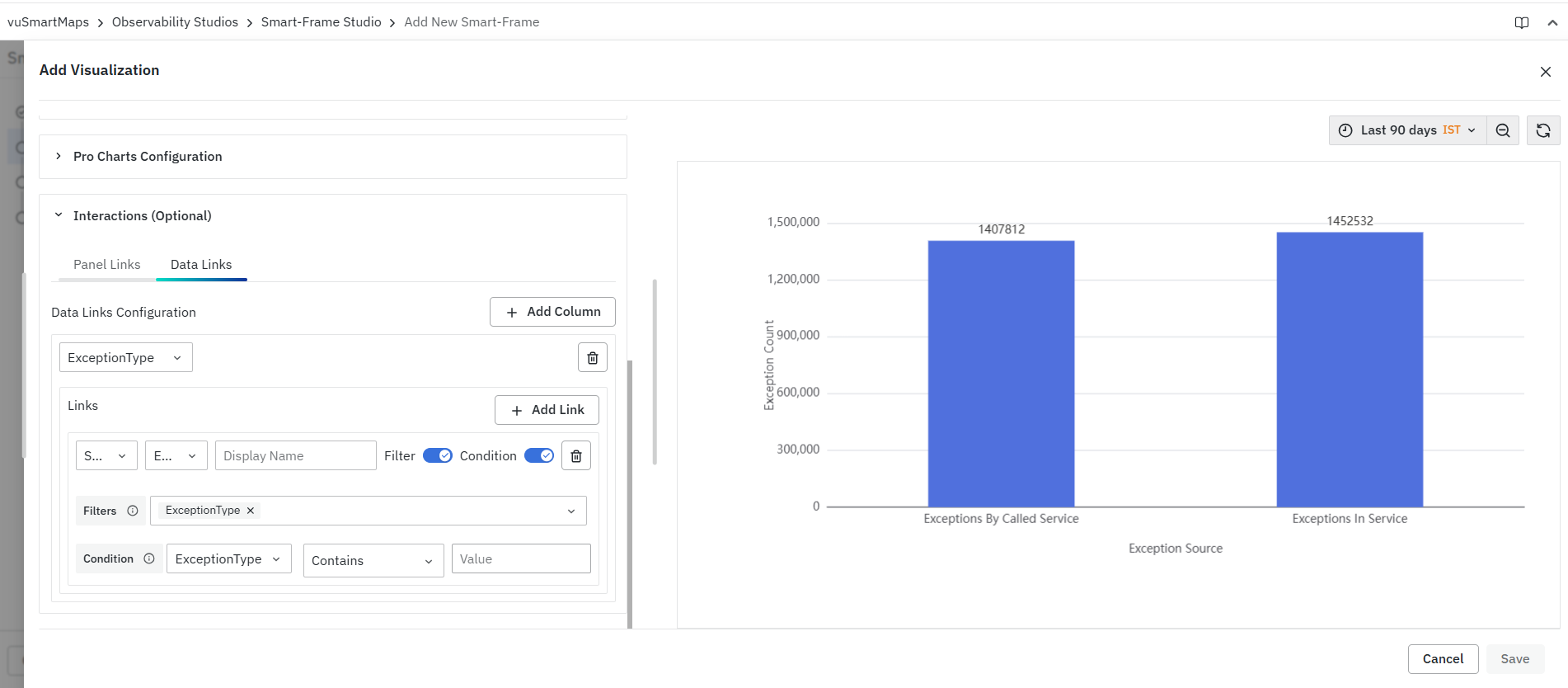
The Data Links configuration may vary depending on the selected visualization type. For some visualizations, links can be configured based on selected columns or fields. For flow-based visualizations, links can be configured separately for nodes and edges.
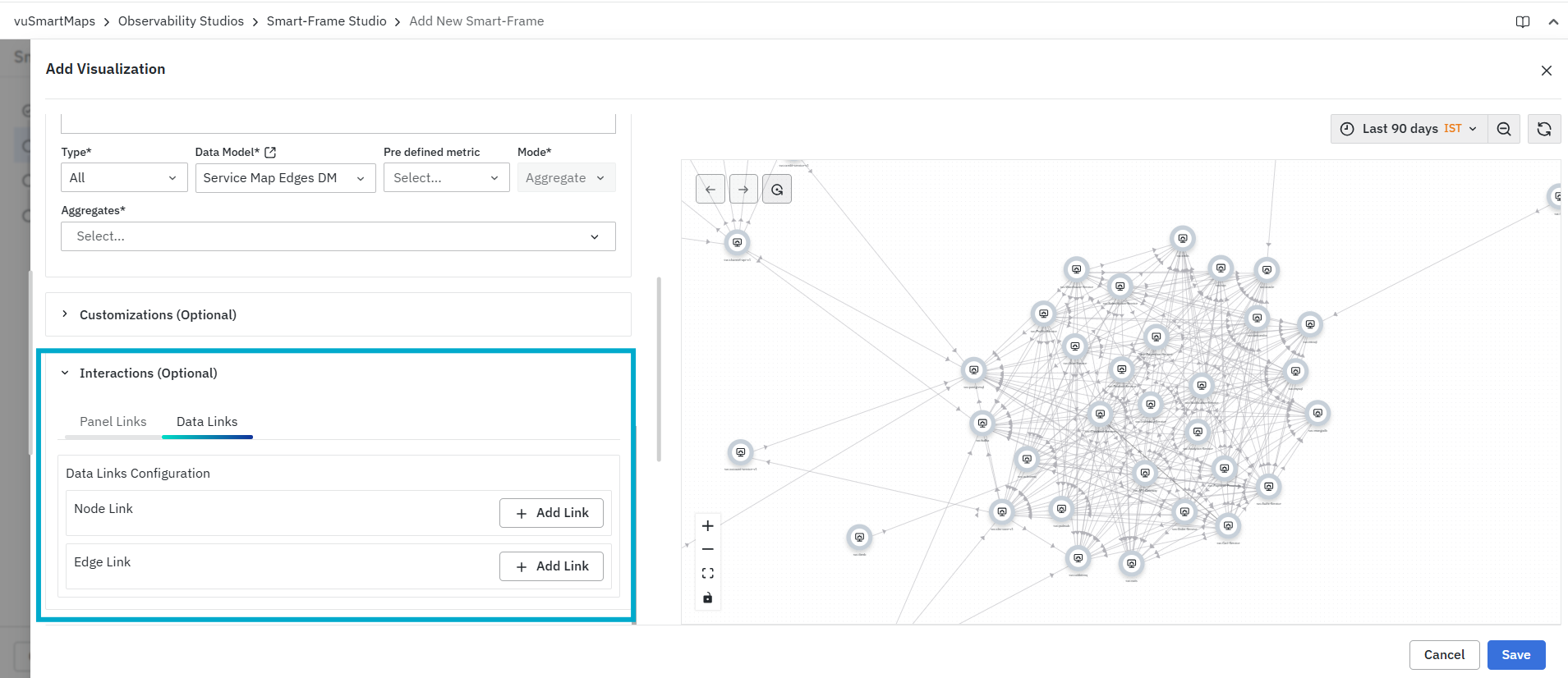
To configure a data link:
-
Select the Data Links tab.
-
Select or configure the required data element, such as a column, field, node, or edge, based on the selected visualization type.
-
Click Add Link under the relevant section.
-
Select the required link type.
-
Choose the required Smart-Frame or enter the external page link, based on the selected link type.
-
Enter the Display Name.
-
Enable Filter, if the selected data should be passed as a filter.
-
Enable Condition and select the required metric, operator, and value to define when the link should be applied.
-
Click Save to save the visualization.
The delete icon can be used to remove a configured data link.
Save the Visualization
After completing the configuration, click Save to save the visualization.
Smart-Frame Links
The Smart-Frame Links widget provides quick access to related Smart Frames and external pages directly from a Smart Frame. This widget helps users create navigation paths between operational views, allowing faster access to detailed investigations, dashboards, and supporting workflows without manually searching for them.
Typical use cases include:
- Linking overview Smart Frames to detailed investigation Smart Frames.
- Connecting application-level views with service-level views.
- Providing quick access to external dashboards and monitoring tools.
- Creating guided troubleshooting and operational workflows.
Adding a Smart-Frame Links Widget
To add a Smart-Frame Links widget:
- Navigate to the Widgets step while creating or editing a Smart Frame.
- Click + Widget.
- Select New Smart-Frame Links from the widget menu.

- Configure the required links.
- Preview the configured links.
- Click Save.
The Add Smart-Frame Links page consists of the following sections:
- Configuration
- Preview

Configuration
The Configuration section allows users to create one or more navigation links that can redirect users to either a Smart Frame or an external page.
To configure a Smart-Frame Link:
- Click Add Links.
- Select the required link type:
- Smart-Frame
- External Page
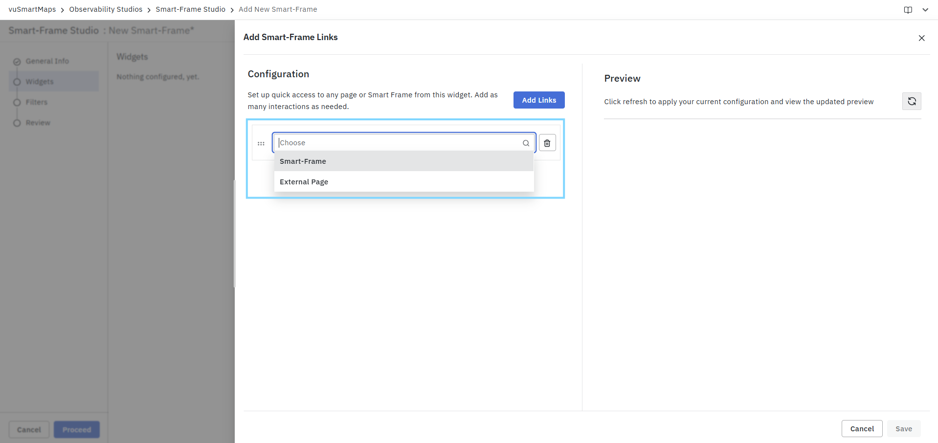
- Configure the required fields based on the selected link type.
- Enter a display name and optional description.
- Enable Open Link in New Tab, if required.
- Repeat the process to add additional links.
Multiple links can be added to a single widget.
Smart-Frame Link
Use the Smart-Frame option to create navigation links to existing Smart Frames.
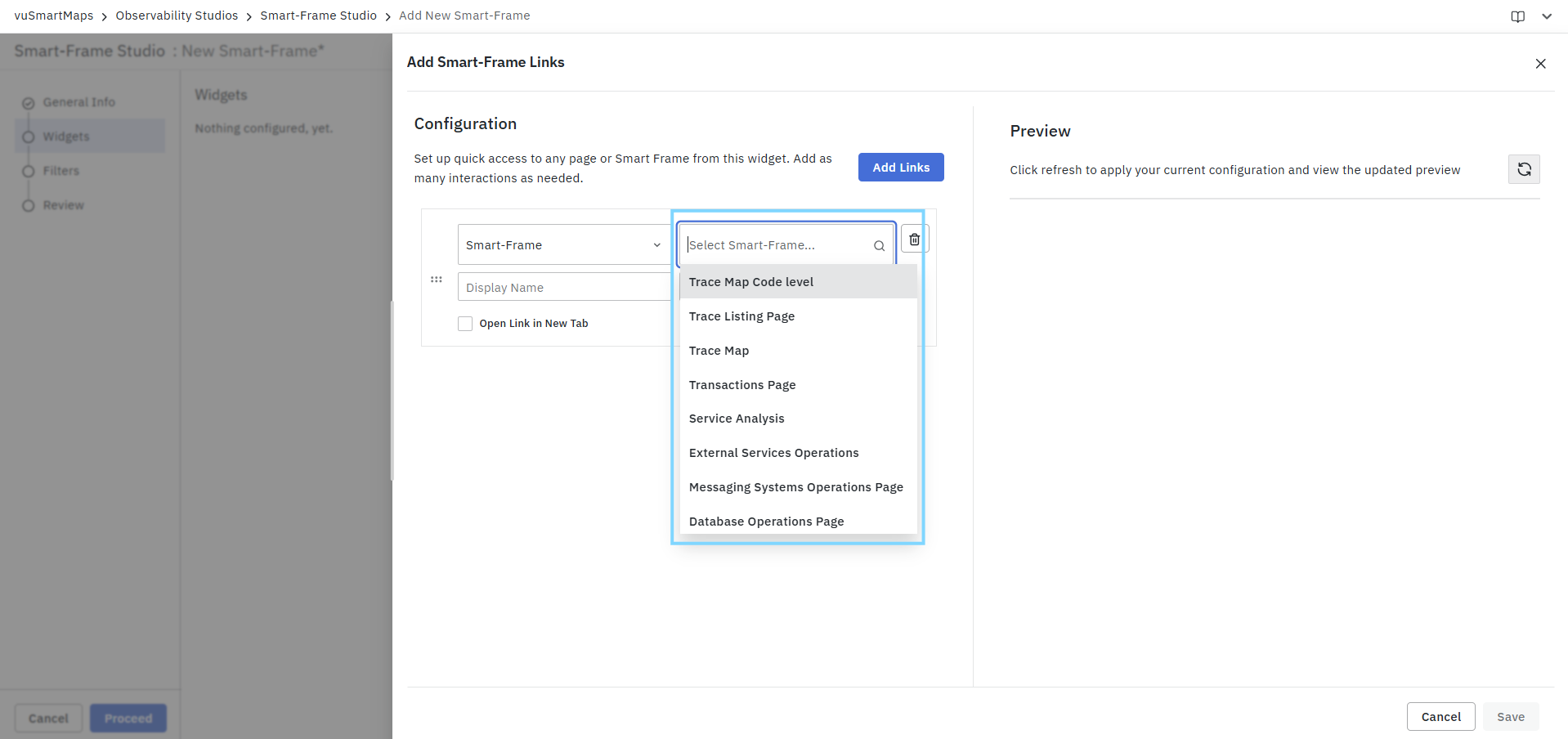
Configure the following fields:
| Field | Description |
|---|---|
| Smart-Frame | Select the destination Smart Frame. |
| Display Name | Name displayed in the widget. |
| Description | Optional description for the link. |
| Open Link in New Tab | Opens the selected Smart Frame in a new browser tab. |
Users can choose from available Smart Frames such as Trace Map, Service Analysis, Transactions Page, Database Operations Page, Messaging Systems Operations Page, and other configured Smart Frames.
External Page Link
Use the External Page option to navigate to an external URL.
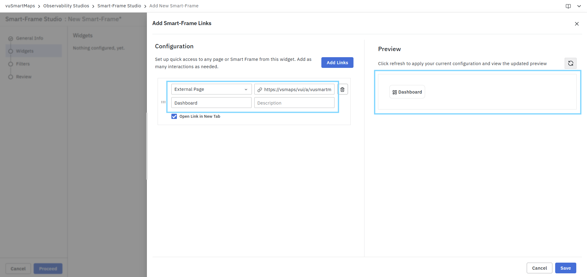
Configure the following fields:
| Field | Description |
|---|---|
| External URL | URL of the destination page. |
| Display Name | Name displayed in the widget. |
| Description | Optional description for the link. |
| Open Link in New Tab | Opens the URL in a new browser tab. |
This option is useful for linking to external dashboards, knowledge bases, ticketing systems, runbooks, or monitoring portals.
Managing Links
The Smart-Frame Links widget provides additional controls for managing configured links:
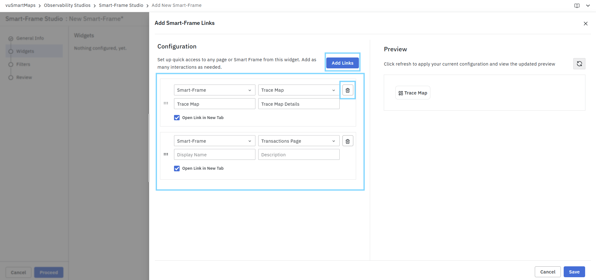
| Action | Description |
|---|---|
| Add Links | Adds a new Smart-Frame or External Page link. |
| Delete | Removes the selected link. |
| Reorder | Rearranges the display order of configured links. |
Preview
The Preview section displays how the configured links will appear in the Smart Frame. Click the Refresh icon to apply the current configuration and view the latest preview.
The preview allows users to validate:
- Link names.
- Widget appearance.
- Navigation structure.
- Overall user experience before saving.
Example
The following example demonstrates a Smart-Frame Links widget configured with multiple navigation options:
| Link Name | Destination |
|---|---|
| Trace Map | Trace Map Smart Frame |
| Transactions Page | Transactions Investigation Smart Frame |
| Dashboard | External Monitoring Dashboard |
This configuration allows users to quickly switch between related operational views and external resources during investigation and troubleshooting workflows.
Saving the Widget
After configuring and reviewing the required links:
- Click Save to add the Smart-Frame Links widget to the Smart Frame.
- Continue configuring additional widgets, filters, or review settings as required.
You can view the Smart-Frame Links in Smart-Frames as shown in the below screenshot.
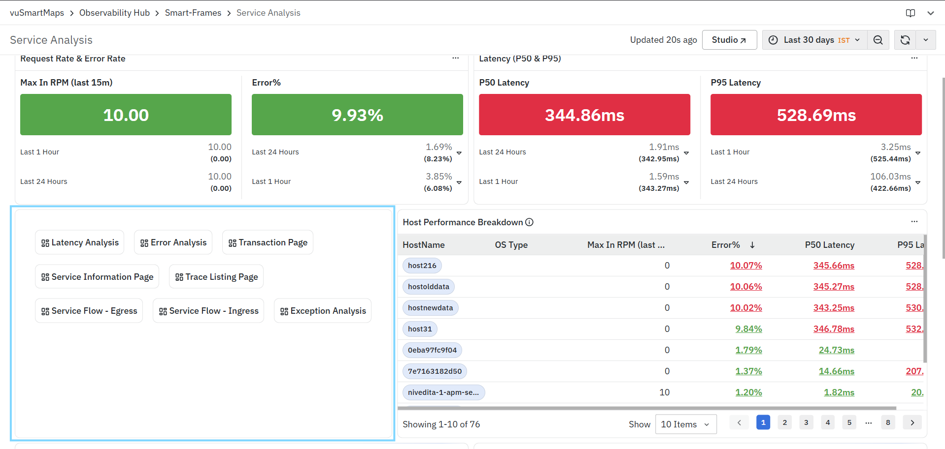
Insight Card
The Insight Card widget is used to display important observations, findings, recommendations, or contextual insights within a Smart Frame. Insight Cards help surface critical information that may require immediate attention and provide additional operational context for investigation and analysis.
Common use cases include:
- Highlighting anomalies and operational issues.
- Displaying AI-generated or system-generated insights.
- Presenting recommendations for investigation.
- Showing summarized operational findings.
- Providing contextual information related to application, service, or transaction behavior.
Adding an Insight Card Widget
To add an Insight Card widget:
- Navigate to the Widgets step while creating or editing a Smart Frame.
- Click + Widget.
- Select Insight Card from the widget menu.
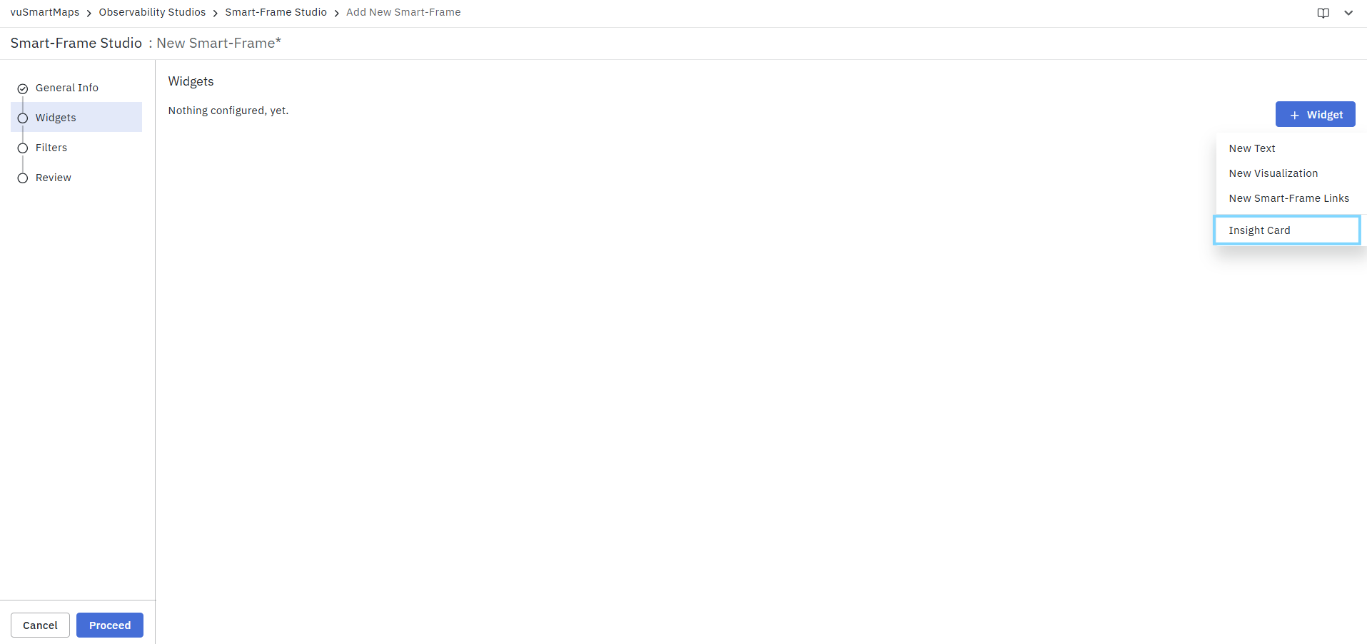
- Choose the required insight from the available list.
- Review the generated preview.
- Click Save.
The Add Insight Card page consists of the following sections:
- Insight Selection
- Preview
Insight Selection
The Insight field allows users to select an available insight definition that will be displayed within the Smart Frame.
To configure an Insight Card:
- Click the Insight drop-down.
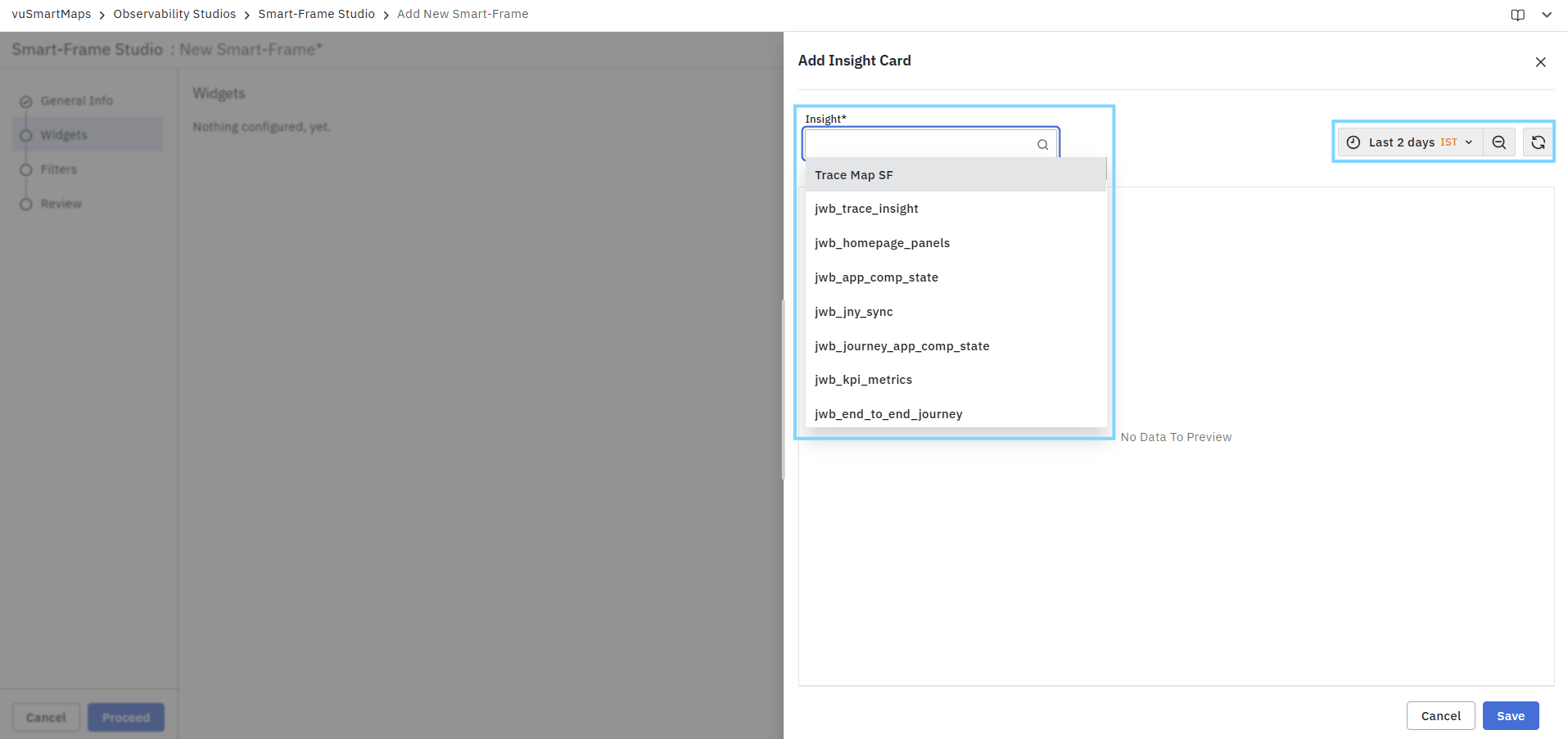
- Select the required insight from the available list.
- The selected insight is automatically loaded into the preview panel.
The available insights depend on the configured environment and may include operational, transaction, application, service, or journey-related insights.
Preview
The Preview section displays the insight data generated for the selected insight definition. After selecting an insight, the widget automatically retrieves and displays the corresponding information based on the selected time range.
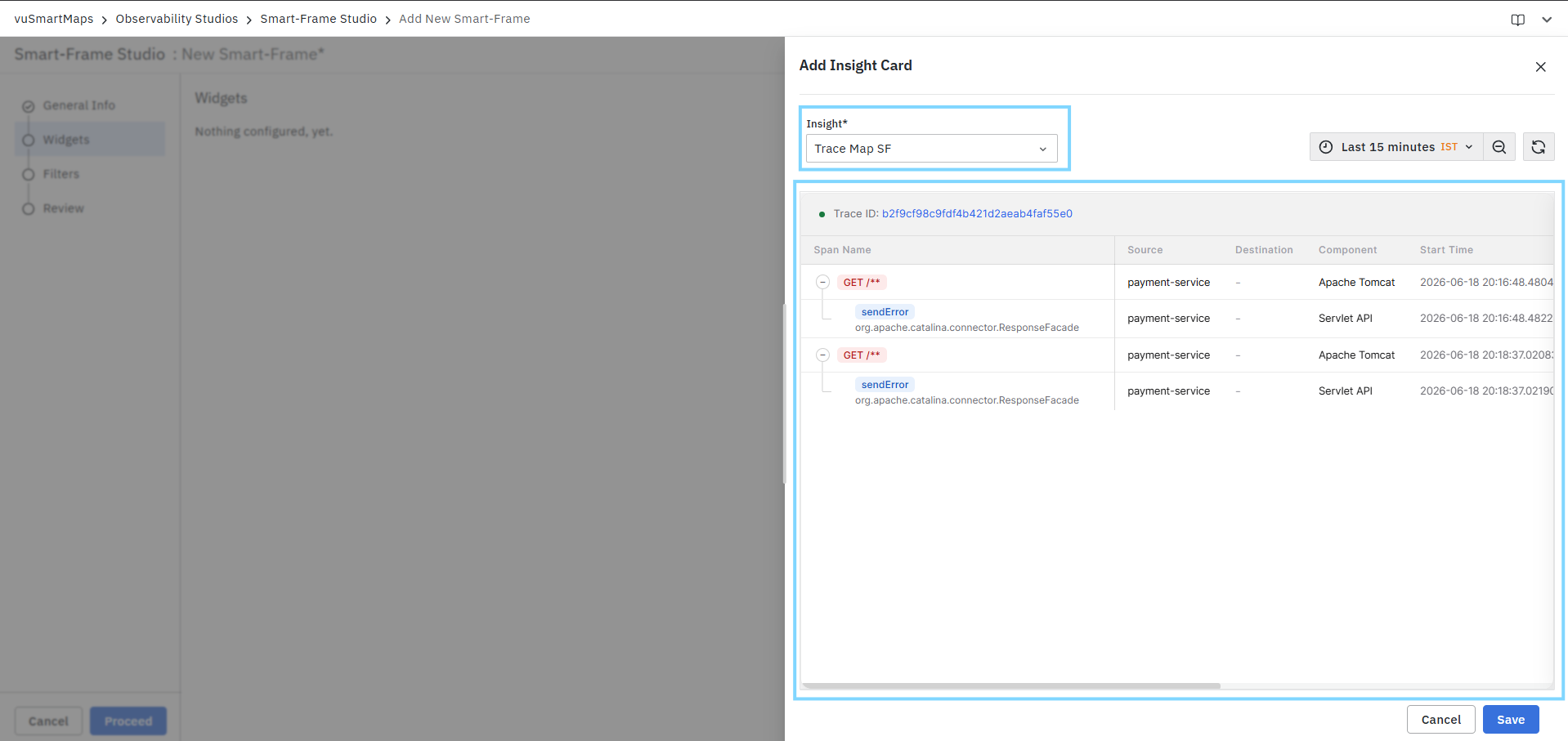
The preview helps users validate:
- Available insight records.
- Trace and transaction details.
- Related services and components.
- Operational findings and recommendations.
- Overall widget appearance before saving.
Time Range Selection
Users can control the data displayed in the preview using the time range selector available in the upper-right corner of the preview panel.
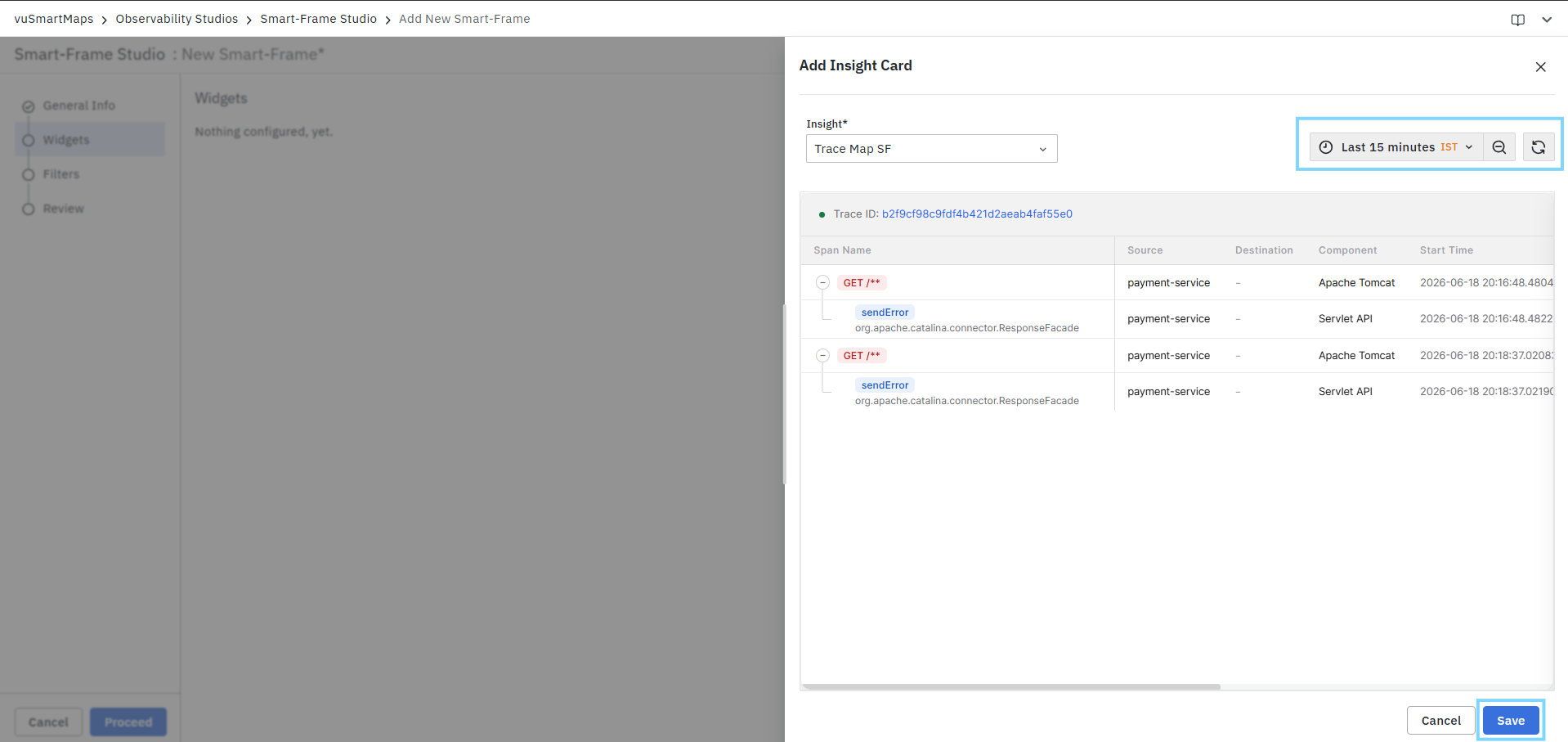
To update the preview:
- Select the required time range.
- Click the Refresh icon.
- Review the updated insight data.
The preview automatically reflects insights generated during the selected time period.
Saving the Widget
After selecting and reviewing the required insight:
- Click Save to add the Insight Card widget to the Smart Frame.
- Continue configuring additional widgets, filters, or review settings as required.
After completing the widget configuration, click Proceed to move to the Filters step. The Filters step allows users to configure Smart Frame-level filters that can be applied across widgets within the Smart Frame. These filters help users refine and interact with the displayed data based on selected criteria.
Filters
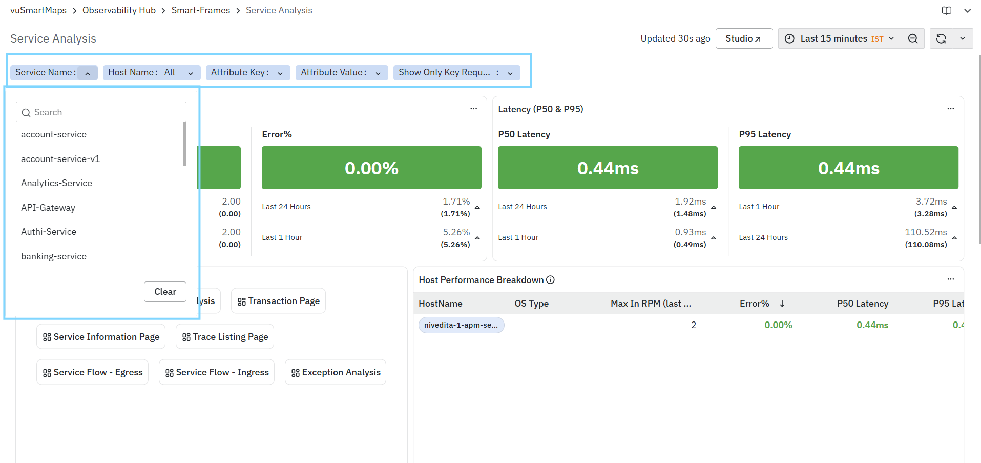
The Filters step allows users to configure Smart Frame-level filters that can be used across widgets within the Smart Frame. Filters help users refine the displayed data and provide a consistent filtering experience across all configured widgets. This step is optional and can be skipped if no filters are required.
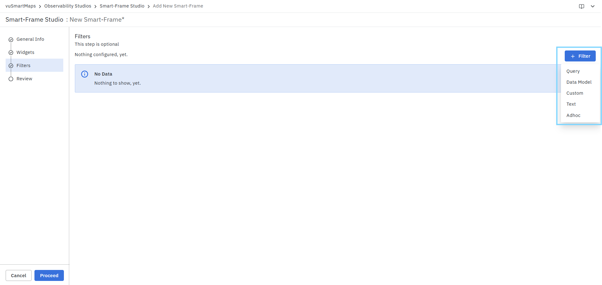
To add a filter:
- Navigate to the Filters step.
- Click + Filter.
- Select the required filter type from the available options:
- Query
- Data Model
- Custom
- Text
- Adhoc
- Configure the selected filter as required.
Once the required filters have been configured, click Proceed to continue to the Review step. You can view the Filters in SmartFrames as shown in the below screenshot.
Query Filter
The Query filter type allows users to create a filter using the results returned by a custom query. The filter values are dynamically populated from the selected data store and can be used across widgets within the Smart Frame.
To configure a Query filter:
- Click + Filter and select Query.
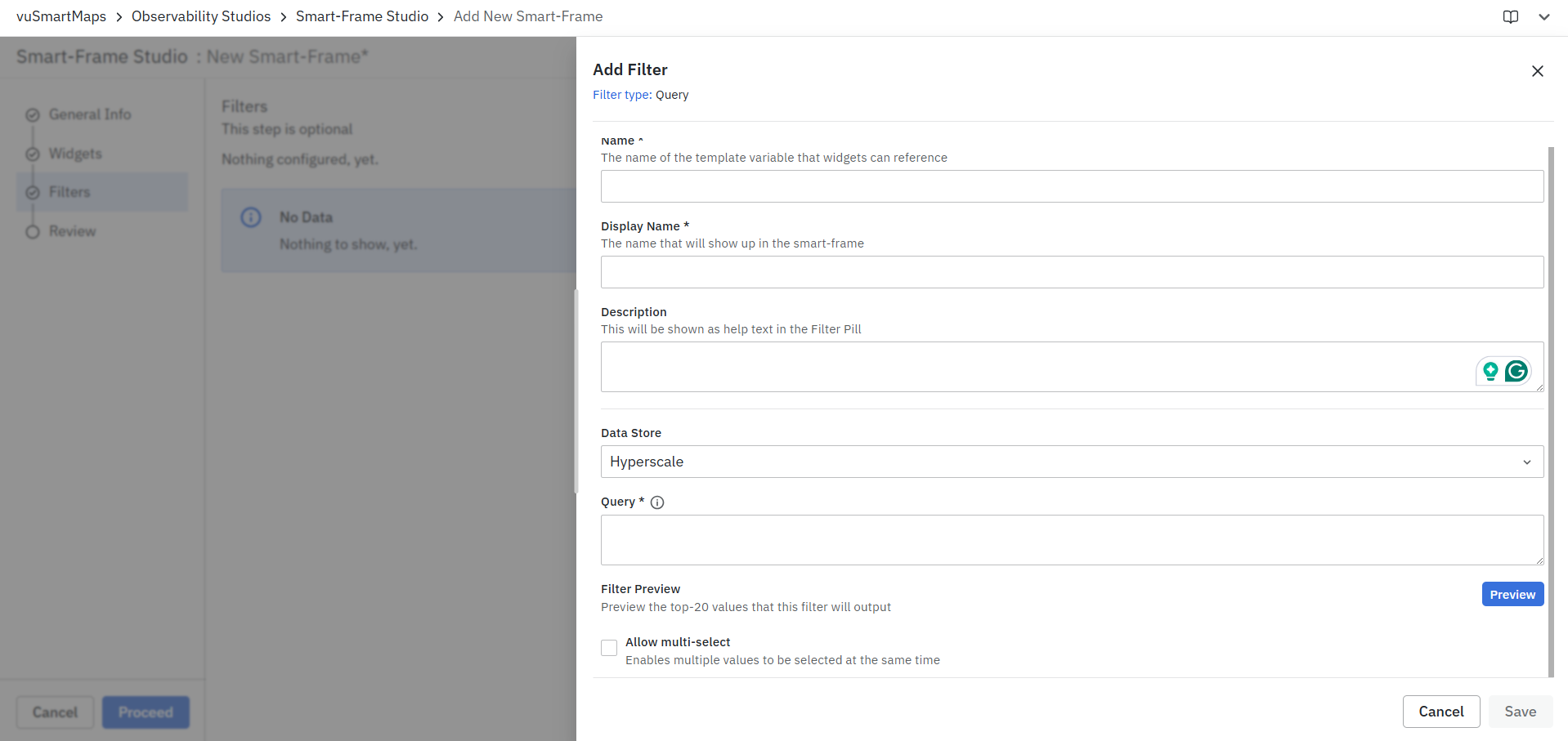
- Enter a unique Name for the filter. This name acts as the template variable that widgets can reference.
- Enter a Display Name. This is the label displayed to users within the Smart Frame.
- Optionally, provide a Description. The description is displayed as help text in the filter pill.
- Select the required Data Store from the available list.
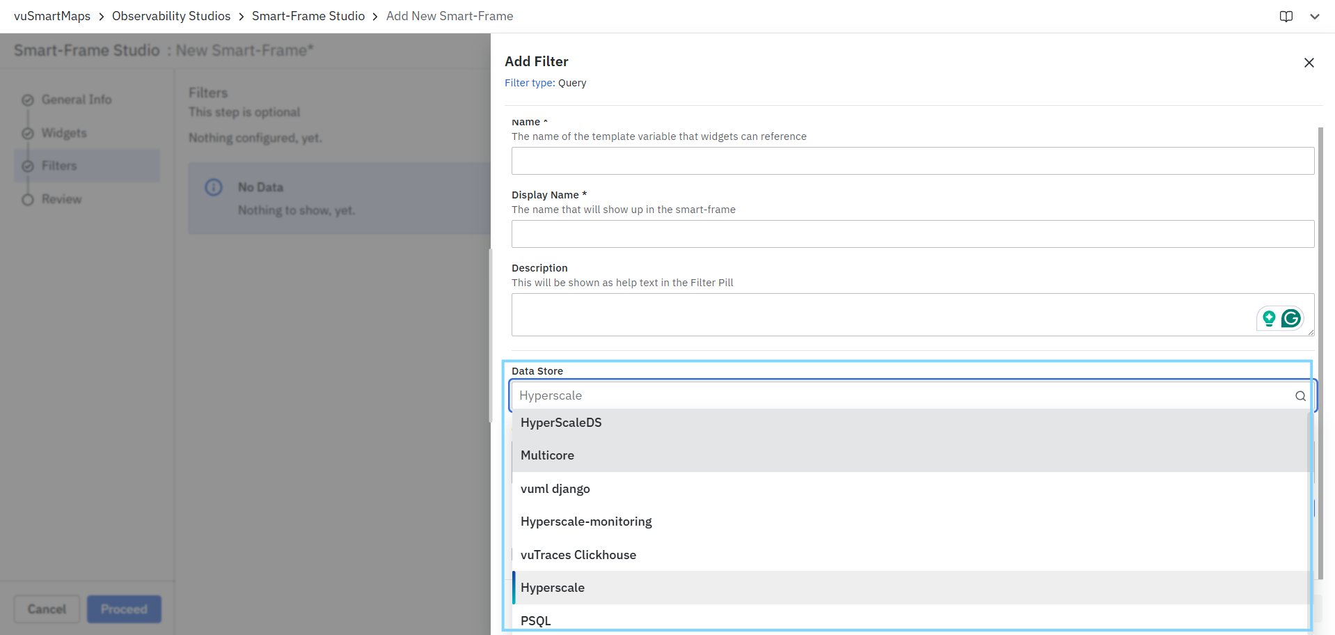
- Enter the query in the Query field. The query is used to retrieve the filter values from the selected data store.
- Click Preview to view the top 20 values returned by the query.
- Enable Allow multi-select if users should be able to select multiple filter values simultaneously.

- Click Save to add the filter to the Smart Frame.
To search across all available values, include __dynamicFilter in the query as indicated in the Query field help text.
Field Examples
| Field | Example |
|---|---|
| Name | application |
| Display Name | Application |
| Description | Select an application to filter the Smart Frame widgets. |
| Data Store | Hyperscale |
| Query | Query that retrieves the list of application names from the selected data store. Example: SELECT DISTINCT AppName FROM traces WHERE __dynamicFilter |
| Preview | Displays sample values such as Payment-Service, Account-Service, and Transaction-Service. |
| Allow Multi-Select | Enabled to allow users to select multiple applications simultaneously. |
Example Outcome: After saving the filter, users can select one or more applications from the Application filter, and all configured widgets will display data based on the selected application values.
Data Model Filter
The Data Model filter type allows users to create filters using values available within a selected Data Model. The filter values are automatically populated based on the selected metric and can be used across widgets within the Smart Frame.
To configure a Data Model filter:
- Click + Filter and select Data Model.
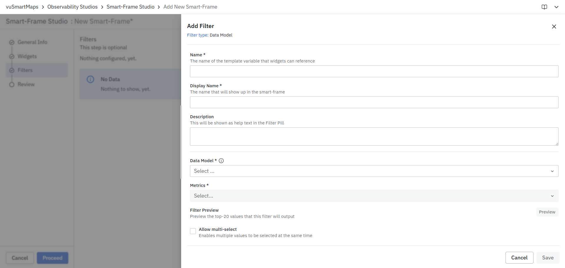
- Enter a unique Name for the filter. This name acts as the template variable that widgets can reference.
- Enter a Display Name. This is the label displayed to users within the Smart Frame.
- Optionally, provide a Description. The description is displayed as help text in the filter pill.
- Select the required Data Model from the available list.

- Select the required Metric from the selected Data Model.

- Click Preview to view the top 20 values returned for the selected metric.
- Enable Allow multi-select if users should be able to select multiple filter values simultaneously.
- Click Save to add the filter to the Smart Frame.

Field Examples
| Field | Example |
|---|---|
| Name | application |
| Display Name | Application |
| Description | Select an application to filter Smart Frame widgets. |
| Data Model | Database RPM and Error Pct KPI |
| Metric | error_pct |
| Preview | Displays sample values returned for the selected metric. |
| Allow Multi-Select | Enabled to allow users to select multiple values simultaneously. |
Example Outcome: After saving the filter, users can select one or more values from the Application filter, and all configured widgets that reference the filter will update their data based on the selected values.
Custom Filter
The Custom filter type allows users to create a filter using a predefined list of values. Unlike Query and Data Model filters, Custom filters do not retrieve values from a data source. Instead, users manually define the filter values that will be available for selection within the Smart Frame.
To configure a Custom filter:
- Click + Filter and select Custom.

- Enter a unique Name for the filter. This name acts as the template variable that widgets can reference.
- Enter a Display Name. This is the label displayed to users within the Smart Frame.
- Optionally, provide a Description. The description is displayed as help text in the filter pill.
- Enter the required values in the Comma-separated values field. Each value must be separated by a comma.
- Enable Allow multi-select if users should be able to select multiple values simultaneously.
- Click Save to add the filter to the Smart Frame.
Field Examples
| Field | Example |
|---|---|
| Name | environment |
| Display Name | Environment |
| Description | Select the environment to filter Smart Frame widgets. |
| Comma-separated Values | Production, Staging, UAT, Development |
| Allow Multi-Select | Enabled to allow users to select multiple environments simultaneously. |
Example Outcome: After saving the filter, users can select one or more environments such as Production, Staging, or UAT, and all configured widgets that reference the filter will display data based on the selected environment values.
Text Filter
The Text filter type allows users to create a free-text search filter within a Smart Frame. Users can enter keywords or phrases, and the filter matches the entered text against available text-based fields in the underlying data, such as service names, endpoints, error messages, transaction details, and other searchable text fields.
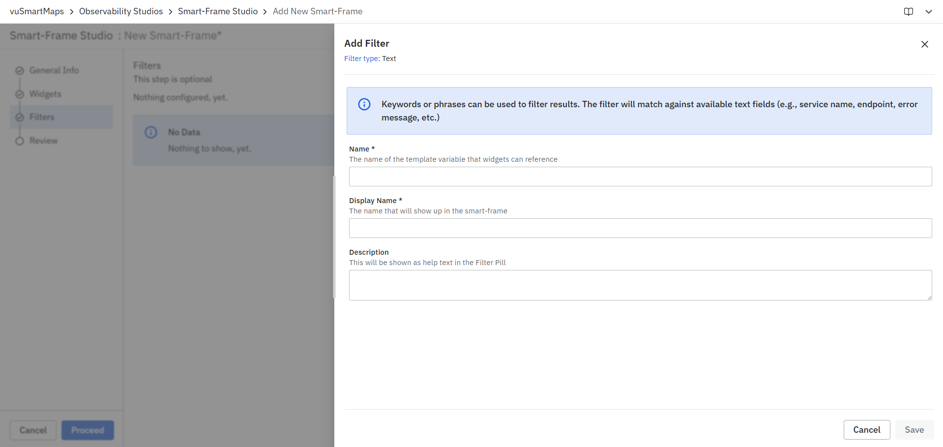
To configure a Text filter:
- Click + Filter and select Text.
- Enter a unique Name for the filter. This name acts as the template variable that widgets can reference.
- Enter a Display Name. This is the label displayed to users within the Smart Frame.
- Optionally, provide a Description. The description is displayed as help text in the filter pill.
- Click Save to add the filter to the Smart Frame.
The Text filter does not require a data source, query, or predefined values. Users can enter search terms directly while using the Smart Frame.
Field Examples
| Field | Example |
|---|---|
| Name | searchText |
| Display Name | Search |
| Description | Search services, endpoints, transactions, or error messages within the Smart Frame. |
Example Outcome: After saving the filter, users can enter keywords such as payment-service, GET /api/orders, or connection timeout in the Search filter. Widgets configured to use this filter will display data that matches the entered text across supported fields.
Adhoc Filter
The Adhoc filter type allows users to create dynamic filters based on values available in selected tables within a data store. These filters can be applied across widgets in the Smart Frame, enabling users to filter data without defining custom queries.
To configure an Adhoc filter:
- Click + Filter and select Adhoc.
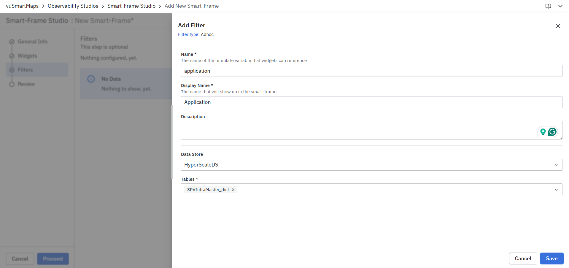
- Enter a unique Name for the filter. This name acts as the template variable that widgets can reference.
- Enter a Display Name. This is the label displayed to users within the Smart Frame.
- Optionally, provide a Description. The description is displayed as help text in the filter pill.
- Select the required Data Store from the available list.

- Select one or more Tables from which filter values should be derived.
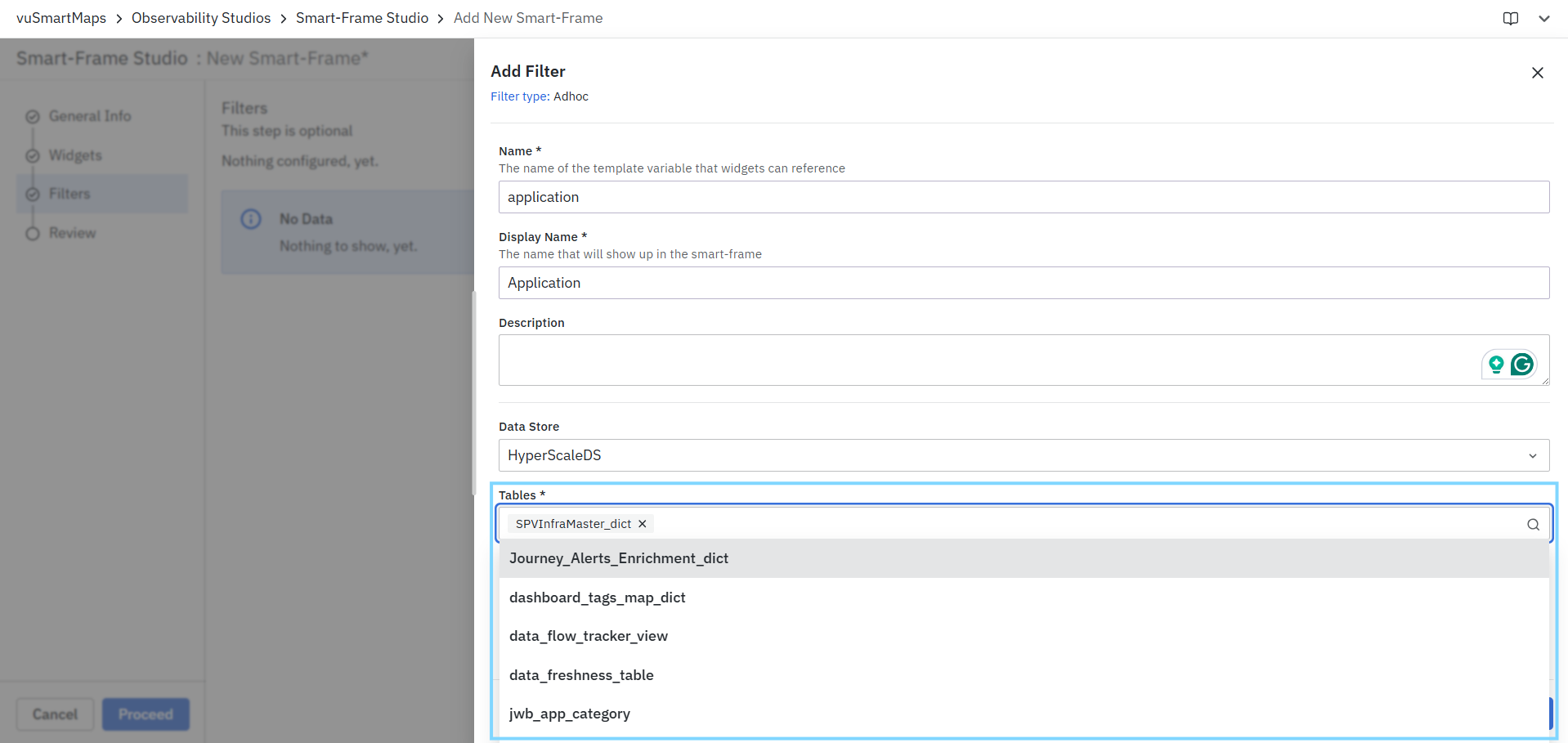
- Click Save to add the filter to the Smart Frame.
Field Examples
| Field | Example |
|---|---|
| Name | application |
| Display Name | Application |
| Description | Select an application to filter Smart Frame widgets. |
| Data Store | HyperScaleDS |
| Tables | SPVInfraMaster_dict |
| Save | Saves the filter configuration and makes it available within the Smart Frame. |
Example Outcome: After saving the filter, users can use the Application filter to dynamically retrieve and apply values from the selected SPVInfraMaster_dict table. Widgets configured to reference this filter will automatically update their data based on the selected values. You can view the Adhoc Filters in SmartFrames as shown in the below screenshot.

Review
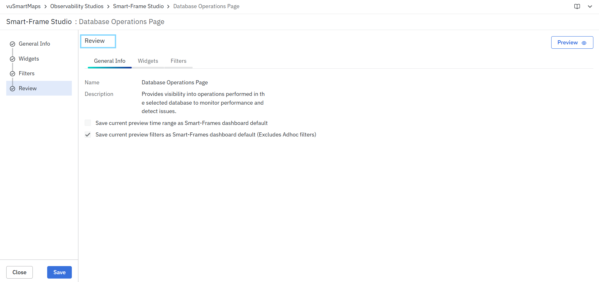
The Review step is the final stage of the Smart Frame creation workflow. It allows you to verify the Smart Frame configuration before saving. The Review page provides a consolidated view of the configured General Information, Widgets, and Filters, enabling you to validate the setup and make any necessary changes before publishing the Smart Frame.
Reviewing the Smart Frame Configuration
The Review page is organized into the following tabs:
- General Info – Displays the Smart Frame name and description.
- Widgets – Displays all widgets added to the Smart Frame along with their configuration details and validation status.
- Filters – Displays all Smart Frame-level filters configured for the dashboard.
You can navigate between these tabs to review the complete Smart Frame configuration before saving.
General Info
The General Info tab displays the Smart Frame details configured during the first step of the workflow.
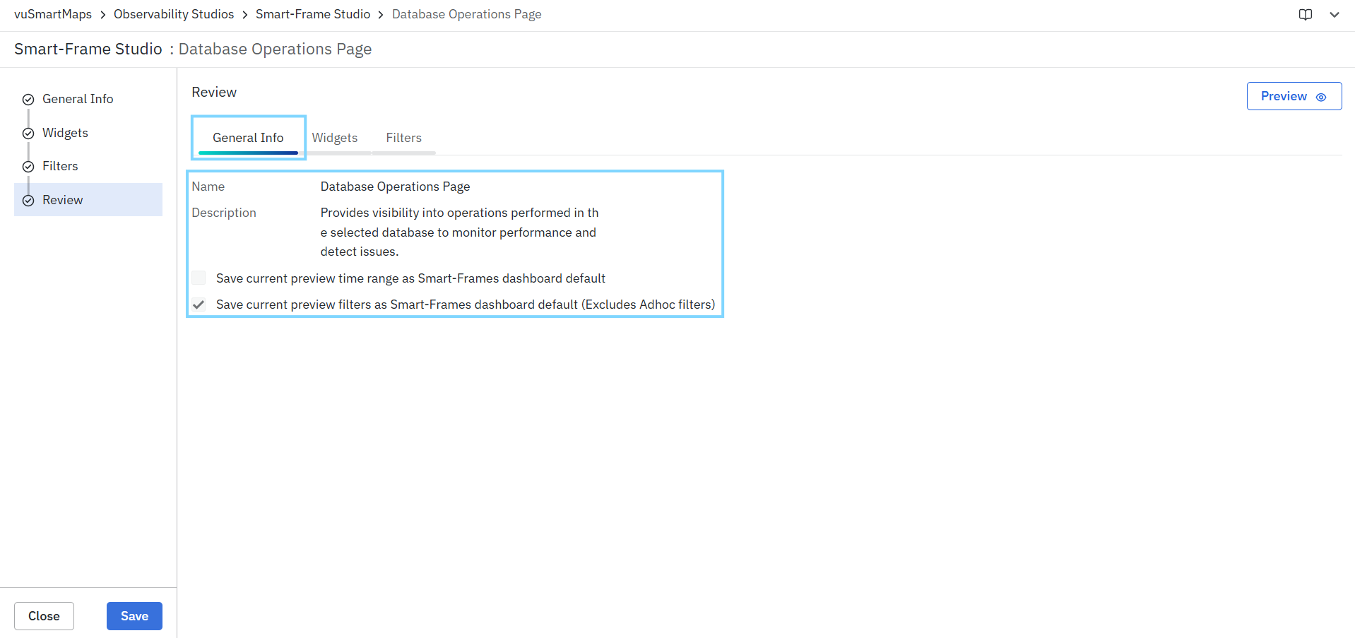
It includes:
- Name – The name of the Smart Frame.
- Description – A brief description of the Smart Frame's purpose.
- Save current preview time range as Smart-Frames dashboard default – Saves the currently selected preview time range as the default time range when the Smart Frame is opened.
- Save current preview filters as Smart-Frames dashboard default (Excludes Adhoc filters) – Saves the currently selected filter values as the default filters for the Smart Frame.
Widgets
The Widgets tab displays all widgets configured for the Smart Frame and provides validation information for each widget.
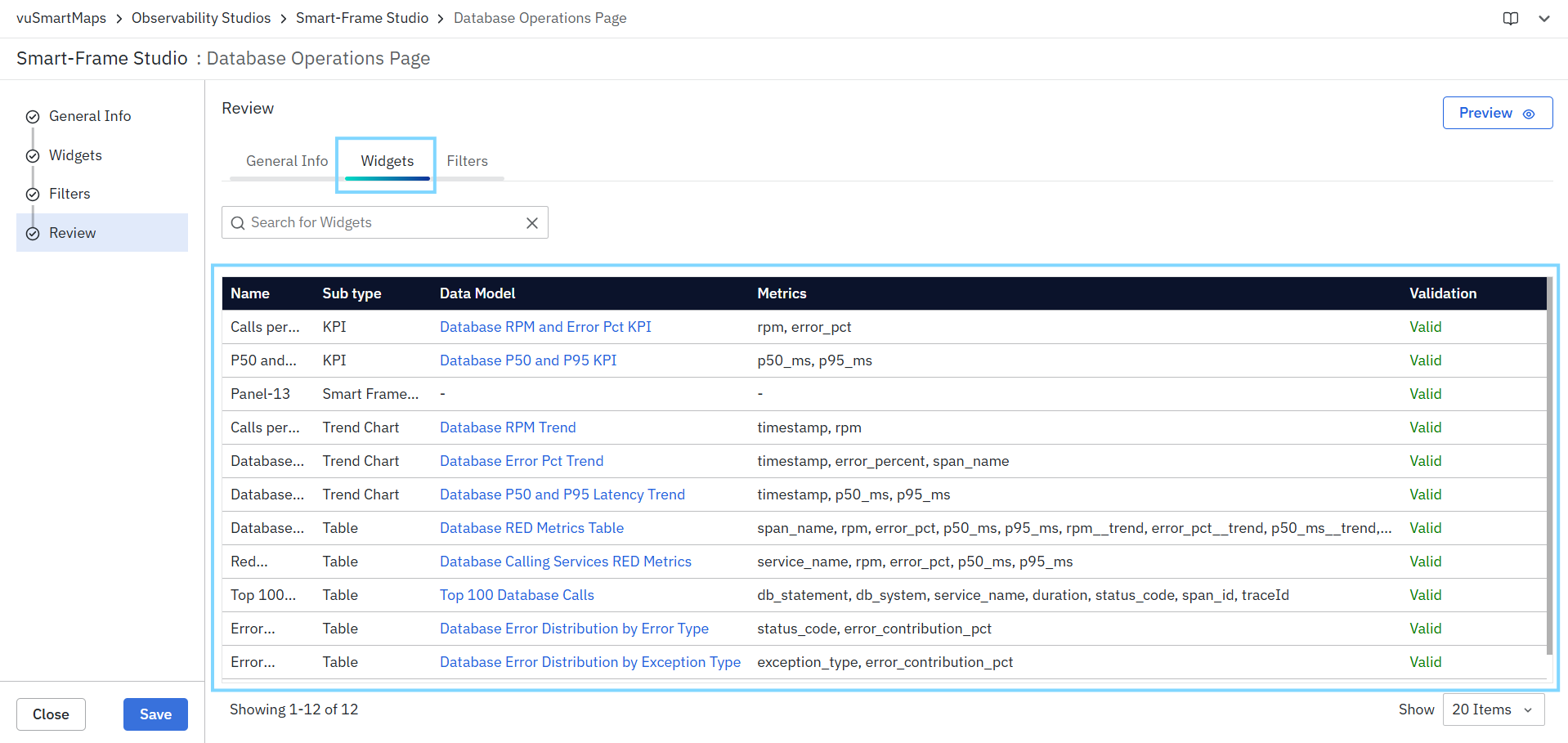
The widget summary table includes the following details:
| Field | Description |
|---|---|
| Name | Name of the widget. |
| Sub Type | Widget type, such as KPI, Trend Chart, Table, Smart Frame Link, and so on. |
| Data Model | Data model used by the widget. |
| Metrics | Metrics configured for the widget. |
| Validation | Indicates whether the widget configuration is valid and ready for use. |
Use this tab to verify that all required widgets have been added and validated successfully.
Filters
The Filters tab displays all Smart Frame-level filters configured for the dashboard.

The filter summary table includes the following details:
| Field | Description |
|---|---|
| Name | Internal filter name used as the template variable. |
| Display Name | Filter label displayed to users within the Smart Frame. |
| Type | Filter type such as Query, Data Model, Custom, Text, or Adhoc. |
| Description | Help text associated with the filter, if configured. |
Use this tab to verify that the required filters have been configured correctly and are available for use across widgets.
Previewing the Smart Frame
Before saving the Smart Frame, you can preview the complete dashboard configuration.

To preview the Smart Frame:
- Click Preview in the upper-right corner of the Review page.
- The Smart Frame opens in preview mode.
- Review the dashboard layout, widgets, visualizations, and configured filters.
- Verify that widgets display the expected data and that filters function correctly.
- Close the preview and return to the Review page if additional changes are required.
The preview provides an end-to-end view of the Smart Frame exactly as it will appear to users after it is saved.
Saving the Smart Frame
After reviewing the configuration and validating the preview:
- Click Save.
- The Smart Frame is created and becomes available in Smart-Frame Studio.
Example Outcome: After saving, the Smart Frame appears in the Smart-Frame Studio catalog and can be opened, shared, and used for monitoring and analysis with the configured widgets and filters.
FAQs
What are the steps to create a Smart Frame?
The Smart Frame creation workflow consists of four steps: General Info, Widgets, Filters, and Review. After reviewing the configuration, you can save the Smart Frame.
What types of widgets can I add to a Smart Frame?
You can add Text, Visualization, Smart-Frame Links, and Insight Card widgets. Multiple widget types can be combined within the same Smart Frame.
What visualization types are supported in Smart Frames?
Smart Frames support Table, Trend Chart, KPI, Pro Charts, Service Map, Service Flow, and Dynamic Insights visualizations.
What is the difference between Standard and Custom Data Models?
Standard Data Models provide predefined aggregation and query configurations, while Custom Data Models allow users to configure aggregations and additional options such as Bucket, Time Series, Filter, Order, and Limit.
What types of filters can I configure for a Smart Frame?
You can configure Query, Data Model, Custom, Text, and Adhoc filters. These filters can be applied across widgets within the Smart Frame.
Can I configure navigation and drill-down interactions for visualizations?
Yes. You can configure Panel Links and Data Links to navigate to related Smart Frames, external pages, or other supported destinations. Data Links can also pass selected data as filters or apply conditions.
What can I verify during the Review step?
The Review step provides a consolidated view of the General Info, Widgets, and Filters configuration. You can validate widget configurations, preview the complete Smart Frame, verify data and filters, and then save it.
