APM Dashboards
Accessing Application Performance Monitoring Dashboards
The Application Performance Monitoring (APM) section in vuSmartMaps provides a centralized observability experience for monitoring application health, analyzing service dependencies, tracking transactions, and troubleshooting performance issues across distributed systems.
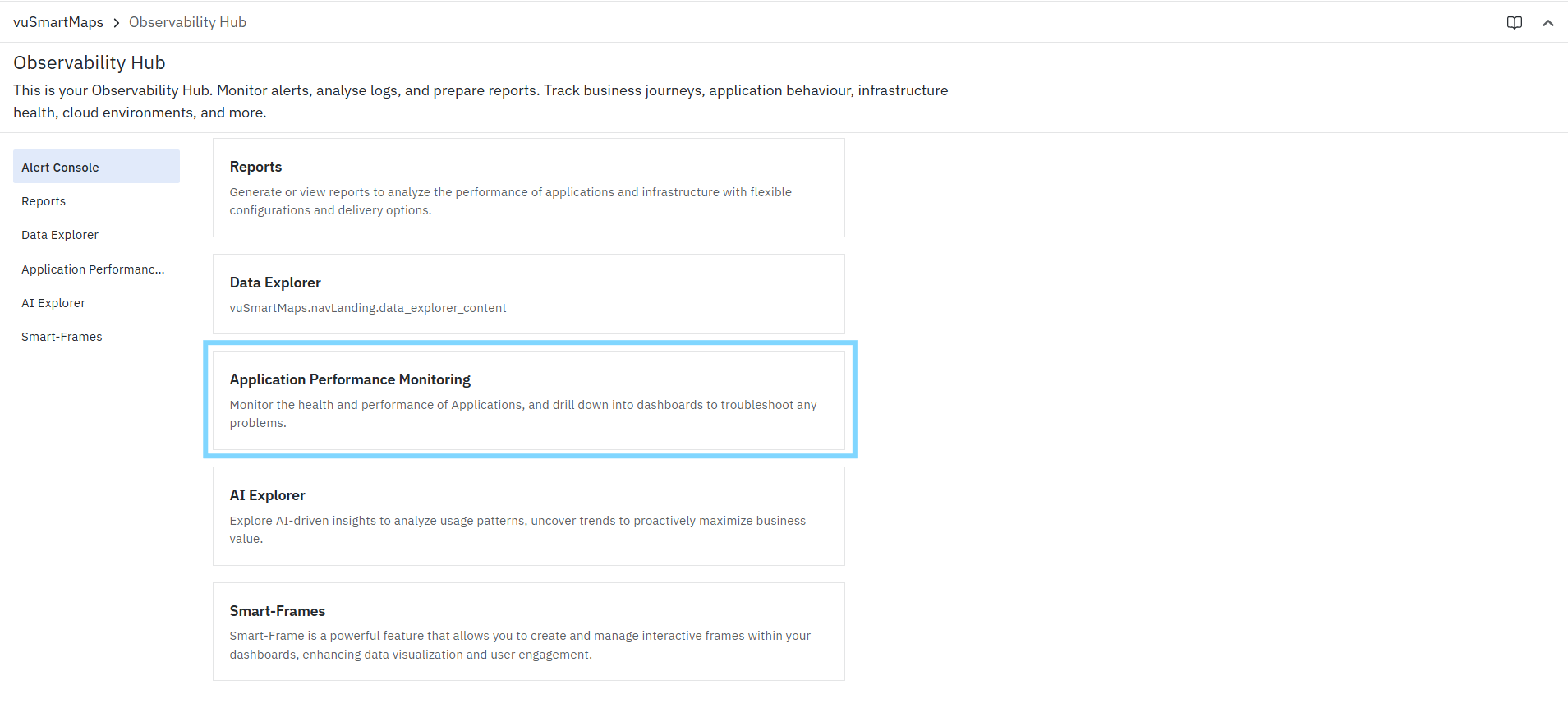
To access the APM Dashboard:
- From the left navigation menu, go to Observability Hub.
- In the Observability Hub page, select Application Performance Monitoring.
The Application Performance Monitoring page opens and displays the APM dashboard landing page, where the available dashboards are organized for quick access.
Application Performance Monitoring Overview
The Application Performance Monitoring page serves as the central workspace for monitoring the health and performance of applications in vuSmartMaps. It provides access to multiple APM dashboards that help you analyze service behavior, visualize dependencies, inspect traces, monitor transactions, and identify performance bottlenecks or failures.
APM Landing Page
The Application Performance Monitoring landing page acts as the entry point to the APM dashboards. It displays the available dashboard categories in a structured list and allows users to quickly open the dashboard most relevant to their analysis.
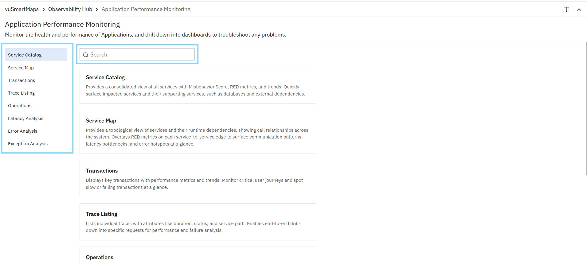
The page includes:
- A left-side navigation panel listing all available APM dashboards
- A search bar to quickly find a dashboard
- A dashboard card area that displays the available dashboards with short descriptions
Dashboard Categories in APM
The Application Performance Monitoring section includes the following dashboards:
- Service Catalog: The Service Catalog dashboard provides a consolidated view of all discovered services along with key performance indicators such as service health, traffic, latency, and failure trends. It helps you quickly identify impacted services and understand their operational behavior.
- Service Map: The Service Map dashboard provides a topological view of services and their runtime dependencies. It helps visualize service-to-service communication paths, identify dependency relationships, and detect latency or error hotspots across the application landscape.
- Transactions: The Transactions dashboard displays key business and technical transactions with their performance metrics and trends. It helps you monitor critical user journeys and quickly identify slow or failing transactions.
- Trace Listing: The Trace Listing dashboard displays individual traces with important attributes such as duration, status, and service path. It enables end-to-end visibility into requests and supports drill-down analysis for troubleshooting performance and failures.
- Operations: The Operations dashboard provides span-level visibility into service operations. It helps identify slow, error-prone, or high-impact internal operations that contribute to service degradation or latency issues.
- Latency Analysis: The Latency Analysis dashboard helps analyze latency distribution, latency trends, and contributing factors across services and requests. It is useful for identifying bottlenecks and understanding what is driving performance degradation.
- Error Analysis: The Error Analysis dashboard helps track error rates, failure trends, and impacted services or APIs. It enables faster identification of error hotspots and supports investigation into the services or operations contributing to failures.
- Exception Analysis: The Exception Analysis dashboard surfaces application exceptions across services and helps identify recurring issues, exception trends, and potential root causes. It is useful for understanding exception-heavy services and troubleshooting application failures in detail.
Each dashboard focuses on a specific aspect of application observability and can be used independently or as part of a drill-down workflow.
Dashboard Controls, Filters, and Panel Actions
This section describes the common controls, filtering capabilities, and panel-level actions available across APM dashboards. These features help you customize the view, narrow down data, and perform deeper analysis efficiently.
Dashboard Controls

At the top-right of the dashboard, the following controls are available:
- Studio: Opens the dashboard in SmartFrames Studio, allowing you to view or modify the dashboard configuration.
- Time Range Selector: Lets you select the time window for analysis (for example, last 5 minutes, last 3 hours, or last 30 days).
The selected time range is applied consistently across all panels in the dashboard. - Zoom/Search: Helps you navigate and adjust the dashboard view for better visibility and focused exploration.
- Refresh: Reloads the dashboard with the most recent data, ensuring you are viewing the latest metrics.
Filters
The top section of the dashboard provides filters that allow you to refine the data displayed across all panels. These filters enable contextual analysis by narrowing down results based on specific criteria.
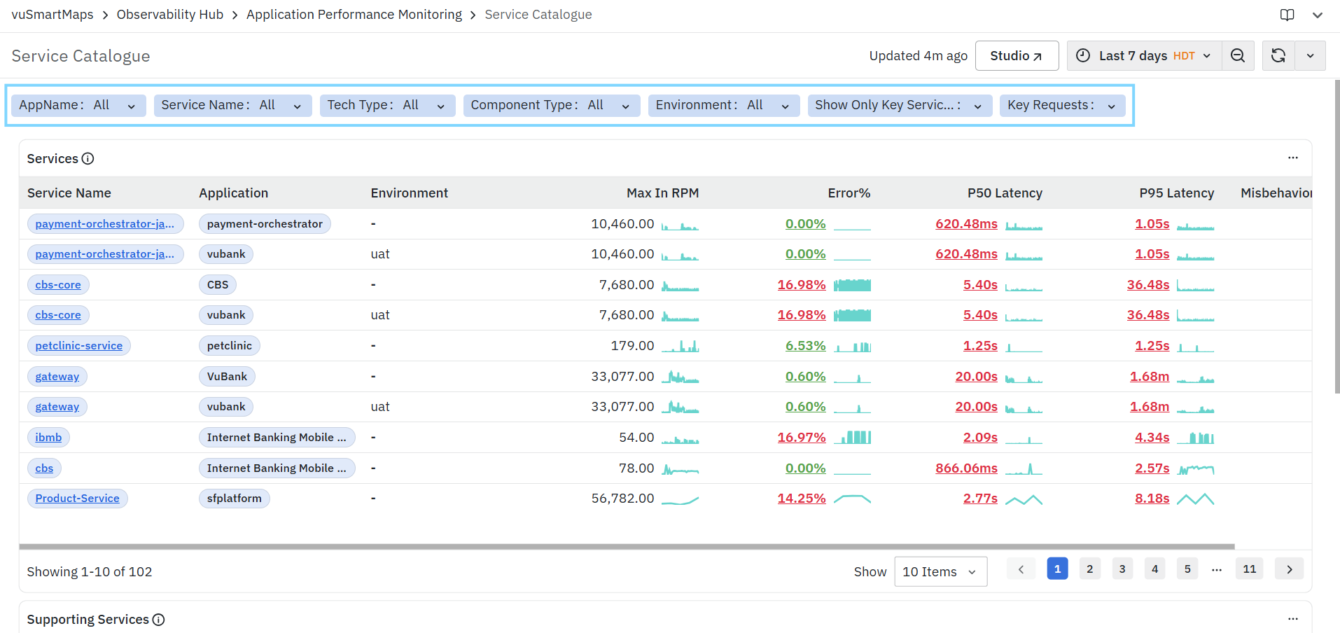
Depending on the dashboard, filters may include:
- Service and Application Context: Filter data based on services, applications, service clusters, or anchor services to focus on a specific part of the system.
- Transaction and Operation Context: Narrow down data to specific transactions, APIs, or operations for deeper request-level analysis.
- Infrastructure and Environment Context: Filter based on environment, host, server, or location to isolate issues in specific deployments or infrastructure layers.
- Error and Result Context: Analyze failures by filtering on result type, exception type, or HTTP status codes.
- Performance Context: Apply filters such as duration thresholds or latency conditions to identify slow or degraded transactions.
- Attribute-Based Filtering: Use attribute keys and values to perform granular filtering across spans and traces, including custom or business-specific attributes.
- Key Data Focus: Focus on critical data using options like key services or key requests to reduce noise and highlight high-impact areas.
- Trace-Level Filtering (where applicable): Filter using trace identifiers to investigate individual request executions.
All filters dynamically update the entire dashboard, ensuring a consistent and contextual view across all panels.
Adhoc Filter (Advanced)
The Adhoc Filter allows you to create dynamic, custom filters without modifying the predefined filters in the dashboard.

This is especially useful when:
- Investigating specific attributes or edge cases
- Performing deep-dive analysis on selected data
- Isolating specific services, transactions, traces, or hosts
To use the Adhoc Filter:
- Click + Adhoc Filter
- Select a field (column)
- Choose one or more values
- Add additional conditions if required
- Click Apply
The applied filters are reflected across all panels, enabling precise and targeted analysis.
Panel Actions
Each panel includes a More options menu that provides additional actions for navigation, inspection, and deeper analysis.
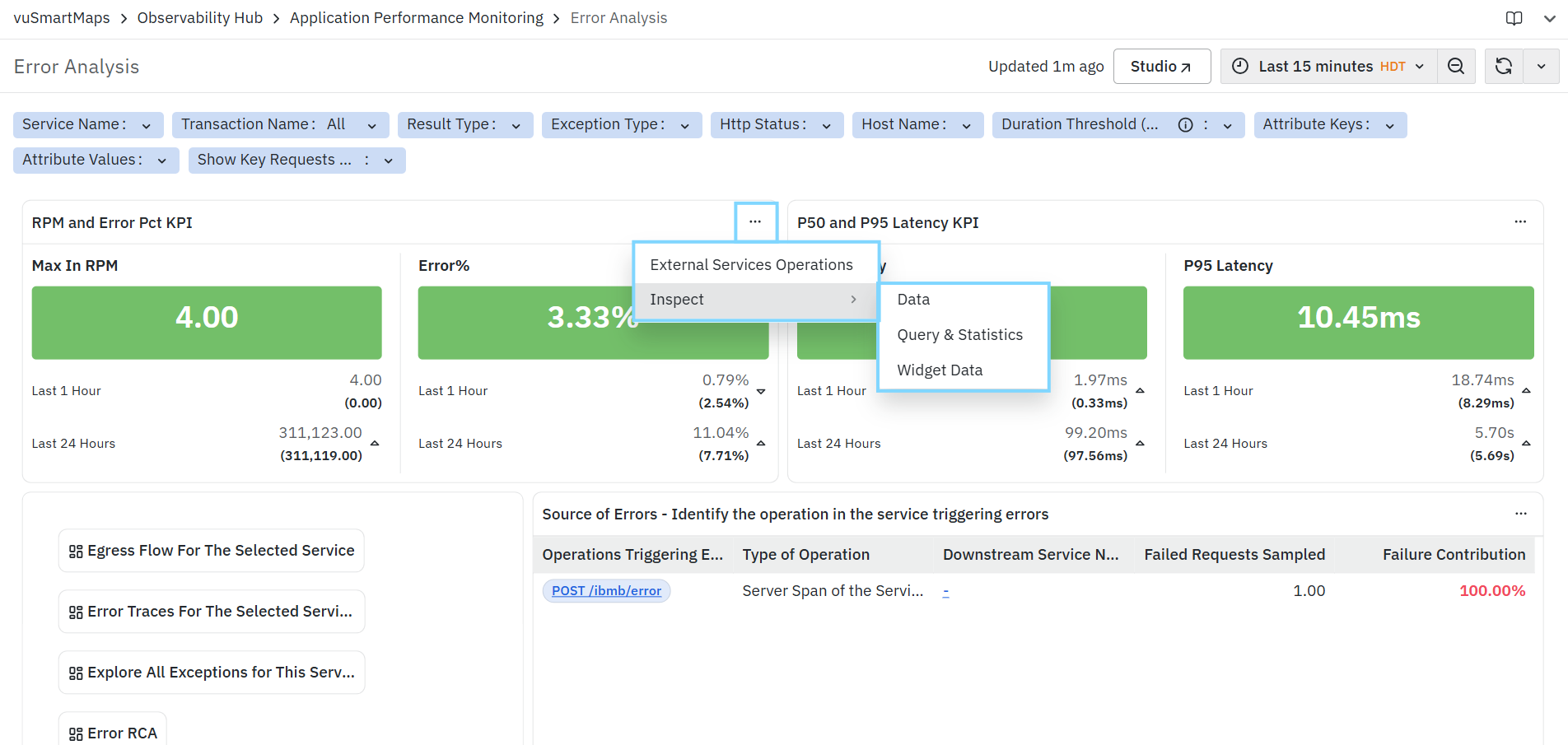
The available actions may vary depending on the panel, and typically include:
- Open Detailed / Related View
- Navigates to a more detailed or context-specific view (such as service-level, transaction-level, trace-level, or dependency analysis).
- This allows you to move from aggregated metrics to a deeper investigation without manually reapplying filters.
- Test (available only for applicable panels): Allows you to validate and test the panel configuration.
- Inspect

The Inspect option provides detailed information about the data, query execution, and widget configuration for the selected panel. It is accessible from the three-dot menu of the panel.
It includes the following sections:
Data
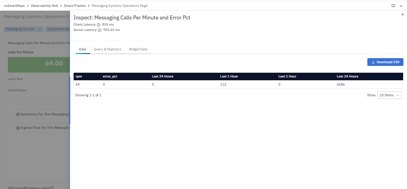
The Data tab displays the actual data used in the panel.
- Shows metric values such as rpm and error_pct
- Displays values for different time ranges (for example, Last 1 Hour, Last 24 Hours)
- Provides an option to Download CSV for exporting the data
- Displays the number of rows returned
This section provides visibility into the underlying dataset used to render the panel.
Query & Statistics

The Query & Statistics tab displays query execution details.
It includes:
- Query blocks (A, B, C, etc.) representing individual queries used in the panel
- Query Runtime – Time taken to execute the query
- Memory Used – Memory consumption during execution
- Rows Scanned – Number of rows processed
- Rows Returned – Number of rows returned by the query
This section provides insights into query performance and execution behavior.
Widget Data
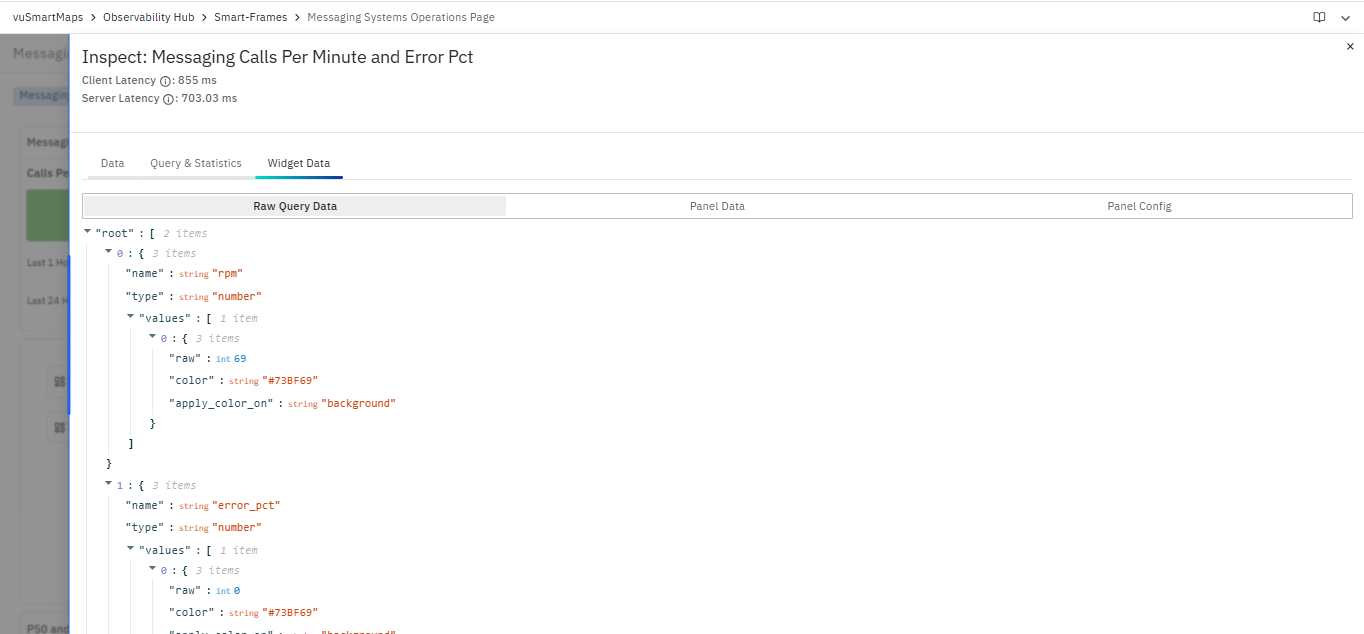
The Widget Data tab displays the structured data and configuration used by the widget.
It includes:
- Raw Query Data – Displays raw data returned from the query
- Panel Data – Displays processed data used for rendering
- Panel Config – Displays configuration applied to the panel
The data is shown in structured format, including:
- Metric name (for example, rpm, error_pct)
- Data type
- Values and formatting attributes (such as color and display configuration)
This section provides a detailed view of how data is structured and rendered within the widget.
Available filters and panel actions may vary depending on the dashboard and the selected analysis context.
Service Catalogue
The Service Catalogue is the landing dashboard in the Application Performance Monitoring (APM) module. It provides a consolidated view of all instrumented application services and their supporting services, along with key RED metrics, including request volume, error rate, and latency. This dashboard helps you quickly identify services that may be experiencing performance issues and acts as the starting point for deeper analysis.
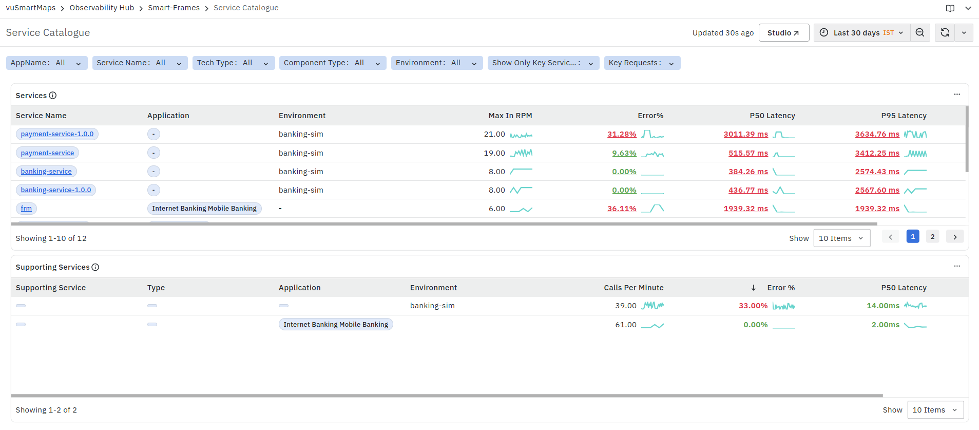
The dashboard is divided into two main panels:
At the top of the dashboard, you can also use the available filters and time controls to narrow down the displayed data based on your monitoring requirements.
Services Panel
The Services panel displays all instrumented application services in the selected scope along with their key RED metrics and trend indicators. This panel is primarily used to get a quick overview of service health and to identify services that may require immediate attention.

It helps you identify:
- Services handling high request traffic
- Services with elevated error rates
- Services with higher latency
- Services showing abnormal or high-impact behavior based on the Misbehavior Score
The panel includes the following columns:
- Service Name: Displays the name of the instrumented service.
- The Service Name is clickable. When you click a service name, a context menu is displayed with the following options:
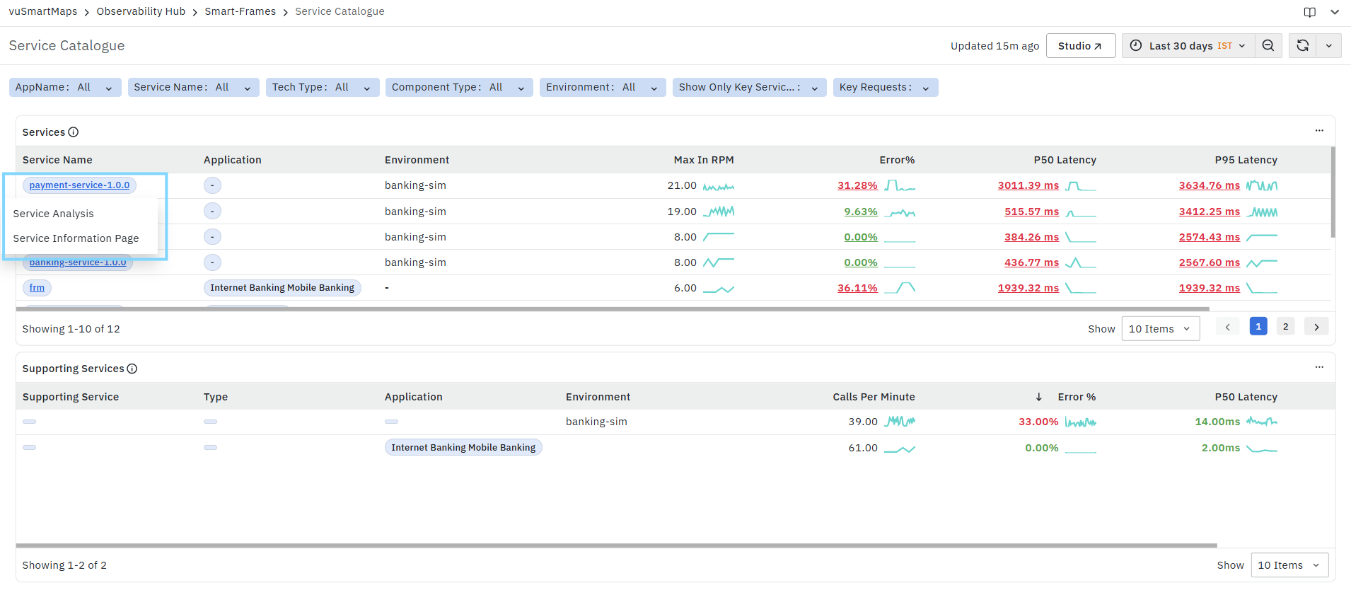
- Service Analysis: Selecting Service Analysis opens the Service Analysis page for the selected service with the required service context already applied. To learn more about this page, refer to Service Analysis.

- Service Information Page: Selecting Service Information Page opens the Service Information Page for the selected service with the selected context. To learn more about this page, refer to the Service Analysis Page.

-
This makes the Service Name the primary entry point for navigating from the Service Catalogue to detailed service-level analysis and service metadata views.
-
Application: Displays the application associated with the service.
- This helps you understand which application the service belongs to, especially in environments where multiple applications are being monitored.
-
Environment: Displays the environment in which the service is running, such as development, staging, or production.
- This is useful when the same service exists across multiple environments, and you want to isolate performance issues to a specific environment.
-
Max In RPM: Displays the maximum inbound requests per minute observed for the service during the selected time range.
- This metric helps you understand the peak traffic handled by the service and quickly identify high-traffic services. A sparkline is displayed alongside the value to provide a quick visual indication of the traffic trend.
-
Error%: Displays the percentage of requests that resulted in errors for the service.
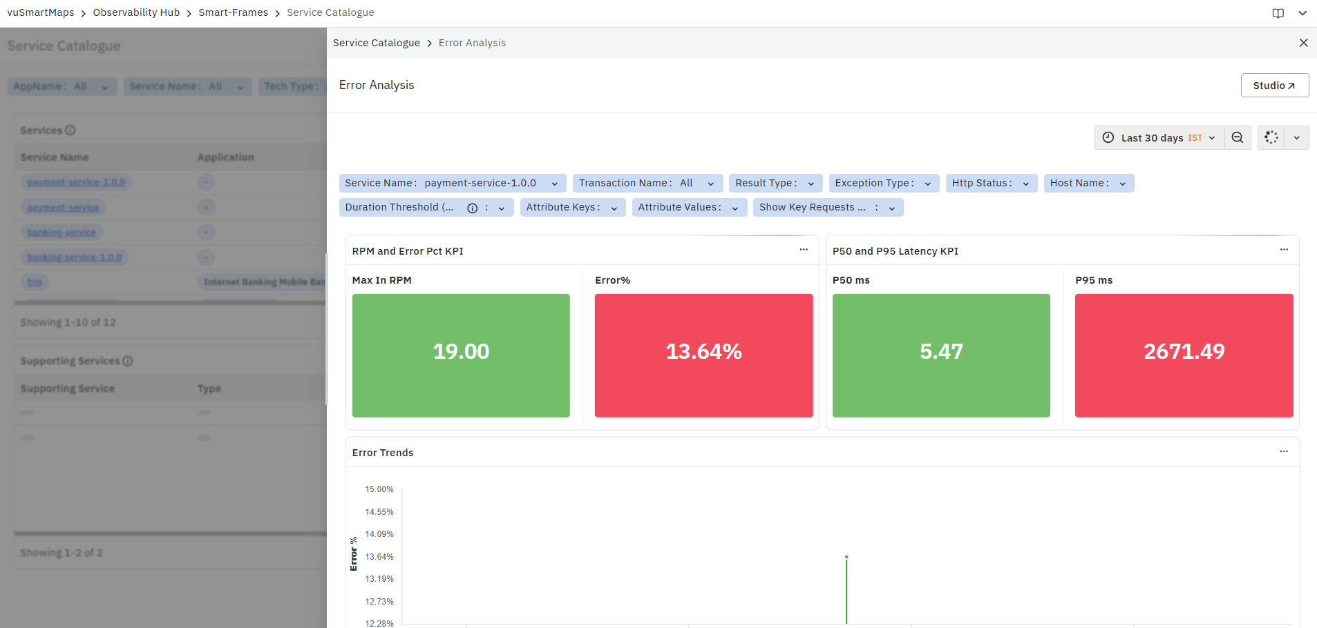
- This value is clickable. When you click an Error% value, the platform opens the Error Analysis page with the required condition already applied for the selected service and metric context.
-
This helps you move directly from a high-level error indication to a detailed error investigation without manually applying filters.
- A sparkline is also displayed next to the value to help you quickly observe recent error behavior.
-
P50 Latency: Displays the median response time of the service.
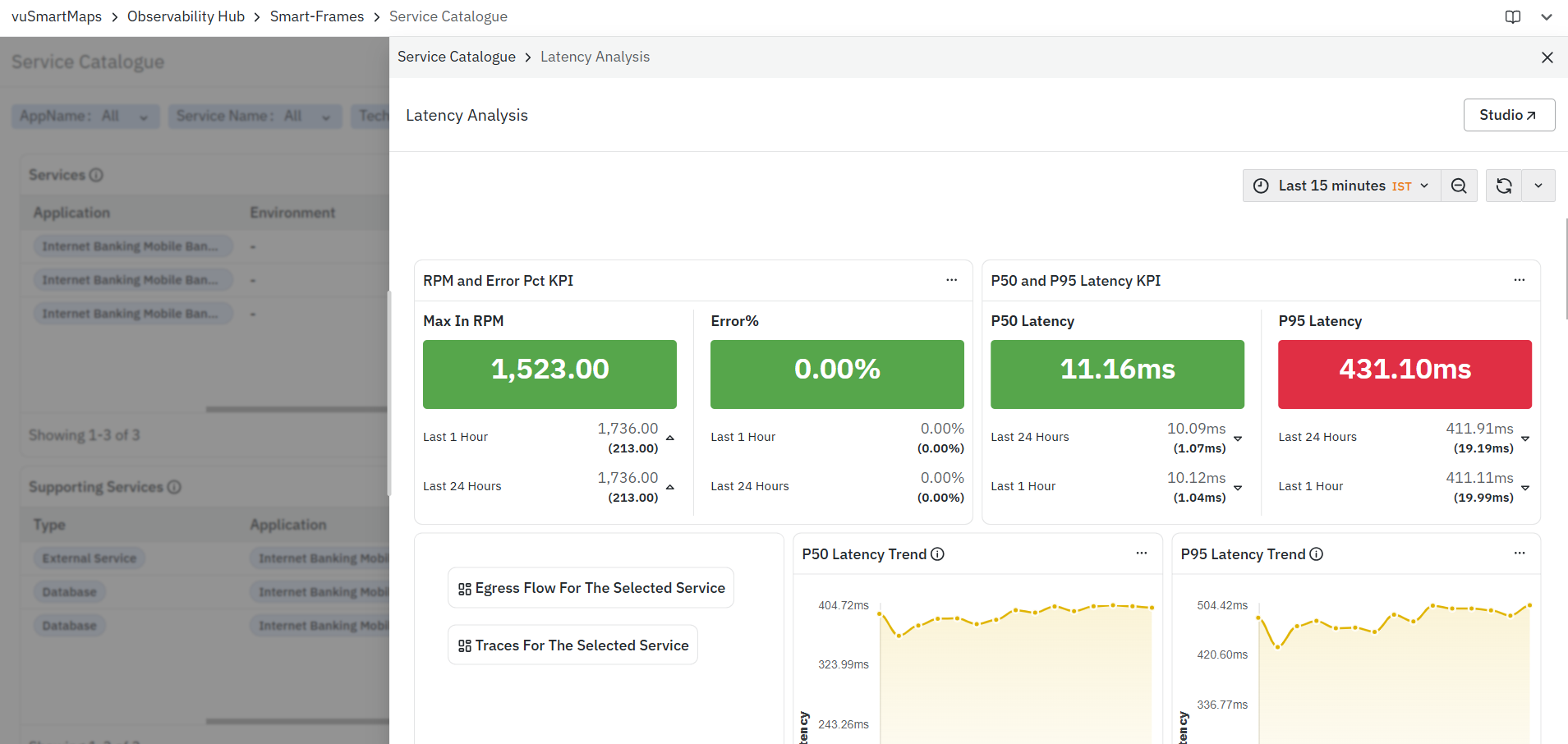
- The P50 Latency value is clickable. When you click a P50 Latency value, the platform opens the Latency Analysis page with the required condition already applied for the selected service and metric context.

-
This helps you directly investigate typical service response performance for the selected service.
- A sparkline is shown next to the value to indicate the recent latency trend.
-
P95 Latency: Displays the 95th percentile response time of the service.
-
This metric is useful for identifying slower requests and understanding tail latency, which may not always be visible through median values alone.
-
The P95 Latency value is also clickable. When you click a P95 Latency value, the platform opens the Latency Analysis page with the required condition already applied for the selected service and metric context.
-
-
This is especially useful when you want to investigate performance degradation affecting slower or outlier requests.
- A sparkline is displayed next to the value for quick trend visibility.
-
Misbehavior Score: Displays a calculated score that indicates how abnormal or impactful the service behavior is compared to its recent baseline.
-
The Misbehavior Score helps prioritize which services need attention first by combining:
-
Behavioral deviation from normal patterns
-
Service impact
-
Traffic significance
-
-
A higher score generally indicates that the service is behaving unusually and may be contributing to a larger or more impactful issue. This makes it easier to identify services that should be investigated first, especially in large environments with many services.
-
Supporting Services Panel
The Supporting Services panel displays dependent services that support application services, such as databases, messaging systems, and external services. These are services that application services interact with, and that may contribute to latency or error conditions. This panel helps you understand whether a downstream dependency may be impacting application performance.
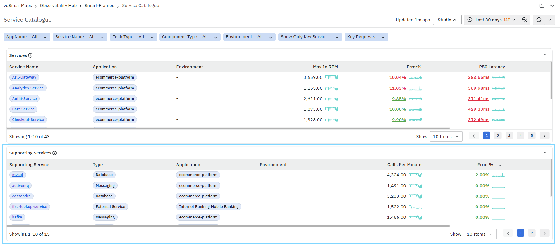
The panel includes the following columns:
- Supporting Service: Displays the name of the supporting service.
- This can represent a database, messaging system, or external service used by the application services.
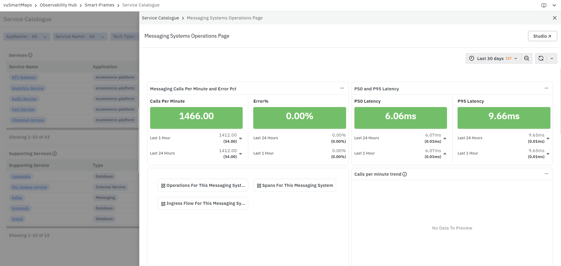
- The Supporting Service name is clickable. Selecting a supporting service opens the corresponding operations page for that service based on its type, with the required context applied.
-
For example, depending on the selected service, it may open the
-
For more information, see the respective operations pages later in this guide.
-
Selecting the relevant option opens the corresponding operations page for the selected supporting service with the required context applied. These pages will be explained in detail later in the guide.
-
Type: Displays the type of supporting service. This helps identify whether the dependency is, for example:
-
A Database
-
A Messaging System
-
An External Service
-
This is useful when you want to quickly understand the nature of the dependency before moving into deeper analysis.
-
-
Application: Displays the application associated with the supporting service context.
- This helps correlate the dependency with the application that is interacting with it.
-
Environment: Displays the environment in which the supporting service interaction is observed.
- This is useful for isolating issues to a specific deployment environment.
-
Calls Per Minute: Displays the number of calls made to the supporting service.
- This metric helps you understand how frequently the dependency is being used and whether it is under significant load. A sparkline is displayed alongside the value to show the recent trend.
-
Error %: Displays the percentage of calls to the supporting service that resulted in errors.
- A higher value may indicate failures in database calls, messaging interactions, or external service requests. A sparkline is displayed to help visualize the recent trend.
-
P50 Latency: Displays the median latency for calls made to the supporting service.
- This helps you understand the typical response time of the dependency and whether it may be contributing to service slowness.
-
P95 Latency: Displays the 95th percentile latency for calls made to the supporting service.
- This helps identify slower or outlier dependency calls that may impact end-user transactions even when the median latency appears normal.
Service Information Page
The Service Information Page provides a consolidated view of the selected service's identity, runtime technology, deployment environment, and service dependencies. It helps administrators and application owners understand the configuration, technology stack, and communication patterns of a service without navigating across multiple dashboards. The information displayed on this page is automatically collected from telemetry data and reflects the selected time range.
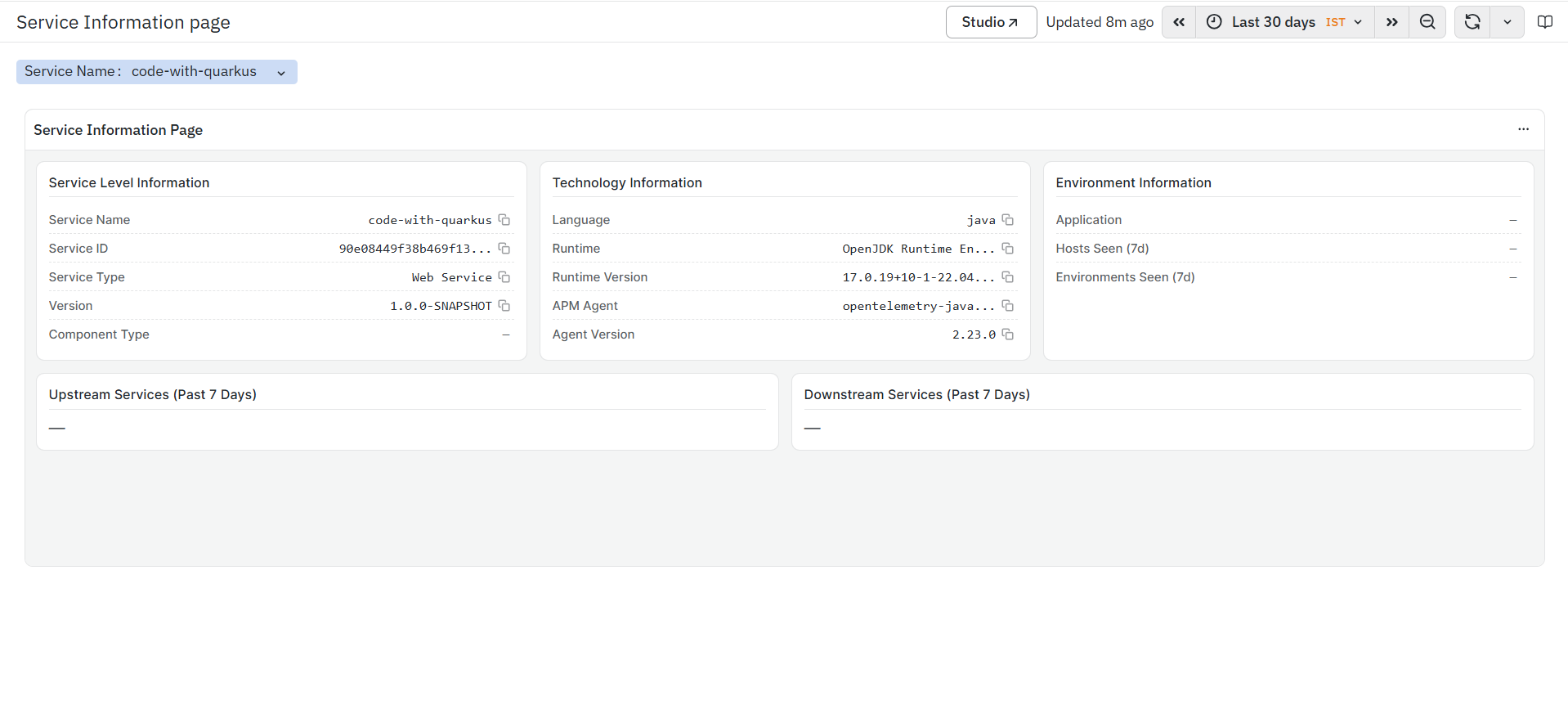
The page is divided into the following sections:
- Service Level Information
- Technology Information
- Environment Information
- Upstream Services (Past 7 Days)
- Downstream Services (Past 7 Days)
What this page shows
- Basic information about the selected service.
- Runtime and technology stack details.
- Deployment and environment information.
- Upstream and downstream service dependencies observed during the last seven days.
Service Level Information
The Service Level Information panel displays the basic metadata associated with the selected service. This section helps identify the service and understand its deployment details.
The panel includes the following fields:
- Service Name:
- Displays the name of the selected service.
- This helps identify the monitored service.
- Service ID:
- Displays the unique identifier assigned to the service.
- This helps uniquely identify the service across the monitored environment.
- Service Type:
- Displays the category of the monitored service.
- Examples include:
- Web Service
- Database Service
- Messaging Service
- This helps identify the role of the service within the application architecture.
- Version:
- Displays the deployed version of the selected service.
- This helps verify the application version currently running.
- Component Type:
- Displays the component classification associated with the service, if available.
- This helps identify the application component represented by the service.
A copy icon is available next to supported fields to quickly copy the displayed values.
Technology Information
The Technology Information panel displays the runtime and instrumentation details of the selected service. This information is automatically discovered from telemetry collected by the APM agent.
The panel includes the following fields:
Language: Displays the programming language used to develop the service.
Examples include:
- Java
- Python
- .NET
- Node.js
This helps identify the technology stack used by the application.
Runtime:
- Displays the runtime environment in which the service is running.
- This helps identify the execution platform of the application.
Runtime Version:
- Displays the version of the runtime environment.
- This helps verify the runtime version used by the deployed service.
APM Agent:
- Displays the instrumentation agent collecting telemetry data for the service.
- This helps identify the monitoring agent configured for the application.
Agent Version:
- Displays the version of the installed APM agent.
- This helps verify the instrumentation version deployed with the application.
Environment Information
The Environment Information panel displays deployment-related information associated with the selected service.
The panel includes the following fields:
Application:
- Displays the application to which the selected service belongs.
- This helps correlate the service with its parent application.
Hosts Seen (7d):
- Displays the hosts on which the selected service has been observed during the last seven days.
- This helps identify the infrastructure hosting the service.
Environments Seen (7d): Displays the deployment environments in which the service has been observed during the last seven days.
Examples include:
- Development
- Test
- UAT
- Production
This helps understand where the service has been deployed.
Upstream Services (Past 7 Days)
The Upstream Services (Past 7 Days) panel displays the services that invoked the selected service during the last seven days.
This section helps you:
- Identify services sending requests to the selected service.
- Understand upstream service dependencies.
- Analyze request flow across dependent services.
If no upstream dependencies are detected during the selected time range, the panel remains empty.
Downstream Services (Past 7 Days)
The Downstream Services (Past 7 Days) panel displays the services invoked by the selected service during the last seven days.
This section helps you:
- Identify downstream service dependencies.
- Understand service-to-service communication.
- Analyze outbound request flows from the selected service.
If no downstream dependencies are detected during the selected time range, the panel remains empty.
Service Map
The Service Map is a dashboard in the Application Performance Monitoring (APM) module. It visualizes how services communicate with each other by displaying upstream and downstream dependencies along with key performance indicators.
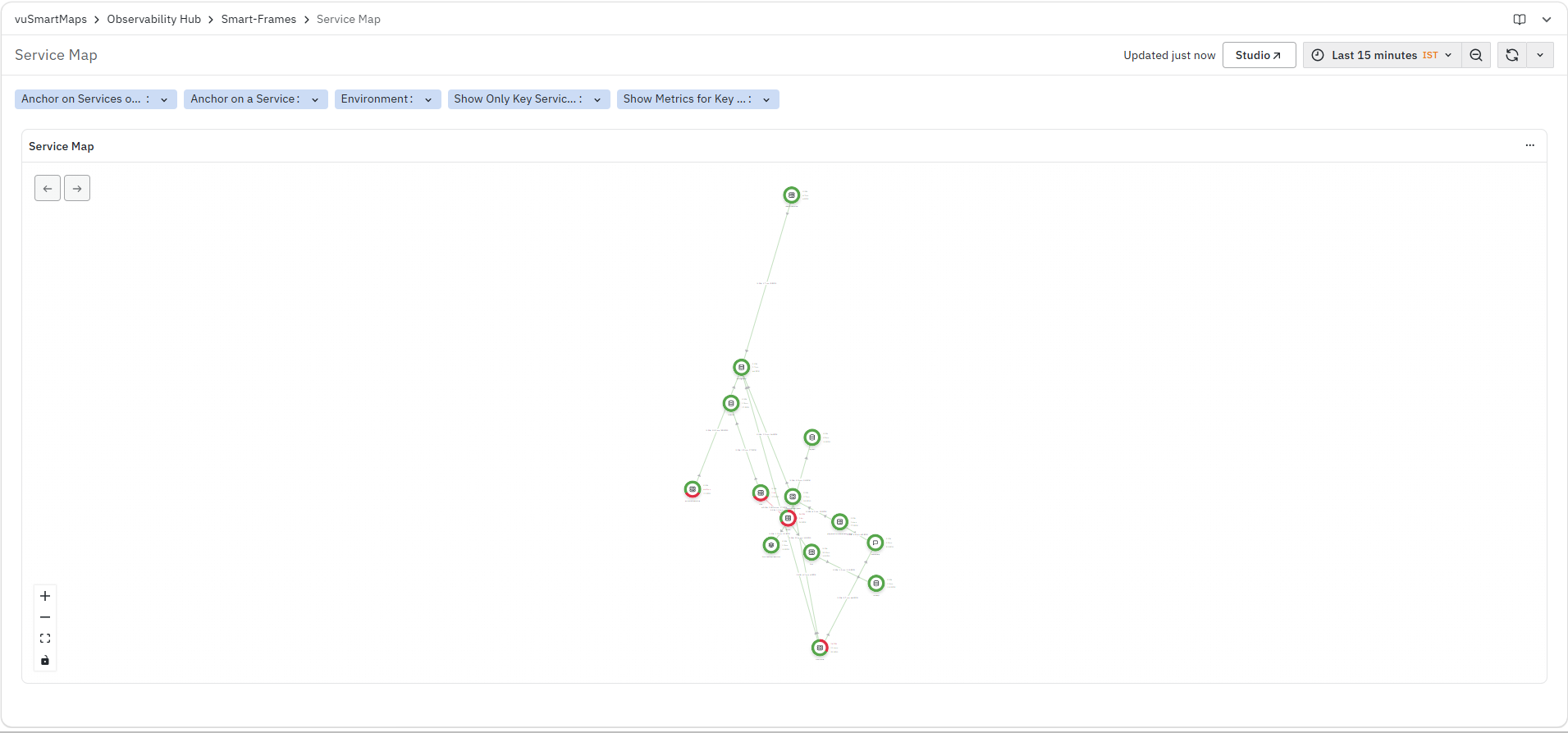
It helps you identify:
- Upstream and downstream service dependencies
- Service communication paths
- Services experiencing higher error rates or latency issues
- Potential bottlenecks and failure impact areas
Transactions Page
The Transactions Page is a dashboard in the Application Performance Monitoring (APM) module. It provides a consolidated view of business and API transactions by analyzing request rate, latency, and error behavior across endpoints. This dashboard helps you monitor transaction performance, identify slow or failing APIs, and analyze trends in request behavior over time.

The dashboard is divided into multiple panels:
- Top 100 Transactions Performance
- Top 5 Transactions By RPM
- Top 5 Transactions by Error Rate Trend
- Top 5 Transactions by Latency Trend (P50)
- Top 5 Transactions by Latency Trend (P95)
- Error Distribution by Http Code
- Error Distribution by Error Type
Top 100 Transactions Performance
The Top 100 Transactions Performance panel displays RED metrics (Request Rate, Error Rate, and Latency) for the top 100 endpoints of the selected service. This panel is primarily used to get a comparative view of transaction performance and identify high-impact APIs.

It helps you identify:
- High-traffic transactions
- Transactions with higher error rates
- Transactions with higher latency
- Performance patterns across endpoints
The panel includes the following columns:
- Endpoint: Displays the API endpoint or transaction name.
- All endpoints in this panel are clickable. When you click an endpoint, the platform navigates to the Trace Listing Page, applying the selected transaction as a filter.

- Trace Listing Page - Displays individual request traces for the selected endpoint. It allows you to view request-level details such as timestamp, duration, service name, and result type, helping you analyze slow or high-latency requests and identify issues at the trace level.
- Max In RPM: Displays the maximum requests per minute observed for the endpoint
- Error%: Displays the percentage of requests resulting in errors
- P50 Latency: Displays the median response time
- P95 Latency: Displays the 95th percentile response time
Top 5 Transactions By RPM
The Top 5 Transactions By RPM panel shows the trend of request rate (RPM) over time for the top 5 most frequently used endpoints of the selected service. This panel helps you understand how request traffic varies over time and highlights endpoints handling the highest load.

It helps you identify:
- High-traffic transactions
- Changes in request volume over time
- Frequently accessed endpoints
The panel displays:
- Request rate (RPM) plotted against timestamp for the top 5 endpoints
Top 5 Transactions by Error Rate Trend
The Top 5 Transactions by Error Rate Trend panel shows how the error percentage changes over time for the top 5 endpoints with the highest errors. This panel helps you track failure patterns and identify time periods where error rates increase.

It helps you identify:
- APIs with increasing error rates
- Time periods with higher failures
- Transactions consistently producing errors
The panel displays:
- Error percentage plotted against timestamp for the top endpoints
Top 5 Transactions by Latency Trend (P50)
The Top 5 Transactions by Latency Trend (P50) panel shows the trend of median latency over time for the top 5 endpoints where most requests are slower. P50 latency represents the typical response time experienced by users.
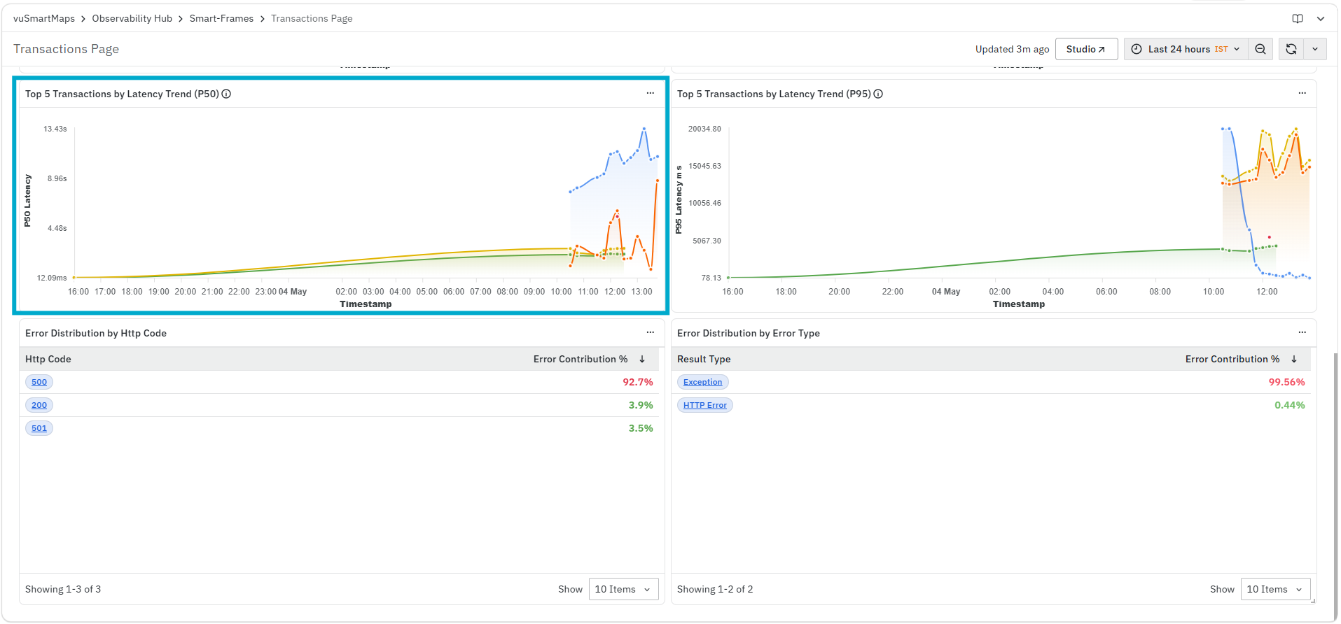
It helps you identify:
- Changes in typical response time
- Gradual latency degradation
- Endpoints with consistently higher median latency
The panel displays:
- P50 latency plotted against timestamp
Top 5 Transactions by Latency Trend (P95)
The Top 5 Transactions by Latency Trend (P95) panel shows the trend of P95 latency over time for the top 5 endpoints where requests are slowest. P95 latency highlights performance issues affecting slower requests.
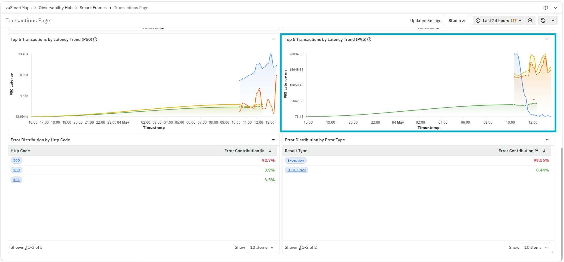
It helps you identify:
- High-latency transactions
- Performance issues affecting end users
- Latency spikes over time
The panel displays:
- P95 latency plotted against timestamp
Error Distribution by HTTP Code
The Error Distribution by HTTP Code panel displays the distribution of errors based on HTTP response status codes for the selected service and filters. This helps you understand which types of HTTP failures are contributing most to overall errors.

It helps you identify:
- Which HTTP status codes are causing failures
- The proportion of each HTTP error type
- Dominant error patterns affecting transactions
The panel includes the following columns:
- HTTP Code: Displays the HTTP status code associated with the error (for example, 500, 404). The HTTP Code is clickable. When you click a specific HTTP code, the platform opens the Error Analysis page for the selected context with the required filters already applied.

- Error Analysis: This page provides a comprehensive view of errors for the selected HTTP code, including key KPIs such as request rate, error percentage, and latency metrics (P50 and P95). It also includes detailed sections like source of errors, error distribution, and failure contribution to help you identify the operations and services causing issues. This enables you to analyze error patterns, understand impact across services, and investigate the root cause of failures effectively. For more details refer to Error Analysis.
- Error Contribution %: Displays the percentage contribution of each HTTP code to total errors.
Error Distribution by Error Type
The Error Distribution by Error Type panel displays the classification of errors based on their type, such as exceptions or HTTP errors. This helps you understand the nature of failures and whether they are application-level or protocol-level issues.

It helps you identify:
- Type of errors occurring in the system
- Relative contribution of each error type
- Whether errors are due to exceptions or HTTP failures
The panel includes the following columns:
- Result Type: Displays the type of error (for example, Exception, HTTP Error). The HTTP Code is clickable. When you click a specific HTTP code, the platform opens the Error Analysis page for the selected context with the required filters already applied.
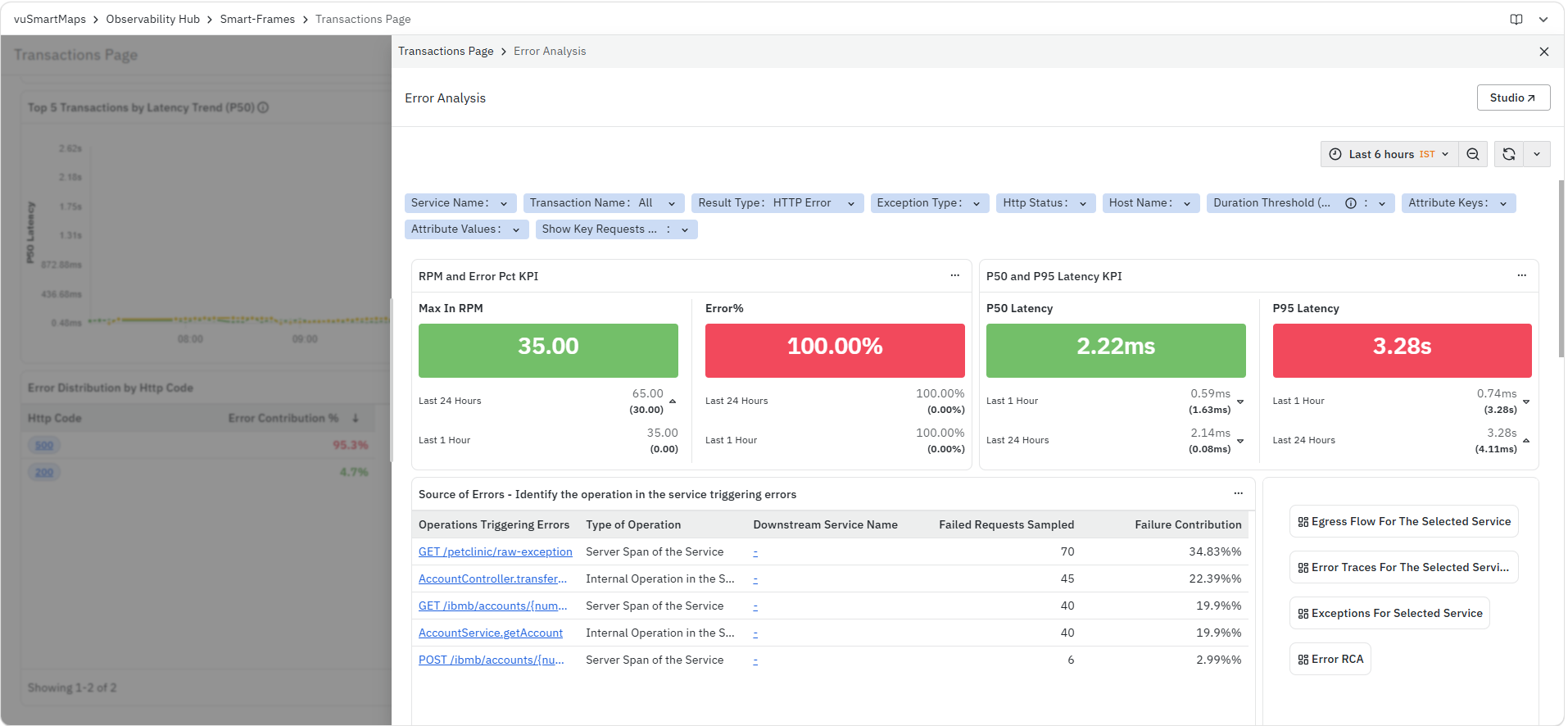
- Error Analysis: This page provides a comprehensive view of errors for the selected HTTP code, including key KPIs such as request rate, error percentage, and latency metrics (P50 and P95). It also includes detailed sections like source of errors, error distribution, and failure contribution to help you identify the operations and services causing issues. This enables you to analyze error patterns, understand impact across services, and investigate the root cause of failures effectively. For more details refer to Error Analysis.
- Error Contribution %: Displays the percentage contribution of each error type to total errors.
Trace Listing Page
The Trace Listing Page is a dashboard in the Application Performance Monitoring (APM) module. It provides a detailed view of individual request traces for the selected service, enabling you to analyze request execution, latency, transaction results, and captured business context at a granular level.
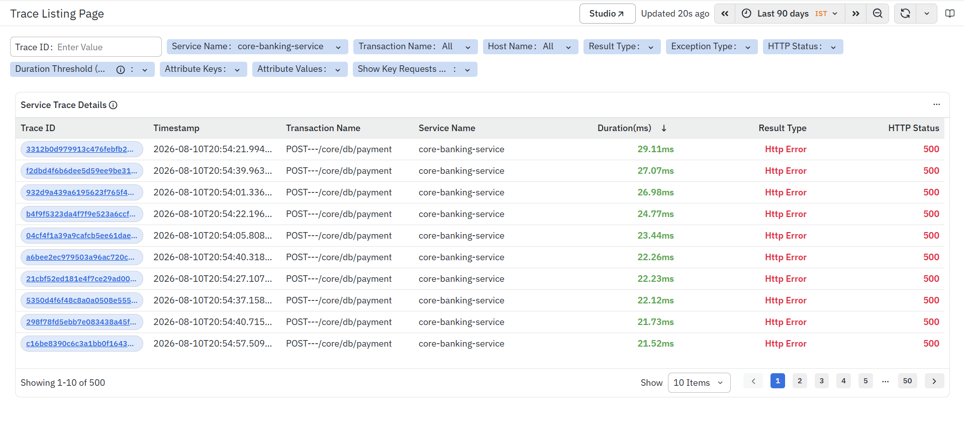
This dashboard helps you inspect request-level data, identify slow or high-latency transactions, analyze success and failure patterns, and drill down into individual traces to understand the complete execution flow across services and application components.
If HTTP Header Capture, HTTP Payload Capture, or Method Argument Capture rules have been configured in APM Studio - Custom Attribute, the extracted values are stored as custom span attributes for matching traces. These captured attributes become available when analyzing the selected trace, enabling you to correlate business-specific information such as customer identifiers, transaction IDs, payment references, or response codes with distributed trace data.
Service Trace Details
The Service Trace Details panel displays all traces that match the selected filters and time range. Each row represents an individual transaction and provides the information required to analyze request execution, performance, and transaction outcomes.
This panel helps you:
- Identify high-latency or slow-performing requests.
- Analyze successful and failed transactions.
- Locate traces requiring deeper investigation.
- Correlate business attributes captured through Header Capture, Payload Capture, or Method Argument Capture.
- Open detailed trace analysis views for troubleshooting.
The panel includes the following columns.
Trace ID
Displays the unique identifier of the trace. Each Trace ID is clickable. Selecting a Trace ID opens a context menu that provides multiple analysis options for the selected transaction.
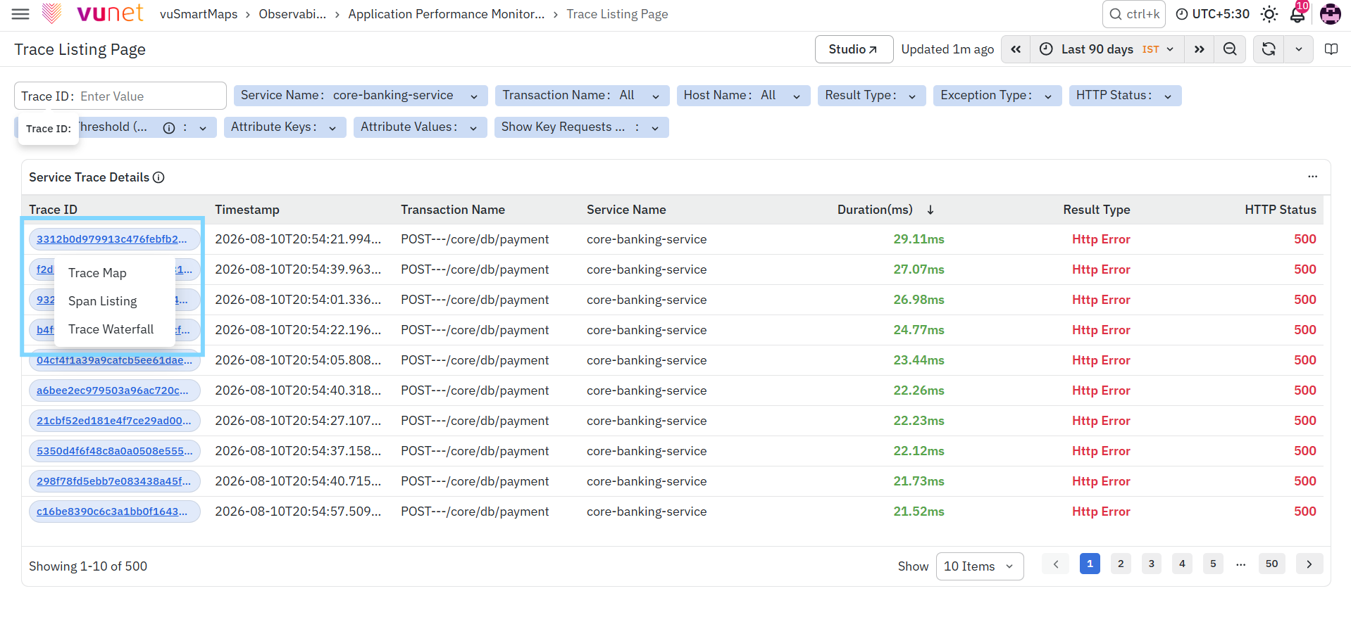
The available options are:
TraceMap
- Opens the TraceMap dashboard for the selected trace.
- TraceMap provides a graphical representation of the complete request execution flow across services, dependencies, and application components. When Code-Level Visibility (CLV) is enabled, TraceMap also displays additional code-level spans such as Controller, Service, ORM, and Database Lifecycle spans, helping you identify performance bottlenecks and execution flow within the application.
- For more information, refer to the TraceMap section.
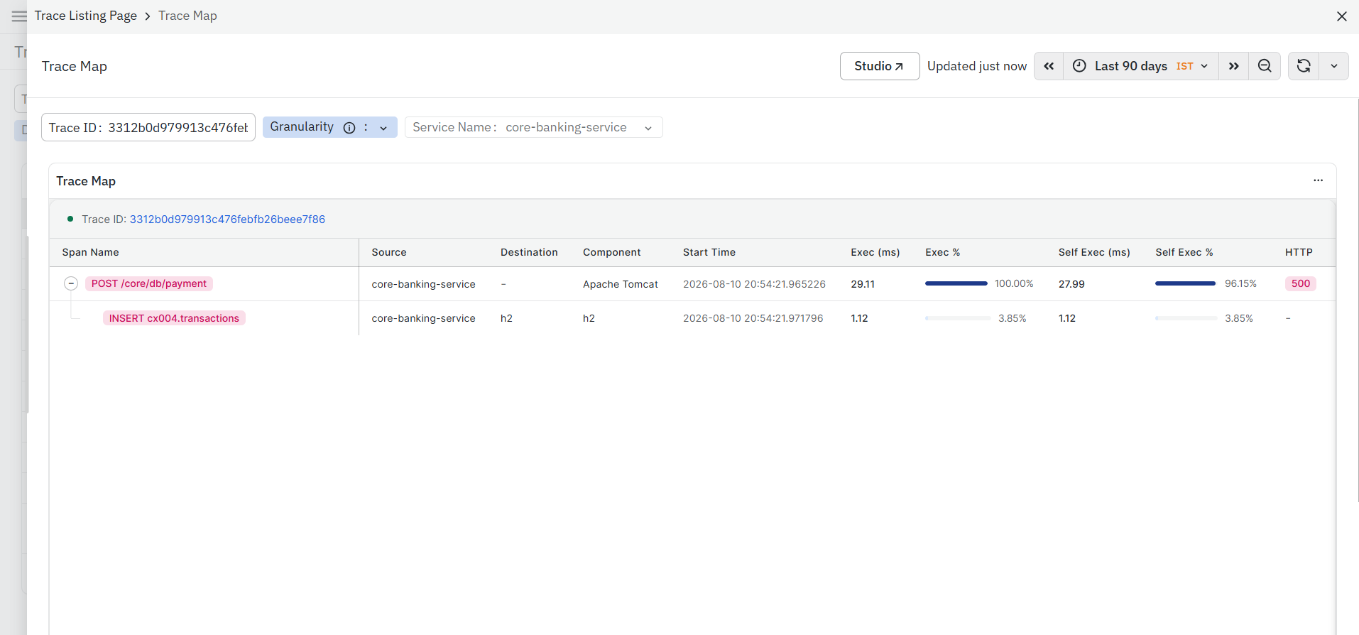
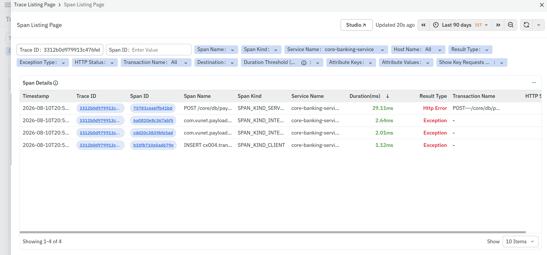
Span Listing
- Opens the Span Listing page for the selected trace.
- Span Listing displays every span generated as part of the trace, allowing you to inspect span-level execution details such as service name, component, duration, execution status, attributes, events, and errors. It provides a detailed breakdown of the request execution across services and application components.
- If custom attributes have been captured through HTTP Header Capture, HTTP Payload Capture, or Method Argument Capture, they are available within the corresponding span, enabling deeper business-context analysis.
- For more information, refer to the Span Listing section.
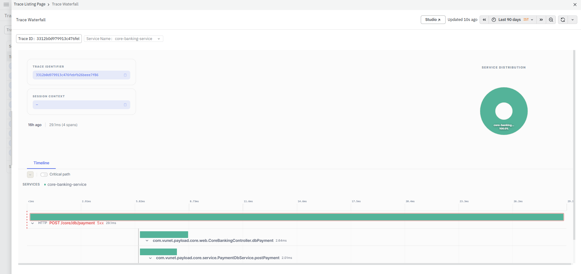
Trace Waterfall
- Opens the Trace Waterfall view for the selected trace.
- Trace Waterfall presents the complete execution timeline of the trace, showing the chronological relationship between spans and the time spent in each operation. This visualization helps identify latency bottlenecks, slow downstream calls, and execution delays.
- When Code-Level Visibility is enabled, additional Controller, Service, ORM, and Database Lifecycle spans are included in the waterfall, providing deeper insight into request execution within the application.
- For more information, refer to the Trace Waterfall section.
Timestamp
- Displays the date and time when the transaction was executed.
- This helps correlate requests with application events and identify transactions within a specific time window.
Transaction Name
- Displays the API endpoint or transaction associated with the trace.
- This helps identify the operation executed by the request.
Service Name
- Displays the service that processed the request.
- This helps determine which application or microservice handled the transaction.
Duration (ms)
- Displays the total execution time of the request in milliseconds.
- Higher values generally indicate transactions that require further investigation.
Result Type
- Displays the overall execution result of the transaction, such as Success or HTTP Error, helping you quickly identify failed requests.
HTTP Status
- Displays the HTTP response status code returned by the application for the request.
Viewing Captured Payload Attributes
If HTTP Payload Capture has been configured in APM Studio, the extracted payload values are stored as custom span attributes for matching traces.
To verify the captured payload:
- Navigate to Application Performance Monitoring > Trace Listing.
- Locate the required trace using the available filters.
- Click the required Trace ID.
- Open Span Listing.
- Select the corresponding span.
- Review the Span Attributes section to verify the configured payload attribute and its extracted value.
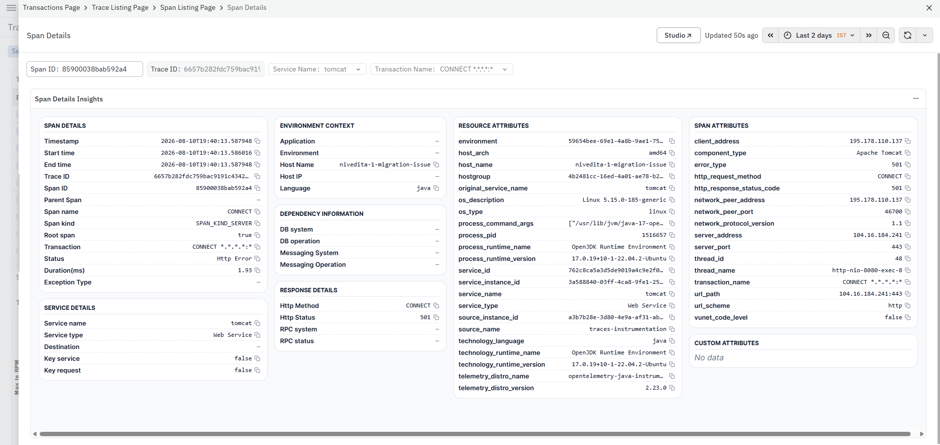
Similarly, if HTTP Header Capture or Method Argument Capture has been configured, the extracted values are also available as custom span attributes for the corresponding spans.
Captured values are available only for traces generated after the corresponding capture rule has been configured and applied. Requests that do not match the configured service, URL pattern, HTTP method, or processing conditions will not contain the captured attributes.
Operations Page
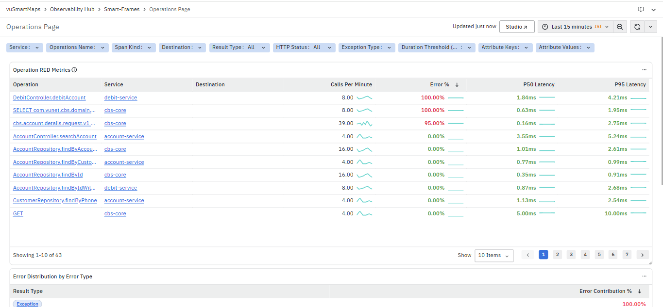
The Operations Page is a dashboard in the Application Performance Monitoring (APM) module. It provides a consolidated view of application operations executed across services and destinations. The dashboard helps monitor operation-level performance by analyzing request volume, error rates, latency, and execution trends. It enables you to identify slow operations, failed requests, high-error transactions, and performance bottlenecks affecting application behavior. The dashboard includes multiple sections and panels, such as:
- Operation RED Metrics
- Error Distribution by Error Type
- Error Distribution by HTTP Code
- Error Distribution by Exception Type
The dashboard also provides navigation to related dashboards for deeper analysis:
Operation RED Metrics

The Operation RED Metrics panel displays performance metrics for operations occurring between source services and their destinations. It provides a consolidated view of how each operation is performing in terms of traffic (Rate), failures (Errors), and latency (Duration), along with trend indicators for quick analysis.
The panel includes the following columns:
- Operation: Displays the operation name (for example, CONNECT, GET). This field is clickable and allows navigation to detailed views.
- Service: Indicates the source service generating the request.
- Destination: Displays the destination endpoint (host, port, or URL) associated with operations affected by socket timeout exceptions. When endpoint information is unavailable in the trace attributes, the field remains empty.
- Calls Per Minute: Shows how frequently the operation is executed. A sparkline is displayed alongside the value to indicate recent trends.
- Error %: Displays the percentage of failed requests for the operation. Higher values indicate reliability issues.
- P50 Latency: Represents the median latency of the operation, indicating typical performance.
- P95 Latency: Represents the higher percentile latency, highlighting slower executions and performance spikes.
Navigation Options
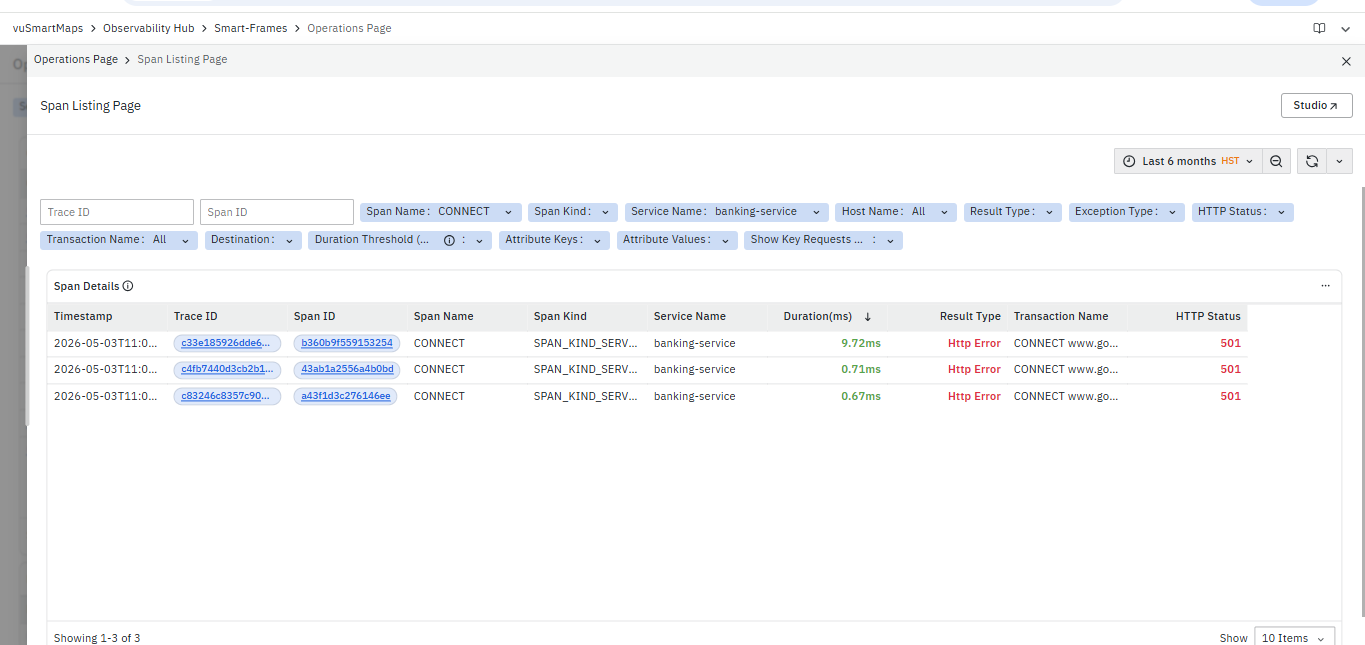
- Spans: Selecting this option redirects you to the Span Listing Page filtered for the selected operation. The dashboard displays detailed span-level execution information, including Trace ID, Span ID, Span Name, Service Name, Duration, Result Type, and Transaction Name. It helps analyze request execution flow, identify failed or slow spans, and investigate operation-level issues affecting application performance.
Error Distribution by Error Type
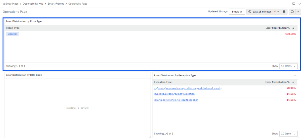
The Error Distribution by Error Type panel displays the distribution of failures based on result type for the selected filters and time range. This panel helps identify the major categories of request failures occurring across operations and services. It provides visibility into application exceptions, HTTP-level failures, and other execution issues impacting transaction processing and service performance.
The panel includes the following columns:
- Result Type
- Error Contribution %
- Result Type: Displays the type of error captured during operation execution, such as Exception or HTTP Error.This helps identify the category of failure affecting operations and transactions.The Result Type value is clickable. When selected, the platform redirects you to the Span Listing Page filtered for the selected error type.

- Span Listing Page
The Span Listing Page displays detailed span-level execution information associated with the selected error type. The dashboard provides visibility into Trace ID, Span ID, Span Name, Service Name, Duration, Result Type, Transaction Name, and HTTP Status for captured spans. It helps analyze failed request executions, identify slow or error-prone spans, and understand where failures occurred within the request flow. From this dashboard, you can further navigate to the TraceMap and Span Details dashboards for deeper trace-level analysis.- Error Contribution %: Displays the percentage contribution of the error type compared to total captured errors.This helps identify dominant failure categories contributing most to application issues and service instability.
Error Distribution by Exception Type

The Error Distribution By Exception Type panel displays the distribution of exceptions captured across spans and operations for the selected filters and time range. This panel helps identify which exception types are contributing most to application failures and transaction execution issues. It provides visibility into framework exceptions, application-level failures, and recurring execution problems impacting service performance and request processing.
The panel includes the following columns:
- Exception Type
- Error Contribution %
-
Exception Type: Displays the name of the exception captured during span execution.This helps identify the exact exception type responsible for request failures and operational issues.The Exception Type value is clickable. When selected, the platform provides the following options:
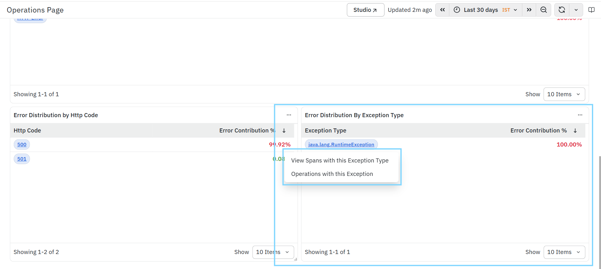
- View Spans with this Exception Type
Selecting this option redirects you to the Span Listing Page filtered for the selected exception type. The dashboard displays span-level execution details, including Trace ID, Span ID, Span Name, Service Name, Duration, Result Type, and Transaction Name. This helps analyze where the exception occurred within the request flow and identify failed or slow spans associated with the selected exception.- Example: For operations that fail with java.net.SocketTimeoutException (Read timed out), users can drill down into the exception and view the span details to identify the destination endpoint involved in the failed request.
- Operations with this Exception
- Selecting this option redirects you to the Operations Page filtered for the selected exception type. The dashboard displays operations affected by the selected exception along with RED metrics such as Calls Per Minute, Error Percentage, P50 Latency, and P95 Latency. This helps identify operations and transactions contributing to the exception and supports operation-level troubleshooting and impact analysis.
- View Spans with this Exception Type
-
Error Contribution %: Displays the percentage contribution of the exception type compared to total exceptions captured in the selected time range. This helps identify high-impact exceptions contributing most to service failures and application instability.
Error Distribution by HTTP Code
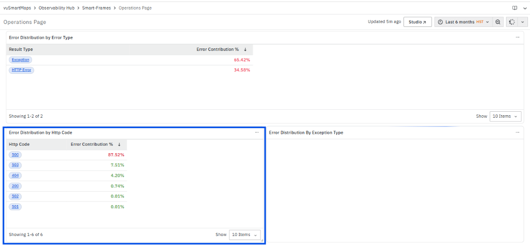
The Error Distribution by HTTP Code panel displays the distribution of failures based on HTTP response status codes for the selected filters and time range. This panel helps identify HTTP-level failures occurring during request execution and provides visibility into the most common failing response codes affecting application behavior and transaction processing.
The panel includes the following columns:
- HTTP Code
- Error Contribution %
HTTP Code: Displays the HTTP response status code captured during operation execution.This helps identify the type of HTTP failures occurring across requests and services.The HTTP Code value is clickable. When selected, the platform redirects you to the Span Listing Page filtered for the selected HTTP status code.
- Span Listing Page
The Span Listing Page displays detailed span-level execution information associated with the selected HTTP status code, including trace details, span execution duration, service name, and transaction information. It helps analyze failed requests and identify where HTTP-level failures occurred during request execution.
Error Contribution %: Displays the percentage contribution of the HTTP status code compared to total HTTP failures captured in the selected time range.
This helps identify the most frequently occurring HTTP failures contributing to application issues and service instability.
Latency Analysis
The Latency Analysis is a dashboard in the Application Performance Monitoring (APM) module. It provides a detailed view of latency behavior for a selected service by analyzing trace data across transactions and operations. This dashboard helps you understand how response times vary across requests, identify slow-performing APIs or operations, and detect performance bottlenecks that impact overall application behavior.
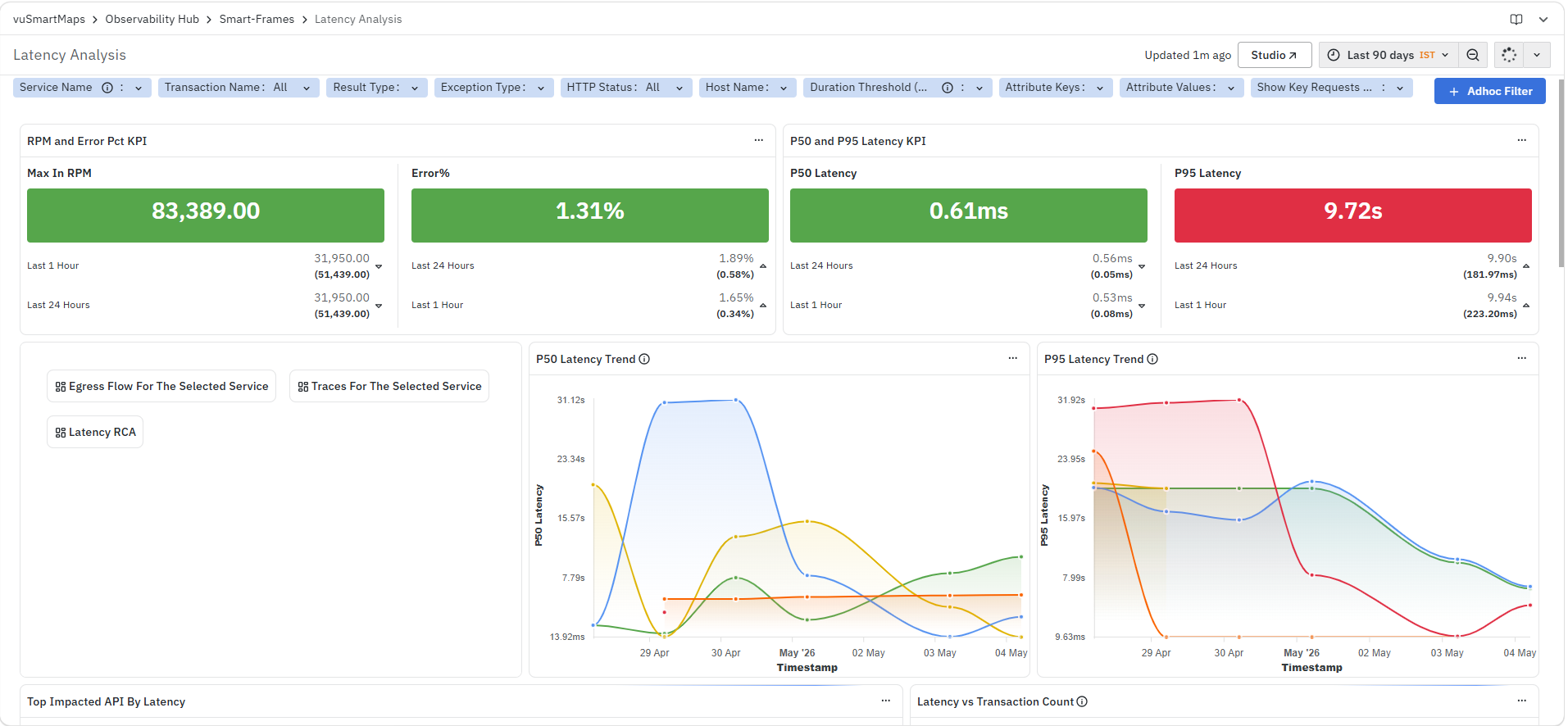
The dashboard is divided into multiple panels:
- RPM and Error Pct KPI
- P50 and P95 Latency KPI
- Egress Flow For The Selected Service
- Traces For The Selected Service
- Latency Insights
- P50 Latency Trend
- P95 Latency Trend
- Top Impacted API By Latency
- Latency vs Transaction Count
- Load vs Latency Correlation
- Error % vs Latency Correlation
- Top 10 APIs by Latency Contribution
- Host Latency Distribution
- Latency Contribution by Dependency
- Top Operations within the service
At the top of the dashboard, you can also use the available filters and time controls to narrow down the displayed data based on your monitoring requirements.
RPM and Error Pct KPI
The RPM and Error Pct KPI panel displays request volume and error percentage for the selected filters and time range. This panel provides a quick summary of traffic and error behavior while analyzing latency.
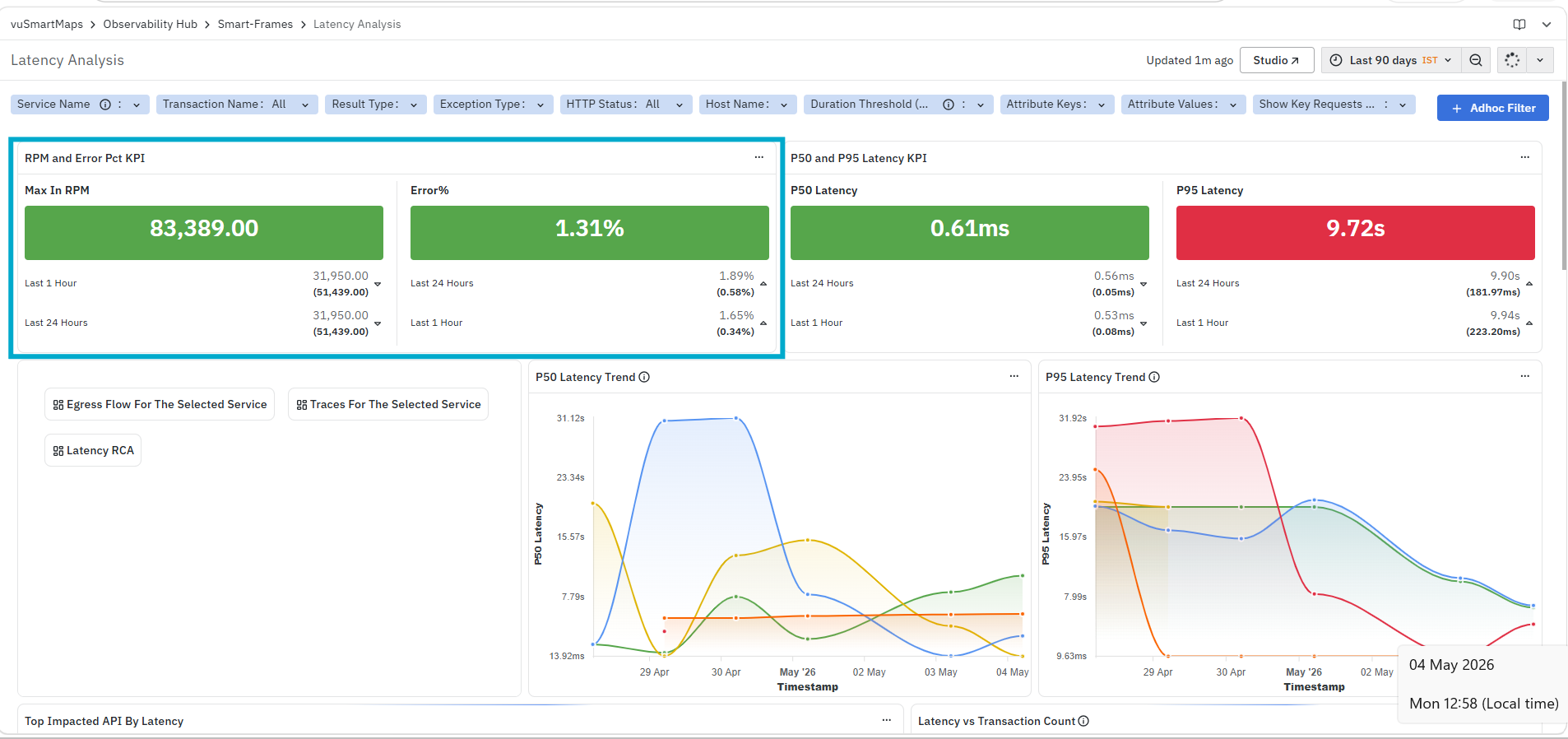
It helps you identify:
- Overall request volume during the selected time range
- Percentage of requests resulting in errors
- Changes in request and error behavior across different time windows
The panel displays:
- Max In RPM: Displays the maximum number of requests per minute observed during the selected time range.
- Error%: Displays the percentage of requests that resulted in errors.
Each metric also shows values for different time windows, such as Last 24 Hours and Last 1 Hour.
P50 and P95 Latency KPI
The P50 and P95 Latency KPI panel displays key latency metrics for the selected filters and time range. This panel provides a summarized view of response time behavior across requests, helping you compare typical latency with higher percentile latency.
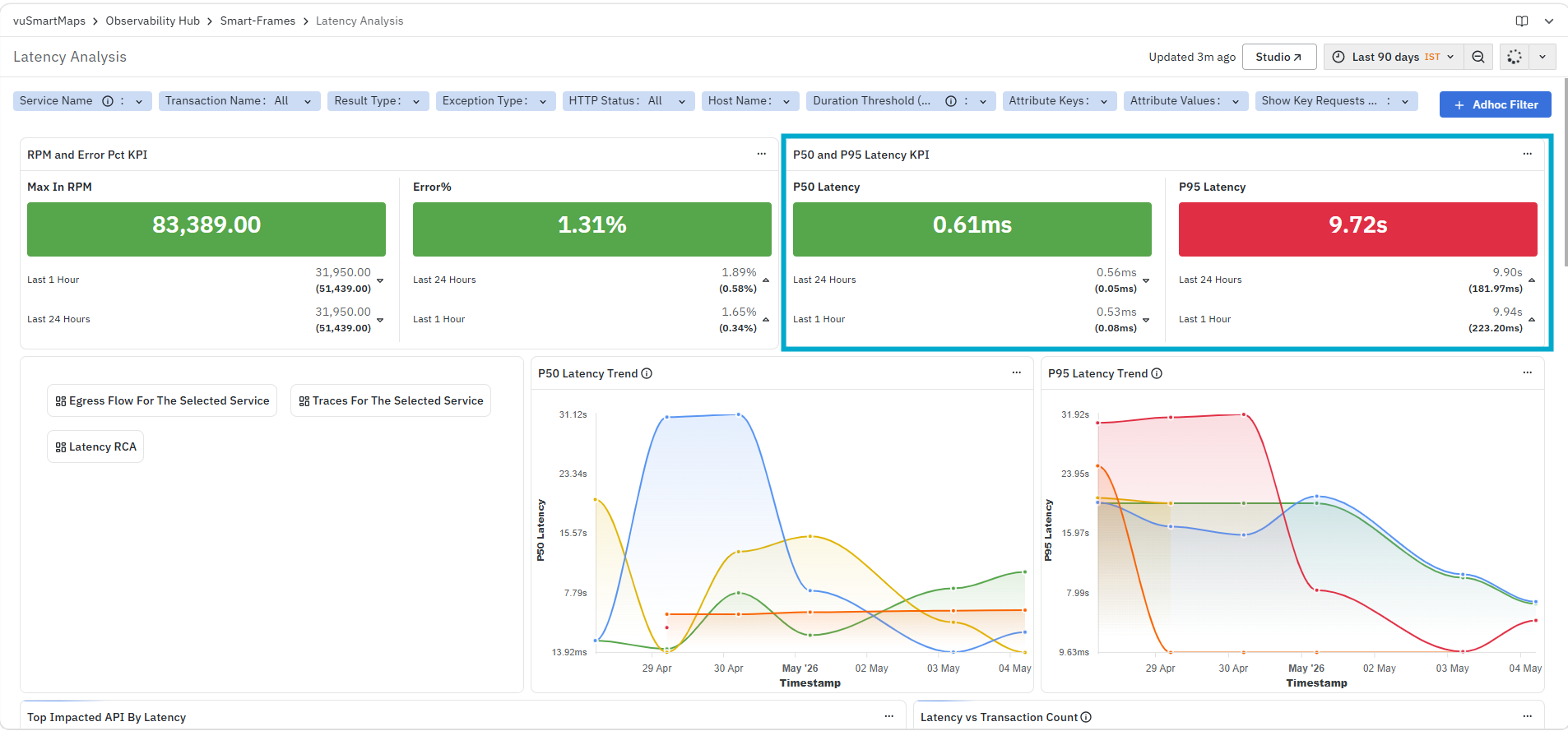
It helps you identify:
- Typical response time across requests
- Higher latency observed across slower requests
- Changes in latency across different time windows
The panel displays:
- P50 Latency: Displays the 50th percentile latency, representing the typical response time.
- P95 Latency: Displays the 95th percentile latency, highlighting slower requests that may impact user experience.
Each metric also shows values for different time windows, such as Last 1 Hour and Last 24 Hours, allowing comparison across time ranges.
Egress Flow For The Selected Service
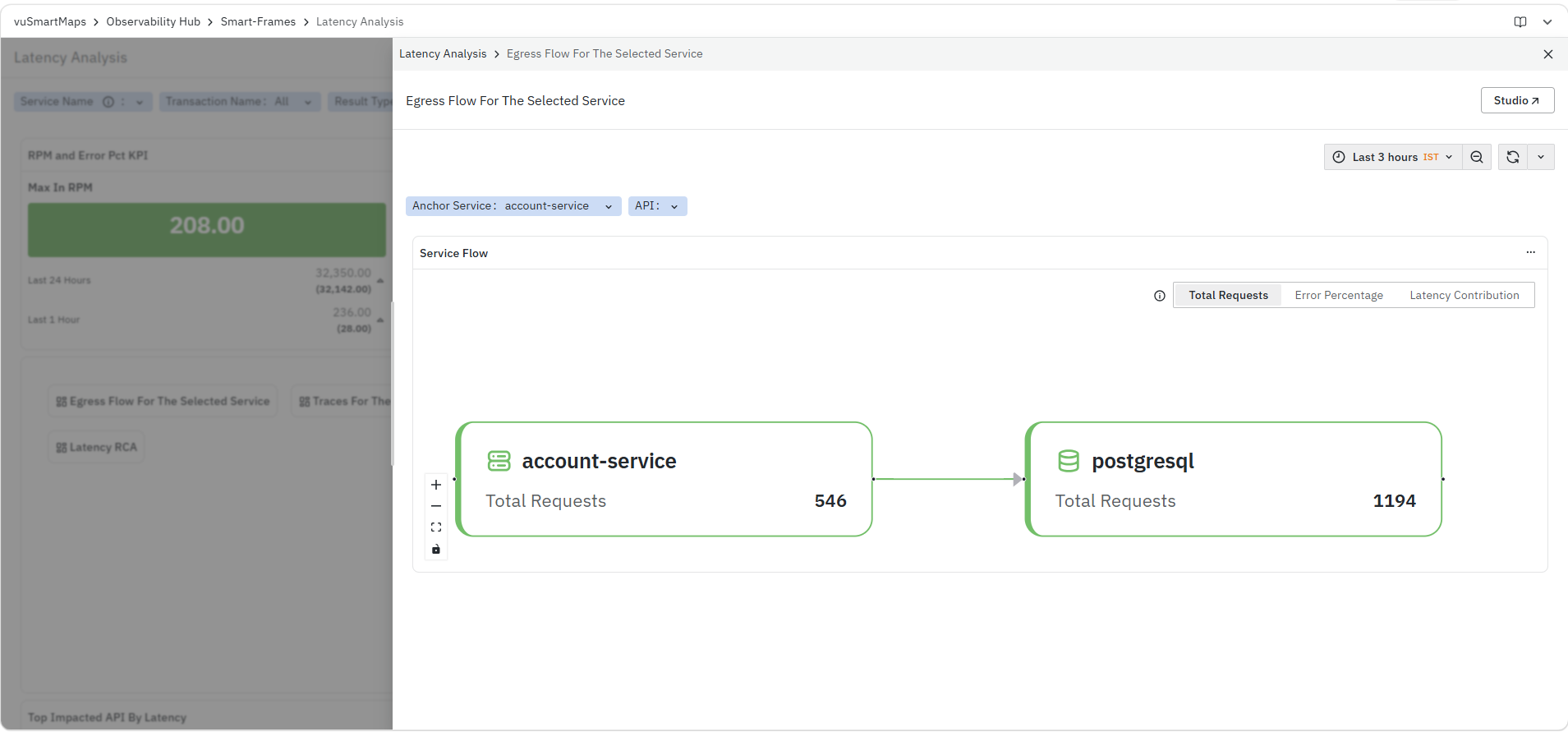
The Egress Flow For The Selected Service panel displays the outgoing service interactions for the selected service, showing how requests flow from the source service to downstream services. It provides a visual representation of service dependencies along with key metrics such as total requests, error percentage, and latency contribution. For more details, refer to Service Flow - Egress
Traces For The Selected Service
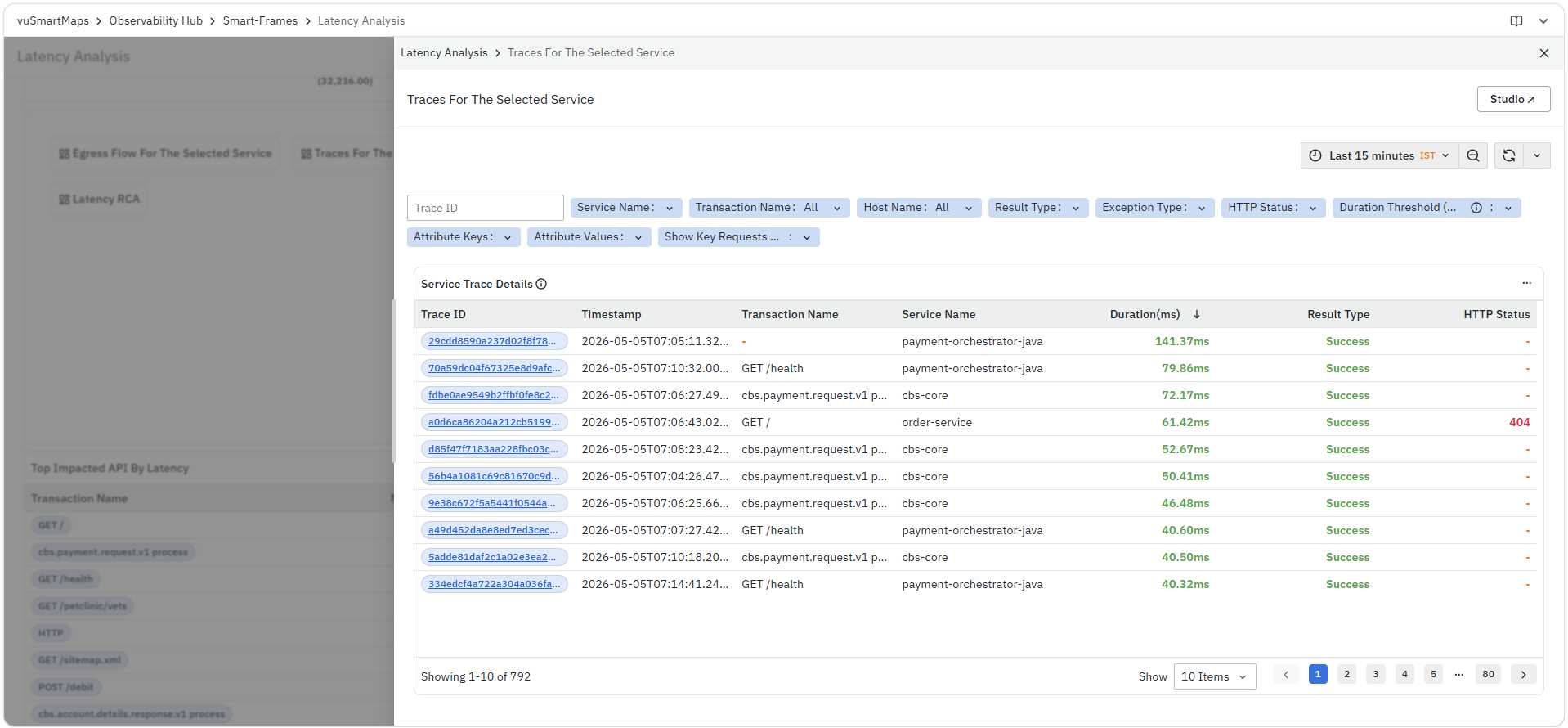
The Traces For The Selected Service panel displays a detailed list of traces for the selected service within the chosen time range. It provides key information such as Trace ID, timestamp, transaction name, service name, duration, result type, and HTTP status to help analyze request-level performance. For more details refer to Trace Listing Page.
Latency insights
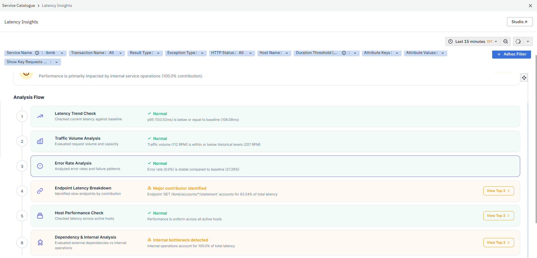
The Latency Insights panel provides a structured analysis of latency issues for the selected service by correlating latency with traffic patterns, error rates, and internal operations. It highlights the overall impact level and identifies key contributors affecting latency performance. For more details, refer to Latency Insights.
P50 Latency Trend
The P50 Latency Trend panel displays the median latency (P50) for the top endpoints of the selected service over time. It represents the response time below which 50% of requests are completed, providing a clear view of typical service performance. This panel helps track how the average response behavior changes across the selected time range.
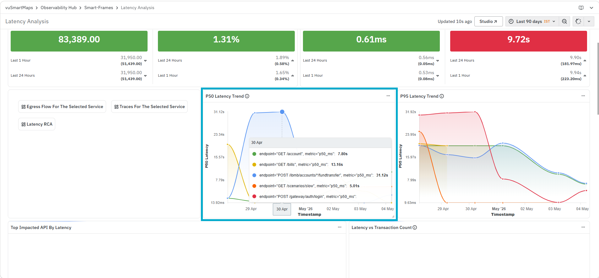
It helps you identify:
- Typical response time experienced by users
- Changes in median latency over time
- Gradual performance degradation or improvement trends
The panel displays:
- A time-series trend of P50 Latency across the selected time range
- Latency values plotted against the timestamp to show performance variation
P95 Latency Trend
The P95 Latency Trend panel displays the 95th percentile latency for the top endpoints of the selected service over time. It represents the response time within which 95% of requests are completed, helping you understand the performance of slower requests that impact most users. This panel is useful for identifying latency issues that may not be visible in average or median metrics.

It helps you identify:
- Latency experienced by slower requests
- Spikes or anomalies in high-percentile latency
- Time periods where performance degradation affects a larger set of users
The panel displays:
- A time-series trend of P95 Latency across the selected time range
- Latency values plotted against timestamp to visualize performance variations
Top Impacted API By Latency
The Top Impacted API By Latency panel displays API-level latency metrics for the selected service. It highlights the APIs that are most impacted in terms of latency, helping you identify endpoints that are slower and may be affecting overall application performance. This panel is useful for pinpointing specific APIs that require optimization.

It helps you identify:
- APIs experiencing higher latency
- High-traffic APIs with performance degradation
- APIs where latency may impact user experience
The panel includes the following columns:
- Transaction Name: Displays the API or endpoint name
- Max In RPM: Displays the maximum number of requests per minute handled by the API
- Error %: Displays the percentage of requests resulting in errors for the API
- P95 Latency: Displays the 95th percentile latency for the API
Latency vs Transaction Count
The Latency vs Transaction Count panel displays the distribution of transactions across different latency ranges for the selected service. It groups transactions into latency buckets (for example, 0–100 ms, 100–500 ms, etc.), helping you understand how requests are spread across various response time ranges. This panel provides a clear view of where most transactions are concentrated in terms of latency.
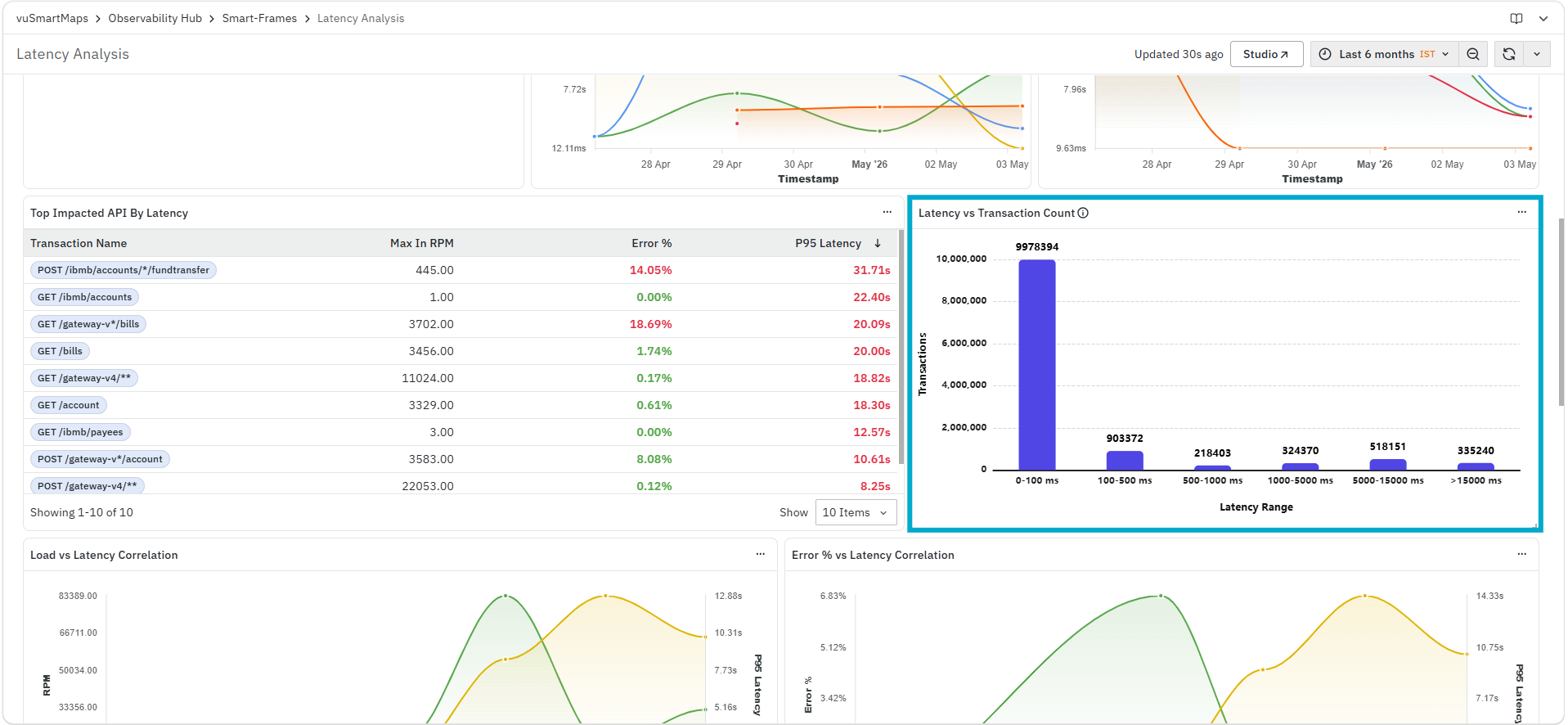
It helps you identify:
- Latency ranges where most transactions occur
- Proportion of fast vs slow requests
- Presence of higher latency buckets impacting performance
The panel displays:
- Latency Range: Represents grouped latency buckets (for example, 0–100 ms, 100–500 ms, etc.)
- Transactions: Displays the number of transactions falling within each latency range
Load vs Latency Correlation
The Load vs Latency Correlation panel displays the relationship between request volume (RPM) and latency (P95) over time for the selected service. It helps you understand how system load impacts latency by plotting both metrics together. This panel is useful for identifying whether increased traffic is contributing to performance degradation.

It helps you identify:
- Correlation between request volume and latency
- Traffic spikes that lead to higher latency
- Performance degradation under increased load
The panel displays:
- RPM: Represents the number of requests per minute over time
- P95 Latency: Represents the 95th percentile latency for the same time period
- A combined time-series view showing how both metrics vary together
Error % vs Latency Correlation
The Error % vs Latency Correlation panel displays the relationship between error rate and latency (P95) over time for the selected service. It helps you understand whether an increase in errors is associated with higher latency, indicating potential performance or stability issues. This panel is useful for identifying patterns where failures and slow responses occur together.
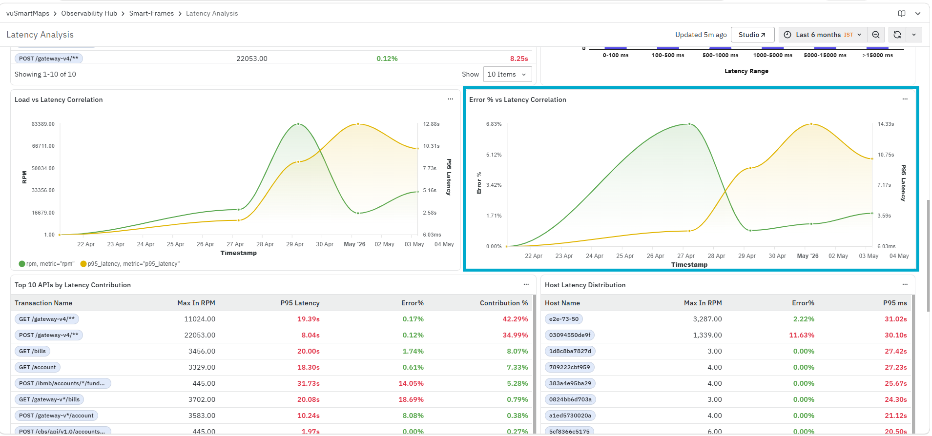
It helps you identify:
- Correlation between error rate and latency
- Time periods where both errors and latency increase together
- Whether failures are contributing to performance degradation
The panel displays:
- Error %: Represents the percentage of requests resulting in errors over time
- P95 Latency: Represents the 95th percentile latency for the same time period
- A combined time-series view showing how both metrics vary together
Top 10 APIs by Latency Contribution
The Top 10 APIs by Latency Contribution panel displays APIs that contribute most to overall latency for the selected service. It highlights high-impact endpoints by combining request volume, latency, and contribution percentage. This panel is useful for identifying APIs that significantly influence overall performance and require optimization.

It helps you identify:
- APIs contributing most to overall latency
- High-impact slow endpoints affecting performance
- APIs with high latency and noticeable contribution percentage
The panel includes the following columns:
- Transaction Name: Displays the API or endpoint name
- Max In RPM: Displays the maximum number of requests per minute handled by the API
- P95 Latency: Displays the 95th percentile latency for the API
- Error%: Displays the percentage of requests resulting in errors
- Contribution %: Displays the percentage contribution of the API to overall latency
Host Latency Distribution
The Host Latency Distribution panel displays host-level latency metrics for the selected service. It provides a comparison of how different hosts are performing in terms of request volume, latency, and error percentage. This panel is useful for identifying whether latency issues are specific to certain hosts or distributed across the infrastructure.
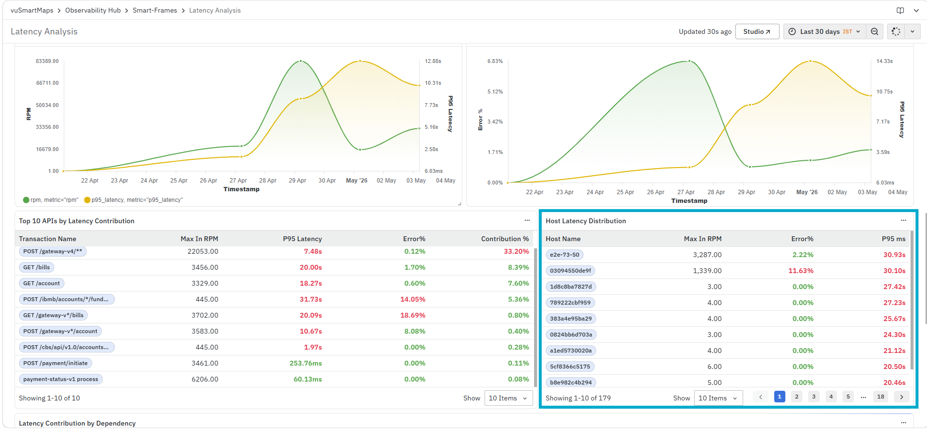
It helps you identify:
- Hosts experiencing higher latency
- Differences in performance across hosts
- Hosts contributing to errors and latency issues
The panel includes the following columns:
- Host Name: Displays the name or identifier of the host
- Max In RPM: Displays the maximum number of requests per minute handled by the host
- Error%: Displays the percentage of requests resulting in errors
- P95 ms: Displays the 95th percentile latency for the host
Latency Contribution by Dependency
The Latency Contribution by Dependency panel displays latency metrics for downstream services or dependencies invoked by the selected service. It highlights how much each dependency contributes to overall latency, helping you understand the impact of external or internal service calls. This panel is useful for identifying whether latency issues are originating from dependent systems.

It helps you identify:
- Dependencies contributing to overall latency
- Downstream services causing performance delays
- External or internal service bottlenecks
The panel includes the following columns:
- Destination: Displays the name of the dependent service
- P95 Downstream Latency (ms): Displays the 95th percentile latency for the dependency
- Latency Contribution (%): Displays the percentage contribution of the dependency to overall latency
Top Operations within the Service
The Top Operations within the Service panel displays operation-level performance metrics for the selected service. It provides a detailed breakdown of how individual operations contribute to overall latency and execution time. This panel helps you analyze which internal operations are consuming more time and impacting service performance.

It helps you identify:
- Operations with higher execution time within the service
- Operations contributing to overall latency
- Performance bottlenecks at the operation level
The panel includes the following columns:
- Operation Name: Displays the name of the operation within the selected service
- Span Count: Displays the total number of spans (executions) recorded for the operation
- Total Self Time (ms): Displays the total time spent exclusively within the operation
- Avg Self Time (ms): Displays the average self time per execution of the operation
- P50 Self Time (ms): Displays the median self time for the operation
- P95 Self Time (ms): Displays the 95th percentile self time, highlighting slower executions
- Max Self Time (ms): Displays the maximum self time observed for the operation
- Total Duration (ms): Displays the total execution duration including downstream calls
- Self Time Contribution (%): Displays the percentage contribution of the operation’s self time to overall service execution
Error Analysis
The Error Analysis is a dashboard in the Application Performance Monitoring (APM) module. It provides a consolidated view of application errors by analyzing trace data across services. This dashboard helps you monitor error trends, identify failing transactions, and understand how errors correlate with latency and request patterns.

The dashboard is divided into multiple panels:
- RPM and Error Rate KPI
- P50 and P95 Latency KPI
- Source of Errors
- Egress Flow For The Selected Service
- Error Traces For The Selected Service
- Exceptions For Selected Service
- Error Insights
- Error Distribution by Error Types
- Error Distribution by HTTP Codes
- Error Distribution by Exception Types
- Error % in each Host
- Top Error Contributing APIs
- Is spike in Request Rate Leading to Errors
- Is High Latency leading to Errors
At the top of the dashboard, you can also use the available filters and time controls to narrow down the displayed data based on your monitoring requirements.
RPM and Error Pct KPI
The RPM and Error Pct KPI panel displays key metrics related to request volume and error percentage for the selected filters and time range. This panel provides a summarized view of how many requests are being processed and how many of them are resulting in errors.
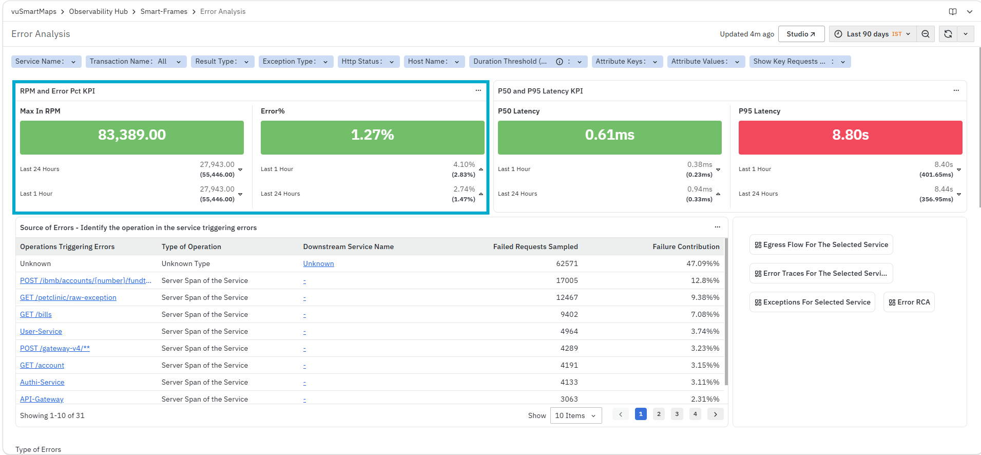
It helps you identify:
- Overall request volume during the selected time range
- Percentage of requests resulting in errors
- Changes in request and error behavior across different time windows
The panel displays:
- Max in RPM: Displays the maximum number of requests per minute observed during the selected time range.
- Error %: Displays the percentage of requests that resulted in errors.
Each metric also shows values for different time windows (for example, Last 1 Hour, Last 24 Hours), allowing you to compare recent and historical behavior.
P50 and P95 Latency KPI
The P50 and P95 Latency KPI panel displays latency metrics for the selected filters and time range. This panel provides a summarized view of response time behavior across requests.
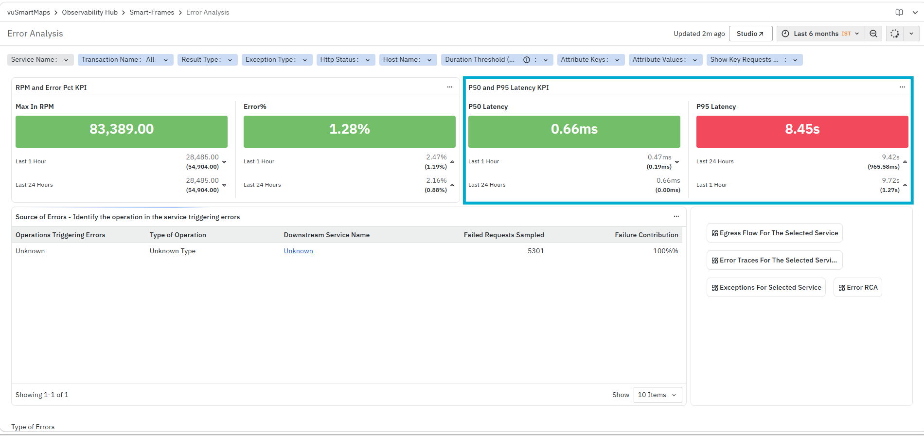
It helps you identify:
- Typical response time across requests
- Higher latency observed across a subset of requests
- Changes in latency across different time windows
The panel displays:
- P50 Latency: Displays the 50th percentile latency.
- P95 Latency: Displays the 95th percentile latency.
Each metric also shows values for different time windows (for example, Last 1 Hour, Last 24 Hours), allowing you to compare recent and historical behavior.
Source of Errors - Identify the operation in the service triggering errors
The Source of Errors panel displays the operations that are triggering errors within the selected service context. This panel helps you identify where failures are originating from and whether they are linked to a specific operation or downstream service.
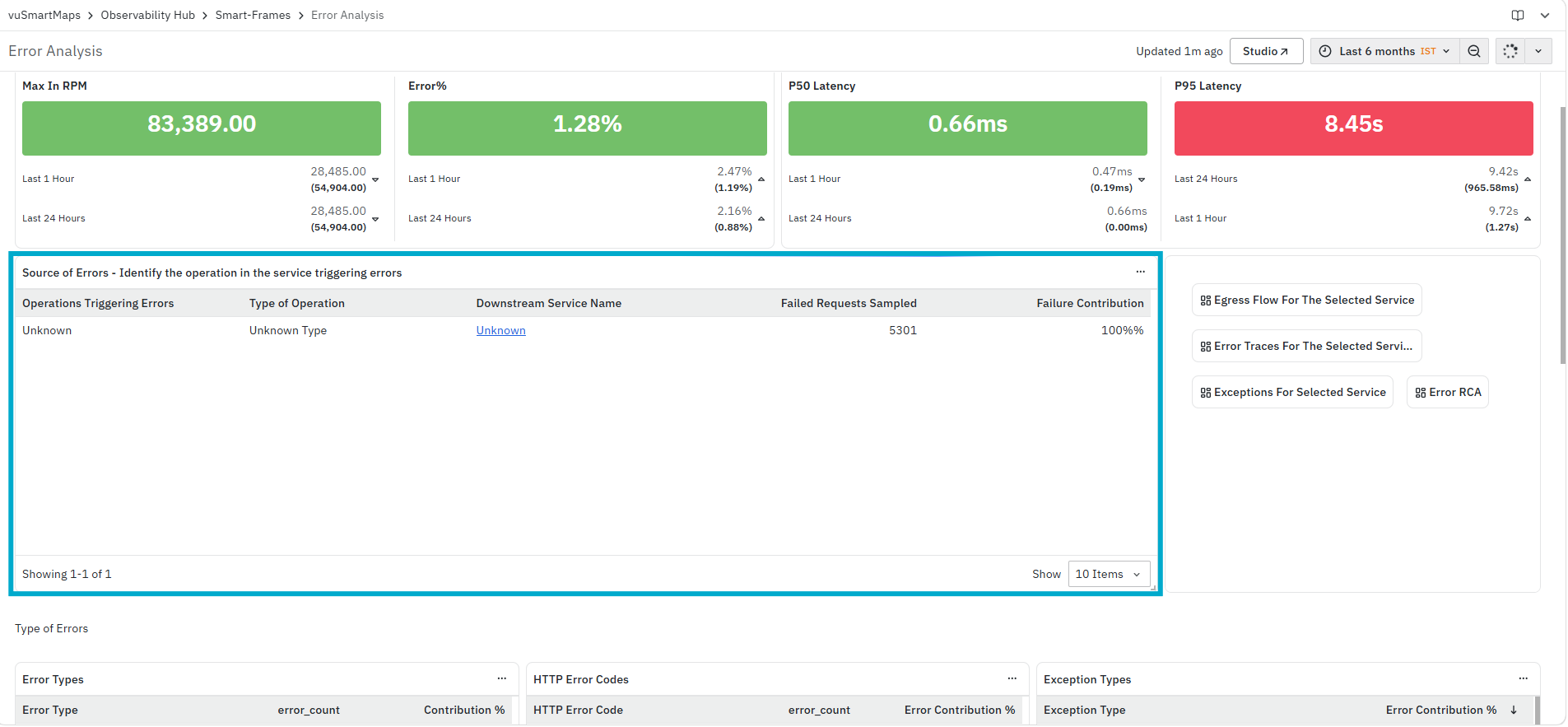
It helps you identify:
- Operations triggering errors
- Type of operation associated with the failure
- Downstream service involved in the error
- Contribution of the failed requests to the overall failure count
The panel includes the following columns:
- Operations Triggering Errors: Displays the operation associated with the error.
- Type of Operation: Displays the operation category or type.
- Downstream Service Name: Displays the downstream service associated with the error.
- Failed Requests Sampled: Displays the number of failed requests sampled for the operation.
- Failure Contribution: Displays the percentage contribution of the operation to total failures.
Egress Flow For The Selected Service

The Egress Flow For The Selected Service panel displays all outgoing calls from the selected service to downstream services. It highlights service dependencies along with latency and failure patterns in external interactions. For more details, refer to Service Flow - Egress.
Error Traces For The Selected Service
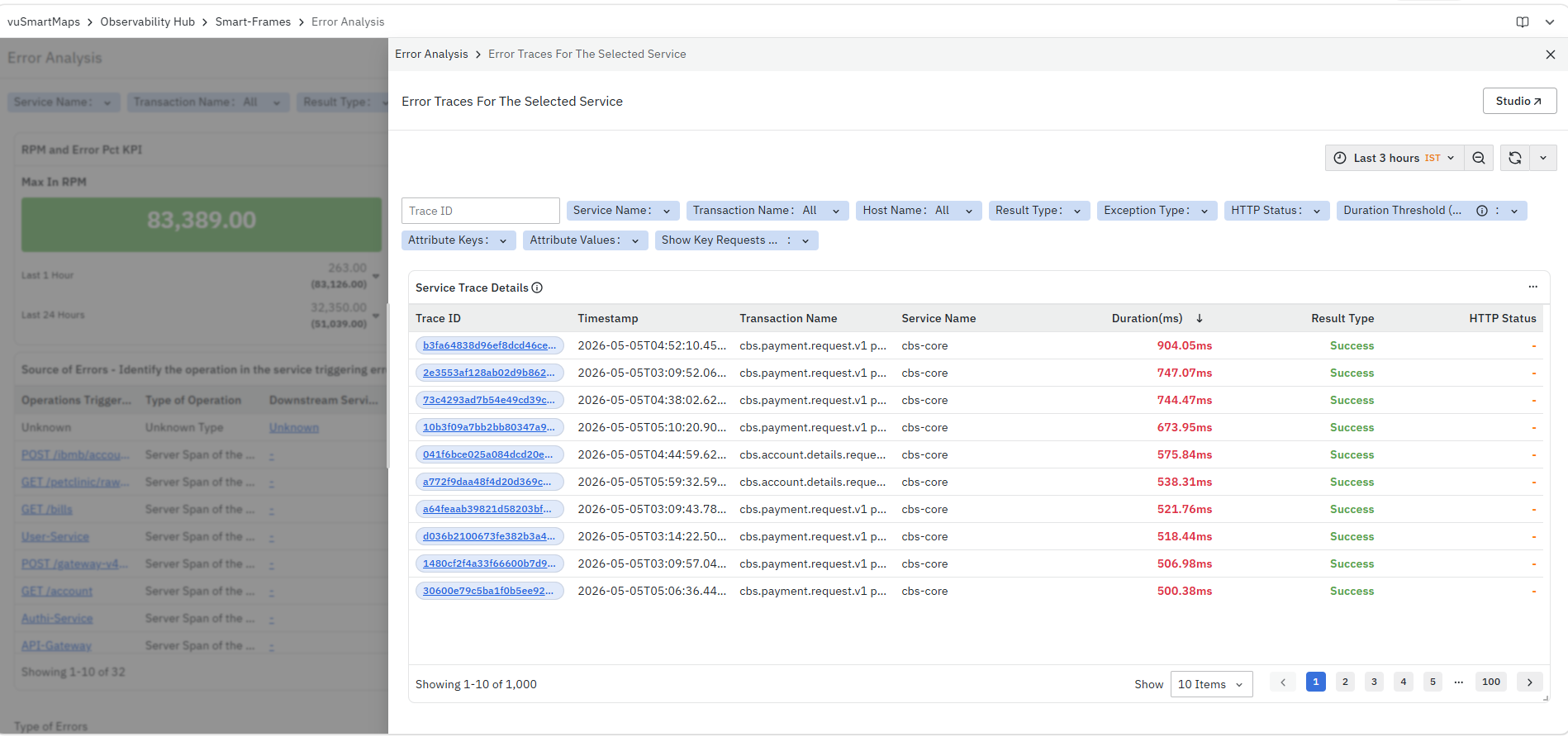
The Error Traces For The Selected Service panel displays trace-level information for requests that resulted in errors. It helps you analyze individual traces to understand latency and failure points in transactions. For more details, refer to the Trace Listing Page.
Exceptions For Selected Service
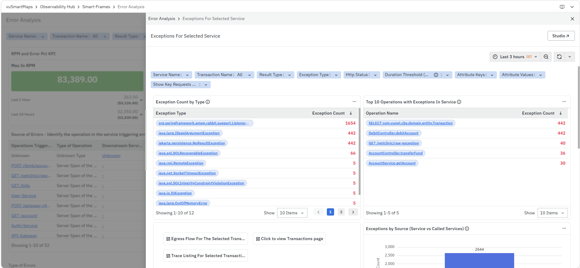
The Exceptions For Selected Service panel provides insights into exceptions occurring within transactions handled by the selected service. It helps identify root causes and areas impacted by failures. For more details, refer to Exception Analysis.
Error Insights
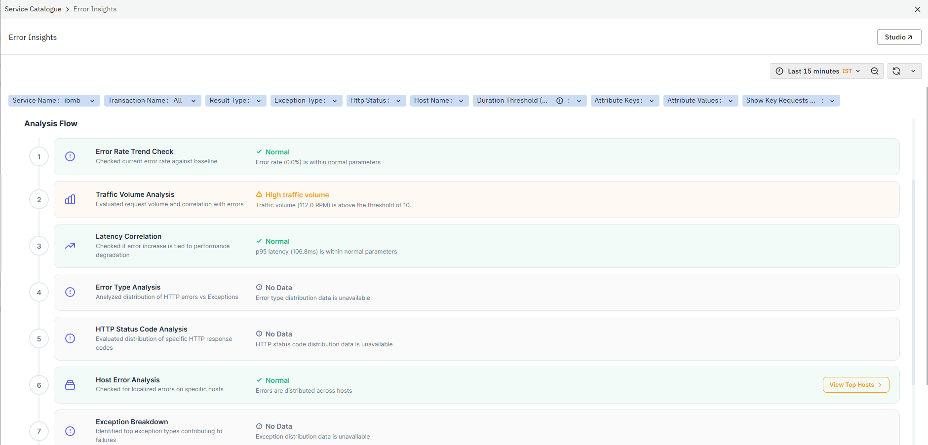
The Error Insights section provides structured analysis of errors by evaluating error trends, traffic patterns, and their correlation with system performance. It highlights the overall impact, identifies whether error rates are within normal limits, and detects any dominant error patterns. This helps you quickly understand the source and nature of failures before moving into deeper analysis. For more details, refer to Error Insights
Error Distribution by Error Type
The Error Distribution by Error Type panel displays the distribution of errors based on error categories for the selected filters and time range. This panel provides a breakdown of how different types of errors contribute to the overall error volume.

It helps you identify:
- Distribution of errors across different error categories
- Relative contribution of each error type to total errors
- Dominant error types within the selected time range
The panel includes the following columns:
- Error Type: Displays the category of error (for example, Exception, HTTP Error).
The Error Type is clickable. When you click an error type, the platform opens the Span Listing Page for the selected error category with the required context already applied.
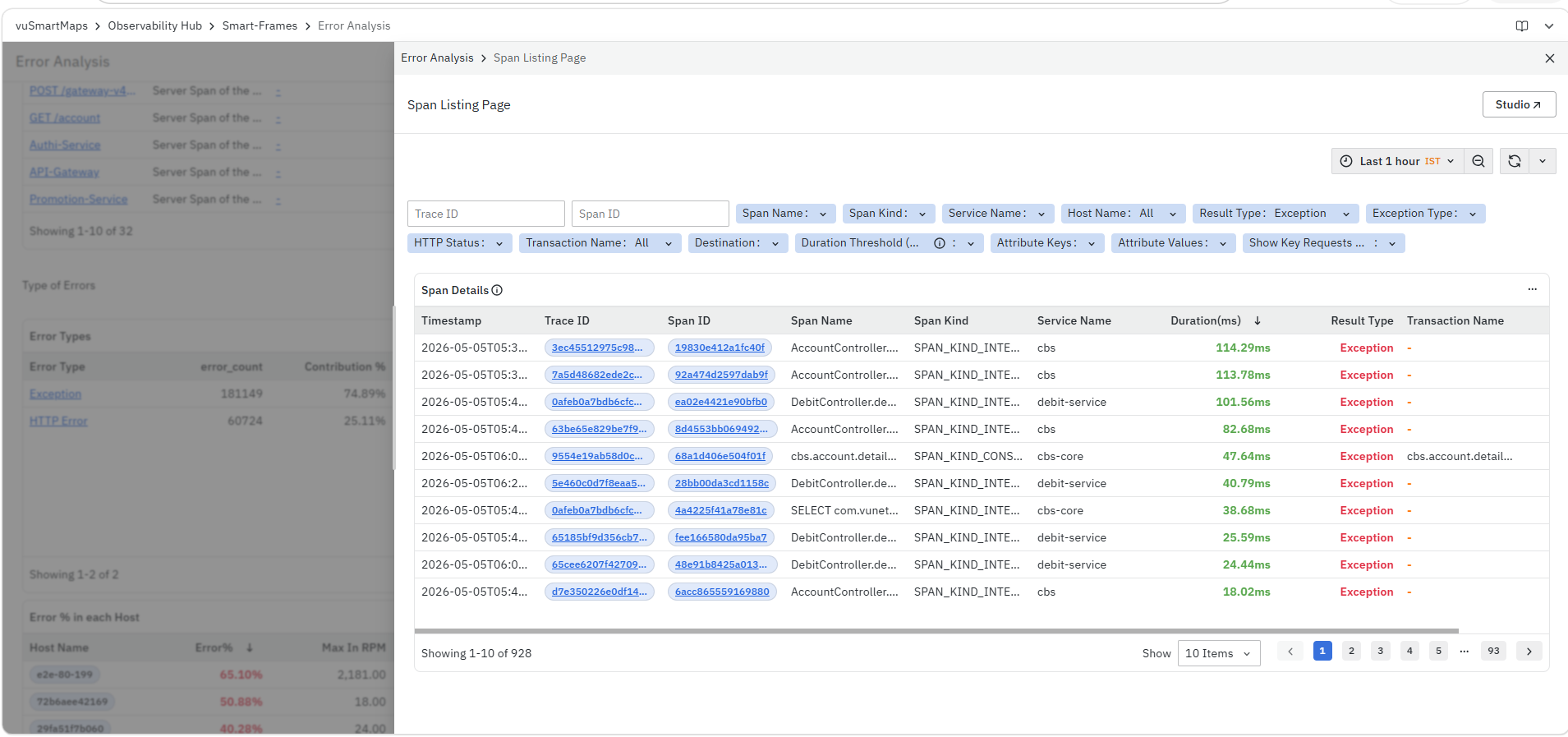
-
Span Listing Page: This page provides a detailed list of spans associated with the selected error type, including trace ID, span ID, span name, service name, duration, and result type. It allows you to analyze individual error occurrences, identify failing operations, and understand how errors are distributed across services. To learn more about this page, refer to the Span Listing Page.
-
error_count: Displays the total number of occurrences for each error type.
-
Contribution %: Shows the percentage contribution of each error type to the total errors.
Error Distribution by HTTP Code
The Error Distribution by HTTP Code panel displays the distribution of errors based on HTTP response status codes. This panel helps categorize errors based on response outcomes.
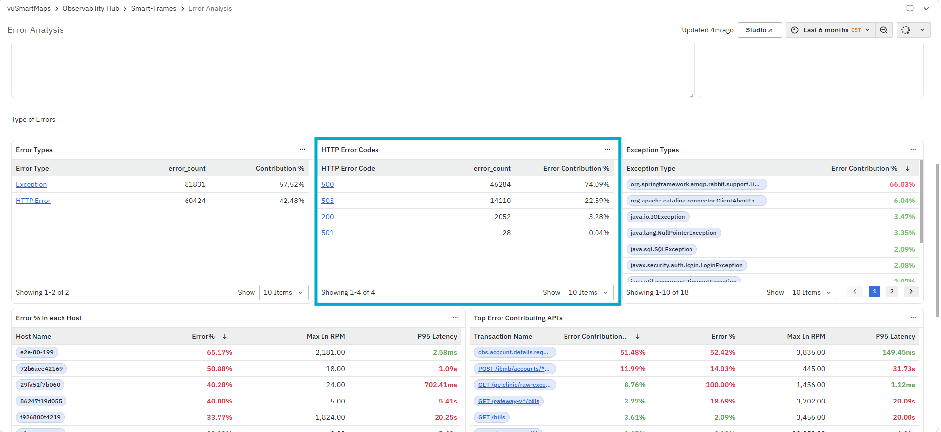
It helps you identify:
- Distribution of errors across different HTTP status codes
- Contribution of each HTTP code to overall errors
- Patterns in response-level failures
The panel includes the following columns:
- HTTP Error Code: Displays the HTTP response status code associated with the error. The HTTP Error Code is clickable. When you click an HTTP error code, the platform opens the Span Listing Page for the selected HTTP status code with the required context already applied.
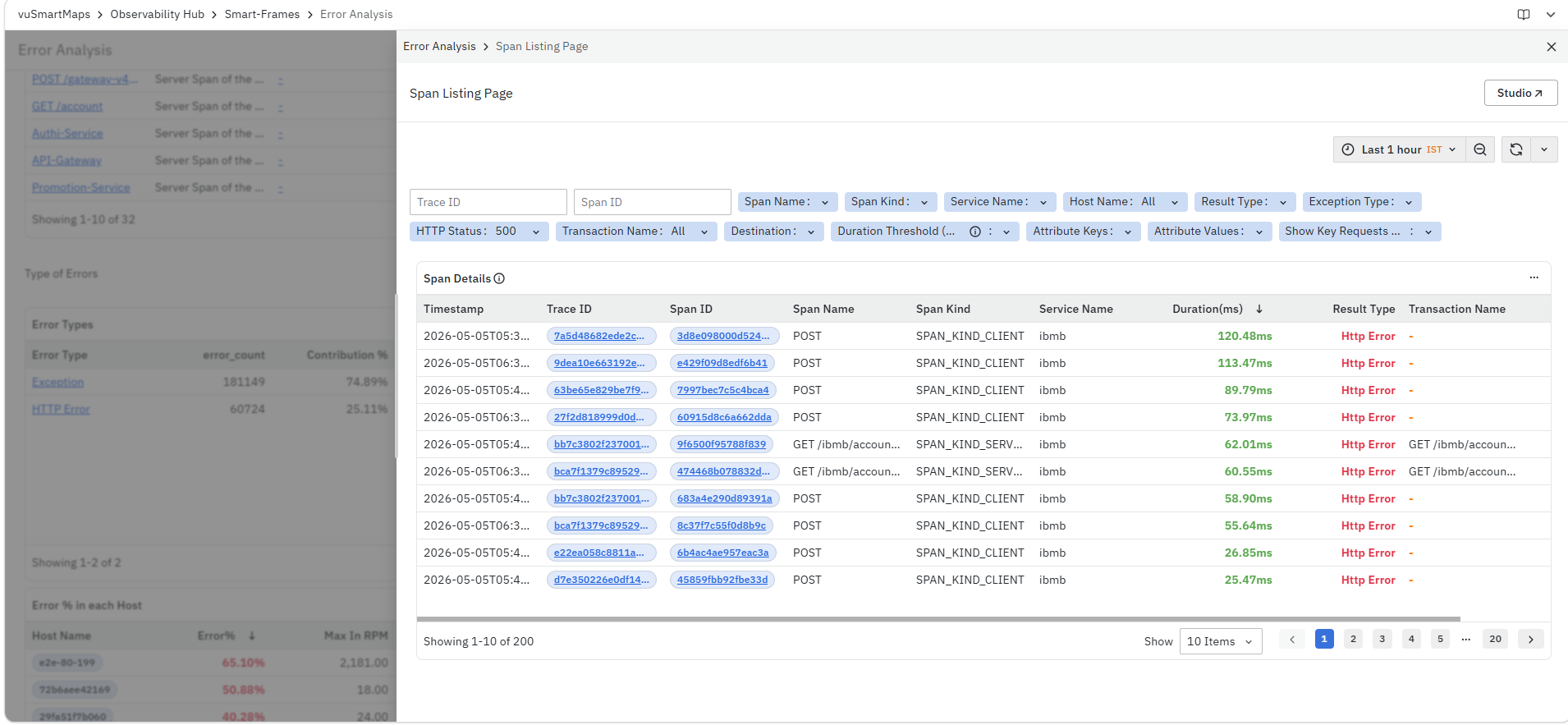
- Span Listing Page: * This page provides a detailed list of spans associated with the selected HTTP status code, including trace ID, span ID, span name, service name, duration, and result type. It allows you to analyze individual error occurrences, identify failing operations, and understand how HTTP-level errors are distributed across services. To learn more about this page, refer to Span Listing Page.
- error_count: Displays the total number of occurrences for each HTTP error code.
Error Contribution %: Shows the percentage contribution of each HTTP error code to the total errors.
Service Entry Exceptions by Type
The Service Entry Exceptions by Type panel displays the distribution of application exceptions based on the exception types encountered by the selected service during the selected time range. This panel helps you identify the exceptions contributing most to application failures and provides quick access to detailed exception and span-level information for further investigation.
It helps you identify:
- Distribution of errors across different exception types.
- Contribution of each exception type to the overall application errors.
- Frequently occurring application exceptions.
- Exception patterns affecting the selected service.
The panel includes the following columns:
Exception Type
Displays the application exception associated with the failed requests.
The Exception Type field is interactive. When you click an exception type, the following options are available:
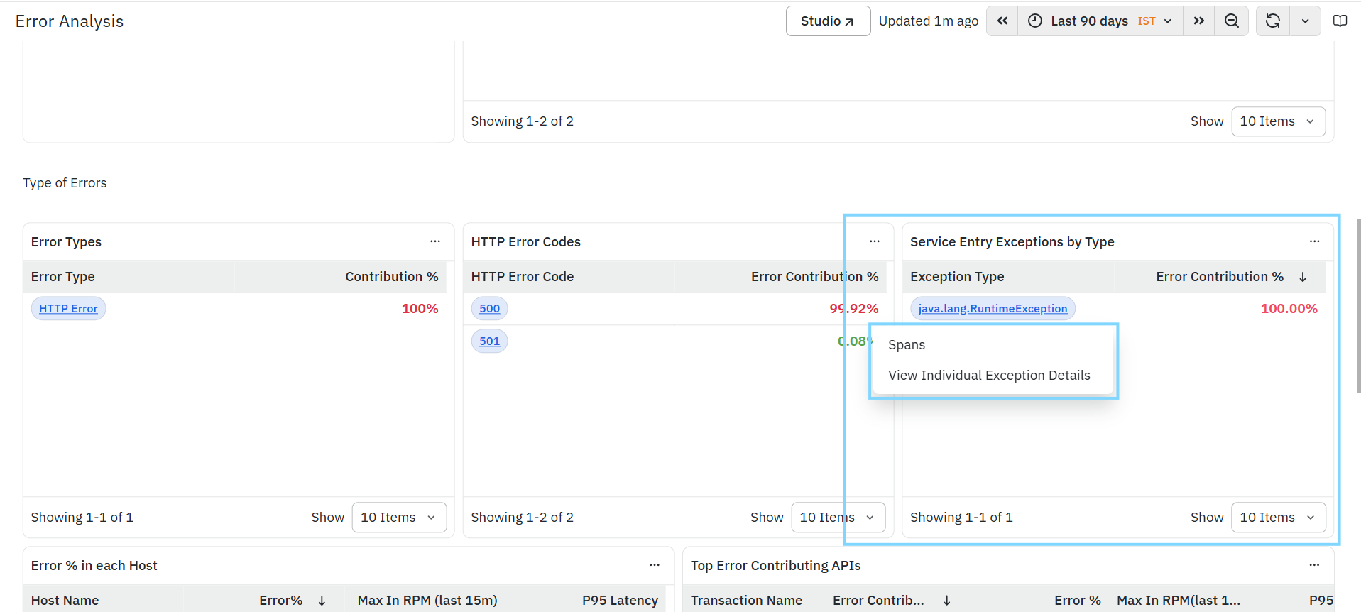
Spans
Opens the Span Listing Page for the selected exception type. The Span Listing Page displays all spans associated with the selected exception, allowing you to investigate individual span executions, review trace details, identify affected services and transactions, and analyze the execution flow that resulted in the exception.
Example: For operations that fail with java.net.SocketTimeoutException (Read timed out), users can drill down into the exception and view the span details to identify the destination endpoint involved in the failed request.
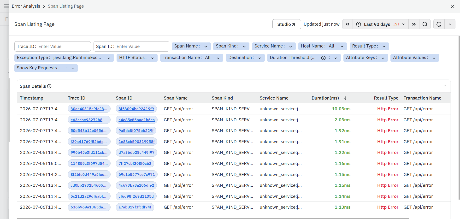
To learn more about the Span Listing Page, refer to Span Listing Page.
View Individual Exception Details
Opens the Trace Exception Explorer for the selected exception type. The Trace Exception Explorer provides detailed information for each occurrence of the selected exception, enabling you to investigate individual exception instances and understand the exact execution context in which the exception occurred.
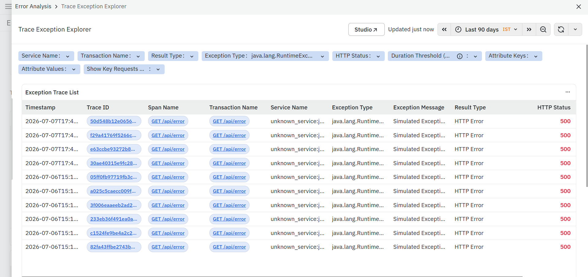
To learn more about the Trace Exception Explorer, refer to Trace Exception Explorer.
Error Contribution %
Displays the percentage contribution of the selected exception type to the total application errors within the selected time range.
Error % in each Host
The Error % in each Host panel displays host-level error metrics for the selected time range. This panel provides a comparative view of how errors are distributed across hosts.
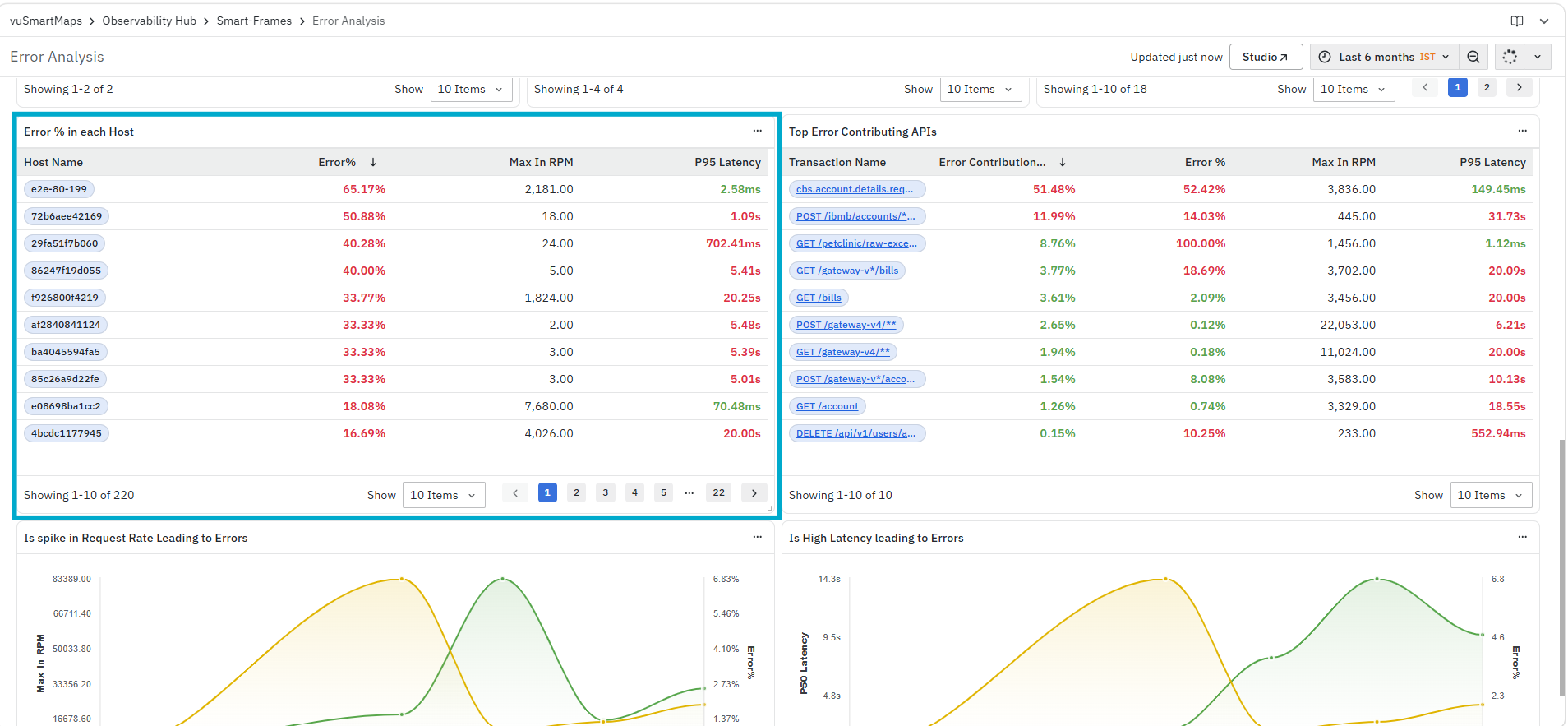
It helps you identify:
- Hosts contributing to a higher error percentage
- Hosts handling higher request volume with errors
- Hosts with higher latency and error conditions
The panel includes the following columns:
- Host Name: Displays the host identifier.
- Error %: Displays the percentage of requests resulting in errors.
- Max in RPM: Displays the maximum requests per minute for the host.
- P95 Latency: Displays the 95th percentile latency for the host.
Top Error Contributing APIs
The Top Error Contributing APIs panel displays API-level error metrics for the selected time range. This panel provides a comparative view of APIs based on error behavior.
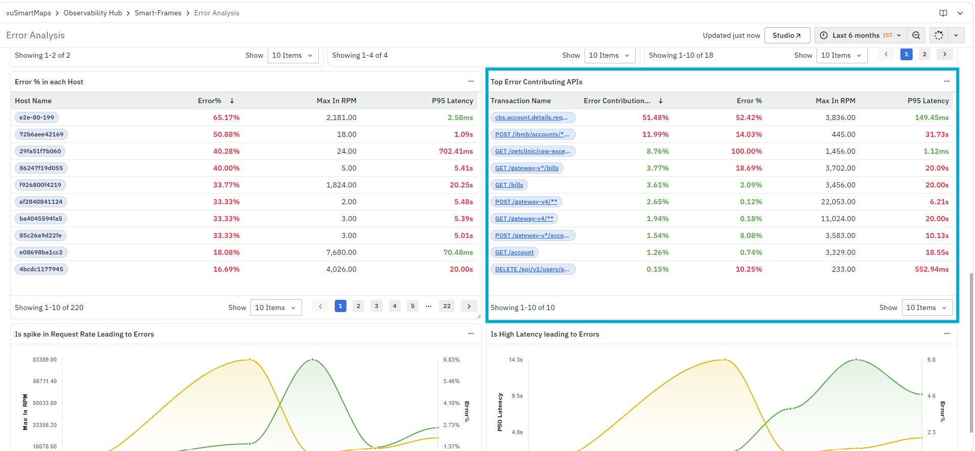
It helps you identify:
- APIs contributing to a higher error percentage
- APIs handling higher request volume with failures
- APIs with higher latency values
The panel includes the following columns:
- Transaction Name: Displays the name of the API or transaction.
- Error Contribution: Displays the contribution of the API to the overall error volume.
- Error %: Displays the percentage of requests resulting in errors for the API.
- Max in RPM: Displays the maximum number of requests per minute for the API.
- P95 Latency: Displays the 95th percentile response time for the API.
Is spike in Request Rate Leading to Errors
The Is spike in Request Rate Leading to Errors panel displays request rate and error-related metrics over the selected time range. This panel provides a time-based comparison of request volume and error behavior.

It helps you identify:
- Changes in request rate over time
- Changes in error percentage over time
- Relationship between request rate and errors
The panel displays:
- Metrics plotted against timestamp
Is High Latency leading to Errors
The Is High Latency leading to Errors panel displays latency and error-related metrics over the selected time range. This panel provides a comparative view of latency and error trends.
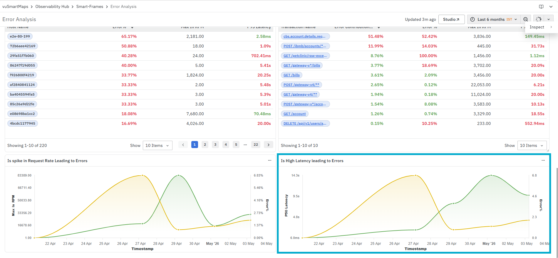
It helps you identify:
- Changes in latency over time
- Changes in error percentage over time
- Relationship between latency and errors
The panel displays:
- Metrics plotted against timestamp
Trace Exception Explorer
The Trace Exception Explorer provides detailed information about individual exception occurrences captured during transaction execution. It enables you to analyze exception events at the trace level, investigate the affected services and transactions, and navigate to related dashboards for deeper root cause analysis.
The dashboard displays all exception traces matching the selected filters and time range, helping you identify when an exception occurred, where it originated, and the associated transaction and span details.
It helps you:
- Investigate individual exception occurrences.
- Analyze exceptions across traces and transactions.
- Identify the affected service and span.
- Review exception messages and HTTP status codes.
- Navigate to related dashboards for further troubleshooting.
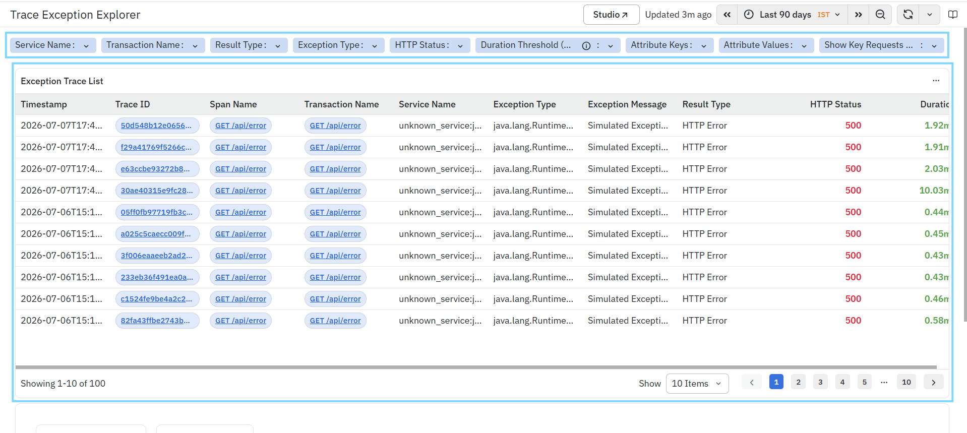
Filters
The dashboard supports the following filters:
- Service Name – Filters exception traces for a specific service.
- Transaction Name – Filters results by transaction.
- Result Type – Filters traces based on the execution result.
- Exception Type – Displays traces matching the selected exception type.
- HTTP Status – Filters traces based on HTTP response status.
- Duration Threshold – Filters traces based on execution duration.
- Attribute Keys – Filters traces using OpenTelemetry attribute keys.
- Attribute Values – Filters traces using OpenTelemetry attribute values.
- Show Key Requests – Displays only key business requests.
Exception Trace List
The Exception Trace List displays every exception occurrence that matches the selected filters.
It helps you:
- Identify individual exception occurrences.
- Analyze trace-level failures.
- Review the affected transaction and service.
- Navigate to detailed trace and operation views.
The panel includes the following information.
Timestamp
Displays the date and time when the exception occurred.
Trace ID
- Displays the unique identifier of the trace in which the exception occurred.
- The Trace ID is interactive.
- Click a Trace ID to open the Trace Map for the selected trace.
The Trace Map provides a graphical representation of the complete trace execution, allowing you to analyze service interactions, span hierarchy, execution flow, latency, and component-level performance for the selected trace.
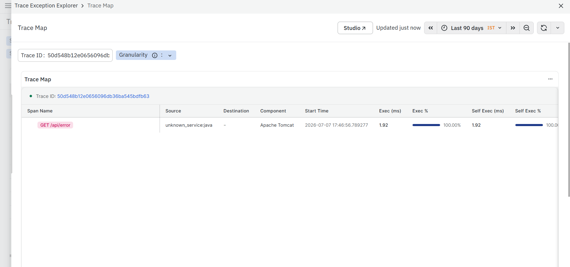
To learn more about the Trace Map, refer to Trace Map.
Span Name
Displays the span in which the exception occurred, The Span Name is interactive, Click a Span Name to access the following options.
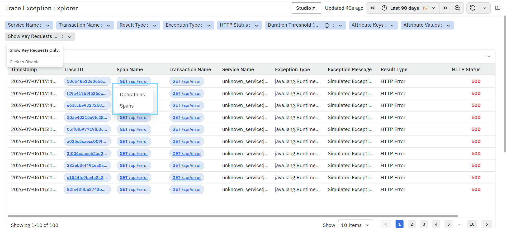
- Operations: Opens the Operations Page for the selected operation. The Operations Page provides detailed RED metrics, request volume, latency, destination, and error statistics for the selected operation, helping you analyze its runtime performance.
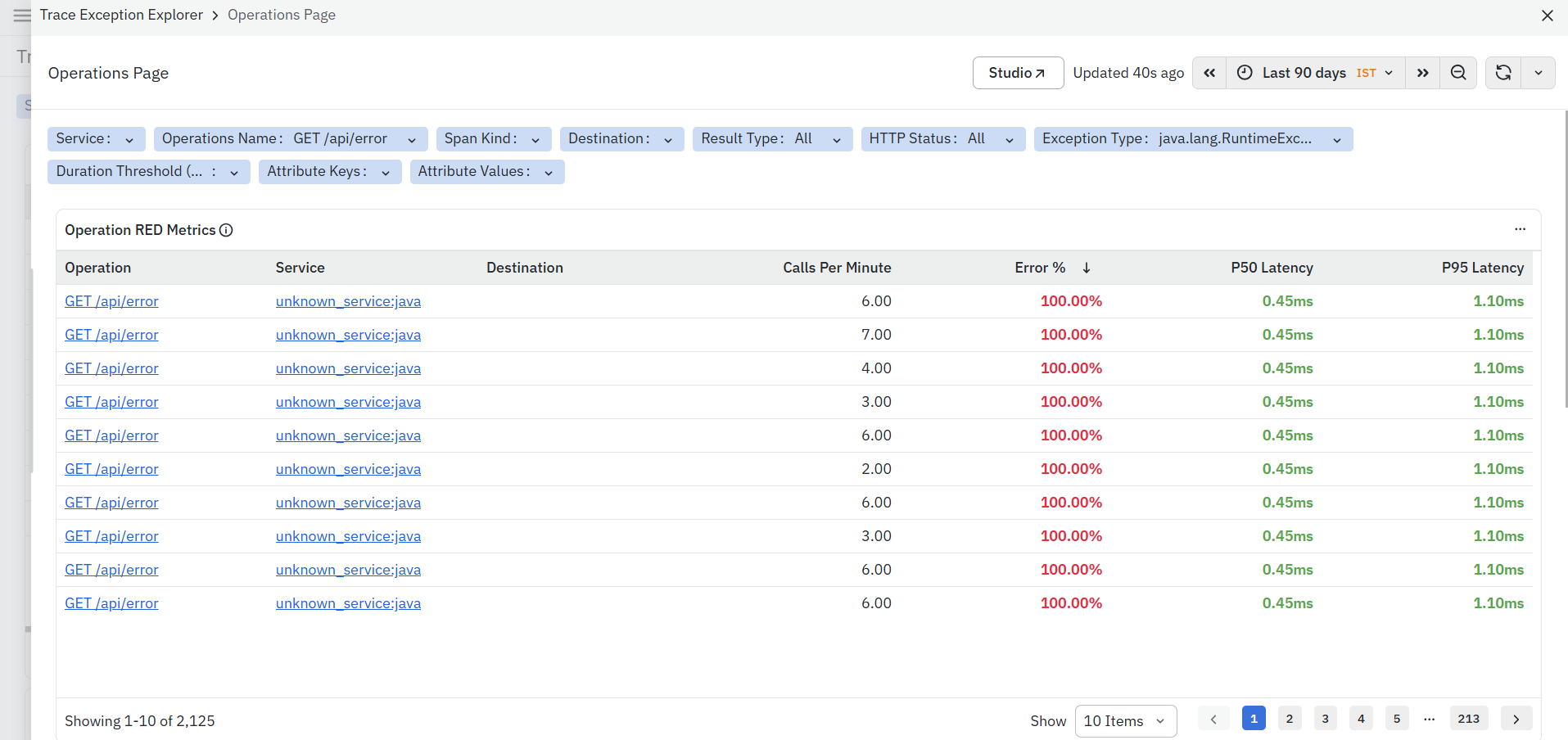
To learn more about the Operations Page, refer to Operations Page.
- Spans: Opens the Span Listing Page for the selected span. The Span Listing Page displays detailed span execution information, allowing you to analyze span attributes, execution time, parent-child relationships, and trace context.
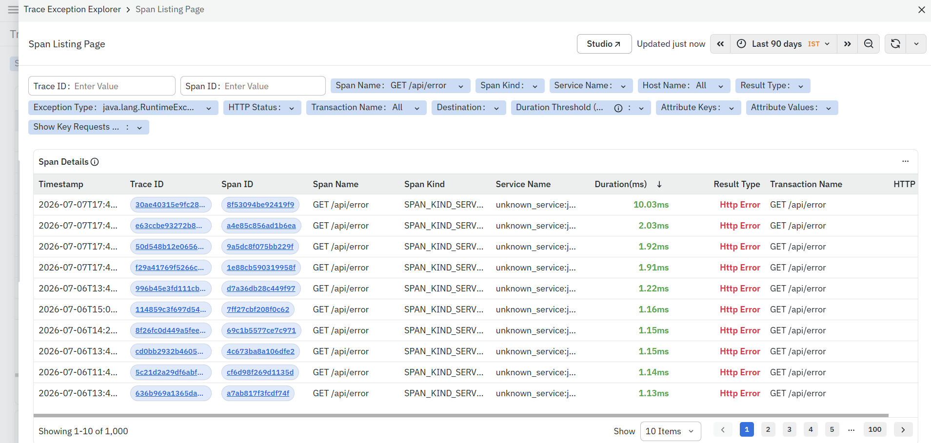
To learn more about the Span Listing Page, refer to Span Listing Page.
Transaction Name
- Displays the transaction associated with the exception.
- The Transaction Name is interactive.
- Click a Transaction Name to open the Transactions Page for the selected transaction.
The Transactions Page provides detailed transaction-level metrics, performance statistics, latency distribution, request volume, and additional diagnostic information for the selected transaction.
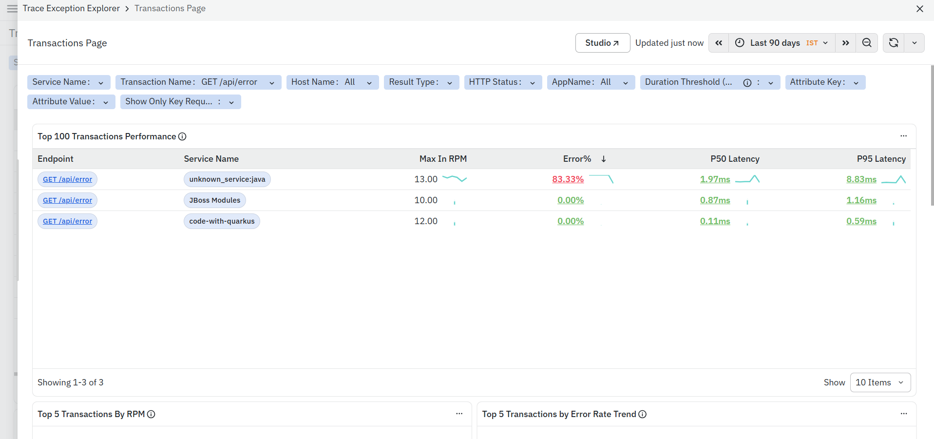
To learn more about the Transactions Page, refer to Transactions Page.
Service Name
Displays the service in which the exception occurred.
Exception Type
Displays the application exception generated during transaction execution.
Exception Message
Displays the exception message returned by the application.
Result Type
Displays the execution result associated with the trace, such as HTTP Error.
HTTP Status
Displays the HTTP response status code returned for the transaction.
Duration
Displays the total execution time of the trace.
SmartFrames Links
The SmartFrames section provides quick navigation to related dashboards, enabling you to continue your investigation without manually navigating through the application.
Code-Level Visibility Integration
When CLV is enabled:
SmartFrames can present richer execution information including:
- Controller execution
- Service execution
- ORM activity
- Database lifecycle
- Exceptions
- Stack traces
This improves root cause analysis without leaving SmartFrames.
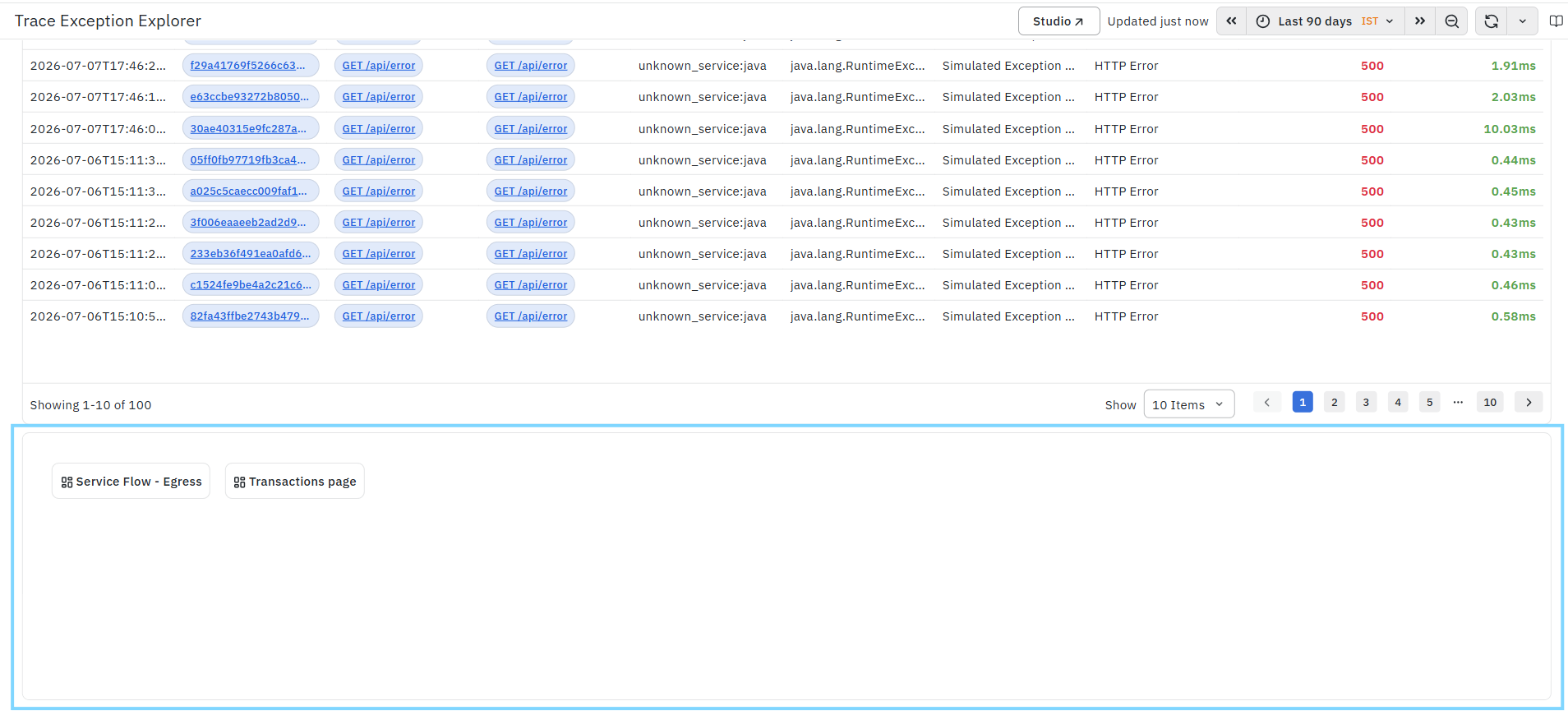
The available SmartFrames are:
Service Flow – Egress
Opens the Service Flow – Egress dashboard for the selected trace context. This dashboard visualizes downstream service communication and helps identify latency, failures, and dependencies across outbound service calls.
To learn more, refer to Service Flow – Egress.
Transactions Page
Opens the Transactions Page for the selected transaction. The Transactions Page provides detailed transaction-level performance metrics, request statistics, latency analysis, and execution details, helping you investigate transaction behavior and identify performance bottlenecks.
To learn more, refer to the Transactions Page.
Exception Analysis
The Exception Analysis for this Service dashboard is a detailed analysis dashboard in the Application Performance Monitoring (APM) module. It provides a consolidated view of exceptions generated within the selected service, along with exception trends, impacted operations, exception sources, and related trace information. This dashboard helps you identify recurring application failures, understand which operations are generating exceptions, and analyze how exceptions impact overall service behavior and transaction flow. The dashboard is divided into multiple analytical panels:
- Exception Count by Type
- Top 10 Operations with Exceptions in Service
- Exceptions by Source (Service vs Called Services)
- Exception Trend Chart
- Top 10 Operations with Exceptions in Called Service
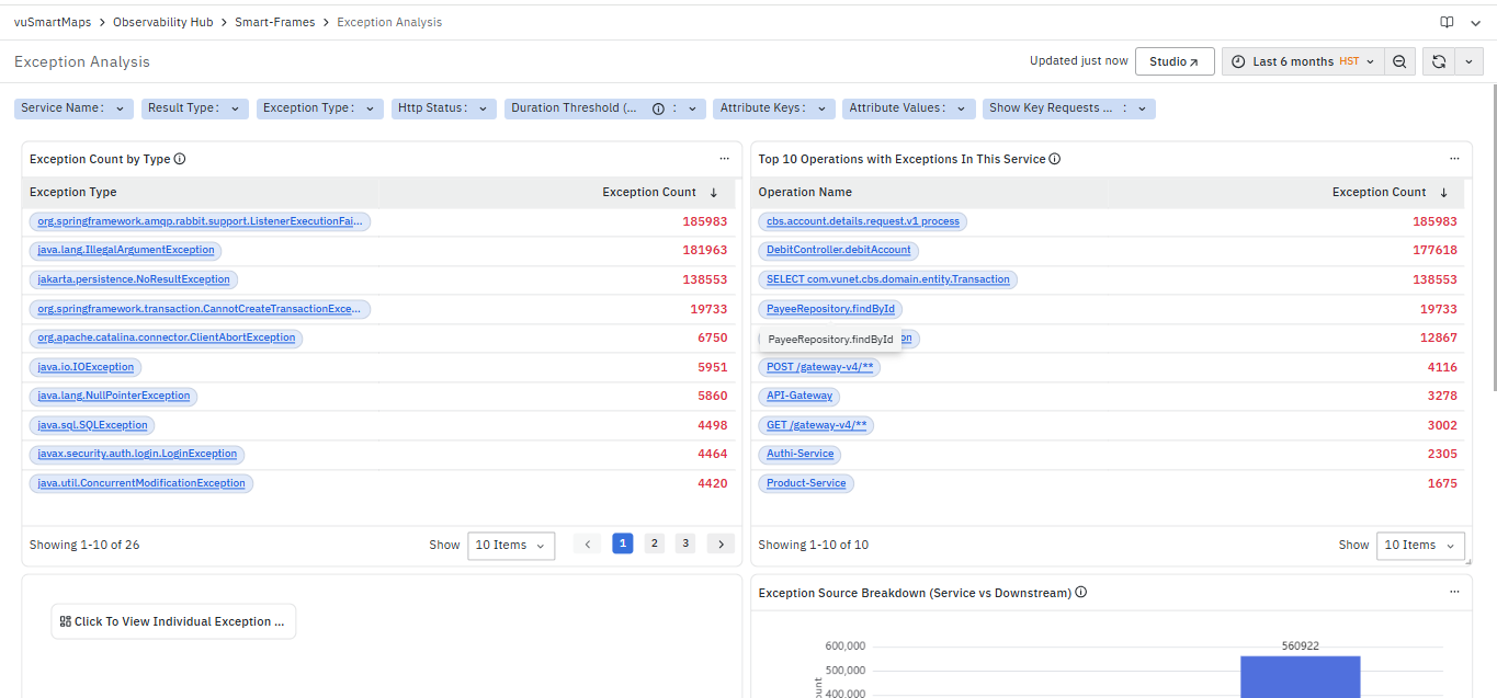
Exception Count by Type

The Exception Count by Type section displays a list of exception types along with their corresponding exception counts. This section is primarily used to identify the most frequently occurring exceptions in the selected context.
It helps you identify:
- Frequently occurring exception types
- Exception patterns across services and transactions
- High-impact exceptions that may require immediate attention
The section includes the following columns:
- Exception Type: Displays the name of the exception.
- This helps you identify the type of failure occurring in the application.
- The Exception Type is clickable. When you click an exception type, a context menu is displayed with the following options:

- Operations For This Exception:
Opens the Operations dashboard filtered for the selected exception type.This helps you analyze which operations are generating this exception. For more information, refer to the Operations dashboard.- Spans For This Exception:
Opens the Span Listing Page filtered for the selected exception type.
This helps you inspect span-level details where the exception has occurred.
For more information, refer to the Span Listing Page.- Traces For This Exception:
Opens the Trace Listing Page filtered for the selected exception type.
This helps you analyze end-to-end request traces associated with the exception.
For more information, refer to the Trace Listing Page.
- Traces For This Exception:
- This makes the Exception Type the primary entry point for navigating from exception-level insights to deeper analysis at operation, span, and trace levels.
- Spans For This Exception:
- Exception Count: Displays the number of occurrences of each exception type.
- Higher values indicate exceptions that are occurring frequently and may impact application stability.
This section helps you quickly prioritize exceptions based on their frequency and directly navigate to deeper levels of analysis.
Exception Trend Chart

The Exception Trend Chart section displays the trend of exception occurrences over time for the selected filters. This section helps in understanding how exception behavior changes within the selected service or transaction context.
The chart represents:
- Timestamp (X-axis) – Displays the selected time range for analysis.
- Exception Count (Y-axis) – Displays the number of exceptions observed at each point in time.
This section helps in:
- Identifying spikes or sudden increases in exception occurrences
- Understanding whether exceptions are increasing, decreasing, or stable over time
- Detecting abnormal behavior compared to the usual pattern
- Correlating exception occurrences with system changes, deployments, or traffic variations
This section is useful for determining the time window during which exceptions started occurring and for assessing whether the issue is continuous or intermittent.
By analyzing the trend, patterns in exception behavior can be identified, which can then be further investigated using other sections of the dashboard.
Exceptions by Source (Service vs Called Downstream)
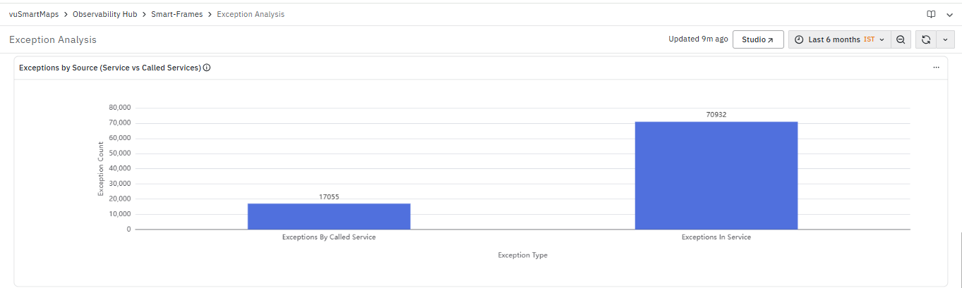
The Exceptions by Source (Service vs Called Services) section provides a comparative view of exceptions occurring within the selected service and those originating from its downstream dependencies. This section helps in understanding the source of failures and determining whether the issue is internal or dependency-driven.
The chart represents:
- Exception Type (X-axis) – Displays the category of exception source.
- Exception Count (Y-axis) – Displays the number of exceptions observed for each category.
The chart includes the following categories:
- Exceptions in Service: Represents the number of exceptions generated within the selected service.
- This indicates failures occurring due to issues within the service itself, such as code-level errors, validation failures, or internal processing issues.
- Exceptions by Called Service: Represents the number of exceptions originating from downstream or dependent services.
- This indicates failures caused by external services, such as database errors, messaging failures, or third-party service issues.
This section helps in:
- Differentiating between internal service failures and dependency-related failures
- Identifying whether the root cause lies within the service or in downstream services
- Understanding the impact of dependencies on overall application stability
This section is useful for determining whether further analysis should be focused on the selected service or on its dependent services.
Top 10 Operations with Exceptions in this Service
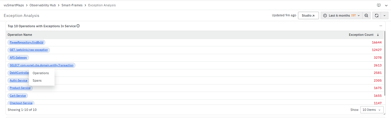
The Top 10 Operations with Exceptions in Service section displays the operations within the selected service that are generating the highest number of exceptions. This section helps in identifying operations that are contributing most to failures.
It includes the following columns:
- Operation Name: Displays the name of the operation or API. The Operation Name is clickable. When an operation is selected, a context menu is displayed with the following options:
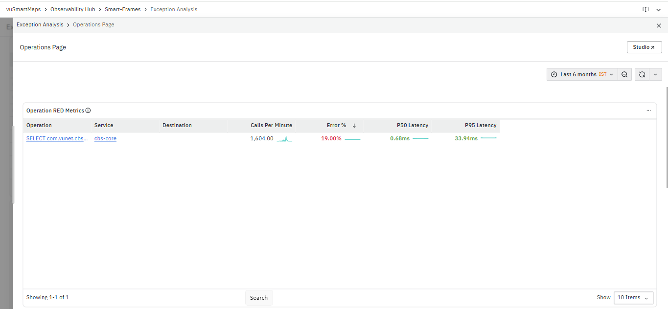
-
Operations:
Opens the Operations dashboard for the selected operation with the required context applied.
This dashboard provides RED metrics such as request rate, error percentage, and latency for the operation.
For more information, refer to the Operations dashboard.
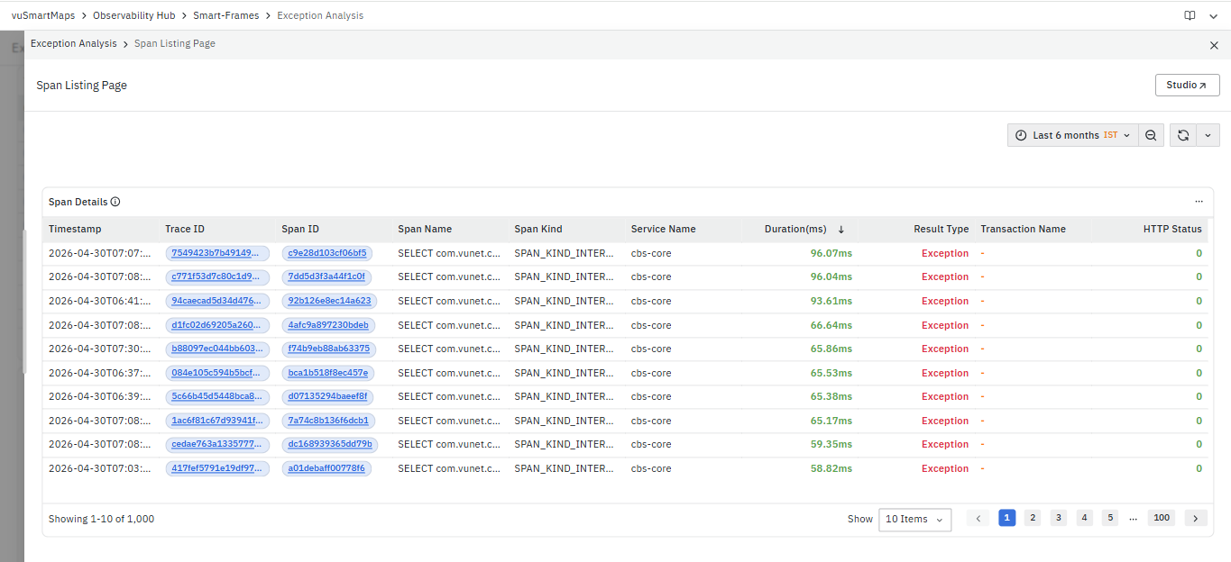
- Spans:
Opens the Span Listing Page for the selected operation with the required context applied.
This page provides span-level details, including execution time, service information, and result type.
For more information, refer to the Span Listing Page.- This makes the Operation Name the primary entry point for navigating from operation-level exception insights to detailed performance and execution analysis.
- Exception Count: Displays the number of exceptions associated with each operation.
- Higher values indicate operations that are frequently failing and may require immediate attention.
This section helps in:
- Identifying operations with high exception occurrences
- Prioritizing operations for debugging and analysis
- Navigating to detailed operation-level and span-level views for further investigation
Top 10 Downstream Operations with Exceptions

The Top 10 Downstream Operations with Exceptions section displays the operations in downstream or dependent services that are generating the highest number of exceptions. This section helps in identifying external or supporting service operations that are contributing to failures.
It includes the following columns:
- Operation Name: Displays the name of the operation in the called service.
- The Operation Name is clickable. When an operation is selected, a context menu is displayed with the following options:
- Operations
- Spans
- This enables navigation to detailed views for further analysis of the selected operation.
- The Operation Name is clickable. When an operation is selected, a context menu is displayed with the following options:
- Exception Count: Displays the number of exceptions associated with each operation.
- Higher values indicate operations in downstream services that are frequently failing and may impact the overall application behavior.
This section helps in:
- Identifying dependency-level operations with high exception occurrences
- Understanding the impact of downstream services on application stability
- Prioritizing investigation of external or supporting service failures
Host Performance Analysis Page
The Host Performance Analysis Page is a dashboard in the Application Performance Monitoring (APM) module. It provides a consolidated view of host-level performance metrics, including CPU, memory, disk, and network utilization. This dashboard helps you monitor the overall health of servers, identify resource bottlenecks, and analyze system performance trends across different hosts.
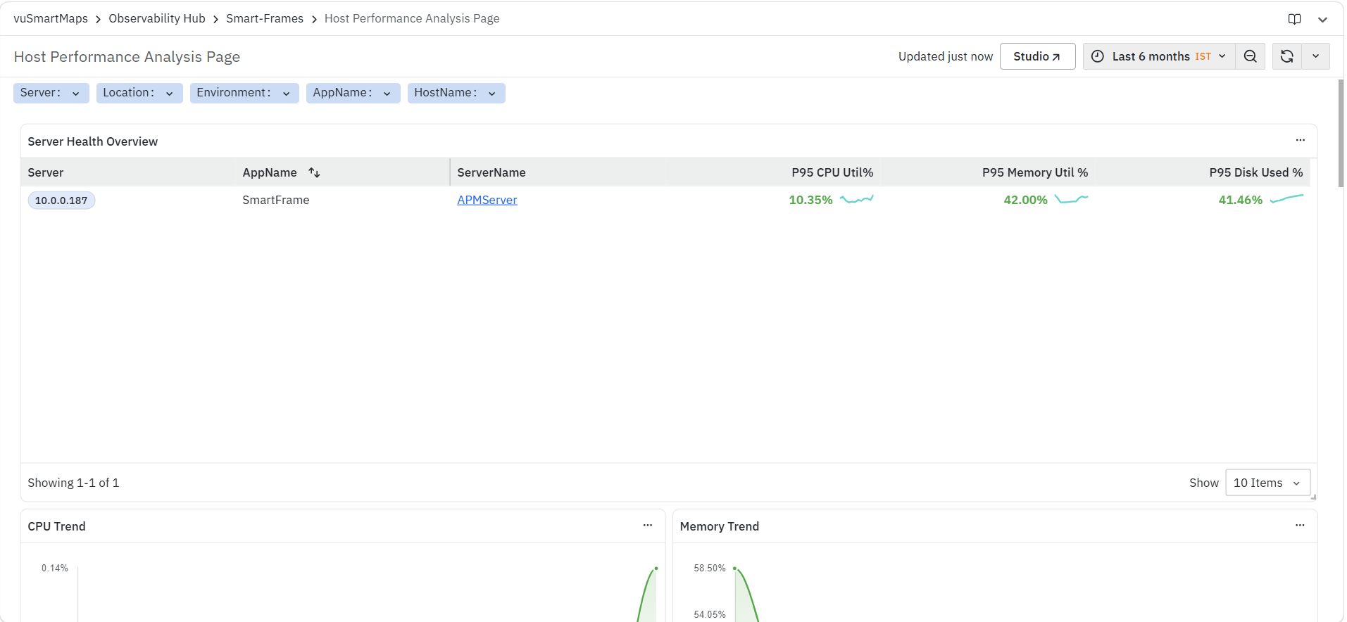
The dashboard is divided into multiple panels:
- Server Health Overview
- CPU Trend
- Memory Trend
- Disk Usage Trend
- Disk Reads/Sec Trend
- Disk Writes/Sec Trend
- Process Details
- Service Details
- Network Stats Details
At the top of the dashboard, you can also use the available filters and time controls to narrow down the displayed data based on your monitoring requirements.
Server Health Overview Panel
The Server Health Overview panel displays a summary of key resource utilization metrics for the selected hosts. This panel is primarily used to get a quick overview of server health and identify hosts that may require attention.
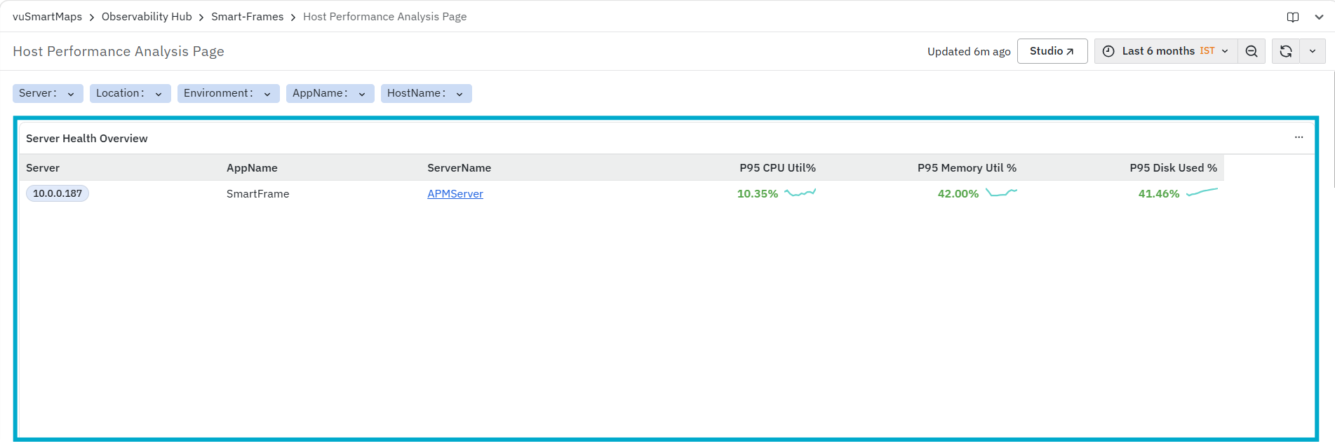
It helps you identify:
- Hosts with high CPU utilization
- Hosts with high memory usage
- Hosts with high disk usage
The panel includes the following columns:
- Server: Displays the IP address or identifier of the host.
- AppName: Displays the application associated with the host.
- ServerName: Displays the configured server name.
- The ServerName is clickable. When you click the ServerName, the platform opens the External Services Operations page for the selected server with the required context already applied.
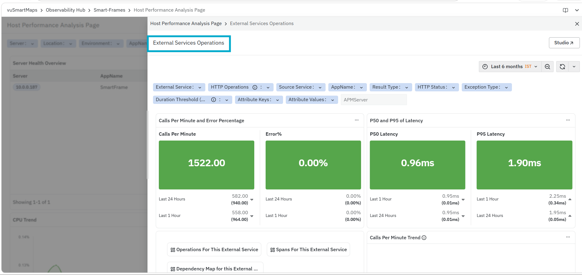
-
External Services Operations: This page provides a detailed view of external service interactions for the selected server, including request volume, error percentage, and latency metrics. It also allows you to analyze operations, spans, dependency maps, and ingress flows related to external services. To learn more about this page, refer to External Services Operations.
-
P95 CPU Util %: Displays the 95th percentile CPU utilization for the host. A sparkline is displayed alongside the value to provide a quick visual indication of the CPU trend.
-
P95 Memory Util %: Displays the 95th percentile memory utilization. A sparkline is displayed alongside the value to indicate recent memory usage behavior.
-
P95 Disk Used %: Displays the 95th percentile disk usage. A sparkline is displayed to indicate how disk usage has changed over time.
CPU Trend
The CPU Trend panel displays CPU utilization for the selected hosts over the selected time range. This panel is primarily used to understand how CPU usage changes over time and to identify patterns or fluctuations in resource consumption.
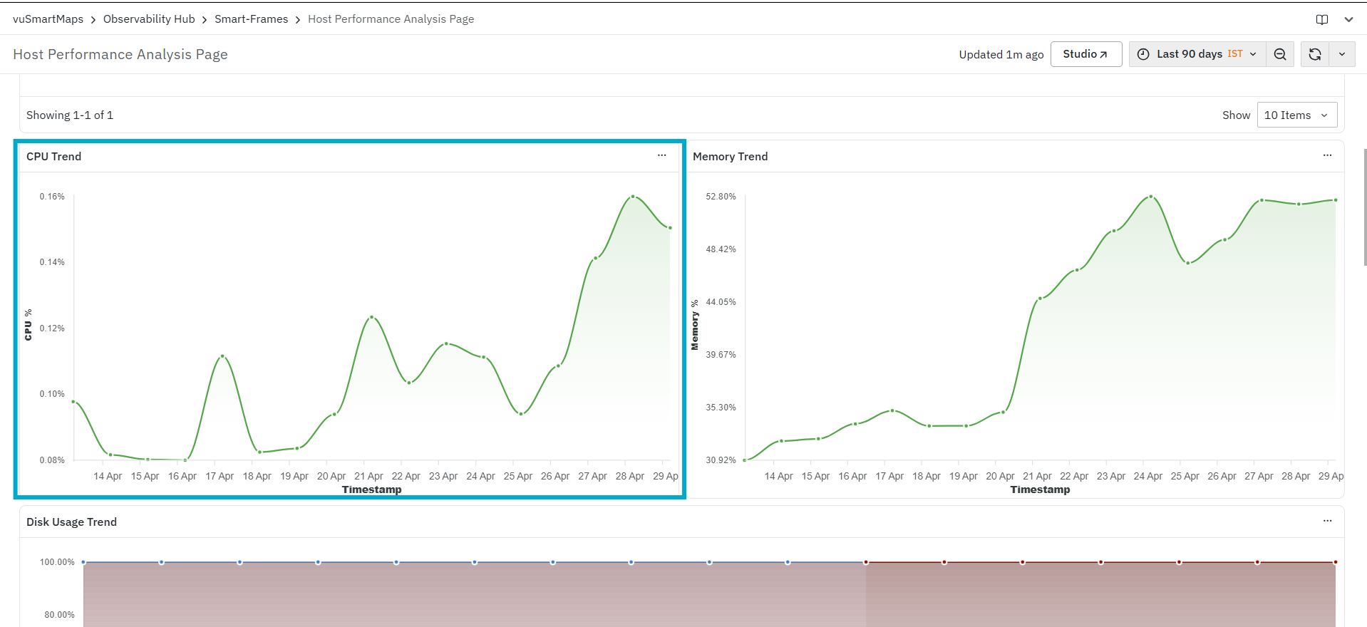
It helps you identify:
- Changes in CPU utilization over time
- Periods of increased or decreased CPU activity
- Overall CPU usage trends for the selected host
The panel displays CPU utilization (%) on the Y-axis and the timestamp on the X-axis, allowing you to visualize how CPU usage varies across the selected time window.
Memory Trend
The Memory Trend panel displays memory utilization for the selected hosts over the selected time range. This panel is primarily used to understand how memory usage changes over time and to identify patterns or fluctuations in memory consumption.
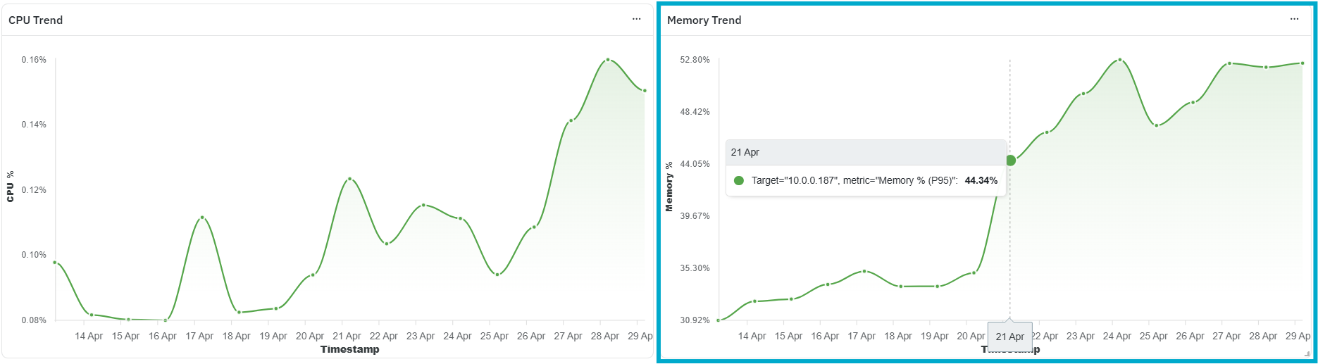
It helps you identify:
- Changes in memory utilization over time
- Periods of increased or decreased memory usage
- Overall memory consumption trends for the selected host
The panel displays memory utilization (%) on the Y-axis and the timestamp on the X-axis, allowing you to visualize how memory usage varies across the selected time window.
Disk Usage Trend
The Disk Usage Trend panel displays disk utilization for the selected hosts over the selected time range. This panel is primarily used to understand how disk usage changes over time across different storage devices.
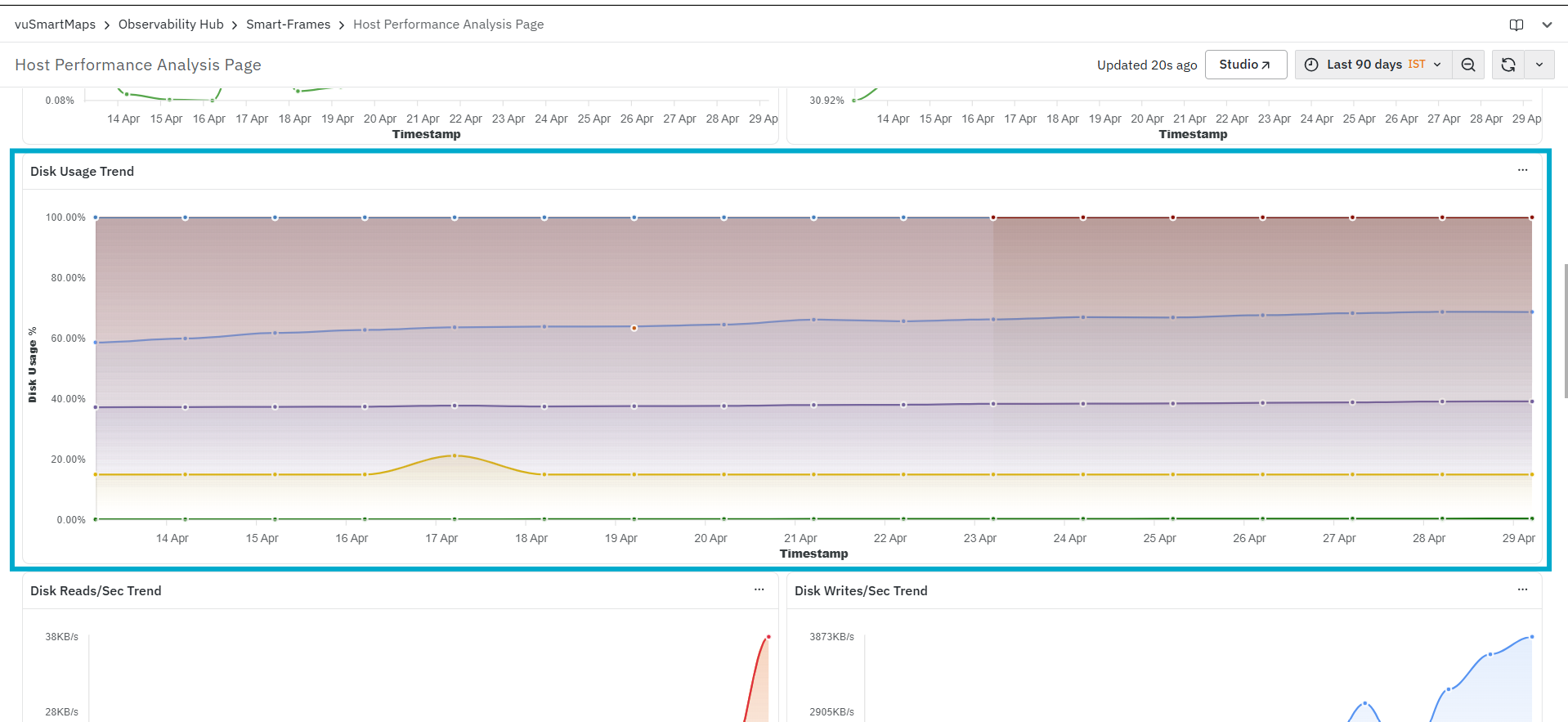
It helps you identify:
- Changes in disk utilization over time
- Usage patterns across different disk devices
- Overall disk consumption trends for the selected host
The panel displays disk usage (%) on the Y-axis and the timestamp on the X-axis. Multiple lines may be displayed in the graph, each representing a different disk device associated with the host, allowing you to compare usage across devices.
Disk Reads/Sec Trend
The Disk Reads/Sec Trend panel displays the rate of disk read operations for the selected hosts over the selected time range. This panel is primarily used to understand how disk read activity changes over time across different disk devices.
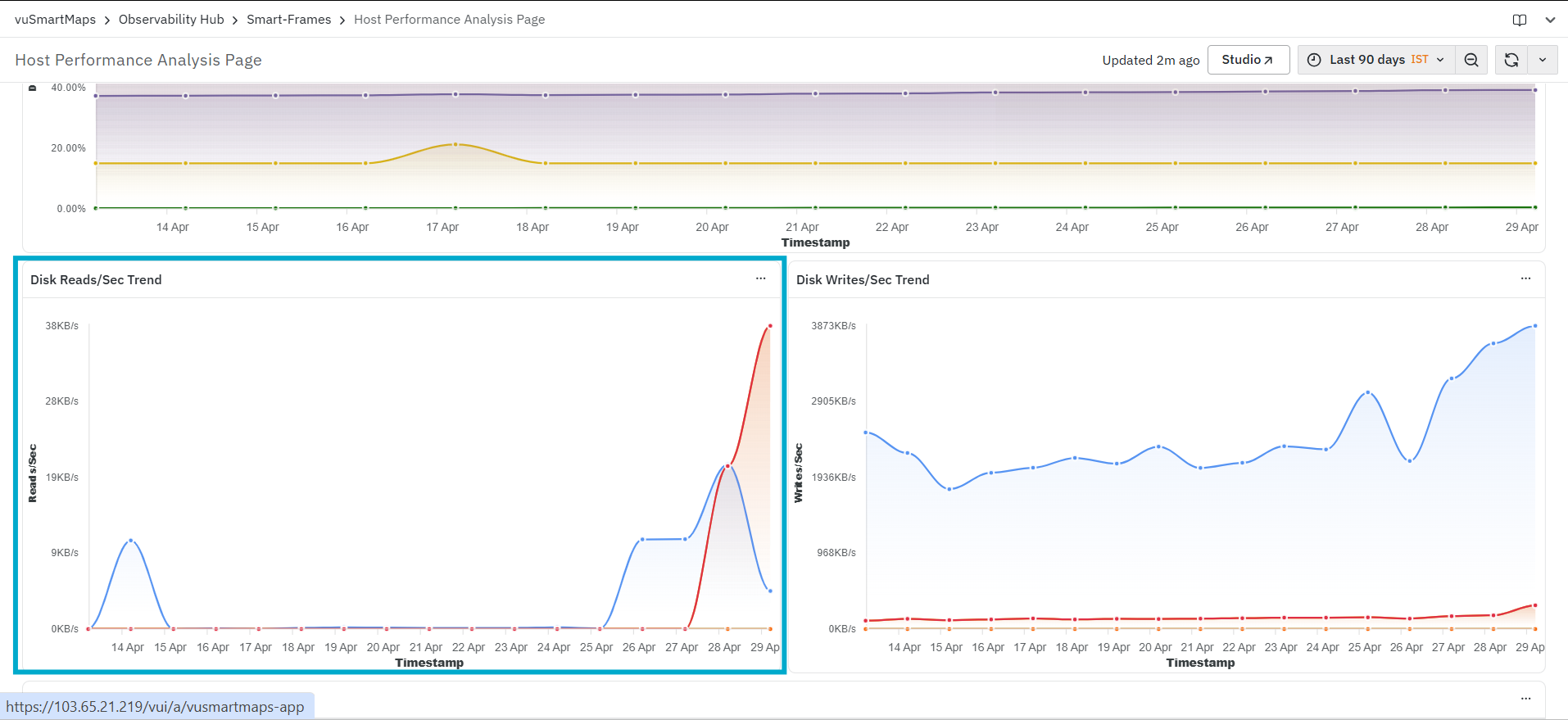
It helps you identify:
- Changes in disk read activity over time
- Periods of increased or decreased read operations
- Read patterns across different disk devices
The panel displays read throughput (KB/s) on the Y-axis and the timestamp on the X-axis. Multiple lines may be displayed in the graph, each representing a different disk device associated with the host, allowing you to compare read activity across devices.
Disk Writes/Sec Trend
The Disk Writes/Sec Trend panel displays the rate of disk write operations for the selected hosts over the selected time range. This panel is primarily used to understand how disk write activity changes over time across different disk devices.
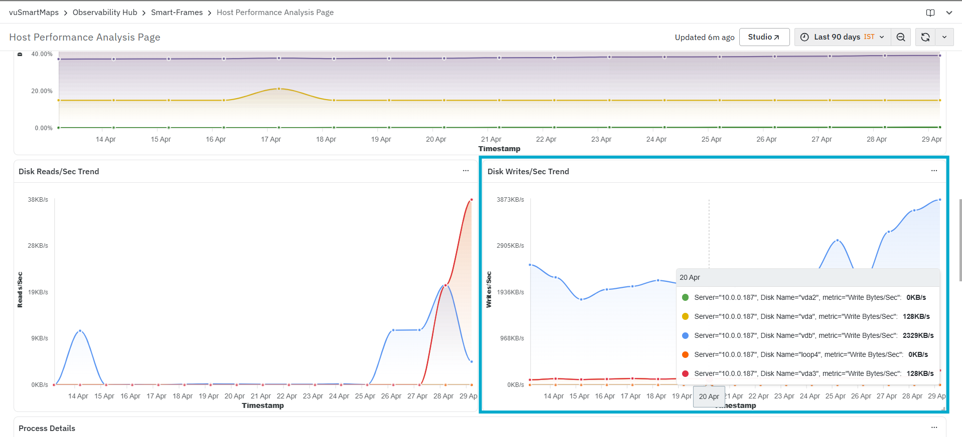
It helps you identify:
- Changes in disk write activity over time
- Periods of increased or decreased write operations
- Write patterns across different disk devices
The panel displays write throughput (KB/s) on the Y-axis and the timestamp on the X-axis. Multiple lines may be displayed in the graph, each representing a different disk device associated with the host, allowing you to compare write activity across devices.
Process Details
The Process Details panel displays process-level resource utilization for the selected hosts. This panel is primarily used to understand how system resources are being consumed by individual processes running on the host.

It helps you identify:
- Processes consuming high CPU
- Processes consuming high memory
- Overall resource usage distribution across processes
The panel includes the following columns:
- Server: Displays the IP address or identifier of the host.
- ServerName: Displays the server name.
- AppName: Displays the application associated with the host.
- PName: Displays the process name.
- PCMD Line: Displays the command used to run the process.
- PID: Displays the process ID.
- P95 CPU Util %: Displays the 95th percentile CPU utilization for the process.
- P95 Memory Util %: Displays the 95th percentile memory utilization for the process.
- PState: Displays the current state of the process (for example, Running or Sleeping).
Service Details
The Service Details panel displays system-level services running on the selected hosts along with their current state and uptime. This panel is primarily used to understand the status and availability of services on the host.
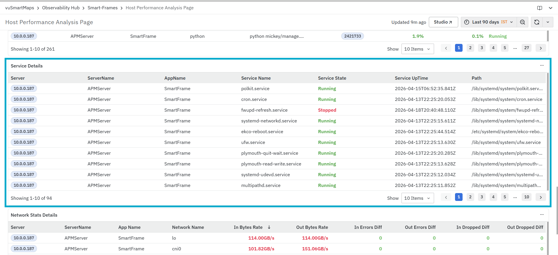
It helps you identify:
- Services that are currently running
- Services that are stopped
- Overall service status across the host
The panel includes the following columns:
- Server: Displays the IP address or identifier of the host.
- ServerName: Displays the server name.
- AppName: Displays the application associated with the host.
- Service Name: Displays the name of the service running on the host.
- Service State: Displays the current state of the service (for example, Running or Stopped).
- Service Uptime: Displays the uptime of the service.
- Path: Displays the path associated with the service.
Network Stats Details
The Network Stats Details panel displays network-level metrics for the selected hosts across different network interfaces. This panel is primarily used to monitor incoming and outgoing traffic, as well as identify network-related errors.
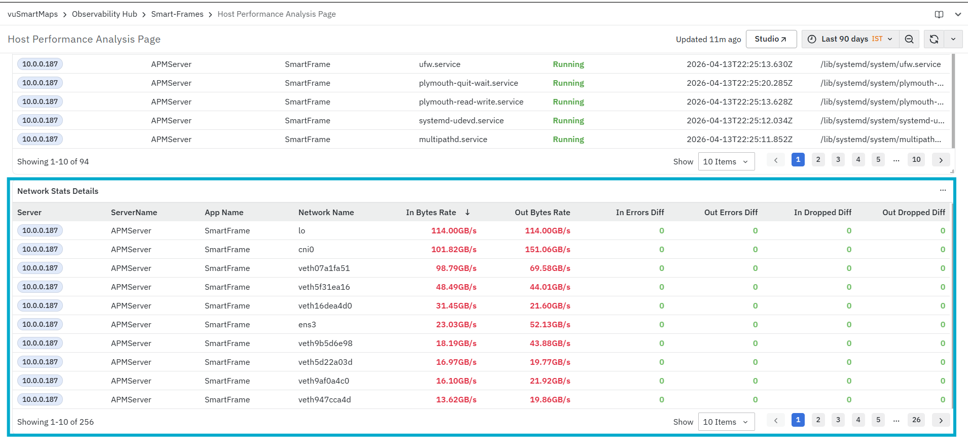
It helps you identify:
- Network interfaces with high inbound or outbound traffic
- Network interfaces are experiencing errors
- Packet drops that may indicate network issues
The panel includes the following columns:
- Server: Displays the IP address or identifier of the host.
- ServerName: Displays the server name.
- App Name: Displays the application associated with the host.
- Network Name: Displays the name of the network interface (for example, lo, cni0 , ens3,).
- In Bytes Rate: Displays the incoming network traffic rate for the interface.
- Out Bytes Rate: Displays the outgoing network traffic rate for the interface.
- In Errors Diff: Displays the change in the number of incoming network errors.
- Out Errors Diff: Displays the change in the number of outgoing network errors.
- In Dropped Diff: Displays the change in the number of incoming packets dropped.
- Out Dropped Diff: Displays the change in the number of outgoing packets dropped.
Latency Insights
The Latency Insights dashboard specializes in the Application Performance Monitoring (APM) module. It provides a structured analysis of latency issues by evaluating request behavior across services, transactions, hosts, and dependencies.
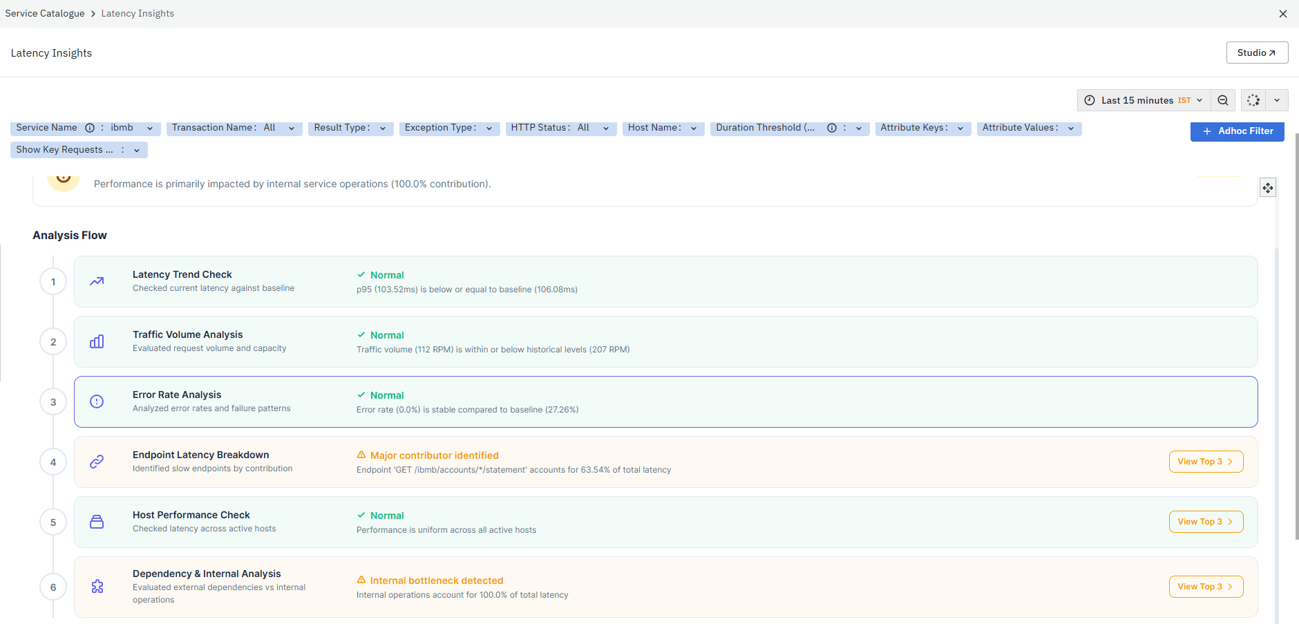
This dashboard helps you systematically identify performance bottlenecks by analyzing latency trends, traffic patterns, error behavior, and internal or external service contributions. It also provides a high-level overview of the detected latency issue and its impact, highlighting the overall severity, the primary bottleneck, and the contribution of the identified component to overall latency.
The dashboard is divided into two panels:
Analysis Flow
The Analysis Flow section provides a structured step-by-step evaluation of latency behavior across different dimensions. Each step represents a stage in identifying the primary contributors to latency.
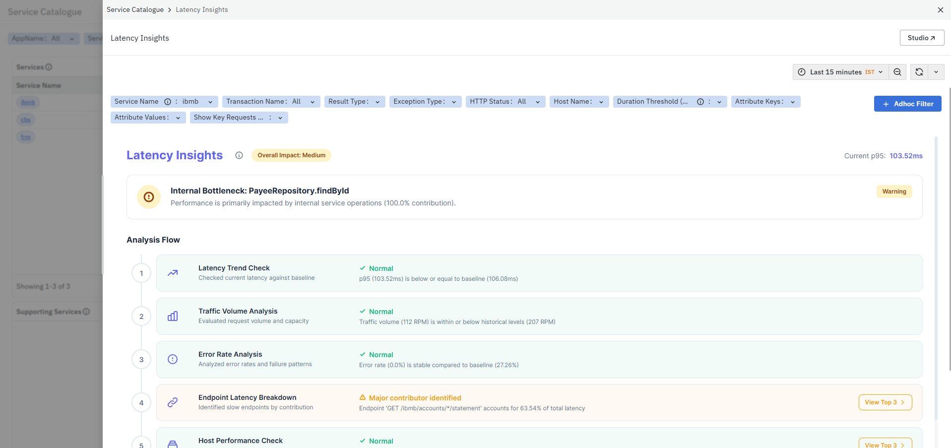
It helps you:
- Systematically validate different aspects of performance
- Identify whether latency is caused by traffic, errors, hosts, or dependencies
- Narrow down the primary contributors to latency in a guided manner
The analysis includes the following stages:
- Latency Trend Check – The Latency Trend Check evaluates current latency against historical baseline values.
- Traffic Volume Analysis – The Traffic Volume Analysis evaluates request volume and system capacity.
- Error Rate Analysis – The Error Rate Analysis evaluates error rates and failure patterns.
- Endpoint Latency Breakdown – The Endpoint Latency Breakdown identifies endpoints contributing most to overall latency.
- Host Performance Check – The Host Performance Check evaluates latency across active hosts.
- Dependency & Internal Analysis – The Dependency & Internal Analysis evaluates latency contribution from internal operations and dependencies.
Analysis Flow Actions
The View Top 3 action is available only in the following sections:
- Endpoint Latency Breakdown – Displays the top endpoints contributing most to overall latency.
- Host Performance Check – Displays the top hosts experiencing the highest latency.
- Dependency & Internal Analysis – Displays the top operations contributing most to latency.
This action helps you quickly focus on the most impactful components during latency analysis by filtering the view to the top contributors.
Latency Analysis
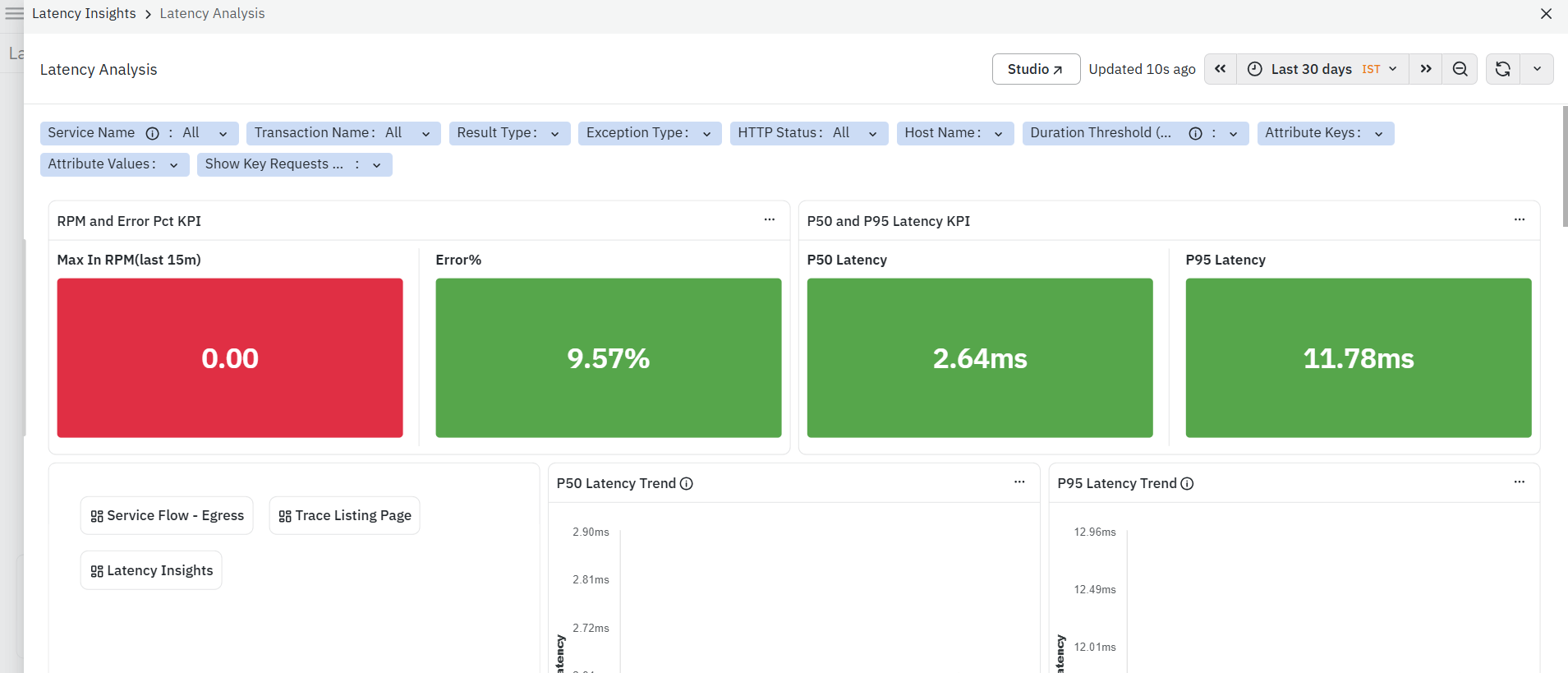
The Latency Analysis dashboard provides a detailed view of latency behavior for a selected service using trace data. It helps you understand response time variations, identify slow-performing APIs or operations, and detect performance bottlenecks impacting application performance. For more details, refer to Latency Analysis.
Service Flow - Ingress
The Service Flow - Ingress is a dashboard in the Application Performance Monitoring (APM) module. It provides a visual representation of incoming calls to the selected service from upstream services, helping you understand traffic sources, request flow, and failure patterns.
Why doesn't Service Flow show data for "Last 5 minutes"?**
Service Flow is calculated in fixed 5-minute intervals, for example, 10:00–10:05 and 10:05–10:10. The interval that is still in progress is intentionally excluded because some transactions are still being processed, so the results may be incomplete or misleading.
If you select Last 5 minutes, the selected time window is almost entirely within the current interval, so the panel may show no data. This is expected and does not mean that data is missing.
What to do:
- Select Last 15 minutes or longer to view recent Service Flow data.
- The most recent 5-minute interval appears automatically once it has finished and been processed.
Service Flow can lag real time by up to 5 minutes.
:::
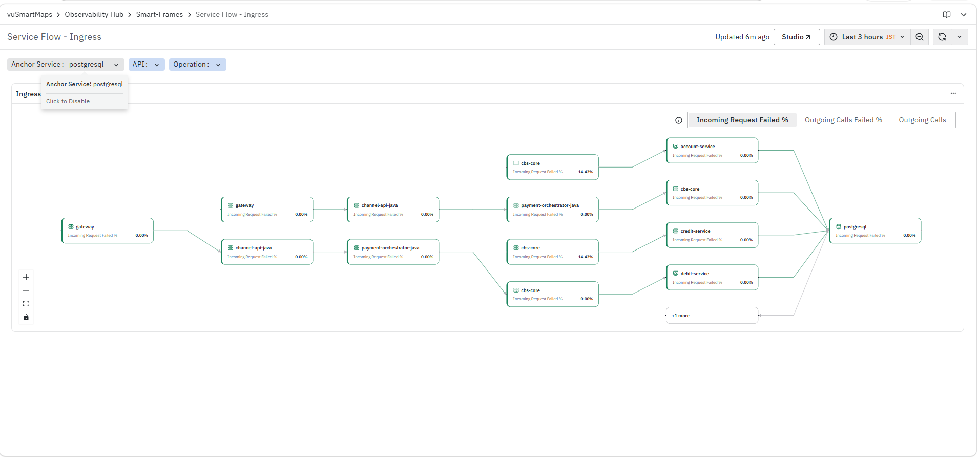
This dashboard helps you analyze how requests enter a service, identify upstream dependencies, and detect issues such as high failure rates or abnormal traffic patterns affecting the selected service.
The dashboard consists of the following sections:
Ingress Flow Visualization
The Ingress panel displays a graphical flow of incoming requests to the selected service from upstream services. It represents how different services interact and route traffic toward the anchor service.
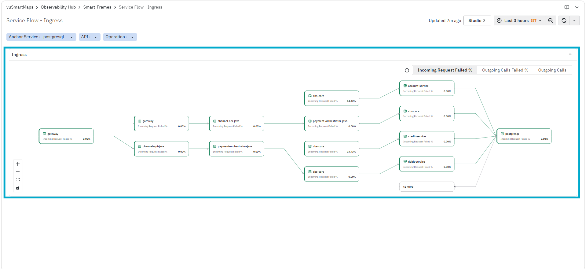
It helps you identify:
- Upstream services sending requests to the selected service
- Request flow paths across services
- Points where failures or high error rates occur
- Distribution of traffic across different upstream dependencies
Each node in the flow represents a service, and the connections represent the request flow between services. The visualization highlights the relationship between upstream services and the selected anchor service.
The panel supports multiple metric views, such as:
- Incoming Request Failed % – Displays the percentage of failed incoming requests
- Outgoing Calls Failed % – Displays failure percentage for outgoing calls
- Outgoing Calls – Displays the volume of outgoing calls
These options help you analyze the flow from different perspectives based on failures or traffic volume.
Service Flow - Egress
The Service Flow - Egress is a dashboard in the Application Performance Monitoring (APM) module. It visualizes all outgoing calls from the selected service to downstream services, helping you understand service dependencies, traffic distribution, and performance impact.
Why doesn't Service Flow show data for "Last 5 minutes"?**
Service Flow is calculated in fixed 5-minute intervals, for example, 10:00–10:05 and 10:05–10:10. The interval that is still in progress is intentionally excluded because some transactions are still being processed, so the results may be incomplete or misleading.
If you select Last 5 minutes, the selected time window is almost entirely within the current interval, so the panel may show no data. This is expected and does not mean that data is missing.
What to do:
- Select Last 15 minutes or longer to view recent Service Flow data.
- The most recent 5-minute interval appears automatically once it has finished and been processed.
Service Flow can lag real time by up to 5 minutes.
:::
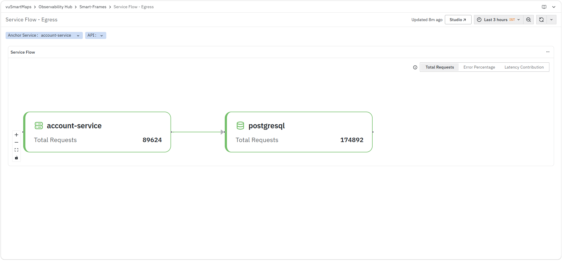
This dashboard helps you analyze how a service interacts with its downstream components, identify dependency-related issues, and detect failures or latency contributions affecting overall performance.
The dashboard consists of the following sections:
Service Flow Visualization
The Service Flow panel displays a graphical representation of outgoing calls from the selected service to its downstream services. It shows how the anchor service interacts with dependent services and how requests are distributed across them.
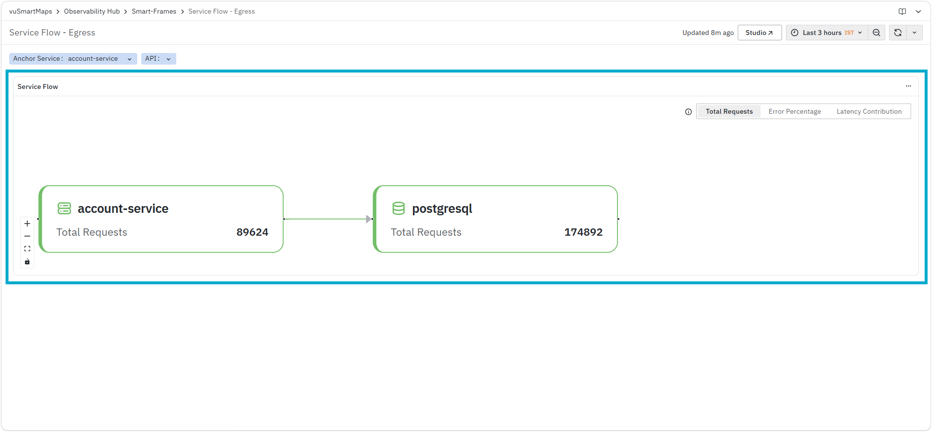
It helps you identify:
- Downstream services receiving requests from the selected service
- Call flow paths between services
- Distribution of request load across dependencies
- Services contributing to failures or latency
Each node represents a service, and the connections represent outgoing calls from the anchor service to downstream services.
The panel provides the following metric views:
- Total Requests – Displays the total number of outgoing requests between services
- Error Percentage – Displays the percentage of failed outgoing requests
- Latency Contribution – Displays how much each downstream service contributes to overall latency
These views allow you to analyze dependency behavior from traffic, reliability, and performance perspectives.
Dependency Service Map
The Dependency Service Map is a dashboard in the Application Performance Monitoring (APM) module. It visualizes how services communicate with each other by displaying upstream and downstream dependencies along with key performance indicators.

It helps you identify:
- Upstream and downstream service dependencies
- Service communication paths
- Services experiencing higher error rates or performance issues
- Potential bottlenecks and failure impact areas
Span Listing Page
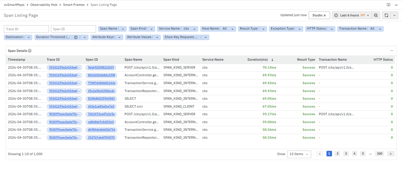
The Span Details dashboard is a detailed span-level analysis dashboard in the Application Performance Monitoring (APM) module. It provides execution details, runtime information, dependency context, resource attributes, and telemetry metadata for the selected span within a trace. This dashboard helps you analyze individual operations and investigate execution-level issues within distributed transactions. The dashboard is divided into multiple information sections:
Span Details
The Span Details section displays a list of spans along with their execution details. This section provides visibility into how individual operations are executed as part of request traces across services.
It includes the following columns:
- Timestamp: Displays the time at which the span was executed.
- This allows correlation of span execution with other events and time-based patterns.
- Trace ID: Displays the trace identifier associated with the span.The Trace ID is clickable and provides the following options:
- Trace Map
- Trace Waterfall
-
The Trace ID is clickable. When selected, the platform opens the TraceMap dashboard for the selected trace.
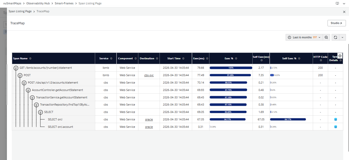
- The TraceMap presents a hierarchical representation of all spans within the trace, showing the end-to-end execution flow across services.
- It enables identification of how the request propagates through services and where delays or failures occur.
- For more information, refer to the TraceMap dashboard.
-
Trace Waterfall: Opens the Trace Waterfall dashboard for the selected trace.

- The Trace Waterfall presents a timeline-based visualization of span execution across services.
- It helps analyze span duration, request flow sequence, parallel execution, critical path operations, and latency contribution of individual spans within the transaction lifecycle.
- For more information, refer to the Trace Waterfall dashboard.
-
Span ID: Displays the unique identifier of the span.
- The Span ID is clickable. When selected, the platform opens the Span Details dashboard for the selected span.
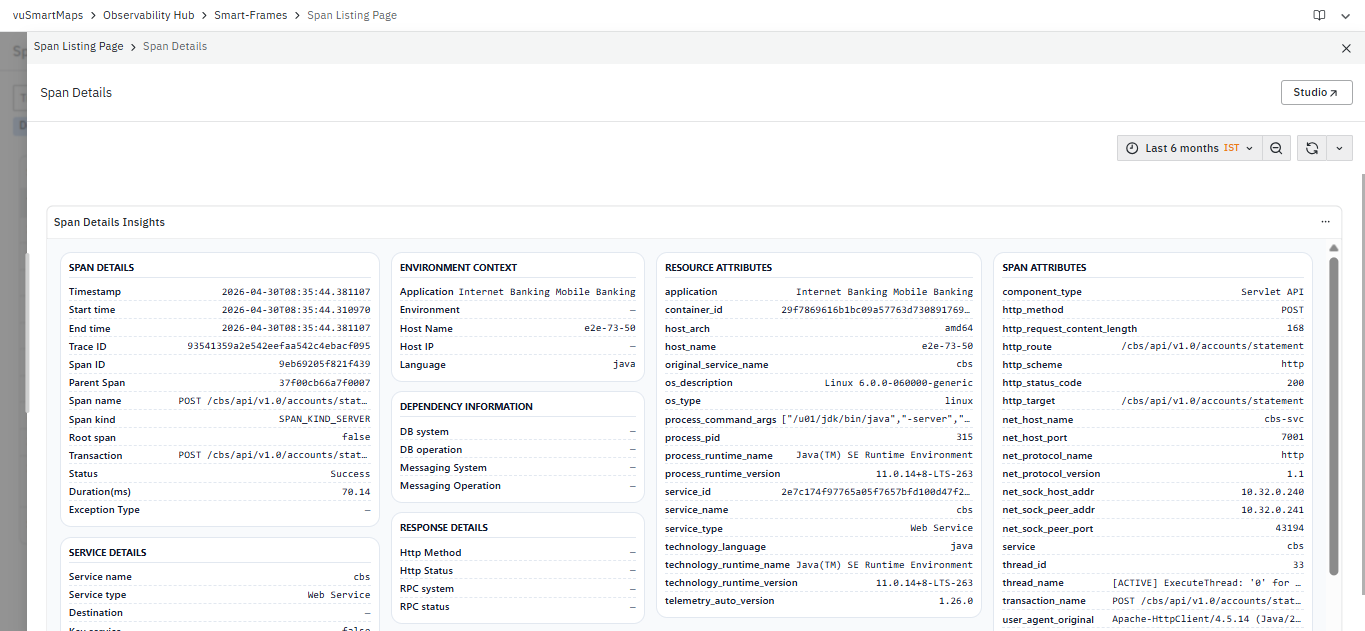
- This dashboard provides detailed span-level attributes, including execution context, metadata, and associated information.
- It enables focused analysis of a single operation within the trace.
- For more information, refer to the Span Details dashboard.
- The Span ID is clickable. When selected, the platform opens the Span Details dashboard for the selected span.
-
Span Name: Displays the name of the operation executed in the span.
- This represents the specific action performed as part of the request flow.
-
Span Kind: Displays the type of span (for example, SERVER, CLIENT, INTERNAL).
- This indicates the role of the span in the overall execution flow.
-
Service Name: Displays the service executing the span.
- This identifies the service responsible for the operation.
-
Duration (ms): Displays the execution time of the span in milliseconds.
- This provides visibility into how long each operation takes and highlights slower spans within the trace.
-
Result Type: Displays the result of the span execution.
- This indicates whether the span execution was successful or resulted in an exception.
-
Transaction Name: Displays the transaction associated with the span.
- This allows correlation of spans with specific transactions or request flows.
-
HTTP Status: Displays the HTTP response code associated with the span.
- This provides response-level context for the operation.
This section enables detailed analysis of span execution across services, allowing identification of performance bottlenecks, failures, and operation-level behavior within request traces.
A common workflow when using the Span Listing Page is:
- Use the top filters to narrow down spans based on trace, service, or operation.
- Review the Span Details section to identify:
- High-duration spans
- Spans with exceptions
- Frequently executed operations
- Correlate spans with their corresponding traces using the Trace ID.
- Use the filtered results to isolate performance bottlenecks or failure points.
Trace Waterfall
The Trace Waterfall dashboard provides a chronological visualization of the execution flow of a single trace. It displays every span involved in processing a request, along with its execution duration, parent-child relationships, and sequence of execution. This dashboard helps identify latency contributors, analyze request flow across services and dependencies, and investigate performance bottlenecks within a transaction.
The dashboard presents the complete lifecycle of a request, allowing you to understand how execution time is distributed across operations, services, database calls, and other dependencies.
The dashboard is divided into the following sections:
Trace Information
The Trace Information section displays the basic information associated with the selected trace.
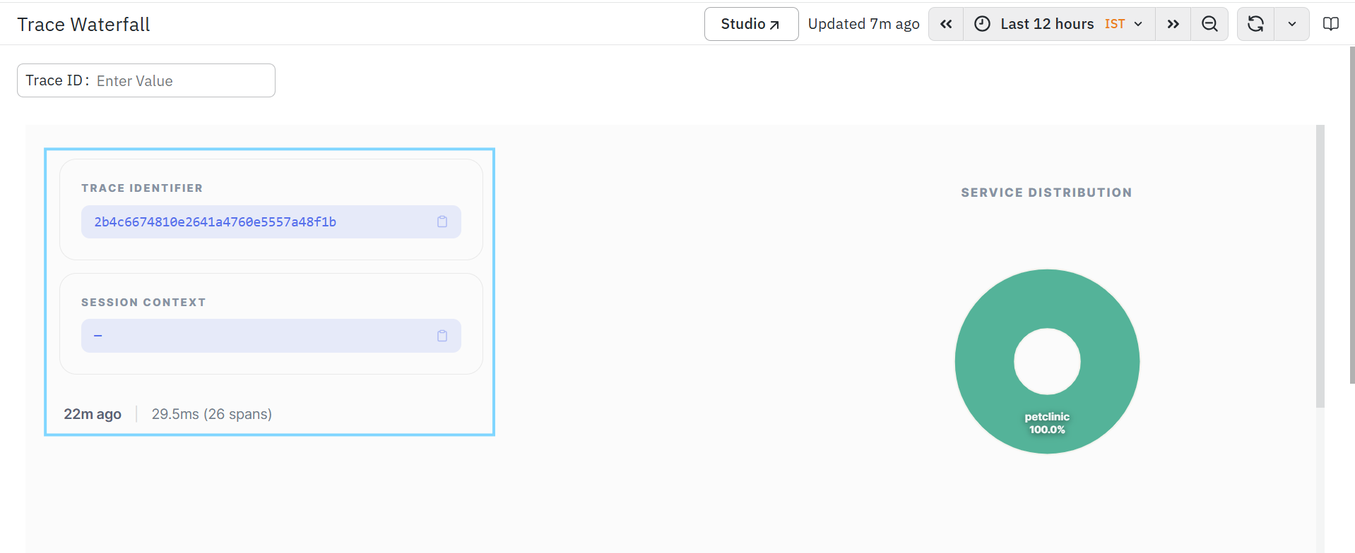
The section includes the following fields:
Trace ID
- Displays the unique identifier of the selected trace.
- This helps uniquely identify the transaction and correlate it across other APM dashboards.
- A copy icon is available to copy the Trace ID.
Session Context
- Displays the session identifier associated with the trace, if available.
- This helps correlate multiple requests belonging to the same user session or business transaction.
- A copy icon is available to copy the Session Context value.
Trace Summary
Below the trace information, the dashboard displays summary information for the selected trace, including:
- Trace Age – Displays how long ago the trace was captured.
- Total Duration – Displays the total execution time of the trace.
- Span Count – Displays the total number of spans that participated in the trace execution.
This summary provides a quick overview of the overall transaction execution.
When Code-Level Visibility is enabled in APM Studio, Trace Waterfall displays additional execution spans such as Controller, Service, ORM, Database Lifecycle, and Exception spans. These spans provide deeper visibility into application execution.
Service Distribution
The Service Distribution panel displays the percentage of trace execution contributed by each participating service.
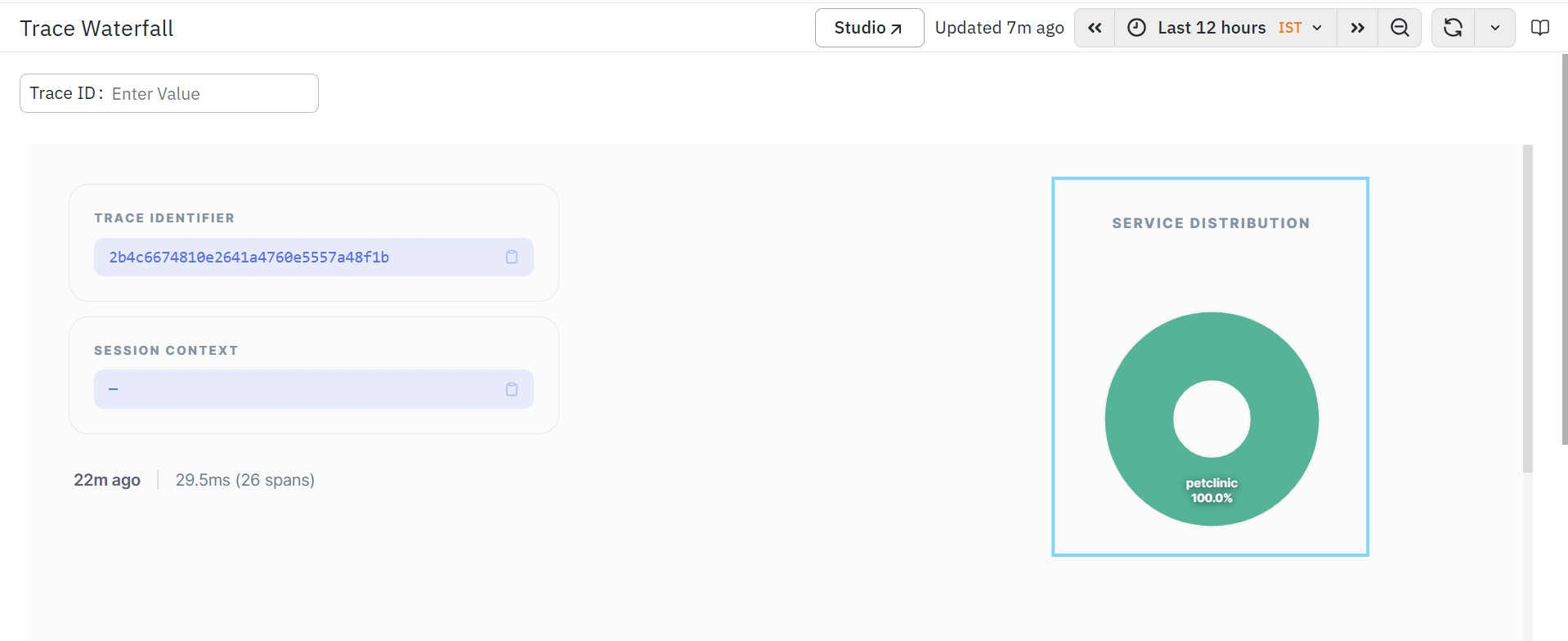
This section helps you:
- Identify services involved in the trace.
- Understand how execution is distributed across services.
- Quickly determine the dominant service participating in the transaction.
The visualization updates automatically based on the selected trace.
Timeline
The Timeline section provides a chronological view of span execution across the entire trace. Each horizontal bar represents an individual span. The position of the bar indicates when the span started during the transaction, while the length of the bar represents its execution duration.
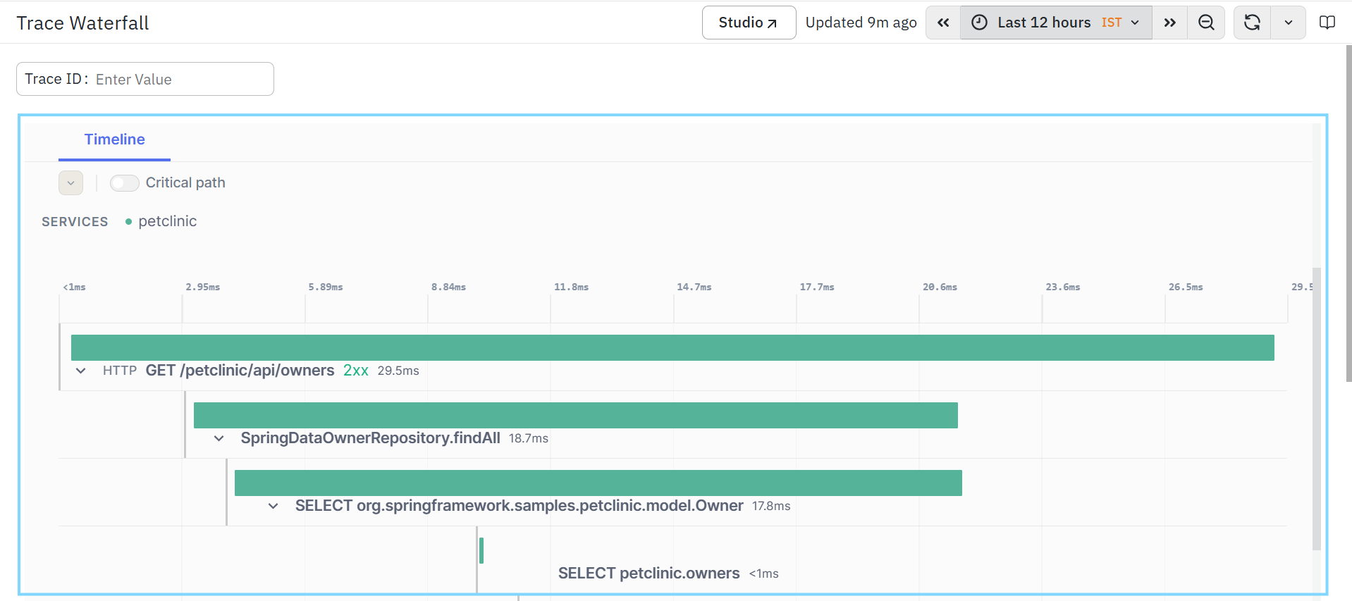
This helps you:
- Visualize the order of execution.
- Understand parent-child relationships between spans.
- Identify sequential and parallel execution.
- Analyze execution overlap between operations.
- Detect long-running operations contributing to transaction latency.
Timeline Controls
Critical Path
The Critical Path option highlights the sequence of spans that contributes most to the total execution time of the trace.
Enabling this option helps you:
- Identify the primary latency path.
- Focus on spans contributing most to end-to-end response time.
- Prioritize optimization efforts for slow transactions.
Services
- Displays the services participating in the selected trace.
- Selecting a service filters the timeline to display spans associated with that service.
- This helps isolate the execution flow for individual services during troubleshooting.
Trace Execution Waterfall
- The Trace Execution Waterfall displays the hierarchical execution flow of the selected trace.
- Each row represents an individual span.
- Nested spans indicate parent-child relationships between operations, allowing you to understand how requests propagate through the application.
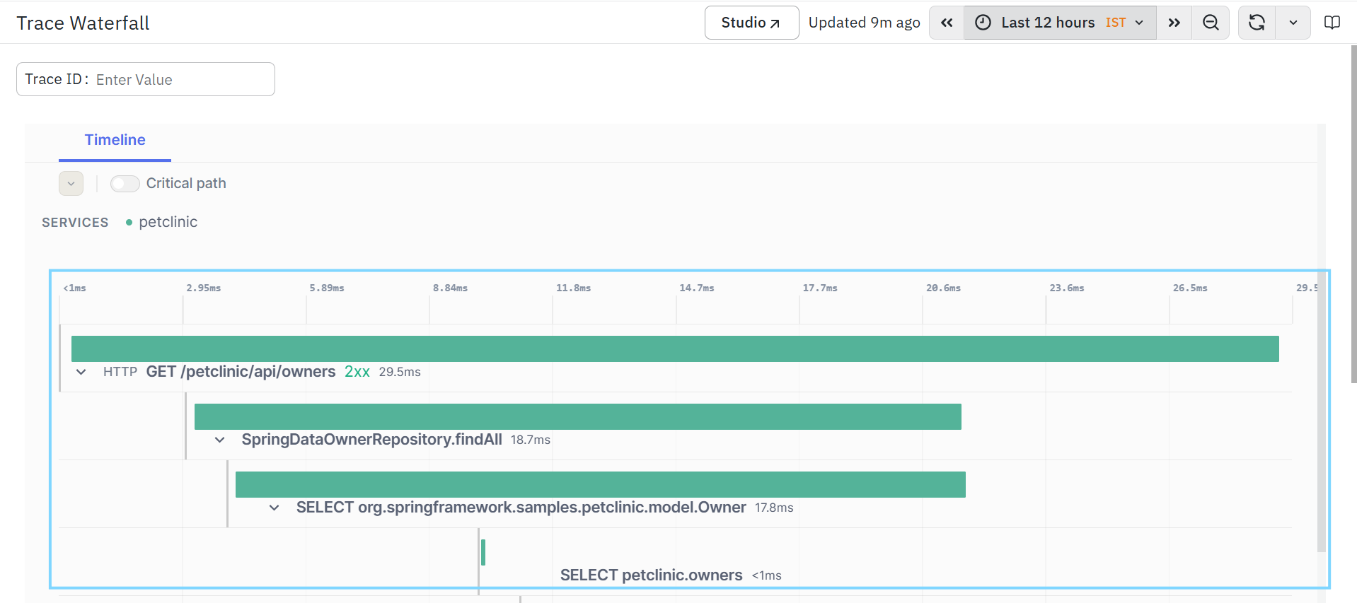
The waterfall visualization helps you:
- Analyze execution sequence.
- Understand request propagation.
- Identify slow operations.
- Detecting downstream dependency latency.
- Investigate database calls, messaging operations, and service invocations.
Each span displays the following information.
Span Type
Displays the type of operation performed by the span.
Examples include:
- HTTP Request
- Database Query
- Messaging Operation
- Internal Processing
This helps identify the nature of the executed operation.
Span Name
Displays the name of the executed operation.
Examples include:
- API endpoint
- Database query
- Repository method
- Internal service method
This helps identify the specific operation executed during the request.
Execution Duration
- Displays the total execution time of the span.
- The duration is shown alongside each span and visually represented by the length of the timeline bar.
- Longer bars indicate operations consuming more execution time.
Parent-Child Relationship
- Child spans are displayed beneath their parent spans.
- This hierarchy illustrates how requests propagate through services and dependencies, helping you understand execution flow across the transaction.
Expand and Collapse
- Each parent span includes an expand/collapse control.
- You can expand a span to view all child spans or collapse it to simplify the execution view.
- This helps focus on specific portions of the trace during analysis.
External Services Operations

The External Services Operations dashboard is a detailed analysis dashboard in the Application Performance Monitoring (APM) module. It provides a consolidated view of operations performed on external services and downstream dependencies, along with key RED metrics, including request volume, error percentage, and latency. This dashboard helps you monitor interactions with external systems, identify slow or failing dependency calls, and analyze how downstream services impact overall application performance.The dashboard is divided into multiple analytical panels:
- Calls Per Minute and Error Percentage
- Calls Per Minute Trend
- P50 and P95 Latency Trend
- Error percentage Trend
- Navigations Options
- External Service Operations RED Metrics
- RED Metrics per Calling Service
- Error Distribution by Error code
- Error Distribution by Result Code
- Error Distribution by Exception Type
Calls Per Minute and Error Percentage
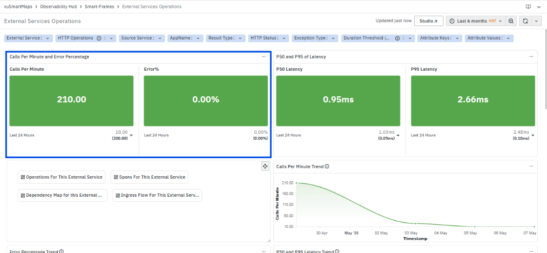
The Calls Per Minute and Error Percentage section displays high-level RED metrics for the selected external service. This section provides a summarized view of request volume and failure rate within the selected time range.
It includes the following metrics:
- Calls Per Minute: Displays the number of calls made to the external service per minute.
- This represents the request volume handled by the external service.
- The value reflects the current or aggregated rate based on the selected time range.
- A trend indicator is displayed along with the value to represent recent behavior.
- Error %: Displays the percentage of calls that resulted in errors.
- This represents the proportion of failed requests compared to total requests.
- The value is calculated based on the selected time range.
- A trend indicator is displayed to show recent variation in error rate.
This section provides a consolidated view of traffic and error behavior for the external service, enabling quick assessment of its operational state.
P50 and P95 of Latency
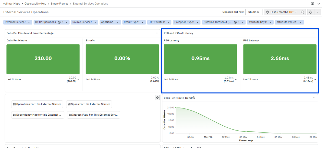
The P50 and P95 of Latency section displays latency metrics for the selected external service, providing visibility into response time behavior.
It includes the following metrics:
- P50 Latency: Displays the median response time of external service calls.
- This represents the typical latency experienced for most requests within the selected time range.
- P95 Latency: Displays the 95th percentile response time.
- This represents the latency for slower requests and highlights higher-end response times that may impact performance.
Both metrics are displayed for the selected time range along with a trend indicator showing recent variation. This section provides a combined view of typical and higher-end latency, enabling assessment of overall performance and identification of slower request behavior.
Navigation Options
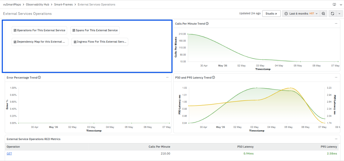
The Navigation Options section provides quick access to related dashboards for the selected external service. Each option is clickable and redirects to a corresponding page with the selected context applied.
It includes the following options:
- Operations For This External Service:
Opens the Operations For This External Service page.
This page displays operation-level RED metrics, including calls per minute, error percentage, and latency for operations interacting with the external service.
For more information, refer to the Operations For This External Service page. - Spans For This External Service:
Opens the Span Listing Page filtered for the selected external service.
This page displays span-level execution details, including operation, service, duration, and result type for requests involving the external service.
For more information, refer to the Span Listing Page. - Dependency Map for this External Service:
Opens the Dependency Map view for the selected external service.
This view displays service-to-service interactions and shows how the external service is connected within the application flow.
For more information, refer to the Dependency Map. - Ingress Flow For This External Service:
Opens the Ingress Flow view for the selected external service.
This view displays incoming request flows from source services to the external service.For more information, refer to the Ingress Flow.
These options provide direct navigation to detailed dashboards for analyzing operations, spans, and service interactions related to the external service.
Calls Per Minute Trend
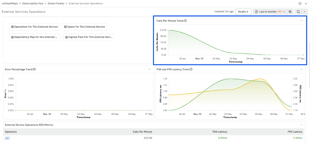
The Calls Per Minute Trend section displays how the request rate to the selected external service changes over time. This section provides a time-based view of traffic behavior.
The chart represents:
- Timestamp (X-axis) – Displays the selected time range for analysis.
- Calls Per Minute (Y-axis) – Displays the number of calls made per minute at each point in time.
This section presents the variation in request volume across the selected time window, highlighting patterns such as steady traffic, gradual changes, or sudden spikes.
The trend reflects how frequently the external service is being invoked over time and indicates periods of increased or reduced activity.
This section provides visibility into traffic patterns and supports identification of abnormal variations in request rate.
Error Percentage Trend
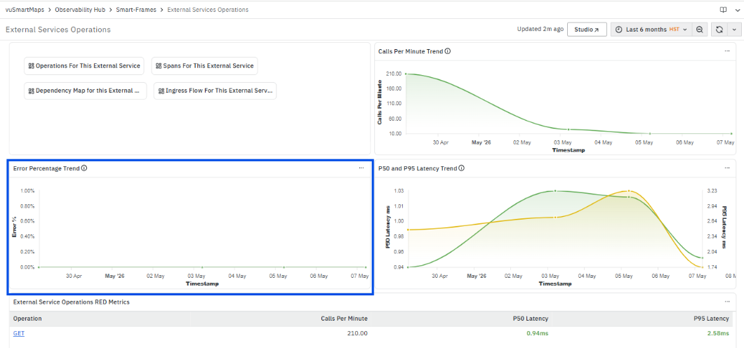
The Error Percentage Trend section displays how the error rate for the selected external service changes over time. This section provides a time-based view of failures in relation to total requests.
The chart represents:
- Timestamp (X-axis) – Displays the selected time range for analysis.
- Error Percentage (Y-axis) – Displays the percentage of requests that resulted in errors at each point in time.
This section presents the variation in error rate across the selected time window, highlighting patterns such as stable behavior, gradual increase or decrease, or sudden spikes.
The trend reflects how the failure rate evolves over time and indicates periods where the error percentage deviates from the normal pattern.
P50 and P95 Latency Trend
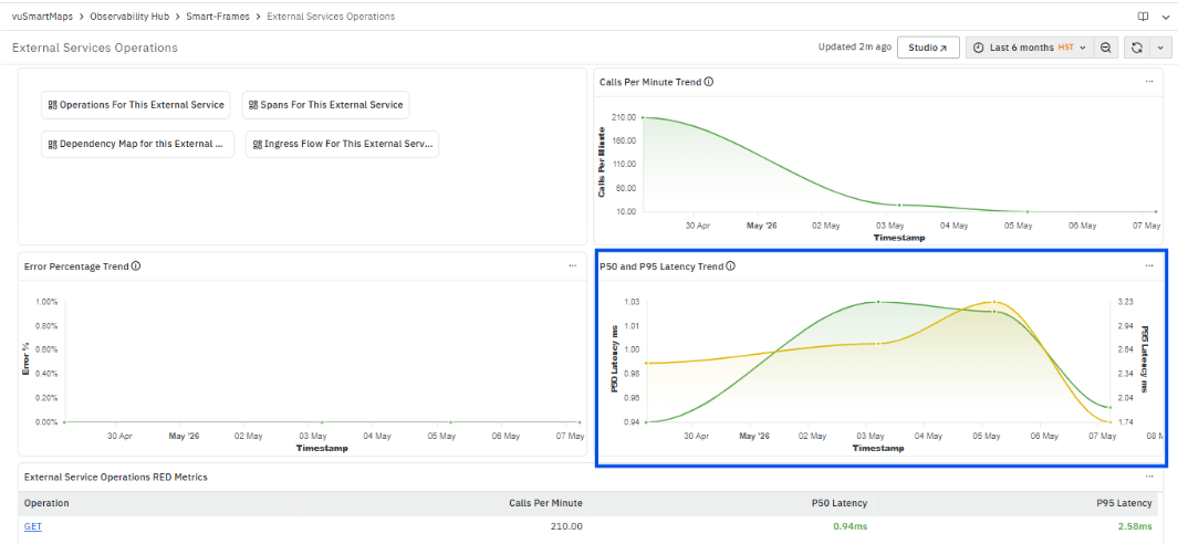
The P50 and P95 Latency Trend section displays how latency for the selected external service changes over time. This section provides a time-based view of response time behavior.
The chart represents:
- Timestamp (X-axis) – Displays the selected time range for analysis.
- Latency (Y-axis) – Displays latency values for P50 and P95 at each point in time.
The trend includes:
- P50 Latency – Represents the median response time over time.
- P95 Latency – Represents higher-end response times, highlighting slower requests.
This section presents the variation in latency across the selected time window, showing patterns such as stable performance, gradual changes, or sudden spikes.
The trend reflects both typical latency behavior and higher percentile latency, indicating periods where response times increase or deviate from the normal pattern.
External Service Operations RED Metrics

The External Service Operations RED Metrics section displays operation-level metrics for interactions with the selected external service. It provides visibility into request rate and latency for each operation.
It includes the following columns:
- Operation: Displays the name of the operation interacting with the external service.
- The Operation Section is clickable. When selected, a context menu is displayed with the following options:
- Operations
- Selecting Operations opens the Operations Page for the selected operation with the applied filters.
- This page displays operation-level RED metrics, including calls per minute, error percentage, and latency across services and destinations.
- For more information, refer to the Operations Page.
- Selecting Operations opens the Operations Page for the selected operation with the applied filters.

- Spans

- Selecting Spans opens the Span Listing Page for the selected operation with the applied filters.
- This page displays span-level execution details such as duration, service name, result type, and transaction information.
- For more information, refer to the Span Listing Page.
- This page displays span-level execution details such as duration, service name, result type, and transaction information.
- Calls Per Minute: Displays the number of calls made per minute for the operation.
- Represents the request volume handled by the operation.
- P50 Latency: Displays the median response time for the operation.
- P95 Latency: Displays the 95th percentile response time.
This section provides a consolidated view of operation-level traffic and latency for external service interactions and enables navigation to detailed operation and span-level dashboards for further analysis.
RED Metrics per Calling Services
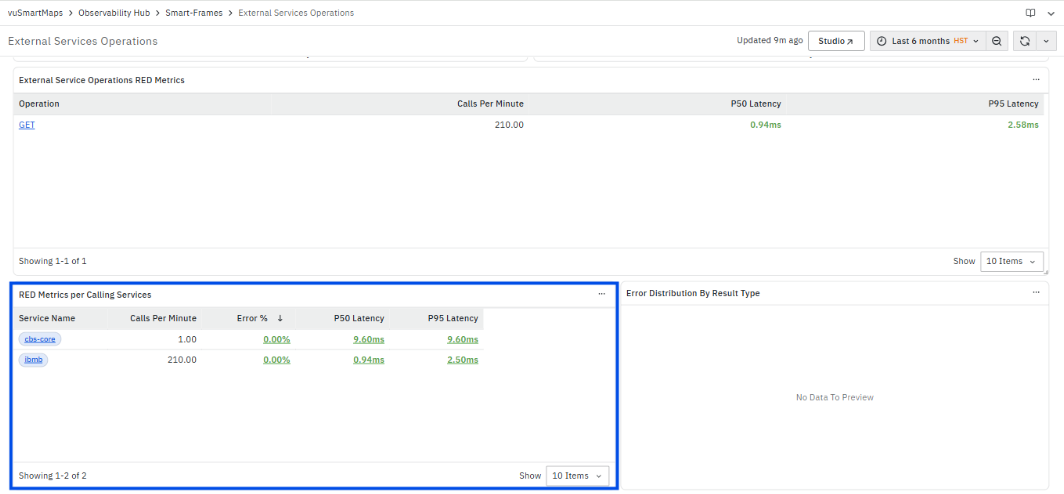
The RED Metrics per Calling Services section displays RED metrics grouped by services that are invoking the selected external service. It provides visibility into how different calling services interact with the external service.
It includes the following columns:
- Service Name: Displays the name of the calling service.
- The Service Name is clickable. When selected, a context menu is displayed with the following options:
- Operations
- Spans
- This enables navigation to detailed operation-level and span-level views for the selected service context.
- The Service Name is clickable. When selected, a context menu is displayed with the following options:
- Calls Per Minute: Displays the number of calls made per minute by the calling service.
- Represents the request volume generated by the service.
- Error %: Displays the percentage of calls resulting in errors.
- Indicates the failure rate for requests originating from the service.
- P50 Latency: Displays the median response time for requests from the calling service.
- P95 Latency: Displays the 95th percentile response time.
This section provides a comparative view of traffic, error rate, and latency across calling services and enables navigation to detailed dashboards for further analysis.
Error Distribution by Result Type
The Error Distribution by Result Type section displays the distribution of request outcomes for the selected external service.
The chart represents:
- Result Type (X-axis) – Displays different execution outcomes such as Success or Exception.
- Count (Y-axis) – Displays the number of requests for each result type.
This section presents how requests are categorized based on their execution result, providing a breakdown of successful and failed requests within the selected time range.
Error Distribution by Exception Type
The Error Distribution by Exception Type section displays the distribution of errors based on exception categories.
The chart represents:
- Exception Type (X-axis) – Displays different types of exceptions encountered.
- Count (Y-axis) – Displays the number of occurrences for each exception type.
This section provides a categorized view of exceptions, showing how frequently each exception type occurs within the selected context.
Error Distribution by Error Code
The Error Distribution by Error Code section displays the distribution of errors based on response or error codes.
The chart represents:
- Error Code (X-axis) – Displays different error or HTTP response codes.
- Count (Y-axis) – Displays the number of occurrences for each error code.
This section provides a breakdown of failures based on response codes, highlighting the frequency of different error conditions.
Messaging Systems Operations Page
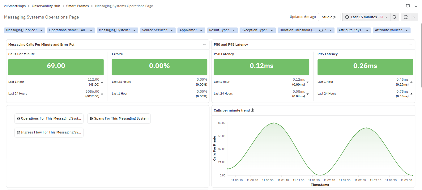
The Messaging Systems Operations Page is a dashboard in the Application Performance Monitoring (APM) module. It provides a consolidated view of messaging-system related operations across services, helping you monitor message processing performance, request volume, errors, and latency. The dashboard helps identify slow messaging operations, high-latency requests, failed message flows, and communication bottlenecks between producer and consumer services.The dashboard includes multiple sections and panels, such as:
- Messaging Calls Per Minute and Error Pct KPI
- P50 and P95 Latency
- Calls Per Minute Trend
- P50 and P95 Latency Trend
- Error Percentage Trend
- Messaging Operations RED Metrics
- RED Metrics per Calling Services
- Messaging Error Contribution by Error Type
- Messaging Error Distribution by Exception Type
Messaging Calls Per Minute and Error Pct

The Messaging Calls Per Minute and Error Pct section displays high-level RED metrics for messaging operations. It provides a summarized view of request volume and failure rate for the selected filters and time range.
It includes the following metrics:
- Calls Per Minute: Displays the number of messaging calls per minute.
- Represents the request volume processed by the messaging system.
- The value reflects the current or aggregated rate based on the selected time range.
- Error %: Displays the percentage of messaging calls resulting in errors.
- Represents the proportion of failed requests compared to total requests.
- The value is calculated based on the selected time range.
This section provides a consolidated view of traffic and error behavior for messaging operations.
P50 and P95 Latency
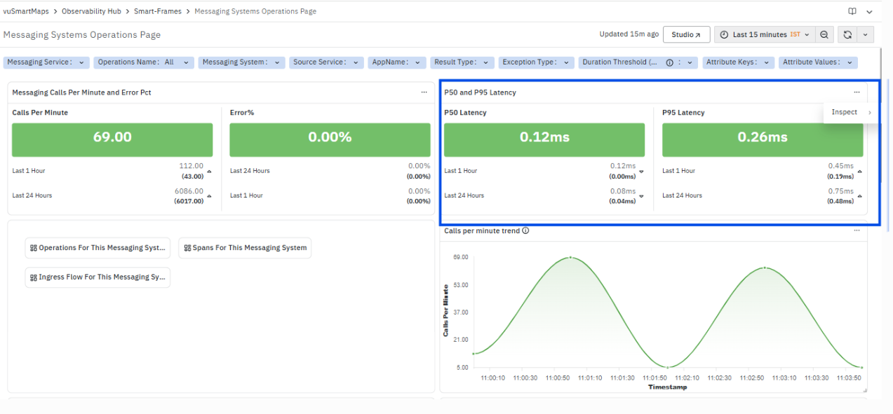
The P50 and P95 Latency section displays latency metrics for messaging operations, providing visibility into response time behavior for the selected time range.
It includes the following metrics:
- P50 Latency: Displays the median response time.
- Represents the typical latency observed for messaging operations.
- Also shows values for Last 1 Hour and Last 24 Hours for comparison.
- P95 Latency: Displays the 95th percentile response time.
- Represents higher-end latency values, highlighting slower operations.
- Also shows values for Last 1 Hour and Last 24 Hours for comparison.
This section provides a combined view of typical and higher-end latency for messaging operations.
Navigation Option

Operations For This Messaging System

The Operations For This Messaging System dashboard provides detailed visibility into messaging operations executed within the selected messaging service. It displays operation-level RED metrics, including calls per minute, error percentage, and latency values, helping you identify slow or high-volume messaging operations. The dashboard helps analyze producer and consumer activities, monitor operation performance trends, and detect messaging operations contributing to delays or failures. It also provides visibility into latency distribution and operation-wise messaging traffic for troubleshooting messaging system performance issues.
Spans For This Messaging System
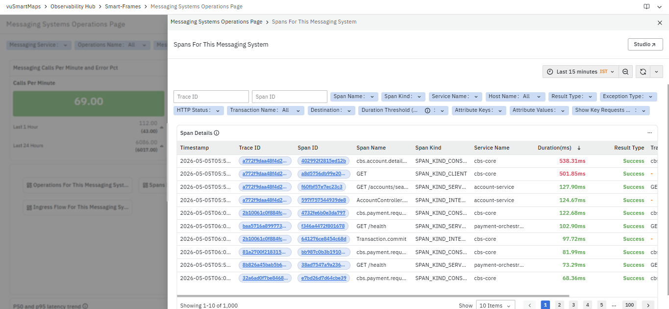
The Spans For This Messaging System dashboard displays detailed span-level execution information related to the selected messaging service. It helps analyze how messaging requests are processed across services by showing trace details, span execution duration, span kind, service name, transaction name, and result status. The dashboard allows you to identify failed spans, slow message-processing operations, and request execution paths associated with messaging workflows. Trace ID and Span ID values are clickable, allowing navigation to TraceMap and Span Details dashboards for deeper root cause analysis.
Ingress
The Ingress Flow For This Messaging System dashboard visualizes incoming request flow into the selected messaging service from upstream services and APIs. It helps identify which applications, APIs, or services are sending requests to the messaging system and how traffic enters the service. The dashboard provides visibility into service dependencies, request flow patterns, and upstream communication paths involved in message processing. This helps analyze traffic sources, monitor dependency relationships, and troubleshoot issues related to incoming messaging requests.
Calls Per Minute Trend

The Calls per minute trend section displays how the messaging request rate changes over time for the selected filters and time range.
The chart represents:
- Timestamp (X-axis) – Displays the selected time window.
- Calls Per Minute (Y-axis) – Displays the number of messaging calls per minute at each point in time.
This section presents the variation in request volume across the selected time range, showing patterns such as increase, decrease, or fluctuations in traffic.
P50 and P95 Latency Trend

The P50 and P95 Latency Trend section displays how latency for messaging operations changes over time for the selected filters and time range.
The chart represents:
- Timestamp (X-axis) – Displays the selected time window.
- Latency (Y-axis) – Displays latency values for both P50 and P95.
The trend includes:
- P50 Latency – Represents the median response time over time.
- P95 Latency – Represents higher-end latency values, highlighting slower operations.
This section presents the variation in latency across the selected time range, showing patterns such as increase, decrease, or fluctuations in response time.
Error Percentage Trend
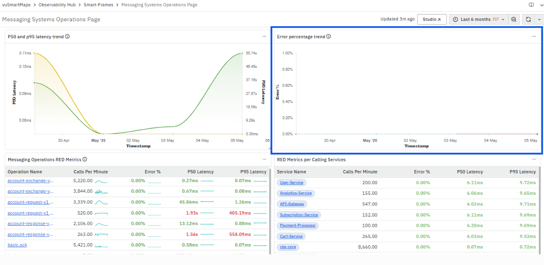
The Error Percentage Trend section displays how the error rate for messaging operations changes over time for the selected filters and time range.
The chart represents:
- Timestamp (X-axis) – Displays the selected time window.
- Error % (Y-axis) – Displays the percentage of requests that resulted in errors.
Multiple series are displayed based on different span names, representing error percentage for each operation or message flow.
This section presents the variation in error rate across the selected time range, showing patterns such as stability, spikes, or fluctuations in failures.
Messaging Operations RED Metrics

The Messaging Operations RED Metrics section displays operation-level metrics for messaging system interactions. It provides visibility into request rate, error percentage, and latency for each operation.
It includes the following columns:
- Operation Name: Displays the name of the messaging operation.
- The Operation Name is clickable. When selected, a context menu is displayed with the following options:
- Operations
- Spans
- Operations:
Opens the Operations Page for the selected operation.
This page displays operation-level RED metrics such as calls per minute, error percentage, and latency across services and destinations. - Spans:
Opens the Span Listing Page for the selected operation.
This page displays span-level execution details, including timestamp, trace ID, span ID, duration, service name, and result type.
- The Operation Name is clickable. When selected, a context menu is displayed with the following options:
- Calls Per Minute: Displays the number of calls made per minute for the operation.
- Error %: Displays the percentage of calls resulting in errors.
- P50 Latency: Displays the median response time for the operation.
- P95 Latency: Displays the 95th percentile response time.
RED Metrics per Calling Services
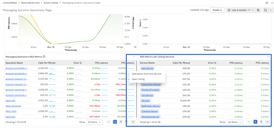
The RED Metrics per Calling Services section displays RED metrics grouped by services that are invoking the messaging system. It provides visibility into how different calling services interact with messaging operations.
It includes the following columns:
- Service Name: Displays the name of the calling service.
- The Service Name is clickable. When selected, a context menu is displayed with the following options:
- Operations from this Service:
Opens the Operations Page filtered for the selected service.
This page displays operation-level RED metrics such as calls per minute, error percentage, and latency for operations associated with the service. - Span Listing Page:
Opens the Span Listing Page filtered for the selected service.
This page displays span-level execution details, including timestamp, trace ID, span ID, duration, and result type.
- Calls Per Minute: Displays the number of calls made per minute by the calling service.
- Error %: Displays the percentage of calls resulting in errors.
- P50 Latency: Displays the median response time.
- P95 Latency: Displays the 95th percentile response time.
Messaging Error Contribution By Error Type
The Messaging Error Contribution By Error Type section displays the contribution of errors categorized by error types for messaging operations.
The chart represents:
- Error Type (X-axis) – Displays different error categories.
- Count (Y-axis) – Displays the number of occurrences for each error type.
This section provides a breakdown of how different error types contribute to overall failures within the selected time range.
Messaging Error Distribution By Exception Type
The Messaging Error Distribution By Exception Type section displays the distribution of errors based on exception types.
The chart represents:
- Exception Type (X-axis) – Displays different exception categories.
- Count (Y-axis) – Displays the number of occurrences for each exception type.
This section provides a categorized view of exceptions, showing how frequently each exception type occurs within the selected context.
Database Operations Page

The Database Operations Page is a dashboard in the Application Performance Monitoring (APM) module. It provides a consolidated view of database-related operations executed across services and applications. The dashboard helps monitor database query performance, request volume, latency, and failures, enabling you to identify slow database operations, problematic queries, and database-related bottlenecks impacting application performance. The dashboard includes multiple sections and panels, such as:
- Calls Per Minute and Error Percentage
- P50 and P95 Latency
- Navigation Options
- Calls Per Minute Trend
- Database P50 and P95 Latency Trend
- Database Error Rate Trend
- Top 100 Database Operations by Latency
- RED Metrics per Calling Service
Calls Per Minute and Error Percentage
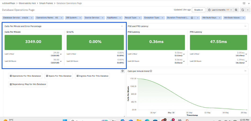
This section provides a summary of database activity and reliability by displaying the volume of operations and the corresponding error rate.
- Calls Per Minute represents the number of database operations executed per minute for the selected filters. It reflects the overall load on the database and helps track changes in request volume over time.
- Error % represents the percentage of database operations that resulted in failures. It indicates the stability of database interactions under the current workload.
For both metrics, the panel also displays comparative values for:
- Last 1 Hour
- Last 24 Hours
These values provide a quick reference to understand recent performance in comparison to a broader time window.
P50 and P95 Latency
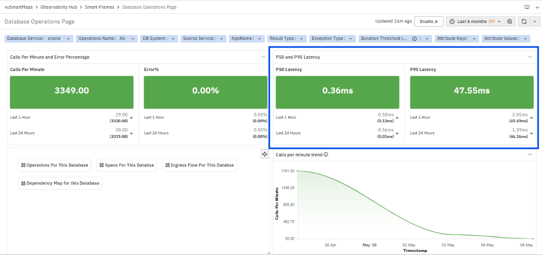
This section displays latency metrics for database operations, providing visibility into response time behavior.
- P50 Latency represents the median execution time of database operations, indicating the typical response time observed.
- P95 Latency represents the higher percentile latency, highlighting slower operations and outliers.
For both metrics, the panel also displays values for:
- Last 1 Hour
- Last 24 Hours
These values provide a comparison of recent latency behavior against a longer time window.
Navigation Options

The following options are available to navigate to detailed database analysis dashboards:
- Operations For This Database
Displays operation-level analytics for the selected database, including operation name, source service, destination, and RED metrics (Calls Per Minute, Error %, P50 and P95 Latency). - Spans For This Database
Displays a detailed list of spans related to database operations, including trace ID, span ID, span name, service name, duration, result type, and other execution details. - Ingress Flow For This Database
Displays incoming service interactions to the selected database. Requires selection of anchor service, API, or operation, and supports limited time range selection. - Dependency Map for this Database
Displays a service dependency map showing relationships between services interacting with the database, including upstream and downstream connections with visual indicators.
Calls per minute trend
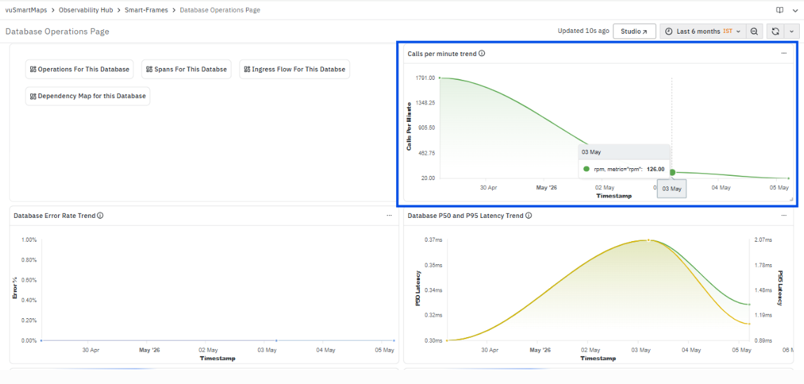
This chart provides a time-based view of database request volume, showing how the number of operations executed per minute changes across the selected time range.
- X-axis (Timestamp) – Displays the time intervals for the selected duration.
- Y-axis (Calls Per Minute) – Displays the number of database operations executed per minute.
The trend line represents the variation in database activity, allowing identification of patterns such as gradual increase, decrease, or stable load over time. It reflects how the database workload evolves during the selected period.
Database Error Rate Trend
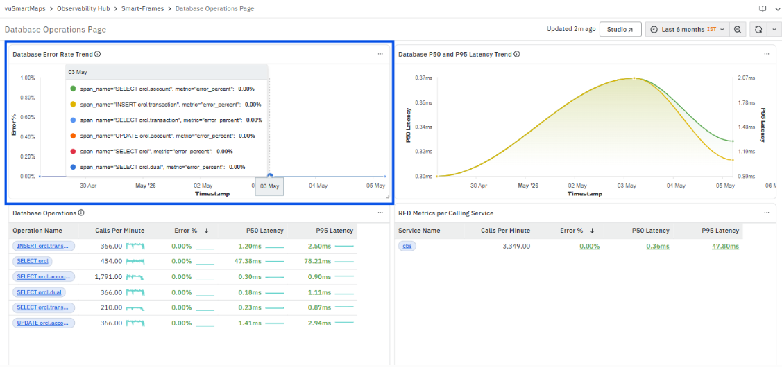
This chart displays the variation of error percentage for database operations over the selected time range.
- X-axis (Timestamp) – Represents the time intervals.
- Y-axis (Error %) – Represents the percentage of database operations that resulted in errors.
Each plotted series corresponds to a specific database operation (span name), showing its individual error percentage trend. This allows comparison of error behavior across different operations.
The chart helps identify whether errors are occurring consistently, increasing, or remaining negligible over time.
Database P50 and P95 Latency Trend

This chart displays the variation of database latency over time using two percentile metrics.
- P50 Latency (Left Y-axis) – Represents the median execution time of database operations, indicating the typical latency observed.
- P95 Latency (Right Y-axis) – Represents higher percentile latency, highlighting slower operations and latency outliers.
- X-axis (Timestamp) – Represents the time intervals across the selected duration.
The chart plots both P50 and P95 latency trends together, allowing comparison between normal performance and higher latency behavior. This helps in identifying periods where latency increases and distinguishing between overall performance changes and isolated slow operations.
Database Operations
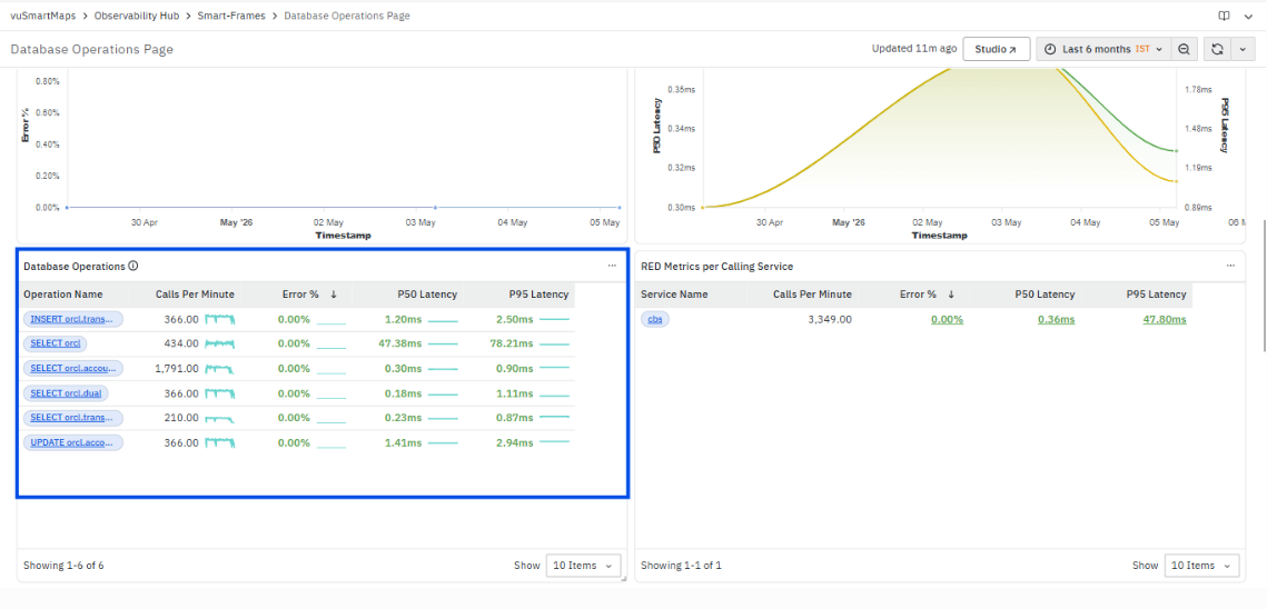
The Database Operations panel displays RED metrics (Rate, Errors, Duration) for all database queries executed by services. It provides a consolidated view of query performance, helping you understand load, failures, and latency across operations.
The panel includes the following columns:
- Operation Name: Displays the database query (for example, INSERT, SELECT, UPDATE). This field is clickable and provides navigation options.
- Calls Per Minute: Shows how frequently the operation is executed.
- Error %: Displays the percentage of failed executions.
- P50 Latency: Represents the median execution time of the query.
- P95 Latency: Represents higher percentile latency, highlighting slower executions.
Navigation Options (On clicking Operation Name):
- Operations: Opens a detailed view showing aggregated RED metrics for the selected operation across services, along with filters to refine analysis.
- Spans: Opens a detailed span listing view showing individual executions of the selected operation with trace-level details such as duration, service, and result.
Dashboard Controls and Filters (in redirected views):
- Service, Operations Name, Span Kind, Destination
- Result Type, HTTP Status, Exception Type
- Duration Threshold
- Attribute Keys and Attribute Values
These controls allow you to filter and narrow down analysis for specific scenarios.
RED Metrics per Calling Service

The RED Metrics per Calling Service panel displays performance metrics for services that are making calls to the database. It helps you understand how each service interacts with the database in terms of load, errors, and latency.
The panel includes the following columns:
- Service Name: Displays the name of the calling service (for example, cbs). This field is clickable and provides navigation options.
- Calls Per Minute: Shows how frequently the service is making database calls.
- Error %: Displays the percentage of failed requests from the service.
- P50 Latency: Represents the median latency of requests from the service.
- P95 Latency: Represents higher percentile latency, highlighting slower requests from the service.
Navigation Options (On clicking Service Name):
- Operations: Opens a detailed view showing operations executed by the selected service along with RED metrics.
- Spans: Opens a span listing view showing individual request executions for the selected service with trace-level details.
Top 100 Database Operations by Latency
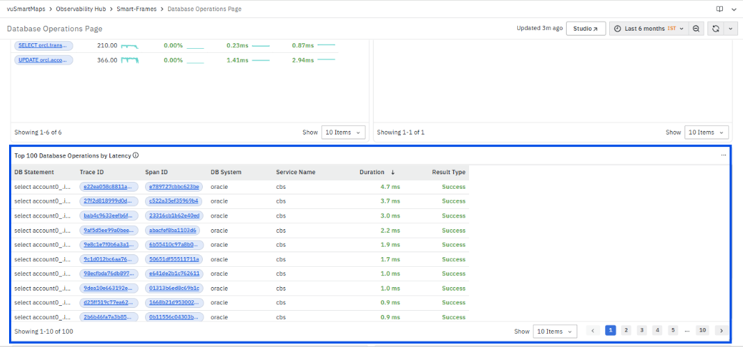
The Top 100 Database Operations by Latency panel displays the list of database queries sorted based on their execution time. It highlights the slowest queries in the system, allowing you to quickly identify performance bottlenecks and analyze their impact on overall application performance.
The panel includes the following columns:
- DB Statement: Displays the actual database query being executed (for example,
select account0_id...). This helps you understand which type of operation is consuming more time. - Trace ID: Represents the unique identifier of the complete transaction flow. This field is clickable.
- Span ID: Represents the unique identifier of the specific database execution within the trace. This field is clickable.
- DB System: Indicates the database type (for example, oracle).
- Service Name: Displays the service that executed the database query.
- Duration: Shows the total execution time of the query. This column is used to identify slow-performing queries.
- Result Type: Indicates whether the query execution was successful or failed.
Navigation Options:
- Trace ID (Clickable):
Opens the Trace Map, which provides a hierarchical view of the complete request flow across multiple services. It shows how the database query is part of the overall transaction, including parent and child spans, execution time distribution, and service dependencies. This helps in identifying where most time is spent within the request lifecycle. - Span ID (Clickable):
Opens the Span Details Page, which provides detailed information about the selected database execution. It includes:- Execution timing (start time, end time, duration)
- Service and environment details
- Database attributes such as query, DB name, and connection details
- Dependency information
- Result status and execution context
Error Insights
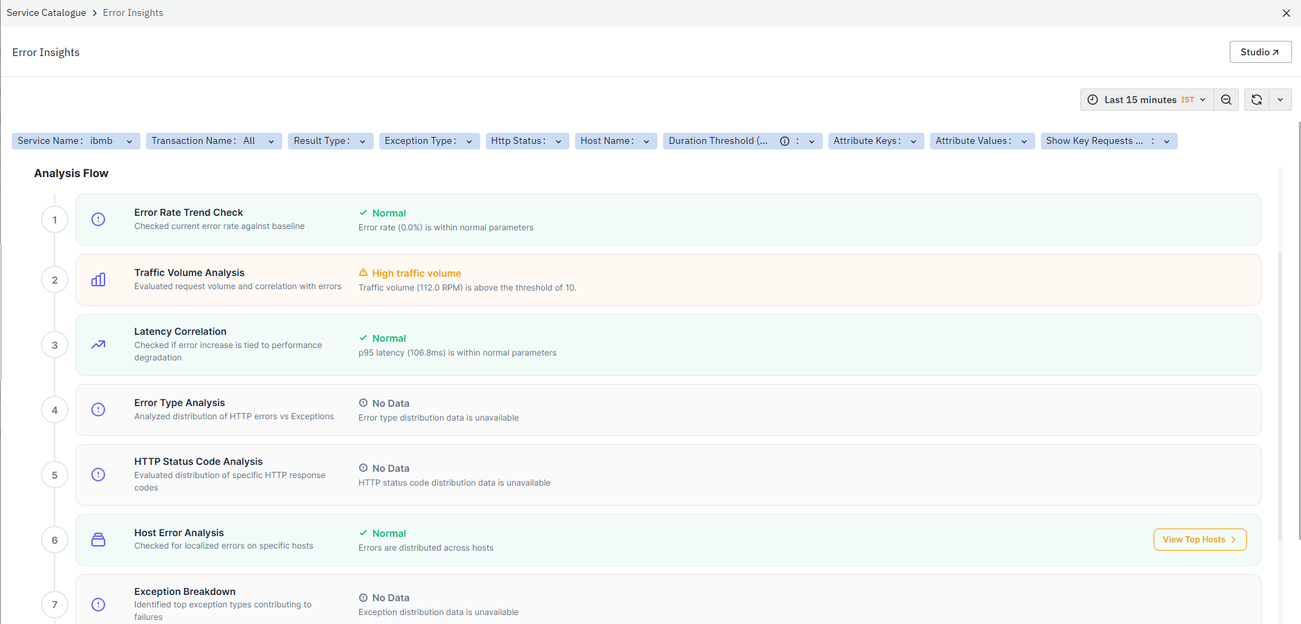
The Error Insights dashboard is an analysis dashboard in the Application Performance Monitoring (APM) module. It provides a consolidated view of application failures, error trends, traffic behavior, latency correlation, endpoint impact, and dependency-level issues for the selected service. This dashboard helps identify the primary contributors responsible for failures and supports faster troubleshooting of transaction and service-level issues.
Header Summary Section
- Overall Impact: Displays the impact level (for example, Medium) based on the system condition.
- Current Error Rate: Shows the current error percentage.
- Insight Banner: Displays messages such as “Error Rates Stable - High Traffic”.
- Indicates the current system condition by combining multiple signals, such as error rate and traffic.
- Highlights warnings when defined thresholds are breached.
Analysis Flow
The Analysis Flow is the core analysis section of the Error Insights dashboard. It provides a guided and sequential evaluation of service behavior to help identify the primary contributors to failures affecting the selected service or transaction. Each stage evaluates a specific condition, such as error growth, traffic spikes, latency degradation, exception patterns, endpoint failures, and dependency impact. The analysis flow displays the current status of each stage using indicators such as Normal, High, Warning, or No Data, along with supporting observations and metrics.
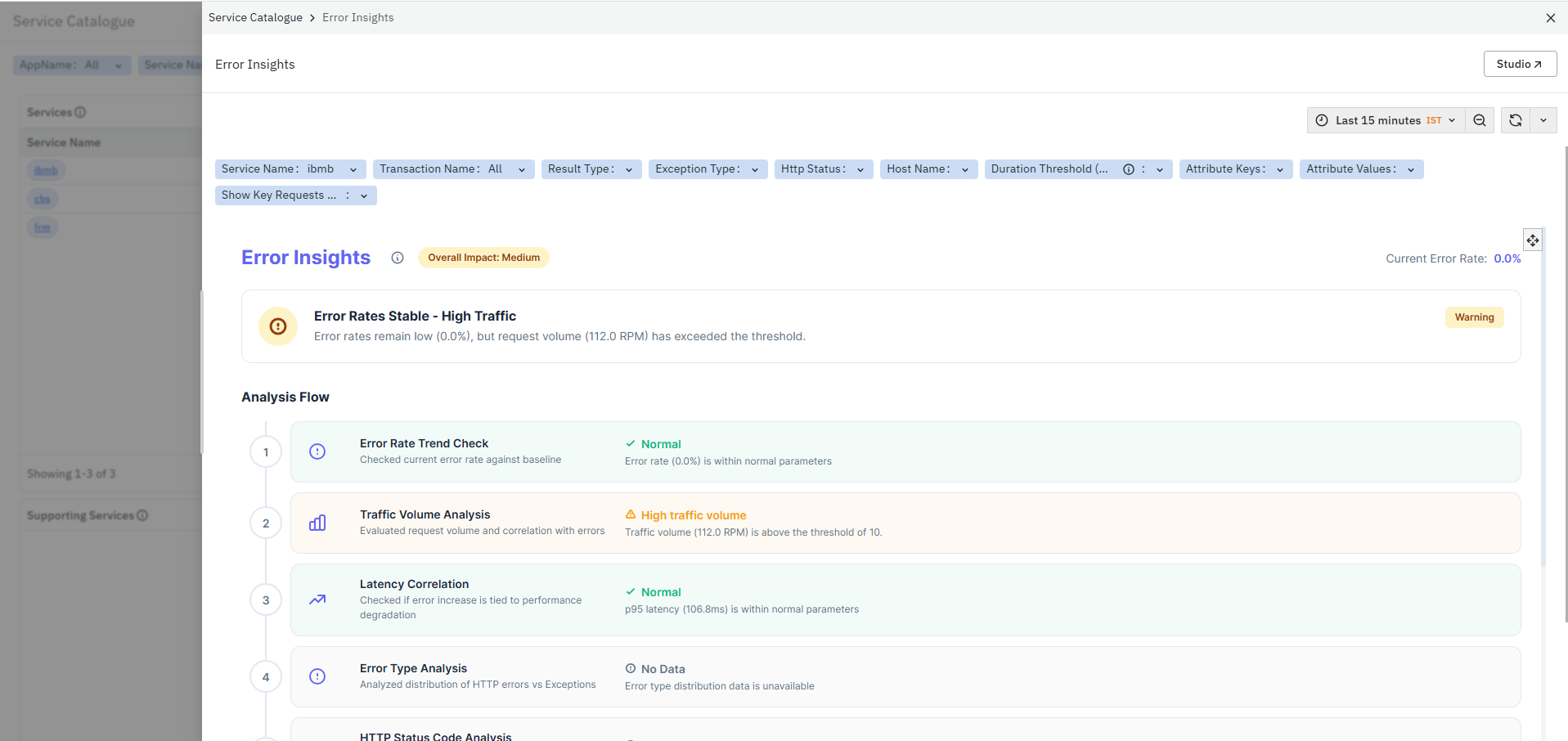
1. Error Rate Trend Check
This section evaluates whether the current error rate has deviated from the normal baseline behavior.
What it checks:
- Current error percentage
- Error trend against the expected baseline
The section displays:
- Current status (Normal / Warning / High)
- Error percentage observation
- Supporting status message
This helps determine whether there is an increase in failures or whether the service is operating within expected error thresholds.
2. Traffic Volume Analysis
This section analyzes whether increased request traffic is contributing to the observed issue.
What it checks:
- Requests Per Minute (RPM)
- Current traffic compared to the threshold or historical baseline
The section displays:
- Traffic status
- Current RPM value
- Threshold comparison message
This helps identify whether high incoming traffic, sudden request spikes, or abnormal load patterns are stressing the service and contributing to failures or latency degradation.
3. Latency Correlation
This section evaluates whether response time degradation is associated with the detected issue.
What it checks:
- P95 latency values
- Latency trend against the acceptable threshold
The section displays:
- Latency status
- Current latency value
- Latency observation message
This helps determine whether the issue is related to slow request processing, backend delays, or downstream dependency bottlenecks affecting transaction execution.
4. Error Type Analysis
This section categorizes failures based on error classification.
What it checks:
- Distribution of exception-based failures
- Distribution of HTTP-based failures
The section displays:
- Error categorization status
- Error distribution availability
This helps identify the nature of failures and determine whether issues are primarily caused by application exceptions, HTTP response failures, or dependency-related execution problems.
5. HTTP Status Code Analysis
This section analyzes failures based on HTTP response status codes.
What it checks:
- Distribution of HTTP response codes
- Frequency of specific HTTP failures
The section displays:
- HTTP analysis status
- Availability of HTTP failure distribution
This helps identify whether failures are caused by:
- Server-side errors (5xx)
- Client-side request issues (4xx)
- Gateway or upstream dependency failures
6. Host Error Analysis
This section analyzes how failures are distributed across infrastructure hosts.
What it checks:
- Error distribution across hosts
- Host-level RPM and Error %
The section displays:
- Host-level error table
- Current host analysis status
The table includes:
- Host
- RPM
- Error %
This helps determine whether failures are isolated to a specific host, deployment node, or infrastructure component.
7. Exception Breakdown
This section identifies the dominant exception types contributing to failures.
What it checks:
- Exception occurrences across traces and spans
- Frequency of specific exceptions
The section displays:
- Exception analysis status
- Exception availability information
This helps identify recurring application exceptions, framework-level issues, database exceptions, or dependency execution failures affecting request processing.
8. Endpoint Error Breakdown
This section identifies APIs or endpoints contributing most to failures.
What it checks:
- Endpoint-level RPM
- Endpoint-level Error %
- Error contribution percentage
The section displays:
- Endpoint analysis table
- Endpoint status information
The table includes:
- Endpoint
- RPM
- Error %
- Contribution %
This helps isolate APIs generating high failure rates and identify endpoints contributing most to application instability.
The section also provides the View Top Endpoints option.
Selecting this option redirects you to a detailed endpoint-level analysis view for deeper API troubleshooting.
9. Error Source Breakdown
This section identifies the primary source or hotspot contributing to failures within the transaction flow.
What it checks:
- Failed trace contribution by spans and services
- Dependency-level failure contribution
The section displays:
- Error source analysis table
- Hotspot detection status
The table includes:
- Span Name
- Source Type
- Destination
- Failed Traces
- Impact %
This helps identify:
- Problematic spans
- Failing downstream services
- Dependency bottlenecks
- High-impact components contributing to transaction failures
The section also provides the View Contributors option.
Selecting this option redirects you to a detailed contributor analysis view showing trace-level failure contributors and dependency relationships.
Service Analysis Dashboard
The Service Analysis dashboard is a detailed analysis dashboard in the Application Performance Monitoring (APM) module. It provides a consolidated view of service health, request traffic, latency, errors, and host-level performance for the selected service. This dashboard helps monitor overall service behavior, identify latency spikes, detect abnormal performance patterns, and analyze issues affecting application stability and user experience. The dashboard is divided into multiple analytical panels:
- Request Rate & Error Rate
- Latency (P50 & P95)
- Host Performance Breakdown
- Misbehaviour Score Trend
- Request Per Minute Trend
- P50 and P95 Latency Trend
- Error Rate Trend
Request Rate & Error Rate
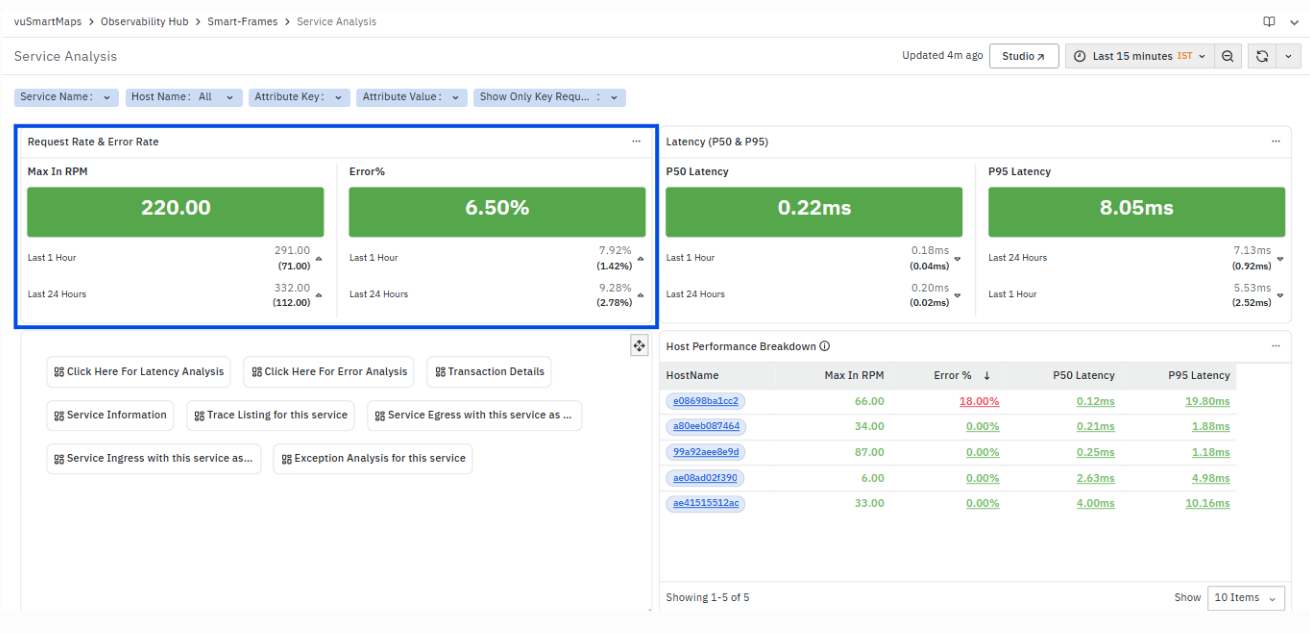
The Request Rate & Error Rate section provides a high-level summary of how much traffic the service is handling and how reliably it is processing that traffic. It combines volume and failure indicators to give an immediate view of service health.
The section includes the following metrics:
1. Max In RPM (Requests Per Minute)
- Displays the maximum number of incoming requests per minute handled by the service in the selected time range
- Represents peak traffic load on the service
Additional values shown:
- Last 1 Hour – Maximum RPM observed in the last hour
- Last 24 Hours – Maximum RPM observed in the last 24 hours
- Values in brackets represent comparative/reference values (baseline or previous values)
What it indicates:
- Sudden spikes → Increased load or traffic surge
- Drop in RPM → Reduced usage or possible ingestion issues
- Helps understand whether the service is under heavy load
2. Error %
- Displays the percentage of failed requests out of total requests
- Includes failures such as:
- Exceptions
- HTTP errors
Additional values shown:
- Last 1 Hour – Error percentage in the last hour
- Last 24 Hours – Error percentage in the last 24 hours
- Bracket values indicate comparison with baseline or previous period
What it indicates:
- High Error % → Service instability or failures
- Low/Error = 0% → Healthy processing
- Sudden increase → Possible issue introduced (deployment, dependency failure, etc.)
How to interpret both metrics together
- High RPM + Low Error % → Service is handling high traffic efficiently
- High RPM + High Error % → Service is overloaded or failing under load
- Low RPM + High Error % → Issues unrelated to traffic (logic, dependency failure)
- Low RPM + Low Error % → Normal or low usage scenario
Latency (P50 and P95)
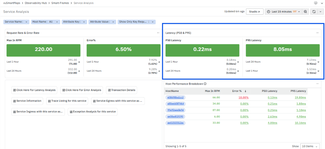
The Latency (P50 & P95) section shows how fast the service is responding to requests by measuring response time distribution. It helps understand both typical performance and worst-case delays experienced by users.
The section includes the following metrics:
1. P50 Latency (Median Latency)
- Represents the median response time of the service
- 50% of the requests complete faster than this value
- Reflects typical or normal performance
Additional values shown:
- Last 1 Hour – Median latency in the last hour
- Last 24 Hours – Median latency in the last 24 hours
- Values in brackets indicate comparison or baseline values
What it indicates:
- Stable P50 → Consistent service performance
- Increase in P50 → General slowdown affecting most requests
2. P95 Latency (Tail Latency)
- Represents the 95th percentile response time
- 95% of requests complete within this time, while the slowest 5% take longer
- Captures worst-case performance experienced by users
Additional values shown:
- Last 1 Hour – P95 latency in the last hour
- Last 24 Hours – P95 latency in the last 24 hours
- Bracket values indicate comparison with previous/baseline values
What it indicates:
- High P95 → Few requests are significantly slow
- Large gap between P50 and P95 → Performance inconsistency
- Sudden spikes → Possible backend or dependency issues
How to interpret P50 and P95 together
- Low P50 + Low P95 → Healthy and consistent performance
- Low P50 + High P95 → Most requests are fast, but some are slow (outliers)
- High P50 + High P95 → Overall service slowdown
- Increasing P95 only → Tail latency problem (intermittent slowness)
Navigation Options (Service Analysis Dashboard)

The navigation buttons provided in the Service Analysis dashboard allow you to quickly drill down into specific areas for deeper analysis. Each option redirects to a dedicated dashboard focused on a particular aspect of service performance.
Available Navigation Options
- Click Here for Latency Analysis
Redirects to the Latency Analysis dashboard to investigate response time trends, latency distribution, and identify slow-performing APIs or transactions. - Click Here for Error Analysis
Opens the Error Analysis dashboard where you can analyze error rates, identify error sources, and understand failure patterns across services and operations. - Transaction Details
Navigates to the Transaction Details dashboard showing top transactions, their performance (RPM, latency, errors), and detailed breakdowns. - Service Information
Displays metadata about the selected service, including service type, technology stack, runtime details, and environment context. - Trace Listing for this service
Opens the Trace Listing page with a list of traces for the selected service, allowing detailed inspection of individual request executions. - Service Egress with this service as anchor service
Shows outgoing dependencies (calls made by this service to other services), helping you understand downstream interactions. - Service Ingress with this service as anchor service
Displays incoming dependencies (calls coming into this service), helping identify upstream sources of traffic. - Exception Analysis for this service
Redirects to the Exception Analysis dashboard to analyze exception types, counts, impacted operations, and exception trends.
Host Performance Breakdown
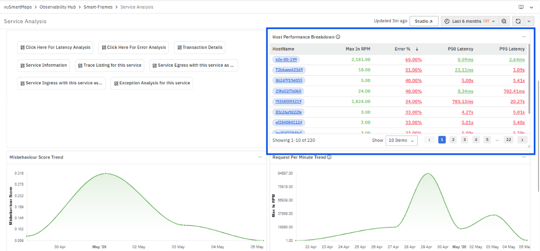
The Host Performance Breakdown panel provides a host-level view of how the selected service is performing across different machines. It helps identify whether issues like high latency or errors are coming from a specific host or are spread across multiple hosts.
What this panel shows
- Comparison of traffic, errors, and latency across hosts
- Identification of overloaded or unhealthy hosts
- Insight into how evenly the service load is distributed
Columns in the panel
-
HostName
Displays the unique host identifier where the service is running.
Each HostName is clickable.On click:
You are redirected to the Host Performance Analysis page, where you can:- View detailed metrics specific to that host
- Analyze request rate, error %, and latency trends over time
- Identify whether issues are due to CPU, memory, or request handling
- Drill down into host-level bottlenecks affecting service performance
-
Max In RPM (Requests Per Minute)
Shows the maximum traffic handled by the host in the selected time range.
Helps identify high-load hosts. -
Error %
Displays the percentage of failed requests on that host.
Useful to detect hosts contributing to failures. -
P50 Latency
Represents the median response time for requests on that host.
Indicates typical performance. -
P95 Latency
Shows higher percentile latency, highlighting slower requests.
Helps detect performance degradation under load.
How to interpret
- High RPM + High Latency → Host may be overloaded
- High Error % → Host-specific failure or instability
- Latency variation across hosts → Load imbalance or infra issue
Misbehaviour Score Trend

The Misbehaviour Score Trend panel shows how the overall health or abnormal behavior of the service changes over time. It is a derived indicator that combines signals like errors, latency spikes, and unusual traffic patterns.
Panel shows
- A time-based trend of service behaviour score
- Helps detect anomalies, instability, or degradation patterns
How to interpret
- Low / stable score → Service behaving normally
- Increasing score → Potential issues (errors, latency spikes, irregular traffic)
- Sudden spikes → Transient failures or incidents
Key points
- Useful for early anomaly detection
- Helps correlate with other trends like latency or errors
- Gives a quick health indicator without deep analysis
Request Per Minute (RPM) Trend
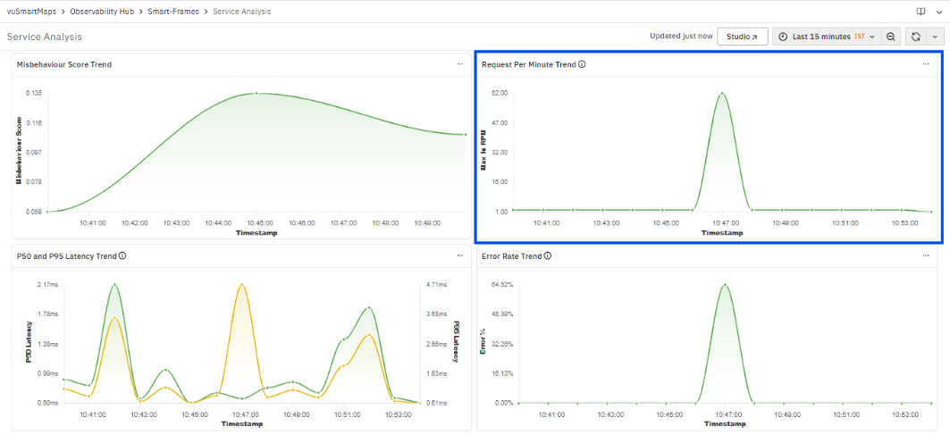
The Request Per Minute Trend panel shows how incoming traffic to the service varies over time.
What this panel shows
- Volume of requests handled by the service over time
- Traffic patterns such as spikes, drops, or steady load
How to interpret
- Increasing trend → Growing load on the service
- Sudden spikes → Traffic bursts or peak usage
- Drop in traffic → Possible upstream issue or downtime
Key points
- Helps identify load patterns and peak hours
- Can be correlated with latency and error trends
- Useful to detect if traffic spikes are causing issues
P50 and P95 Latency Trend

The P50 and P95 Latency Trend panel shows how response times change over time for the service.
What this panel shows
- P50 latency (median) → Typical response time
- P95 latency → Performance for slower requests
How to interpret
- P50 stable, P95 high → Few slow requests (tail latency issue)
- Both increasing → Overall service slowdown
- Sudden spikes → Performance degradation or backend issues
Key points
- P50 reflects normal user experience
- P95 highlights worst-case performance
- Helps identify intermittent vs consistent latency issues
Error Rate Trend

The Error Rate Trend panel shows how the percentage of failed requests changes over time.
What this panel shows
- Error percentage across the selected time range
- Trend of failures in the service
How to interpret
- Stable near 0% → Healthy service
- Gradual increase → Emerging issue
- Sudden spike → Incident or failure event
Key points
- Helps identify when errors started increasing
- Useful to correlate with traffic or latency spikes
- Indicates severity and duration of issues
Span Details
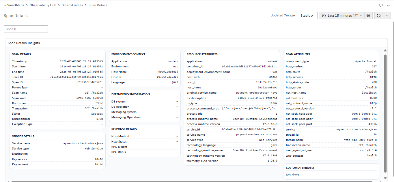
The Span Details dashboard is a detailed span-level analysis dashboard in the Application Performance Monitoring (APM) module. It provides a consolidated view of execution metadata, service context, dependency information, runtime details, and request-level attributes for the selected span within a trace. This dashboard helps analyze how individual operations are executed, identify latency contributors, investigate failed spans, and understand request execution behavior across services and dependencies. The dashboard is divided into multiple information sections:
- Span Details
- Service Details
- Environment Context
- Dependency Information
- Response Details
- Resource Attributes
- Span Attributes
- Custom Attributes
What this dashboard shows
- Complete execution details of a selected span
- Context of the service, host, and environment
- Request-level attributes and dependencies
- Metadata required for deep root cause analysis
Sections in the dashboard
Span Details
The Span Details section displays detailed execution information for the selected span within a trace. This section helps analyze how a specific request or operation was executed, how long it took, whether it succeeded or failed, and how it is related to other spans in the transaction flow.
The section includes the following fields:
Timestamp: Displays the exact time at which the span was captured.
This helps correlate span execution with application events and troubleshooting timelines.
Start Time: Displays the span execution start time.
This helps identify when the operation execution began.
End Time: Displays the span execution completion time.
This helps determine the total execution window of the operation.
Trace ID: Displays the unique identifier associated with the complete transaction trace.
This helps correlate the selected span with all other spans belonging to the same request flow.
Span ID: Displays the unique identifier of the selected span.
This uniquely identifies the operation execution within the trace.
Parent Span: Displays the parent span associated with the selected span.
This helps understand span hierarchy and request execution relationships.
Span Name: Displays the name of the executed operation or request.
Examples include API endpoints, database queries, or internal method executions.
Span Kind: Displays the type of span execution.
Examples include:
- SPAN_KIND_SERVER
- SPAN_KIND_CLIENT
- SPAN_KIND_INTERNAL
This helps identify whether the span represents an incoming request, outgoing dependency call, or internal processing operation.
Root Span: Indicates whether the selected span is the root span of the trace.
Root spans represent the starting point of the transaction execution flow.
Transaction: Displays the transaction or API associated with the span.
This helps correlate the span with the business transaction being executed.
Status: Displays the execution status of the span.
Examples include:
- Success
- Exception
- HTTP Error
This helps quickly identify failed or problematic operations.
Duration(ms): Displays the total execution duration of the span in milliseconds.
This helps identify slow-running operations contributing to transaction latency.
Exception Type: Displays the exception associated with the span, if available. This helps identify application-level failures and runtime exceptions affecting execution.
Code-Level Visibility: Span Details display additional execution metadata captured through Code-Level Visibility, including:
- Controller execution
- Service execution
- ORM operations
- Database lifecycle
- Method execution time
- Attributes
- Exceptions
Service Details
The Service Details section displays metadata associated with the service that generated the selected span. This section helps identify the originating service and understand its role within the application architecture.
The section includes the following fields:
Service Name: Displays the name of the service generating the span.
This helps identify which service processed the request.
Service Type: Displays the type of monitored service.
Examples include:
- Web Service
- Database
- Messaging Service
Destination: Displays the destination endpoint (host, port, or URL) associated with operations affected by socket timeout exceptions. When endpoint information is unavailable in the trace attributes, the field remains empty.
Key Service: Indicates whether the service is marked as a key business service.
This helps prioritize monitoring and troubleshooting efforts.
Key Request: Indicates whether the span belongs to a key business request or critical transaction flow.
This helps focus analysis on high-priority operations.
Environment Context
The Environment Context section displays infrastructure and deployment-related information associated with the selected span. This section helps correlate application behavior with runtime environment details.
The section includes the following fields:
Application: Displays the application associated with the span.
This helps identify the business application generating the request.
Environment: Displays the deployment environment.
Examples include:
- Production
- UAT
- Development
Host Name: Displays the host or node where the span was executed.
This helps correlate issues with specific infrastructure nodes.
Host IP: Displays the IP address of the host generating the span.
This helps identify infrastructure-level execution locations.
Language: Displays the application programming language.
Examples include:
- Java
- Python
- .NET
This helps identify the runtime technology stack associated with the request.
Dependency Information
The Dependency Information section displays database and messaging dependency details associated with the selected span. This section helps identify external systems or downstream services involved during request execution.
The section includes the following fields:
DB System: Displays the database technology associated with the span.
Examples include:
- MySQL
- PostgreSQL
- Oracle
DB Operation: Displays the database operation executed during the span.
Examples include:
- SELECT
- INSERT
- UPDATE
Messaging System: Displays the messaging platform associated with the span.
Examples include:
- Kafka
- RabbitMQ
Messaging Operation: Displays the messaging operation executed.
Examples include:
- Publish
- Consume
This section helps identify dependency-level operations contributing to latency or failures.
Response Details
The Response Details section displays protocol-level response information associated with the selected span. This section helps analyze request outcomes and protocol communication details.
The section includes the following fields:
HTTP Method: Displays the HTTP method used for the request.
Examples include:
- GET
- POST
- PUT
- DELETE
HTTP Status: Displays the HTTP response status code returned during execution.
Examples include:
- 200
- 404
- 500
RPC System: Displays the RPC framework associated with the span, if available.
Examples include:
- gRPC
RPC Status: Displays the RPC execution status.
This helps identify RPC-level communication failures or successful executions.
Resource Attributes
The Resource Attributes section displays infrastructure, runtime, deployment, and telemetry metadata collected for the selected span. This section helps analyze the execution environment and runtime context of the application service.
The section includes details such as:
- Application name
- Container ID
- Deployment environment
- Host architecture
- Host name and IP
- Operating system details
- Process information
- Runtime version
- Service identifier
- Technology language
- Telemetry SDK version
This section helps correlate performance issues with deployment configurations, runtime versions, infrastructure nodes, and telemetry instrumentation details.
Span Attributes
The Span Attributes section displays request-level operational attributes captured during span execution. This section helps analyze detailed request behavior, protocol communication, network information, and execution context.
The section includes attributes such as:
- Component type
- HTTP method
- HTTP route
- HTTP scheme
- HTTP status code
- HTTP target
- Network host details
- Protocol information
- Thread details
- Transaction name
- User agent
- Web context
This section helps understand how the request was processed and identify request-specific execution characteristics contributing to latency or failures.
Custom Attributes
The Custom Attributes section displays additional user-defined or application-specific attributes collected for the selected span.
These attributes may include:
- Business identifiers
- Custom request metadata
- Correlation identifiers
- Tenant-specific fields
- Transaction-specific tags
This section helps enrich troubleshooting and provides additional business context associated with request execution.
TraceMap
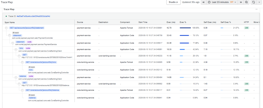
The TraceMap dashboard is a trace visualization dashboard in the Application Performance Monitoring (APM) module. It provides a complete end-to-end view of request execution across services, spans, and dependencies within a distributed application environment. By presenting the hierarchical relationship between spans, the TraceMap enables you to follow the complete execution path of a request from its entry point through downstream services and internal application components.
The dashboard helps analyze transaction flow, understand service dependencies, identify latency bottlenecks, and isolate failures occurring during request processing. It displays execution metrics for each span, including execution duration, self execution time, execution percentage, component information, source and destination services, and HTTP response status, making it easier to identify where time is spent during a transaction.
When Code-Level Visibility (CLV) is enabled, the TraceMap is enriched with additional application-level execution spans, including controller methods, service methods, business logic, ORM operations, and database lifecycle operations. These additional spans provide deeper visibility into application execution and help identify performance bottlenecks at the code level.
Code-level execution spans are displayed only for traces generated after [Code-Level Visibility] is enabled and the monitored application has been restarted.
Trace ID
At the top-left of the dashboard, a Trace ID field is available.
The Trace ID field is used to search and load a specific trace for analysis. Once a trace is selected, the dashboard displays all spans associated with that trace along with the corresponding execution details.
This helps inspect the complete request execution flow for an individual transaction and provides visibility into all operations executed as part of the trace.
TraceMap Overview
The TraceMap dashboard displays span execution details in a hierarchical tabular layout. The hierarchy helps represent the execution relationship between spans involved in the selected trace.
When Code-Level Visibility is enabled, additional spans appear within the TraceMap hierarchy beneath the corresponding request or service span. These spans represent the internal execution flow of the application and help correlate business logic execution with distributed trace data.
Typical Code-Level Visibility spans include:
- Controller execution
- Service execution
- Business method execution
- ORM operations
- Database lifecycle operations
- Exception spans (when exception capture is enabled)
Each row in the dashboard represents an individual span executed during request processing. Parent spans and child spans are displayed in a structured format to represent the execution flow across services and operations.
The dashboard includes the following columns:
- Span Name
Displays the name of the operation executed as part of the selected trace. Depending on the instrumentation and Code-Level Visibility configuration, Span Name can represent:
- Incoming HTTP requests
- Controller methods
- Service methods
- Business logic methods
- ORM operations
- Database interactions
- External service calls
The hierarchical indentation represents the parent-child relationship between spans and shows the exact execution sequence of the request across services and application components. Selecting a span opens the Span Details panel, allowing you to inspect detailed execution information for that span.
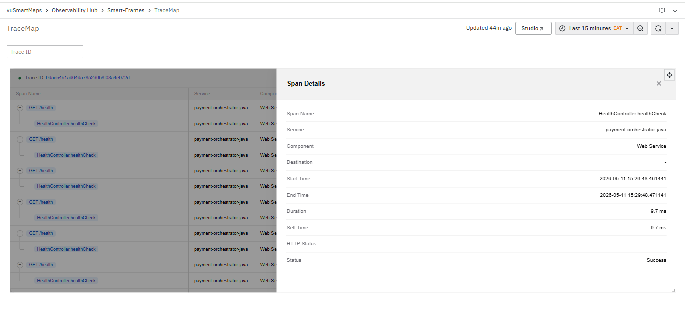
- Span Details: Selecting a span opens the Span Details panel without leaving the TraceMap dashboard. The panel displays detailed execution information for the selected span, including:
- Service
- Component
- Destination
- Duration
- Self Execution Time
- HTTP Status
- Execution Status
- Span Attributes
- Events (when available)
When Code-Level Visibility is enabled, Span Details also display additional code-level information associated with controller, service, ORM, and database lifecycle spans, making it easier to analyze application execution without navigating away from the TraceMap.
-
Service
Displays the service associated with the selected span. This helps identify the services involved in the request execution flow.
-
Component
Displays the component type associated with the span, such as Apache Tomcat, Application Code, JDBC, Database, Messaging Service, or other supported instrumentation components. This helps classify the execution layer involved in the trace.
-
Destination
Displays the destination associated with the span. This helps identify downstream services, messaging systems, or dependencies involved during request execution. For internal code-level spans, this field may remain empty because the execution occurs within the same service.
-
Start Time
Displays the timestamp at which the span execution started. This helps understand the execution sequence of spans within the trace.
-
Exec (ms)
Displays the total execution duration of the span in milliseconds. Higher values may indicate spans contributing more to request latency. Long execution durations can indicate slow business logic, database queries, external service calls, or application bottlenecks.
-
Exec %
Displays the percentage contribution of the span execution duration relative to the total trace duration. A visual indicator is displayed for quick comparison across spans.
-
Self Exec (ms)
Displays the self execution duration of the span excluding child span execution time. This helps identify time spent within the operation itself. Comparing Exec (ms) and Self Exec (ms) helps determine whether latency originates within the current operation or its downstream child spans.
-
Self Exec %
Displays the percentage contribution of the self execution duration relative to the total trace duration. This helps compare internal execution contributions across spans.
-
HTTP
Displays the HTTP response status associated with request spans. Common values include 200 (Success), 400 (Bad Request), 404 (Not Found), and 500 (Internal Server Error). This helps quickly identify failed requests during trace analysis.
-
Source
Displays the service where the span originated. This helps identify which application or microservice initiated the operation represented by the span and provides visibility into request flow across distributed services.
-
More Info
Displays additional execution information associated with the selected span, where applicable. Depending on the span type, this column may provide quick access to supplementary span metadata or related execution details.
What Happens After Using TraceMap
Using the TraceMap dashboard enables you to:
- Drill down into individual spans using the Span Details panel.
- Analyze Controller, Service, ORM, and Database Lifecycle spans when Code-Level Visibility is enabled.
- Identify slow services, methods, and database operations contributing to request latency.
- Trace failures back to the exact service, dependency, or application method responsible.
- Understand the complete execution sequence of requests across distributed systems.
- Correlate distributed service calls with application-level execution to accelerate root cause analysis.
Trace Code Stacktrace
The Trace Code Stacktrace dashboard provides source-level execution details for a selected span within a trace. It displays the span metadata along with the corresponding application stack trace, enabling developers and application owners to investigate exceptions, identify the execution path, and troubleshoot code-level issues.
When stack trace information is available, the dashboard displays the sequence of method calls captured during the execution of the selected span. This helps correlate application exceptions with the corresponding source code and understand where the failure occurred.
Stack traces are displayed only when Capture Stack Trace is enabled in Code-Level Visibility configuration within APM Studio.
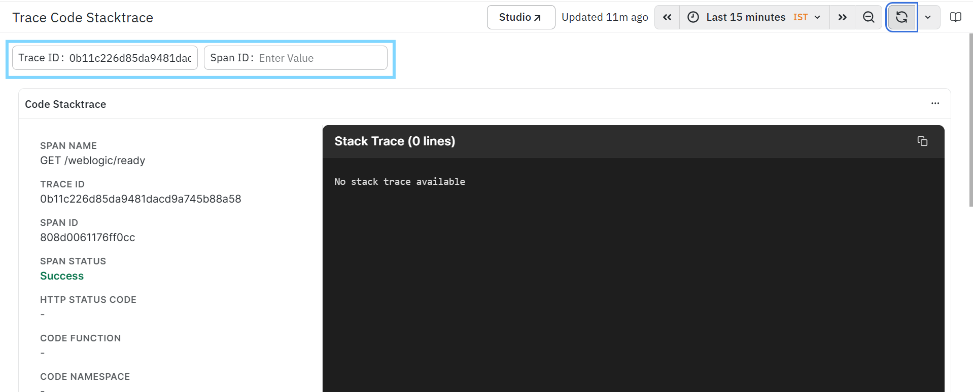
The dashboard is divided into the following sections:
Span Information
The Span Information section displays metadata associated with the selected span. This information helps identify the operation and understand its execution context.
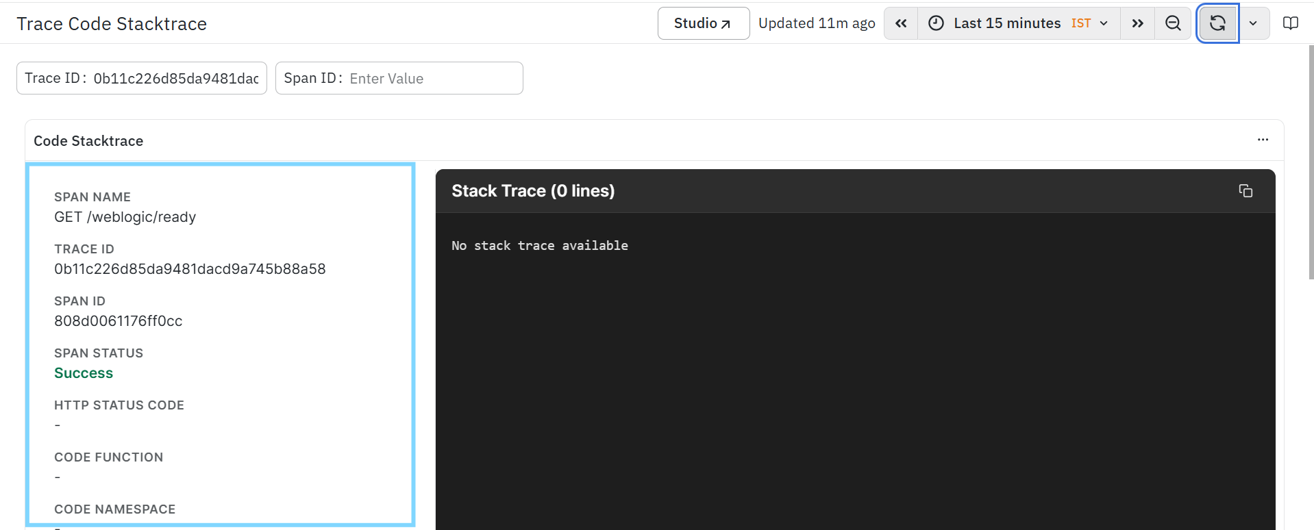
The section includes the following fields:
Span Name
Displays the name of the operation or request executed by the selected span.
Examples include:
- API endpoints
- Database operations
- Internal service methods
This helps identify the operation associated with the stack trace.
Trace ID
- Displays the unique identifier of the trace containing the selected span.
- This helps correlate the span with the complete transaction across other APM dashboards.
Span ID
- Displays the unique identifier assigned to the selected span.
- This uniquely identifies the span within the transaction trace.
Span Status
Displays the execution status of the selected span.
Examples include:
- Success
- Exception
- HTTP Error
This helps determine whether the operation completed successfully or encountered an error during execution.
HTTP Status Code
Displays the HTTP response status code associated with the selected span, when available.
Examples include:
- 200
- 400
- 404
- 500
This helps identify the response returned by the application for the request.
Code Function
- Displays the application function or method associated with the selected span, when available.
- This helps identify the function responsible for executing the operation.
Code Namespace
- Displays the namespace or package associated with the executing function, when available.
- This helps identify the application module or package where the operation was executed.
Stack Trace
The Stack Trace section displays the application stack trace captured during the execution of the selected span.
The stack trace lists the sequence of function or method calls executed before the operation completed or failed. This information helps developers understand the execution path, identify the origin of exceptions, and troubleshoot application issues.
When available, the stack trace provides:
- Function call hierarchy.
- Source-level execution flow.
- Exception call path.
- Method invocation sequence.
- Runtime execution context.
If no stack trace information is available for the selected span, the dashboard displays an appropriate message indicating that the stack trace is unavailable.
A copy icon is provided to copy the complete stack trace for troubleshooting or sharing with development teams.
How to use the Trace Code Stacktrace
Use the Trace Code Stacktrace dashboard to investigate application behavior at the code level.
A typical investigation workflow is:
- Select the required Trace ID.
- Specify or select the corresponding Span ID.
- Review the Span Information to understand the execution context.
- Verify the Span Status and HTTP Status Code to determine whether the operation completed successfully or encountered an error.
- Examine the Stack Trace to identify the sequence of method calls leading to the operation or exception.
- Use the stack trace to locate the relevant application code and troubleshoot the issue
Trace Span Error
The Trace Span Error dashboard provides detailed exception information for a selected span within a trace. It displays the span metadata along with the exception details captured during the execution of the selected operation. This dashboard helps developers and application owners investigate runtime exceptions, analyze failed operations, and identify the root cause of application errors.
When exception information is available, the dashboard displays the captured exception details for the selected span. This enables users to understand the error encountered during execution and correlate it with the associated trace and span.
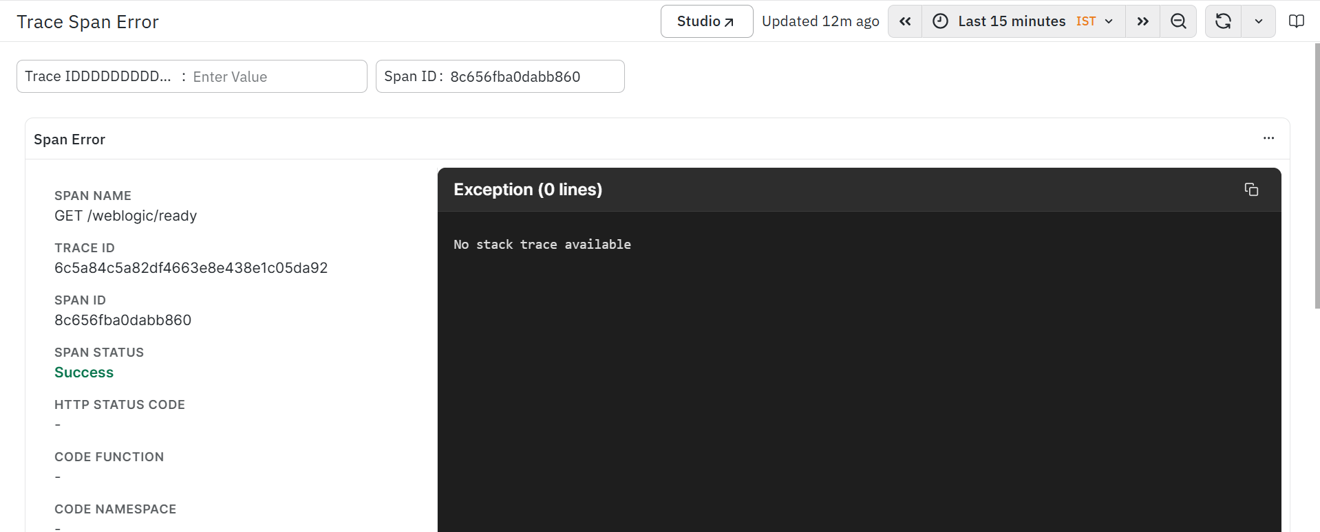
The dashboard is divided into the following sections:
- Span Information
- Exception Details
Span Information
The Span Information section displays metadata associated with the selected span. This information helps identify the operation in which the exception occurred and provides the execution context for troubleshooting.
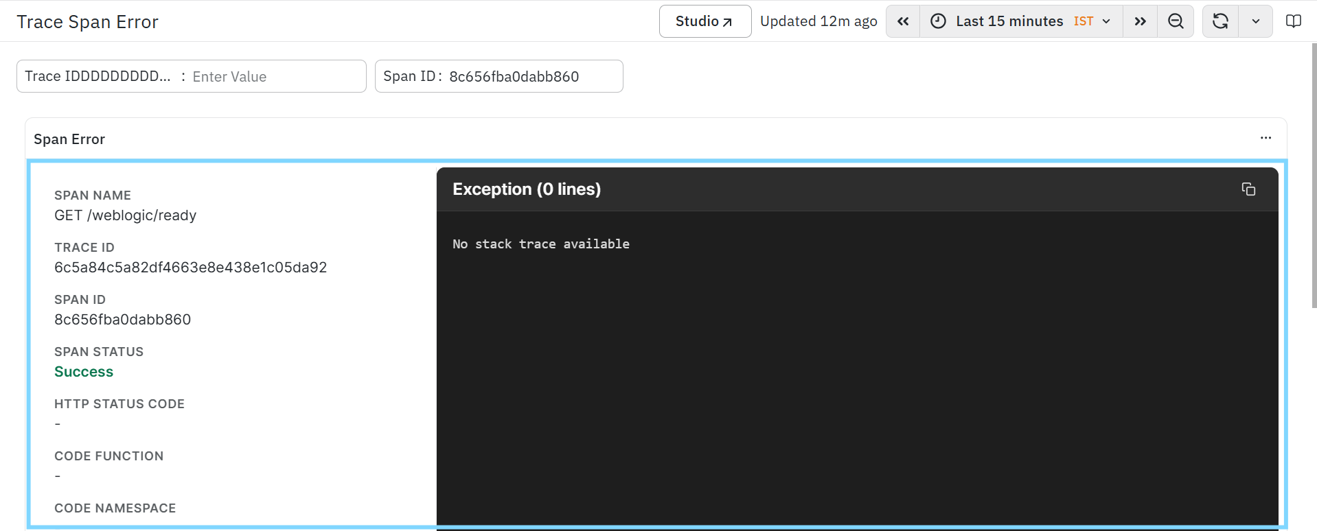
The section includes the following fields:
Span Name
Displays the name of the operation or request executed by the selected span.
Examples include:
- API endpoints
- Database operations
- Internal service methods
This helps identify the operation associated with the captured exception.
Trace ID
- Displays the unique identifier of the trace containing the selected span.
- This helps correlate the span with the complete transaction across other APM dashboards.
Span ID
- Displays the unique identifier assigned to the selected span.
- This uniquely identifies the span within the selected trace.
Span Status
Displays the execution status of the selected span.
Examples include:
- Success
- Exception
- HTTP Error
This helps determine whether the operation completed successfully or encountered an error during execution.
HTTP Status Code
Displays the HTTP response status code returned for the selected span, when available.
Examples include:
- 200
- 400
- 404
- 500
This helps identify the response generated by the application.
Code Function
- Displays the application function or method associated with the selected span, when available.
- This helps identify the function responsible for executing the operation.
Code Namespace
- Displays the namespace or package associated with the executing function, when available.
- This helps identify the application module in which the operation was executed.
Exception Details
The Exception Details section displays the exception captured during the execution of the selected span.
When available, this section provides the complete exception information generated by the application, helping users identify runtime failures and understand the cause of unsuccessful request execution.
The exception information may include:
- Exception type.
- Exception message.
- Runtime error details.
- Exception call information captured during execution.
A copy icon is available to copy the displayed exception details for troubleshooting or sharing with development teams.
If no exception information is available for the selected span, the dashboard displays an appropriate message indicating that no exception details were captured.
How to use the Trace Span Error
Use the Trace Span Error dashboard to investigate runtime exceptions associated with a specific span.
A typical investigation workflow is:
- Select the required Trace ID.
- Specify or select the corresponding Span ID.
- Review the Span Information to understand the execution context.
- Verify the Span Status and HTTP Status Code.
- Examine the Exception Details to identify the error captured during execution.
- Use the exception information to determine the root cause and continue troubleshooting.
Trace DB Details
The Trace DB Details dashboard provides detailed information about database operations executed as part of a selected span within a trace. It displays metadata about the database interaction along with the corresponding database statement captured during execution. This dashboard helps developers and database administrators analyze database calls, investigate query execution, and troubleshoot database-related performance issues.
When database telemetry is available, the dashboard displays the executed SQL statement or database command associated with the selected span, enabling users to understand how the database interaction contributes to the overall transaction.
Database lifecycle information is available only when DB Lifecycle Span is enabled in the Code-Level Visibility configuration.
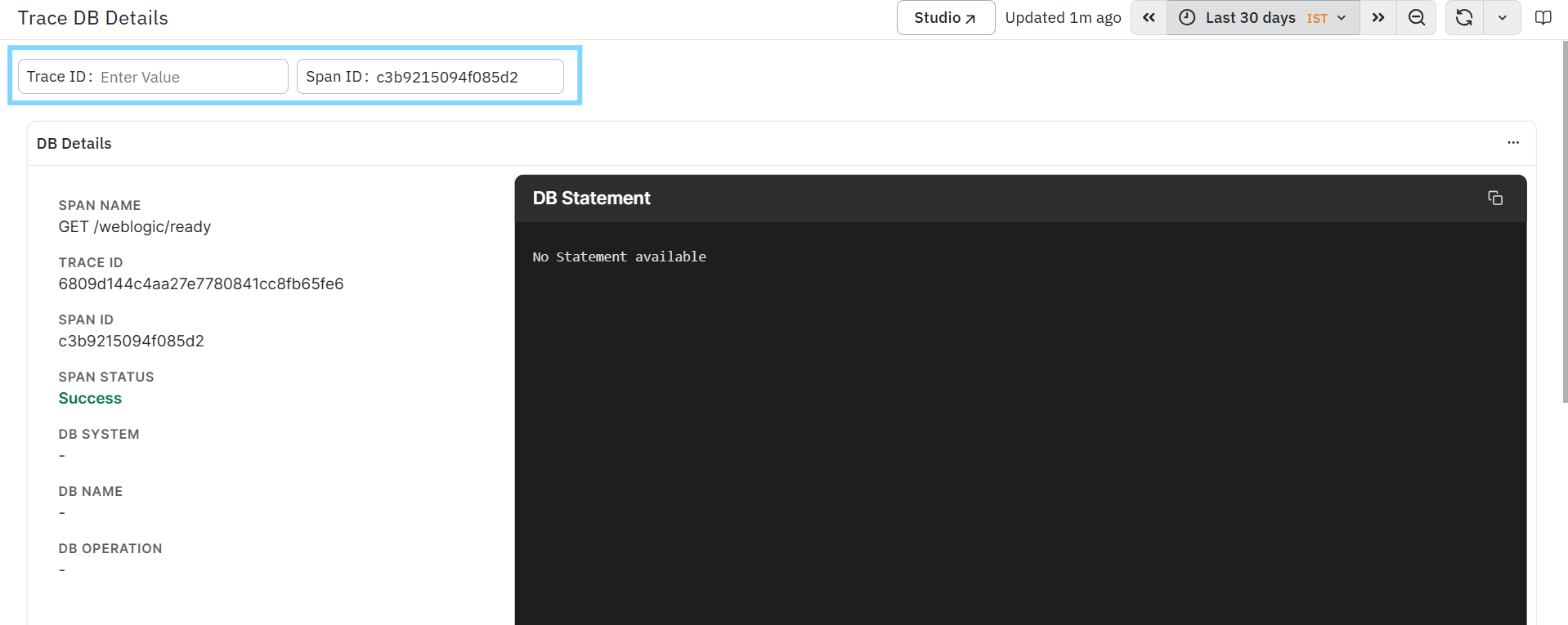
The dashboard is divided into the following sections:
Database Operation Information
The Database Operation Information section displays metadata associated with the selected database span. This information helps identify the database interaction and understand its execution context.
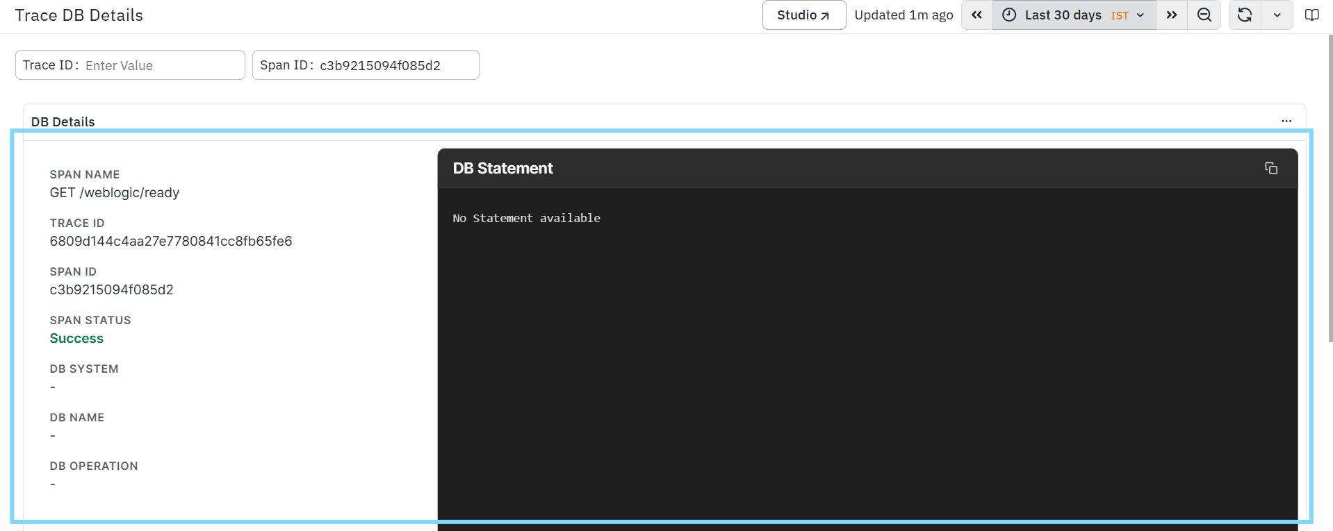
The section includes the following fields:
Span Name
Displays the name of the operation associated with the database request.
Examples include:
- API endpoint
- Database query
- Repository method
- Stored procedure invocation
This helps identify the operation responsible for initiating the database interaction.
Trace ID
- Displays the unique identifier of the trace containing the selected database span.
- This helps correlate the database operation with the complete transaction across other APM dashboards.
Span ID
- Displays the unique identifier assigned to the selected database span.
- This uniquely identifies the database operation within the trace.
Span Status
Displays the execution status of the selected span.
Examples include:
- Success
- Exception
- HTTP Error
This helps determine whether the database operation completed successfully or encountered an error.
DB System
Displays the database technology associated with the selected span.
Examples include:
- MySQL
- PostgreSQL
- Oracle
- Microsoft SQL Server
- MongoDB
This helps identify the database platform involved in the transaction.
DB Name
- Displays the name of the database accessed by the selected operation.
- This helps identify the database instance used during request execution.
DB Operation
Displays the database operation performed during span execution.
Examples include:
- SELECT
- INSERT
- UPDATE
- DELETE
- CREATE
- ALTER
This helps identify the type of database activity executed by the application.
Database Statement
The Database Statement section displays the database statement captured during execution of the selected span.
When available, this section displays the SQL query or database command executed by the application. This information helps users analyze query execution, understand database interactions, and identify inefficient or long-running queries.
The displayed statement may include:
- SQL query.
- Database command.
- Stored procedure call.
- Prepared statement.
- Query executed by the application.
A copy icon is available to copy the displayed database statement for troubleshooting, performance analysis, or collaboration with database administrators and development teams.
If no database statement is available for the selected span, the dashboard displays an appropriate message indicating that no statement was captured.
How to use the Trace DB Details
Use the Trace DB Details dashboard to investigate database interactions associated with a specific span.
A typical investigation workflow is:
- Select the required Trace ID.
- Specify or select the corresponding Span ID.
- Review the Database Operation Information to understand the execution context.
- Verify the Span Status, DB System, DB Name, and DB Operation.
- Examine the Database Statement to identify the query or command executed during the request.
- Use the statement to analyze query behavior, investigate performance bottlenecks, or troubleshoot database-related issues.
FAQs
How do I access the APM dashboards?
From the left navigation menu, go to Observability Hub and select Application Performance Monitoring.
What dashboards are available in APM?
APM provides dashboards such as Service Catalog, Service Map, Transactions, Trace Listing, Operations, Latency Analysis, Error Analysis, and Exception Analysis.
What is the Service Catalog dashboard used for?
The Service Catalog provides a consolidated view of instrumented services with key RED metrics such as request volume, error rate, and latency.
What is the Service Map dashboard used for?
The Service Map visualizes service-to-service communication, upstream and downstream dependencies, and potential latency or error hotspots.
What filters are available across APM dashboards?
Depending on the dashboard, you can filter data by service, application, transaction, operation, environment, host, errors, latency, attributes, key services, and trace identifiers.
What is the Adhoc Filter?
The Adhoc Filter allows you to create dynamic filters by selecting a field and one or more values without modifying the predefined dashboard filters.
What information does the Inspect option provide?
Inspect provides details about the panel's underlying data, query execution, statistics, widget data, and panel configuration.
What is the Transactions dashboard used for?
The Transactions dashboard helps monitor business and API transactions using request rate, error rate, and latency metrics to identify slow or failing transactions.
What can I analyze using the Trace Listing dashboard?
Trace Listing provides request-level details such as Trace ID, timestamp, transaction name, service name, duration, result type, and HTTP status, with options to open TraceMap, Span Listing, and Trace Waterfall.
What does the Latency Analysis dashboard show?
Latency Analysis helps analyze response-time behavior using P50 and P95 latency, latency trends, impacted APIs, dependencies, hosts, and operations.
What does the Error Analysis dashboard provide?
Error Analysis helps investigate error trends, failing transactions, error sources, exceptions, HTTP errors, error contribution, and their relationship with latency and request patterns.
How can I investigate a specific trace or error?
You can use clickable Trace IDs, error types, HTTP codes, exception types, and other dashboard fields to navigate to detailed views with the relevant context and filters applied.
