Visualizations
Overview
Visualization Panels are essential tools for data visualization and effectively presenting information through various visual elements. Explore a diverse range of charts, tables, gauges, metrics, heatmaps, and more to display your data in a manner that suits your requirements. Each panel type offers unique features and benefits, enabling you to create impactful visualizations effortlessly.
Visualization panels are divided into two categories, i.e., Predefined Panel and Custom Panel. Each panel features a query editor specific to its data source, allowing you to craft queries for visualizing your chosen data. Let's now take a closer look at each panel type to understand their distinct feature.

Predefined Panel
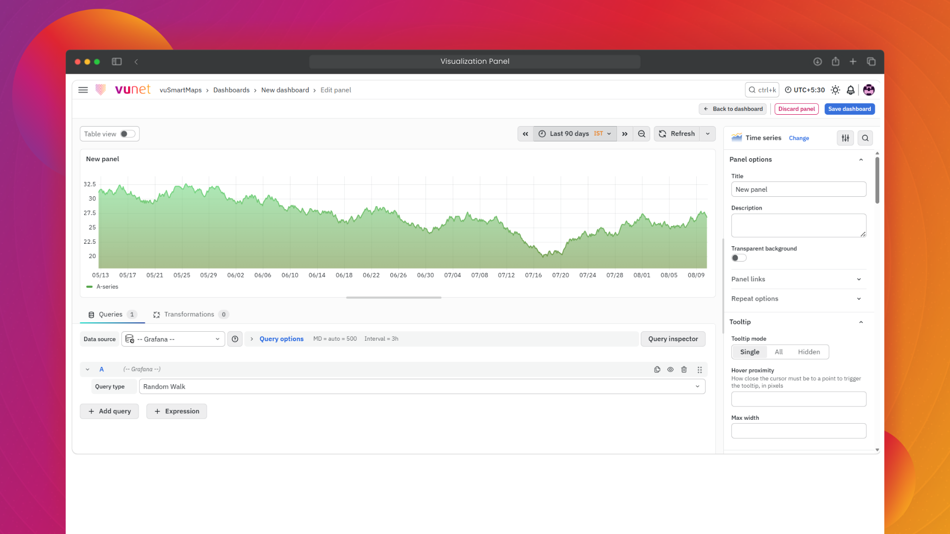
Area Chart
An Area Chart is used to display time-series data and show how values change over time. It connects data points with a line and fills the area below the line to highlight the magnitude of change. It is useful for analyzing trends, comparing multiple data series, and understanding cumulative patterns.
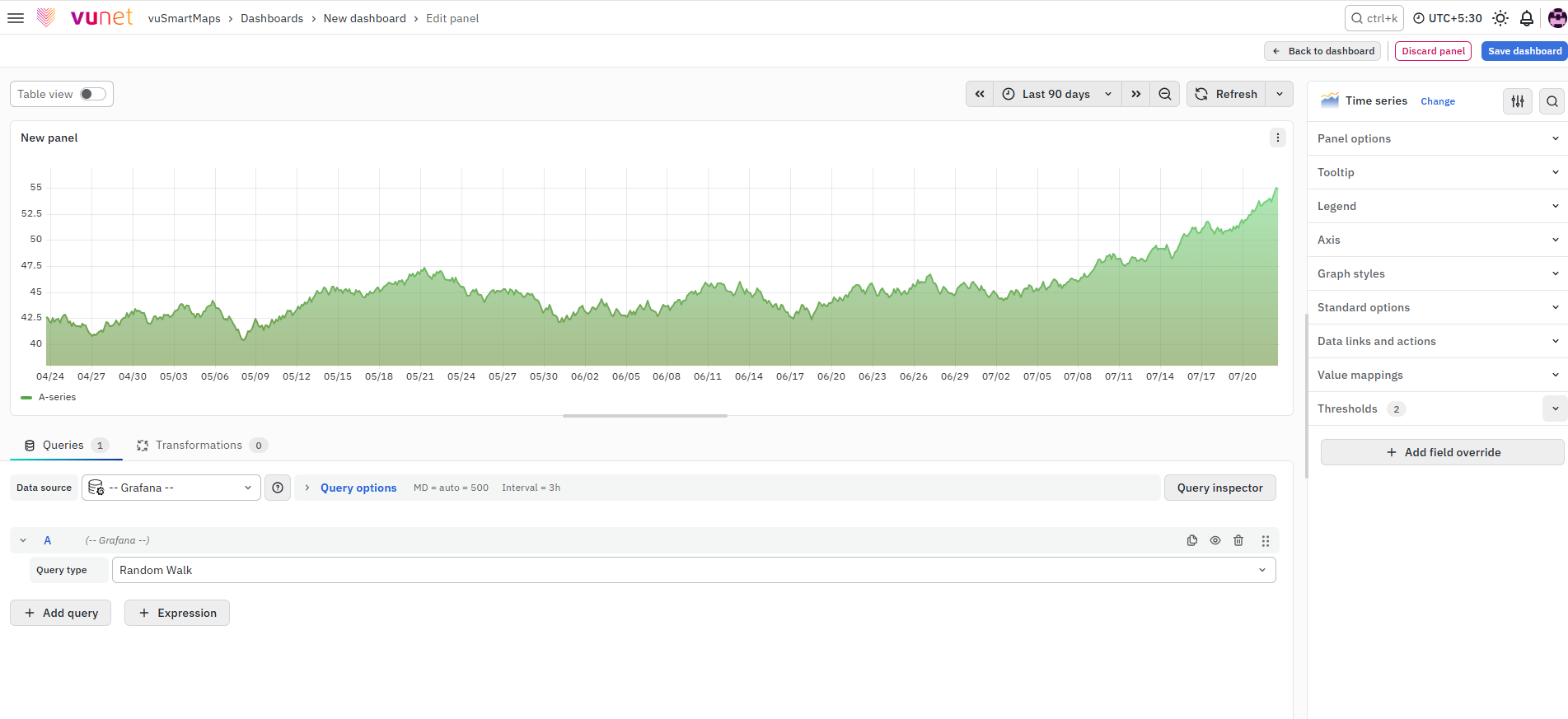
Line Chart
A Line Chart is used to show how a value changes across a continuous sequence such as time, dates, or intervals. It connects data points with lines, making it easy to identify trends, spikes, drops, and changes over time. It is useful for comparing multiple metrics, systems, or services in a single view.
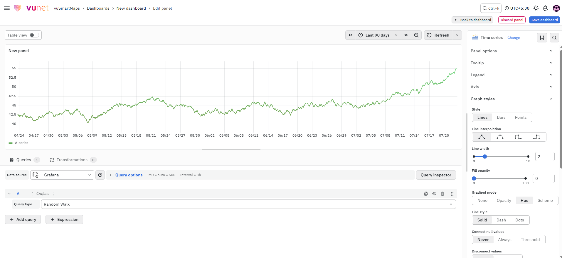
Heatmap
A Heatmap represents data using color variations across two dimensions. Each cell shows a value, and the color intensity helps users quickly understand the magnitude of that value. It is useful for identifying patterns, high-activity periods, unusual spikes, and value distribution across time or ranges.
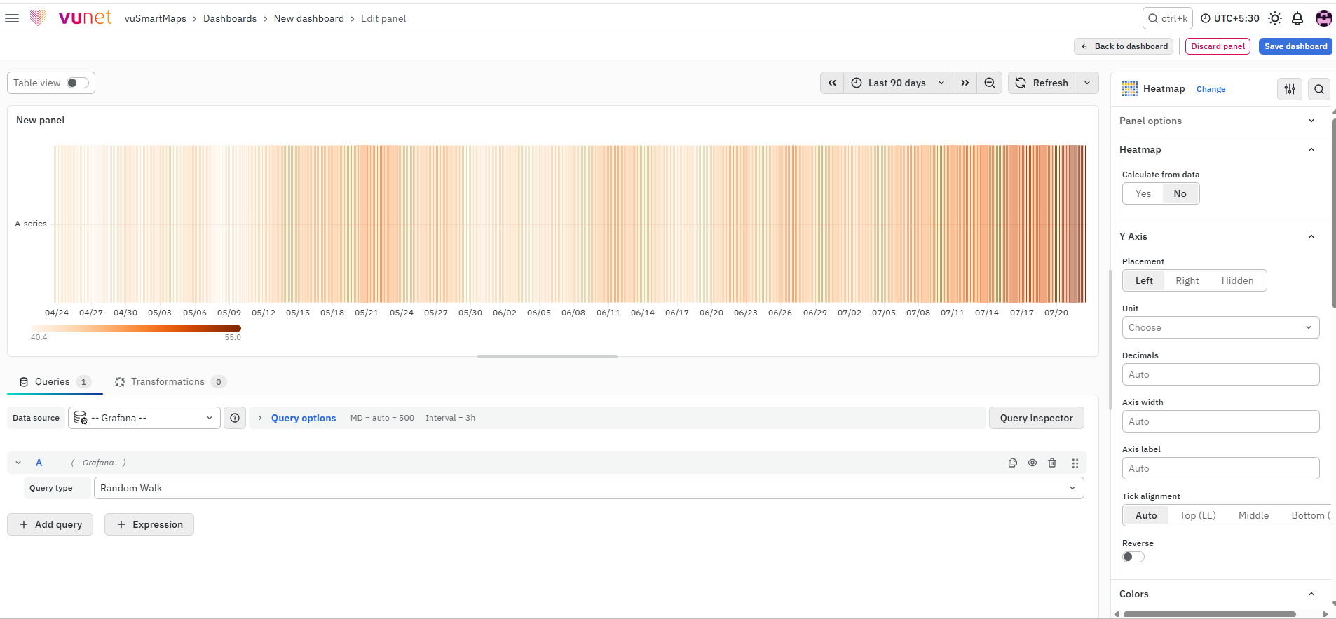
Pie Chart
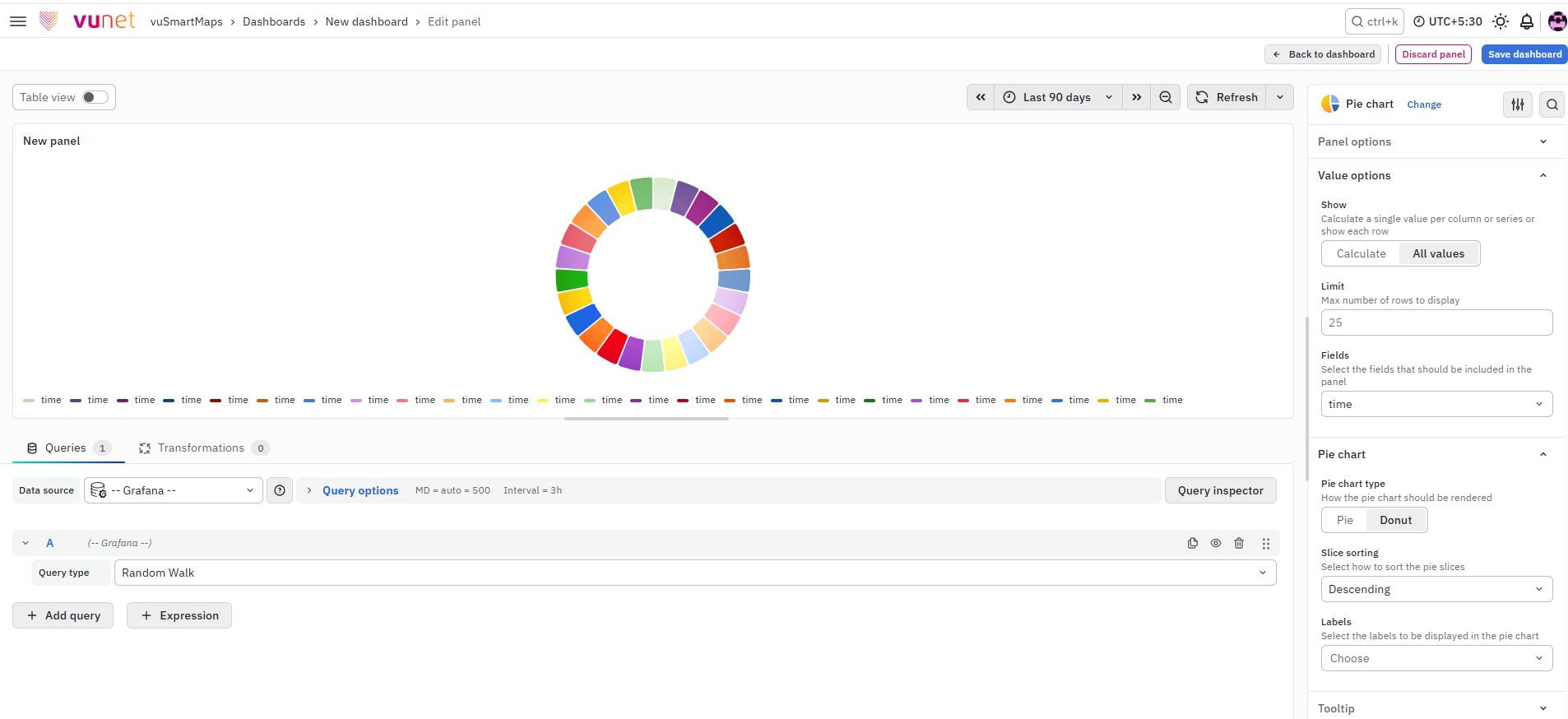
A Pie Chart displays data as slices of a circle, where each slice represents a category’s contribution to the total value. It is useful for showing percentage or proportional distribution across a small number of categories. It helps users quickly identify which category contributes the most without analyzing detailed tables.
Data Table
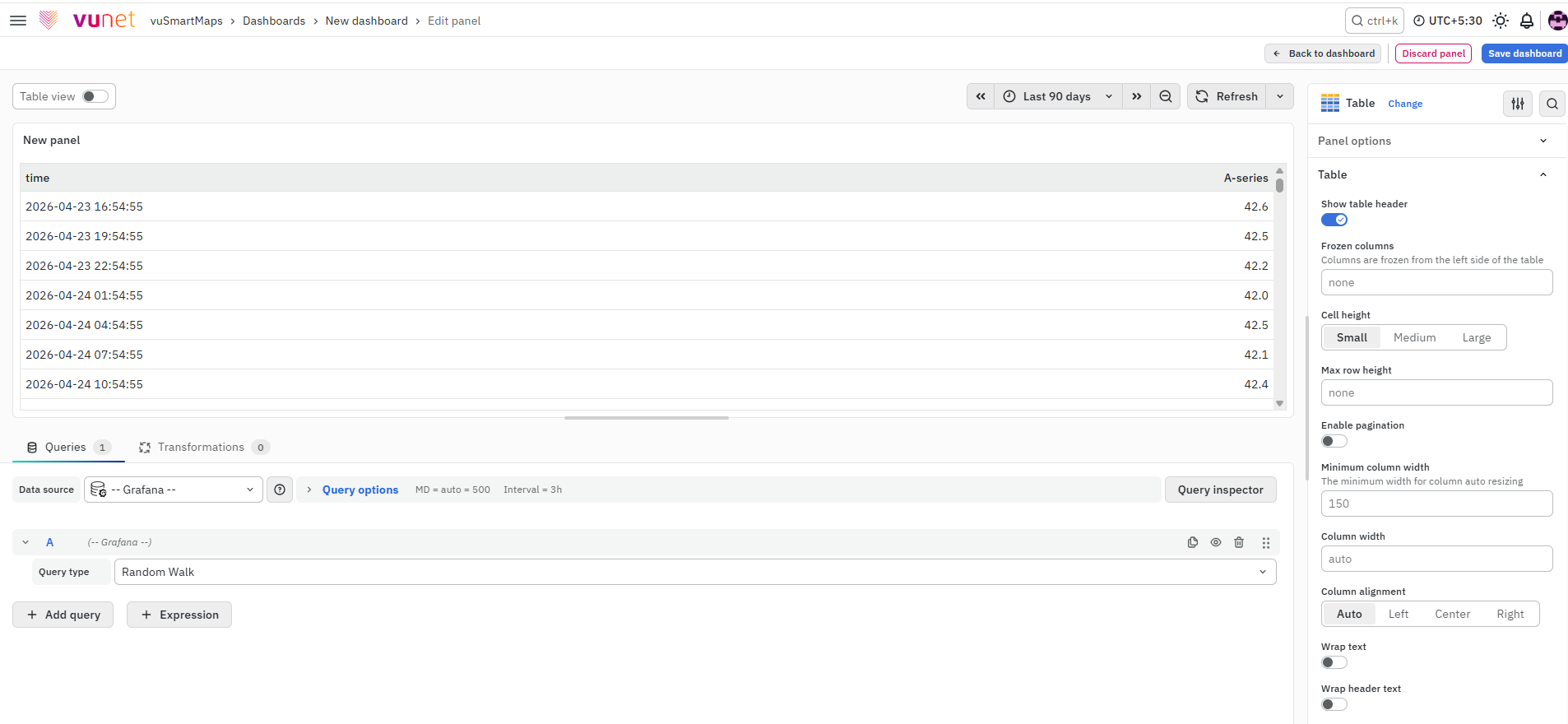
A Data Table displays information in a structured row-and-column format. It is useful when users need to view exact values, compare records, or analyze data across time, groups, or metrics. It also supports options such as pagination, color coding, thresholds, value mappings, and data links for deeper analysis.
Gauge Chart
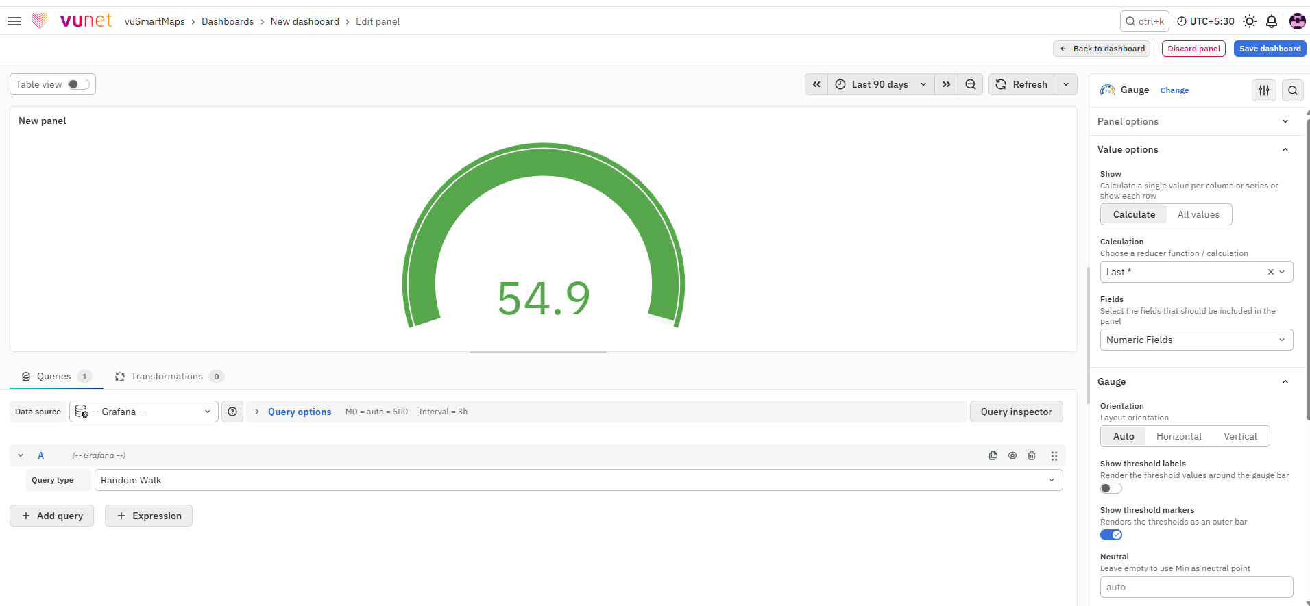
A Gauge Chart displays a single value using a dial-like visual, similar to a speedometer. The value is interpreted against colored ranges such as normal, warning, or critical. It is useful for quickly understanding the current status of performance-based metrics.
Metric
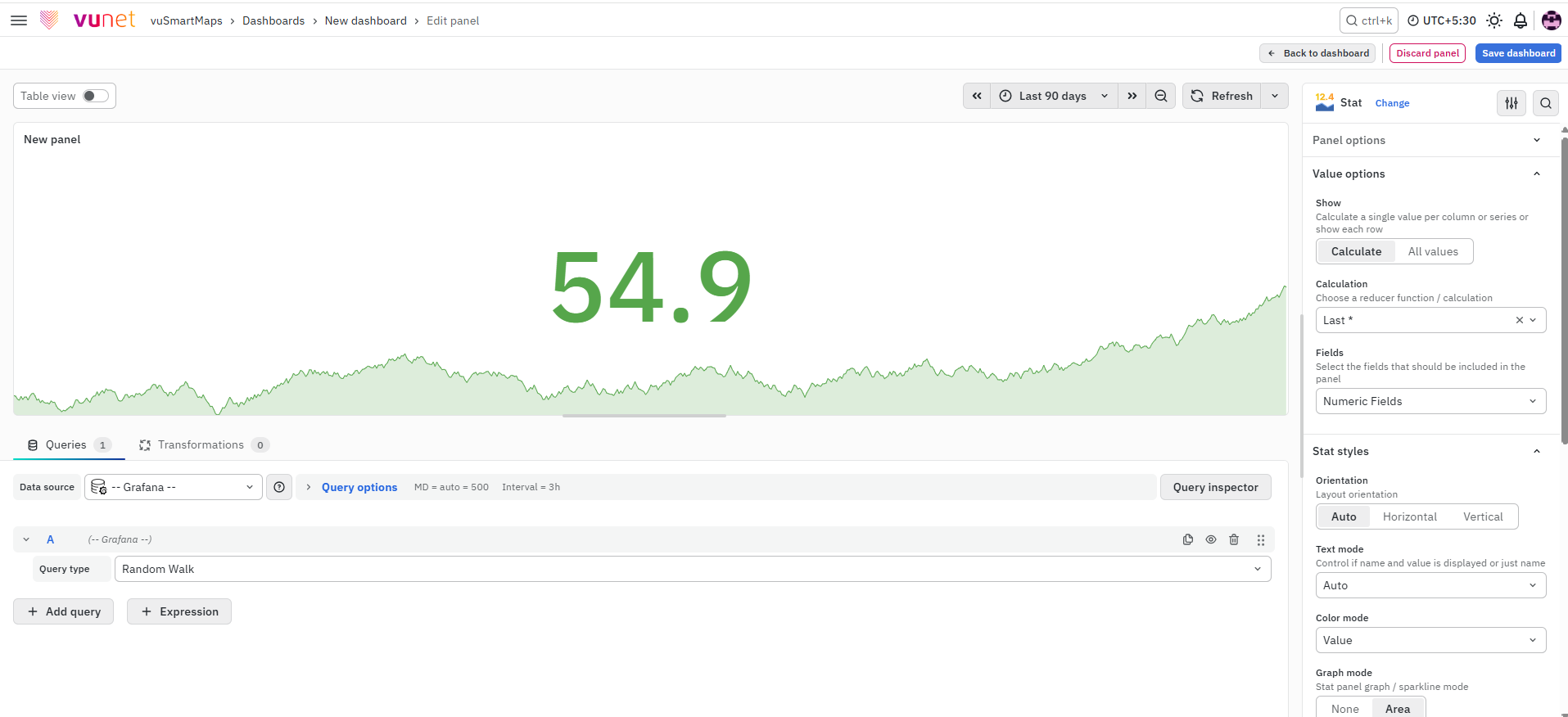
A Metric panel displays one important value in a simple and easy-to-read format. It is useful when users need to view totals, KPIs, quick comparisons, or threshold-based values at a glance. It helps reduce visual complexity and supports fast operational review.
HTML Widget
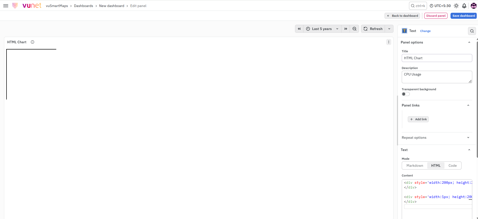
An HTML Widget allows users to create custom dashboard content using HTML. It can be used to add headings, separators, formatted blocks, reference links, and other visual elements. It helps organize large dashboards and improves readability for operations and support teams.
Business Chart
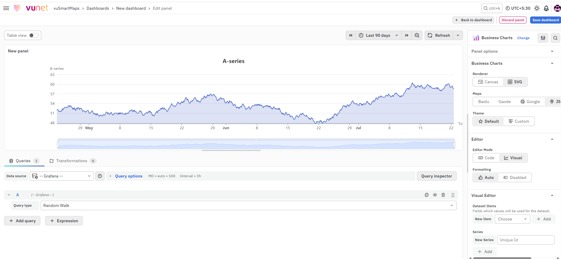
A Business Chart helps users create dynamic, interactive, and highly customizable charts in vuSmartMaps dashboards. It is useful when standard predefined panels are not enough for specific business or analytical requirements. It allows teams to present operational data with custom layouts, chart behavior, and interactions.
Custom Panel
Matrix Visualization
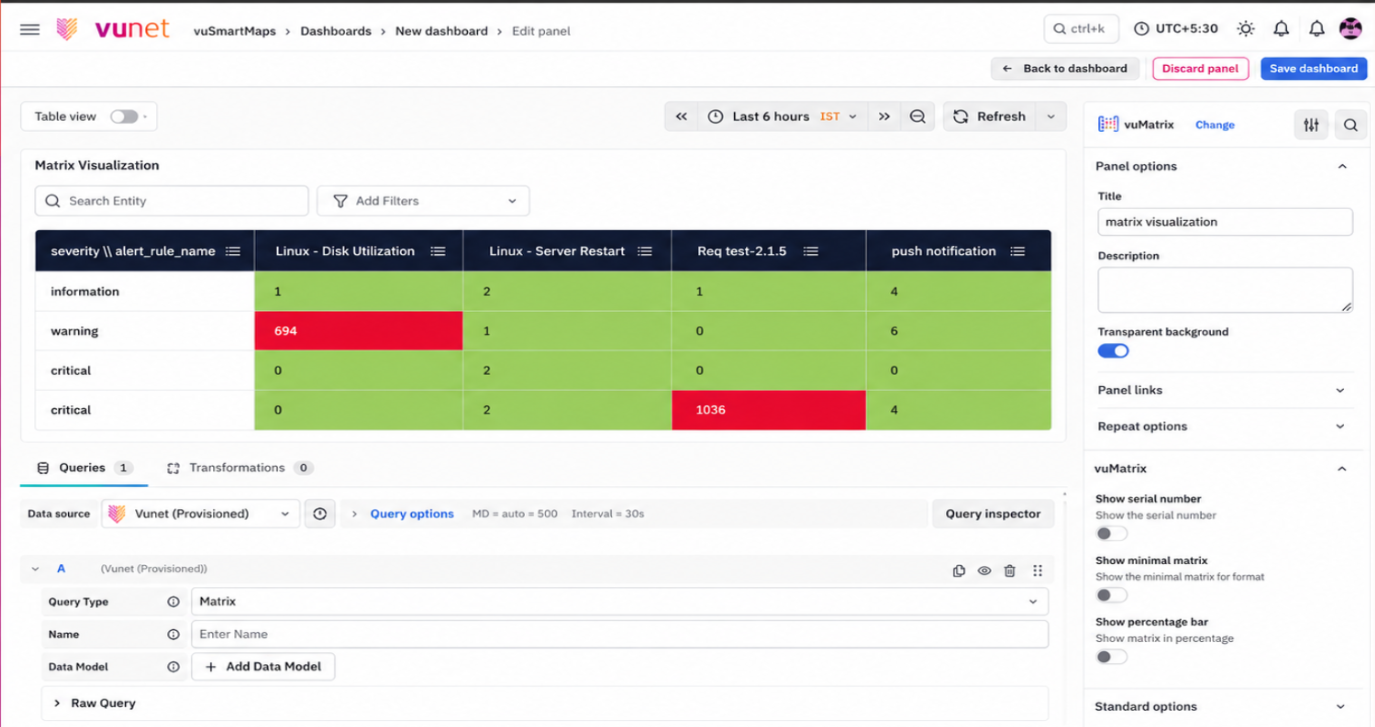
Matrix Visualization displays aggregated metric values in a structured row-and-column format. It helps users compare values across two category dimensions, where each cell represents the metric value for a specific row and column combination. It is useful for comparing grouped data, identifying patterns, and highlighting critical values using thresholds or color coding.
Insight Visualization
Insights are pivotal in driving business success, offering invaluable guidance to data analysts and decision-makers alike. By simplifying complex data presentations, insights enable clear and actionable information, empowering users at every level to make informed decisions effortlessly. With insights, identifying root causes and correlations becomes streamlined, allowing for customized and easily comprehensible views, ultimately leading to enhanced operational understanding and improved outcomes. Here are some of our Insights for your understanding.
Observability View
Application Status
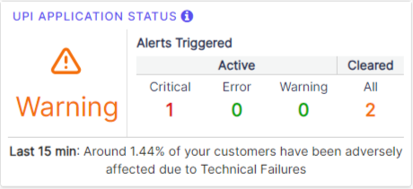
These insights help in representing the data and metrics in a way that enables effective monitoring, understanding, and troubleshooting of complex systems.
Heart Beat
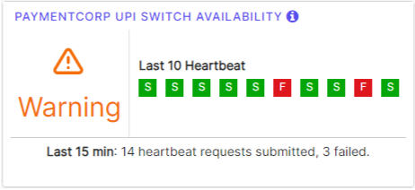
These insights help in representing the data and metrics in a way that enables effective monitoring, understanding, and troubleshooting of complex systems.
Business Journey Observability
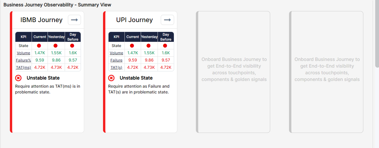
This panel displays the overall state of a Business Journey and when the Business Journey is in an unstable state the view highlights the impacted touchpoints/applications, components, and golden signals.
Performance Overview
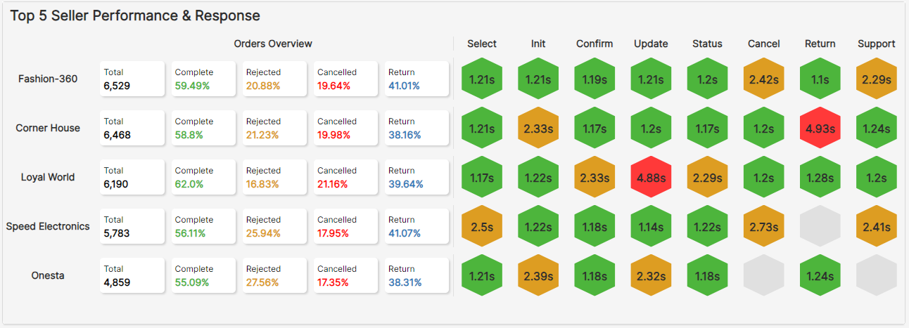
This panel provides a performance and response overview of the top 5 categories, evaluating and comparing their performance metrics.
Actionable Insights
Insights – Summarized Data
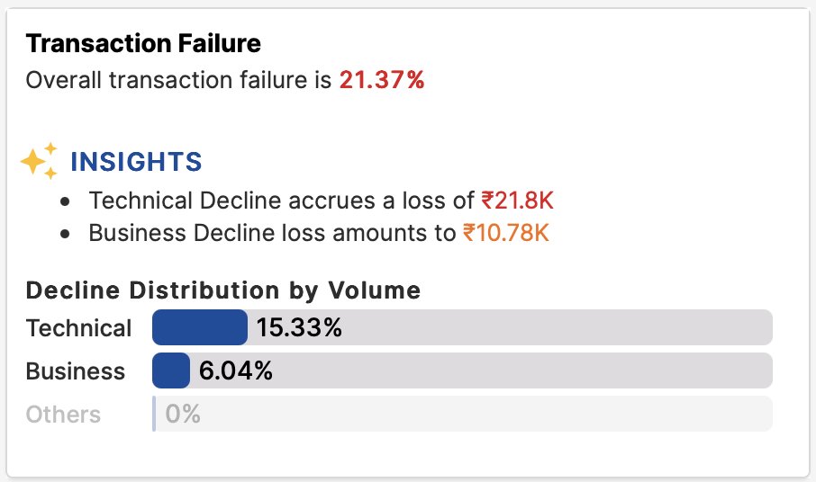
This panel allows the user to focus on a single key parameter and highlights the major points of concern, and its impact on the business is shown in the insights.
Insights Quadrant
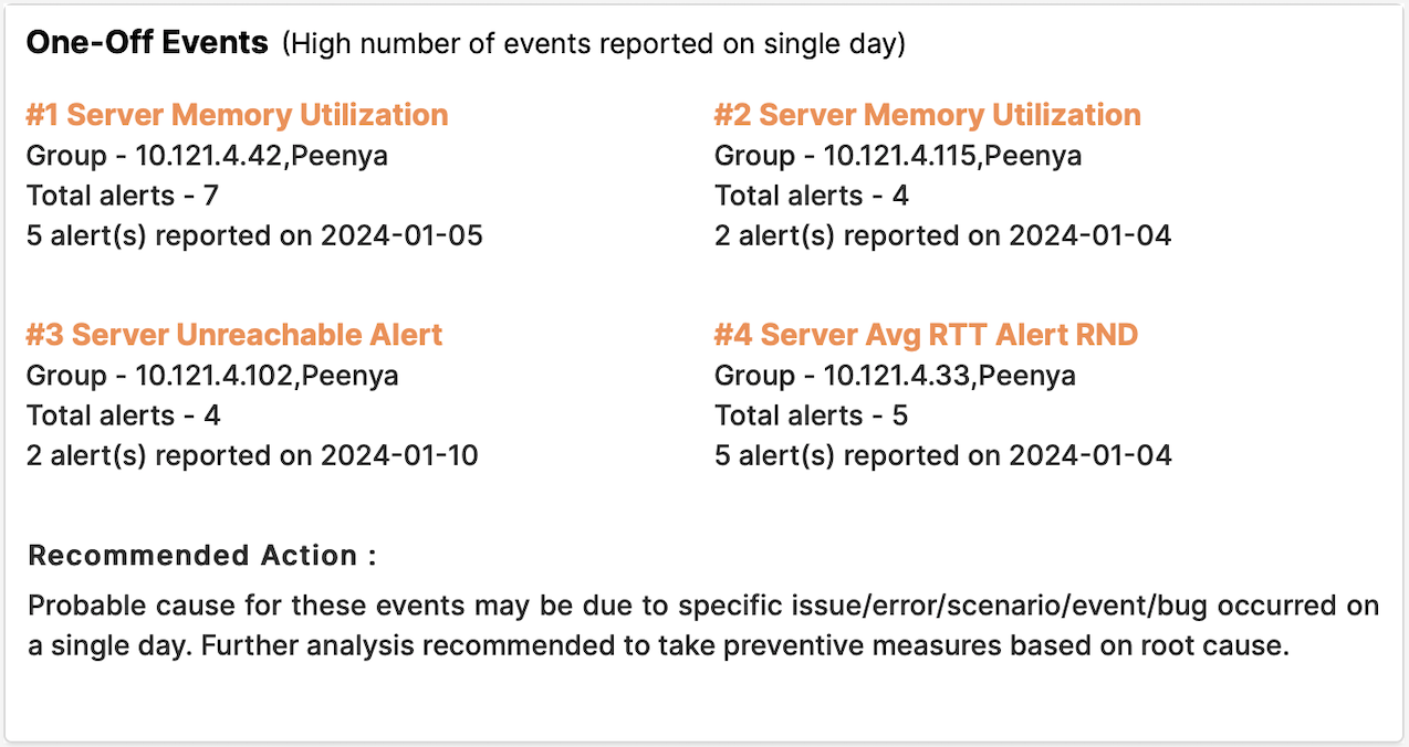
This panel allows the user to analyze the past 7 days’ data and categorize the events in one of the four quadrants based on the frequency of occurrence and provides a recommended action for each type of event.
Performance Overview
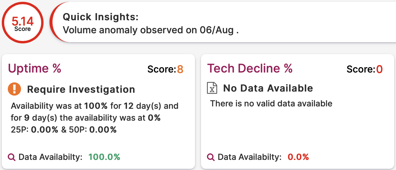
This panel allows the user to analyze data for four key parameters: Uptime Percentage, Technical Decline Percentage, Volume, and TAT for an application journey and provides an overall score for the application based on the individual parameters.
Problems & Recommendations
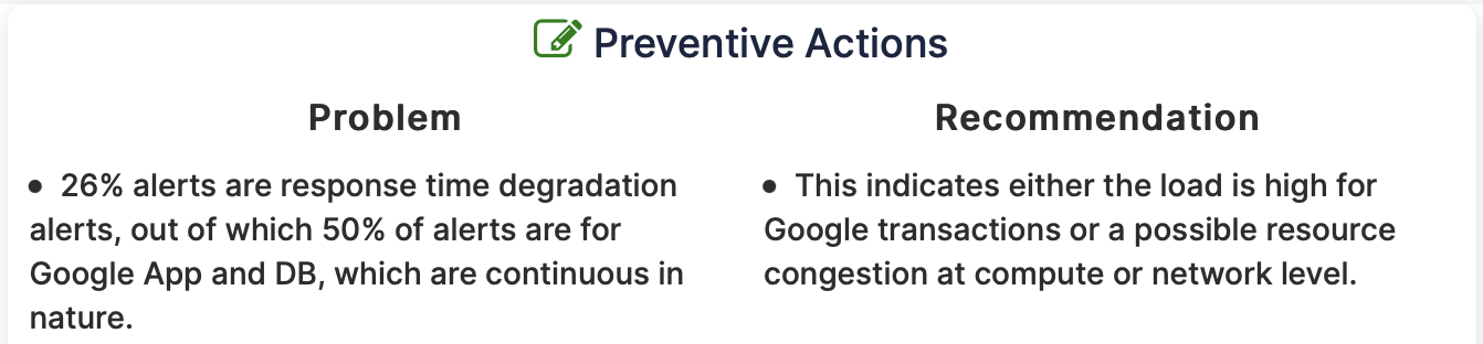
This panel gives in-depth details of the root cause of the problem and provides possible actionable solutions.
Comparative View
Stat Panel Comparative View
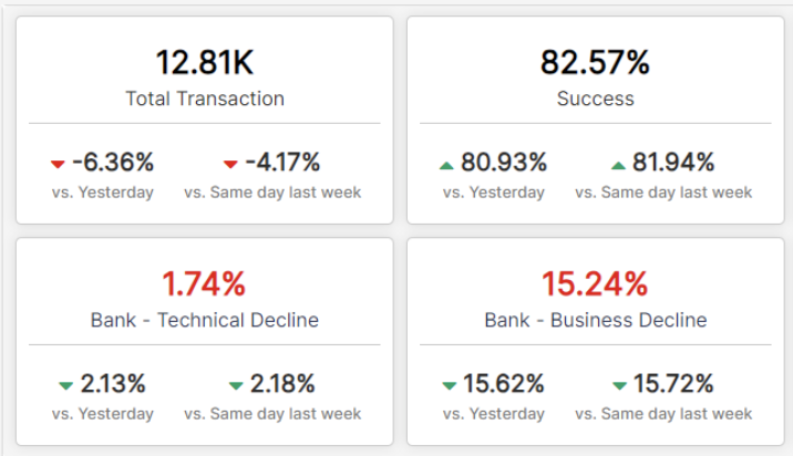
This panel gives an overview of all the metric values and compares the value with yesterday and the same day last week.
Insight Comparative View
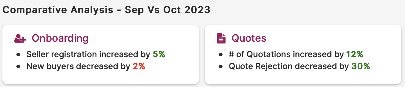
This panel gives the percentage increase or decrease of metric values wrt to last month or last week in simple English language statements which gives an easily understandable overview of the data.
Trend Comparative View
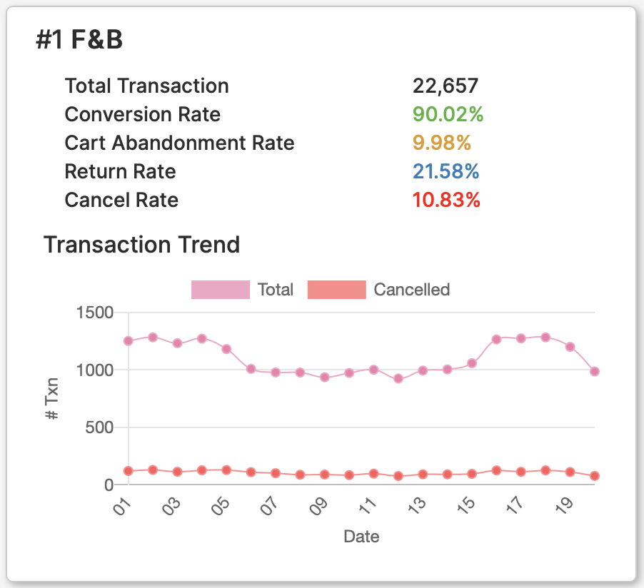
This panel gives an overview of the Top 3 values of any group along with their important metric values and a trend chart that can display important metrics in a graphical format.
Funnel Views
Simple Funnel View
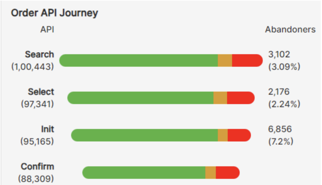
This panel allows the user to visualize the progression of data through different stages and highlights the quantity/value as it moves from one stage to another.
Funnel View with KPI
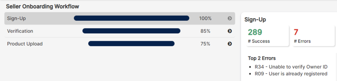
This panel allows the user to visualize the progression of data through different stages as well as gives information on its KPIs and error details.
Standard View
Double Doughnut Chart

To show the count distribution of multiple metrics in a single doughnut chart with its further grouping.
Doughnut Chart
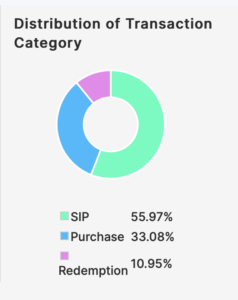
To show the percentage distribution of multiple metrics on a doughnut:
Insight Table
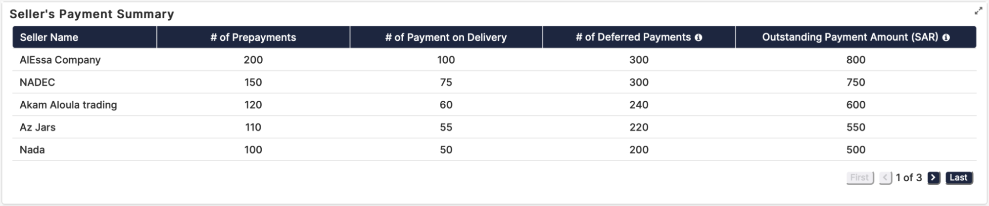
The Insight is a customized visualization to represent data in a tabular format with table pagination added.
To learn more about insight visualization refer to this link.
Unified Transaction Map
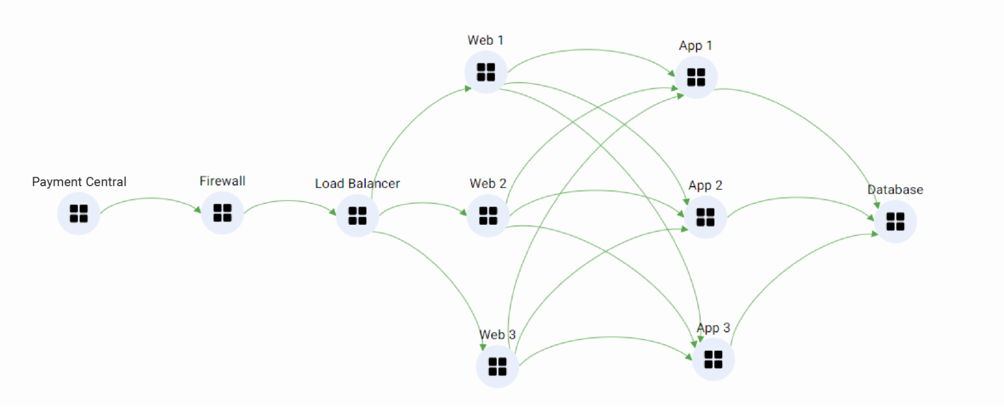
A Unified Transaction Map (UTM) provides a visual overview of how components within a network, application, or transaction are connected and function. It displays logical components and their connections, along with key metrics for each. Additionally, it offers insights into the stages and elements of business transactions as they progress over time.
Here are some of our UTMs for your understanding.
Payment Journey
The Payment Central system has received a payment request, which is subsequently forwarded to the firewall. The firewall then establishes a connection with the load balancer, which in turn distributes the request across three web gates. Each web gate hosts three applications, all of which are connected to a single database.
To learn more about UTM refer to this link.
FAQs
How are Visualization Panels categorized?
Visualization Panels are categorized into two main types: Predefined Panels and Custom Panels. Predefined Panels come with preset designs tailored to specific data types, while Custom Panels offer more flexibility for users to create their own unique visualizations. For a detailed breakdown, refer to the documentation
How can Visualization Panels help in tracking business performance?
Visualization Panels offer a suite of tools tailored to tracking business performance metrics. For instance, Line Charts are great for visualizing trends over time, while Gauge Charts provide a clear snapshot of key performance indicators. Additionally, Insight Visualizations offer actionable recommendations based on data analysis, empowering users to make informed decisions. Check out the documentation for real-world examples and best practices.
How can Visualization Panels simplify complex data presentation?
Visualization Panels offer several features aimed at simplifying complex data presentation. Insight Visualizations, for example, provide deep insights into data trends and patterns, making it easier for users of all skill levels to understand and act upon data. By leveraging these tools, users can streamline their data presentation process and drive more informed decision-making. Dive deeper into our documentation to unlock the full potential of Visualization Panels.
I'm having trouble presenting tabular data effectively. What should I use?
If you're struggling to present tabular data effectively, consider using the Matrix Visualization Panel. This robust tool allows for the presentation of aggregated metrics across various groups, with features such as color coding and customizable row and column organization.
I am uncertain about how to visually represent network or transaction flow. Do you have any recommendations?
Visualizing network or transaction flow can be challenging, but our Unified Transaction Map (UTM) Panel is specifically designed to address this need. By visually representing the flow of components within a network or transaction, the UTM Panel provides valuable insights into key metrics and transaction phases. Explore our documentation for tips and best practices on using the UTM Panel.
How can I create custom visualizations for my dashboard?
Creating custom visualizations for your dashboard is made easy with the HTML Widget Visualization Panel. This feature allows you to leverage HTML code to craft unique visuals tailored to your specific needs. With features like error spotting, autocomplete, and collapsible HTML tags, the HTML Widget Panel offers unparalleled flexibility and functionality. Get started with creating custom visuals by referring to our documentation.
How do I choose the right visualization panel for my data?
Choosing the right panel depends on your data type and objective:
- For trend analysis: use Line Charts or Area Charts.
- For category comparison: use Pie Charts or Data Tables.
- For advanced insights: try Insight Visualization or UTM panels.
Can I customize the look of predefined visualizations without using HTML?
Yes! Most predefined panels offer configuration options such as:
- Color schemes
- Thresholds
- Data formatting
- Other display settings
You can personalize your visualizations directly from the settings menu in the panel editor, without writing any code.
