Dashboards
Overview
Dashboards provide visual representations of data, making it easier to analyze and understand complex information. A dashboard is a collection of panels organized in rows, where each panel acts as a visualization unit with its own data query editor. A similar concept can be seen in a smartphone dashboard, where users quickly view key information such as battery usage, storage, network status, and app activity in one place. In the same way, dashboards in vuSmartMaps bring multiple panels together to show business journeys, operational metrics, infrastructure health, and system performance from a single screen.
Dashboards help users create queries, adjust visuals, and build interactive views using data from configured sources. However, dashboard snapshots are fixed, and query changes do not update snapshot data because snapshots cannot re-run queries. Dashboards also simplify data interpretation by helping users identify trends, patterns, irregularities, and operational issues. They support real-time observability, historical analysis, troubleshooting, collaboration, and data-driven decision-making.
Key Benefits Include
- Simplified Data Interpretation: Dashboards simplify data interpretation, enabling users to quickly identify trends and patterns.
- Customizable and Interactive: The dashboard’s customizable and interactive features empower users to uncover actionable insights and make informed decisions.
- Dynamic and Intuitive: Dashboards provide a dynamic and intuitive data analysis experience.
- Comprehend Data Visualization: Dashboards present data visualizations in an easy-to-understand format.
- Enhance Collaboration: By facilitating data sharing, dashboards enhance collaboration among team members.
- Facilitate Data-Driven Decision-Making: Dashboards empower users to make data-driven decisions based on real-time insights.
- Improved Visibility into Key Metrics: Dashboard analytics improve visibility into essential operational metrics.
- Swift Access to Valuable Insights: Users can quickly access operational and business insights through the dashboard interface.
- Real-Time Data Observation: Dashboards help users observe real-time data updates and operational changes.
- Effortless Customization: Users can customize dashboard displays for a more effective data analysis experience.

Why This Feature Is Useful
Dashboards help users visualize operational and business data in a clear and meaningful way. Instead of analyzing raw numbers, users can view charts, graphs, KPIs, and trends to quickly identify issues, bottlenecks, anomalies, and performance changes.
Dashboards are useful because they help organizations:
- Make data-driven decisions using real-time or near-real-time insights.
- Gain visibility across multiple applications, systems, and data sources.
- Monitor performance metrics and KPIs in one place.
- Identify faults, irregularities, and low-performance areas faster.
- Explore data using filters, drilldowns, and interactive visualizations.
- Share insights with teams, stakeholders, or customers.
- Access dashboards from mobile devices for on-the-go observability.
Dashboards can also be exported as images or PDFs for external use. This helps users share dashboard views with stakeholders, use them in reports and presentations, keep offline copies for reference, and maintain visual records for documentation, audits, or compliance purposes. Overall, dashboards improve visibility, collaboration, reporting, and decision-making by making complex data easier to understand and act on.
Example Scenario
A payment operations team notices increased transaction latency during peak business hours. The team opens a dashboard in vuSmartMaps and reviews multiple visual panels showing:
- Transaction performance
- Infrastructure health
- CPU utilization
- Disk utilization
- Error trends
- Response time
Using filters, drilldowns, and graphical visualizations, the team identifies abnormal server behavior and isolates the infrastructure component causing the issue. The team then uses the RCA Storyboard to further analyze incidents and operational impact.
When to Use This Feature
Use Dashboards and Visualization when you need to:
- Monitor operational and infrastructure metrics in real time.
- Analyze trends, anomalies, and bottlenecks.
- Observe KPIs and performance metrics.
- Investigate operational failures or low performance.
- Perform historical analysis.
- Troubleshoot infrastructure or application issues.
- Share operational insights with teams or stakeholders.
- Export dashboard data for reporting or presentations.
- Analyze data using filters, drilldowns, and visualizations.
Comprehensive Understanding
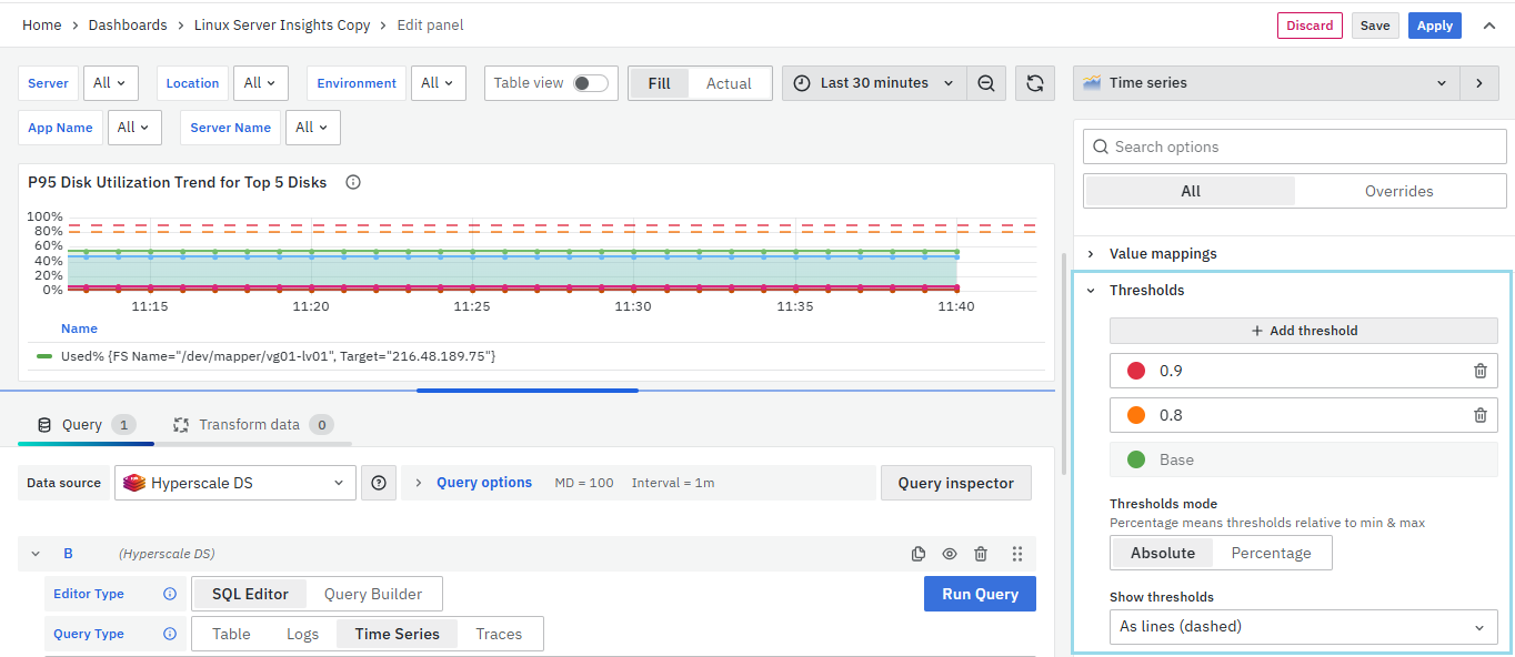
Dashboards provide comprehensive visibility into IT infrastructure health and performance. Any abnormalities or potential bottlenecks are immediately highlighted, helping teams proactively identify issues before they impact operations.
The dashboard also provides:
- Intelligent Alerting for threshold breaches and anomalies.
- Historical Data Analysis for identifying patterns and planning capacity requirements.
- Interactive Troubleshooting capabilities using drilldowns and detailed metric analysis.
- Real-time operational visibility for infrastructure and applications.
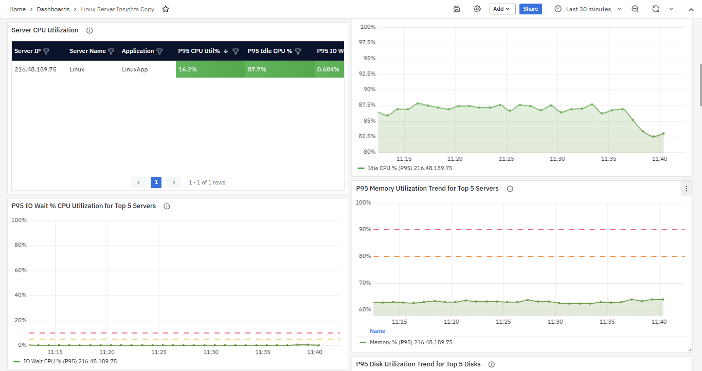
Users can select multiple panel types within the same dashboard and arrange them side by side to better understand the relationship between infrastructure health, operational metrics, and system performance.
The Dashboard interface in vuSmartMaps provides multiple capabilities for viewing, managing, configuring, and analyzing operational and business data. The page contains dashboard listing options, visualization panels, dashboard configuration settings, filters, drilldown capabilities, and export options.
Dashboard Listing Page
The Dashboard Listing Page displays all available dashboards and folders configured in vuSmartMaps. Users can search, filter, organize, and access dashboards from this page. The page contains the following sections:
- Dashboard List – Displays all available dashboards and folders configured in vuSmartMaps.
- Dashboard Name / Thumbnail – Opens the selected dashboard when clicked.
- Search Bar – Helps users search dashboards and folders using keywords.
- Filter by Tag – Filters dashboards using configured tags.
- Shared Option – Displays dashboards that are shared with users or teams.
- Sort Option – Sorts dashboard listings based on selected criteria.
- Folder Structure – Helps organize dashboards into different folders for easier navigation.
Dashboard Interface
After opening a dashboard, the selected dashboard loads with configured panels and visualizations. The dashboard interface provides interactive capabilities for operational analysis and data exploration. The dashboard interface contains the following sections:
- Panels – Visualization units used to display operational, infrastructure, and business data.
- Rows – Organize multiple panels within the dashboard.
- Visualization Area – Displays charts, graphs, tables, and other visual representations of data.
- Data Query Editor – Used internally by the panel to retrieve and display data from configured data sources.
- Dashboard Settings – Allows configuration of dashboard name, description, timezone, and auto-refresh settings.
- Filters and Variables – Help refine displayed data and dynamically adjust dashboard views.
- Time Range Selector – Allows users to select predefined or custom time ranges for analysis.
- Auto-refresh Option – Automatically refreshes dashboard data at configured intervals.
- Drilldown Area – Allows navigation to more detailed views when users interact with visualizations or data points.
- Data Statistics Download – Allows downloading dashboard statistics in CSV format for deeper analysis.
- Save Dashboard Option – Saves dashboard configurations for future use.
- Snapshots – Provides fixed dashboard views that preserve dashboard data at a specific point in time.
- Playlists – Helps manage and cycle through dashboard views efficiently.
- Library Panels – Provides reusable panel functionality for dashboards.
Dashboard Panels and Visualizations
Dashboards support multiple panel types and visualizations that help users analyze operational and infrastructure data more effectively. Users can arrange multiple panel types side by side within the same dashboard to better understand the relationship between operational metrics and infrastructure health. The visualization area may contain:
- Charts
- Graphs
- Tables
- KPI panels
- Trend visualizations
- Infrastructure metrics
- Operational metrics
- Business journey metrics
Dashboard Interaction Features
The dashboard interface provides multiple interaction capabilities for deeper operational analysis.
Time Range Selector
The Time Range Selector is typically available at the top-right corner of the dashboard. Users can select predefined relative time ranges such as:
- Last 30 minutes
- Last 7 days
Users can also configure custom absolute time ranges. Once selected, the dashboard automatically updates to display data for the selected period.
Drilldown
Drilldown capabilities allow users to explore data in greater detail. Users can click visualizations or data points within the dashboard to navigate to more detailed views based on dashboard configuration.

Search and Filter
Search and Filter functionalities help users refine operational analysis. Users can enter keywords, terms, or values in the search or filter fields to dynamically update displayed data. Additional predefined filters can also be applied based on:
- Time
- Category
- Data attributes
- Operational criteria
Step-by-Step Instructions
Create a New Dashboard
To create a new Dashboard follow these steps
- Open Left Navigation Menu: Click the menu at the top left and choose Dashboards.
- Start a New Dashboard: Click New > New Dashboard.
- Add Visualizations: Select Add visualization to customize your dashboard.
When creating a new dashboard, you'll encounter three key sections:
- Visualization: Configure the appearance and properties of your graph or visual elements. Adjust settings like table view, graph resolution, time range selection, zoom options, and more to suit your preferences.
- Visualization Options: Tailor the visual settings further based on the chosen visualization type. These options vary depending on your selection.
- Query: Specify the data source to generate the desired graph output.
Query Selection
Before diving into visualization options, it's crucial to select an appropriate query as your data source. Your choice defines the data you'll be working with and how you visualize it. You can also opt for multiple queries to enhance your dashboard's insights.
Metric and Grouping:
- Metric: Represents data on the y-axis. Choose from options like count, average, sum, max, min, extended stats, percentiles, unique, raw documents, raw data, or logs.
- Group By: Categorizes data on the x-axis. Common examples include time intervals like days or months. Use aggregation types like terms, filters, geo hash grid, date histogram, or histogram.
Multiple Metrics and Buckets: You have the flexibility to add multiple metrics and buckets, allowing for a more comprehensive data representation. For instance, you can track CPU usage at various time intervals simultaneously.
Multiple Queries and Configurations: To gain deeper insights, you can add multiple queries with distinct "Group By" options, enabling comparisons across different aspects of your data. Custom labels can be applied to metrics and groups for clarity.
Loading Dashboards
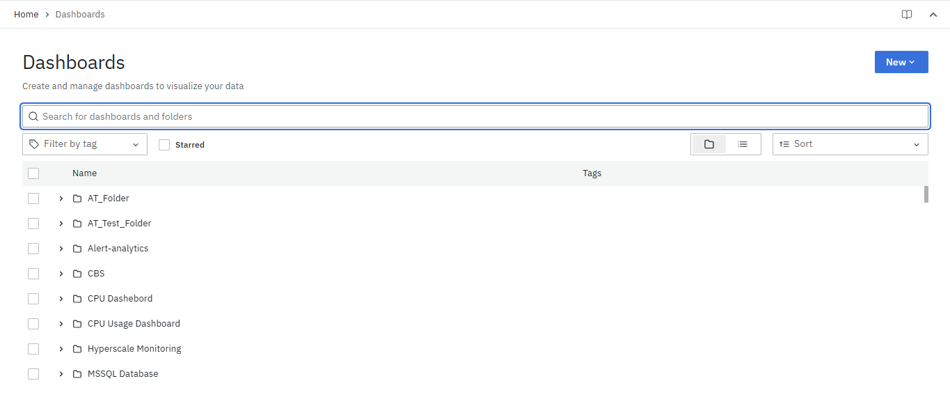
- Open vuSmartMaps.
- Navigate to the Left Navigation Menu.
- Click Dashboards.
- Review the list of available dashboards.
- Click the required dashboard name or thumbnail.
- The selected dashboard loads with configured visualizations and data panels.
Selecting Time
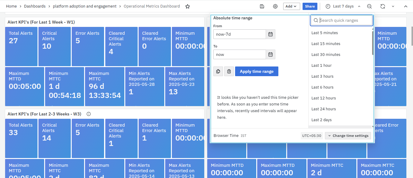
- Open the required dashboard.
- Go to the time range selector at the top-right corner.
- Click the selector to open the dropdown or calendar.
- Select a predefined relative time range such as:
- Last 30 minutes
- Last 7 days
- Alternatively, select a custom absolute time range.
- The dashboard automatically updates for the selected time frame.
Using Drilldown
- Open the required dashboard.
- Click a visualization or data point within the dashboard.
- The dashboard transitions to a more detailed view depending on the configuration.
- Continue interacting with visualizations or data points for deeper analysis.
Using Search and Filter
- Open the required dashboard.
- Locate the search or filter input field near the top of the dashboard.
- Enter relevant keywords, terms, or values.
- The dashboard dynamically updates to display matching results.
- Apply predefined filters or filter conditions to refine data further.
Downloading Data Statistics
- Open the required dashboard.
- Navigate to the dashboard management options.
- Download Data Statistics in CSV format for deeper analysis.
What Happens After the Steps
After loading and interacting with dashboards, users can visualize operational and infrastructure data using multiple panels and visualizations. Users can:
- Analyze operational metrics.
- Observe real-time and historical trends.
- Perform drilldown analysis.
- Filter operational data dynamically.
- Investigate bottlenecks and anomalies.
- Export dashboards for reporting and collaboration.
- Save dashboard configurations for future use.
Tips / Best Practices
- Select the correct time range before starting analysis.
- Use drilldown capabilities for deeper operational investigation.
- Combine multiple panel types within the same dashboard for better visibility.
- Use filters and variables to refine operational analysis.
- Review dashboards regularly to identify unusual patterns or operational changes.
- Export dashboards as PDFs or images for external sharing and reporting.
- Save dashboard configurations after making changes for future reuse.
- Use historical analysis to identify recurring operational issues.
Troubleshooting
-
Issue: Dashboard is not showing expected data.
- Possible Cause: Incorrect time range or filters may be selected.
- Solution: Review the selected time range and applied filters.
-
Issue: Dashboard snapshot is not updating.
- Possible Cause: Dashboard snapshots are fixed and cannot re-run queries.
- Solution: Use the live dashboard view instead of the snapshot.
-
Issue: Unable to perform deeper analysis.
- Possible Cause: Drilldown interaction may not have been used.
- Solution: Click visualizations or data points to navigate to detailed views.
-
Issue: Unable to find specific dashboard data.
- Possible Cause: Search or filter conditions may not be configured correctly.
- Solution: Use relevant keywords, filters, or predefined filter conditions.
-
Issue: Operational issue is difficult to identify.
- Possible Cause: Multiple metrics may need to be analyzed together.
- Solution: Use multiple panels side by side to correlate infrastructure and operational behavior.
FAQs
What are Dashboards in vuSmartMaps?
Dashboards are visual interfaces that display operational, infrastructure, and business data using panels, charts, graphs, and tables. They help users analyze and understand complex information more easily.
Can dashboards display real-time data?
Yes. Dashboards support real-time or near-real-time data observation and automatically update based on the configured refresh settings.
Can I customize dashboards?
Yes. Dashboards support customizable and interactive visualizations. Users can adjust visuals, configure dashboard settings, and organize panels based on operational requirements.
Can I select different time ranges for analysis?
Yes. The Time Range Selector allows users to select predefined relative time ranges or configure custom absolute time ranges.
What is Drilldown in dashboards?
Drilldown allows users to navigate from high-level visualizations to more detailed views by clicking on visualizations or specific data points.
How do Search and Filter help in dashboards?
Search and Filter functionalities help users refine displayed data using keywords, filters, categories, or specific data attributes.
Can dashboards be exported?
Yes. Dashboards can be exported as images or PDFs for external sharing, reporting, presentations, offline access, documentation, and archiving purposes.
Can dashboard data be downloaded?
Yes. Users can download Data Statistics in CSV format for deeper analysis.
What is the Business and Operational Storyboard?
The Business and Operational Storyboard provides adaptable business journey and operational insights for multiple user roles across financial institutions, fintech organizations, banks, and operational teams.
What is the RCA Storyboard?
The RCABot Storyboard helps users gain insights into incidents, early warnings, and detailed operational analysis to improve operational efficiency and journey management.
Can dashboards help identify operational issues?
Yes. Dashboards help identify trends, irregularities, bottlenecks, failures, and performance degradation using visual analytics and operational metrics.
