Pie Chart
Overview
A pie chart is a circular statistical graphic with slices that are proportional to the quantity they represent. In a pie chart, the arc length of each slice (and consequently its central angle and area) is proportional to the quantity it represents. A similar concept can be seen in a smartphone storage view, where storage is divided into categories such as apps, photos, videos, and system files. Each section shows how much space that category uses compared to the total storage. In the same way, a pie chart helps users quickly understand how different categories contribute to the overall value.
It's typically used to illustrate percentages or proportional data, often accompanied by percentage labels next to each slice. Pie charts are most effective when depicting data with roughly five categories or fewer.
Why This Feature Is Useful
In banking and payment operations, teams often need a quick view of how data is distributed.
For example:
- Understanding how transaction volumes are split across channels.
- Viewing how alerts are distributed by severity.
- Comparing contribution of different systems to overall activity.
A Pie Chart makes this easy by showing proportions visually. Users can immediately identify which category contributes the most and take faster decisions without analyzing detailed tables.
Example Scenario
A payment operations team is analyzing transaction failures across a few systems.
They create a Pie Chart panel using the relevant query. Each slice represents a failure category. The chart shows:
- Category name
- Percentage contribution
- Actual value
By looking at the chart, the team quickly identifies which system is contributing the highest number of failures for further analysis.
When to Use This Feature
Use the Pie Chart when:
- You want to show percentage or proportional data.
- You need a quick visual summary of distribution.
- You are working with a small number of categories (ideally five or fewer).
- You want users to quickly compare category contribution.
Avoid using Pie Charts when there are too many categories, as it becomes difficult to interpret.
Comprehensive Understanding
You can configure a Pie Chart within a dashboard panel. The screen contains the following sections:
Visualization
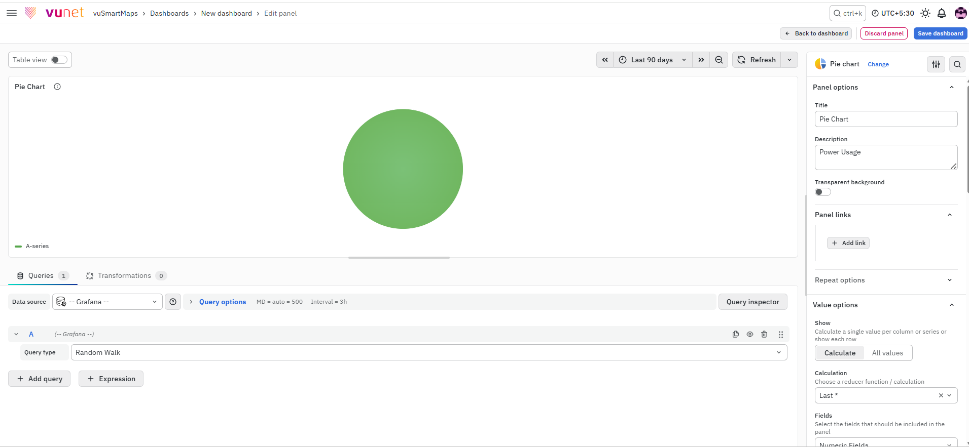
On the right side of the default screen, the user selects Pie Chart as the visualization type. This changes the panel into a pie chart view.
Panel Options
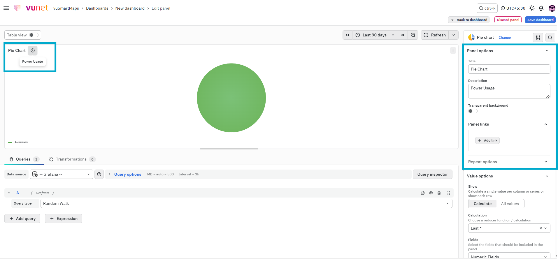
This section is used to define the basic details of the panel.
- Title – Used to identify the Pie Chart panel on the dashboard.
- Description – Provides additional context about what the Pie Chart represents. This can be viewed by hovering over the information icon on the panel.
- Panel Link – Allows you to attach a link to another dashboard or external URL.
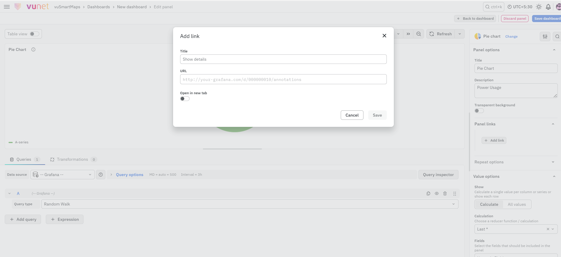
You can configure:
- Link title
- URL
- Open in a new tab option
When configured, clicking the panel opens the linked page based on the selected behavior.
Repeat Options
The Repeat Options section allows the panel to be repeated for each value selected in a dashboard variable.
- Repeat by variable: Select the required dashboard variable to create a separate panel for each selected value.
- Disable repeating: Keeps panel repetition disabled.
Repeated panels are not displayed while editing the panel. Return to the dashboard and refresh or reload it to view the repeated panels.
Value Options
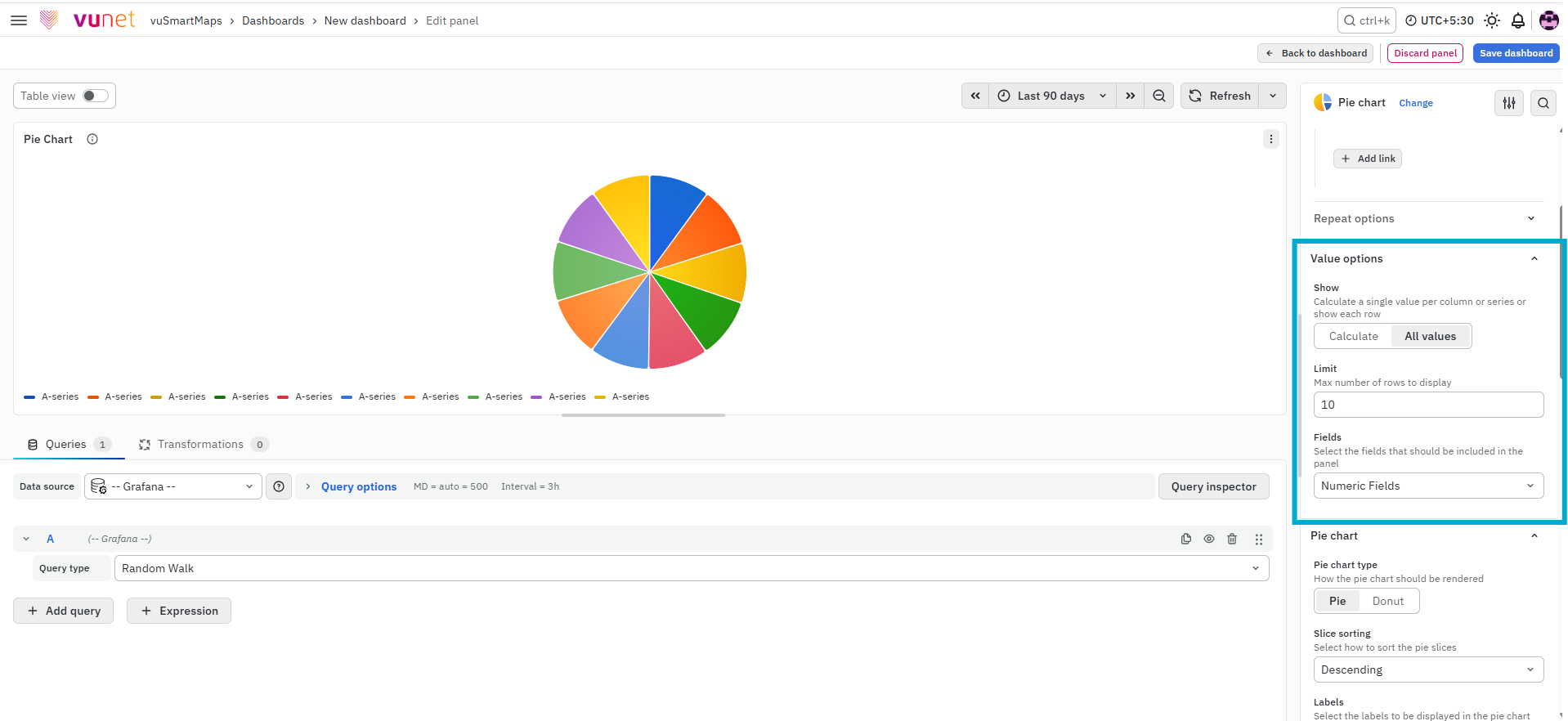
This section controls what values appear in the panel. The user can choose whether to show a calculated value or all values, limit how many values are displayed, and decide which fields should be shown. Available field selections include numeric fields (All fields with numerical values), all fields (All fields that are not removed by transformations), time fields (All fields with time values), and A-Series (The standard A-series).
Pie Chart Settings
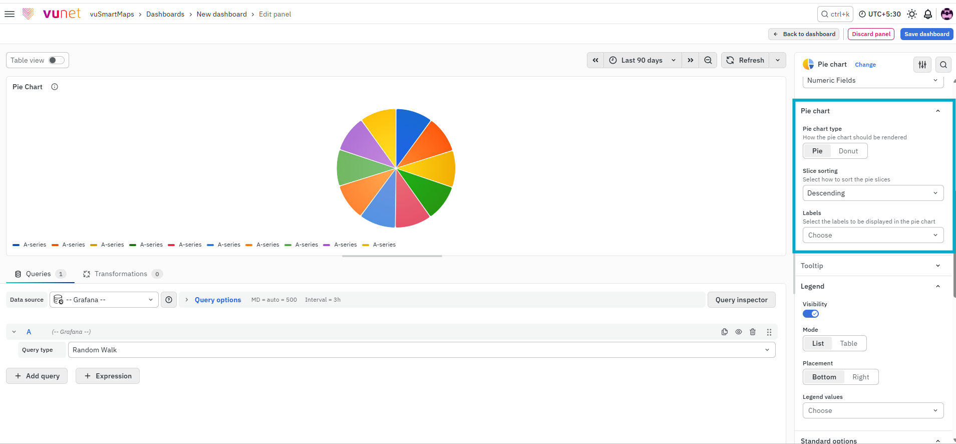
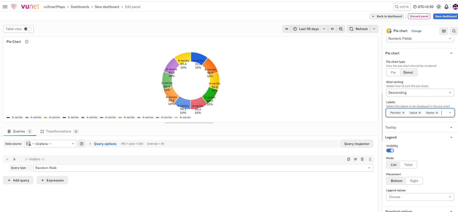
This section contains the core chart display options. The user can choose the chart type as Pie or Donut, arrange the slices in Descending order using Slice Sorting, and select which labels appear on the chart, such as Percent, Name, and Value.
Tooltip
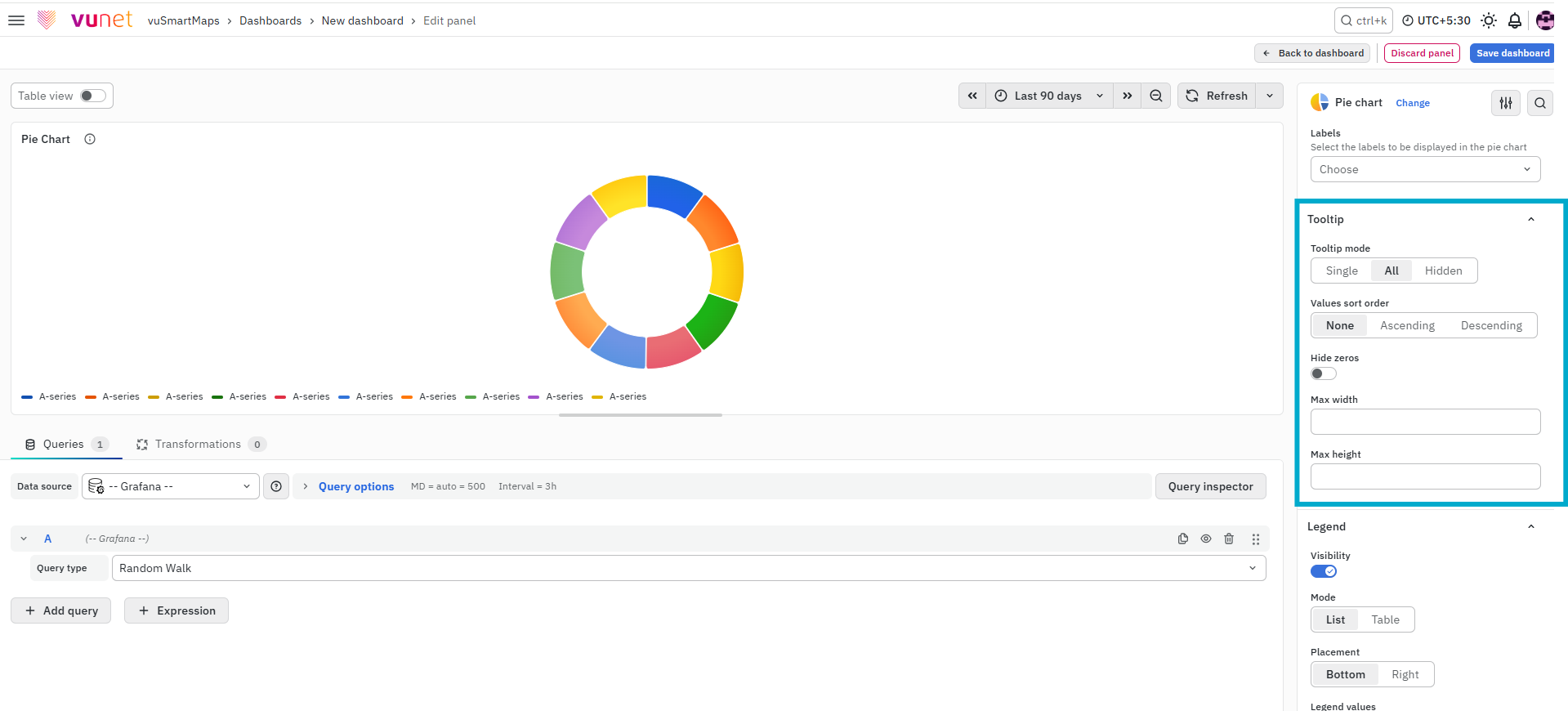
This section controls the hover information shown when the cursor is placed over chart data. Tooltip visibility can be set to single, all, or hidden. A maximum width can also be set for the tooltip box.
Legend
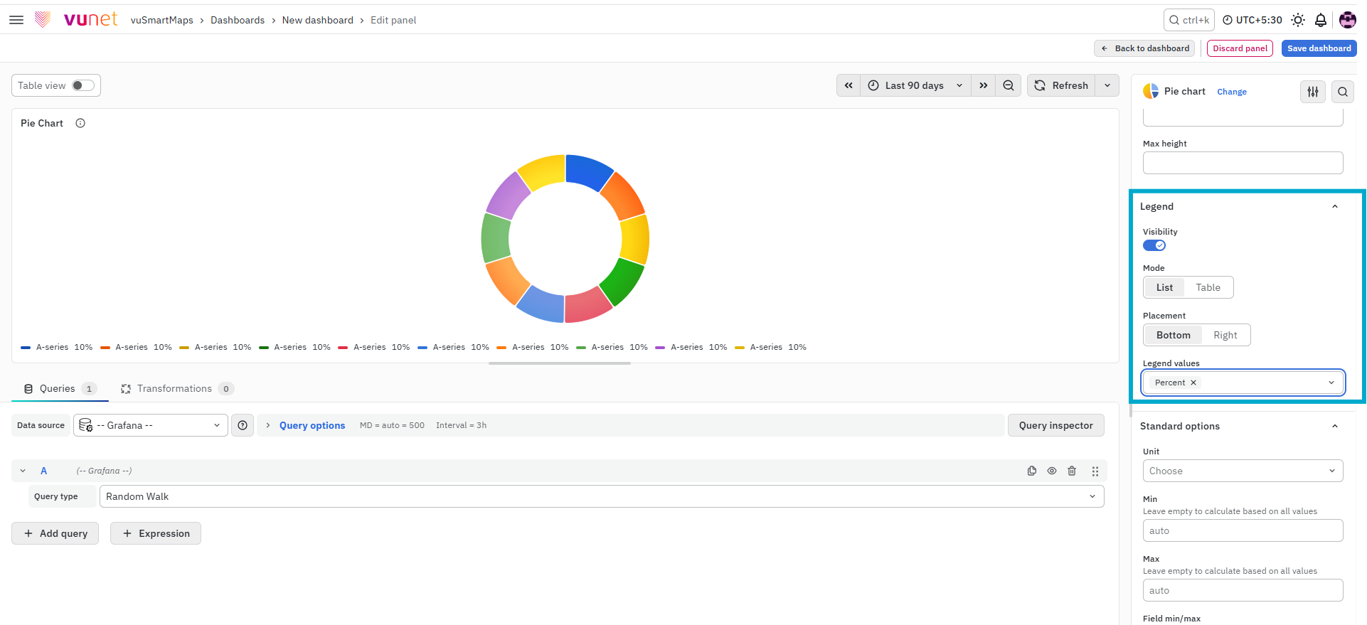
This section controls how legend information is displayed. Users can choose the legend mode as list or table, set placement to bottom or right, define legend width when placed on the right, and choose which values appear in the legend, such as percent or value.
Standard Options
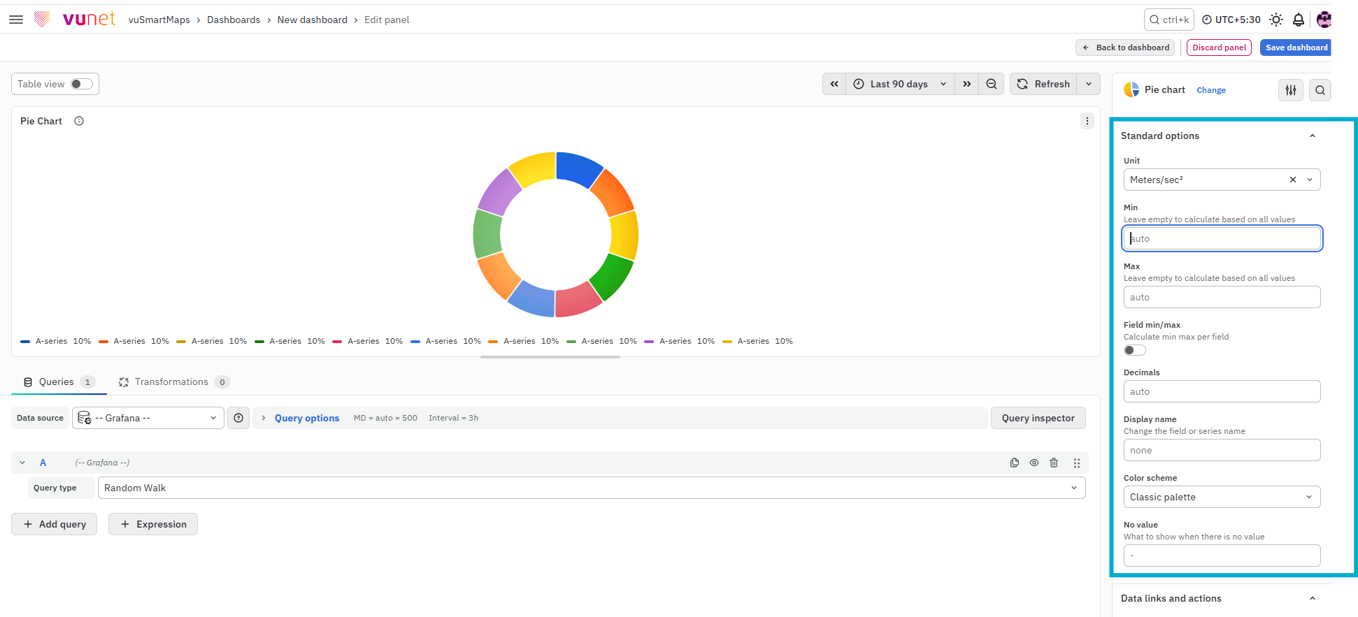
This section is used to configure standard display behavior. Options include unit type, minimum value, maximum value, field min/max, decimal places, display name, color scheme, and no value text.
Value Mappings
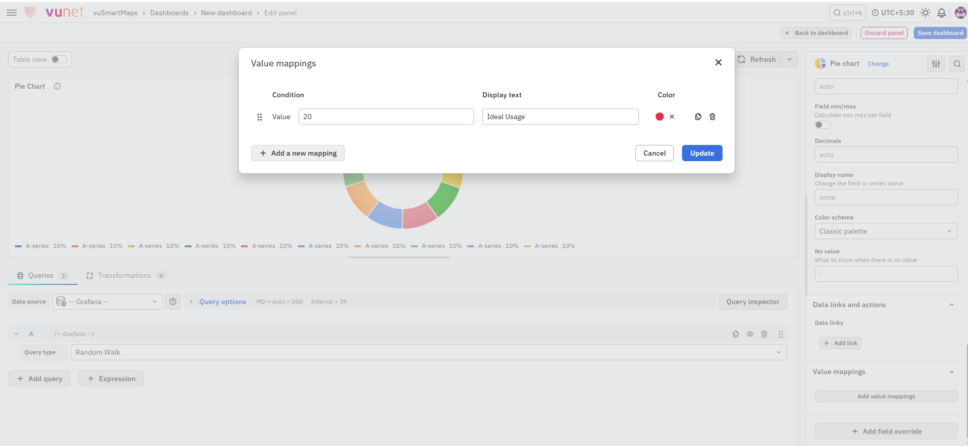
The Value Mappings option allows you to find a specific value, and the display text is displayed wherever the value lies. Matching values are highlighted using the selected color.

Data Links and Actions
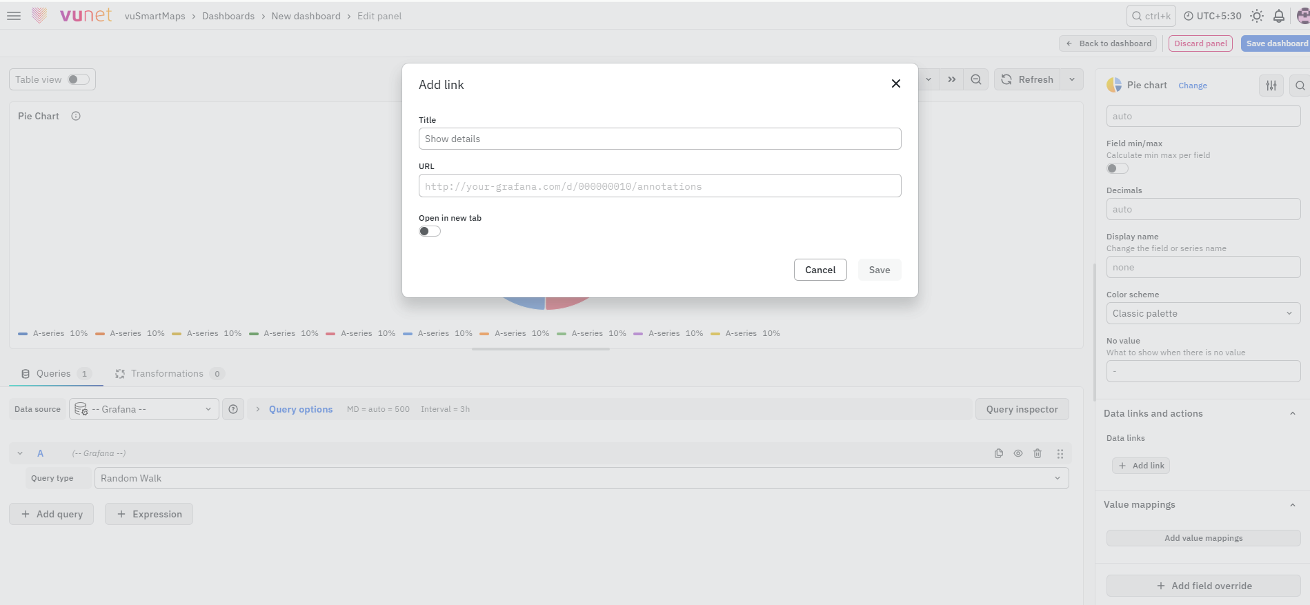
This section allows links to be attached to the data itself instead of the panel. When a user clicks the data, the link option appears. This is useful for quick access to related pages or resources.
Add Field Override
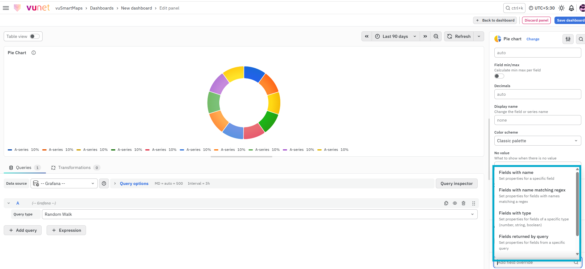
This section allows users to override settings for one or more fields. Overrides can be applied by field name, matching regex, field type, query or values. The steps include selecting the field, selecting the override property, and configuring that property.
Step-by-Step Instructions
- Create a new dashboard panel.
- Configure the Query and select the appropriate Data Source (Refer to Dashboard Basics > Query)
- On the right side of the screen, select Visualization and choose Pie Chart.
- In Panel Options, enter the panel name and description. Add a panel link if required by entering the link title and URL, and choose whether it should open in a new tab. Then save the link.
- In Value Options, choose how the values should be displayed.
- Select Calculate if you want each value reduced to a single value per series.
- Select All values if you want every value from a single series displayed.
- Apply a limit if required.
- Select the fields to display.
- In the Pie Chart settings, choose the chart style as Pie or Donut. Then choose the labels you want to display, such as name, percent, and value.
- Configure the Tooltip settings. Choose whether the tooltip display should be single, all, or hidden. Set the maximum width if needed.
- Configure the Legend settings. Select the legend mode, placement, width if applicable, and legend values.
- In Standard Options, configure the display settings such as unit type, min, max, decimal places, display name, color scheme, and no-value handling.
- If needed, configure Value Mappings so that specific values display custom text and highlighting.
- If needed, configure Data Links and Actions to add clickable links directly on the chart data.
- If required, click Add Field Override. Then:
- Select the field
- Select the override property
- Configure the override property. Repeat this process if you need multiple overrides.
- Save the panel. You can edit the panel later if required.
What Happens After the Steps
Once the panel is saved:
- The Pie Chart is displayed on the dashboard.
- Each slice represents a category from the query.
- Labels, legend, and tooltip appear based on configuration.
- Links and overrides work as configured.
- The panel can be edited anytime.
Tips / Best Practices
- Use Pie Charts only for a small number of categories.
- Use Percent labels for quick comparison.
- Use Value labels when exact numbers are important.
- Avoid overcrowding with too many slices.
- Use Donut view for better readability if needed.
- Use Data Links to connect charts to deeper analysis.
Troubleshooting
-
Issue : Pie Chart not displaying correctly.
- Possible cause: Query or data source issue.
- Solution: Verify query configuration.
-
Issue : Too many slices in chart.
- Possible cause : Too many categories.
- Solution : Limit values or refine query.
-
Issue : Legend not visible or incorrect.
- Possible cause : Incorrect legend settings.
- Solution : Check legend mode and placement.
-
Issue : Tooltip not appearing.
- Possible cause : Tooltip mode set to hidden.
- Solution : Change tooltip mode.
-
Issue : Export or navigation link not working.
- Possible cause : Incorrect URL.
- Solution : Verify panel link or data link configuration.
FAQs
What is a pie chart, and when should I use it?
A pie chart is a circular statistical graphic that represents data in slices, where each slice is proportional to the value it represents.
Best for illustrating percentages or proportional data.
Recommended for five categories or fewer for better readability.
For more details, see Pie Chart.
How do I create a pie chart in the dashboard?
- Create a new dashboard panel.
- Configure the query with the appropriate data source.
- Select Pie Chart as the visualization type.
- See Creating a Pie Chart for detailed steps.
What are the options for displaying values in the pie chart?
You can choose to show calculated values, all values, or limit the number of displayed values. Additionally, you can select specific fields to display. More details are in Value Options.
How do I customize the labels on my pie chart?
You can choose to display different types of labels such as series names, percentages, and raw numerical values. See Pie Chart Labels for further details.
How can I add a link to another dashboard or website from my pie chart panel?
- Use Panel Link in Panel Options.
- Add a title, URL, and configure it to open in new tab if needed.
- For instructions, refer to Panel Link.
What is the tooltip feature, and how can I configure it?
- Tooltip shows data when hovering over the pie chart.
- Set it to single, all, or hidden mode.
- Learn more in Tooltip.
How do I adjust the legend settings in my pie chart?
The legend can be displayed at the bottom or right and in list, table, or hidden mode. You can also choose which values to show in the legend. See Legend for detailed options.
What are field overrides, and how do I use them?
- Field overrides allow modifying settings for specific fields.
- Apply overrides based on field names, regex matches, field types, or specific queries.
- For step-by-step instructions, see Field Override.
Why is my pie chart not displaying any data?
- Check if the query is correctly configured.
- Ensure the data source is appropriately selected.
- Verify the minimum and maximum value settings.
- Ensure that data is available within the specified range.
How do I handle missing or null values in my pie chart data?
- Use the No Value option in Standard Options.
- Specify what should be displayed when there is no data available.
- More details are available in Standard Options.
