Metric
Overview
Metrics are used to measure and display important values in a simple format. It is useful when you want to show one number without adding unnecessary visual complexity. Similar value-based indicators are commonly seen on smartphone screens, where users quickly check information such as battery percentage, network strength, or storage usage without opening detailed settings pages. In the same way, Metrics help users quickly understand important operational or business values.
Metrics are a good choice when you want to show a total value or quickly compare values across different time periods. This makes them useful for summary-level monitoring and quick operational review.

Why This Feature Is Useful
In banking and payment operations, teams often need to look at one important number quickly. This could be the total number of failed transactions, average latency, CPU usage, or error count.
A Metric helps:
- Show a single value clearly .
- Reduce visual clutter.
- Support quick comparisons.
- Highlight important values using thresholds.
- Provide quick navigation using panel links or data links.
Instead of reading a detailed chart, users can understand the current value at a glance. This is useful for fast monitoring and quick understanding of important values.
Example Scenario
A payment operations team wants to monitor the number of failed UPI transactions in the last 15 minutes.
They create a Metric panel using the required query and data source. The panel shows:
- A single summarized value.
- A meaningful panel name.
- A threshold-based color change when the value crosses a defined limit.
By looking at the Metric, the team can immediately identify whether the failure count is normal or needs attention.
When to Use This Feature
Use the Metric when:
- You want to display a single important value.
- You want to compare totals across time periods.
- You need a simple summary instead of a detailed graph.
- You want to apply thresholds to a value.
- You want to attach quick links to a panel or value.
Avoid using Metrics when you need to analyze trends over time in detail. In such cases, a time-based chart may be more suitable.
Comprehensive Understanding
You can configure a Metric within a dashboard panel. The screen contains the following sections:
Visualization
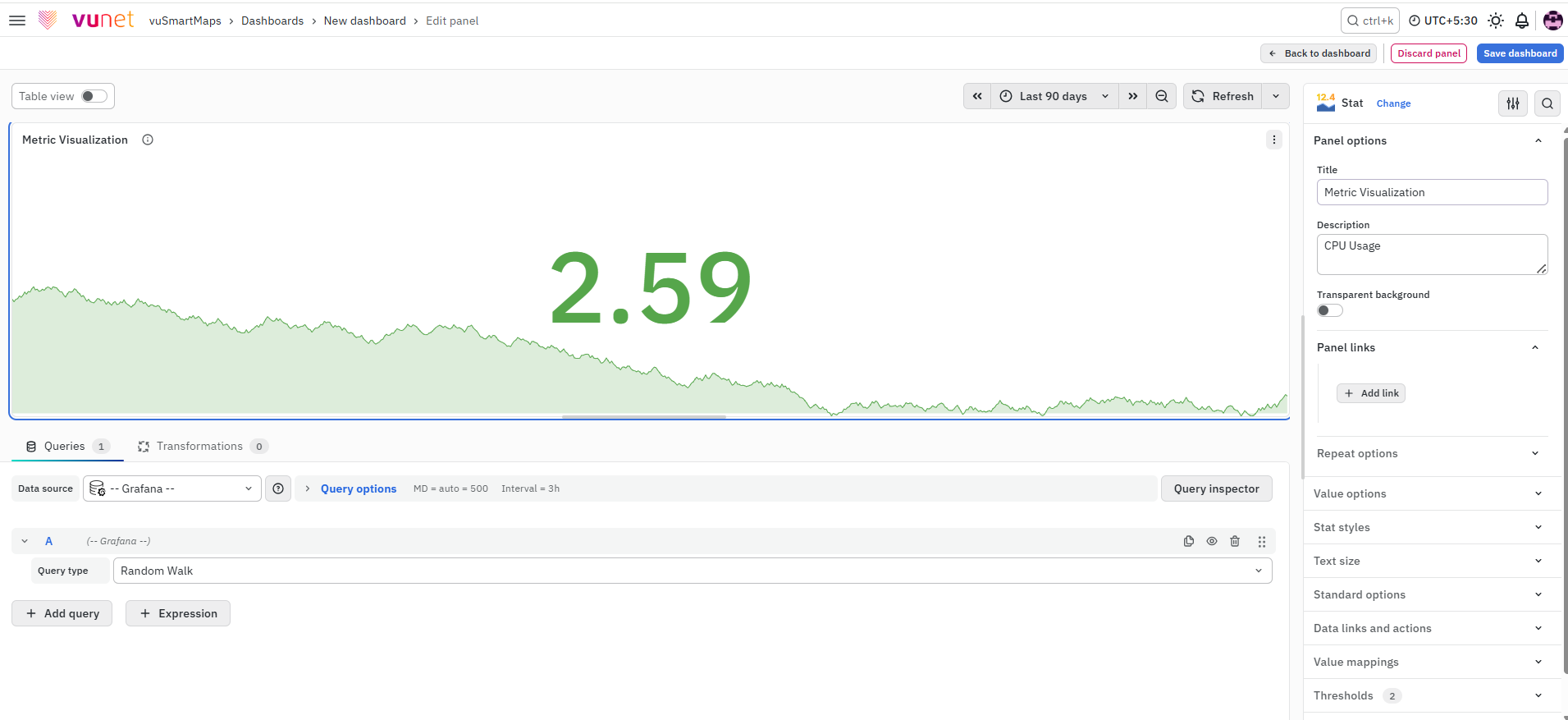
On the right side of the default screen, select Stat as the visualization type. This creates the Metric panel. Once selected, the panel displays a summarized value based on the configured query and selected fields.
Panel Options
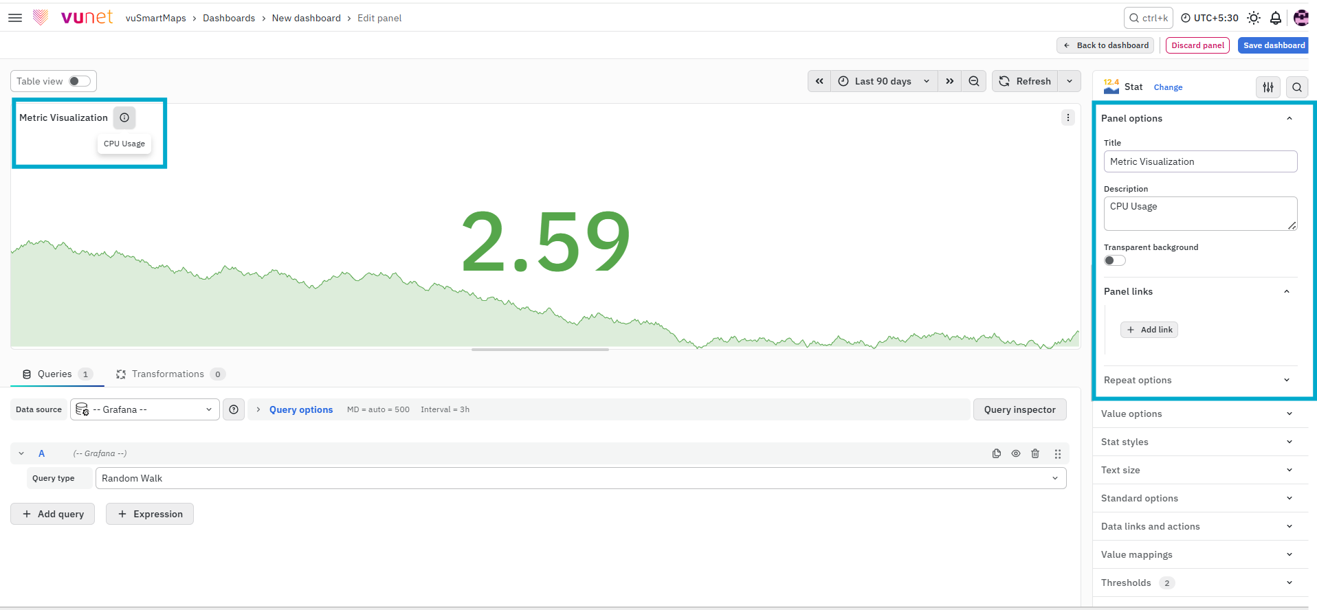
This section is used to define the basic details of the panel.
- Title – Used to identify the panel on the dashboard.
- Description – Provides additional context about what the Metric represents. This can be viewed by hovering over the information icon on the panel.
- Panel Link – Allows you to attach a link to another dashboard or external URL.
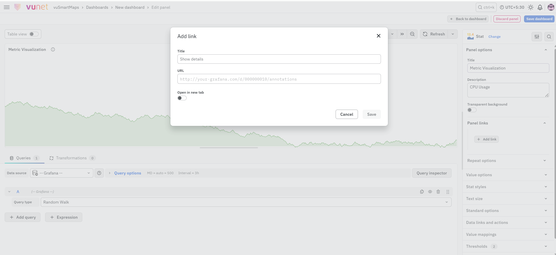
You can configure:
- Link title
- URL
- Open in a new tab option
When configured, clicking the panel opens the linked page based on the selected behavior.
Repeat Options
The Repeat Options section allows the panel to be repeated for each value selected in a dashboard variable.
- Repeat by variable: Select the required dashboard variable to create a separate panel for each selected value.
- Disable repeating: Keeps panel repetition disabled.
Repeated panels are not displayed while editing the panel. Return to the dashboard and refresh or reload it to view the repeated panels.
Value Options
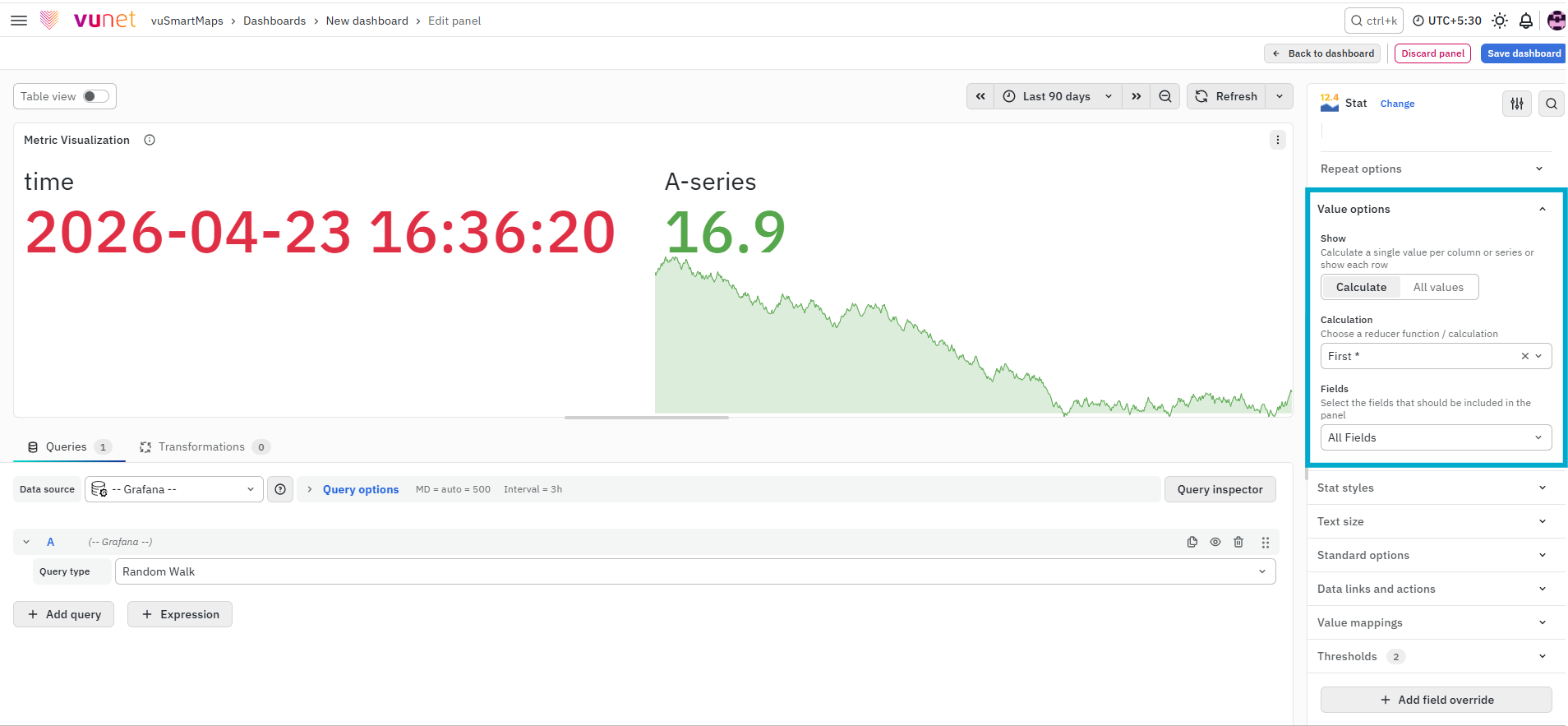
This section controls what value is displayed in the Metric panel.
You can configure:
- Show – Calculate a single value per column or series, or show each row.
- Calculation – Choose the reducer function or calculation.
- Fields – Select the fields to include in the panel.
These settings control how the final value is derived and displayed.
Stat Styles
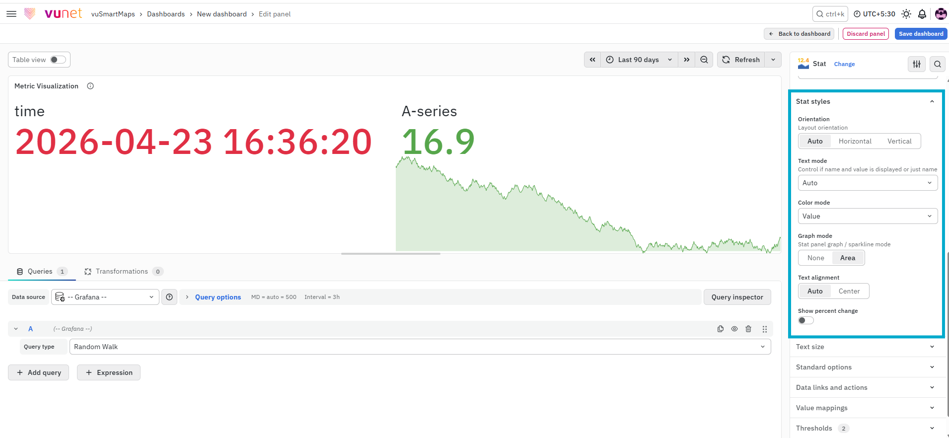
This section controls how the Metric is displayed visually. You can configure:
- Orientation – Auto, Horizontal, Vertical.
- Text Mode – Auto, Value, Value and Name, Name, None.
- Color Mode – None, Value, Background.
- Graph Mode – None, Area.
- Text Alignment – Auto, Center.
- Show Percent Change – On or Off.
- Percent Change Color Mode – Standard, Inverted, Same as Value.
These options help define how the Metric appears on the dashboard.
Text Size
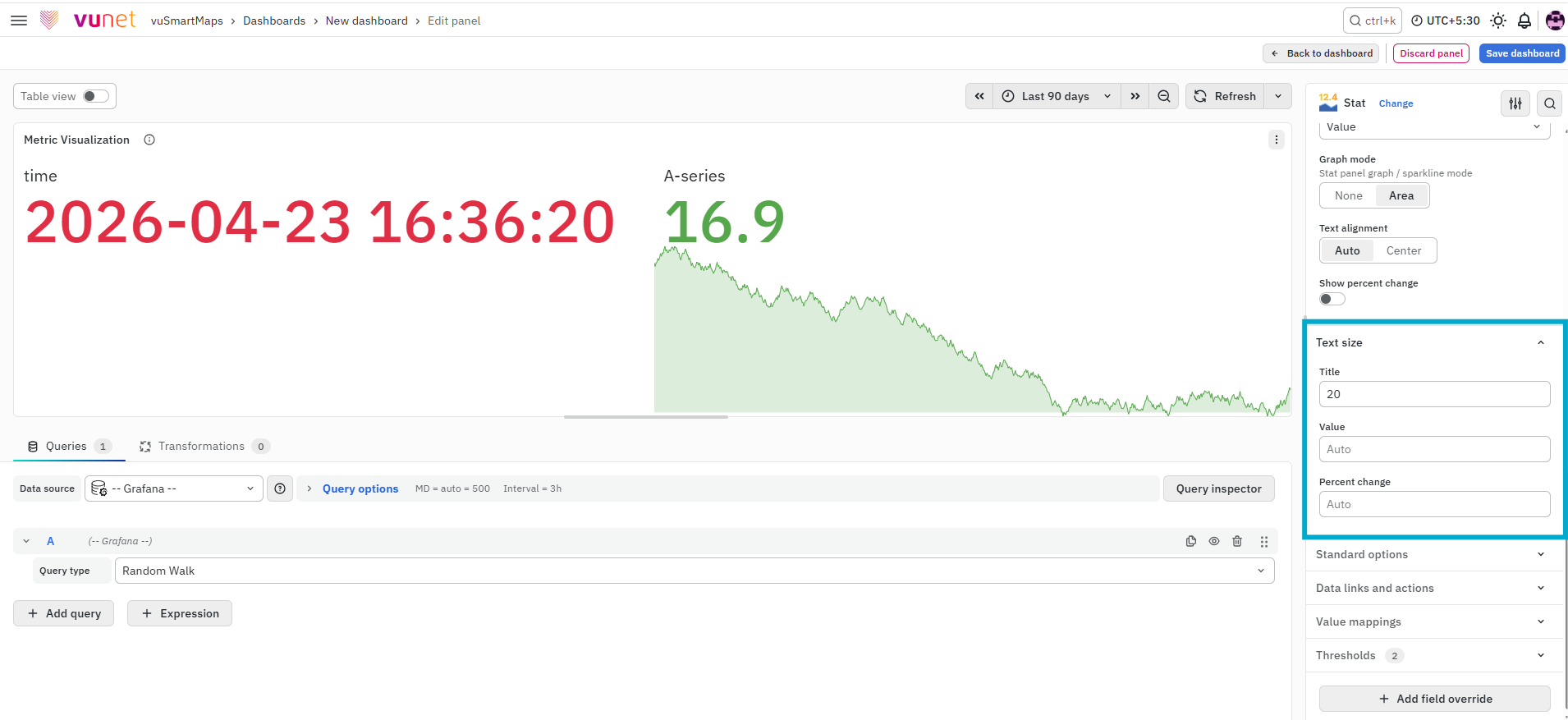
This section allows you to change the text size used in the Metric panel. You can configure:
- Title size – Controls the panel title text size.
- Value size – Controls the displayed value size.
- Percent Change Size – Controls the percentage change text size.
This helps improve readability based on the importance of the panel.
Standard Options
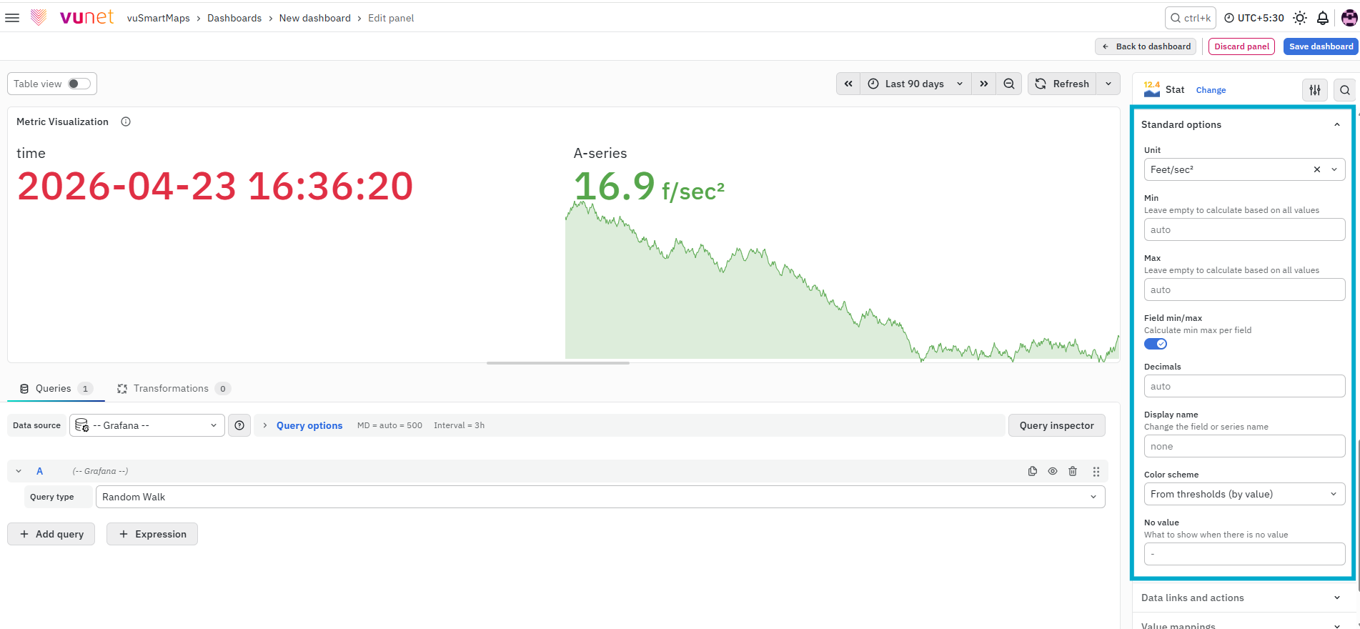
This section controls general display settings for the Metric.
Options include:
- Unit type – Defines how values are displayed.
- Min – Minimum value to be considered.
- Max – Maximum value to be considered.
- Field Min/Max – Calculates min or max for each field individually.
- Decimal – Controls number precision.
- Display name – Custom label for the series.
- Color scheme – Defines the color scheme.
- No Value – Defines what is shown when no value is available.
These settings help standardize how the value is presented.
Data Links and Actions
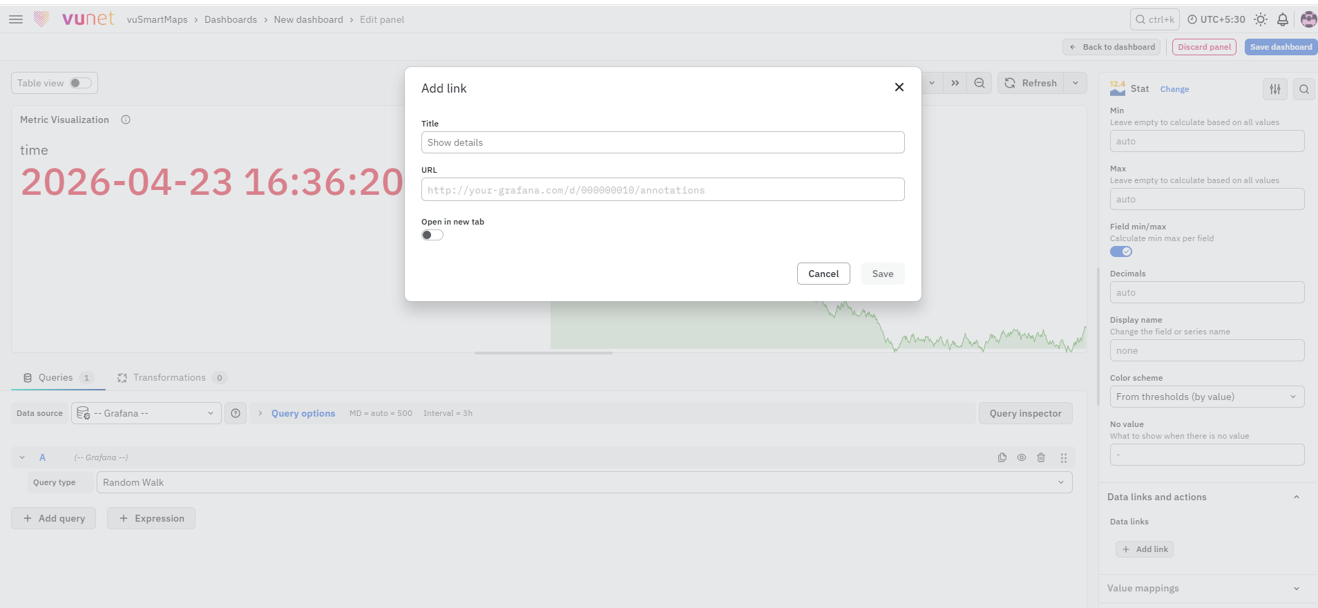
This section allows you to attach links directly to the displayed data. When a user clicks on the data, the configured link appears and can be opened. This is useful for quick navigation to related dashboards or external references.
Value Mappings
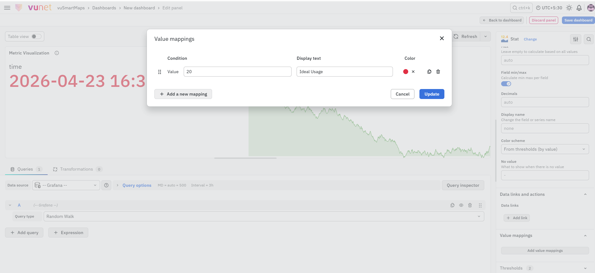
This section allows you to map specific values to custom display text. When a value matches the defined condition, it is replaced with the configured text and highlighted using the selected color. This is useful for making values easier to understand.
Thresholds
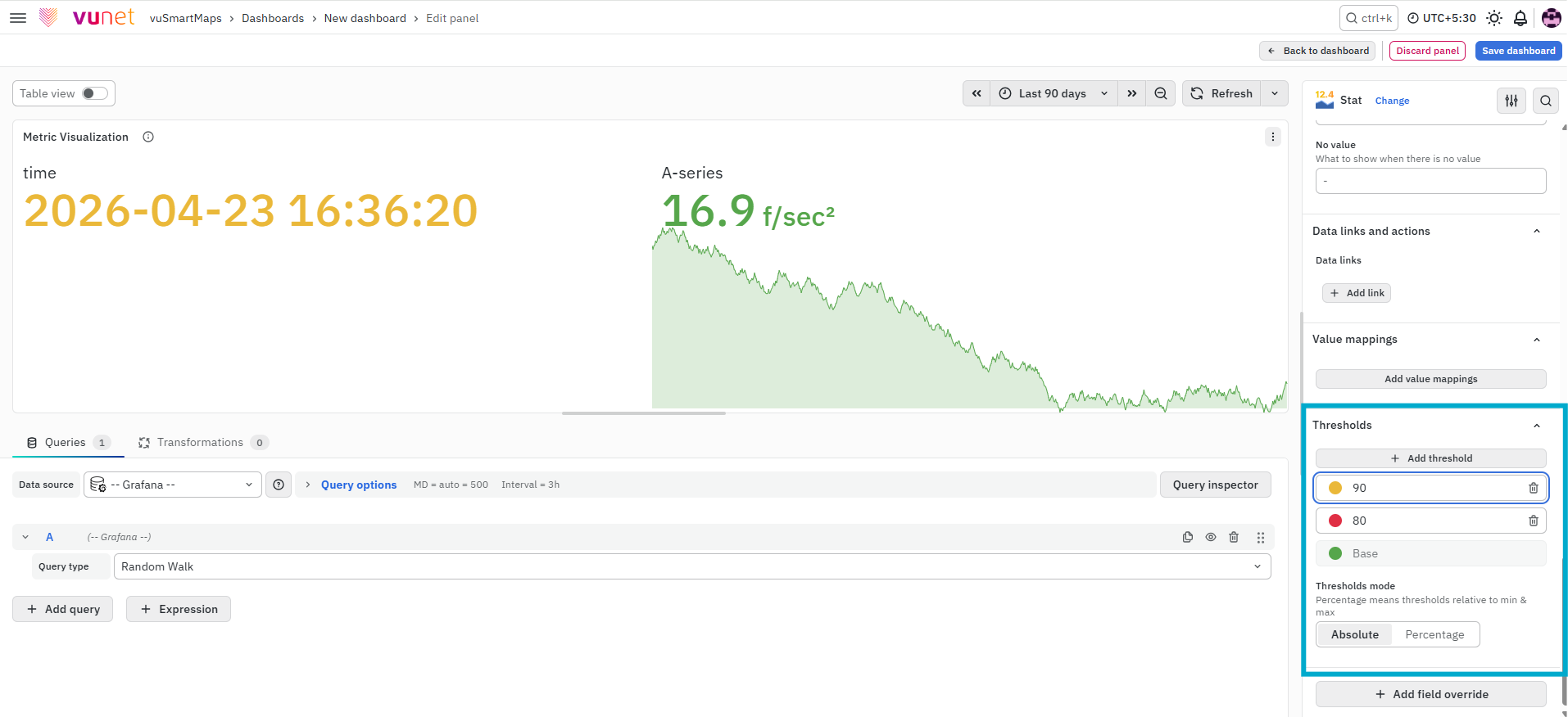
This section allows you to define value-based thresholds and highlight them using colors for better visibility. You can configure thresholds in the following modes:
- As absolutes
- As percentages
You can assign different colors to different threshold levels to represent conditions such as normal, warning, or critical.
Add Field Override
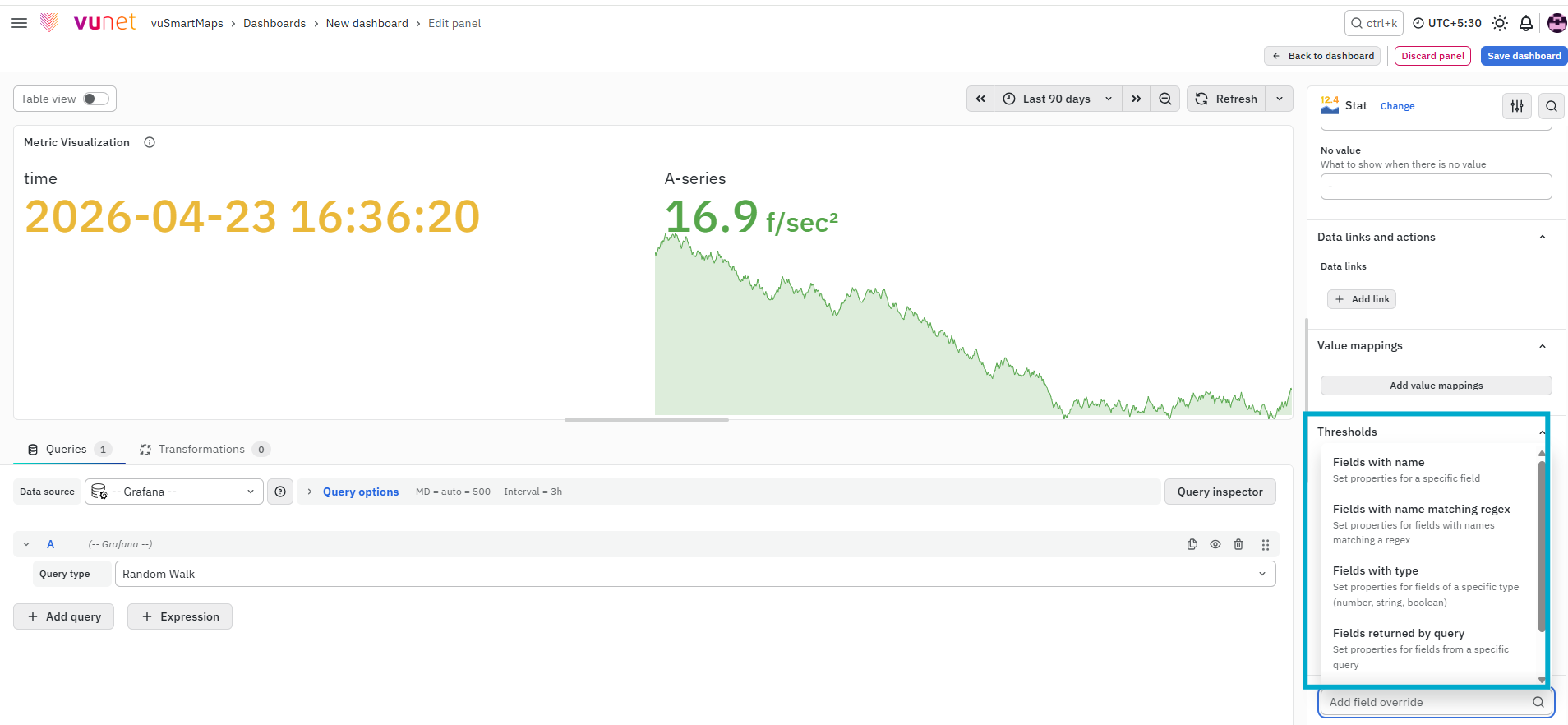
This section allows you to apply custom settings to specific fields instead of applying them globally.
You can define overrides based on:
This section allows you to apply custom settings to specific fields instead of applying them globally.
You can define overrides based on:
- Name
- Matching Regex
- Type
- Query
- Values
To apply an override:
- Select the field.
- Select the override property.
- Configure the override property.
This is useful when specific fields need different settings from the rest of the panel.
Step-by-Step Instructions
- Create a new dashboard panel.
- Configure the query and select the appropriate data source.
(Refer to Dashboard Basics > Query) - On the right side of the screen, select Visualization and choose Stat.
- In Panel Options, enter the panel name and description. Add a panel link if required.
- Configure Value Options:
- Select what to show
- Choose the required calculation
- Select the fields to include
- Configure Stat Styles:
- Select orientation
- Select text mode
- Select color mode
- Select graph mode
- Select text alignment
- Configure Text Size:
- Set title size
- Set value size
- Configure Standard Options:
- Set unit type
- Configure min and max values
- Set decimals
- Set display name
- Set color scheme
- Configure no-value display
- (Optional) Configure:
- Data Links and Actions
- Value Mappings
- Thresholds
- Field Overrides
- Save the panel. The panel can be edited later if needed.
What Happens After the Steps
Once the panel is saved:
- The Metric is displayed on the dashboard.
- A summarized value is shown based on the configured query.
- The selected display settings are applied.
- Thresholds and value mappings are applied as configured.
- Panel links or data links become available if configured.
- The panel can be edited later.
This allows users to quickly view and act on an important value from the dashboard.
Tips / Best Practices
- Use Metrics when you want to highlight one important value.
- Use clear panel names so users understand the value immediately.
- Use thresholds to highlight warning and critical conditions.
- Use value mappings when raw values are not easy to interpret.
- Use panel links and data links to help users move to deeper analysis.
- Use field overrides only when specific fields need different settings.
Troubleshooting
-
Issue: Metric is not displaying.
- Possible Cause: Data may not be available for the selected query or field.
- Solution: Verify the configured query, selected fields, and data source.
-
Issue: Incorrect value is shown.
- Possible Cause: The wrong calculation or field may be selected.
- Solution: Review the Value Options and confirm the selected calculation and fields.
-
Issue: Value format is unclear.
- Possible Cause: Standard Options may not be configured properly.
- Solution: Check unit type, decimals, display name, min/max values, and no-value settings.
-
Issue: Threshold colors are not working as expected.
- Possible Cause: Threshold values or threshold mode may be set incorrectly.
- Solution: Verify whether thresholds should be configured as absolutes or percentages and review the assigned colors.
-
Issue: Clicking the panel or value does not open the expected page.
- Possible Cause: Panel Link or Data Link may not be configured correctly.
- Solution: Review the link title, URL, and tab-opening setting.
FAQs
Why would I use a Metric?
A Metric is useful when you want to display one important value clearly without making the visualization complex. It is also useful for quick comparisons across time periods.
Which visualization type should I select to create a Metric?
Select Stat as the visualization type.
Can I add a link to the Metric panel?
Yes. You can use Panel Link to link the panel to another dashboard or external URL.
Can I add a link directly to the displayed value?
Yes. You can use Data Links to attach a link directly to the data.
Can I highlight values using colors?
Yes. You can use Thresholds to define values and apply color-based highlighting.
Can I show custom text instead of raw values?
Yes. You can use Value Mappings to replace values with custom display text and color.
Can I apply different settings to only one field?
Yes. You can use Add Field Override to apply specific settings to selected fields only.
