Heat Map
Overview
A Heatmap is a visualization used to represent data using colors across two dimensions. Each cell in the heatmap displays a value, and the color of the cell indicates the magnitude of that value. Instead of reading numbers in a table, users can quickly understand patterns by observing color variations. Similar color-based visualizations are commonly seen in smartphone screen-time or battery usage views, where different colors help users quickly identify periods of high or low activity. In the same way, Heatmaps help users transform complex operational data into an easy-to-understand visual format using colors.
Typically, warmer colors represent higher values, while cooler colors represent lower values. Heatmaps are useful when you want to understand how data is distributed over time or across value ranges.
Why This Feature Is Useful
In banking and payment systems, large volumes of transaction data are generated continuously. Analyzing this data using tables alone can be difficult and time-consuming.
A Heatmap helps users:
- Quickly identify patterns and trends in data.
- Detect high activity periods or unusual spikes.
- Understand how values are distributed across time and ranges.
- Analyze system behavior such as latency, load, or transaction distribution.
This allows operations and monitoring teams to identify patterns and issues more quickly.
Example Scenario
A payment operations team wants to analyze transaction latency behavior during the day.
They create a Heatmap panel where:
- The X-axis represents time intervals (for example, every 1 hour).
- The Y-axis represents latency ranges (for example, 0–100 ms, 100–200 ms).
- The color intensity represents the number of transactions.
By observing the Heatmap, the team notices that during certain hours, higher latency ranges show stronger color intensity. This indicates a performance issue during those time periods.
When to Use This Feature
Use a Heatmap when:
- You want to analyze how data is distributed over time.
- You need to identify patterns or unusual spikes.
- You are working with large datasets.
- You want to visualize metrics such as latency, throughput, or event distribution.
- You need a quick visual understanding instead of detailed numerical analysis.
Avoid using Heatmaps when you only need to compare individual values without distribution.
Comprehensive Understanding
You can configure a Heatmap within a dashboard panel. The screen contains the following sections:
Visualization
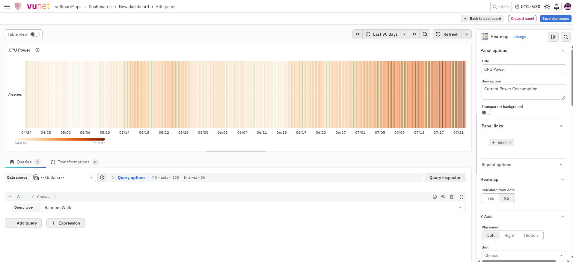
On the right side of the default screen, select Heatmap as the visualization type. Once selected, the panel changes into a heatmap view where:
- Data is displayed as rectangular cells.
- Each cell represents a combination of X-axis and Y-axis values.
- The color of each cell indicates the magnitude of the data.
Panel Options
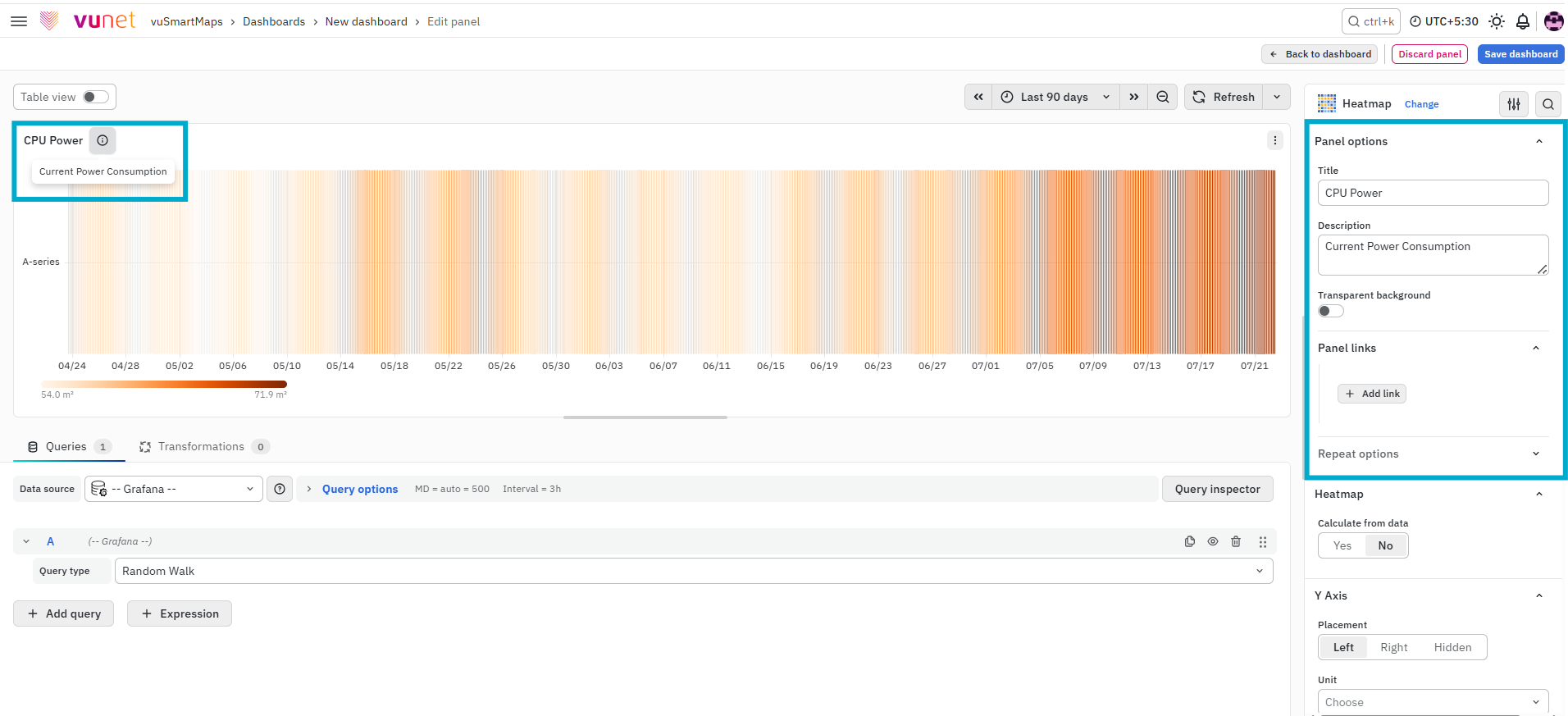
This section is used to define the basic details of the panel.
- Title – Used to identify the panel on the dashboard.
- Description – Provides additional context about what the panel represents. The description is available in the top-left corner of the panel and can be viewed by hovering over the information (i) icon.
- Panel Link – Allows you to attach a link to another dashboard or external URL.
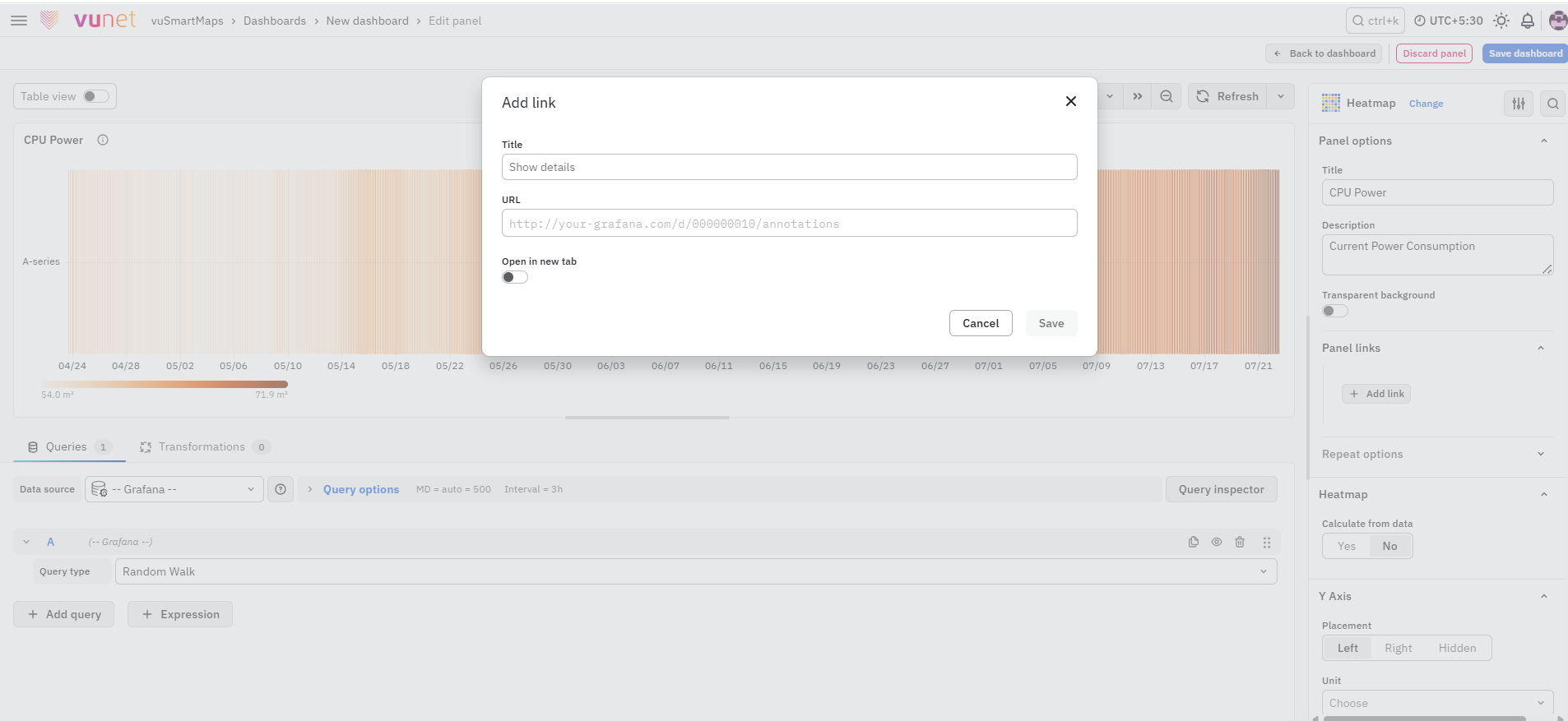
You can configure:
- Title
- URL
- Open in new tab
The URL can point to another dashboard or any helpful resource. When the panel is clicked, the link opens either in the same tab or a new tab based on your selection.
Repeat Options
The Repeat Options section allows the panel to be repeated for each value selected in a dashboard variable.
- Repeat by variable: Select the required dashboard variable to create a separate panel for each selected value.
- Disable repeating: Keeps panel repetition disabled.
Repeated panels are not displayed while editing the panel. Return to the dashboard and refresh or reload it to view the repeated panels.
Heatmap Settings
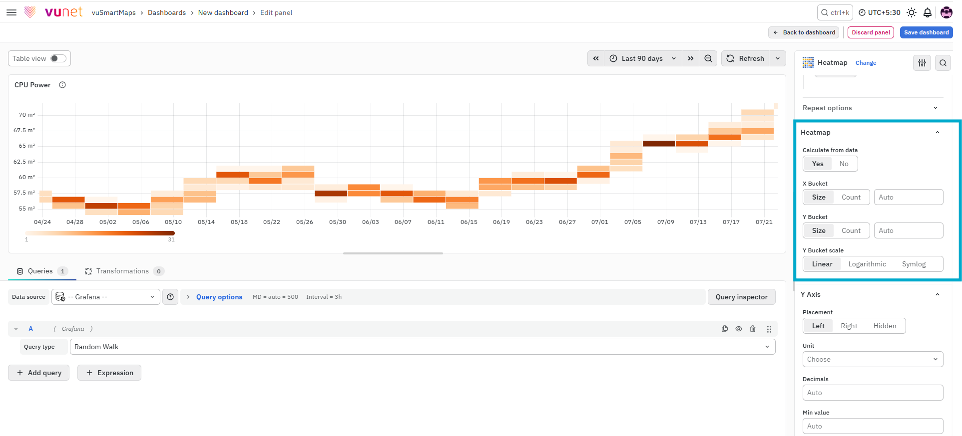
This section controls how the heatmap is built from the data.
-
Calculate from data - Defines whether the heatmap values are already calculated in the data source or should be calculated directly within the panel.
-
X Bucket - Defines how the X-axis is divided into groups (buckets). You can set a Size (for example, 1 hour intervals) Or use Count to divide the axis into a fixed number of buckets.
-
Y Bucket - Defines how the Y-axis values are grouped. Can be divided using Size (value range) Or Count (number of buckets).
-
Y Bucket Scale - Defines how values are scaled on the Y-axis:
- Linear – Uses a linear scale.
- Logarithmic – Select a log base of 2 or 10.
- Symlog – Uses a symlog scale. Choose a log base (2 or 10) and specify a Linear threshold value.
These settings directly impact how the data is distributed and visualized in the heatmap.
Y-Axis
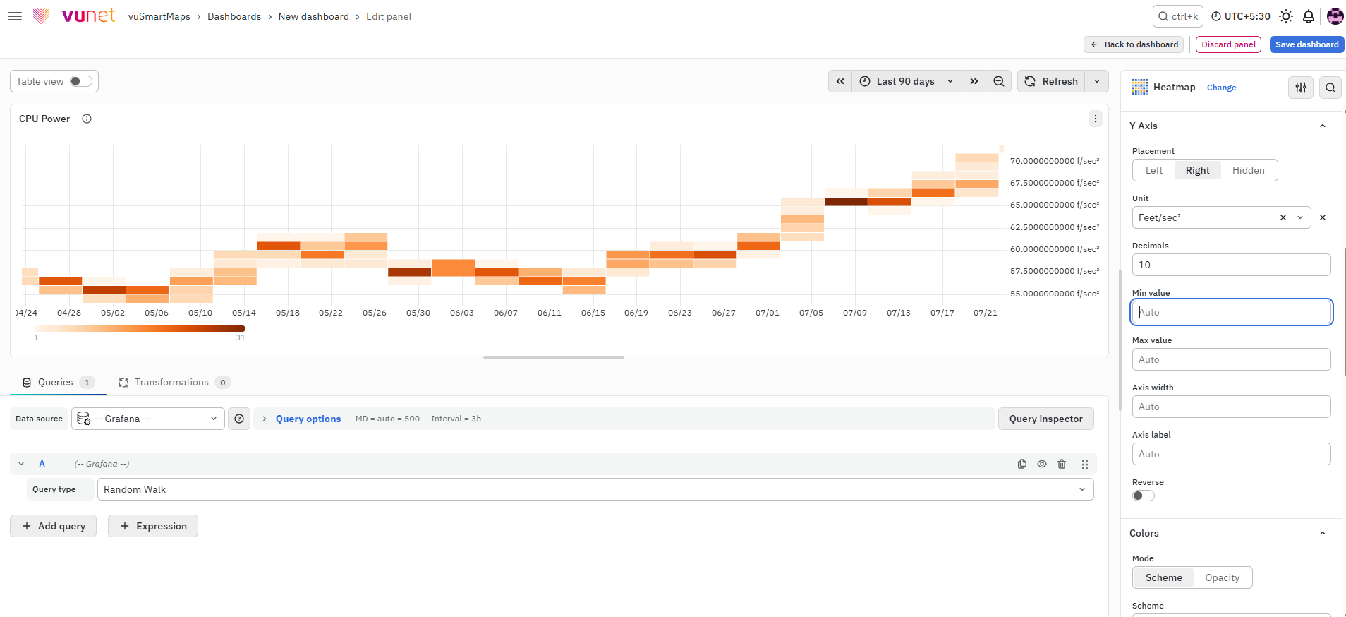
This section controls how the Y-axis appears on the chart.
- Unit – Defines how values are displayed (for example, ms, %, count).
- Scale: Linear or logarithmic.
- Decimals – Controls how many decimal places are shown.
- Y Min / Max – Sets the visible range of values.
- Width – Adjusts the width of the axis.
- Axis Label – Adds a descriptive label to the axis.
- Reverse – Displays values in reverse order.
These settings help improve readability and align the chart with the type of data being analyzed.

Colors
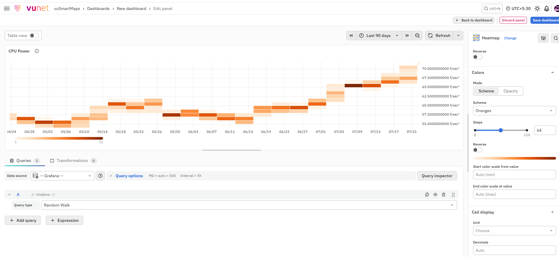
This section controls how values are represented using colors.
- Color Spectrum – Maps values from minimum to maximum using colors.
- Mode
- Scheme – Color changes based on value.
- Opacity – Same color, but transparency changes based on value.
- Scale – Defines how values are mapped to colors.
- Steps – Number of color variations (from 1 to 128).
- Reverse – Reverses the color scheme.
- Start / End – Defines custom minimum and maximum values for color mapping.
The color spectrum may appear inverted in the light theme depending on the selected color scheme.
Cell Display
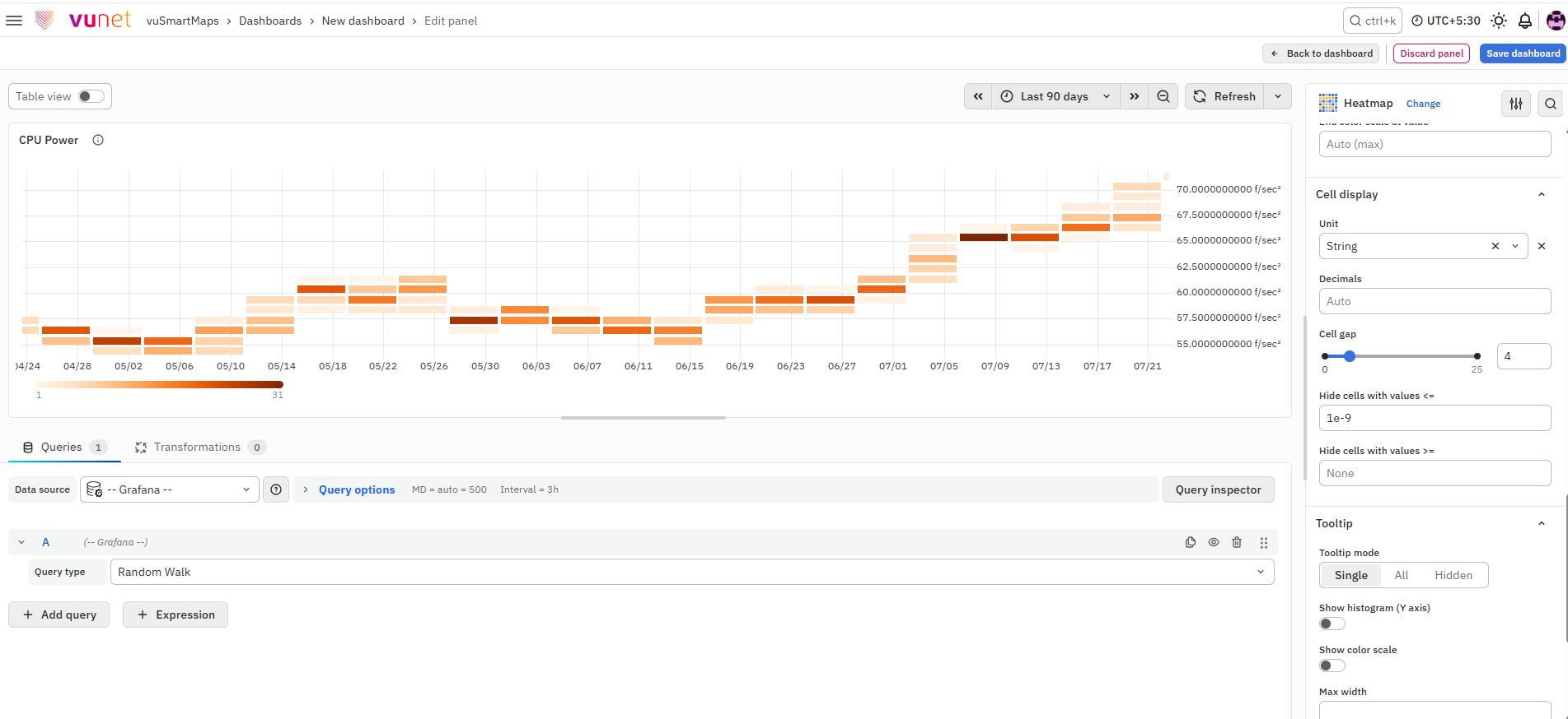
This section controls how each cell in the heatmap is displayed.
- Unit – Defines the unit for cell values.
- Decimals – Controls precision.
- Cell Gap – Adjusts spacing between cells.
- Hide ≤ – Hides cells with values less than or equal to a threshold.
- Hide ≥ – Hides cells with values greater than or equal to a threshold.
These options help clean up the visualization and focus only on relevant data.
Tooltip
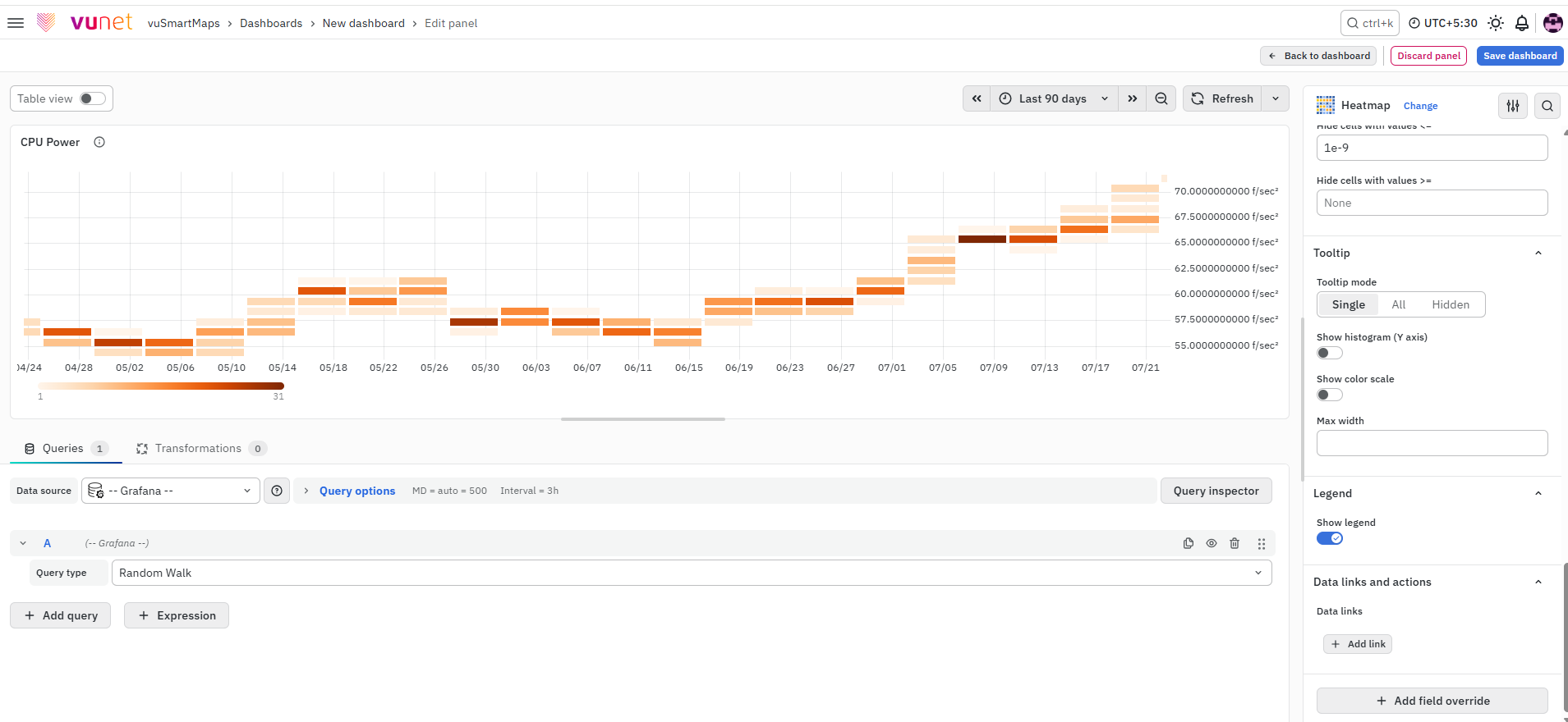
This section controls what happens when the user hovers over a cell.
- Tooltip Mode: Select Single to display information for the hovered cell, All to display all related values, or Hidden to disable the tooltip.
- Show Histogram – Displays a small histogram showing value distribution for that time. A histogram represents the distribution of the bucket values for a specific timestamp.
- Show Color Scale – Displays the color mapping inside the tooltip.
- Max Width – Controls tooltip size.
Tooltips provide detailed information for each cell without cluttering the panel.
Legend
This section controls whether the legend is displayed. The legend shows how colors map to values, helping users interpret the heatmap correctly.
Data Links and Actions
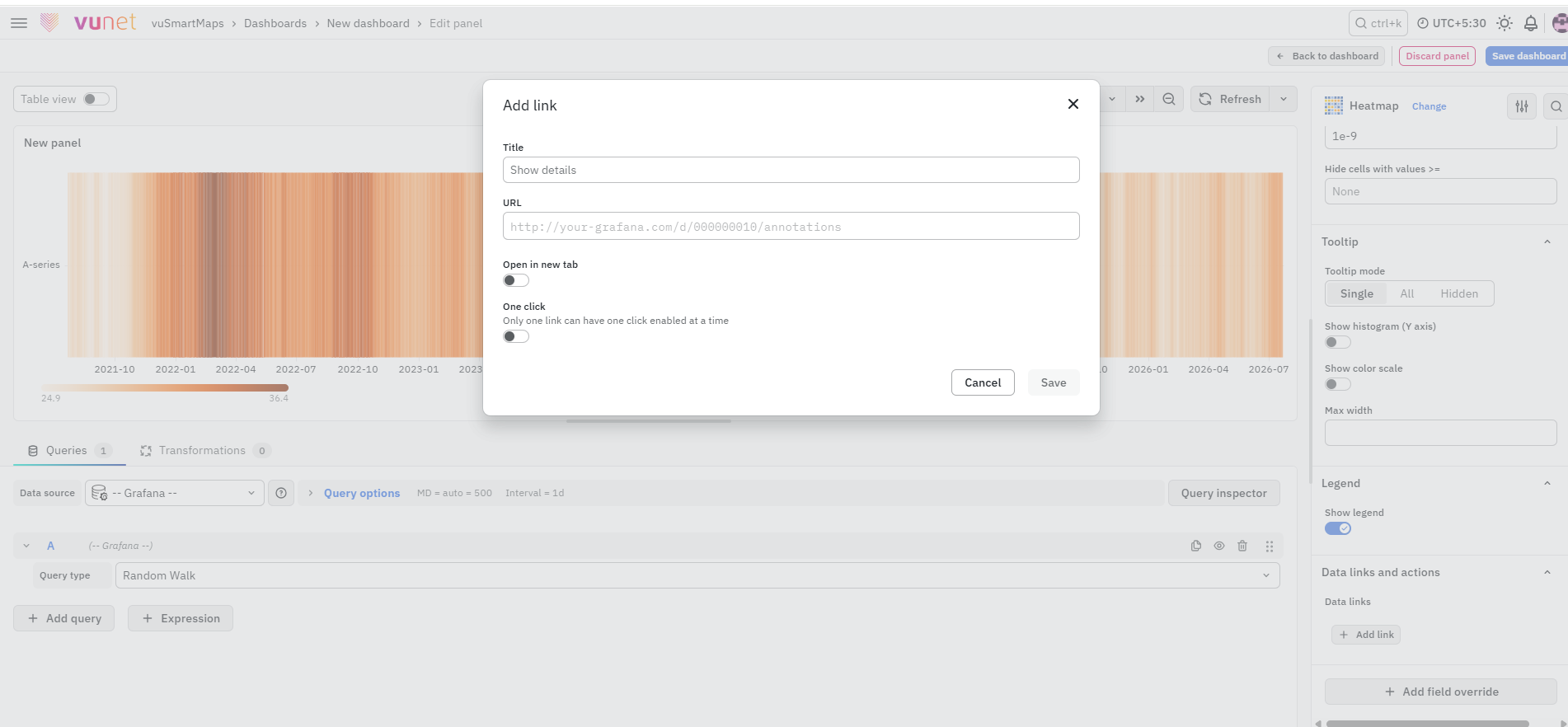
This section allows you to attach links directly to the data. When a user clicks on any cell:
- A link option appears
- The user can open the configured link
This is useful for instant navigation to related dashboards or detailed analysis pages.
Add Field Override
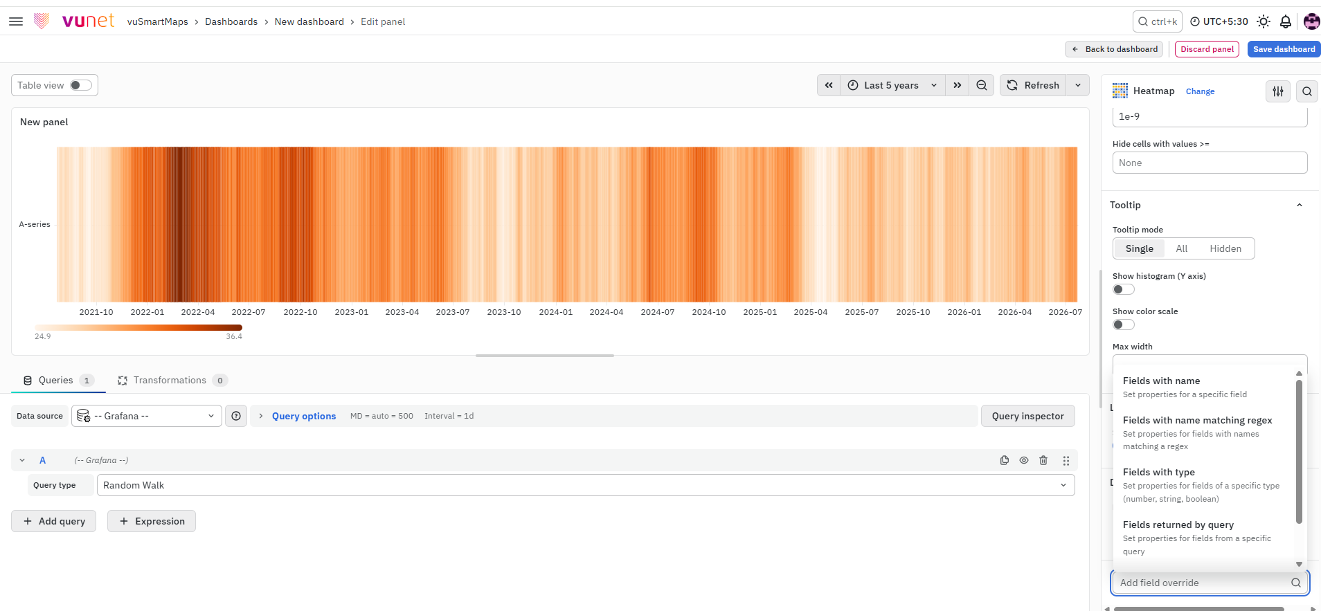
This section allows you to override settings for specific fields in the Heatmap panel. Overrides are useful when different fields require different configurations instead of using the same default panel settings.
You can apply overrides based on:
- Name
- Matching Regex
- Type
- Query
- Values
To add a field override:
- Select the field type.
- Select the field.
- Select the override property.
- Configure the property.
You can add multiple overrides if required. Selected fields will use the overridden settings, while the remaining fields continue to use the default Heatmap configuration.
Step-by-Step Instructions
Follow these steps to create and configure a Heatmap panel:
- Navigate to the Dashboard section and click to create a new panel.
- Configure the query:
- Select the appropriate data source
- Define the query to fetch the required data
(Refer to Dashboard Basics > Query)
- On the right side of the screen, select Visualization and choose Heatmap.
- The panel will immediately switch to heatmap view
- Configure Panel Options:
- Enter a clear panel name
- Add a description to explain the purpose of the panel
- (Optional) Add a panel link by entering title and URL
- Choose whether the link should open in a new tab
- Configure Heatmap Settings:
- Select Calculate from data if the panel should compute values
- Set X Bucket:
- Choose Size (for example, time interval like 1h)
- Or choose Count
- Set Y Bucket:
- Define value grouping using Size or Count
- Choose Y Bucket Scale:
- Linear for normal distribution
- Logarithmic for large value variation
- Symlog if both small and large values exist
- Configure Y-Axis:
- Set unit (for example, ms, %, count)
- Adjust decimals
- Define min and max values if required
- Add axis label
- Enable reverse if needed
- Configure Colors:
- Select mode (Scheme or Opacity)
- Adjust scale and steps
- Set Start and End values if required
- Reverse color scheme if needed
- Configure Cell Display:
- Set unit and decimals
- Adjust cell gap
- Hide unwanted value ranges using thresholds
- Configure Tooltip:
- Enable tooltip
- Enable histogram if needed
- Enable color scale display
- Set maximum width
- Configure Legend:
- Enable or disable legend display
- Configure Data Links and Actions (optional):
- Add URL for navigation
- This will appear when clicking on cells
- Configure Field Overrides (if required):
- Click Add Field Override
- Select field type (Name, Regex, Type, Query or Values)
- Select the field
- Select override property
- Configure the property
- Repeat if multiple overrides are needed
- Click Save to store the panel. You can edit the panel later if needed.
What Happens After the Steps
Once the Heatmap is saved:
- Data is displayed as colored cells.
- Color intensity represents value magnitude.
- Users can hover over cells to see details.
- Patterns, spikes, and anomalies become visible.
- Users can navigate using data links if configured.
Tips / Best Practices
- Use appropriate bucket sizes to maintain clarity.
- Avoid too many buckets, as it can make the Heatmap dense.
- Use color schemes that clearly differentiate values.
- Use tooltips and histograms for deeper analysis.
- Add meaningful panel descriptions for better usability.
Troubleshooting
-
Issue: Heatmap not displaying correctly.
- Possible cause: Issue with query or data source.
- Solution:
- Verify that the query is correctly configured.
- Ensure the correct data source is selected.
- Check if the query is returning data.
-
Issue: No data visible in the Heatmap.
- Possible cause: No data available for the selected time range.
- Solution:
- Check the global time selector.
- Ensure data exists for the selected duration.
- Try expanding the time range.
-
Issue: Tooltip not appearing on hover.
- Possible cause: Tooltip setting is disabled.
- Solution:
- Go to Tooltip settings.
- Enable “Show Tooltip”.
- Adjust hover settings if required.
-
Issue: Histogram not visible in tooltip.
- Possible cause: Histogram option is not enabled.
- Solution: Enable “Show Histogram” in Tooltip settings.
FAQs
What is a Heatmap and when should I use it?
A Heatmap is a visualization that shows how data is distributed using colors.
- Best used for identifying patterns, trends, and concentration of values
- Useful for metrics like latency, transaction volume, and activity distribution
- Ideal when working with large datasets
How do I create a Heatmap in the dashboard?
- Create a new dashboard panel
- Configure the query and select the data source
- Select Heatmap as the visualization type
- Configure settings and save
How do I control how data is grouped in the Heatmap?
- Use X Bucket to define grouping on the X-axis (time or count)
- Use Y Bucket to define grouping on the Y-axis (value ranges)
This controls how data is distributed in the heatmap.
How do I adjust the color representation?
- Go to the Colors section
- Configure:
- Mode (Scheme or Opacity)
- Steps (color variation)
- Start and End values This helps highlight high and low values clearly.
Why is my Heatmap not showing any data?
Check the following:
- Query configuration
- Data source selection
- Global time range
- Availability of data in the selected duration
What is the difference between Panel Link and Data Links?
- Panel Link – Opens when the entire panel is clicked
- Data Links – Opens when a specific cell is clicked
Use Data Links for detailed drill-down navigation.
Why does my Heatmap look too dense or cluttered?
- Too many buckets or very small intervals
- Too much data in a single view
Fix:
- Increase bucket size
- Reduce bucket count
- Simplify query
How do I use tooltips effectively?
- Enable tooltip to view detailed values on hover
- Enable histogram to see value distribution
- Adjust tooltip width for better readability
What should I do if values look incorrect in the Heatmap?
- Verify query logic and aggregation
- Check bucket configuration
- Ensure correct fields are used
