Gauge Chart
Overview
A Gauge Chart is a visualization that represents a single value using a dial, similar to a speedometer. The value is displayed using a needle, and it is interpreted against a colored range or axis. Similar visualizations are commonly seen in digital displays in cars, where the speedometer helps drivers quickly understand the current speed by observing the needle position instead of reading detailed numbers. In the same way, Gauge Charts help users quickly understand the current state of a metric.
Instead of reading numbers from a table, users can quickly understand the current state of a metric by observing where the needle points. Typically, colors such as green, yellow, and red indicate normal, warning, and critical levels.

Why This Feature Is Useful
In banking and payment systems, teams need to continuously monitor key metrics such as system usage, latency, or transaction success rates. A Gauge Chart helps users:
- Quickly understand the current value of a metric.
- Identify whether the value is within acceptable limits.
- Quickly identify when values cross configured thresholds.
- Present critical information in a simple and intuitive way.
This allows operations and monitoring teams to take immediate action when required.
Example Scenario
A payment operations team wants to monitor CPU usage of a system handling payment transactions. They create a Gauge Chart where:
- The gauge displays the current CPU usage
- Green represents safe usage
- Yellow represents moderate usage
- Red represents high usage
By observing the gauge, the team can quickly identify when CPU usage crosses acceptable limits and take corrective action.
When to Use This Feature
Use a Gauge Chart when:
- You want to display a single key metric.
- You need quick visual interpretation of performance.
- You want to track threshold-based metrics.
- You want a simple visualization for dashboards.
Avoid using it when:
- You need to compare multiple values.
- You need trend analysis over time.
Comprehensive Understanding
You can configure a Gauge Chart within a dashboard panel. The screen contains the following sections:
Visualization
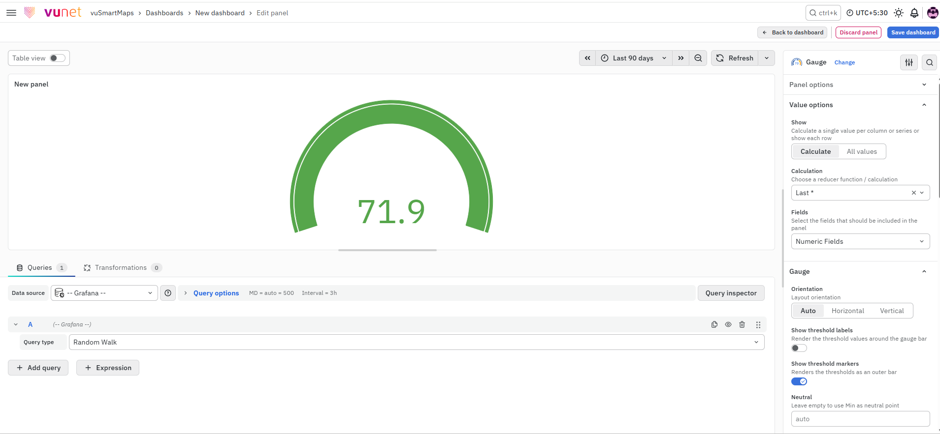
On the right side of the default screen, select Gauge as the visualization type. Once selected, the panel changes into a gauge view where:
- A dial is displayed.
- A needle represents the current value.
- The value is interpreted against a colored range.
Panel Options
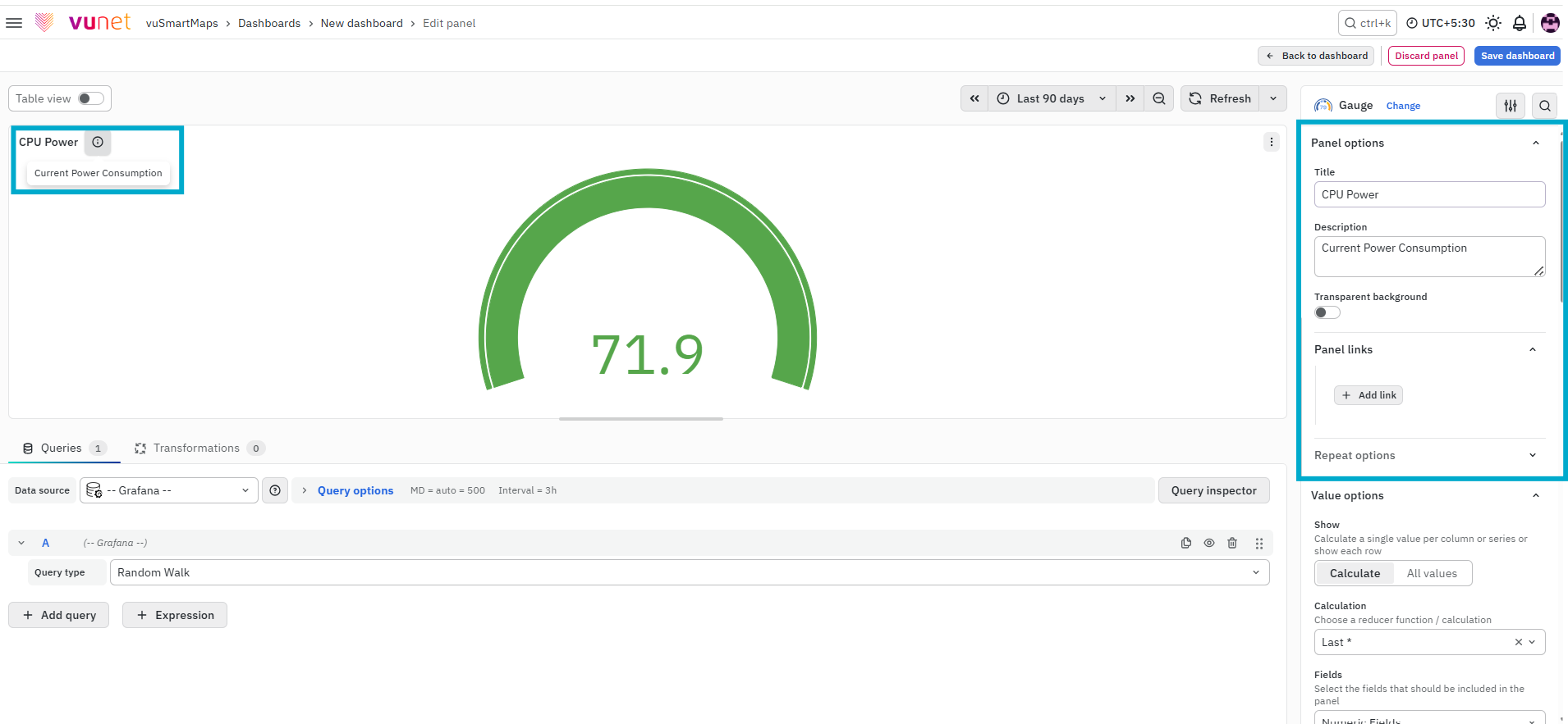
This section is used to define the basic details of the panel.
- Title – Used to identify the panel on the dashboard.
- Description – Provides additional context about what the panel represents. The description is available in the top-left corner of the panel and can be viewed by hovering over the information (i) icon.
- Panel Link – Allows you to attach a link to another dashboard or external URL.
After configuring the Panel Link, click Save to apply the changes.
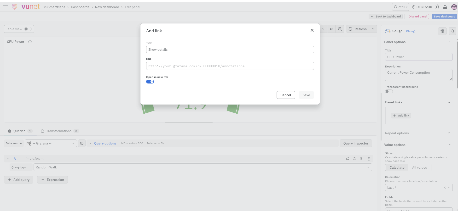
You can configure:
- Title
- URL
- Open in new tab
The URL can point to another dashboard or any helpful resource. When the panel is clicked, the link opens either in the same tab or a new tab based on your selection.
Repeat Options
The Repeat Options section allows the panel to be repeated for each value selected in a dashboard variable.
- Repeat by variable: Select the required dashboard variable to create a separate panel for each selected value.
- Disable repeating: Keeps panel repetition disabled.
Repeated panels are not displayed while editing the panel. Return to the dashboard and refresh or reload it to view the repeated panels.
Value Options
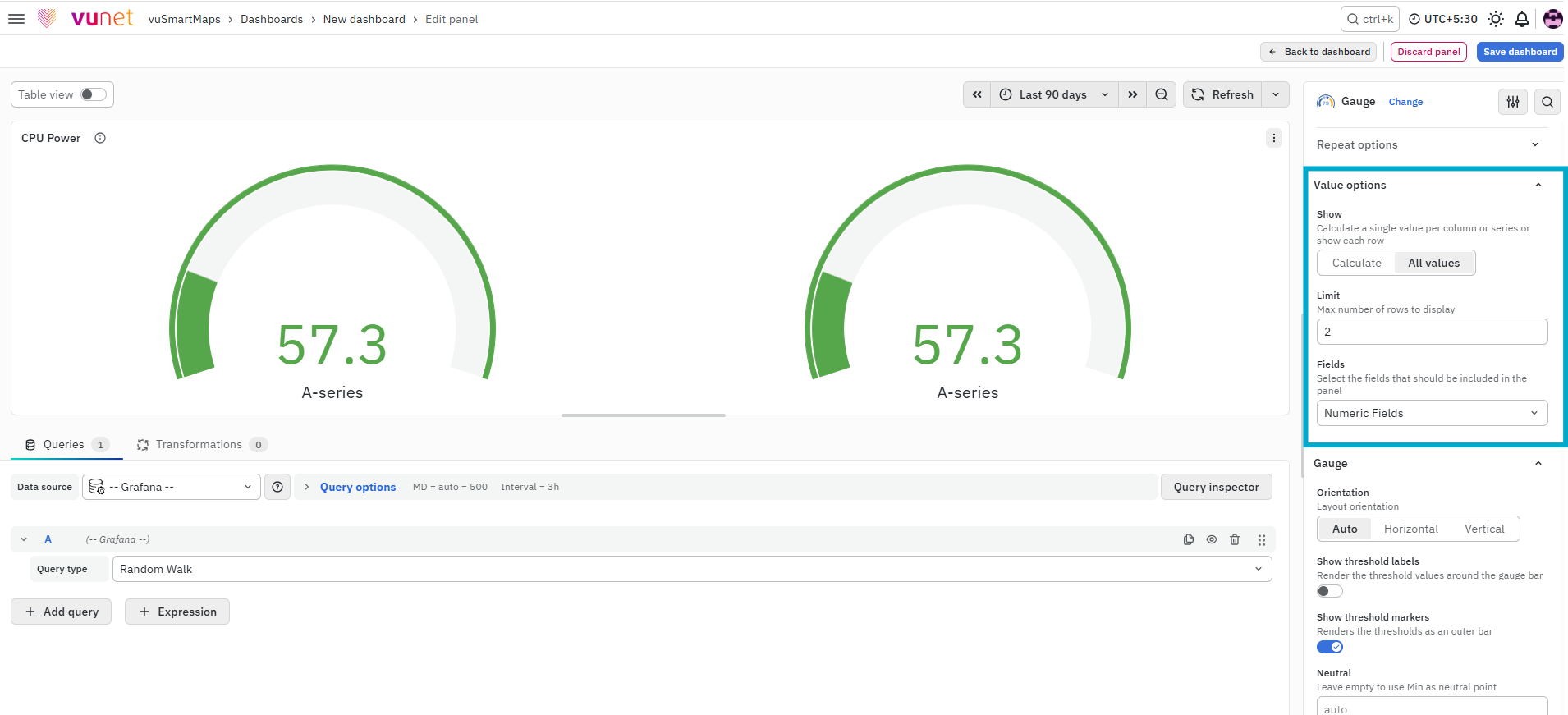
This section controls how values are selected and displayed.
- Show
- Calculate – Displays one calculated value from all rows.
- All values – Displays each row separately.
- Calculation – Defines how the value is calculated (for example, sum or average).
- Limit – Maximum number of rows displayed (default: 5000).
- Fields – Select the fields to display.
These settings define how the data is interpreted before being shown on the gauge.
Gauge
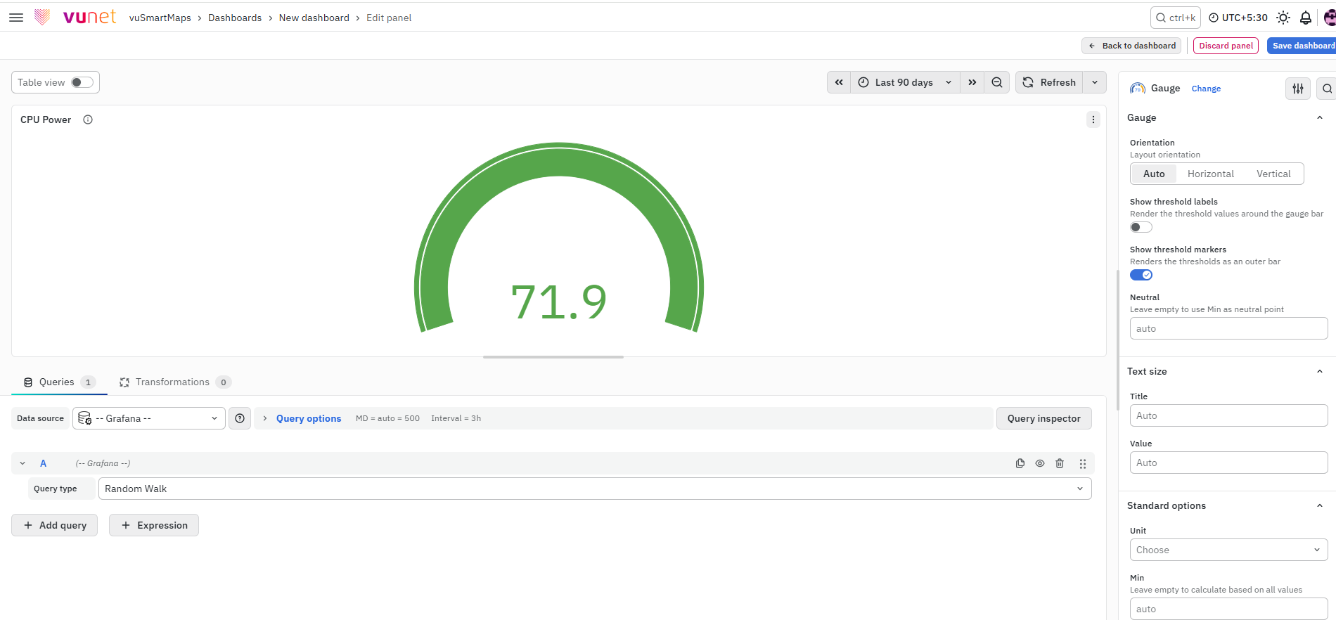
This section controls how the gauge behaves.
- Orientation – Auto, Horizontal, or Vertical.
- Show threshold labels – Displays threshold values on the gauge.
- Show threshold markers – Displays visual indicators for thresholds.
- Neutral – Defines the starting value from which the gauge fills.
These settings affect how the gauge is rendered and how thresholds are visualized.
Text Size
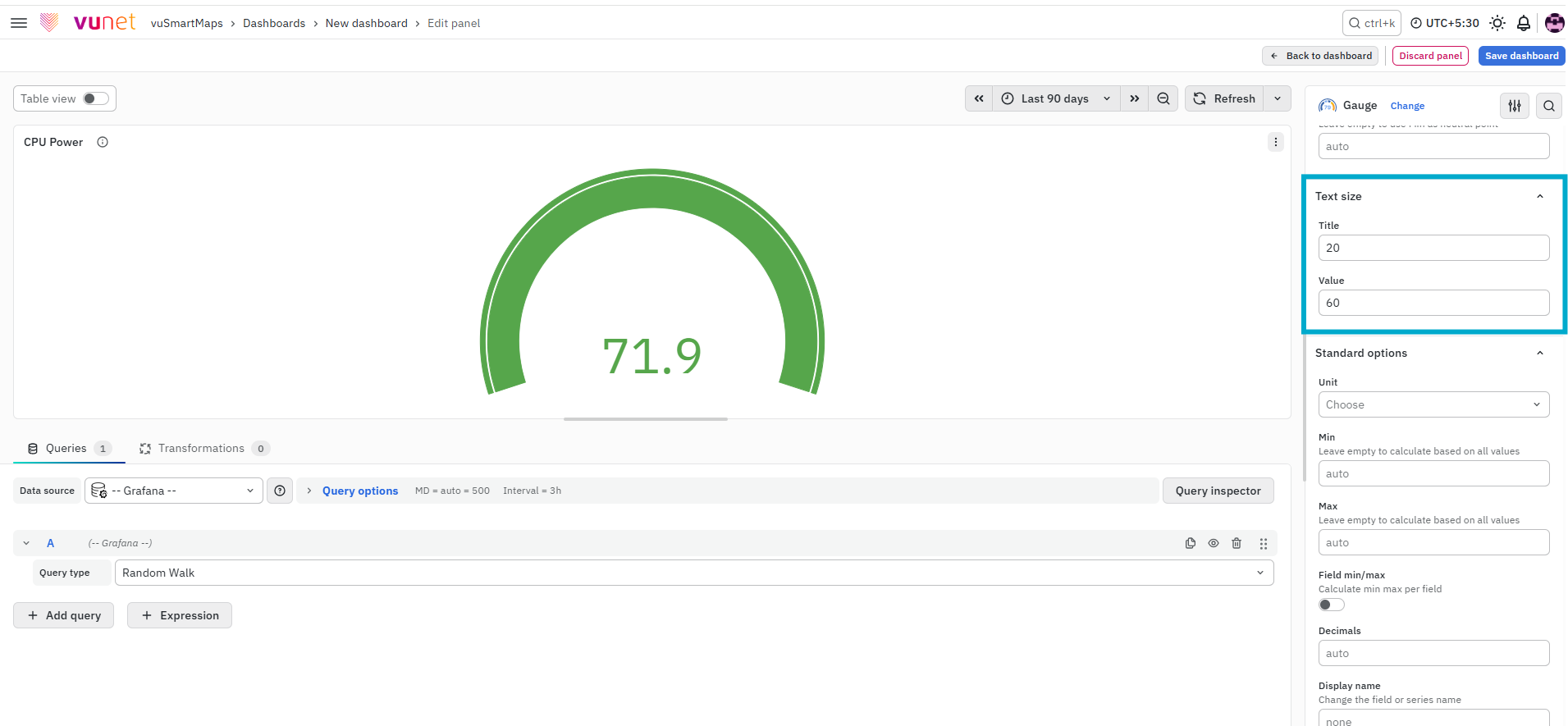
This section controls the appearance of text in the gauge.
- Title size – Size of the chart title.
- Value size – Size of the displayed value.
Standard Options
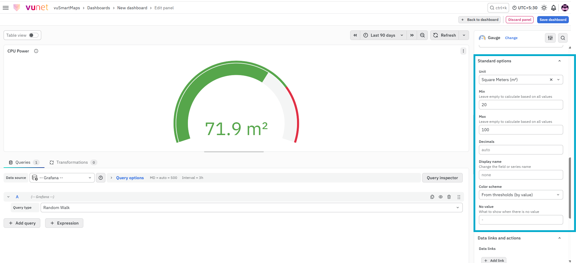
This section controls general display settings.
- Unit type: The type of Unit parameters.
- Min: Minimum value to be considered.
- Max: Maximum value to be considered.
- Field Min/Max: Enable Field min/max to calculate the min or max of each field individually, based on the minimum or maximum value of the field.
- Decimal: Total digits after the decimal point.
- Display name: Series name to be displayed.
- Color scheme: choose a color scheme for the graph.
- No Value: What to show when there is no value.
Data Links and Actions
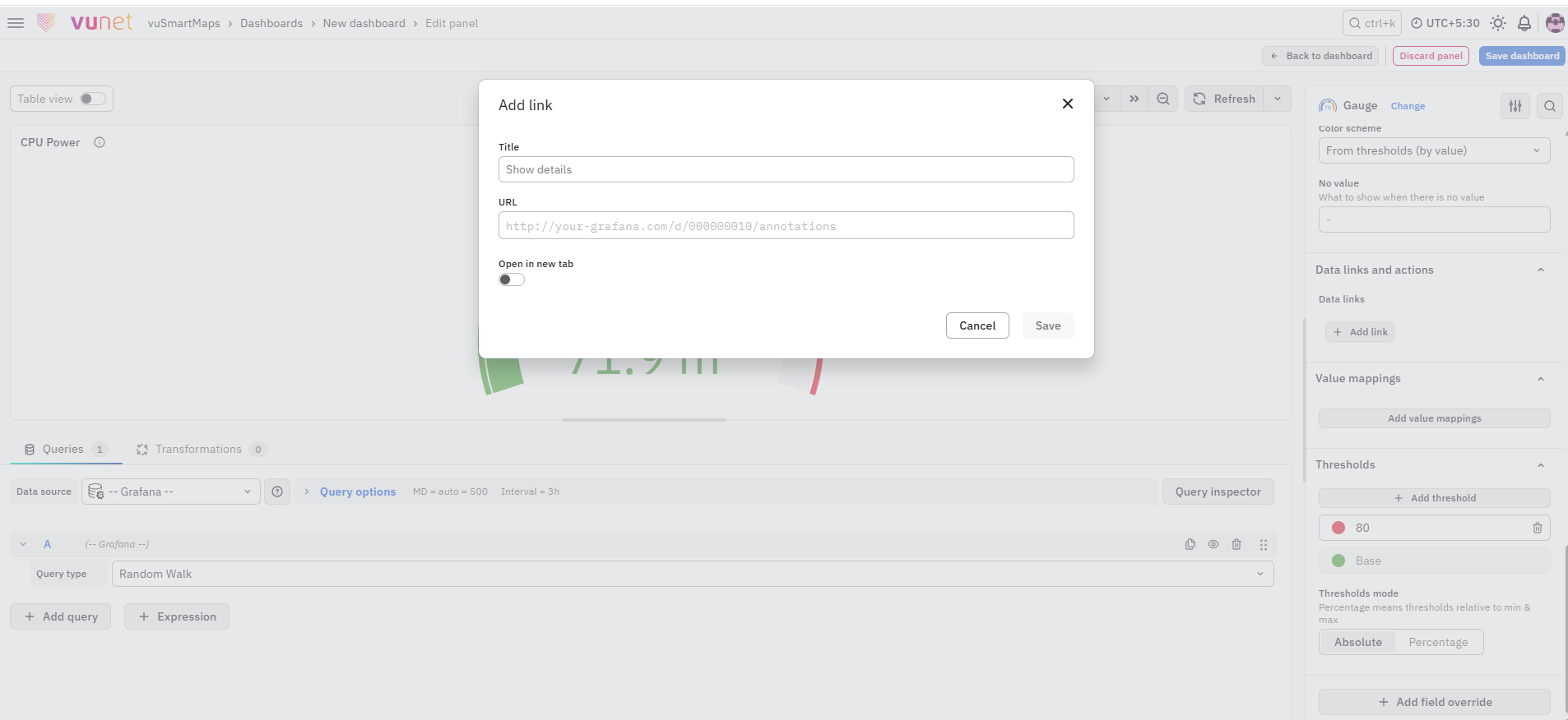
The Data Links option is similar to Panel Link, but it is applied to the data instead of the entire panel. When a user clicks on the gauge:
- The link option appears on the data.
- The user can open the configured link.
This is useful for instant navigation to related dashboards or external resources directly from the data point.
Value Mappings
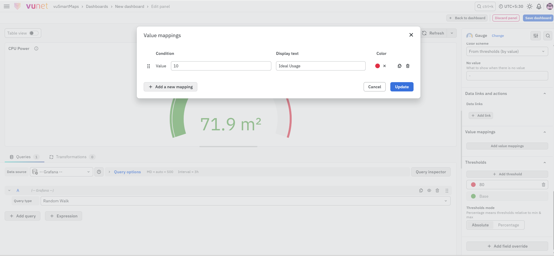
This section allows mapping values to specific display text.
- When a defined value is detected, it is replaced with configured text.
- The value is highlighted using selected color.
This helps improve readability and interpretation.
Thresholds
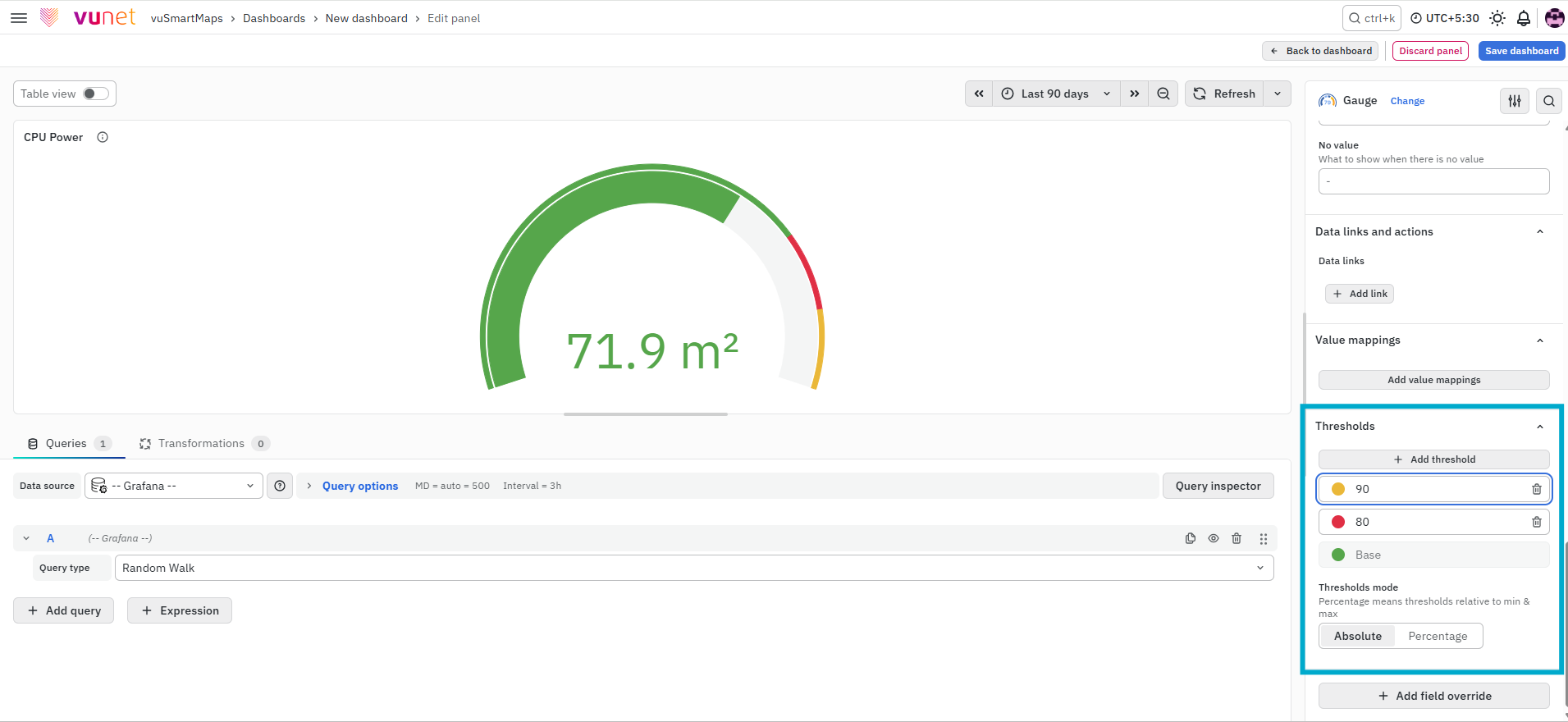
This section is used to define threshold values.
-
Thresholds are used to color-code the gauge
-
Two modes are supported:
- Absolute values
- Percentage values
For example: CPU usage can be configured as:
- Green → Normal range
- Yellow → Warning level
- Red → Critical level
This allows users to quickly identify when a value crosses defined thresholds and take action.
Add Field Override
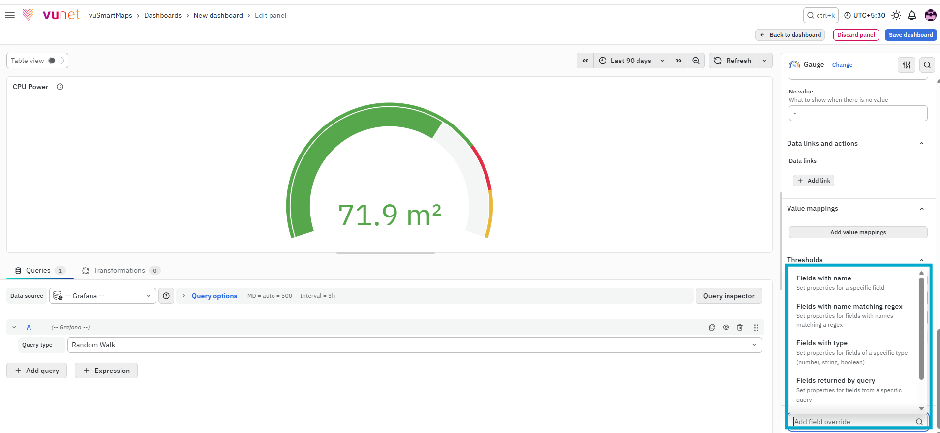
This section allows you to override settings for specific fields instead of applying the same configuration to all fields. Overrides allow you to change the settings for one or more fields. The available override options are the same as the field options in the panel. The only difference is that you can choose which fields the settings should apply to.
To add a field override, click on the Add Field Override button and Select the Field type based on the following properties:
- Name: Set properties for a specific field with a name.
- Matching Regex: Set properties for fields with name matching a regex.
- Type: Set properties for a field of a specific type (number, string, boolean).
- Query: Set properties from the field for a specific query.
- Value: Set properties for fields based on a selected calculation, such as Last, First, or Minimum.
You can add multiple field overrides by repeating the same steps. Selected fields will use the overridden settings, while other fields continue to use the default panel configuration.
Step-by-Step Instructions
Follow these steps to create and configure a Gauge Chart panel:
- Navigate to the Dashboard section and create a new panel.
- Configure the query:
- Select the appropriate data source
- Define the query to fetch required data
(Refer to Dashboard Basics > Query)
- On the right side of the screen, select Visualization → Gauge.
- The panel switches to gauge view
- Configure Panel Options:
- Enter panel name
- Add description
- (Optional) Add panel link and configure behavior
- Configure Value Options:
- Select display mode (Calculate or All values)
- Choose calculation method
- Select fields
- Configure Gauge settings:
- Set orientation
- Enable threshold labels or markers if required
- Set neutral value
- Configure Text Size:
- Adjust title and value size
- Configure Standard Options:
- Set unit type
- Define min and max
- Adjust decimals
- Select color scheme
- Configure Thresholds:
- Define threshold values
- Select absolute or percentage mode
- Configure Value Mappings if required.
- Configure Data Links and Actions:
- Add URL for navigation
- This appears when clicking on the gauge
- Configure Field Overrides if customization is needed.
- Click Save to store the panel. You can edit the panel later if required.
What Happens After the Steps
Once the Gauge Chart is saved:
- The gauge is displayed on the dashboard.
- The needle shows the current value.
- Colors indicate performance levels.
- Thresholds highlight critical ranges.
- Users can click the gauge to access configured links.
- The panel can be edited anytime.
Tips / Best Practices
- Use Gauge Charts for single critical metrics.
- Define clear thresholds for better visibility.
- Use intuitive color schemes (green to red).
- Avoid displaying too many values.
- Use value mappings for better readability.
Troubleshooting
-
Issue: Gauge not displaying correctly.
- Possible cause: Issue with query or data source.
- Solution:
- Verify that the query is correctly configured.
- Ensure the correct data source is selected.
- Check if the query is returning data.
-
Issue: No data visible in the Gauge.
- Possible cause: No data available for the selected time range.
- Solution:
- Check the global time selector.
- Ensure data exists for the selected duration.
- Try expanding the time range.
-
Issue: Gauge appears empty or shows incorrect values.
- Possible cause: Incorrect Min/Max or field selection.
- Solution:
- Verify Min and Max settings in Standard Options.
- Check selected fields in Value Options.
- Ensure correct metric is used.
-
Issue: Incorrect value displayed in the Gauge.
- Possible cause: Wrong calculation method selected.
- Solution:
- Verify Calculation in Value Options.
- Check if correct aggregation (sum, average, etc.) is selected.
-
Issue: Threshold colors not applied correctly.
- Possible cause: Incorrect threshold configuration.
- Solution:
- Verify threshold values.
- Check threshold mode (absolute or percentage).
- Ensure correct color mapping.
-
Issue: Gauge appears too small or not readable.
- Possible cause: Text size settings not configured.
- Solution: Adjust Title size and Value size in Text Size section.
-
Issue: Data link not working.
- Possible cause: Incorrect URL configuration.
- Solution:
- Verify URL entered in Data Links.
- Check if “Open in new tab” option is configured correctly.
-
Issue: Value mapping not applied correctly.
- Possible cause: Mapping values do not match data.
- Solution:
- Verify value mapping configuration.
- Ensure data values match mapping conditions.
-
Issue: Field override not applied correctly.
- Possible cause: Incorrect field selection or condition.
- Solution:
- Verify selected field (Name, Regex, Type, Query).
- Ensure override property is correctly configured.
FAQs
How can I visualize a single performance metric effectively?
- Use a Gauge Chart to display a single performance metric.
- Shows the metric on a dial with color-coded ranges for easy interpretation.
- For step-by-step instructions, refer to Creating a Gauge Chart.
Can I customize the appearance of my Gauge Chart?
- Yes, you can customize:
- Text size
- Color schemes
- Value thresholds
- Detailed options are available in Visualization.
How can I set up a Gauge Chart to monitor CPU power consumption?
- Create a Gauge Chart panel for CPU power consumption.
- Name it appropriately and describe its purpose.
- Adjust Value Options to display the required metrics.
- For guidance, see Panel Options and Value Options.
What if there's no value to display on the Gauge Chart?
- Use the "No Value" option in Standard Options to:
- Show a specific message when no data is available.
- Display an indicator instead of a blank chart.
- More details are in the Standard Options section.
How do I add conditional formatting to highlight specific values on my Gauge Chart?
- Use Value Mappings and Thresholds to:
- Highlight specific values or ranges.
- Set color codes or display texts based on conditions.
- For detailed steps, see Value Mappings and Thresholds.
Can I override the default field settings for specific data points in my Gauge Chart?
- Yes, use the Add Field Override option to:
- Modify settings for specific fields based on name, type, or query.
- Check the Add Field Override section for instructions.
