Data Table
Overview
A Data Table is a visualization used to show information in a tabular format. It is useful for displaying data over time and across different groups. For example, it can be used to display the top 10 servers with the highest CPU usage. The Data Table visualization allows users to view basic information about a selected metric for a given data source and a specified time range. It displays data from a metric set in a table view.
The Data Table visualization includes the following key capabilities:
- Number of rows per page
- Color coding
- Serial numbering
- Showing percentages
- Cumulative results
Users can also configure panel settings, table display options, table footer calculations, cell display behavior, standard formatting, data links and Action, value mappings, thresholds, and field overrides.
Why This Feature Is Useful
The Data Table visualization is useful when users need a structured view of metric data. It helps users review values clearly in rows and columns instead of reading raw metric output. In banking and payment operations, teams often need to review grouped operational data such as infrastructure usage, system status, or metric values over a selected time range. A Data Table provides a simple way to view this information in a tabular format.
This feature is useful because it helps users:
- Display metric data in a structured table.
- View information for a selected metric and data source.
- Review data for a specified time range.
- Display values across different groups.
- Control how many rows are displayed.
- Use color coding to make values easier to understand.
- Add serial numbers for easier row reference.
- Show percentages where required.
- Display cumulative results.
- Configure calculations in the table footer.
- Add links, mappings, thresholds, and overrides for better analysis.
Example Scenario
A user wants to monitor server CPU usage in a dashboard. Using Data Table visualization, the user creates a table panel that displays the top 10 servers with the highest CPU usage. The panel shows the selected metric in a tabular format for the configured data source and selected time range.
The user can then improve the table by:
- Setting the panel titel as Data Table
- Adding the description as CPU Usage
- Showing or hiding table headers
- Adjusting row pagination
- Configuring column width and alignment
- Adding table footer calculations such as sum or average
- Applying thresholds to color-code values
- Adding data links and Action to open related dashboards or useful information
This allows users to review CPU usage clearly and take action when values cross configured thresholds.
When to Use This Feature
Use Data Table visualization when:
- Information needs to be displayed in a table.
- Metric data must be reviewed for a selected data source.
- Data needs to be analyzed for a specified time range.
- Users need to display values over time.
- Data needs to be shown across different groups.
- Users need to view top records, such as top 10 servers by CPU usage.
- Visibility with sorting or filtering support from the table view.
- Users need footer-level calculations such as sum or average.
- Users need color coding, value mappings, thresholds, or field-specific overrides.
- Users need links from table data or the panel to another dashboard, website, or useful information.

Comprehensive Understanding
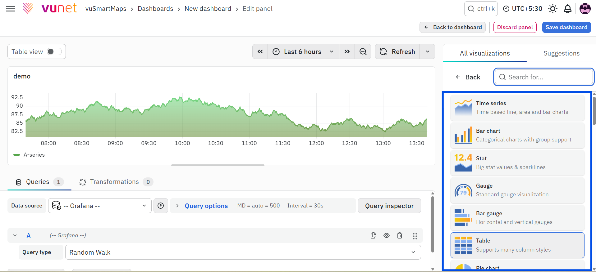
Data Table is created from the dashboard panel configuration screen.
Select Visualization
On the right side of the default screen, select Table as the visualization type. This creates a Data Table panel. The selected visualization determines how the query output is displayed. When Table is selected, the data is displayed in rows and columns.
Visualization Options
Visualization Options allow users to customize the Data Table panel and control how table data is displayed.The available options are:
- Panel Options
- Table
- Table Footer
- Cell option
- Standard Options
- Data Links and Action
- Value Mappings
- Threshold
- Add Field Override
Panel Options
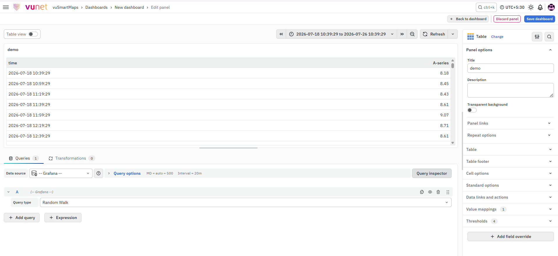
Panel Options are used to edit the properties of the panel. Users can configure:
- Panel Title
- Description
- Panel Link
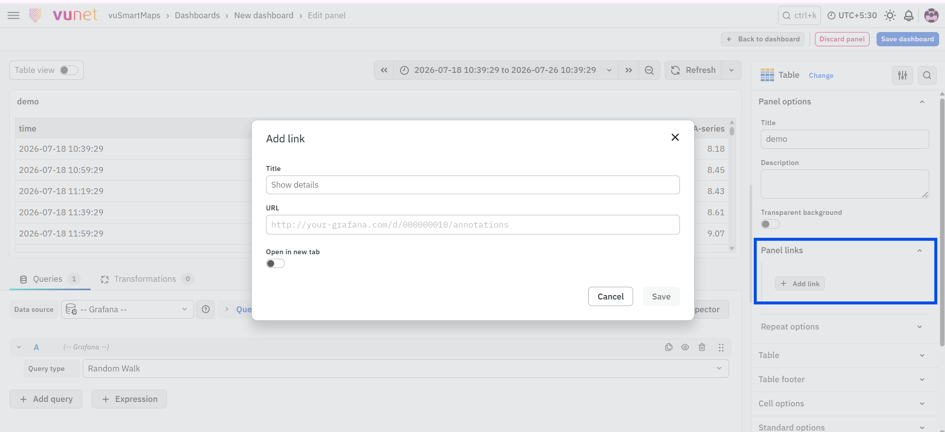
For example, if a user is creating a Data Table to track CPU usage, the panel can be named Data Table and the description can be CPU Usage. The description is available in the top-left corner of the panel. It can be viewed by hovering over the information button.
Panel Link allows users to point the panel to another website or dashboard. Users can enter a title and URL, and select Open in a new Tab if the link should open in a new browser tab. After entering the details, click Save. The URL can be used to open another dashboard, get help, or access useful information. When users click on a panel, the link opens in the same tab or a new tab based on the selected option.
Table Options
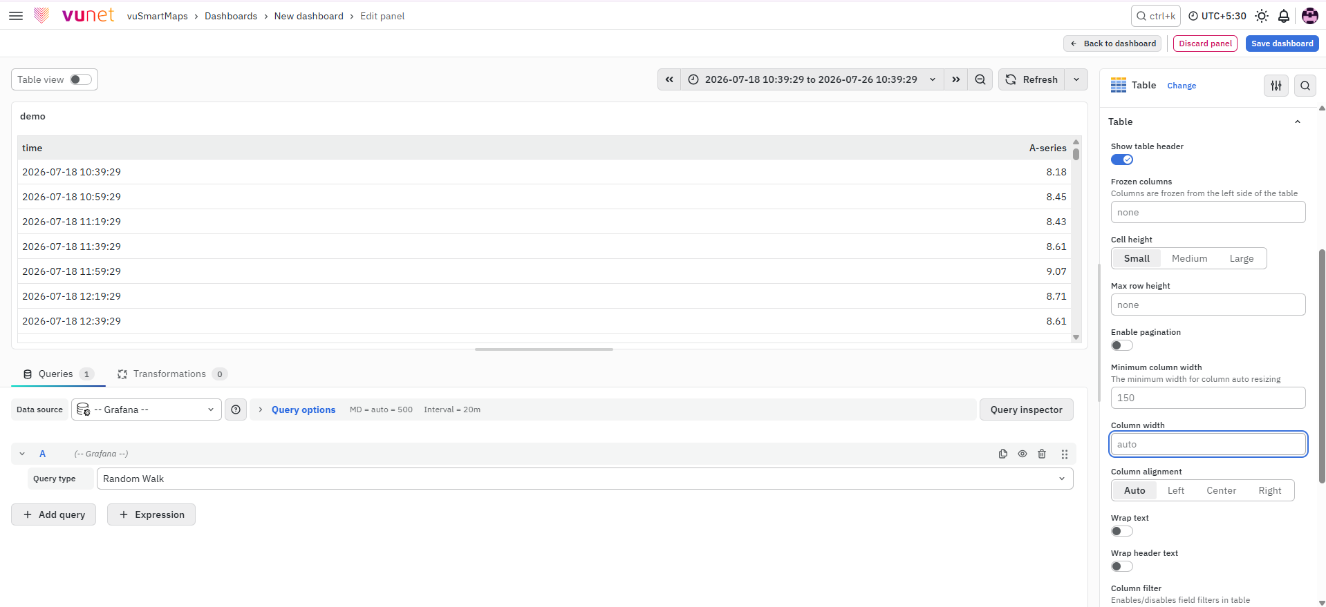
The Table options allow users to change the configuration and behavior of the table. The available options include:
- Show table header: Toggle to show or hide column names.
- Cell height: Choose the cell height as Small, Medium, or Large.
- Enable pagination: Limits visible rows and adjusts to the table height.
- Minimum column width: Sets the minimum width. The default value is 150px. It can be reduced to 50px for small screens.
- Column width: Sets fixed width and overrides auto width.
- Column alignment: Aligns content using Auto, Left, Center, or Right.
- Column filter: Temporarily shows or hides specific column values.
Table Footer
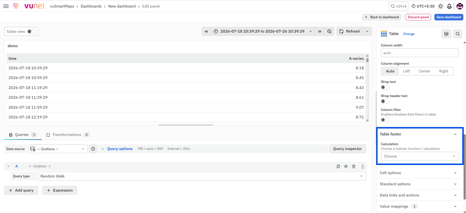
The Table Footer option controls whether a footer is shown in the table. Users can toggle the Show table footer switch on or off. When the footer is enabled, it can show calculations on the included fields.
The available footer options are:
- Show table footer: Toggle on or off to display the footer.
- Calculation: Select a calculation to apply, such as sum or average.
- Count rows: Toggle to show total row count instead of field values.
- Fields: Choose the fields for calculation. If no field is selected, all numeric fields are selected by default.
Cell Option
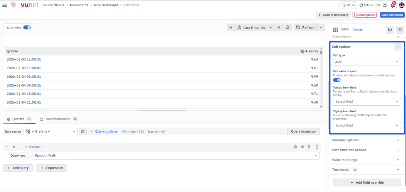
Cell options control how data is displayed in a table. The available options are:
- Cell type: Sets the default display style for cells.
- Wrap text: Enables text wrapping for long content.
- Cell value inspect: Allows value inspection directly from cells.
Standard Options
Standard Options are used to configure common display settings in the table. These settings change the way the table appears.The available Standard Options include:
- Unit type: Type of unit parameter.
- Min: Minimum value to be considered.
- Max: Maximum value to be considered.
- Field Min/Max: Calculates the minimum or maximum of each field individually, based on the minimum or maximum value of the field.
- Decimal: Total digits after the decimal point.
- Display name: Series name to be displayed.
- Color scheme: Color scheme for the graph.
- No Value: Value to show when there is no value.
Data Links and Action
Data Links and Action are similar to Panel Links. They allow users to link a URL and open it in another tab. The difference is that Data Links and Action are placed on the data instead of the panel. Users can click on the data, and the link option appears. Data Links and Action are used when an instant link should appear whenever a user clicks on the data.
Value Mappings
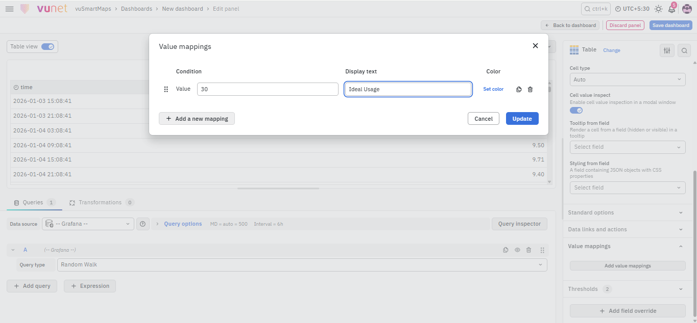
Value Mappings allow users to find a specific value and display custom text wherever that value appears. If a similar value appears in the data, it is highlighted using the selected color.
Threshold
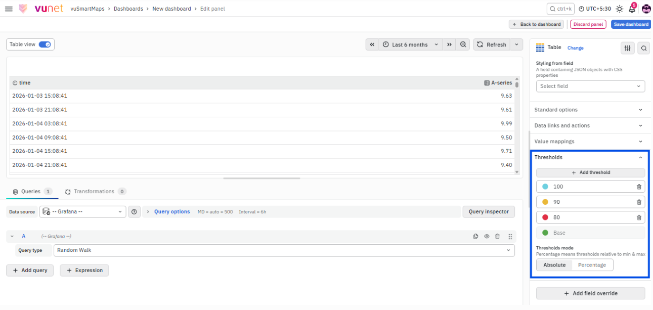
The Threshold option is used to define value thresholds and color-code them. Threshold mode has two options:
- As absolutes
- As percentages
For example, CPU usage can be set as:
- Red for 50
- Yellow for 60
- Blue for 70
This helps users easily see when the output is above the threshold, so that immediate action can be taken or an error alert can be sent.
Add Field Override
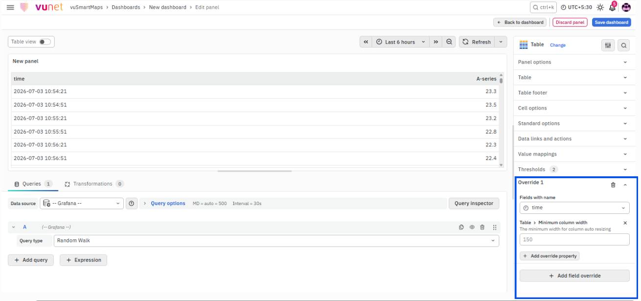
Add Field Override allows users to override an existing field. Overrides allow users to change settings for one or more fields. Field options for overrides are the same as the field options available in a panel. The difference is that users choose which fields the settings apply to.
To add a field override, click Add Field Override. Users can select a field type based on the following properties:
- Name: Set properties for a specific field with a name.
- Matching Regex: Set properties for fields with names matching a regex.
- Type: Set properties for a field of a specific type, such as number, string, or boolean.
- Query: Set properties from the field for a specific query.
To configure a field override:
- Select the field.
- Select the override property.
- Configure the override property.
Multiple field overrides can be added by repeating the same process.
Step-by-Step Instructions
Step 1: Create a New Dashboard Panel
- Open the dashboard area.
- Create a new dashboard panel.
The source document states that a new dashboard panel must be created before configuring the Data Table.
Step 2: Configure the Query and Data Source
- Configure the query.
- Select the appropriate data source.
The query controls which metric data is displayed in the Data Table. The source document refers to Dashboard Basics > Query for more details on query configuration.
Step 3: Select the Table Visualization
- On the right side of the default screen, go to the Visualization selector.
- Select Table.
This creates the Data Table panel.
Step 4: Configure Panel Options
- Open Panel Options.
- Enter the panel name.
- Enter the panel description.
Example:
- Name: Data Table
- Description: CPU Usage
The description can be viewed from the information button in the top-left corner of the panel.
Step 5: Configure Panel Link
- In Panel Options, open the Panel Link section.
- Enter the link title.
- Enter the URL.
- Select Open in a new Tab, if required.
- Click Save.
The link can point to another dashboard, website, help page, or useful information. Based on the selected option, the link opens in the same tab or a new tab.
Step 6: Configure Table Options
- Open the Table options.
- Configure Show table header to show or hide column names.
- Select Cell height as Small, Medium, or Large.
- Enable pagination if visible rows need to be limited.
- Configure Minimum column width. The default is 150px and it can be reduced to 50px for small screens.
- Configure Column width if a fixed column width is required.
- Configure Column alignment as Auto, Left, Center, or Right.
- Use Column filter to temporarily show or hide specific column values.
Step 7: Configure Table Footer
- Open Table Footer.
- Toggle Show table footer on or off.
- If the footer is enabled, select the required Calculation, such as sum or average.
- Enable Count rows if the total row count should be shown instead of field values.
- Select the required Fields for calculation.
If no field is selected, all numeric fields are selected by default.
Step 8: Configure Cell Options
- Open Cell option.
- Select the Cell type to set the default display style for cells.
- Enable Wrap text if long content should wrap within the cell.
- Enable Cell value inspect if users need to inspect values directly from cells.
Step 9: Configure Standard Options
- Open Standard Options.
- Configure the required options:
- Unit type
- Min
- Max
- Field Min/Max
- Decimal
- Display name
- Color scheme
- No Value
These settings control how values appear in the table.
Step 10: Configure Data Links and Action
- Open Data Links and Action.
- Configure the URL that should be linked to data values.
- Use the link to open the required URL in another tab.
Data Links and Action are placed on data. The link option appears when users click on the data.
Step 11: Configure Value Mappings
- Open Value Mappings.
- Define the specific value to be mapped.
- Configure the display text.
- Select the color to highlight matching values.
Wherever the configured value appears in the data, the display text is shown and the value is highlighted using the selected color.
Step 12: Configure Thresholds
- Open Threshold.
- Select the threshold mode:
- As absolutes
- As percentages
- Configure the required threshold values.
- Select colors for the threshold values.
Example:
- CPU usage red for 50
- CPU usage yellow for 60
- CPU usage blue for 70
This helps users identify when values are above the threshold and act immediately.
Step 13: Add Field Override
- Click Add Field Override.
- Select the field type:
- Name
- Matching Regex
- Type
- Query
- Select the field.
- Select the override property.
- Configure the override property.
- Repeat the process to add multiple field overrides, if required.
Step 14: Save and Edit Later
After configuring the Data Table, users can save the panel. The panel can also be edited later.
Save the panel after completing the configuration. If the panel is not saved, the configured table settings may be lost when users navigate away from the page.
What Happens After the Steps
After the Data Table is configured:
- The selected metric data is displayed in a tabular view.
- The table displays information for the selected data source and specified time range.
- The table can show data over time and across different groups.
- Column names are shown if Show table header is enabled.
- Cell height, column width, column alignment, and filters follow the configured table options.
- Pagination limits visible rows if enabled.
- The table footer appears if Show table footer is enabled.
- Footer calculations such as sum or average are shown based on the selected calculation.
- Row count is shown if Count rows is enabled.
- Cell display follows the configured cell options.
- Standard Options control unit type, min/max values, decimal precision, display name, color scheme, and no-value behavior.
- Data Links and Action appear when users click on table data.
- Value Mappings display configured text and colors for matching values.
- Thresholds color-code values based on configured limits.
- Field Overrides apply customized settings to selected fields.
- The panel can be saved and edited later.
Tips / Best Practices
- Use a Data Table when information needs to be displayed in a clear tabular format.
- Use a Data Table to display metric data over time and across groups.
- Use meaningful panel names and descriptions so users can understand the purpose of the table.
- Use Panel Links to connect the panel to another dashboard, help page, website, or useful information.
- Enable table headers when column names are required.
- Use pagination when the table has many rows.
- Adjust minimum column width for smaller screens.
- Use column alignment to improve readability.
- Use column filters to temporarily show or hide specific values.
- Use Table Footer when calculations such as sum or average are required.
- Use Count Rows when users need total row count instead of field values.
- Use Wrap Text for long content.
- Use Cell Value Inspect when users need to inspect cell values.
- Use Standard Options to control unit type, min/max values, decimal precision, color scheme, and no-value display.
- Use Data Links and Action when users need quick access from table data to another URL.
- Use Value Mappings to display custom text and highlight specific values.
- Use Thresholds to color-code values and highlight outputs above configured limits.
- Use Field Overrides when different settings are required for specific fields.
- Save the panel after configuration. The panel can be edited later.
Troubleshooting
-
Issue: Data is not displayed in the table.
- Possible Cause: The query or data source may not be configured correctly.
- Solution: Configure the query and select the appropriate data source. The Data Table displays data from a metric set using the configured query and data source.
-
Issue: Column names are not visible.
- Possible Cause: The Show table header option may be disabled.
- Solution: Open Table options and enable Show table header to show column names.
-
Issue: Row count is not visible in the footer.
- Possible Cause: The Count rows option may not be enabled.
- Solution: Enable Count rows in Table Footer options to show total row count instead of field values.
-
Issue: Data link and Action does not appear when clicking data.
- Possible Cause: Data Links and Action may not be configured.
- Solution: Configure Data Links and Action. Data Links and Action are placed on the data, and the link option appears when users click on the data.
-
Issue: Values are not highlighted with custom display text or color.
- Possible Cause: Value Mappings may not be configured correctly.
- Solution: Open Value Mappings, define the value to be mapped, configure the display text, and select the color. Matching values are displayed with the configured text and highlighted using the selected color.
-
Issue: Threshold colors are not visible.
- Possible Cause: Threshold values or threshold mode may not be configured.
- Solution: Open Threshold, select the threshold mode as absolutes or percentages, and configure the threshold values and colors. This allows values above thresholds to be color-coded.
FAQs
What is a Data Table?
A Data Table is a way to show information in a table. It is useful for displaying data over time and across different groups.
What can Data Table visualization be used for?
Data Table visualization can be used to view basic information about a selected metric for a given data source and specified time range. For example, it can display the top 10 servers with the highest CPU usage.
How do I create a Data Table?
To create a Data Table, create a new dashboard panel, configure the query and select the appropriate data source, and then select Table as the visualization type.
What are the main Data Table features?
The main features include number of rows per page, color coding, serial numbering, and showing percentages.
What are Panel Options used for?
Panel Options are used to configure the panel name, description, and panel link. The panel link can point to another dashboard, website, help page, or useful information.
What are Table options used for?
Table options are used to control table behavior and appearance. These include table headers, cell height, pagination, column width, column alignment, and column filters.
What is the use of Table Footer?
Table Footer is used to show calculations on fields. Users can show or hide the footer, select a calculation such as sum or average, show total row count, and choose fields for calculation.
What are Cell options used for?
Cell options control how data is displayed in a table. Users can configure cell type, wrap text, and cell value inspection.
What are Data Links and Action?
Data Links and Action are links placed on table data. When users click on the data, the link option appears. They can be used to open a URL in another tab.
What are Value Mappings?
Value Mappings allow users to find a specific value and display custom text wherever the value appears. Matching values are highlighted using the selected color.
What are Thresholds?
Thresholds define value limits and color-code them. Threshold mode can be configured as absolutes or percentages.
What does Add Field Override do?
Add Field Override allows users to change settings for one or more selected fields. Users can select fields by name, matching regex, type, or query and configure override properties.
