Area Chart
Overview
An Area Chart is used to display data over time. It plots data points along the x-axis (time) and y-axis (values) and connects them with lines. The area below the line is filled to highlight the magnitude of the trend. Similar trend-based visualizations are commonly seen in smartphone battery usage graphs or the digital display in modern cars, where users observe changes in speed, fuel level, or mileage over time. In the same way, Area Charts in vuSmartMaps help users visualize operational and business trends more effectively.
Area charts are mainly used to show how values change over time and to emphasize the overall trend rather than individual data points. They are also useful for comparing multiple data series and understanding cumulative patterns.
Why This Feature Is Useful
In banking and payment operations, teams need to monitor trends such as transaction volume, latency, or system usage over time. Area Charts help users visualize trends and patterns in time-series data. They make it easier to understand how values change over time and help users identify spikes, drops, or gradual trend changes.
The visualization is useful for:
- Comparing multiple data series.
- Understanding overall data behavior.
- Highlighting the magnitude of changes.
- Observing cumulative or trend-based patterns.
This helps users analyze data more effectively without focusing only on individual data points.
Example Scenario
A payment operations team wants to analyze transaction volume over time. They create an Area Chart panel using a time-series query. The chart shows:
- Time on the x-axis
- Transaction volume on the y-axis
- Filled area representing the trend
By observing the chart, the team identifies peak transaction hours and detects unusual spikes that may indicate system stress or abnormal activity.
When to Use This Feature
Use the Area Chart when:
- You want to analyze trends over time.
- You are working with time-series data.
- You want to highlight the magnitude of change.
- You need to compare multiple data series.
- You want to visualize cumulative or part-to-whole relationships.
Avoid using Area Charts when you only need to compare individual values without a time component.
Comprehensive Understanding
You can configure an Area Chart within a dashboard panel. The screen contains the following sections:
Visualization
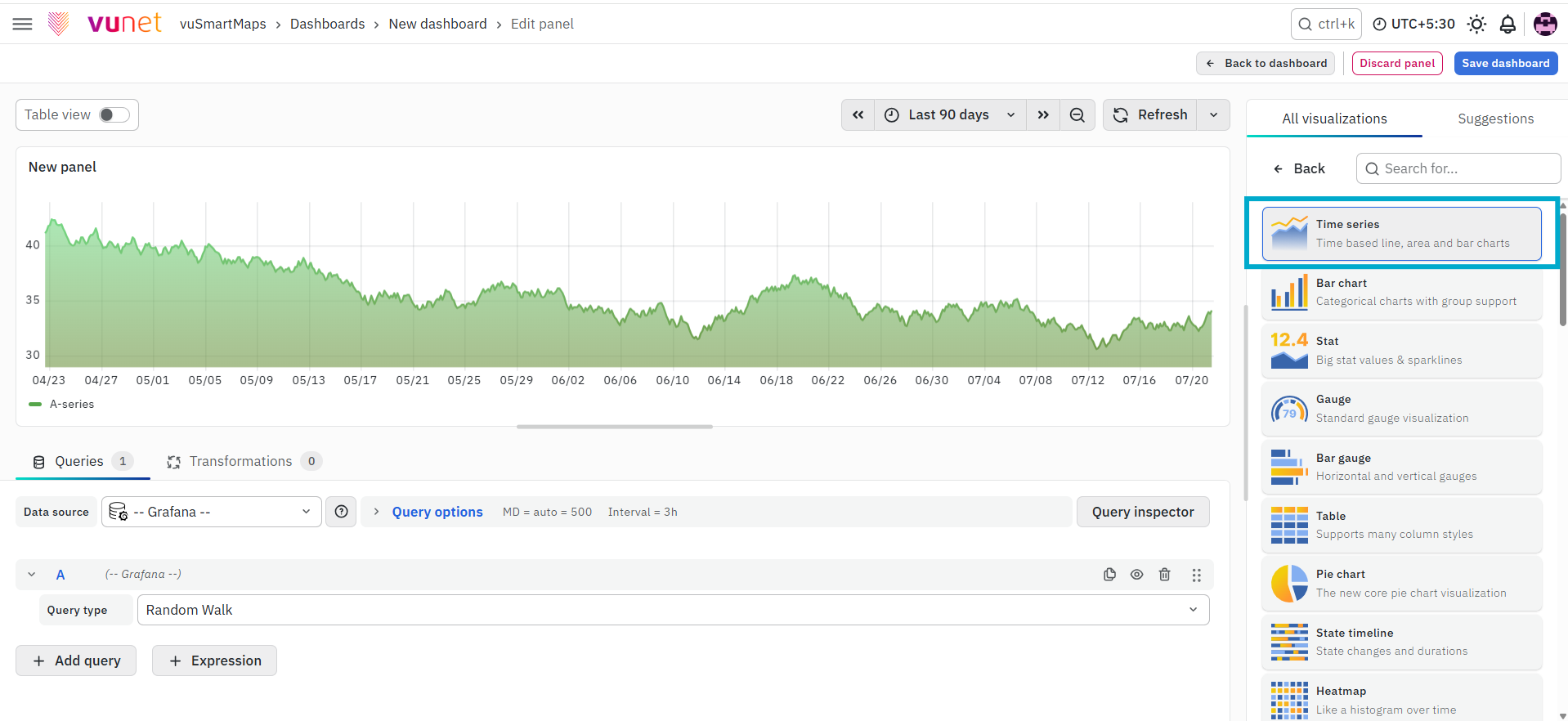
On the right side of the default screen, select Time Series as the visualization type. This converts the panel into an Area Chart. Once selected, the chart displays data in a time-based format, where values are plotted over time and the area under the line is filled to highlight the trend.
Panel Options
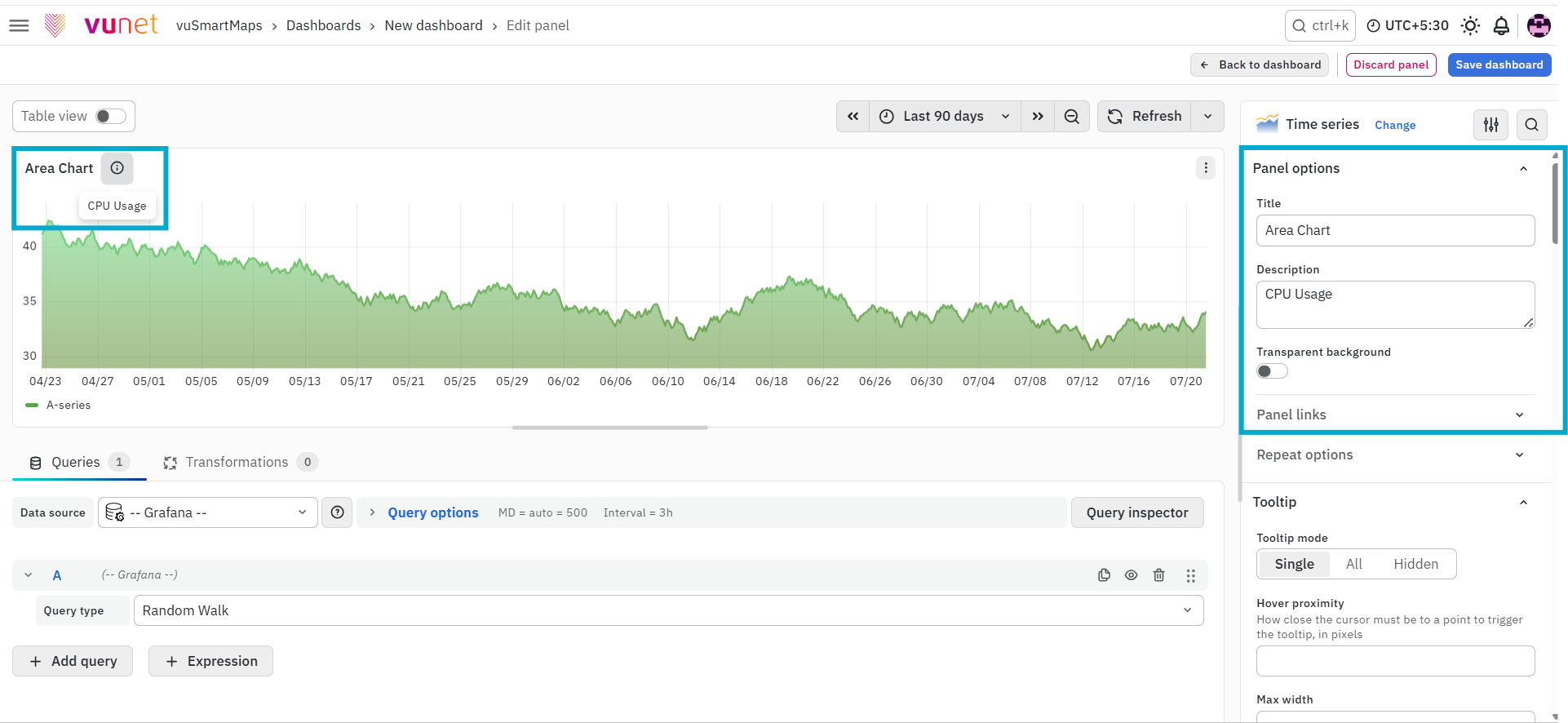
This section is used to define the basic details of the panel.
- Title – Used to identify the panel on the dashboard.
- Description – Provides additional context about what the chart represents. This can be viewed by hovering over the information icon on the panel.
- Panel Link – Allows you to attach a link to another dashboard or external URL.
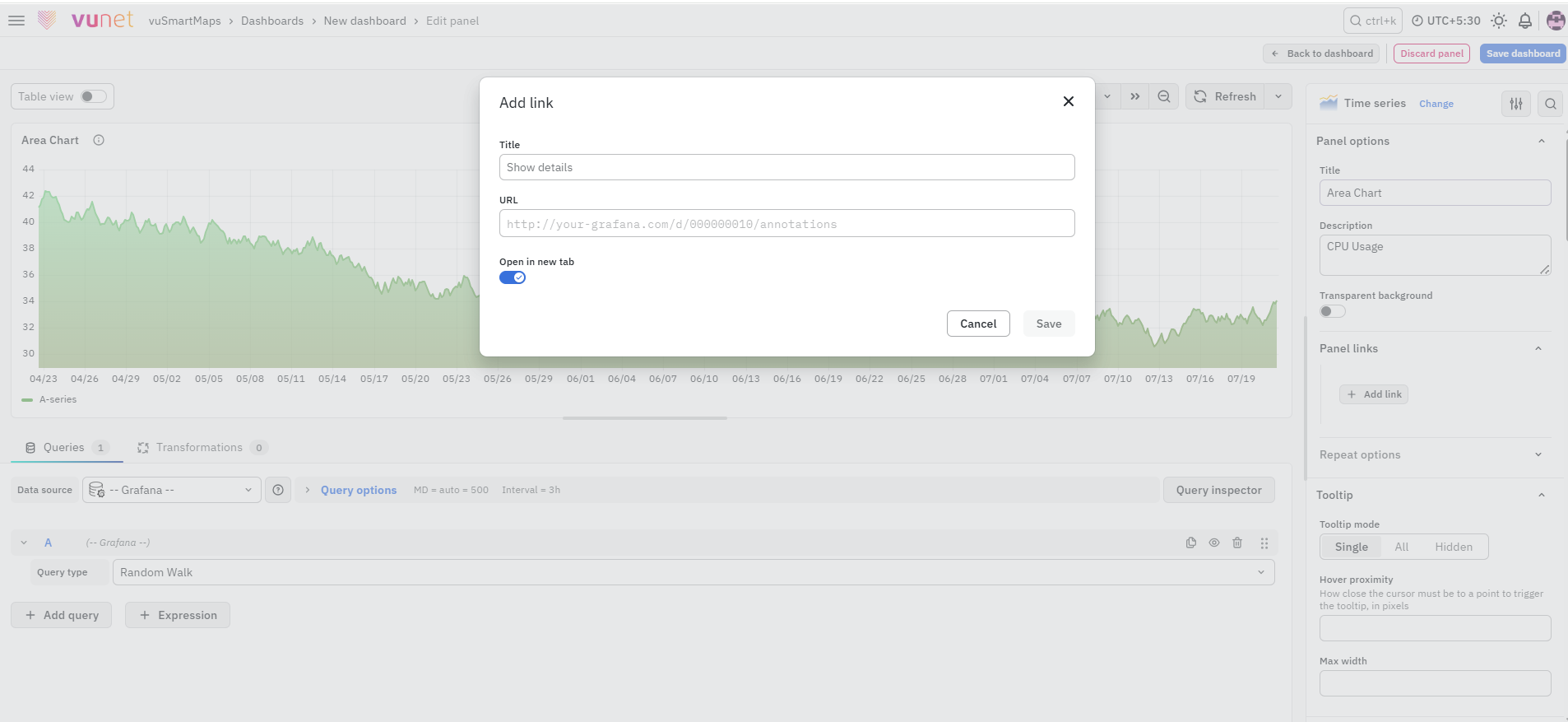
You can configure:
- Link title
- URL
- Open in new tab option
When configured, clicking the panel will open the linked page based on the selected behavior.
Repeat Options
The Repeat Options section allows the panel to be repeated for each value selected in a dashboard variable.
- Repeat by variable: Select the required dashboard variable to create a separate panel for each selected value.
- Disable repeating: Keeps panel repetition disabled.
Repeated panels are not displayed while editing the panel. Return to the dashboard and refresh or reload it to view the repeated panels.
Tooltip
-
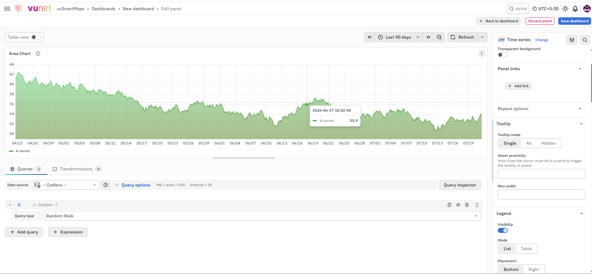
This section controls how data details are displayed when you hover over the chart.
- Single – Displays the tooltip at a single point.
- All – Displays the tooltip at all points.
- Hidden – Disables tooltip display.
-
Additional settings:
- Hover Proximity – Defines how close the cursor must be to a data point to trigger the tooltip.
- Max Width – Controls the maximum width of the tooltip box.
-
Tooltips help users quickly view values without reading the entire chart.
Legend
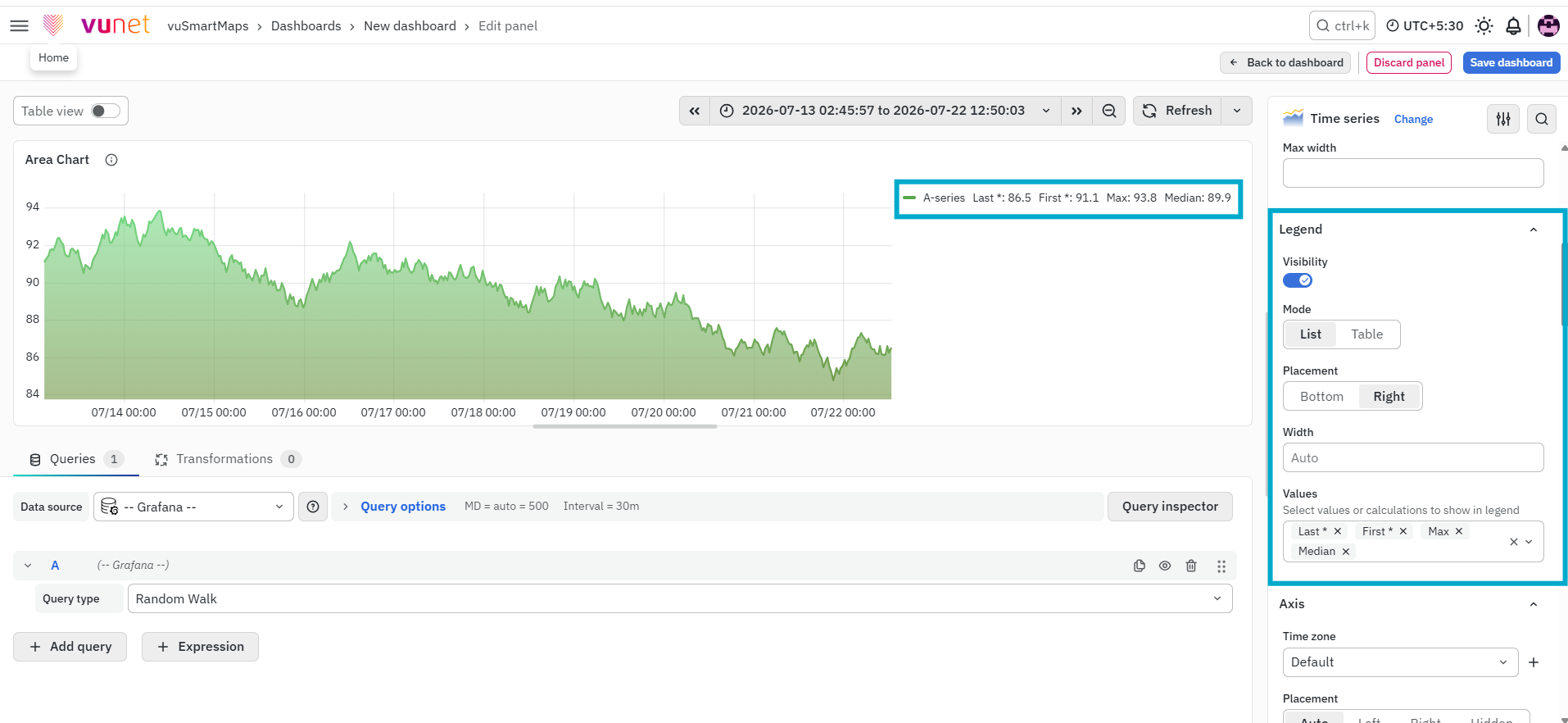
This section controls how the legend appears on the chart. The legend helps users identify different data series. You can configure:
- Mode – Display as List or Table.
- Placement – Position at Bottom or Right.
- Width – Applicable when placed on the right. You can either leave the field empty to enable auto mode or manually enter a value to set the legend width.
- Legend Values – Display metrics such as Last, First, Min, Max, or Total.
This allows users to quickly understand key statistics for each series directly from the chart.
Axis
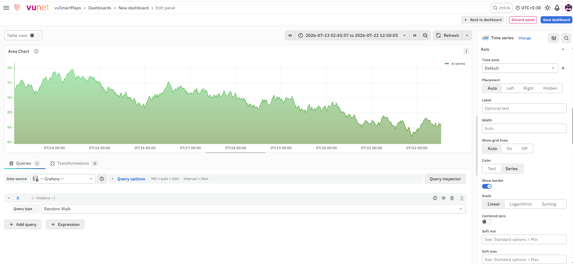
This section is used to configure how the x-axis and y-axis behave and appear. Key options include:
- Time Zone – Defines how time is displayed on the x-axis.
- Placement – Position of the y-axis (Auto, Left, Right, Hidden).
- Label – Adds a descriptive label to the axis.
- Width – Adjusts axis width.
- Show Grid Lines – Controls visibility of grid lines.
- Color – Sets axis color based on text or series.
- Show Border - Set the axis border visibility.
- Scale – Choose between Linear, Logarithmic, or Symlog.
- Centered Zero – Aligns the axis around zero.
- Soft Min / Soft Max – Adjusts visible range dynamically.
These settings help improve readability and align the chart with the type of data being analyzed.
Graph Styles
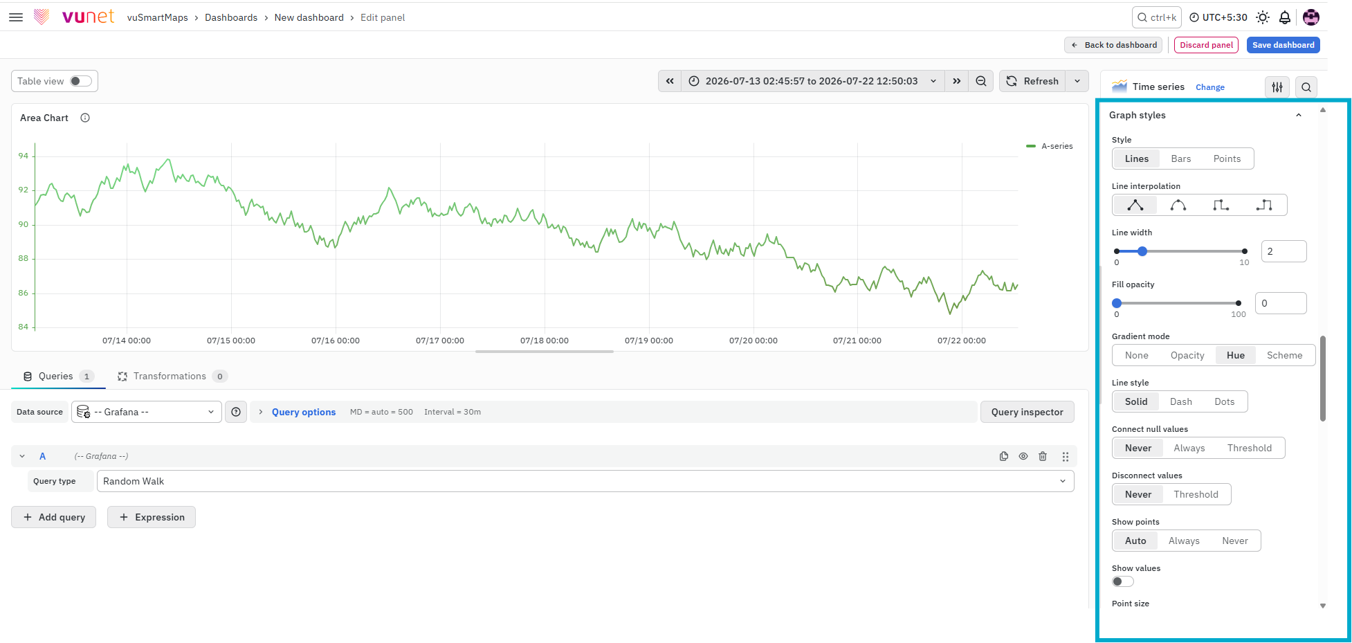
This section is used to define how your time-series data is displayed in the chart. You can choose different styles based on how you want users to interpret the data. You can also use field overrides to combine multiple styles in the same graph.
Available styles include:
- Lines – Displays data points connected by lines. This is useful for showing continuous trends over time.
- Bars – Displays data as vertical bars. This is useful for comparing values at specific time intervals.
- Points – Displays only individual data points. This is useful when you want to highlight exact values without connecting them.
Line
This section controls how lines are displayed in the chart.
-
Line Interpolation – Defines how data points are connected:
- Linear – Points are joined using straight lines.
- Smooth – Curved lines for smoother transitions.
- Step before – Steps between points, with the point at the end of the step.
- Step after – Steps between points, with the point at the start of the step.
Additional configurations include:
- Line width – Controls the thickness of the line.
- Fill opacity – Controls how much the area under the line is filled.
- Gradient mode – Defines how the fill color is applied.
- Line style – Solid, dash, or dots.
- Connect null values – Controls how missing values are handled in the chart.
- Disconnect values – Sets a threshold above which values are visually disconnected.
- Show point – Enables or disables display of data points.
- Point size – Defines the size of data points.
- Stack series – Displays multiple series on top of each other for cumulative analysis.
Bars
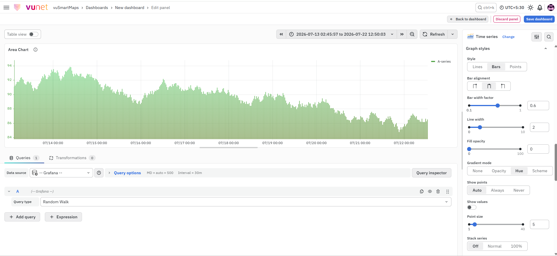
This section controls how bar-style visualization is displayed.
-
Bar Alignment – Defines how bars are positioned relative to data points:
- Before – Bar appears before the data point.
- Center – Bar is centered on the data point (default).
- After – Bar appears after the data point.
Additional configurations include:
- Bar width factor – Adjusts bar width relative to spacing between data points.
- Line width – Controls outline thickness.
- Fill opacity – Controls bar fill intensity.
- Gradient mode – Defines color gradient.
- Line style – Solid, dash, or dots.
- Show point – Shows or hides data points.
- Point size – Defines size of points.
- Stack series – Stacks multiple series for cumulative view.
Points
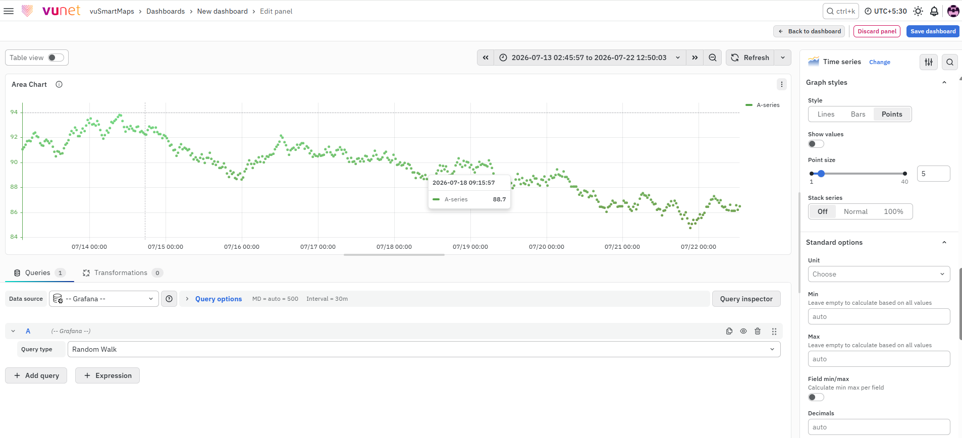
This section controls point-based visualization.
- Point size – Defines the size of individual data points.
- Stack series – Allows stacking of multiple series.

Standard Options
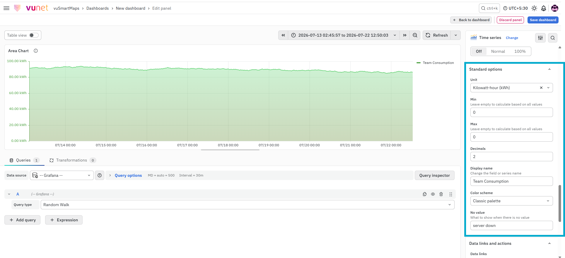
This section controls general display settings for the chart.
Options include:
- Unit Type – Defines how values are displayed (for example, ms, %, count).
- Min / Max – Sets the value range.
- Decimal – Controls number precision.
- Display Name – Custom label for the series.
- Color Scheme – Defines chart colors.
- No Value – Defines what is shown when no data is available.
These settings help standardize how data is presented across dashboards.
Value Mappings
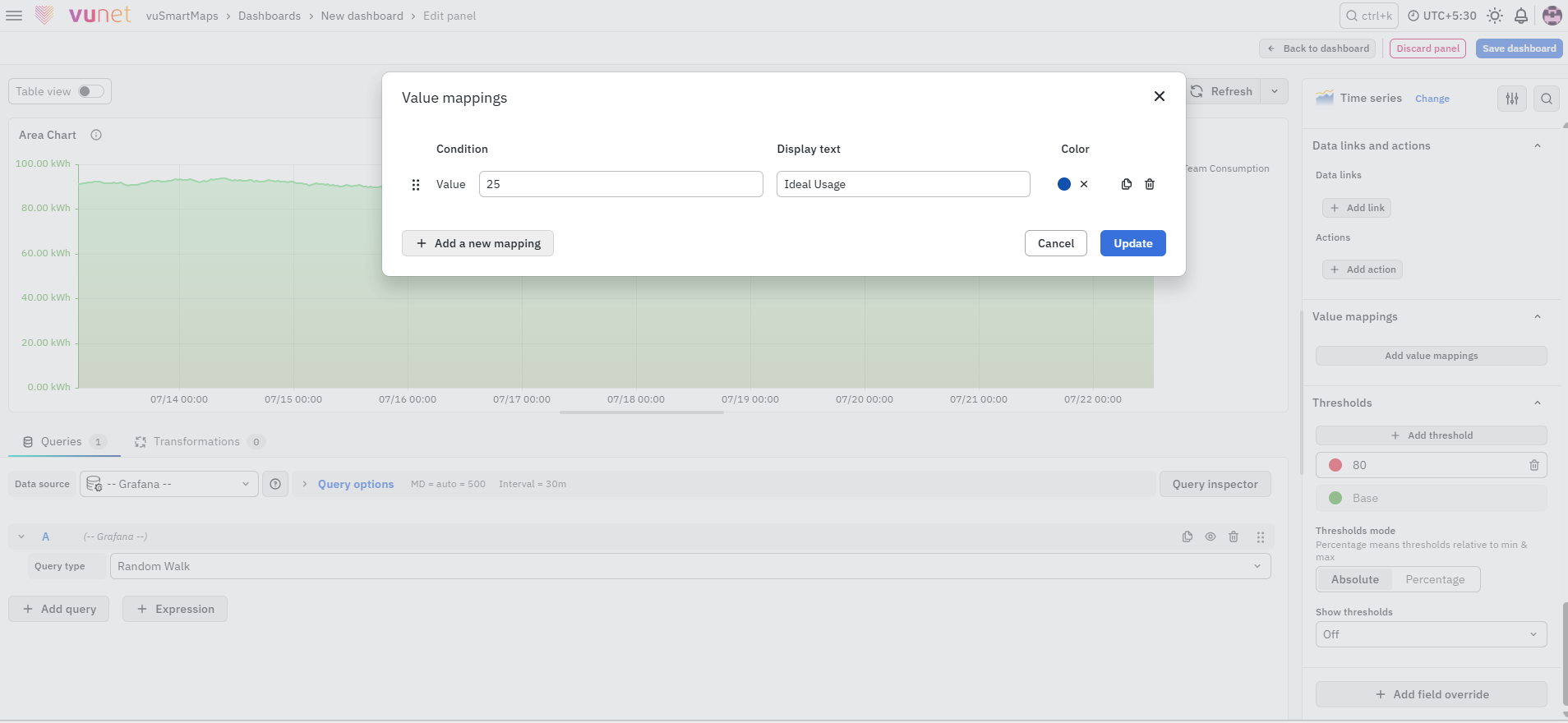
This section allows you to map specific values to custom display text. When a value matches the defined condition, it is replaced with the configured text and highlighted using the selected color. This is useful for highlighting important states or conditions in the data.
Data Links and Actions
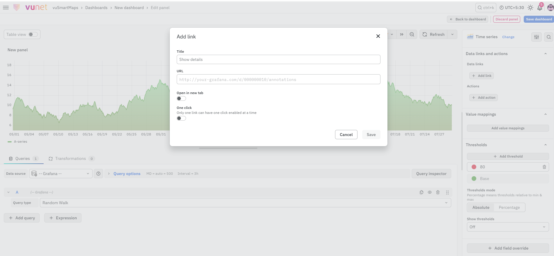
This section allows you to attach links directly to the data points. When a user clicks on a data point in the chart, the configured link appears and can be opened.
You can configure:
- Title – Defines the name of the link.
- URL – Specifies the destination URL.
- Open in new tab – Opens the linked page in a new browser tab.
- One click – Opens the link directly when the data point is clicked. Only one link can have this option enabled at a time.
Actions
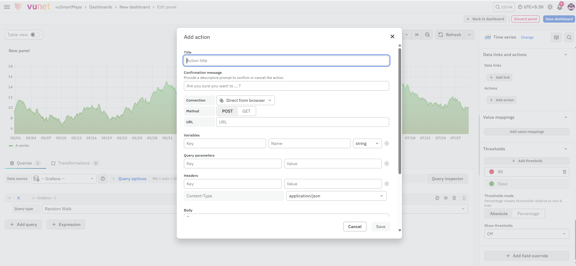
Actions allow users to trigger an HTTP request directly from a data point. You can configure:
- Title – Defines the name of the action.
- Confirmation message – Displays a message before the action is performed.
- Connection – Defines how the request is sent.
- Method – Select GET or POST based on the required action.
- URL – Specifies the endpoint to which the request is sent.
- Variables – Adds field or data values to the action.
- Query parameters – Adds key-value parameters to the request URL.
- Headers – Adds the required request headers.
- Body – Defines the request payload.
- Button style – Sets the colour used to display the action.
Thresholds
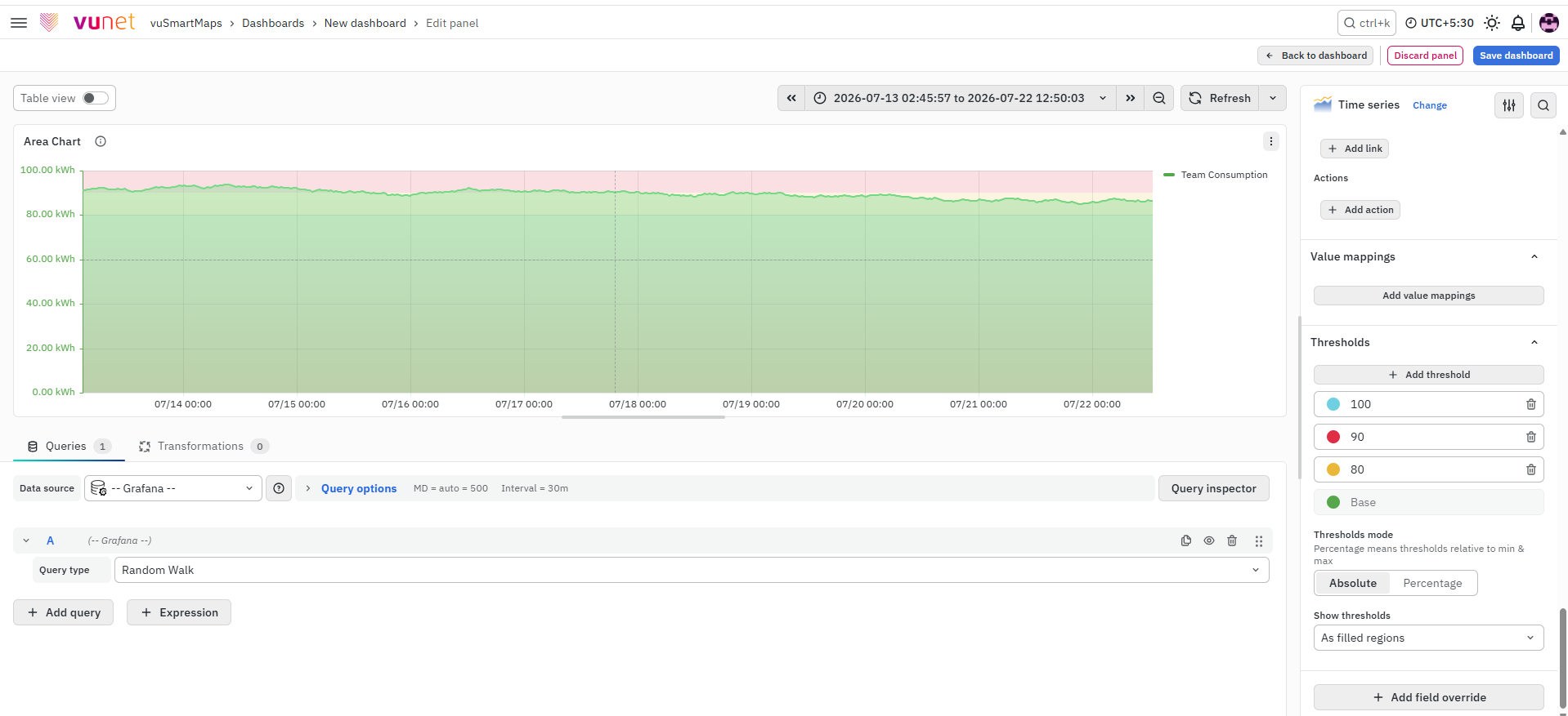
This section allows you to define value-based thresholds and highlight specific value ranges using colours for better visibility. You can configure:
- Add threshold – Adds a new threshold value and allows you to select the colour associated with it.
- Thresholds mode – Determines how threshold values are calculated:
- Absolute – Uses the exact threshold values entered.
- Percentage – Calculates threshold values relative to the minimum and maximum values.
- Show thresholds – Controls how thresholds are displayed on the chart:
- Off – Hides threshold indicators.
- As lines – Displays thresholds as solid lines.
- As lines (dashed) – Displays thresholds as dashed lines.
- As filled regions – Highlights threshold ranges using filled regions.
- As filled regions and lines – Displays filled regions with solid threshold lines.
- As filled regions and lines (dashed) – Displays filled regions with dashed threshold lines.
You can assign different colours to different threshold levels to represent conditions such as normal, warning, or critical. For example, for CPU usage, configure yellow at 80 and red at 110 to help users quickly identify threshold breaches and take the required action.
Add Field Override
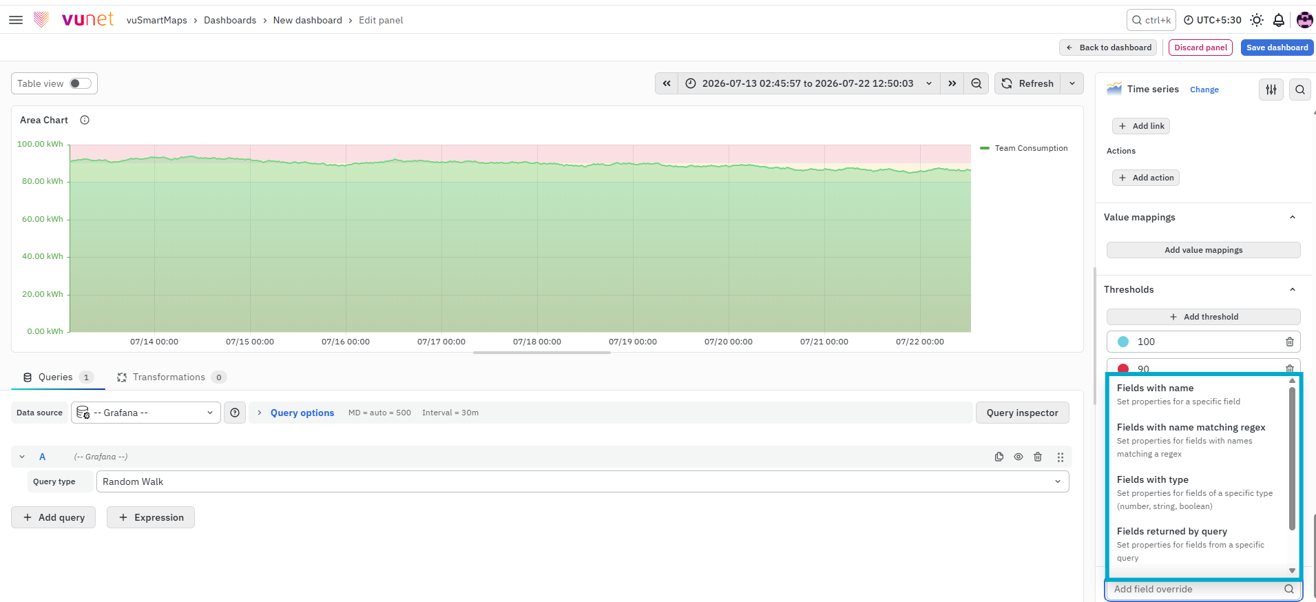
This section allows you to apply custom settings to specific fields instead of applying them globally. You can define overrides based on:
- Field name
- Matching regex
- Field type
- Query
- Values
To apply an override:
- Select the field
- Select the override property
- Configure the required settings
This is useful when different data series need different visual or behavioral configurations.

Step-by-Step Instructions
- Create a new dashboard panel.
- Configure the query and select the appropriate data source.
(Refer to Dashboard Basics > Query) - On the right side of the screen, select Visualization and choose Time Series.
- In Panel Options, enter the panel name and description. Add a panel link if required.
- Configure Tooltip settings:
- Select mode (Single, All, Hidden)
- Set hover proximity
- Set maximum width
- Configure Legend:
- Choose mode and placement
- Select legend values
- Configure Axis settings:
- Set time zone
- Configure axis placement and label
- Adjust scale and limits
- Configure Graph Styles:
- Choose Lines, Bars, or Points
- Adjust styling such as interpolation, fill, and stacking
- Configure Standard Options:
- Set unit type, min/max values, decimals, and color scheme
- (Optional) Configure:
- Value Mappings
- Data Links & Actions
- Thresholds
- Field Overrides
- Save the panel. You can edit the panel later if required.
What Happens After the Steps
Once the panel is saved:
- The Area Chart is displayed on the dashboard.
- Data is plotted over time.
- The filled area highlights the trend.
- Tooltip and legend show additional details.
- Thresholds and styles are applied as configured.
- The panel can be edited anytime.
Tips / Best Practices
- Use Area Charts for time-based analysis.
- Use stacking to compare cumulative values.
- Use thresholds to highlight critical conditions.
- Avoid too many data series to maintain clarity.
- Use smooth interpolation for better visualization.
Troubleshooting
-
Issue: Area Chart is not displaying.
- Possible Cause: Data not available for selected time range.
- Solution: Verify the global time selector and ensure data exists for the selected duration.
-
Issue: No data shown in chart.
- Possible Cause: Metric or grouping field does not contain data.
- Solution: Verify metric and grouping fields in the query.
-
Issue: Unable to sort data.
- Possible Cause: Incorrect query configuration.
- Solution: Use Terms in the query and select Top or Bottom ordering.
FAQs
Why would I use an area chart?
An area chart is a good way to demonstrate trends over time to the viewer, for example showing the population over time. This chart is based on the line chart. The filled area can give a greater sense of the trends in a particular dataset.
Which chart type should I select to observe changes over time?
An area chart is helpful if you want to observe how a metric, such as population, changes over time.
How can I change my current chart (area) to a line chart or bar chart without creating a new chart?
Go to the “Graphs Style” tab and change the chart type to a line or bar based on your needs.
How do I change the color for the legends and set the selected color as a default color?
Go to Standard Options, choose the color scheme for your series, and save your visualization. Your area chart will be saved along with the chosen colors.
How do I change the position of the legend?
Go to Axis settings and change the legend position to the right, left, top, or bottom.
Why does my area chart show no result or not displayed?
The following things need to be checked.
- Global time selector - Whether data is available for the duration selected in the global time.
- Metric - Whether the selected metric field contains data in the underlying index.
- Group By - Whether the selected bucketing field contains data in the underlying index.
How can I sort my Group By field in ascending or descending order if it’s not a time series field?
Choose your Group By field in the Query tab and select “Terms” and in the Order section, select Top or Bottom.
