Matrix Visualization
Overview
Matrix Visualization in vuSmartMaps is used to display aggregated metric values in a structured tabular format. It organizes data using both row groups and column groups, allowing users to compare values across two category dimensions in a single view.
This makes Matrix Visualization useful when a standard table is not sufficient. A standard table lists records mainly in rows, while a Matrix Visualization creates a cross-tabular view where each cell represents the metric value for a specific row and column combination.
Working with Matrix Visualization involves two main activities:
- Configure Matrix Visualization: This includes selecting the data source, visualization type, query type, Data Model, and metric.
- Configure Visualization Options: This includes customizing the panel, matrix display, value formatting, data links and Action, value mappings, thresholds, and field overrides.
Why This Feature Is Useful
Banking and payment environments generate large volumes of operational and business data across multiple systems. These systems may include core banking, UPI services, payment switches, payment gateways, middleware, and infrastructure components. Matrix Visualization helps teams compare grouped metrics quickly without switching between multiple panels or dashboards.
This feature is useful because it helps users:
- Compare metric values across two categories in one view.
- Analyze aggregated data over a selected time period.
- Identify patterns, trends, or anomalies using color coding and thresholds.
- Display percentage bars to understand relative distribution.
- Show serial numbers for easier reference in reports or support discussions.
- Use a simplified matrix layout for better readability.
- Use structured tabular output for reporting and operational review.
For NOC and payment operations teams, this can reduce the time required to identify which system, category, or severity level needs attention.
Example Scenario
A NOC team is monitoring the health of payment infrastructure. The environment includes UPI switches, core banking systems, payment gateways, and server clusters. The team wants to view how many alerts of each severity occurred across different system categories during the selected time range.
Monitoring Alert Severity Across Payment Infrastructure
A NOC team is monitoring the health of payment infrastructure. The environment includes UPI switches, core banking systems, payment gateways, and server clusters. The team wants to view how many alerts of each severity occurred across different system categories during the selected time range.
Using Matrix Visualization, the team creates a panel where:
- Rows show alert severity, such as Information, Warning, and Critical.
- Columns show system or server categories.
- Each cell shows the alert count for that row and column combination.
The team also configures thresholds so that high alert counts are highlighted using colors. If a cell crosses the configured threshold, the color makes the issue easy to notice. The team may also enable Show Percentage Bar to understand the proportion of alerts across categories. This helps prioritize investigation during high-volume incidents. This is an example use case. The exact row group, column group, and metric depend on the selected Data Model.
When to Use This Feature
Use Matrix Visualization when:
- Metrics must be compared across two category dimensions.
- Aggregated data needs to be displayed in a row-and-column format.
- A standard table does not provide enough cross-category visibility.
- Operations teams need to identify patterns or outliers quickly.
- Dashboard users need color-coded metric comparison.
- Percentage-based comparison is required.
- The panel needs to support operational reporting or review.

Comprehensive Understanding
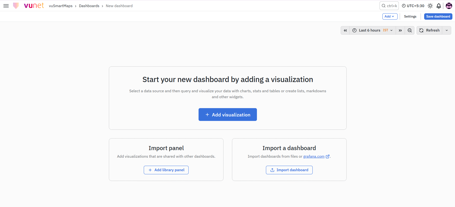
Matrix Visualization is configured from the dashboard editing screen in vuSmartMaps.
Navigation Path
To start creating a Matrix Visualization:
- Open the Toggle Menu.
- Click Dashboards.
- Click New → New Dashboard.
- Click + Add Visualization.
- Select the required data source and visualization type.
The Matrix Visualization configuration screen has three main areas:
- Center Panel
- Left Section
- Right Section
Center Panel: Visualization Display Area
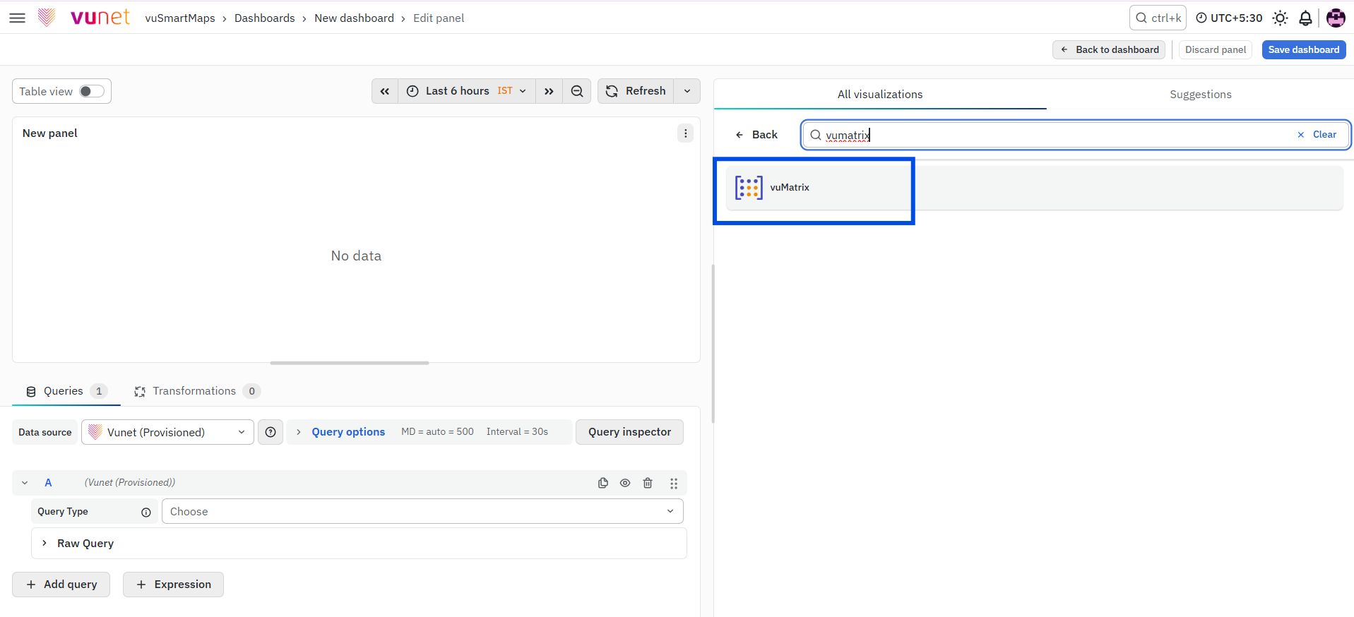
The center panel is the main preview and output area. Before configuration, this area may show an empty visualization panel. After configuration, it displays the Matrix Visualization in a tabular format.
The final matrix output is based on:
- Selected Data Source
- Selected Query Type
- Selected Data Model
- Selected Metric
- Two bucket or grouping fields
Each cell in the matrix represents the metric value for the intersection of one row group and one column group.
Example:If the row group is alert severity and the column group is system category, each cell displays the metric value for that severity and system category combination.
Left Section: Data Source and Query Configuration
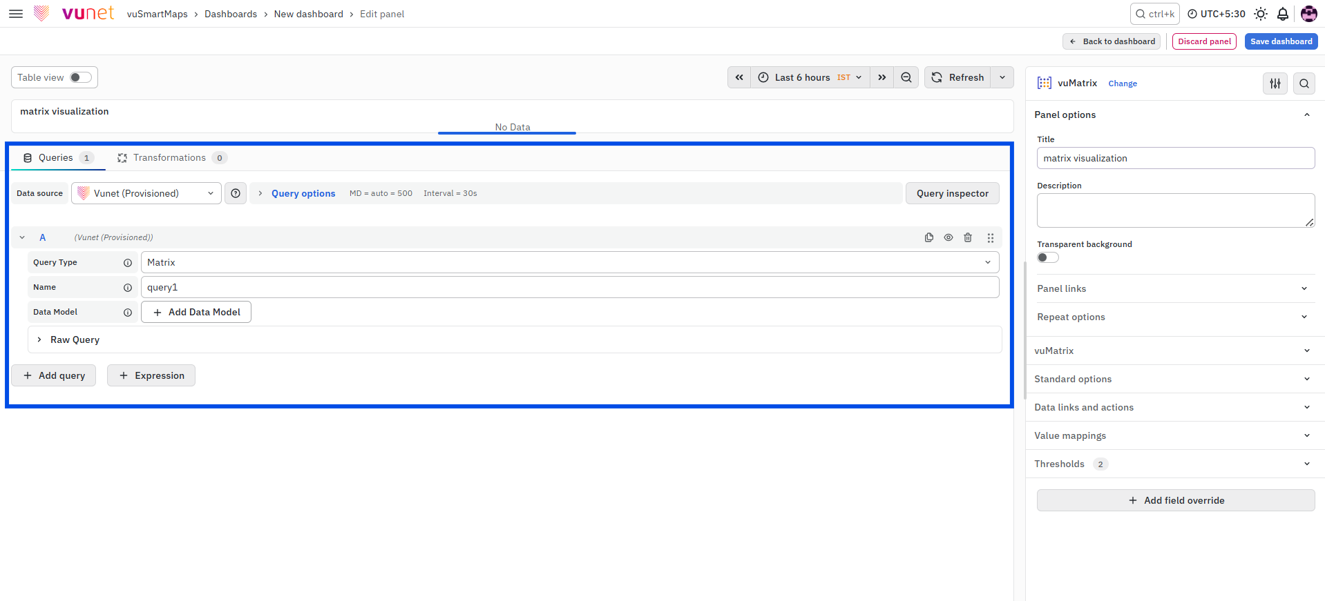
The left section is used to define the data that will be shown in the Matrix Visualization. This section includes:
- Data Source: The Data Source must be selected as Vunet (Provisioned). Matrix Visualization can be accessed only through this data source.
- Query Type: The Query Type must be selected as Matrix.
- Query Name: The Query Name identifies the query used in the panel.
- Data Model: The Data Model provides the metric and bucket fields required to form the matrix.
- Metric: The Metric is the value displayed inside the matrix cells.
Right Section: Visualization and Panel Configuration
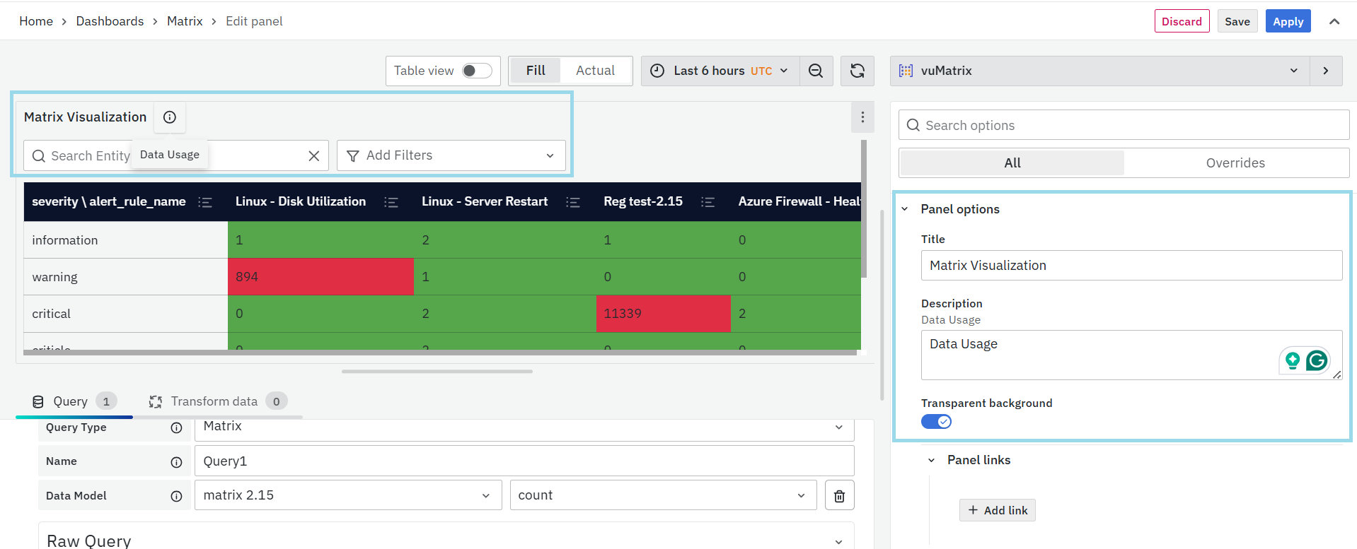
The right section controls how the Matrix Visualization appears and behaves. It includes the following configuration areas:
-
Visualization Selector: The Visualization Selector is used to select the panel visualization type. For Matrix Visualization, select vuMatrix from the visualization options. After vuMatrix is selected, matrix-specific configuration options become available.
-
Panel Options: Panel Options are used to define basic panel-level details. These include:
- Panel Name: Defines the title displayed for the visualization panel.
- Description: Adds explanatory text for the panel. The description is available from the information icon on the panel.
- Panel Link: Allows the panel to link to another dashboard, website, support page, or related resource. Users can enter a title, URL, and choose whether the link should open in a new tab.
Panel Links are useful when users need quick navigation from a summary matrix to a detailed dashboard or supporting reference.
-
vuMatrix Options: The vuMatrix options control how the matrix is displayed. The available options include:
- Show Serial Number: Shows or hides serial numbers for each matrix row.
- Show Minimal Matrix: Displays the matrix as a simplified two-dimensional table. This is useful when the matrix has many rows or columns.
- Show Percentage Bar: Converts cell values into percentage-based progress bars based on the configured percentage bar unit.
-
Standard Options: Standard Options are used to configure formatting and display behavior. These options include:
- Unit type
- Minimum value
- Maximum value
- Decimal precision
- Display name
- Color scheme
- No Value display text
These settings help control how values appear in the matrix.
-
Data Links and Action: Data Links and Action allow users to add clickable links to matrix data values. Unlike Panel Links, which are configured at the panel level, Data Links and Action are configured on the data values. When a user clicks a value in the matrix, the link option appears. This can be used to open another dashboard, external URL, or supporting resource for deeper analysis.
-
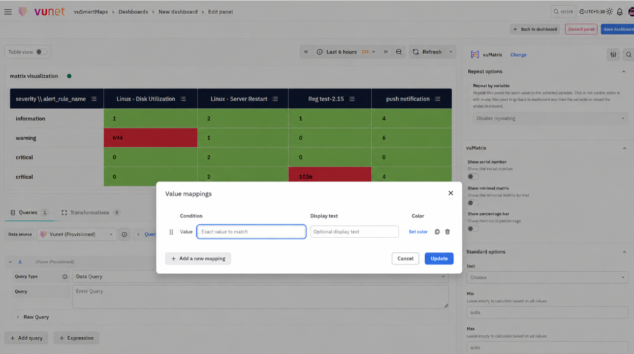
Value Mappings: Value Mappings are used to replace specific values with display text and colors. For example, if a numeric status code appears in the matrix, Value Mappings can be used to show a more readable label. Matching values can also be highlighted using the selected color.
-
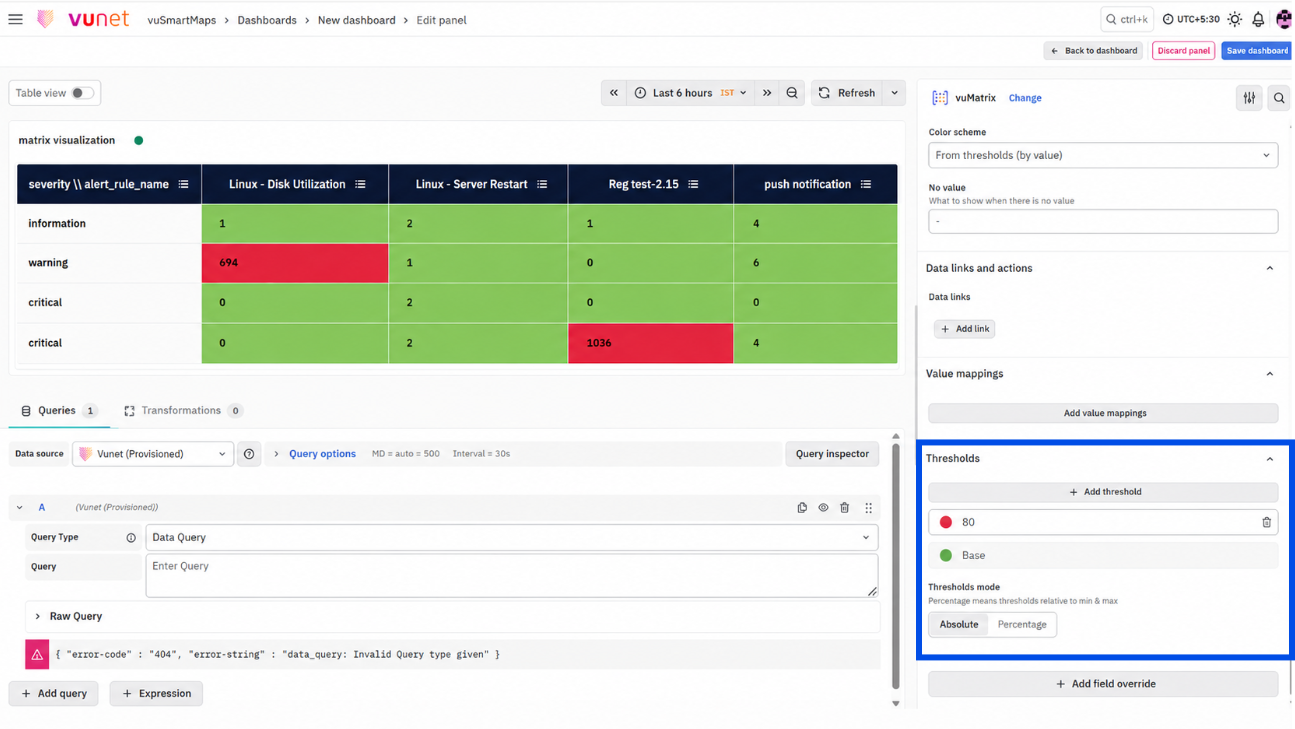
Thresholds: Thresholds are used to define value limits and apply colors when values cross those limits. Threshold mode can be configured as:
- Absolute
- Percentage
For example, thresholds can be configured so that values above a defined level are highlighted with a specific color. This helps users identify abnormal or critical values quickly.
-
Add Field Override: Field Overrides allow users to change display settings for selected fields without changing the entire panel. Field overrides can be applied based on:
- Field name
- Matching regex
- Field type, such as number, string, or boolean
- Query
- Value
Users can add multiple field overrides if required.
Step-by-Step Instructions
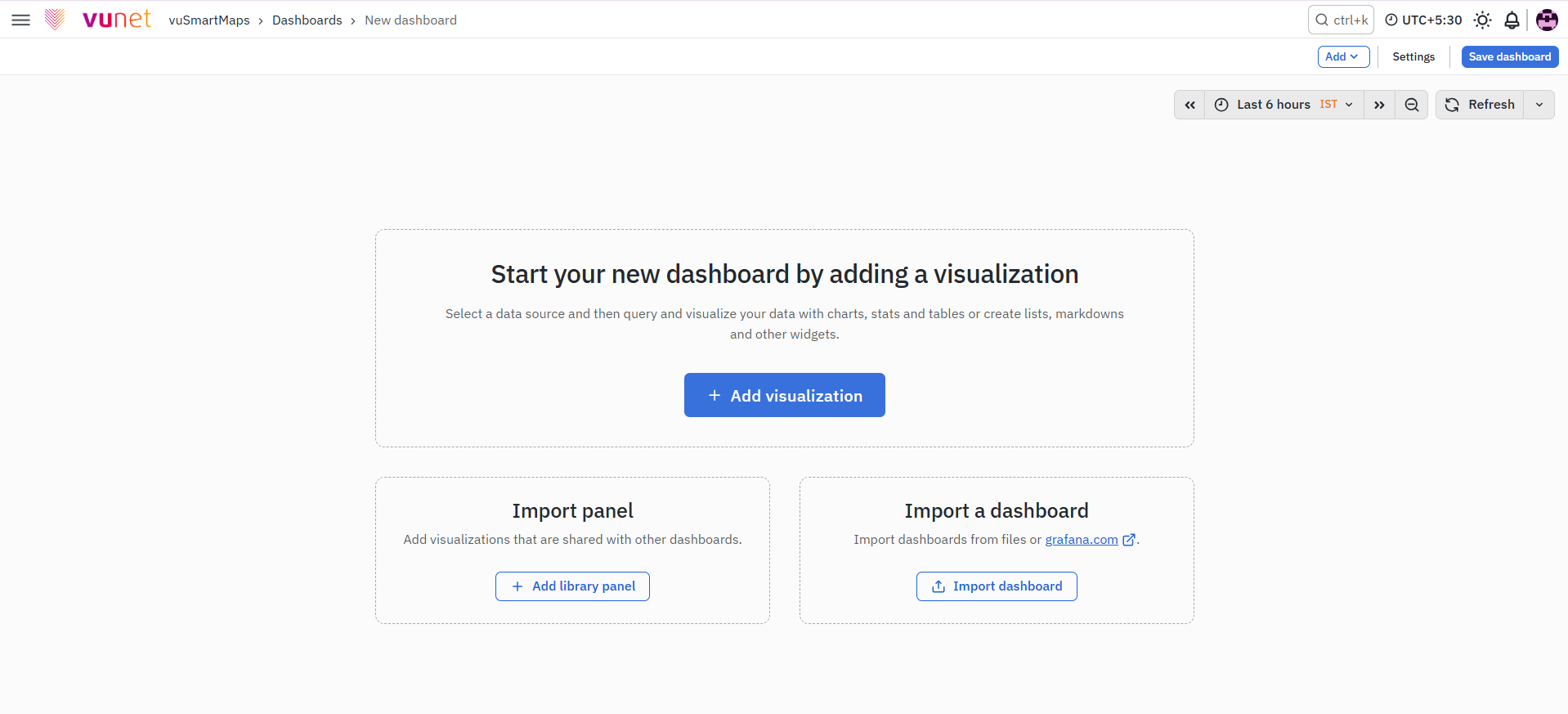
Step 1: Create a New Dashboard
- Open the Toggle Menu.
- Click Dashboards.
- Click New.
- Select New Dashboard.
A new dashboard screen opens.
Step 2: Add a Visualization Panel
On the new dashboard screen, click + Add Visualization. This opens the visualization configuration screen.
Step 3: Select the Data Source
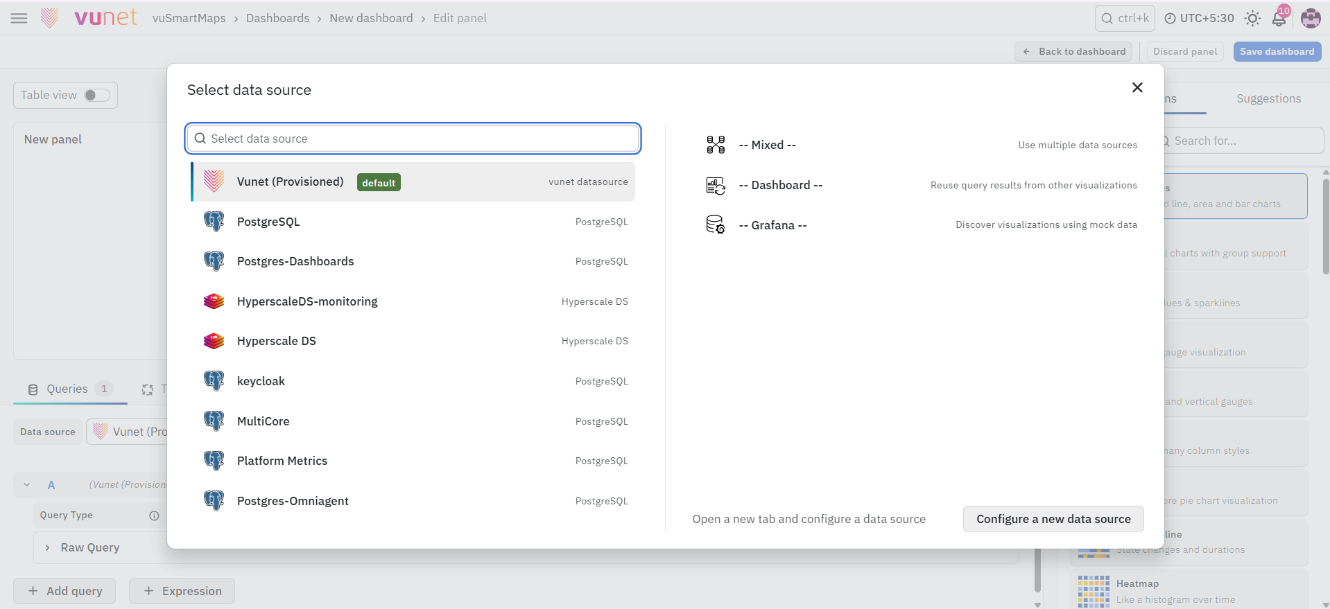
In the data source selection screen, select Vunet (Provisioned). This step is mandatory because Matrix Visualization is available only through the Vunet (Provisioned) data source.
Step 4: Select the Visualization Type
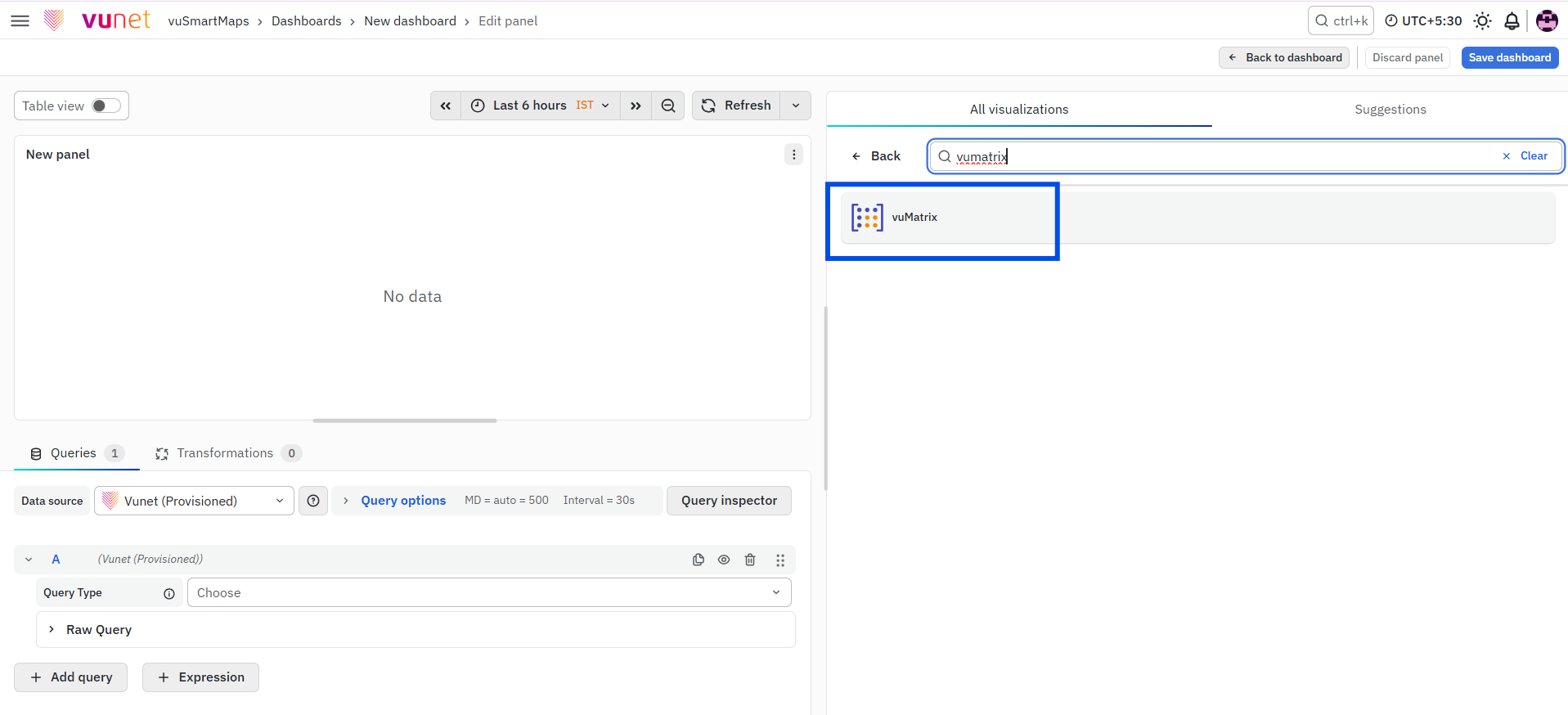
- In the right-side visualization selector, search for or select vuMatrix.
- The panel changes to the Matrix Visualization type.
This enables the matrix-specific options required for configuring the panel.
Step 5: Configure the Matrix Query
- In the query configuration area, select Matrix as the Query Type.
- Enter a Query Name.
- Select the required Data Model.
- Select the metric associated with the selected Data Model.
The Matrix Visualization supports one Data Model. The selected Data Model should have one metric and two bucket fields. The bucket fields are used to form the row and column groups in the matrix.
If the selected Data Model does not meet this structure, the Matrix Visualization may not render as expected.
Step 6: Configure Panel Options
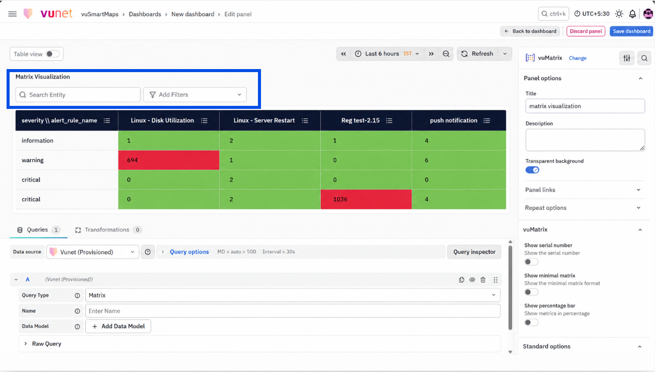
- In the right-side panel, expand Panel Options.
- Enter the Panel Name.
- Optionally enter a Description.
- To add a Panel Link:
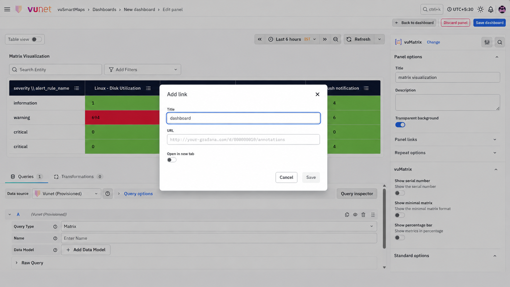
- Open the Panel Link configuration.
- Enter the link title.
- Enter the URL.
- Select Open in a new tab, if required.
- Click Save.
The description helps users understand the purpose of the panel. The panel link helps users navigate to related dashboards, websites, or support resources.
Step 7: Configure vuMatrix Display Options
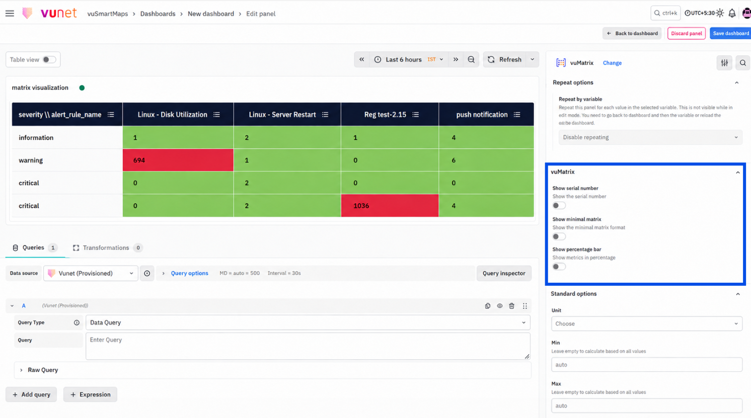
- Expand the vuMatrix section.
- Enable Show Serial Number if row numbering is required.
- Enable Show Minimal Matrix if a simplified two-dimensional table view is required.
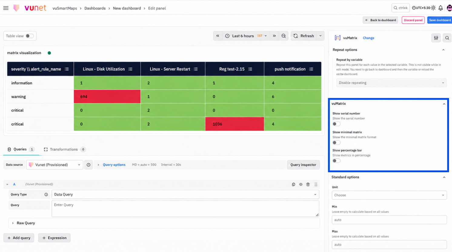
- Enable Show Percentage Bar if values should be shown as percentage progress bars.
- If Show Percentage Bar is enabled, enter the Percentage Bar Unit value.
Use these options based on the size and purpose of the matrix. For large datasets, the minimal matrix view can help reduce visual complexity.
Step 8: Configure Standard Options
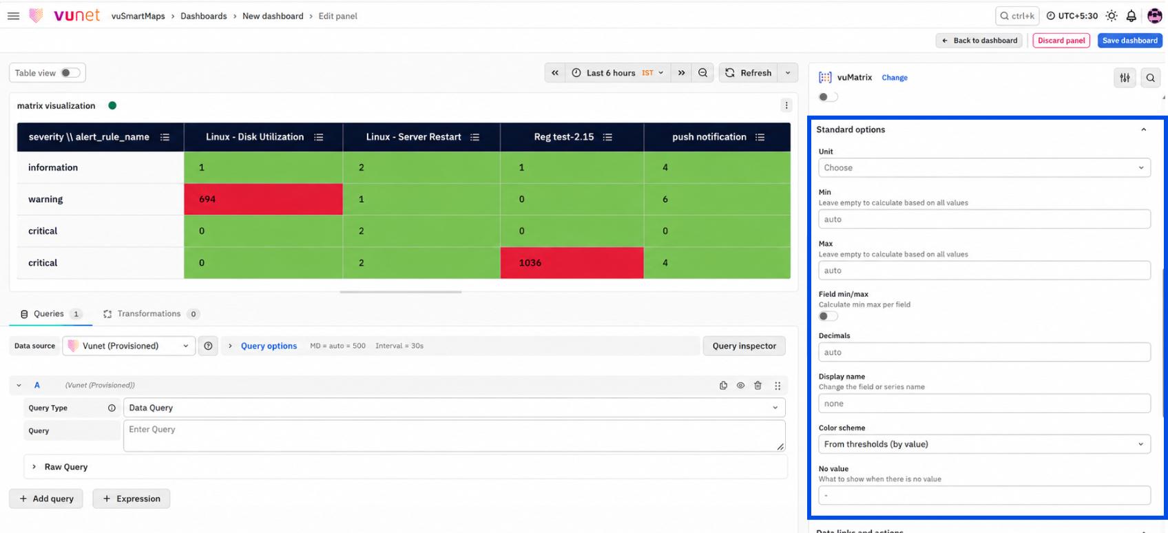
- Expand Standard Options.
- Select the required Unit type.
- Set Min and Max values, if required.
- Configure Decimal precision.
- Enter a Display name, if required.
- Select a Color scheme.
- Configure the No Value display text, if required.
These settings control how values are formatted and displayed in the panel.
Step 9: Configure Data Links and Action, Value Mappings, Thresholds, or Field Overrides
Configure these options if required:
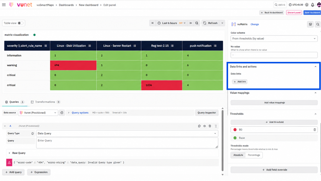
- Use Data Links and Action when users need to open another dashboard or URL from a matrix value.
- Use Value Mappings when specific values need to be displayed as custom text or colors.
- Use Thresholds when values need to be highlighted based on configured limits.
- Use Field Overrides when specific fields need separate formatting.
These options are optional, but they can make the matrix easier to interpret and more useful for operational monitoring.
Step 10: Apply and Save
- Click Apply to apply the panel configuration.
- Save the dashboard to retain the Matrix Visualization panel.
Remember to save the dashboard after applying the panel configuration. If the dashboard is not saved, the changes may be lost when users navigate away from the page.
What Happens After the Steps
After the Matrix Visualization is configured and saved:
- The dashboard displays the matrix panel.
- Rows represent one category or bucket field.
- Columns represent the second category or bucket field.
- Each cell displays the selected metric value for the row and column combination.
- If serial numbering is enabled, each row includes a serial number.
- If a minimal matrix is enabled, the matrix appears as a simplified two-dimensional table.
- If the percentage bar is enabled, values appear as progress bars based on the configured unit.
- If thresholds are configured, matching cells are highlighted using threshold colors.
- If value mappings are configured, matching values display custom text or colors.
- If data links and Action are configured, users can click data values to open the configured dashboard or URL.
Tips / Best Practices
- Use Matrix Visualization when two-category comparison is required.
- Use meaningful row and column groupings so users can understand the matrix quickly.
- Add a clear panel description explaining what the rows, columns, and cell values represent.
- Use thresholds for operationally important metrics so critical values are easy to identify.
- Use a minimal matrix view for large datasets to improve readability.
- Use percentage bars when relative distribution is more useful than raw values.
- Use serial numbers when the matrix output is used for reporting or support reference.
- Use Data Links and Action to connect summary values to detailed dashboards.
- Use Value Mappings when numeric values need readable labels.
- Use Field Overrides when specific fields need separate formatting.
- Confirm that the selected Data Model has one metric and two bucket fields before using Matrix Query Type.
Troubleshooting
-
Issue: Matrix Query Type is not available in the Query Type dropdown.
- Possible Cause: The selected data source may not be Vunet (Provisioned). Matrix Visualization is available only through this data source.
- Solution: In the query configuration area, open the Data Source selector and select Vunet (Provisioned). After selecting the correct data source, check the Query Type dropdown again.
-
Issue: Matrix panel shows “No data”.
- Possible Cause: The selected Data Model may not have data for the selected time range. The selected metric or bucket fields may also not match the expected Matrix structure.
- Solution: Check whether data is available for the selected time range. Extend the time range if required. Also verify that the selected Data Model has one metric and two bucket fields.
-
Issue: Required Data Model is not available in the dropdown.
- Possible Cause: The Data Model may not be compatible with Matrix Visualization. Matrix Visualization requires a Data Model with one metric and two bucket fields.
- Solution: Review the Data Model configuration. If the required Data Model does not appear, contact the platform administrator or update the Data Model so that it includes the required metric and bucket fields.
-
Issue: Threshold colors are not appearing.
- Possible Cause: Threshold values may not be configured, or the threshold mode may not match the scale of the data.
- Solution: Open the Thresholds section and verify the configured values and colors. Check whether the threshold mode is set as Absolute or Percentage. Ensure that the threshold values match the data being displayed.
-
Issue: Panel Link or Data Link and Action does not open.
- Possible Cause:The configured URL may be incomplete or incorrect.
- Solution: Verify that the URL is complete and correctly formatted. If the link opens another dashboard, confirm that the dashboard URL is valid and accessible.
-
Issue: Field Override is not applied to the expected field.
- Possible Cause: The selected field override condition may not match the field name, field type, regex, or query.
- Solution: Review the field selector used in the override. If using field name, ensure the name matches the matrix field exactly. If field names vary, use matching regex where appropriate.
FAQs
How does Matrix Visualization help compare values across categories?
Matrix Visualization organizes metric values using row and column groups. This makes it easier to compare values across two categories in one panel.
What is the difference between Matrix Visualization and Data Table Visualization?
A Data Table lists values in rows. Matrix Visualization supports both row grouping and column grouping, making it better for cross-category comparison.
Can Matrix Visualization help identify anomalies?
Yes. Thresholds, color coding, and percentage bars can help highlight unusual or critical values.
Can matrix cells link to other dashboards?
Yes. Data Links and Action can be used to make data values clickable and redirect users to another dashboard or URL.
What is the use of Show Minimal Matrix?
Show Minimal Matrix displays the matrix as a simple two-dimensional table. This can improve readability, especially for larger datasets.
What does Add Field Override do?
Field Overrides allow users to change display settings for selected fields without changing the entire visualization.
Can Percentage Bars be used in Matrix Visualization?
Yes. The Show Percentage Bar option can display cell values as percentage-based progress bars using the configured percentage bar unit.
