Dashboard Creation
Overview
A dashboard is a collection of panels organized in rows. Each panel is a visualization unit with its own data query editor. This editor is tailored to the panel's chosen data source, helping you create the right visualizations. A similar concept can be seen in a smartphone dashboard, where users can quickly view key information such as battery usage, storage, and network status in one place. In the same way, dashboards in vuSmartMaps bring multiple panels together to help users view and analyze important business and operational data from a single screen.
Dashboards make it easy to build the perfect view. You can create queries, adjust visuals, and craft the ideal dashboard. Every panel can pull data from any configured source. However, dashboard snapshots are fixed. Changes to queries won't update snapshot data since snapshots can't re-run queries. For instance, if you wish to gain insights into your business journey, you can create a dashboard that incorporates various panels to offer comprehensive observability into the business journey.
Why This Feature Is Useful
In banking and payment environments, multiple systems such as core banking, UPI, and payment gateways generate large volumes of data. Dashboards help teams:
- Monitor system health, performance, and transaction data using configured time ranges and refresh settings.
- Analyze transaction trends and failures.
- Identify unusual patterns, spikes, or performance issues from visualized data.
- Consolidate multiple metrics into a single view for faster decision-making.
Example Scenario
A payment operations team wants to monitor UPI transaction performance. They create a dashboard with:
- A line chart showing transaction count over time.
- A metric panel showing total failed transactions.
- A table listing top failing APIs.
This allows the team to quickly identify spikes in failures and investigate the issue further.
When to Use This Feature
Use Dashboards when:
- You need a centralized view of system or transaction data.
- You want to monitor real-time performance.
- You need to compare multiple metrics or systems.
- You want to visualize logs, metrics, or traces.
- You need to share insights with teams or stakeholders.
Comprehensive Understanding
Dashboard Home
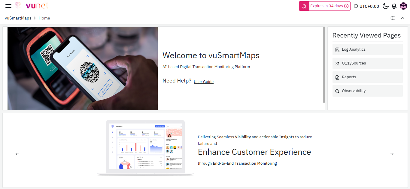
The vuSmartMaps home screen looks like this after you log in.
When creating a new dashboard, you'll encounter three key sections:
- Visualization: Configure the appearance and properties of your graph or visual elements. Adjust settings like table view, graph resolution, time range selection, zoom options, and more to suit your preferences.
- Visualization Options: Tailor the visual settings further based on the chosen visualization type. These options vary depending on your selection.
- Query: Specify the data source to generate the desired graph output.
Query Selection
Query Selection: Before diving into visualization options, it's crucial to select an appropriate query as your data source. Your choice defines the data you'll be working with and how you visualize it. You can also opt for multiple queries to enhance your dashboard's insights.
Metric and Grouping:
-
Metric: Represents data on the y-axis. Choose from options like count, average, sum, max, min, extended stats, percentiles, unique, raw documents, raw data, or logs.
-
Group By: Categorizes data on the x-axis. Common examples include time intervals like days or months. Use aggregation types like terms, filters, geo hash grid, date histogram, or histogram.
-
Multiple Metrics and Buckets: You have the flexibility to add multiple metrics and buckets, allowing for a more comprehensive data representation. For instance, you can track CPU usage at various time intervals simultaneously.
-
Multiple Queries and Configurations: To gain deeper insights, you can add multiple queries with distinct "Group By" options, enabling comparisons across different aspects of your data. Custom labels can be applied to metrics and groups for clarity.
You can configure the various panels and visualizations within vuSmartMaps. Below is a list of all available options, click on any of them to access the detailed guide.
Predefined Panels
Custom Panels
Dashboard Settings
Dashboard Settings: The dashboard settings section provides control over various parameters, including:
-
General Dashboard Setting: Customize the dashboard's name, description, tags, folder location, and editing permissions.
- Time Options: Adjust the dashboard's timezone, browser time, auto-refresh settings, and more.
- Panel Options: Fine-tune tooltip behavior and hover highlighting across panels.
-
Annotations Dashboard Settings: Learn how to add annotation queries that retrieve event data for visualization within graph panels, enhancing the integration of events into your graphs.
-
Variables Dashboard Settings: Discover how to create interactive dashboards using variables, replacing static values in queries with dynamic dropdown selections.
-
Links Dashboard Settings: Effortlessly navigate between related content by placing links to other dashboards and websites below your dashboard's header.
-
JSON Model Dashboard Settings: Explore the JSON model of your dashboard, containing metadata, properties, panel details, and queries.
Dashboard Options
Managing and configuring dashboards involves various options, as outlined below:
- Dashboards: Browse and perform actions like listing, deleting, creating folders, importing, and more on your dashboards.
- Playlists: Create playlists with different dashboard settings.
- Snapshots: View dashboard snapshots.
- Library panels: Access library panels.
When it comes to grouping dashboards, you have two options: you can group them by folders for organized management or group them individually. Additionally, you can choose to sort your dashboards alphabetically, either in ascending order (A-Z) or descending order (Z-A).
Moreover, you can easily manage your dashboards by deleting any unwanted ones - simply select a dashboard and click "Delete." To make modifications and add notes for future reference, click on a dashboard to edit it further.
When it comes to editing dashboards, you have several options at your disposal. You can enhance your dashboard by adding more panels, saving any modifications you make, accessing dashboard-specific settings, defining the time range, manually refreshing the dashboard, and switching between various dashboard views, including full-screen mode. With the auto-refresh option, you can manually refresh your dashboard at any time or set a refresh interval for regular updates.
For advanced dashboard navigation and organization, see the Vu Dashboard List section, which introduces dynamic, card-based dashboard groupings tailored to user preferences.
Dashboard Filters
Dashboard filters are an effective mechanism employed within dashboards to refine the dataset presented based on specific criteria. These filters serve multiple purposes, including the ability to concentrate on particular data subsets, facilitate data comparison, and enable the creation of configurable views tailored to specific requirements.
For instance, dashboard filters can be leveraged to observe and evaluate the performance of a targeted application or network device. A support engineer, for instance, can utilize a dashboard filter to access and scrutinize detailed information pertaining to a particular application or network device.
Variables
Variables in dashboards are placeholders for dynamic values used in metric queries and panel titles. They enable the creation of dynamic filters, allowing the filter to be modified based on the variable's value. By changing the variable value, the metric queries in the dashboard can be adjusted accordingly. For instance, a variable like "$server_name" can be utilized in a metric query to filter CPU usage data for a specific server. Updating the variable value will automatically update the dashboard to display CPU usage for the newly selected server.
Variable Types
-
Query
Query variables are utilized to populate dropdown lists with values retrieved from data sources based on specific queries. These variables enable users to select options dynamically, which are often employed in filters to refine data based on their selections. For instance, a query variable can be created to fetch a list of countries from a database, allowing the user to choose a specific country and display data pertaining only to that selection.
-
Custom
Custom variables, on the other hand, are manually defined variables that offer greater control over available options. They can be populated with predefined values or criteria, and are commonly used in filters to restrict data based on specific requirements. As an example, a custom variable can be created with severity levels such as "Critical," "Error," "Warning," and "Information," which can then be used in a filter to display data relevant to the selected alert severities.
-
Text Box
Text box variables provide users with the flexibility to enter free-form text values as filters within a dashboard. This type of variable allows for searching or filtering data based on specific text criteria. For instance, a text box variable can be employed as a filter in the dashboard to narrow down data by a specific transaction ID, such as "T1234-5678-9012-3456."
-
Constant
Constant variables allow you to define a fixed value that remains unchanged throughout the dashboard. These are especially useful when you want to embed a static value, such as a metric prefix, environment ID, or path, in multiple queries without having to repeat it each time.
For instance, if you frequently query metrics using a prefix like your. metric.prefix, you can store this in a constant variable and reference it across the dashboard for simplicity and consistency.
Constant variables are not interactive and do not appear on the dashboard. They are configured with a single value, which can include letters, numbers, symbols, or wildcards, depending on query format support. Once set, the value can only be changed by editing the variable settings directly.
-
Data Source
Data source variables enable dynamic switching between different data sources configured on the platform. This is useful when you have multiple instances of a data source, such as different environments (e.g., development, staging, production), and want the flexibility to switch between them without modifying individual panel configurations.
You can apply a regex filter to restrict which data source instances are available in the variable dropdown.
Additional options like Multi-value and Include All allow users to select multiple sources at once or include all matching instances in one go. This makes it easier to compare results across environments or aggregate data when needed.
-
Interval
Interval variables are used to represent time-based intervals such as minutes, hours, or days. These variables allow you to control how data is grouped across the dashboard, making them particularly useful for time-series analysis or date-based visualizations.
You can define a custom list of intervals, such as 1m, 10m, 1h, 1d, and so on, to provide users with preset options for grouping or filtering data.
Additionally, enabling the Auto option allows the platform to dynamically calculate a suitable interval based on the current time range and a predefined step count. This helps maintain optimal performance and clarity by adjusting the granularity automatically as users zoom in or out on the timeline.
-
Ad-Hoc
Ad-hoc variables are dynamic filters that enable users to interactively apply filters on the fly while viewing a dashboard. They allow for quick exploration of specific subsets of data without requiring pre-configuration or predefined filters. For example, an Ad-hoc variable can be created as a filter in the dashboard to filter the last five days' transactions for a particular customer using a query like "customer name = <name> AND @timestamp = last 5 days."

Step-by-Step Instructions
Create a Dashboard
To create a new Dashboard, follow these steps:
Open the Left Navigation menu, go to the top left, and click on Dashboards.
You will be redirected to the following page.
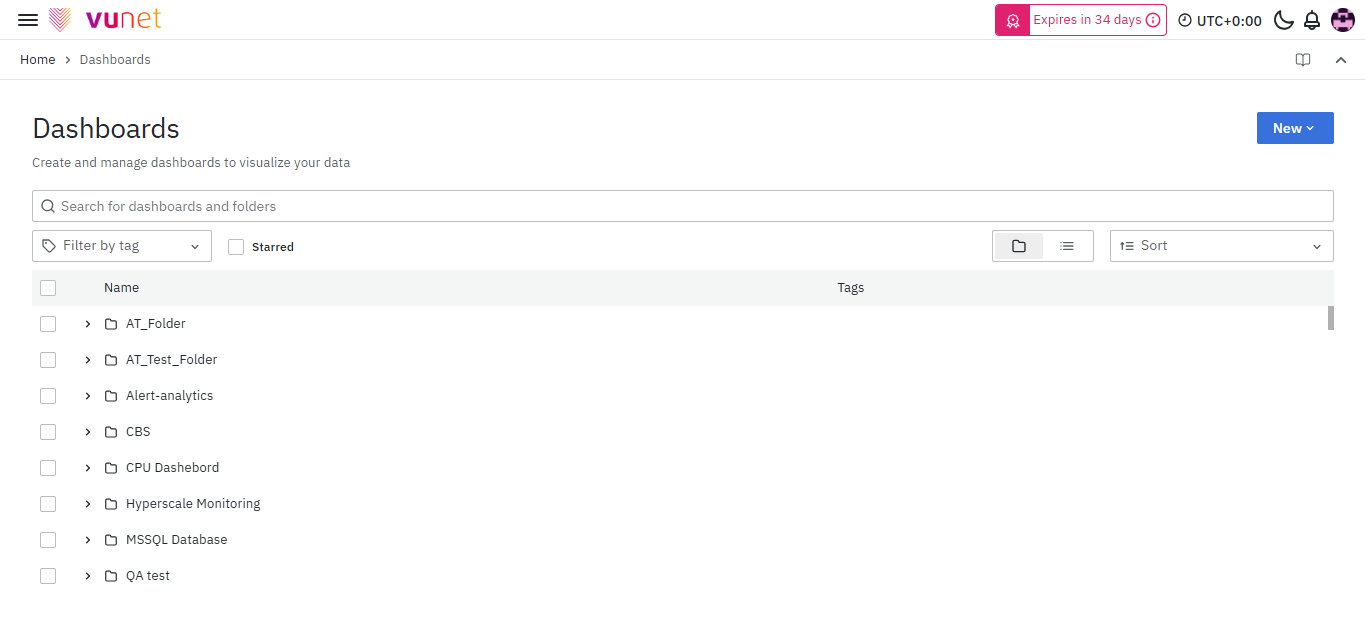
- Click on New -> New Dashboard.
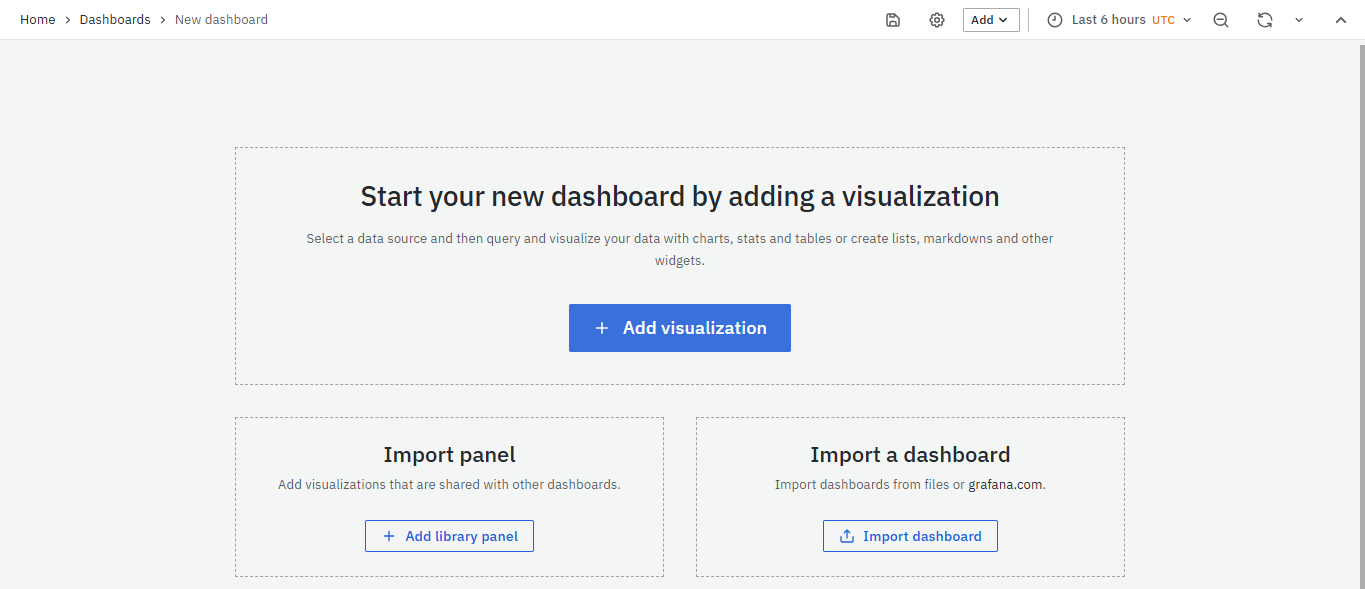
- On clicking you will be directed to the following page. Now, click on the Add visualization.
Now select the Data source.
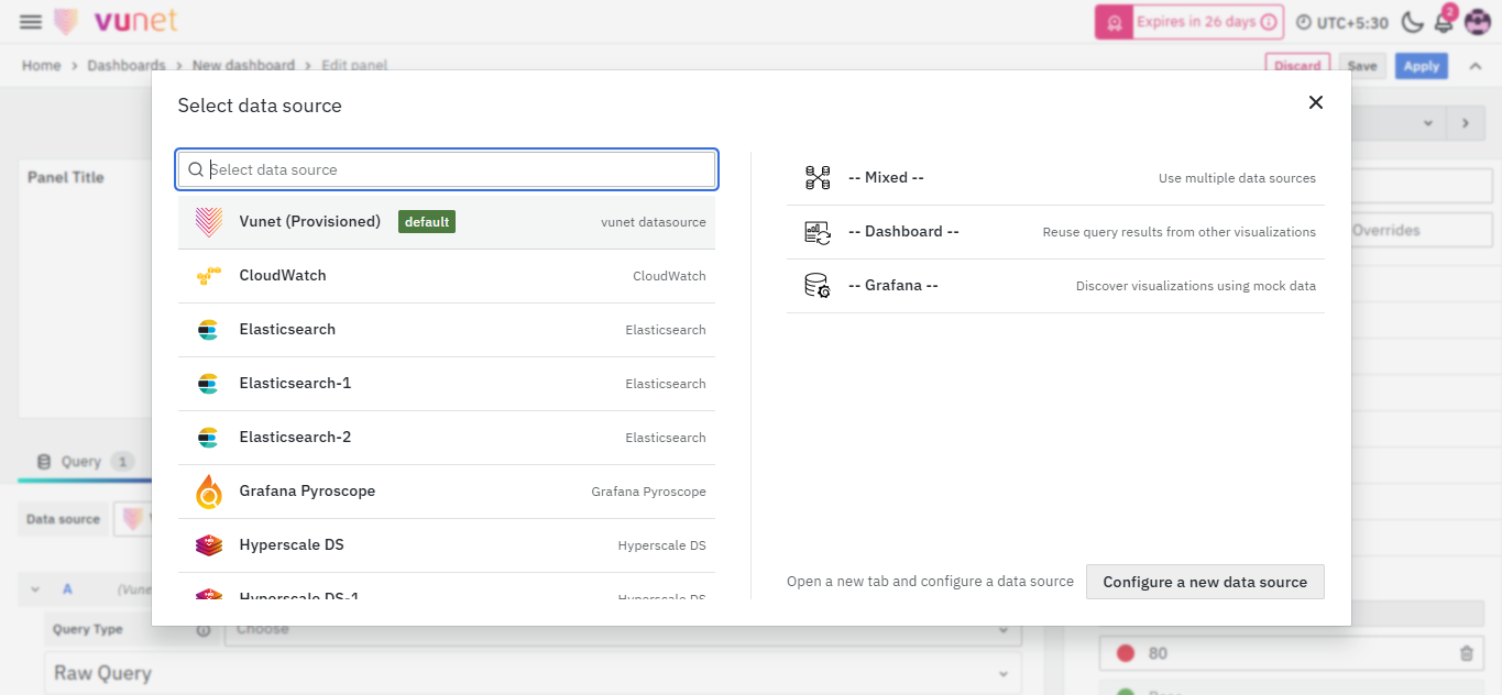
This is the Default Screen that appears when you start creating a new dashboard.
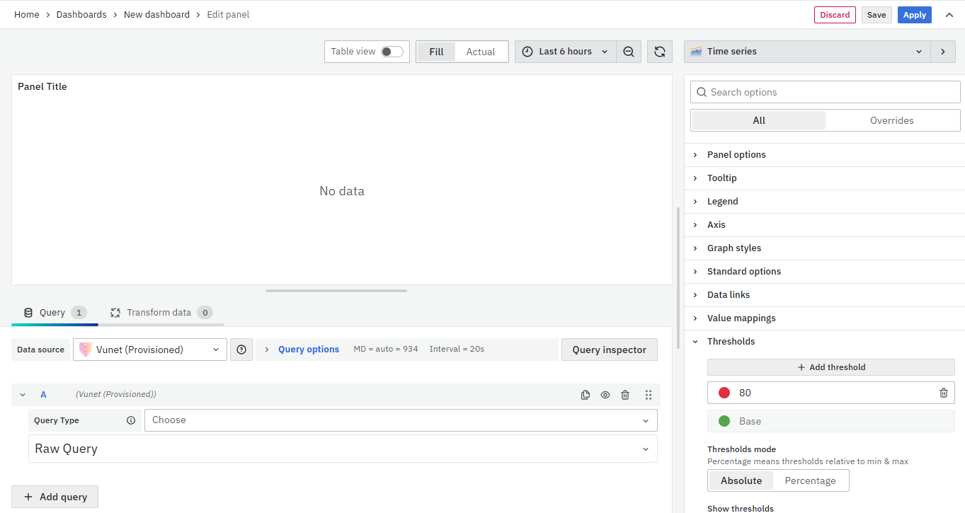
It is divided into 3 sections:
- Visualization
- Visualization Options
- Query
Visualization: The visualization settings, found at the top row of the panel, allow you to customize the graph's visual settings. You can modify the graph layout and change its properties. The graph view options include:
- Table view: On or Off.
- Graph resolution: Fill or Actual.
- Time range selection: Select the time range.
- Time range zoom out: Click to zoom out from the time range.
- Refresh graph: Click to refresh the graph.
Visualization options: Change the graph visual settings. It depends on the type of visualization selected and the options change based on that.
Query: The data source that you add to get the graph output.
Query
Query Selection:
Before exploring visualization options, choose a query as your data source. The query defines what data you'll work with. You can configure and visualize this data through the query settings. You can select multiple queries for visualization.
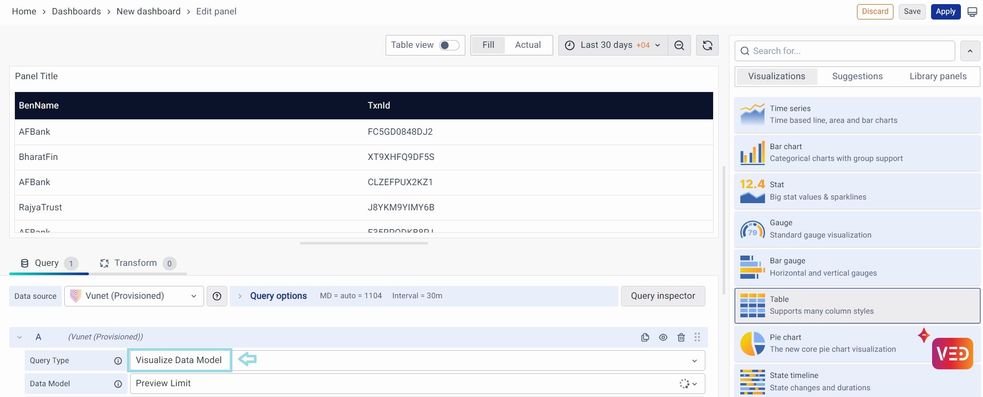
You can directly visualize your Data Model instead of manually adding a query.
- Click on Query Type and choose Visualize Data Model from the drop-down.
- Click on Data Model and choose your Data Model from the drop-down. Example: Preview Limit.
- Choose a visualization from the right column. Example: Table
- Refresh the panel and preview the table.
Metric and Grouping:
- Metric: The data to be represented on the y-axis.
- Group By: The parameter for the x-axis.
Metric Options:
For any query selected, one has to choose a Metric. It is based on the parameter you want to visualize on the y-axis such as count, average, sum, max, etc.
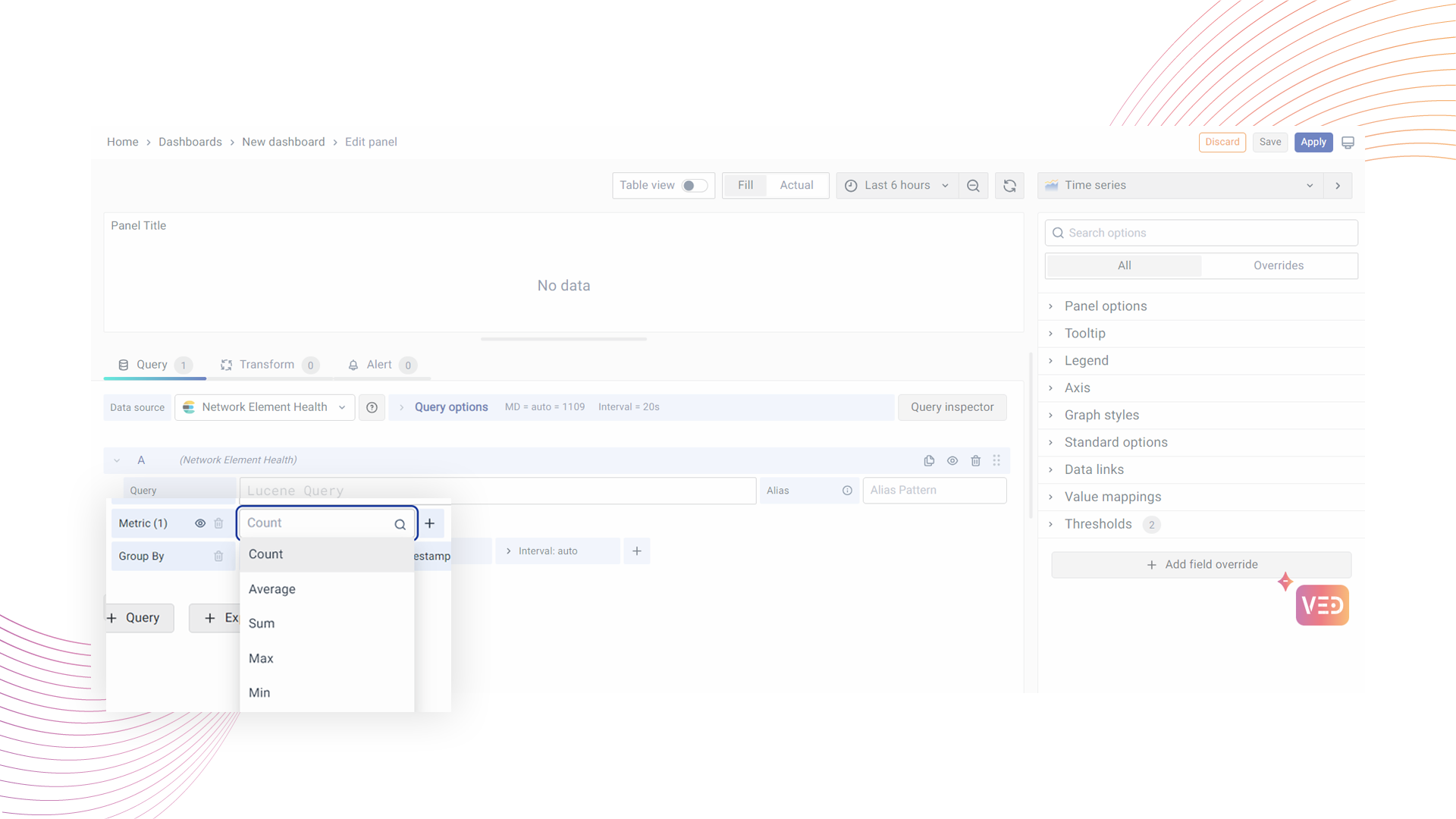
The following are the different types of metric aggregations that can be used as the value on the y-axis.
- Count
- Average
- Sum
- Max
- Min
- Extended Stats
- Percentiles
- Unique
- Raw Document
- Raw Data
- Logs
You can add multiple metrics by clicking the + sign and selecting the type.
Repeat the same for more metrics that you want to add.
Grouping Options:
Choose a Group By parameter. This categorizes data on the x-axis. Common examples are time intervals, like days, months, etc. You can use aggregation types like terms, filters, geo hash grid, date histogram, and histogram. The chosen field and interval define this grouping.
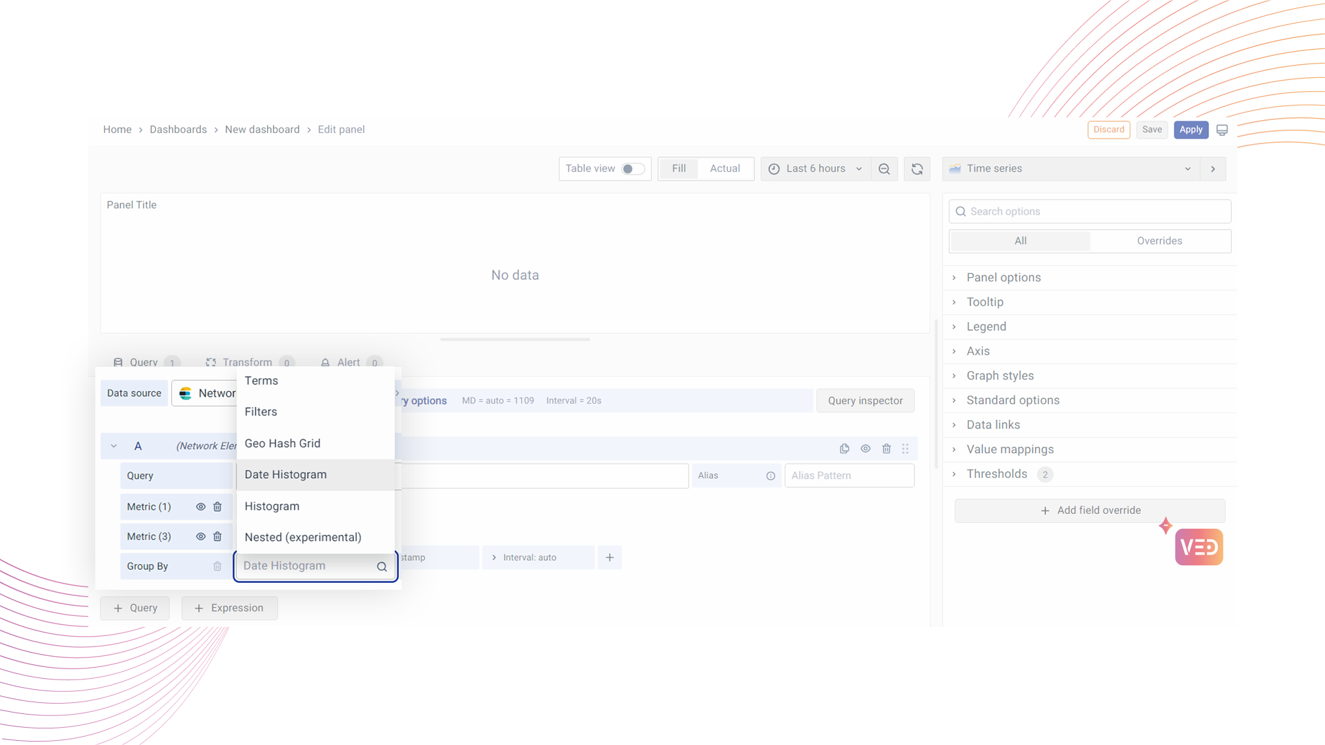
The following are the most commonly used bucket aggregation types:
- Terms: The data is represented by the terms applied.
- Filters: The data is represented as per the filters applied.
- Geo Hash Grid: The data is represented on the scale of geo hash grid coordinates.
- Date Histogram: The data is represented on the scale of time.
- Histogram: The data is represented on the scale of a histogram.
The Field and Interval are selected based on the Group By option. Now the field and interval can be time. Similar to multiple metrics, you can have multiple buckets too. Let’s say you want to see the CPU usage in multiple time settings. It could be in terms of normal time and CPU start time.
Click on the +Query button.
Multiple Queries and Configurations:
You can add more queries, keeping the same metric but changing the "Group By" option. This helps you compare different aspects of your data. You can also create custom labels for metrics and groups.