Business and Operational Storyboard
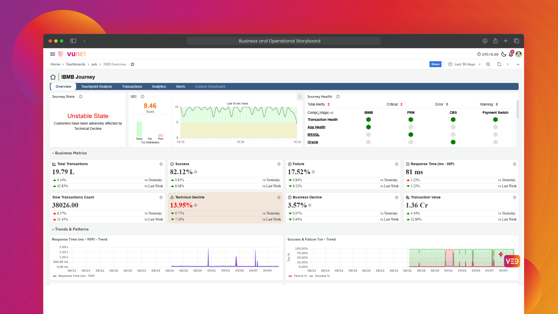
Overview
The Business and Operational Storyboard in vuSmartMaps provides a unified view of business journey performance and the operational health supporting it. Similar to a smartphone health screen, where users can quickly check battery, storage, network status, and performance warnings from one place, the storyboard brings together key business and operational indicators so teams can quickly understand the current state of a payment journey.
It provides visibility into important metrics such as transaction volume, success and failure, response time, technical decline, business decline, transaction value, User Experience Index UEI, touchpoint health, and active alerts. Users can start from the Payment Journey Observability page to identify whether a journey is in a Stable or Unstable state, and then drill down through Overview, Touchpoint Analysis, Transactions, Analytics, and Alerts for further investigation.
Why This Feature Is Useful
A business transaction does not always depend on a single application. It may pass through multiple applications, services, databases, infrastructure components, and downstream systems before it is completed. When a transaction fails or becomes slow, looking at these systems separately can make it difficult to understand where the problem occurred and how it affected the overall business journey.
The Business and Operational Storyboard brings these views together by showing the journey state, UEI, business metrics, infrastructure status, and historical comparisons in one place. Users can then drill down into the affected touchpoint, analyze failures, response codes, response time, transaction types, or hosts, and inspect individual transactions through Transaction Trace when deeper investigation is required.
Example Scenario
A payment operations team is reviewing the IBMB Journey for a selected time range. The team opens the Payment Journey Observability page and checks the journey state and key metrics such as Total Transactions, Technical Decline, Response Time, and UEI.
If an issue is observed, the team opens the Overview storyboard to review Business Metrics, Trends & Patterns, and the End-to-End Transaction Journey Flow. They can then move to the affected touchpoint and use Failure Analysis or Response Time Analysis to identify the relevant response code, transaction type, host, or failed touchpoint.
For deeper analysis, the team can select the corresponding Request UUID or Trace ID and open Transaction Trace to review the transaction flow and logs across touchpoints.
When to Use This Feature
Use the Business and Operational Storyboard when you need to:
- Monitor business journey health: Check whether journeys such as IBMB, UPI, BBPS, or Corporate Banking are in a Stable or Unstable state.
- Analyze transaction performance: Review transaction volume, success, failure, response time, Technical Decline, Business Decline, and UEI.
- Identify affected touchpoints: Understand which application or downstream touchpoint is contributing to failures or increased response time.
- Investigate failures and slow transactions: Analyze response codes, transaction types, host IPs, and failed touchpoints.
- Perform transaction-level analysis: Use Request UUID or Trace ID to review the transaction flow and logs through Transaction Trace.
- Analyze transaction patterns over time: Use Analytics to identify peak and least transaction hours, compare hourly and daily transaction volume and value, and analyze Success and Failure patterns across transaction categories and transaction types.
- Review operational impact: Correlate journey performance with infrastructure health and active alerts.

Comprehensive Understanding
Dashboard Filters
The dashboards provide filter options at the top of the page to narrow the displayed information based on the required analysis. Depending on the selected dashboard, users can filter the data using available fields such as Micro Journey, Response Code, Host IP, Application Name, or Component Name.
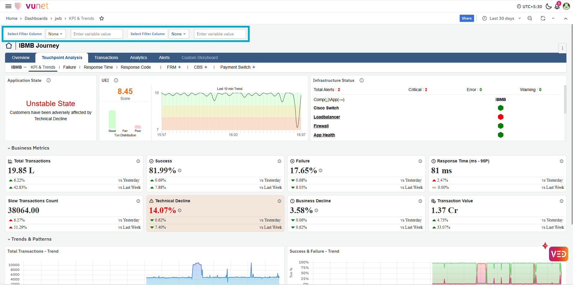
Select the required filter field and specify or select the corresponding value to focus the dashboard on the relevant data. Where multiple filter options are available, they can be used to further narrow the analysis. The available filters may vary depending on the selected storyboard or analysis page.
Payment Journey Observability
The Payment Journey Observability page provides a summary of the available business journeys. Each journey is displayed as a separate card, allowing users to compare the current state of multiple journeys without opening them individually.
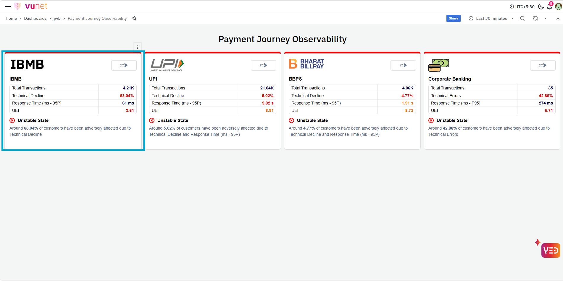
Depending on the journey, the card displays key indicators such as:
- Total Transactions: Shows the transaction volume processed by the journey.
- Technical Decline: Indicates transactions affected by technical issues.
- Response Time (ms - 95P): Shows the 95th-percentile response time for the journey.
- UEI: Provides the User Experience Index for the journey.
Each card also displays the journey state. A green indication represents a Stable State, while a red indication identifies an Unstable State. A short description below the state provides context about the journey performance or the indicators adversely affecting customers. Click the arrow available on a journey card to open the detailed storyboards for that journey.
JWB Overview
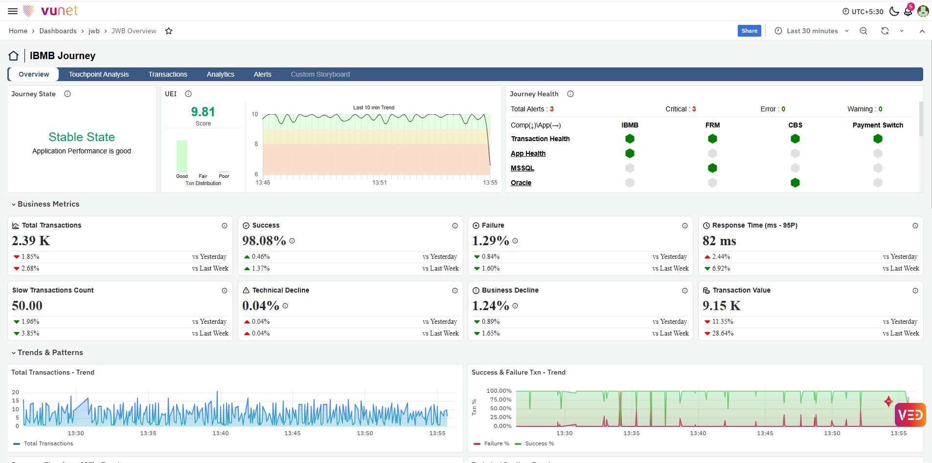
The Overview storyboard provides the overall health and performance of the selected journey. It combines journey state, user experience, infrastructure health, business metrics, performance trends, downstream touchpoint information, micro-journey metrics, host-level KPIs, and the Unified Transaction Map.
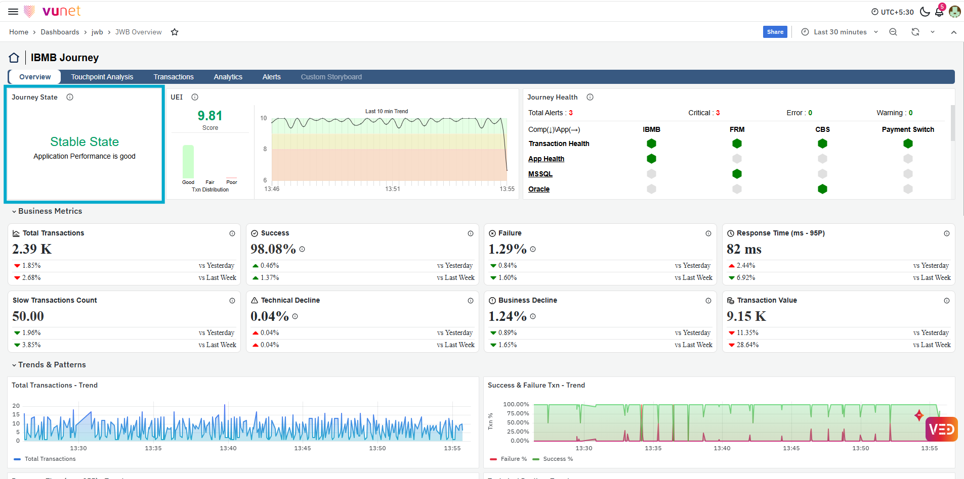
The first panel shows the Journey State, which provides an immediate indication of whether the selected journey is operating normally or requires attention. A Stable State indicates that the journey is performing within the expected conditions. When leading performance indicators are affected, the journey can move to an Unstable State, helping users quickly recognize that the journey requires further analysis.
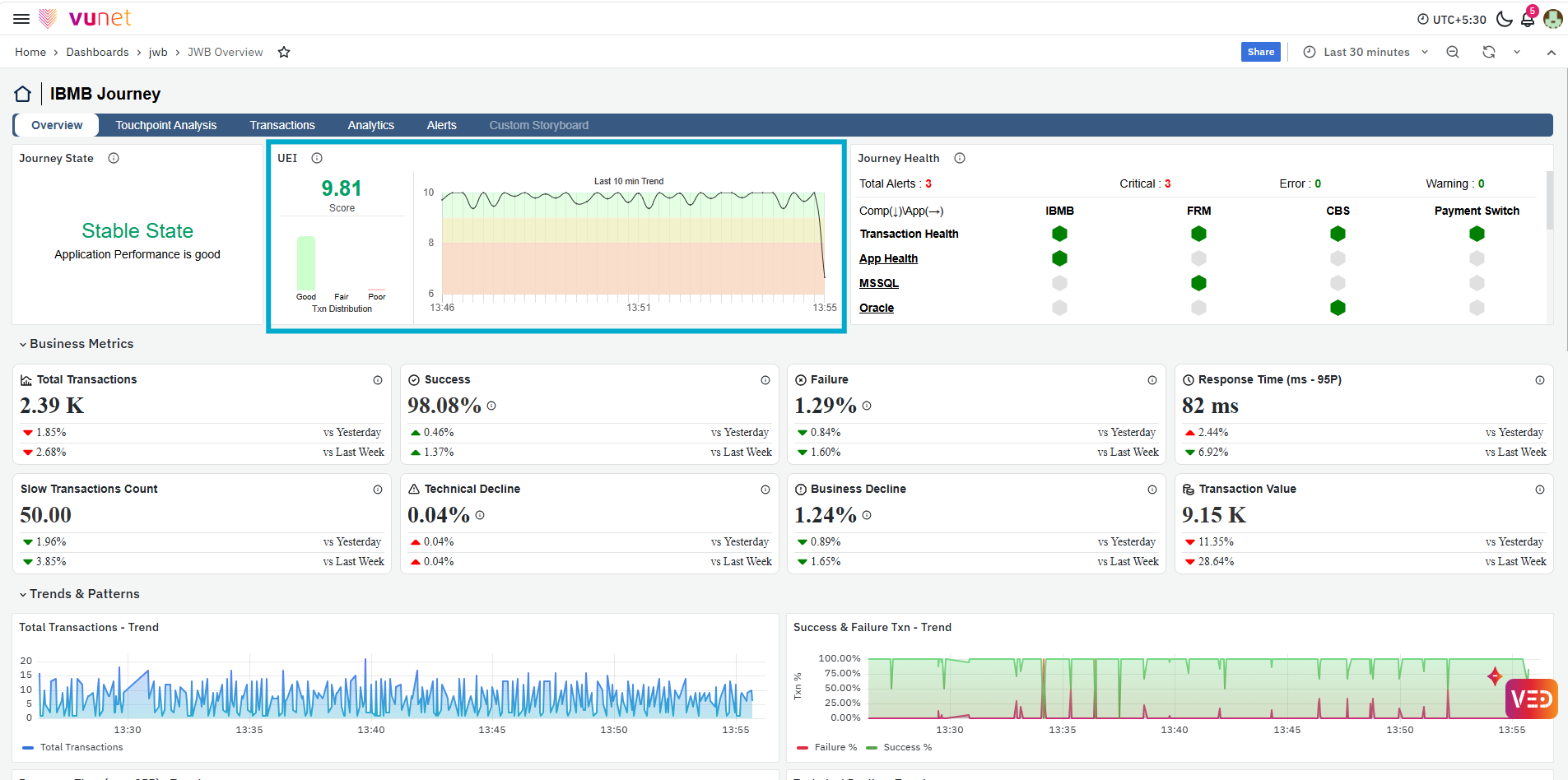
Next, the UEI panel provides the User Experience Index for the journey based on the last 10 minutes. The score is accompanied by the transaction distribution and Last 10 min Trend, helping users understand the current user experience and its recent behavior. The UEI therefore acts as a high-level indicator before users move into individual business or operational metrics.
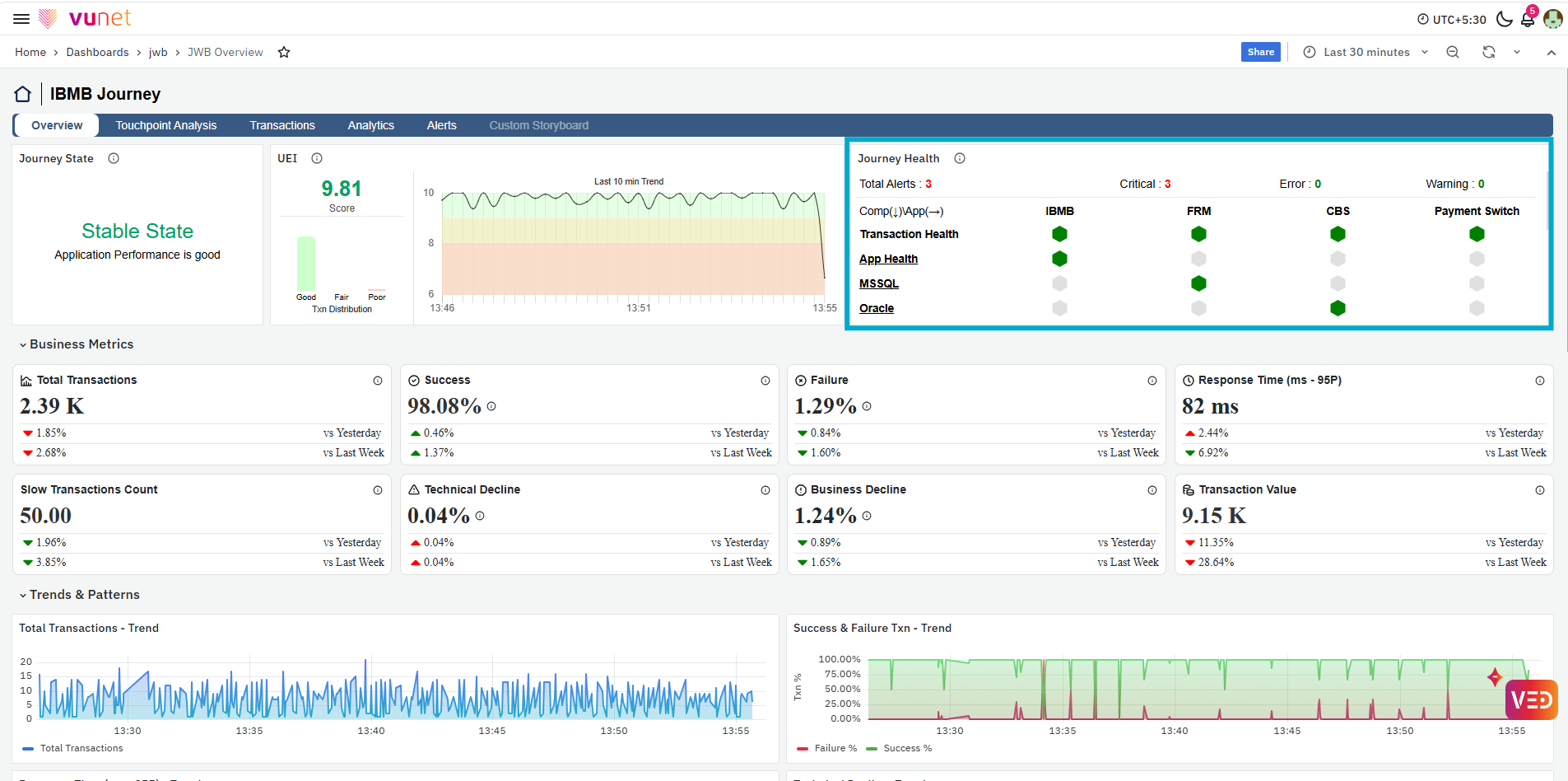
The next panel, Journey Health, provides a component-level view of the operational health supporting each touchpoint in the journey. The panel displays the total number of alerts and their severity, such as Critical, Error, and Warning. Components are arranged against the journey touchpoints, allowing users to identify which component and touchpoint may require attention. This helps connect a business journey issue with the health of its supporting operational components.
Business Metrics
The Business Metrics section provides the important transaction and performance indicators for the selected journey. It displays Total Transactions to show the transaction volume processed during the selected time range, while Success and Failure indicate the percentage of successful and failed transactions. Response Time (ms - 95P) provides the 95th-percentile transaction response time, and Slow Transactions Count shows the number of transactions identified as slow.
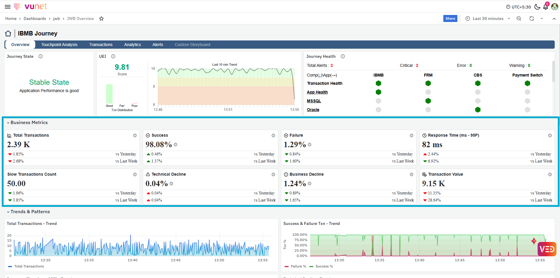
Technical Decline and Business Decline help users understand whether transaction declines are associated with technical or business conditions, while Transaction Value shows the value of transactions processed during the selected period. Each metric also provides a comparison against Yesterday and Last Week, helping users identify changes or anomalies in the current journey performance.
Trends & Patterns
The Trends & Patterns section displays important journey metrics over time. Instead of relying only on the current value, users can observe when changes occurred and whether the behavior is temporary or continuing.
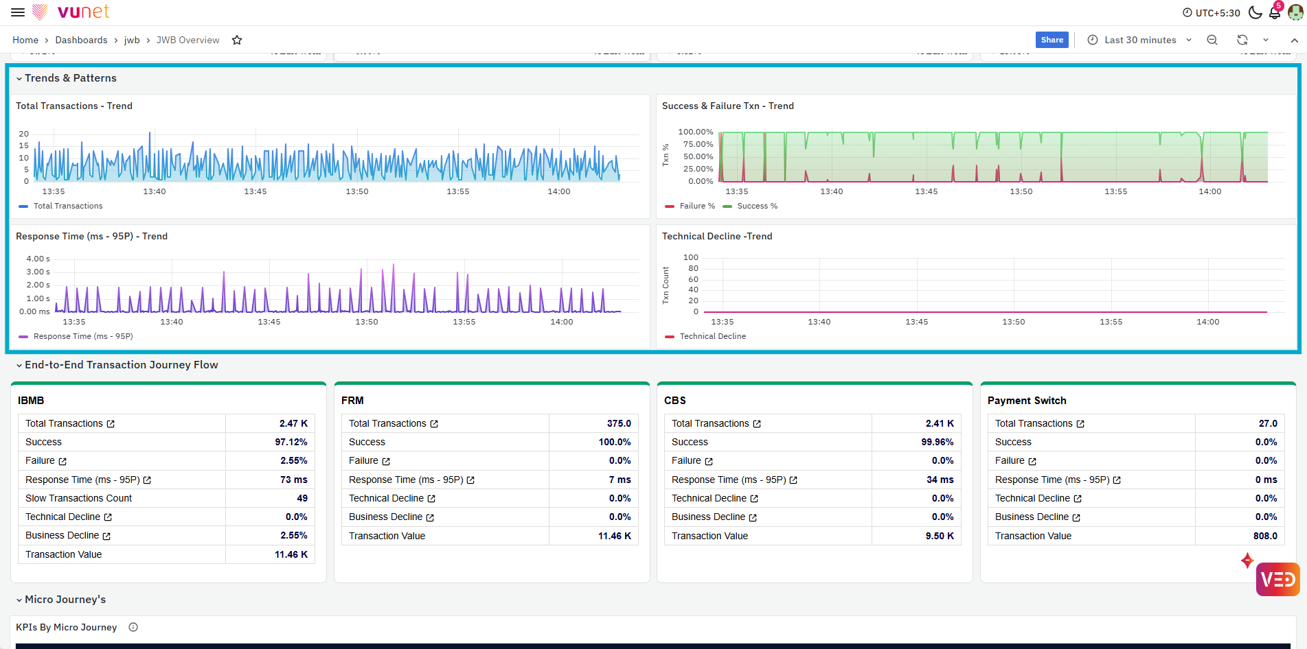
The available trends include:
- Response Time (ms - 95P) - Trend
- Success & Failure Txn - Trend
- Total Transactions - Trend
- Technical Decline - Trend
These panels help correlate changes across metrics. For example, an increase in Technical Decline can be compared with transaction volume and response-time behavior during the same period.
End-to-End Transaction Journey Flow
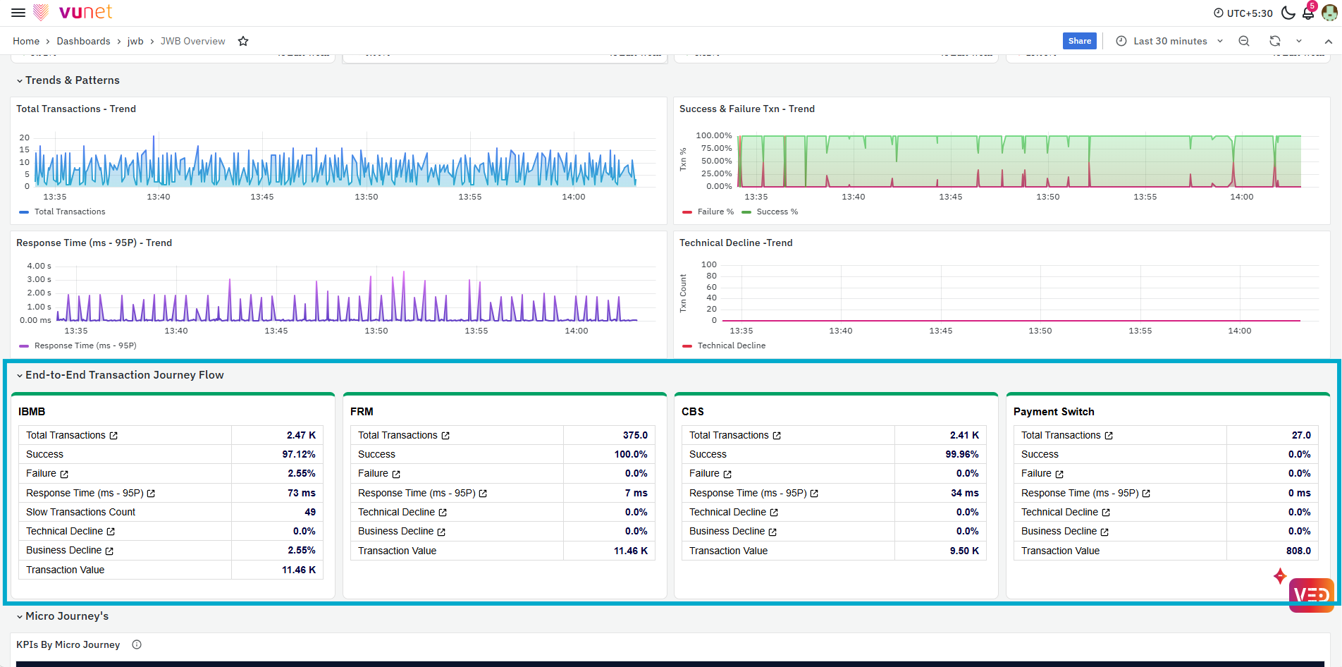
The End-to-End Transaction Journey Flow breaks the journey into its individual touchpoints. For the IBMB Journey, this can include touchpoints such as IBMB, FRM, CBS, and Payment Switch. Each touchpoint displays transaction KPIs such as Total Transactions, Success, Failure, Response Time, Slow Transactions Count, Technical Decline, Business Decline, and Transaction Value. This view helps users determine whether a problem is present across the complete journey or concentrated at a particular downstream touchpoint.
Micro Journeys
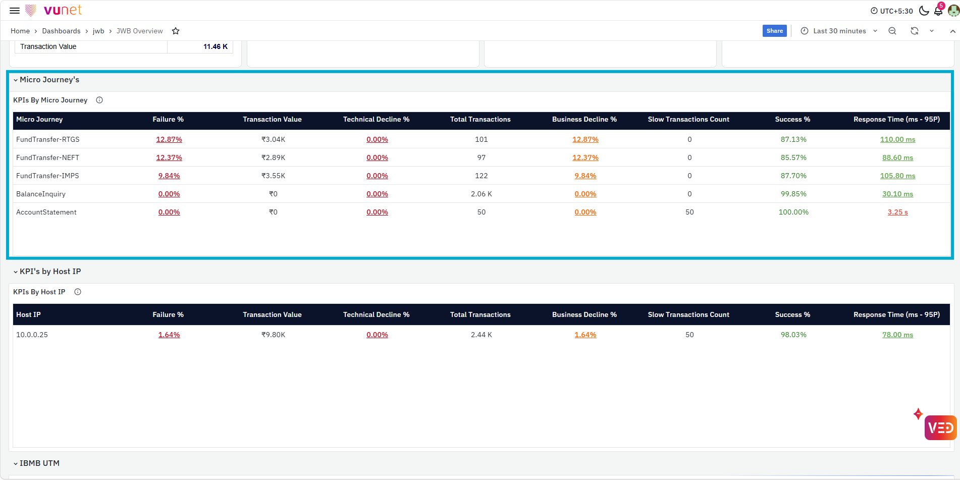
The KPIs By Micro Journey table breaks the overall journey into individual transaction flows or micro journeys. For each micro journey, users can review metrics such as Failure %, Transaction Value, Technical Decline %, Total Transactions, Business Decline %, Slow Transactions Count, Success %, and Response Time (95P). This helps identify whether a particular transaction type is contributing disproportionately to failures, declines, or response-time issues.
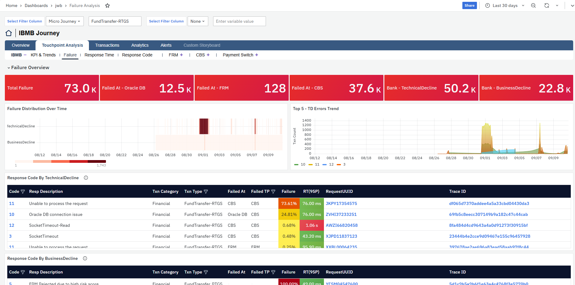
The Failure %, Technical Decline %, and Business Decline % values are clickable. Selecting any of these values opens the Failure page under Touchpoint Analysis for the selected micro journey, allowing users to investigate the corresponding failure details. For more details on failure and response-time analysis, refer to the Touchpoint Analysis section.
Similarly, the Response Time (ms - 95P) value is clickable and opens the Response Time page under Touchpoint Analysis, where users can further analyze the response-time behavior for that micro journey. For more details on failure and response-time analysis, refer to the Touchpoint Analysis section.
KPIs By Host IP
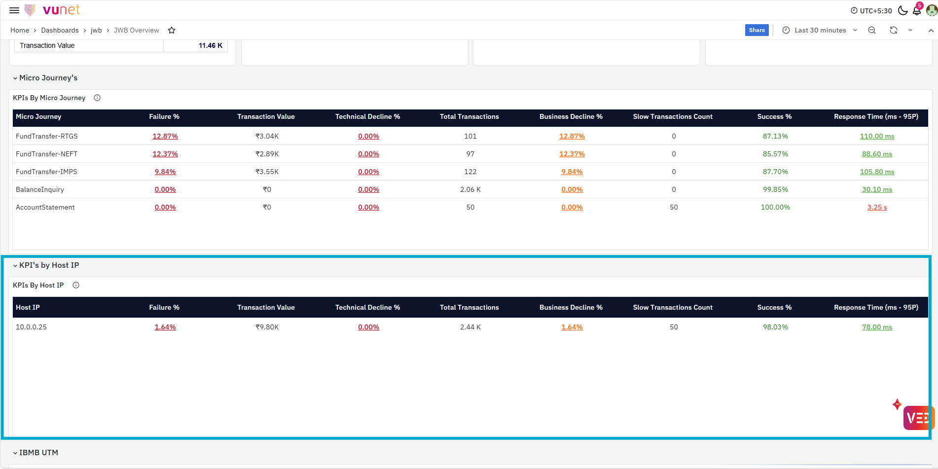
The KPIs By Host IP table provides business and performance metrics for each host participating in the journey. It includes Failure %, Transaction Value, Technical Decline %, Total Transactions, Business Decline %, Slow Transactions Count, Success %, and Response Time (ms - 95P). This helps users compare host-level performance and identify whether failures, declines, slow transactions, or response-time issues are concentrated on a specific host instead of affecting the complete journey.
Similar to the KPIs By Micro Journey table, the Failure %, Technical Decline %, Business Decline %, and Response Time (ms - 95P) values support drill-down analysis from the KPIs By Host IP table. For details on these drill-downs, refer to the Micro Journeys section.
UTM
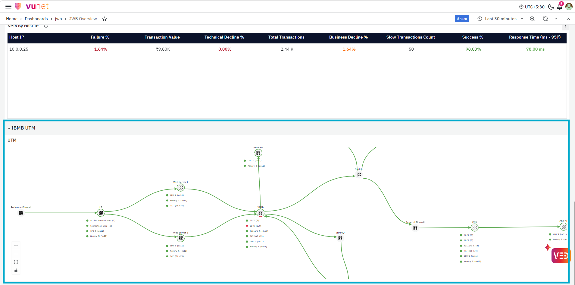
The UTM provides a visual representation of the end-to-end transaction journey and the relationships between the systems participating at different stages. It helps users understand how the journey components are connected and supports transaction tracking and troubleshooting across the journey from initiation to completion.
Touchpoint Analysis Storyboard
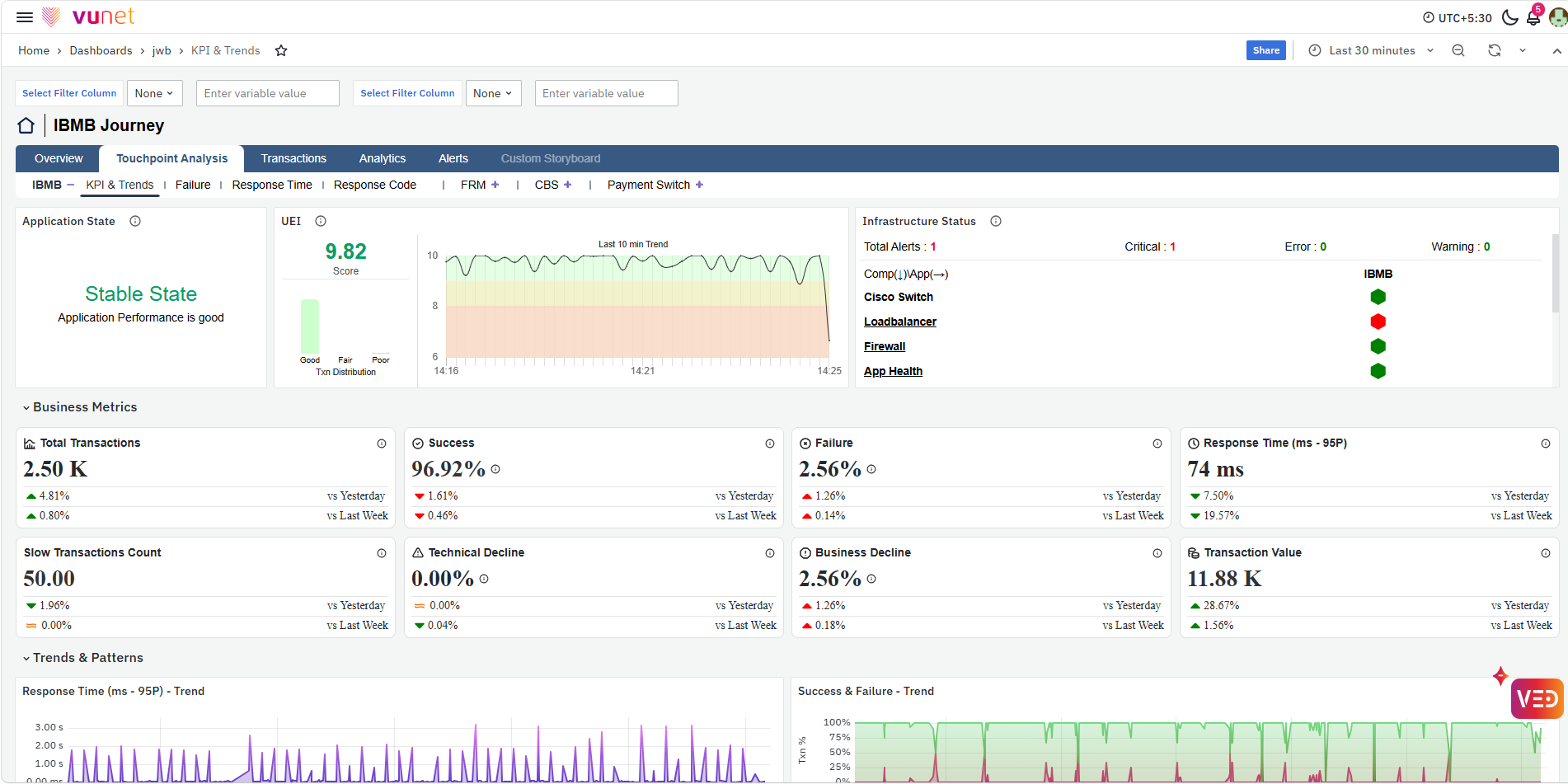
The Touchpoint Analysis storyboard provides a detailed view of the performance of individual touchpoints within the selected journey. For the IBMB Journey, users can analyze touchpoints such as IBMB, FRM, CBS, and Payment Switch and move from the overall journey view to the specific touchpoint requiring attention. The available views include KPI & Trends, Failure, Response Time, and Response Code, helping users analyze transaction performance, failures, response-time behavior, and response-code patterns at the touchpoint level.
KPI & Trends
The KPI & Trends Page provides an in-depth view of the selected touchpoint using its key business and operational indicators. It helps users understand the current performance of the touchpoint and determine whether further failure or response-time analysis is required.
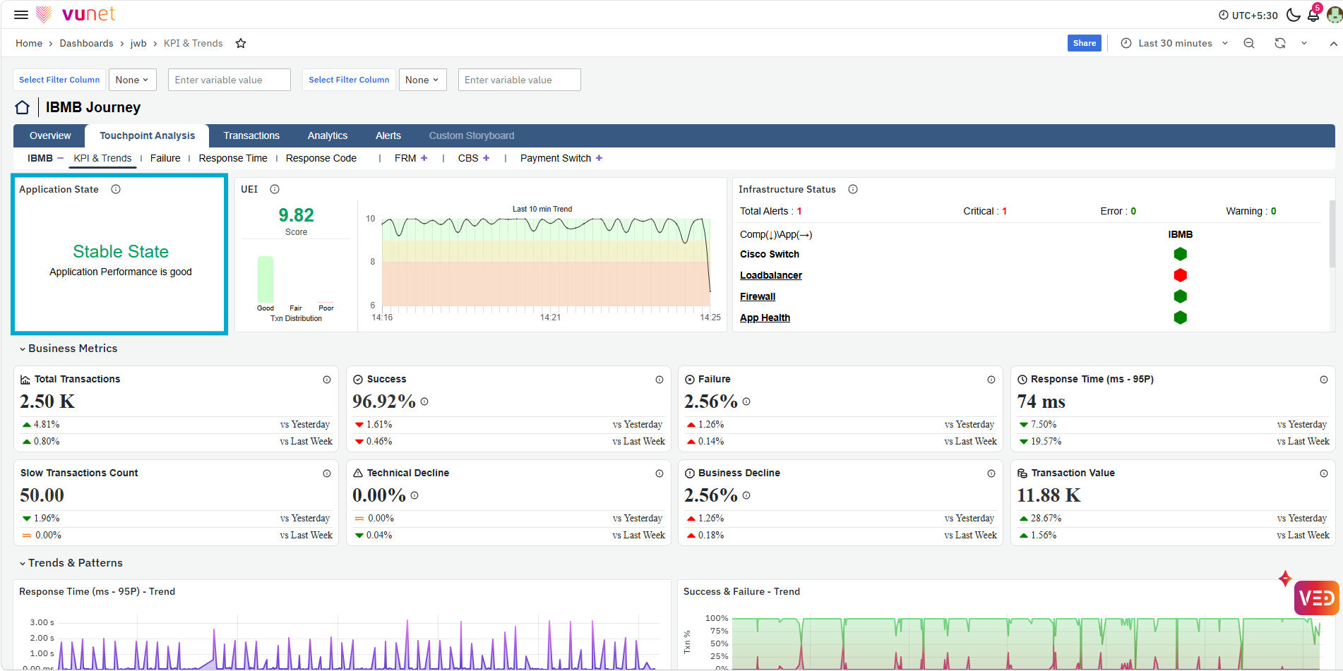
The first panel shows the Application State, which indicates whether the selected touchpoint is in a Stable State or Unstable State. It provides a quick indication of the current application performance and helps users identify whether the touchpoint requires further attention.
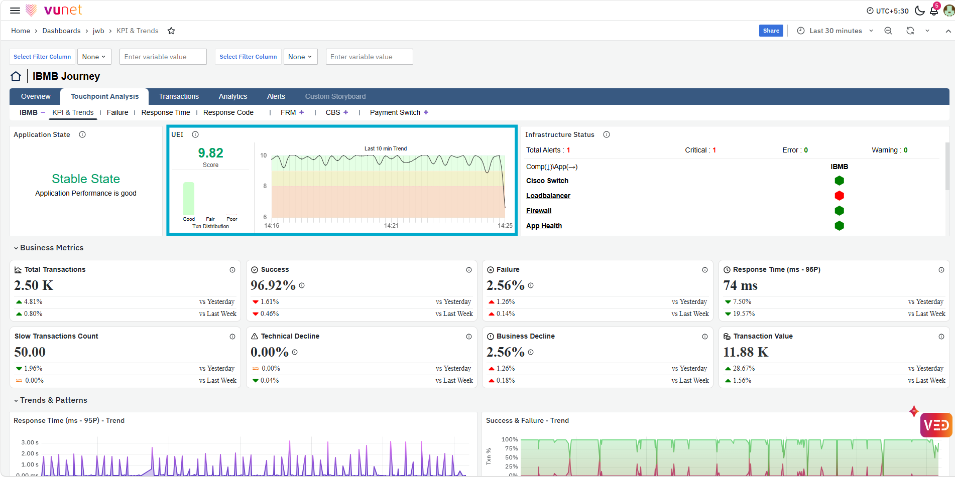
Next, the UEI panel provides the User Experience Index for the selected touchpoint. It displays the UEI score together with the transaction distribution and Last 10 min Trend, helping users understand the overall user experience and its recent behavior.
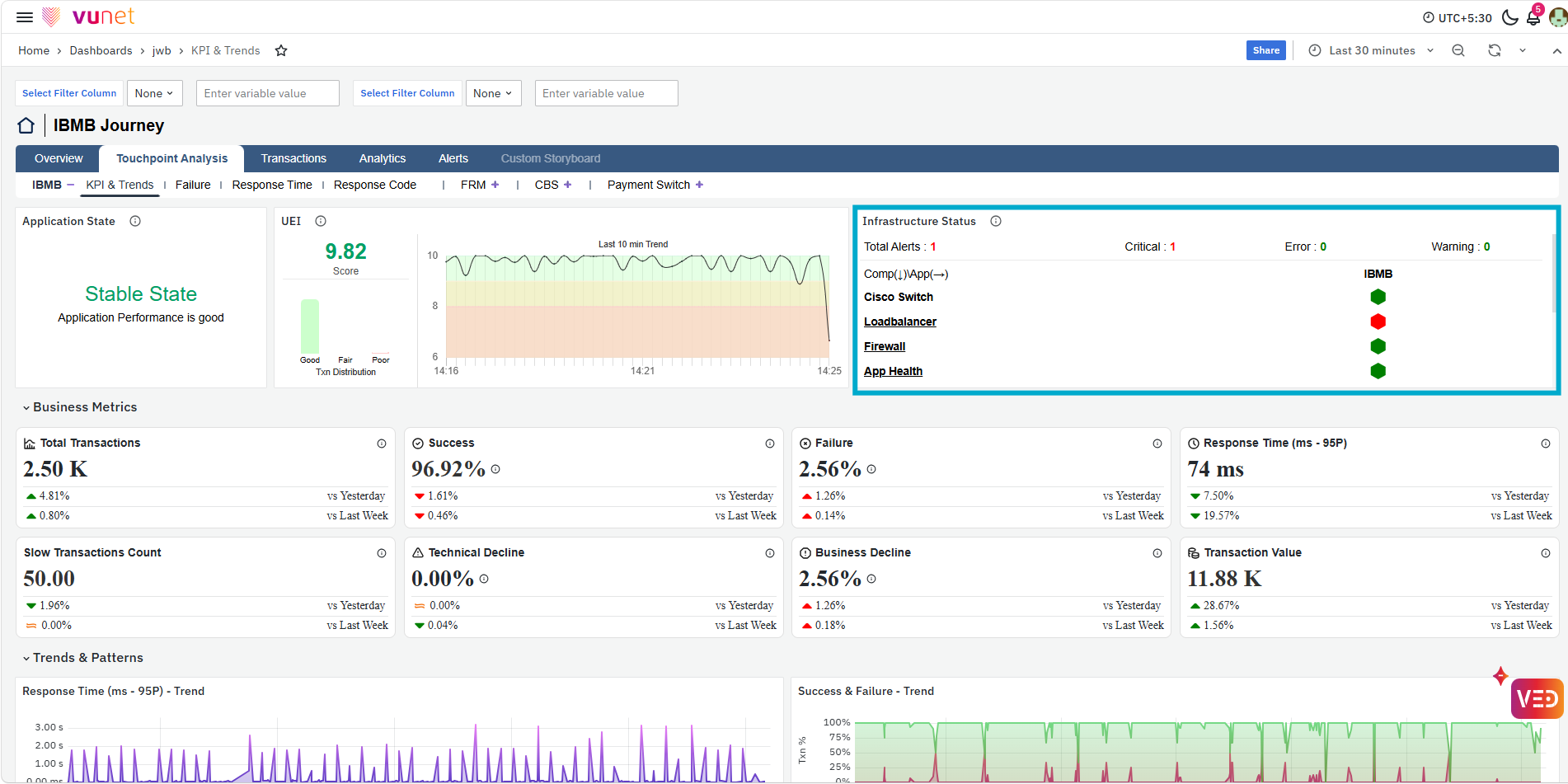
The Infrastructure Status panel provides the health of the infrastructure components supporting the selected touchpoint. It displays the total number of alerts along with Critical, Error, and Warning counts and shows the status of components such as switches, load balancers, firewalls, and application health. This helps users determine whether an application performance issue is associated with the supporting infrastructure.
Business Metrics
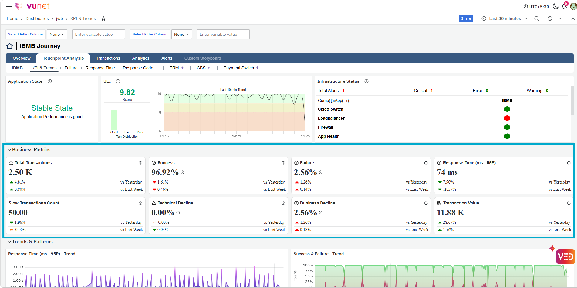
The Business Metrics section provides the important transaction and performance indicators for the selected touchpoint. It includes Total Transactions, Success, Failure, Response Time (ms - 95P), Slow Transactions Count, Technical Decline, Business Decline, and Transaction Value. Each metric also provides a comparison against Yesterday and Last Week, helping users understand whether the current touchpoint performance has changed compared with previous periods.
Trends & Patterns
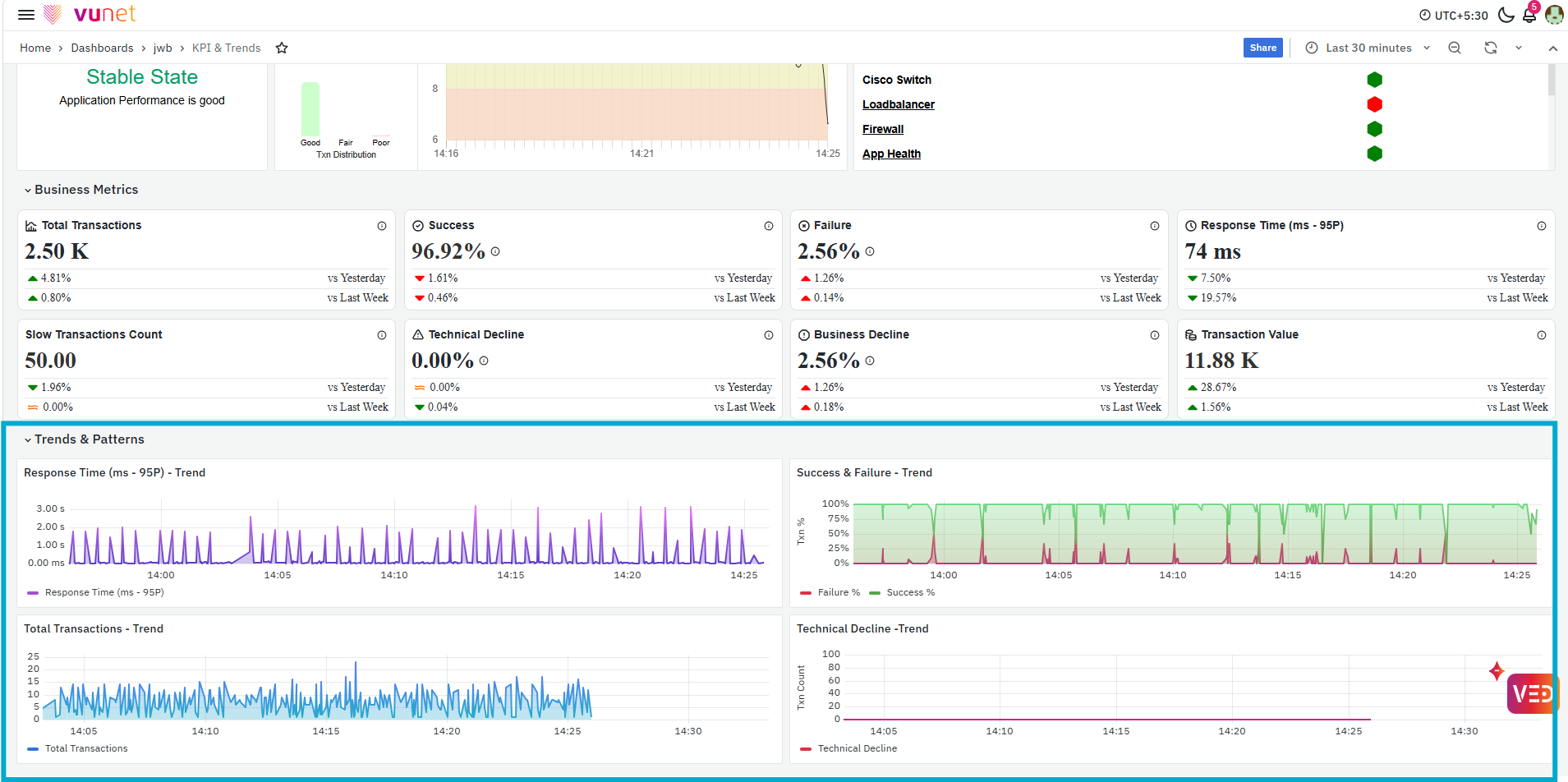
The Trends & Patterns section shows how the key touchpoint metrics change over the selected time range. It includes Total Transactions - Trend, Success & Failure - Trend, Response Time (ms - 95P) - Trend, and Technical Decline - Trend. These trends help users identify when a change occurred and correlate transaction volume, failures, response time, and Technical Decline to understand the current performance pattern.
Failure
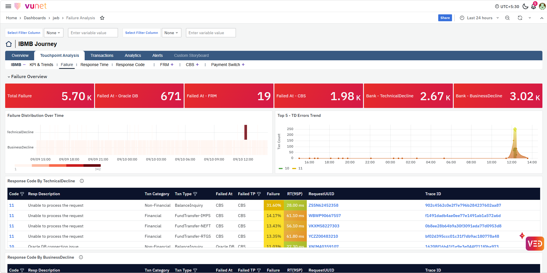
The Failure Page provides a detailed view of transaction failures for the selected touchpoint. It helps users understand the failure type, where the failure occurred, the affected transaction or micro journey, and whether the failure is associated with a technical issue or a business condition.
Failure Overview
The Failure Overview provides a quick summary of the failures observed during the selected time range. Total Failure shows the overall failure count, while the Failed At cards show where failures were identified, such as FRM, CBS, or a supporting database. The Bank - TechnicalDecline and Bank - BusinessDecline cards separate failures based on their category, helping users quickly understand the main contributors to the overall failure count.
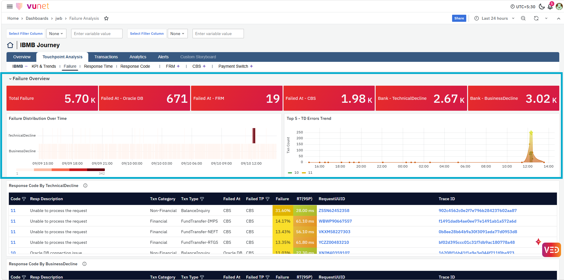
The Failure Distribution Over Time shows how Technical Decline and Business Decline failures are distributed across the selected period, helping users identify periods with higher failure activity. The Top 5 - TD Errors Trend shows the trend of the leading Technical Decline response codes and helps determine which technical errors are contributing most to the observed failures.
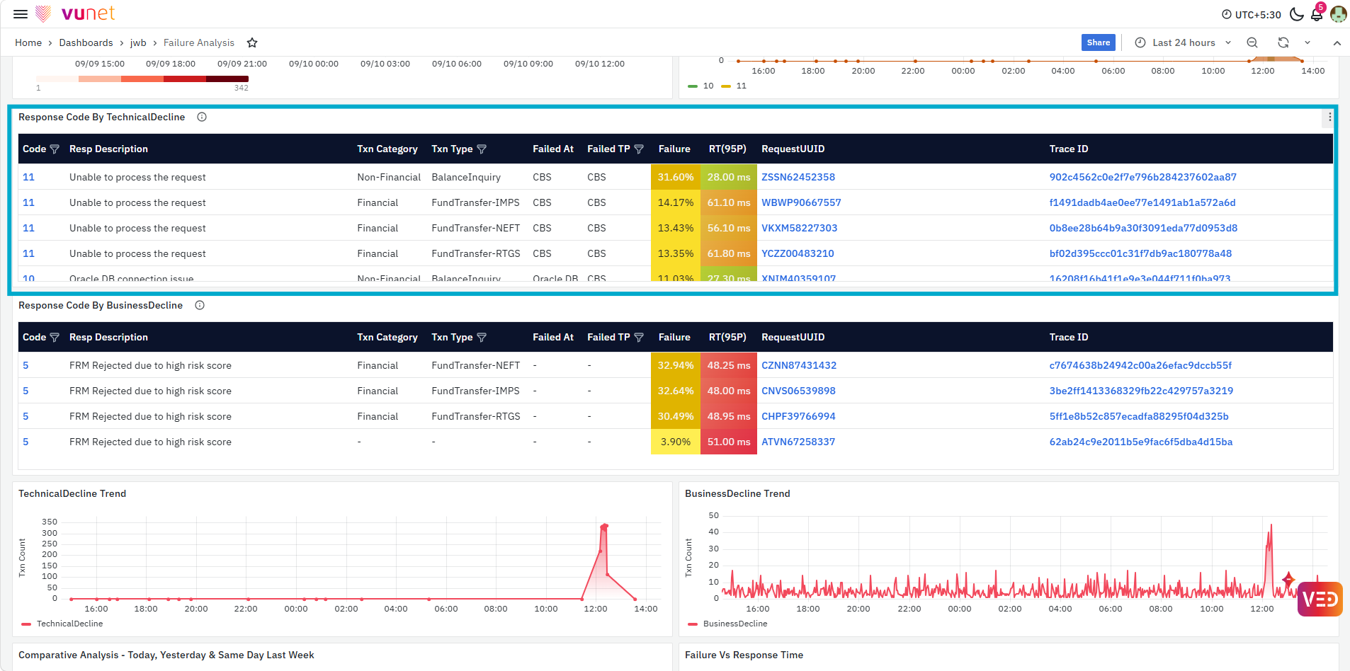
The Response Code By TechnicalDecline table provides response-code-level details for Technical Decline failures. It displays information such as Code, Response Description, Transaction Category, Transaction Type, Failed At, Failed Touchpoint, Failure, Response Time (95P), Request UUID, and Trace ID. This helps users identify the response codes contributing to technical failures and provides sample transactions that can be used for deeper investigation.
The Code value is clickable. Selecting a code opens the Response Code page in Touchpoint Analysis, where users can review detailed trends and analysis for the selected response code. For more details, refer to the Response Code section.
The Request UUID is clickable and opens Transaction Trace in the Transactions page, allowing users to review the selected transaction across the journey touchpoints. For more details, refer to the Transaction Trace section.
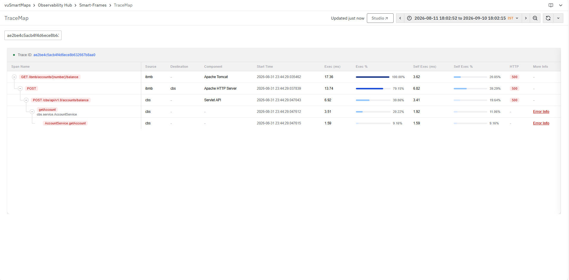
The Trace ID is also clickable and opens the Trace Map SmartFrame, providing further trace-level analysis for the selected transaction. For more details, refer to the Trace Map section.
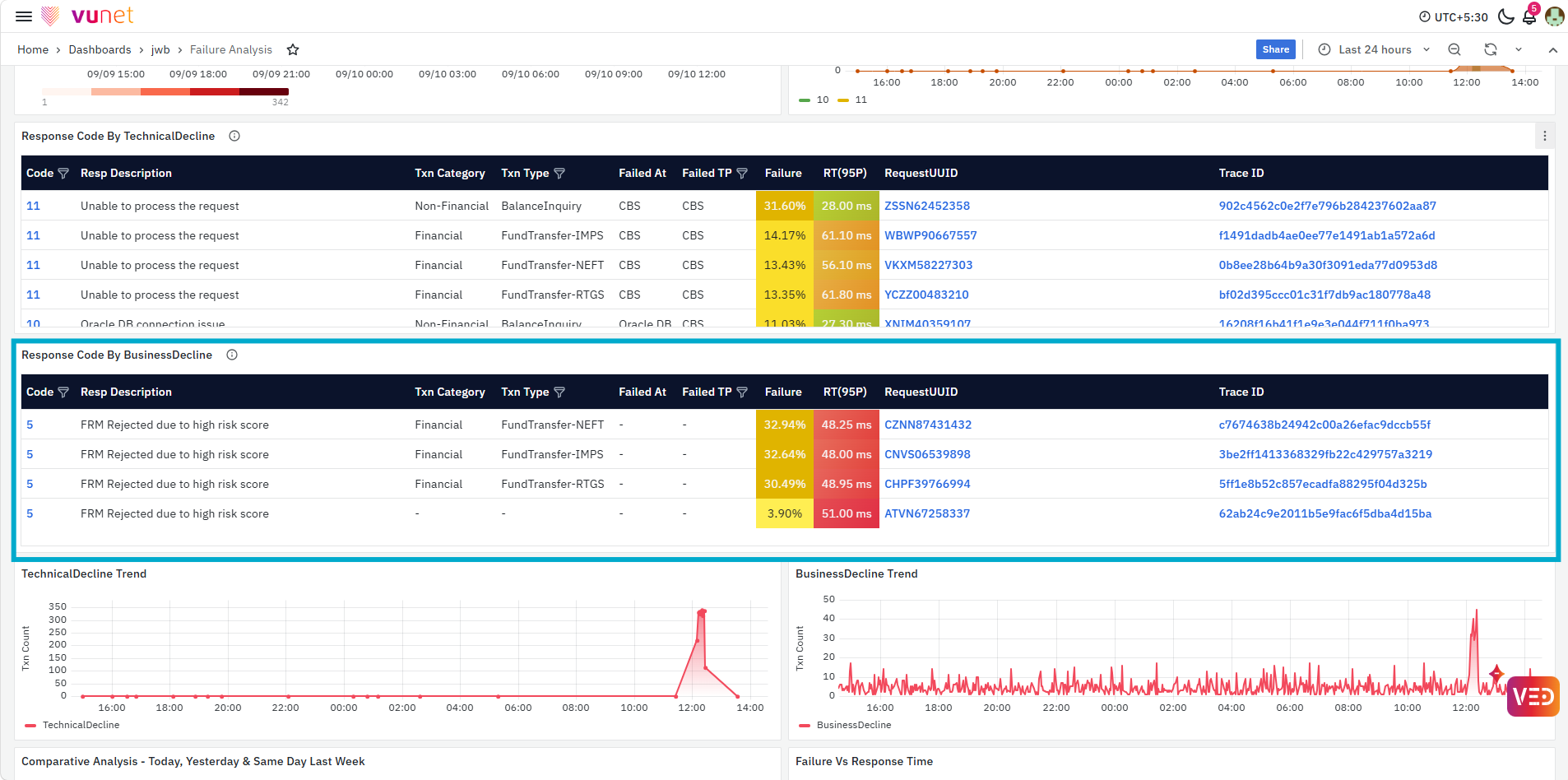
The Response Code By BusinessDecline table provides the corresponding response-code analysis for Business Decline transactions. It helps users identify the business response codes, affected transaction categories and transaction types, failure contribution, response time, and sample Request UUIDs and Trace IDs associated with those declines.
The Code value is clickable. Selecting a code opens the Response Code page in Touchpoint Analysis, where users can review detailed trends and analysis for the selected response code. For more details, refer to the Response Code section.
Request UUID and Trace ID support the same transaction and trace-level drill-downs described earlier. For details, refer to the Transactions section.
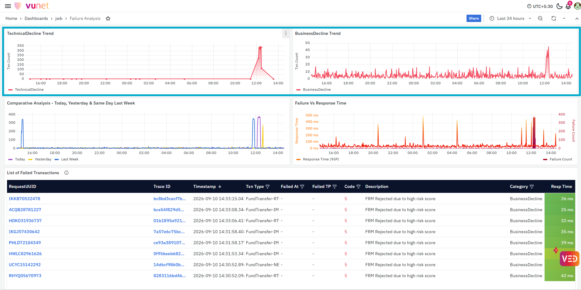
The TechnicalDecline Trend and BusinessDecline Trend panels show how the two failure categories change over time. These trends help users determine when a particular type of decline increased and whether the behavior is temporary or continuing.
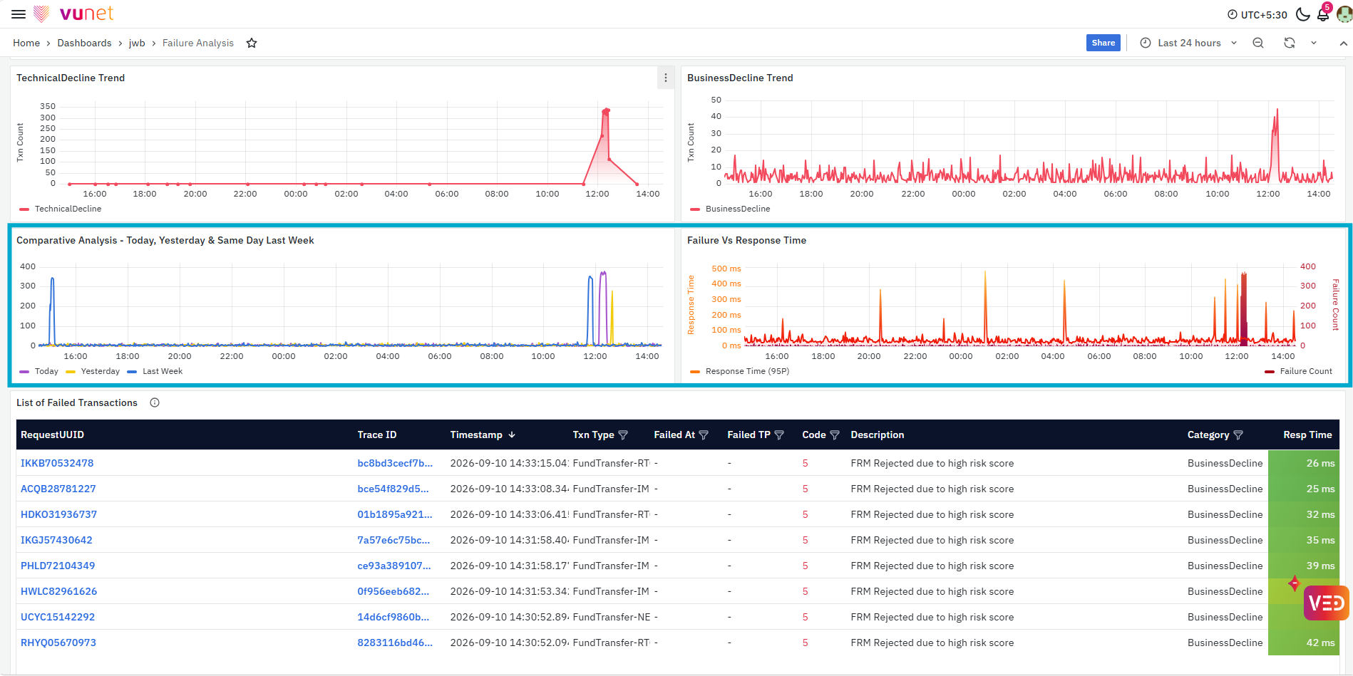
The Comparative Analysis - Today, Yesterday & Same Day Last Week panel provides historical context by comparing current failure behavior with previous periods. The Failure Vs Response Time panel compares the failure count with the 95P response time, helping users determine whether an increase in failures is occurring along with a change in transaction response time. Historical comparison is also identified in the developer manual as a way to detect changes in failure patterns.
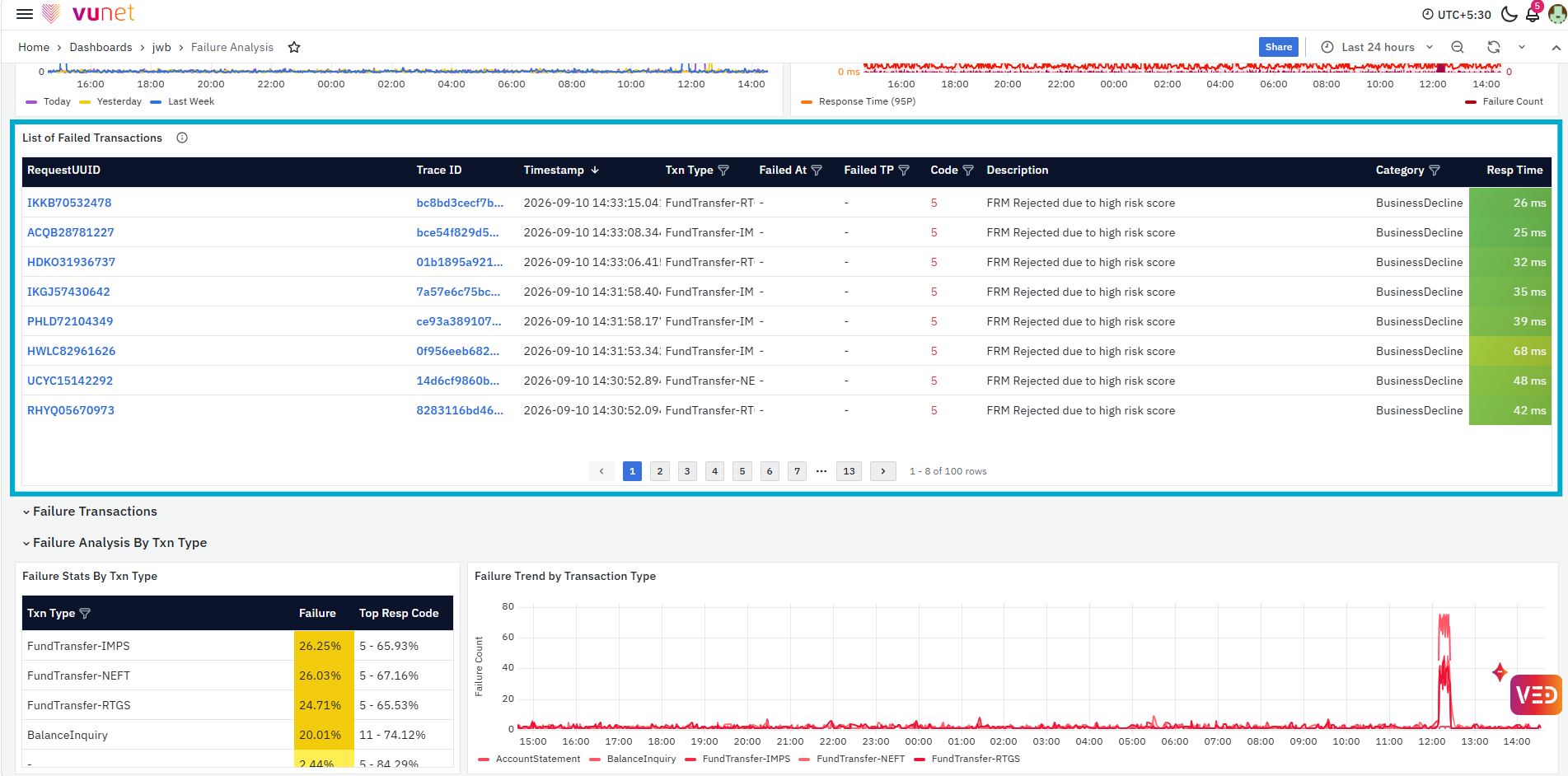
The List of Failed Transactions provides individual failed transaction details, including Request UUID, Trace ID, Timestamp, Transaction Type, Failed At, Failed Touchpoint, Response Code, Description, Category, and Response Time. This allows users to move from the overall failure pattern to the transactions affected by the issue.
Request UUID and Trace ID support the same transaction and trace-level drill-downs described earlier. For details, refer to the Transactions section.
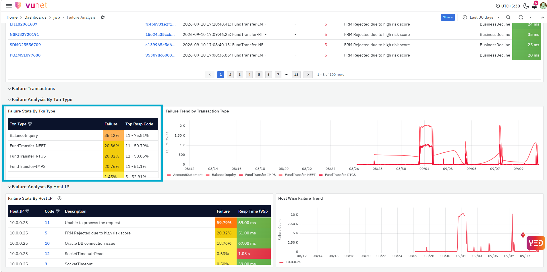
The Failure Analysis By Txn Type section shows how failures are distributed across different transaction types. The Failure Stats By Txn Type table displays the transaction type, its failure percentage, and the top response code contributing to the failures. This helps users identify which transaction types are most affected and which response code is the main contributor for each one.
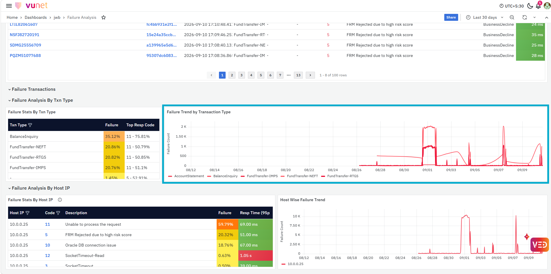
The Failure Trend by Transaction Type panel shows how the failure count for each transaction type changes over the selected time range. By comparing the table and the trend together, users can identify both the most affected transaction types and the time periods when their failures increased.
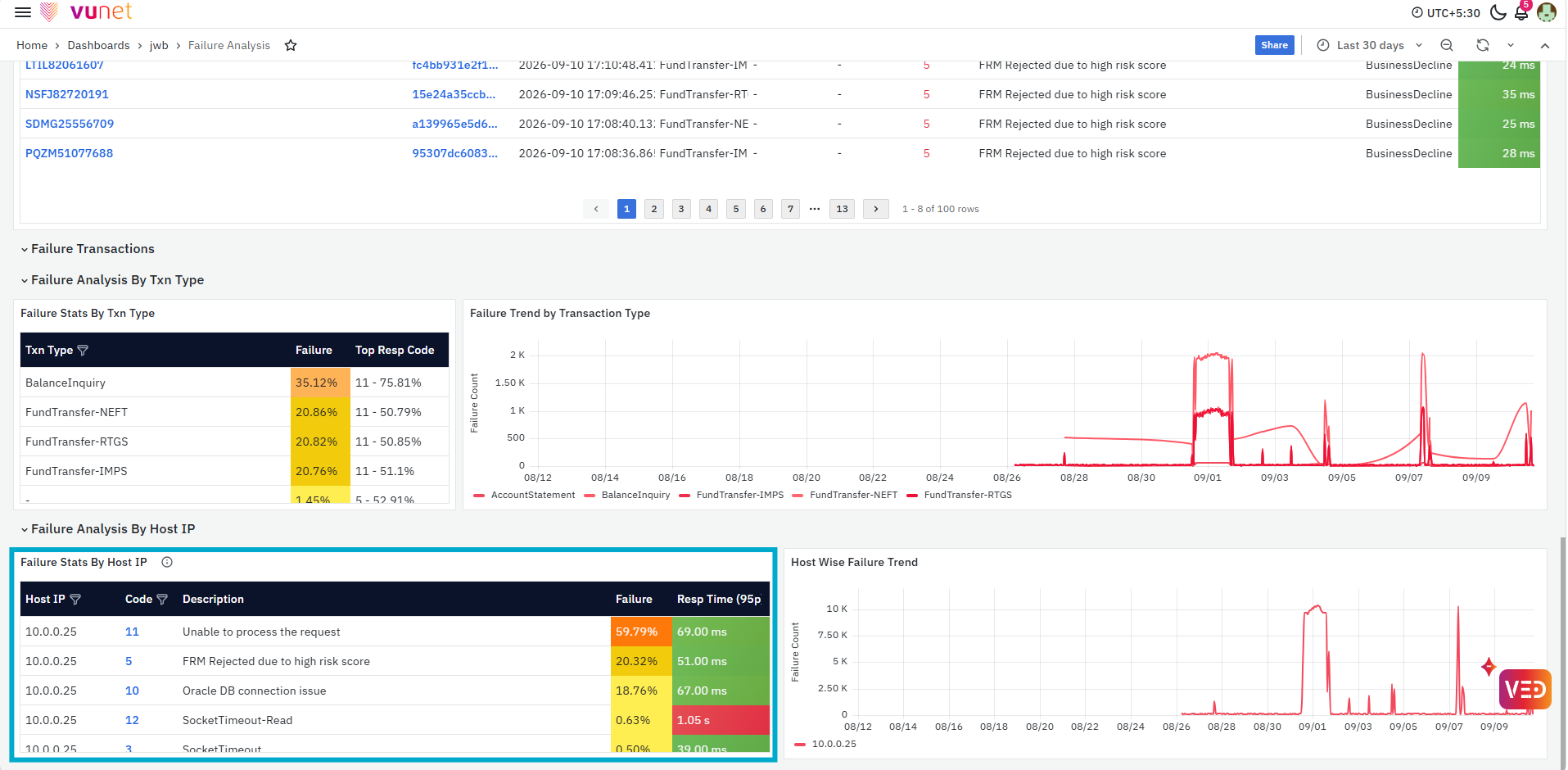
The Failure Analysis By Host IP section provides failure details at the host level. The Failure Stats By Host IP table displays the Host IP, response code, response description, failure percentage, and Response Time (95P). This helps users determine whether failures are concentrated on a particular host and which response codes are contributing to the issue.
The Code value is clickable. Selecting a code opens the Response Code page in Touchpoint Analysis, where users can review detailed trends and analysis for the selected response code. For more details, refer to the Response Code section.
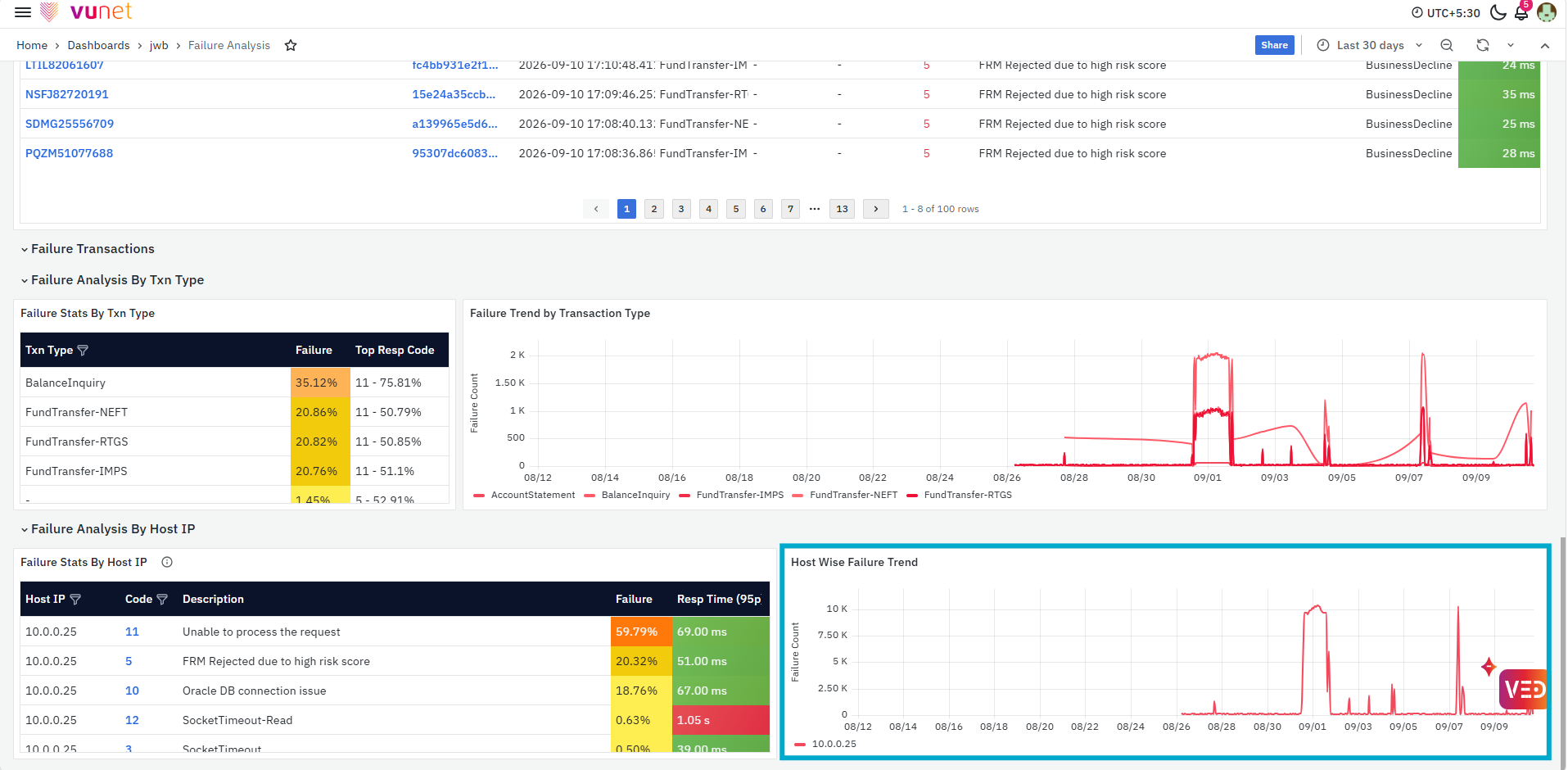
The Host Wise Failure Trend panel shows how the failure count for the host changes over time. This helps users identify when host-level failures increased and correlate them with the response codes and response-time values shown in the table.
Response Time
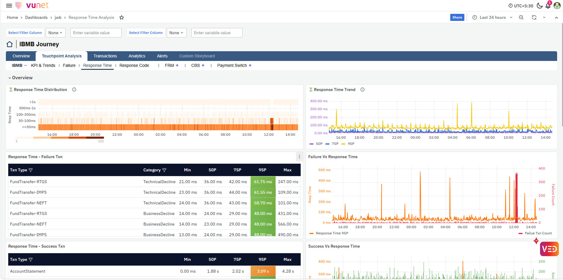
The Response Time section provides a detailed view of transaction response-time behavior for the selected touchpoint. It helps users understand how response time is distributed, identify changes in response-time trends, compare the performance of successful and failed transactions, and identify the transaction types, failure points, touchpoints, or hosts contributing to slower transactions.
Overview
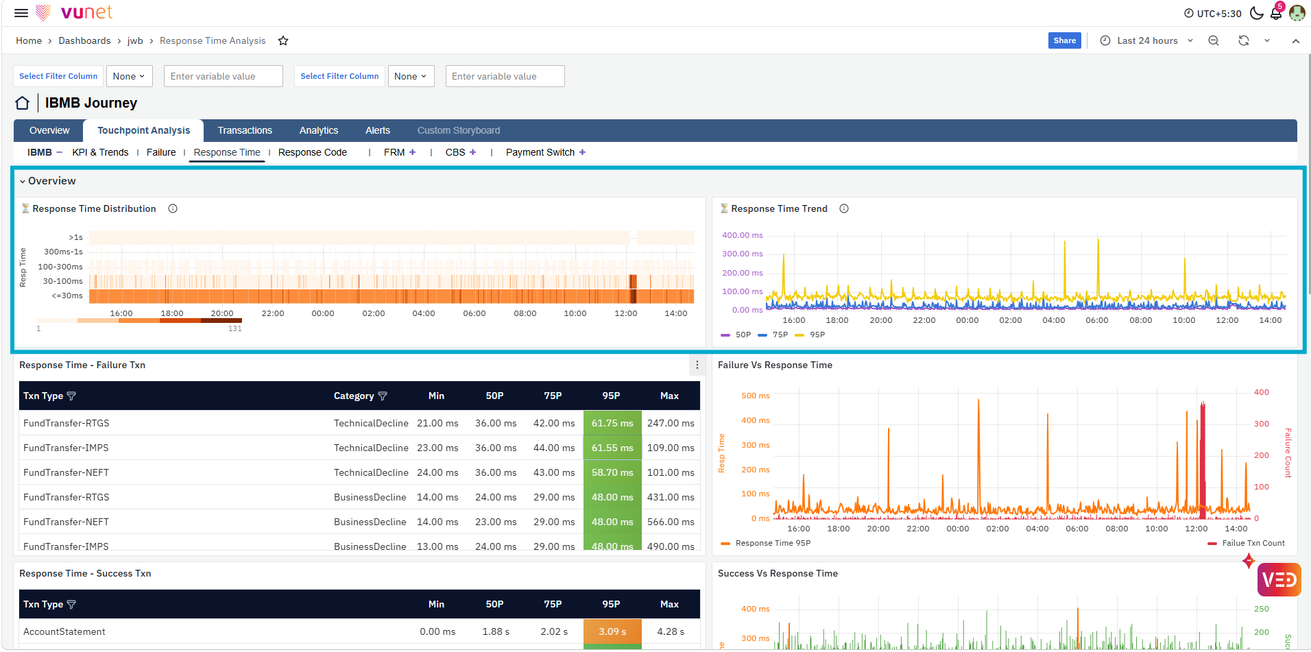
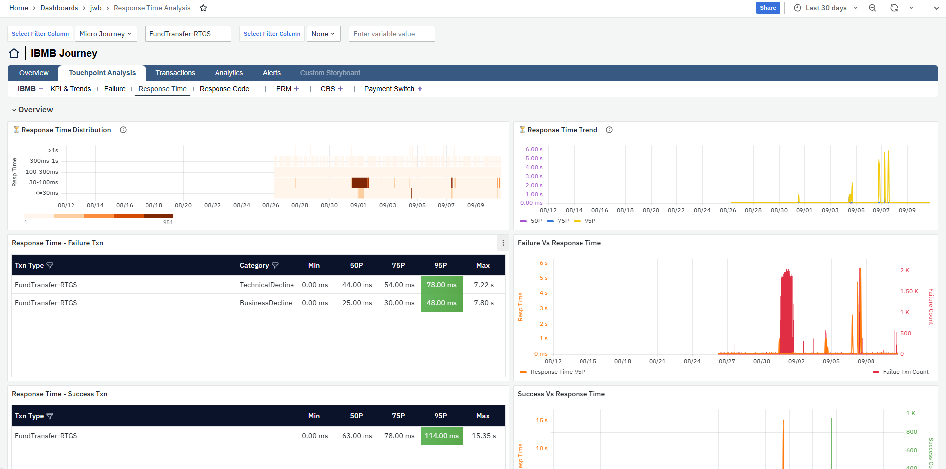
The Overview section brings together the main response-time panels for the selected touchpoint. The Response Time Distribution panel shows how transactions are distributed across different response-time ranges, helping users identify whether more transactions are moving into higher response-time ranges. Next, the Response Time Trend displays the 50P, 75P, and 95P response times over the selected time range, making it easier to identify when response time increased and how the different percentile values changed during that period.
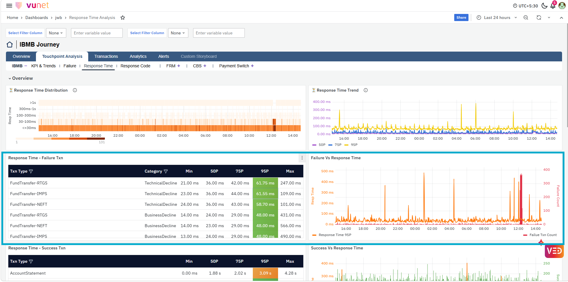
The Response Time - Failure Txn table provides response-time details for failed transactions by Txn Type and Category. It displays the Min, 50P, 75P, 95P, and Max response times, helping users compare response-time behavior across different failed transaction types and Technical Decline or Business Decline categories. Alongside this, the Failure Vs Response Time panel compares the failure transaction count with the 95P response time over time, helping users understand whether an increase in failures is accompanied by an increase in response time.
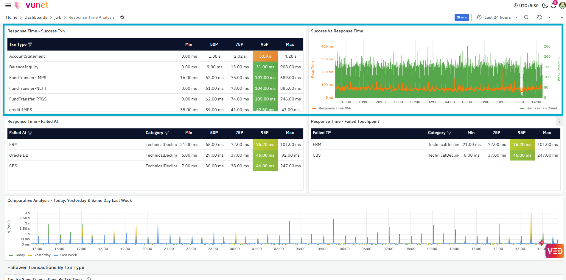
The Response Time - Success Txn table provides the same response-time statistics for successful transactions by transaction type. The Success Vs Response Time panel compares the successful transaction count with the 95P response time, helping users understand response-time behavior even when transactions are completing successfully.
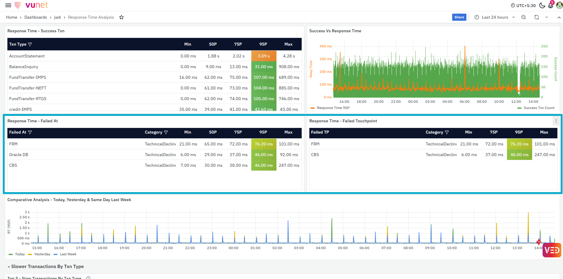
The Response Time - Failed At table shows response-time statistics based on where a transaction failure was identified. It displays the Failed At location, category, and the corresponding Min, 50P, 75P, 95P, and Max response times. The Response Time - Failed Touchpoint table provides a similar view based on the touchpoint associated with the failure. Together, these panels help users determine whether higher response times are associated with a particular failure location or touchpoint.
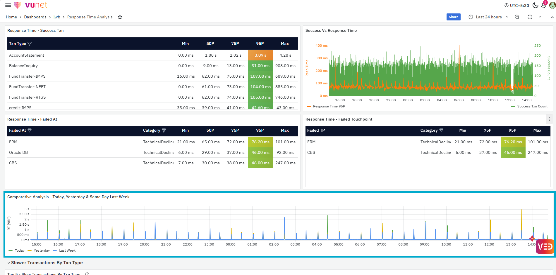
The Comparative Analysis - Today, Yesterday & Same Day Last Week panel compares the 95P response-time trend for the current period with yesterday and the same day last week. This helps users understand whether the current response-time behavior is a recent change or was also observed during previous comparable periods.
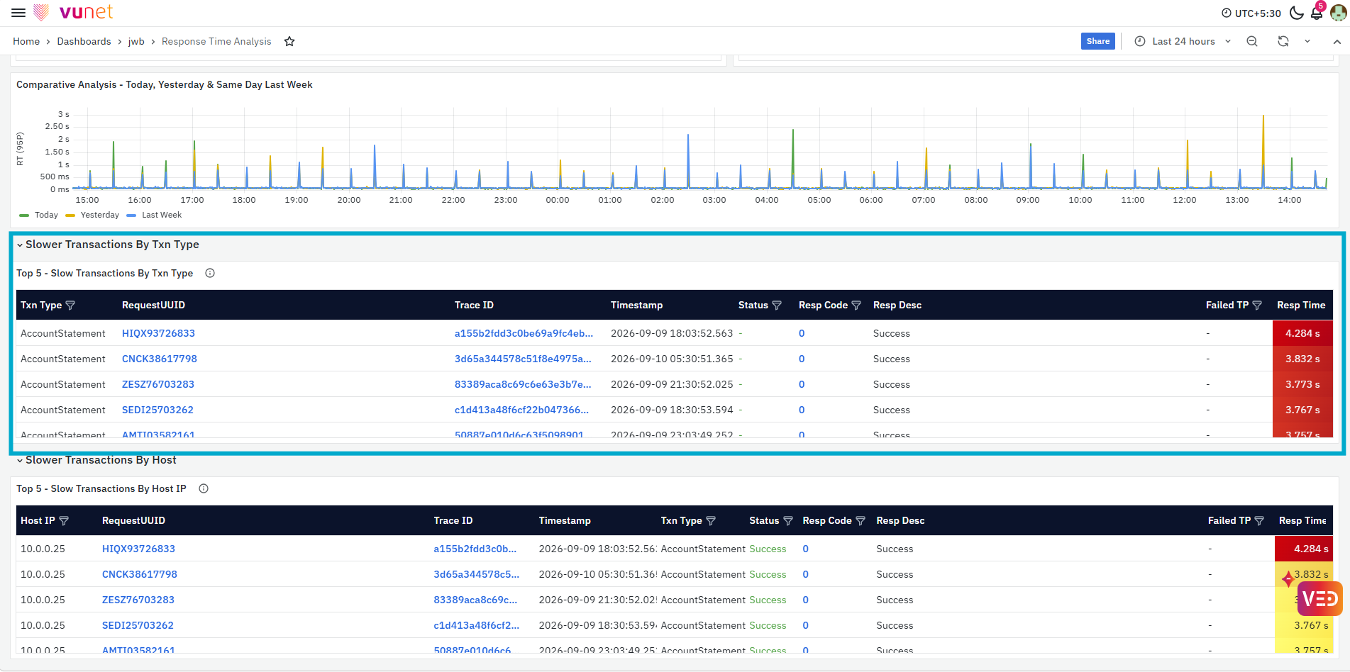
The Slower Transactions By Txn Type section provides the Top 5 - Slow Transactions By Txn Type. It displays details such as Txn Type, RequestUUID, Trace ID, Timestamp, Status, Resp Code, Resp Desc, Failed TP, and Resp Time. This helps users identify the specific transaction types experiencing higher response times and review individual slow transactions for further analysis.
Request UUID and Trace ID support the same transaction and trace-level drill-downs described earlier. For details, refer to the Transactions section.
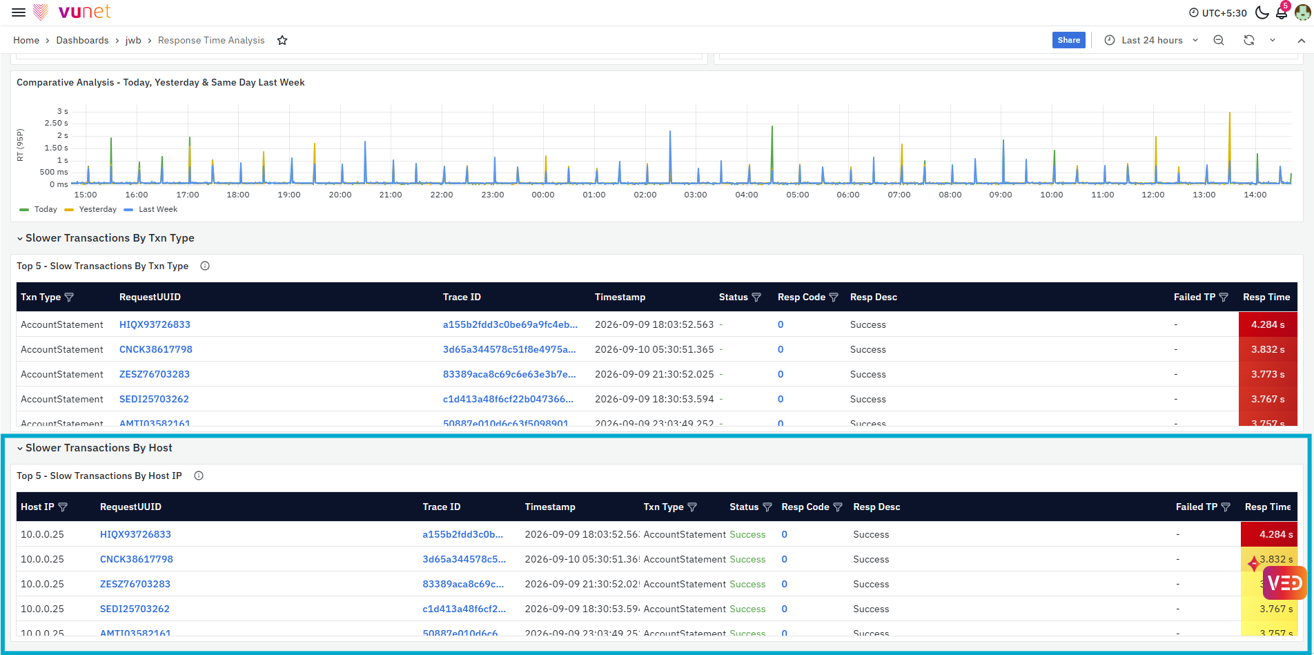
The Slower Transactions By Host section provides the Top 5 - Slow Transactions By Host IP. It displays the Host IP together with RequestUUID, Trace ID, Timestamp, Txn Type, Status, response-code details, Failed TP, and Resp Time. This helps users determine whether slower transactions are concentrated on a particular host and identify the individual transactions contributing to the observed response-time behavior.
Request UUID and Trace ID support the same transaction- and trace-level drill-downs described earlier. For details, refer to the Transactions section.
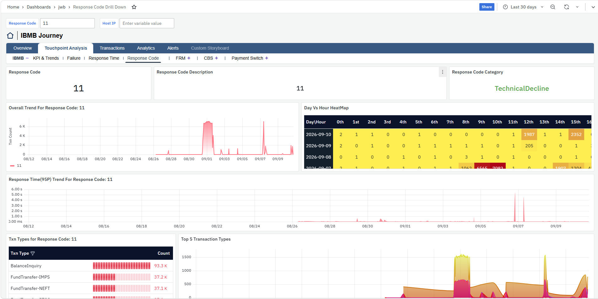
Response Code
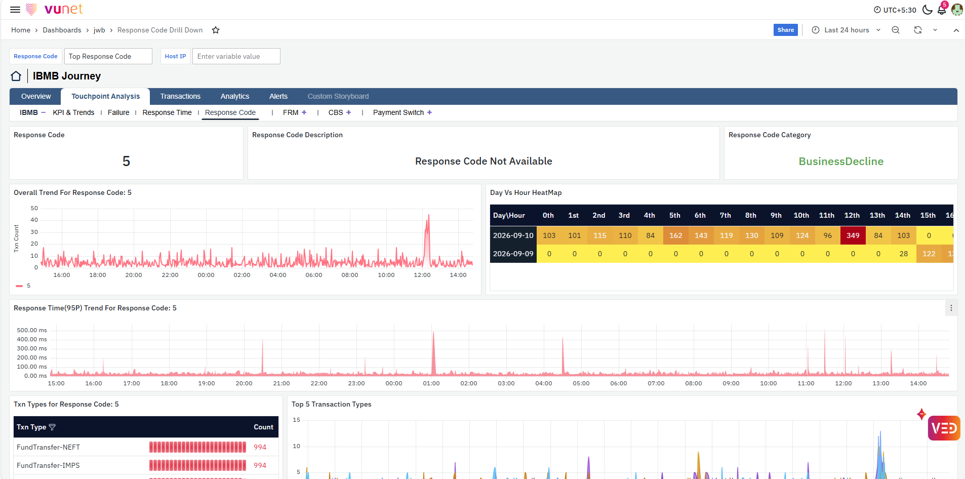
The Response Code section provides detailed analysis of a selected response code for the touchpoint. It helps users understand the response code category, when its occurrences increased, its response-time behavior, and the transaction types and hosts most affected by it. Users can select the required Response Code and use Host IP to further narrow the analysis.
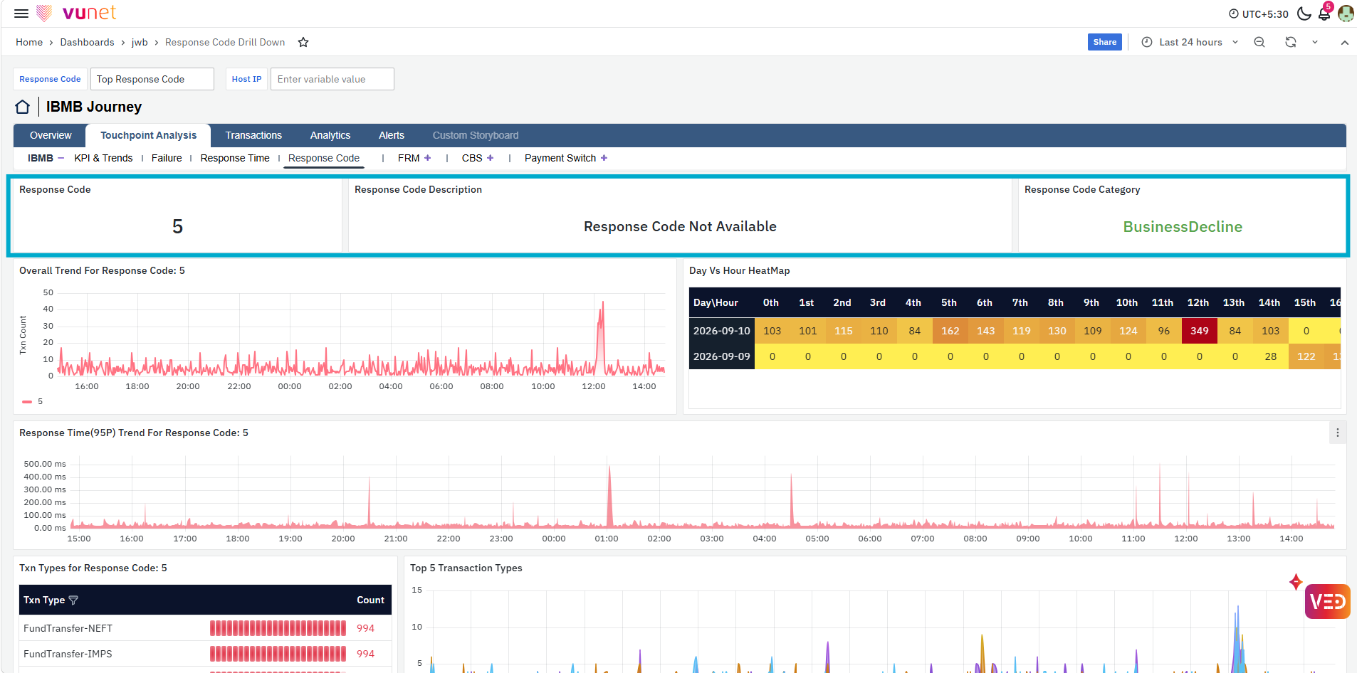
The first panels show the selected Response Code, Response Code Description, and Response Code Category. These provide the basic context for the response code being analyzed, including whether it is associated with a TechnicalDecline or BusinessDecline.
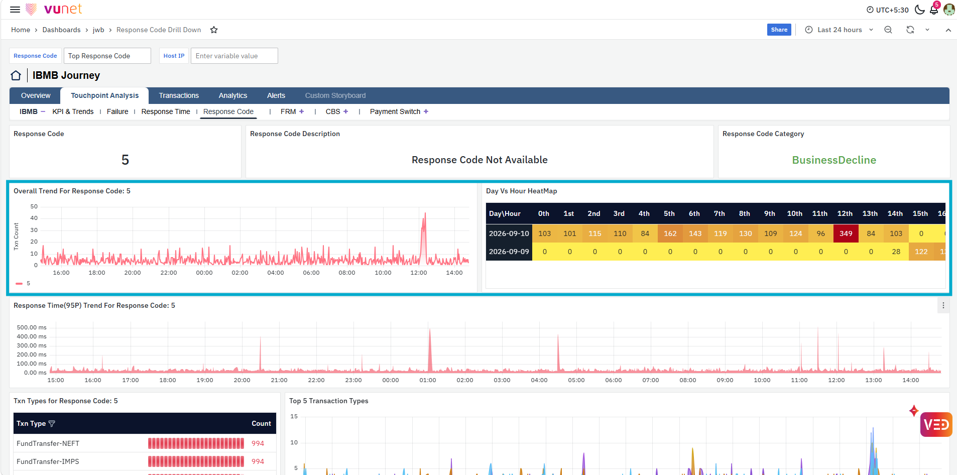
The next panels show the Overall Trend For Response Code and Day Vs Hour HeatMap. The overall trend shows how the occurrence count of the selected response code changes over the selected time range, helping users identify when the response code started increasing and periods with higher occurrences. The heatmap provides a day-and-hour view of the response code occurrences, making it easier to identify specific days and hours with higher activity.
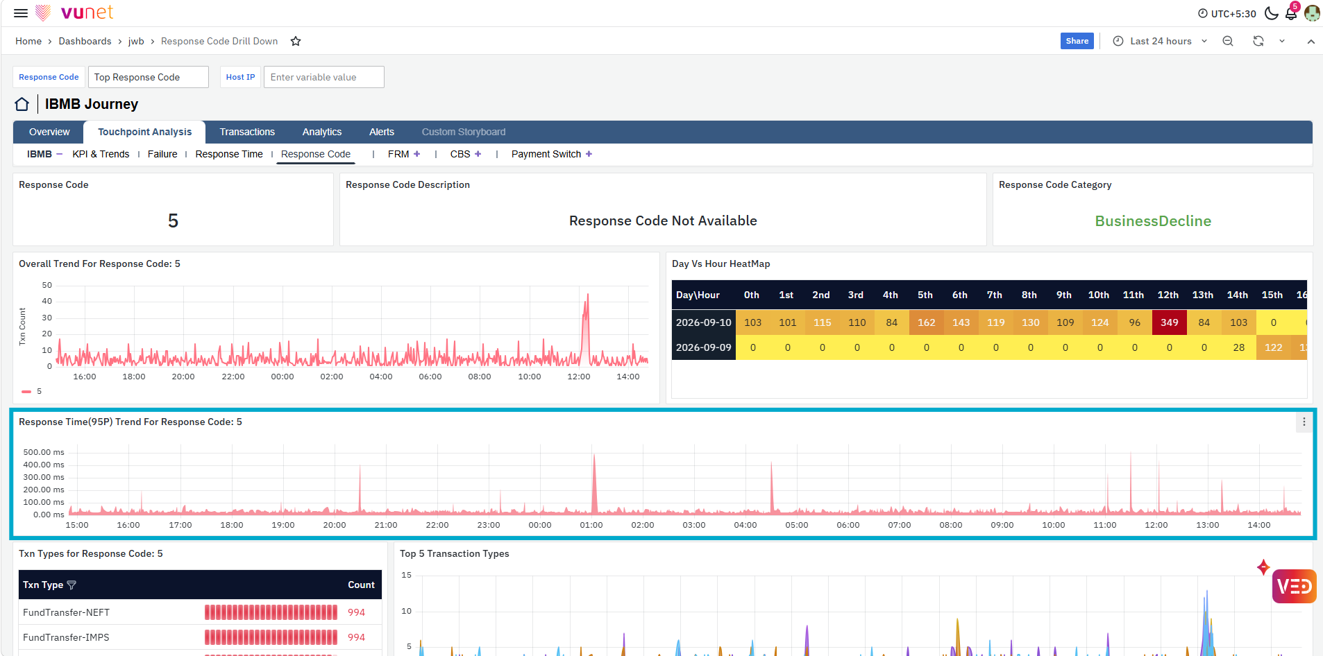
The Response Time (95P) Trend For Response Code panel shows the 95th-percentile response time associated with the selected response code over the selected period. This helps users determine whether changes in response-code occurrences are also accompanied by changes in transaction response time.
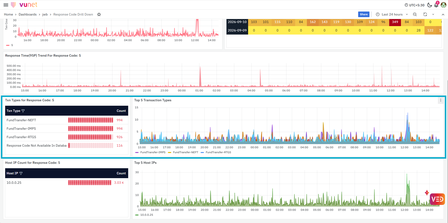
The next panels provide transaction-type-level analysis. Txn Types for Response Code shows the transaction types associated with the selected response code and their occurrence counts, while Top 5 Transaction Types shows how the occurrences for the leading transaction types change over time. Together, these panels help users identify which transaction types are most affected and when their response-code occurrences increased.
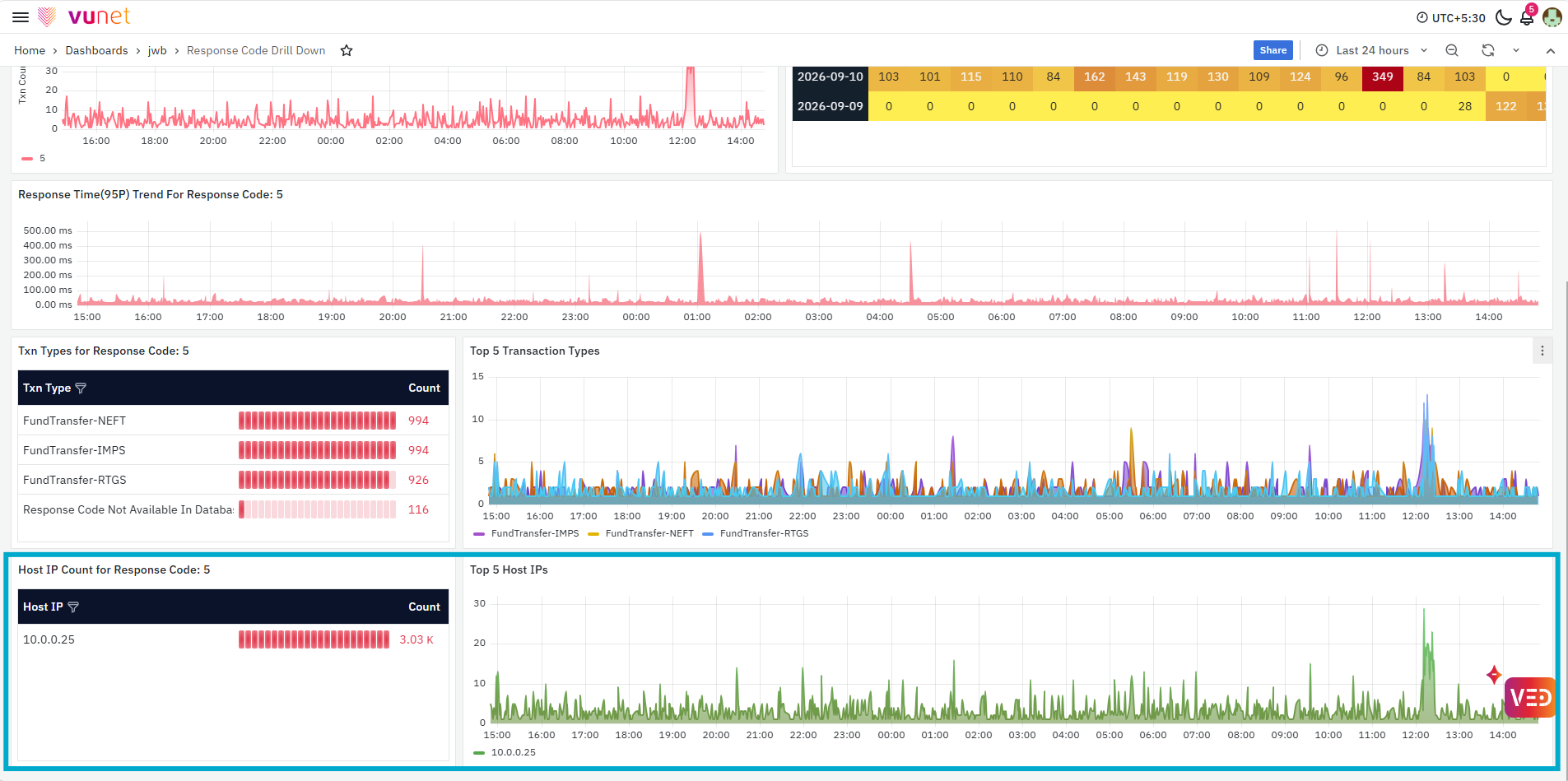
The last panels provide the same analysis at the host level. Host IP Count for Response Code shows the Host IPs associated with the selected response code and their occurrence counts, while Top 5 Host IPs show their trend over time. These panels help users determine whether the response code is concentrated on a particular host and identify when the host-level occurrences increased.
Transactions
The Transactions storyboard provides transaction-level visibility for the selected journey. It helps users move from overall journey or touchpoint analysis to individual transactions and understand their status, failure details, response time, and flow across the different touchpoints. The storyboard includes two views: Transaction Details and Transaction Trace.
Transaction Details
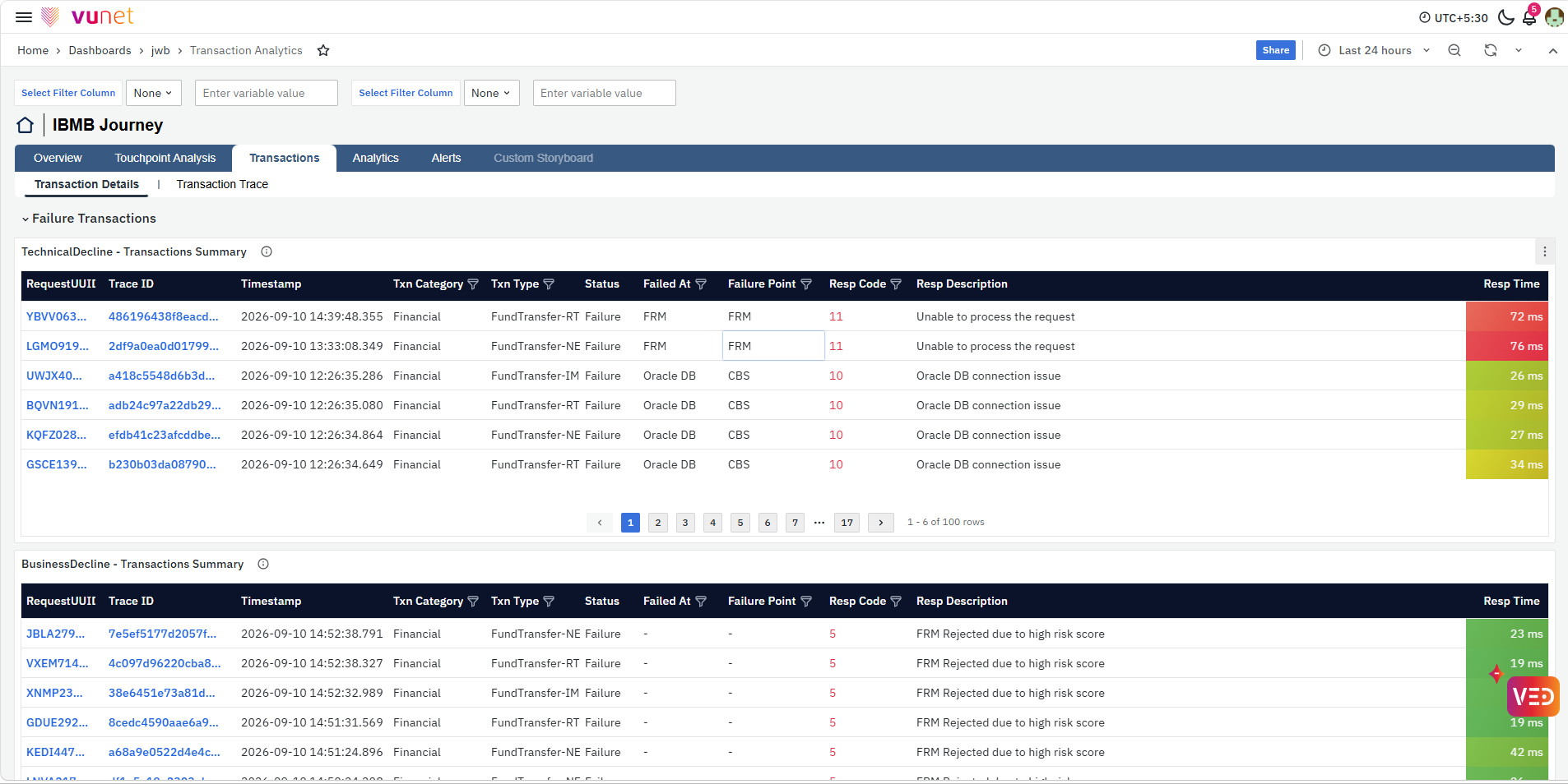
The Transaction Details view provides a consolidated list of failed and successful transactions for the selected time range. The Failure Transactions section separates failed transactions into TechnicalDecline - Transactions Summary and BusinessDecline - Transactions Summary.
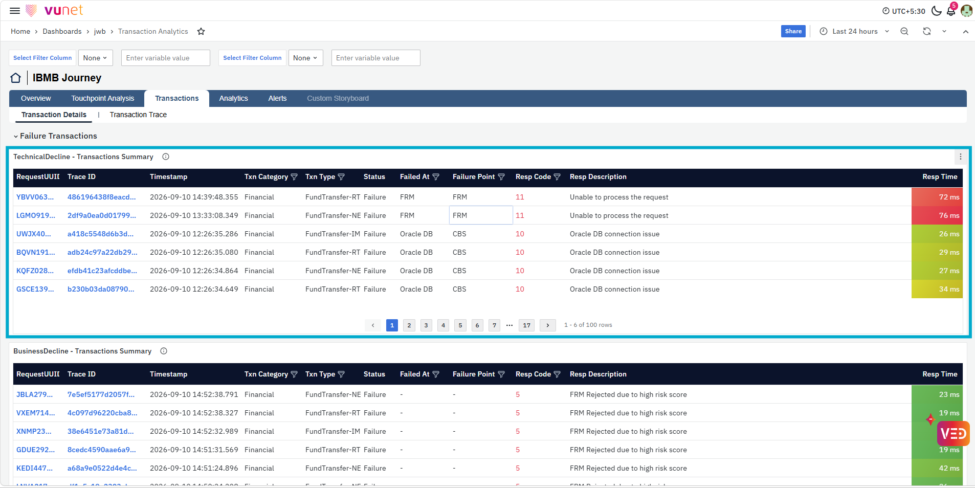
The first table, TechnicalDecline - Transactions Summary, displays transactions affected by technical failures. It provides details such as RequestUUID, Trace ID, Timestamp, Txn Category, Txn Type, Status, Failed At, Failure Point, Resp Code, Resp Description, and Resp Time. This helps users understand which transaction failed, where the failure occurred, the response code associated with the failure, and how long the transaction took.
Request UUID and Trace ID support the same transaction- and trace-level drill-downs described earlier. For details, refer to the Transactions section.
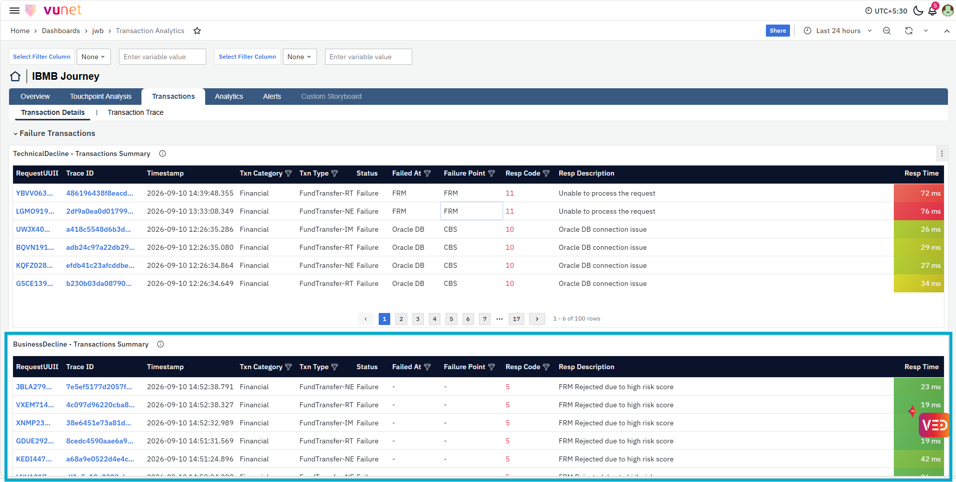
The next table, BusinessDecline - Transactions Summary, provides similar transaction-level information for transactions categorized as Business Decline. Users can review the transaction type, response code and description, and response time to understand the individual transactions contributing to the Business Decline.
Request UUID and Trace ID support the same transaction- and trace-level drill-downs described earlier. For details, refer to the Transactions section.
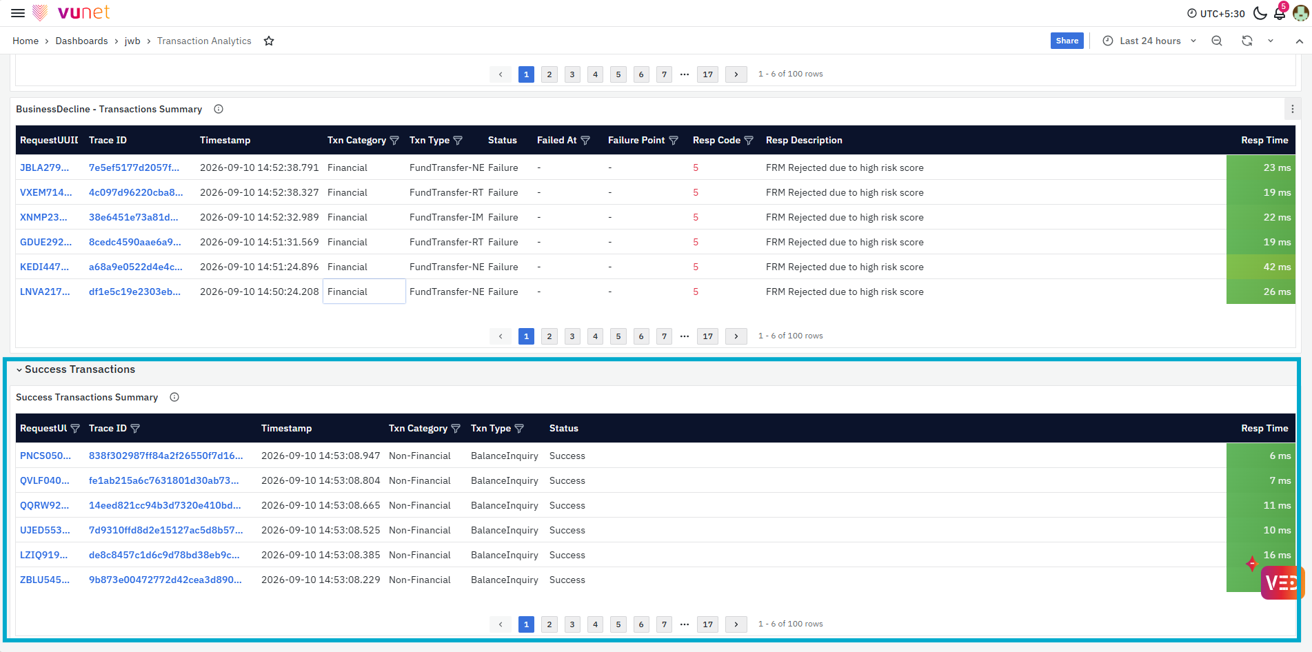
The Success Transactions section provides the Success Transactions Summary for successfully completed transactions. It displays details such as RequestUUID, Trace ID, Timestamp, Txn Category, Txn Type, Status, and Resp Time. This helps users review successful transactions and their response-time behavior for the selected period.
Request UUID and Trace ID support the same transaction- and trace-level drill-downs described earlier. For details, refer to the Transactions section.
Transaction Trace
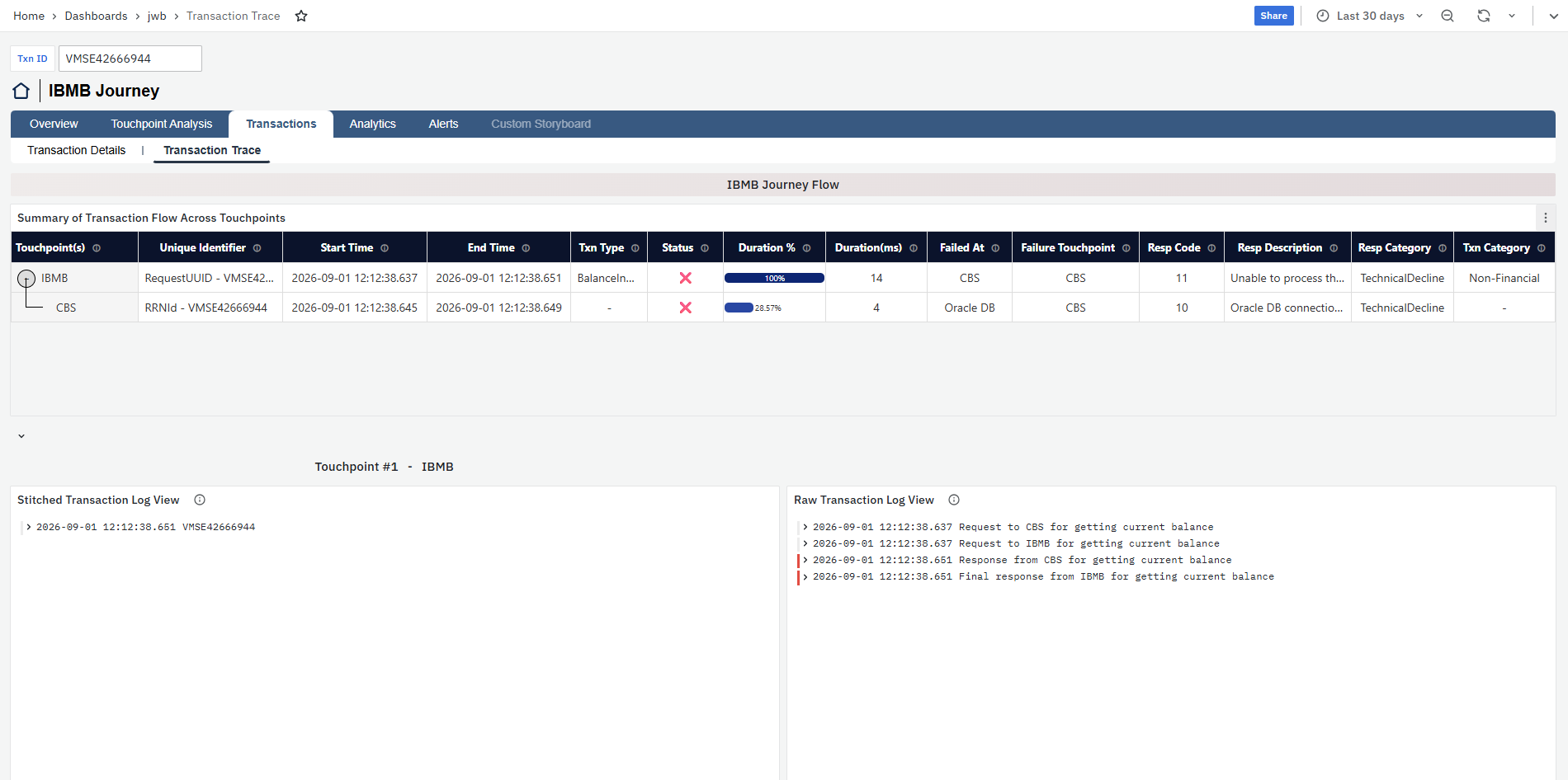
The Transaction Trace view provides an end-to-end view of an individual transaction as it moves across the touchpoints participating in the journey. Users can enter the required Txn ID to retrieve the transaction and review its flow across the journey.
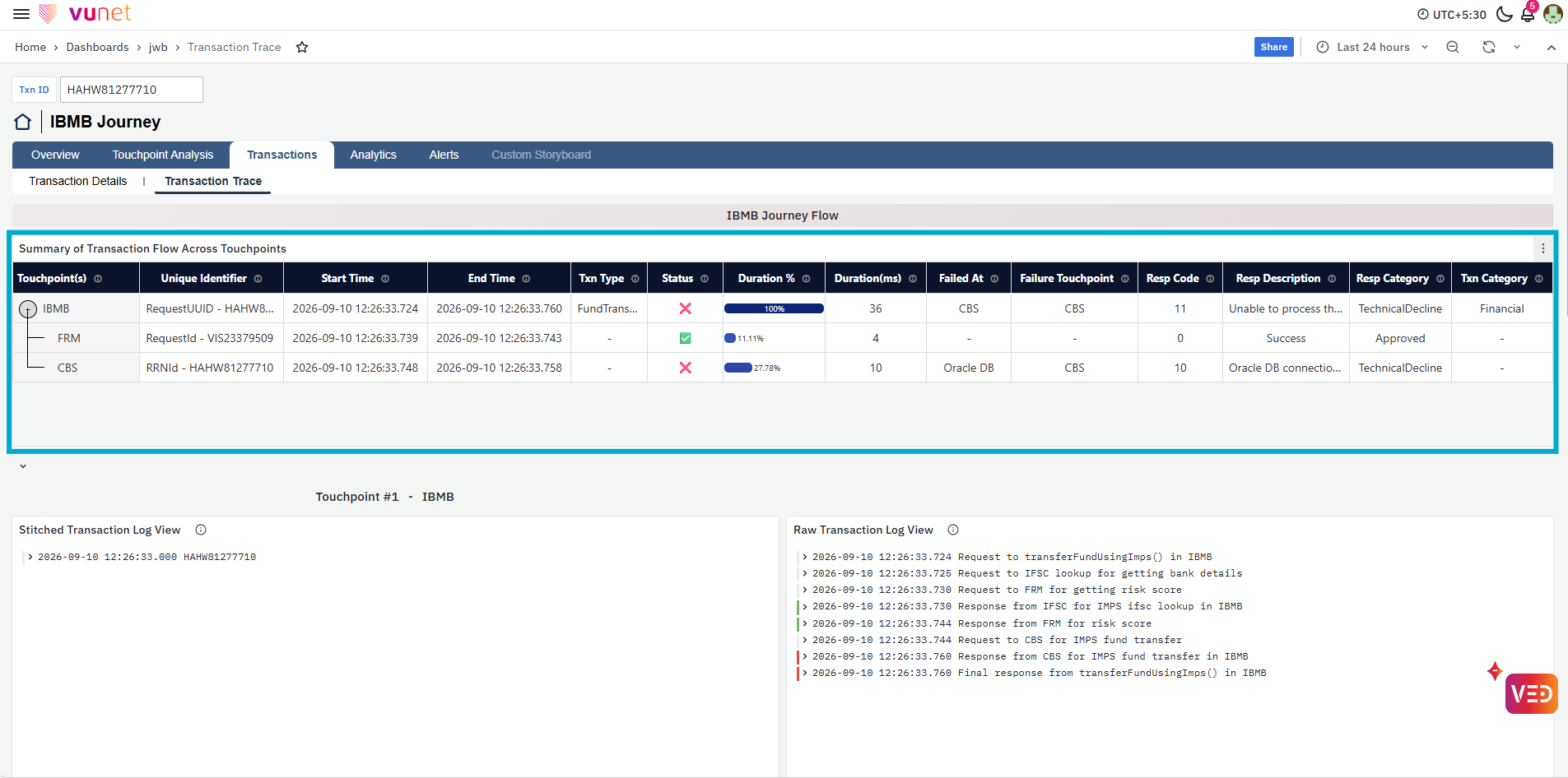
The first panel, Summary of Transaction Flow Across Touchpoints, shows the transaction flow across the available touchpoints, such as IBMB, FRM, CBS, and Payment Switch. For each touchpoint, it provides details such as the Unique Identifier, Start Time, End Time, Txn Type, Status, Duration %, Duration (ms), Failed At, Failure Touchpoint, Resp Code, Resp Description, Resp Category, and Txn Category. This helps users understand the sequence of the transaction, the time spent at each touchpoint, and where a failure occurred.
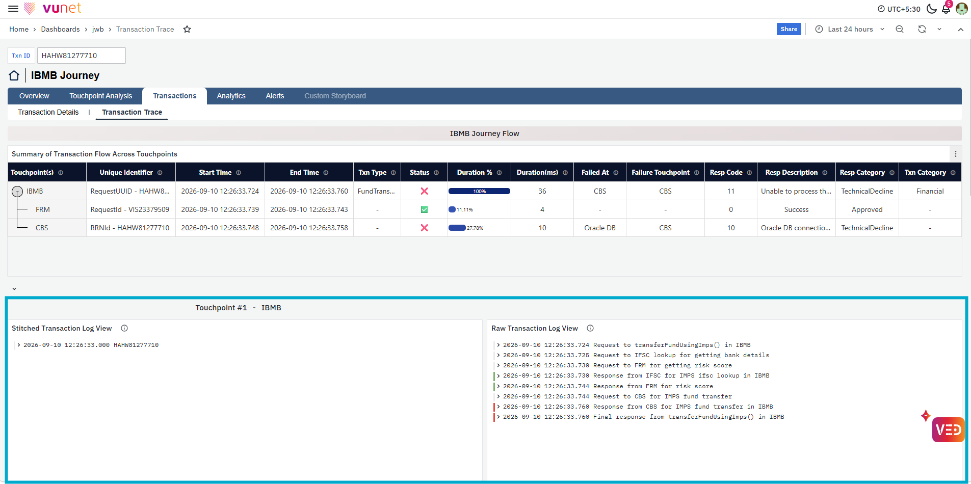
Below the transaction flow summary, each touchpoint is displayed separately with a Stitched Transaction Log View and a Raw Transaction Log View. The Stitched Transaction Log View brings together the transaction information associated with that touchpoint, while the Raw Transaction Log View shows the corresponding transaction log entries in their detailed form. Reviewing both views helps users understand what happened at each stage of the transaction and investigate the events leading to a success or failure.
If a touchpoint does not contain information for the selected transaction, the corresponding log panels display No data. This helps users distinguish touchpoints through which transaction information is available from those where no matching data is present.
Analytics
The Analytics section provides time-based analysis of transaction activity for the selected journey. The Time Based view helps users understand when transaction volume, transaction value, failures, technical failures, business declines, and response-time changes occur. It also separates successful and failed transaction behavior, allowing users to identify hourly and daily patterns and understand which transaction categories or transaction types contribute to the observed behavior.
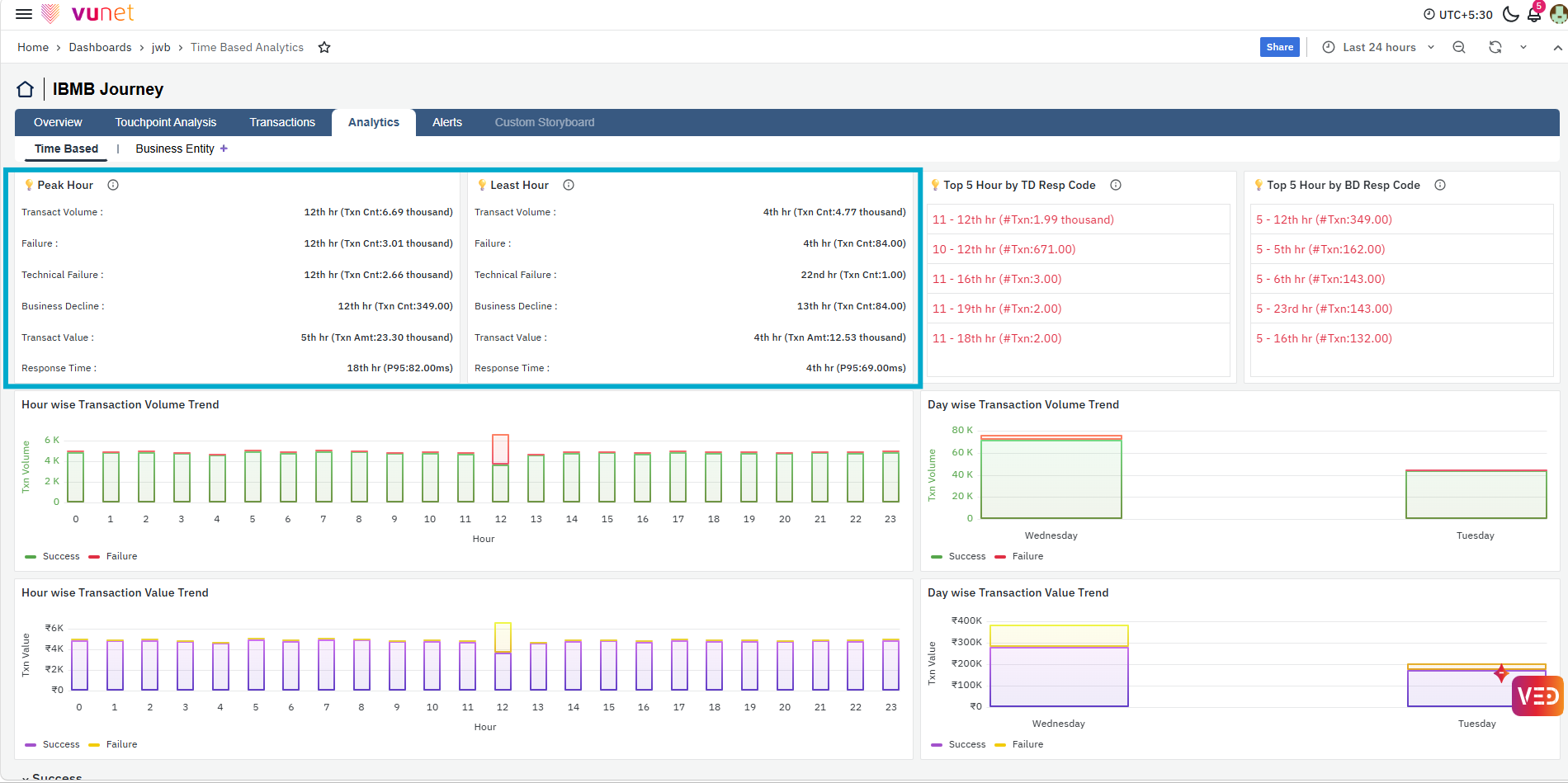
The first panels show the Peak Hour and Least Hour for the selected time range. These panels summarize the hour with the highest and lowest activity across Transaction Volume, Failure, Technical Failure, Business Decline, Transaction Value, and Response Time. This helps users quickly identify the periods with the highest transaction activity or the lowest activity and compare how failures, declines, transaction value, and response time behaved during those hours.
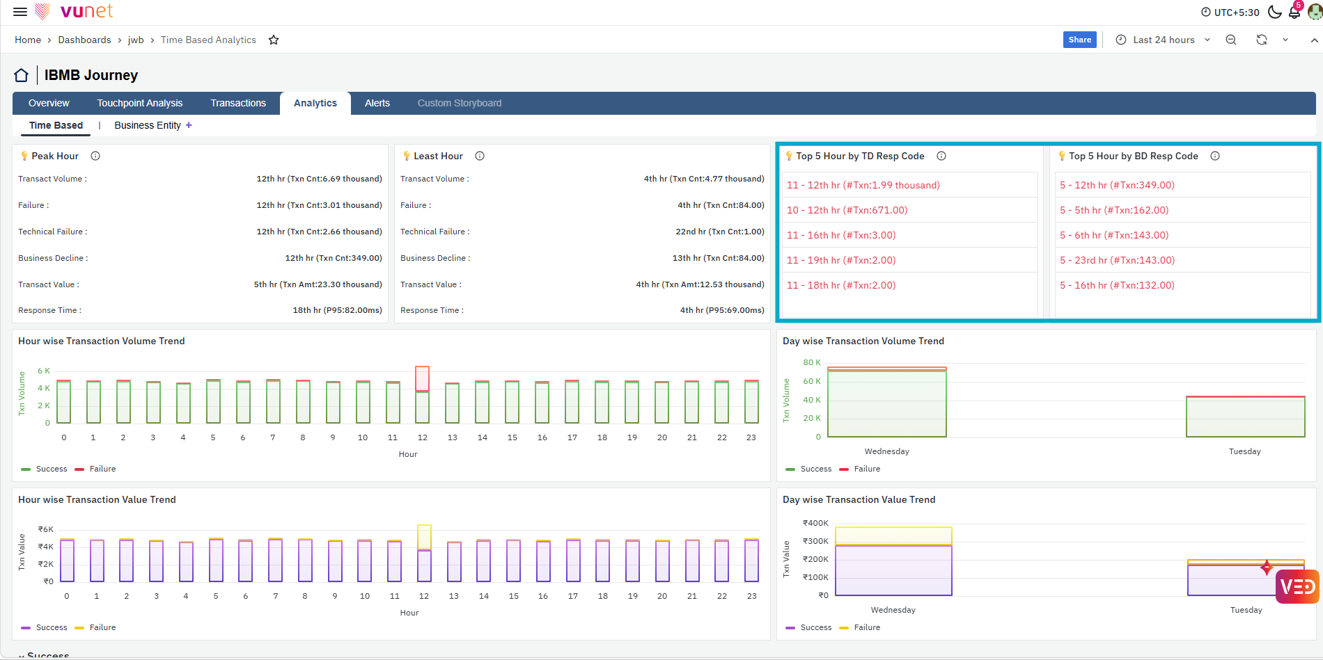
The next panels show the Top 5 Hours by Technical Decline Response Code and Top 5 Hours by Business Decline Response Code. They highlight the response codes with higher occurrences during specific hours, helping users identify when technical or business-related declines were more prominent and which response codes contributed to them.
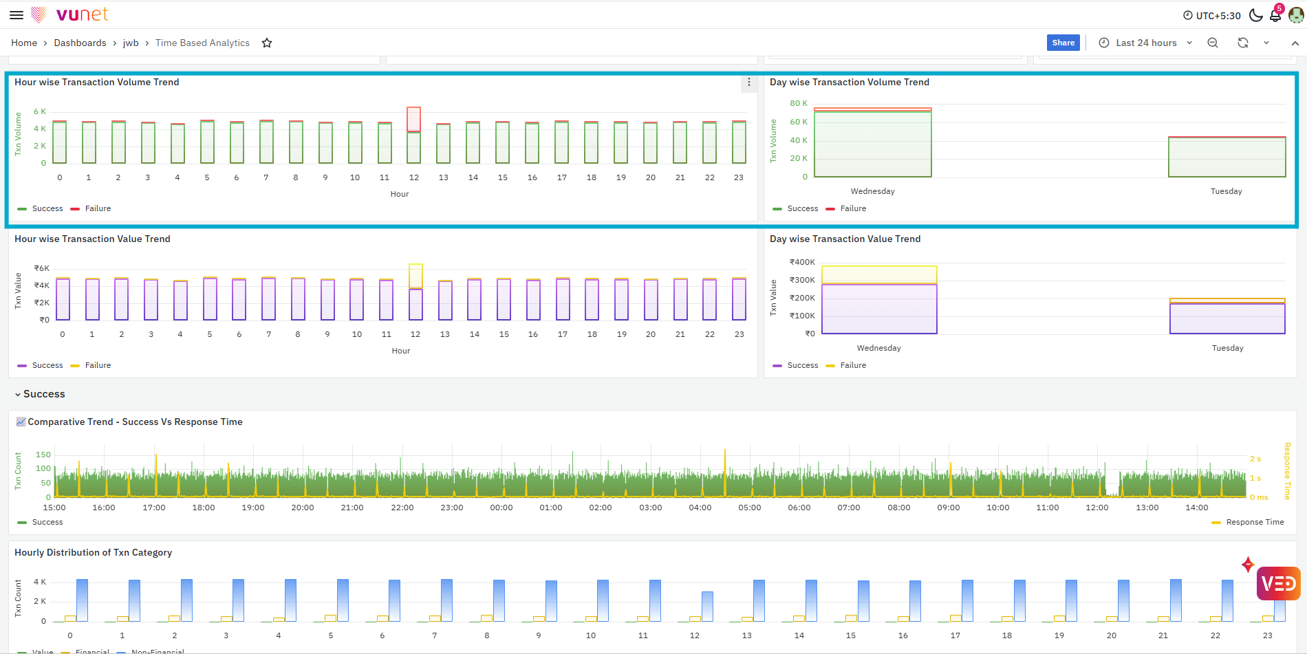
The Hour wise Transaction Volume Trend shows successful and failed transaction volumes across different hours, while the Day wise Transaction Volume Trend provides the same comparison at the day level. Together, these panels help users understand how transaction activity changes over time and identify hours or days where failure volume increases along with overall transaction traffic.
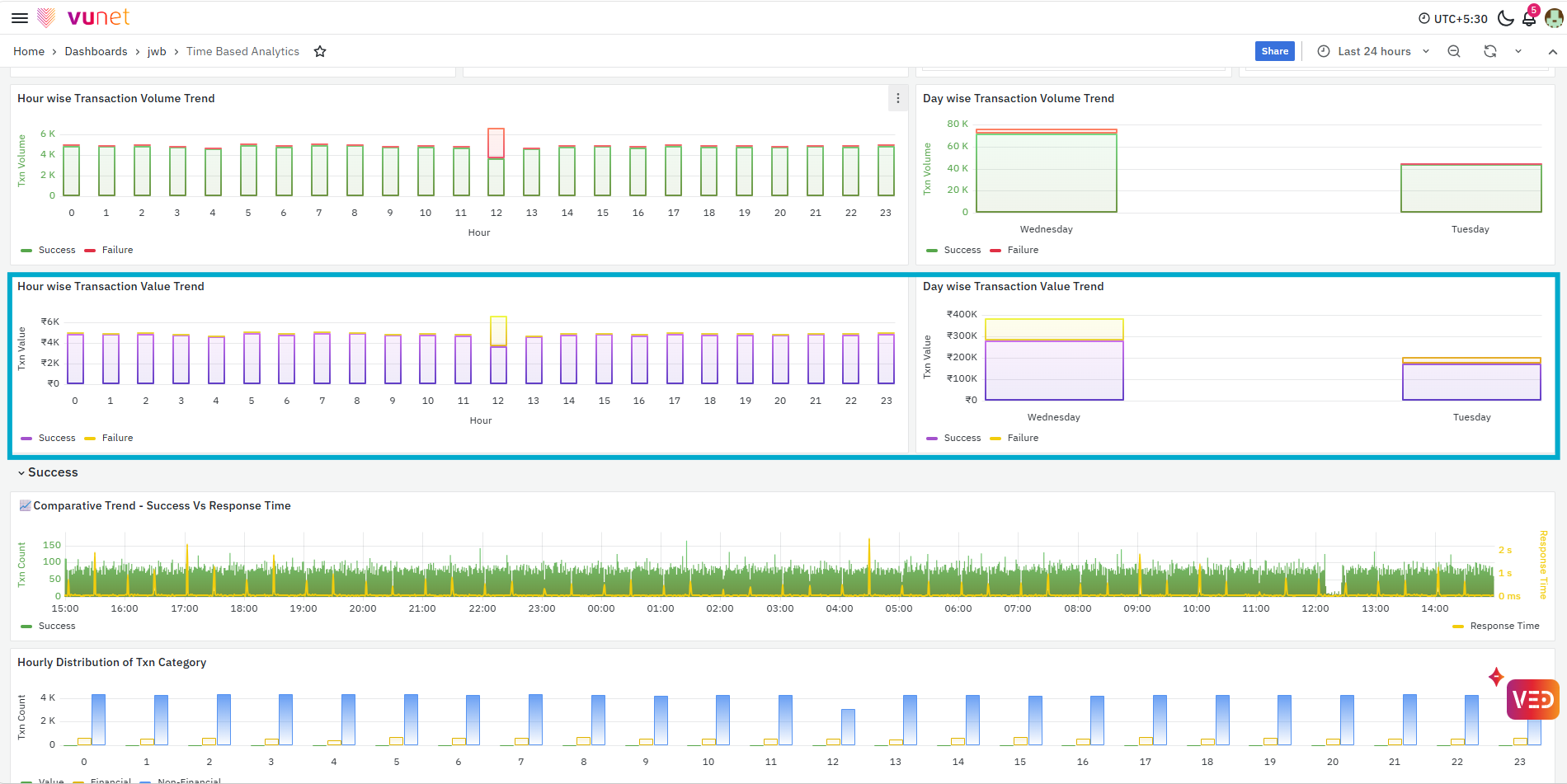
The next panels provide Hour wise Transaction Value Trend and Day wise Transaction Value Trend. These show the transaction value associated with successful and failed transactions across hours and days. This helps users understand whether changes in transaction volume are also reflected in transaction value and identify periods where failed transactions may have a higher business impact.
Success
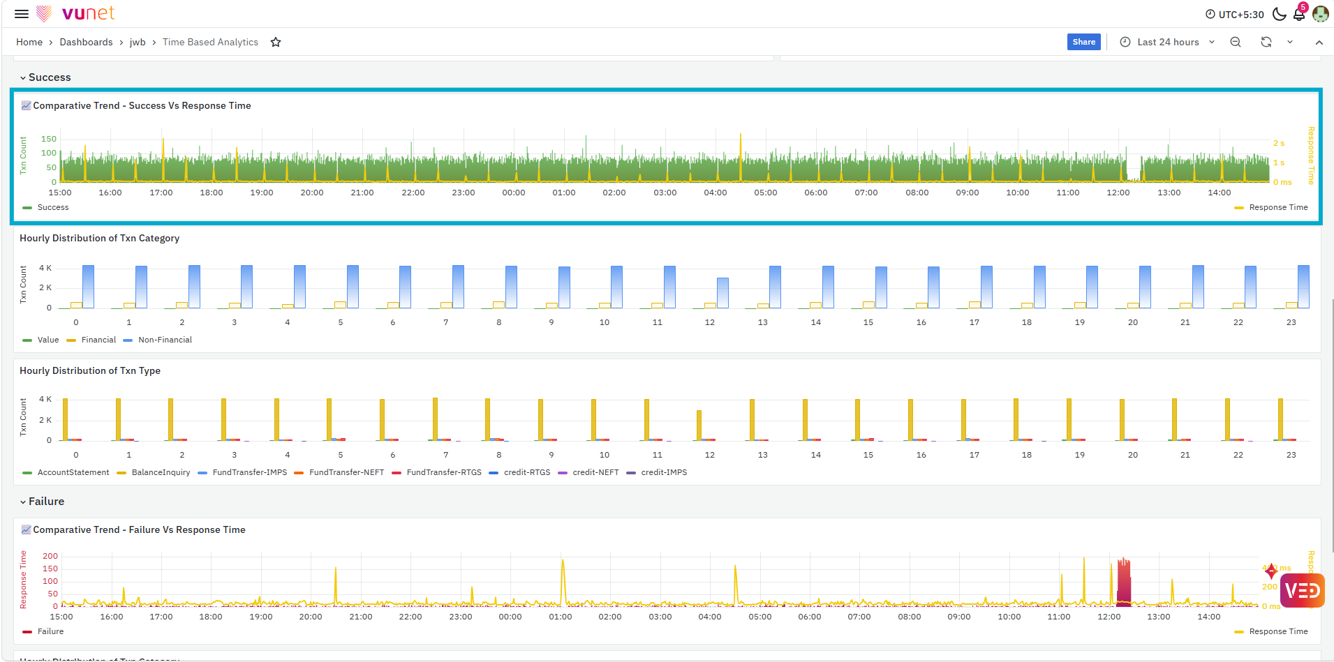
The Success section focuses on the behavior of successful transactions. The first panel compares Success with Response Time, allowing users to observe whether changes in successful transaction counts occur along with changes in response time.
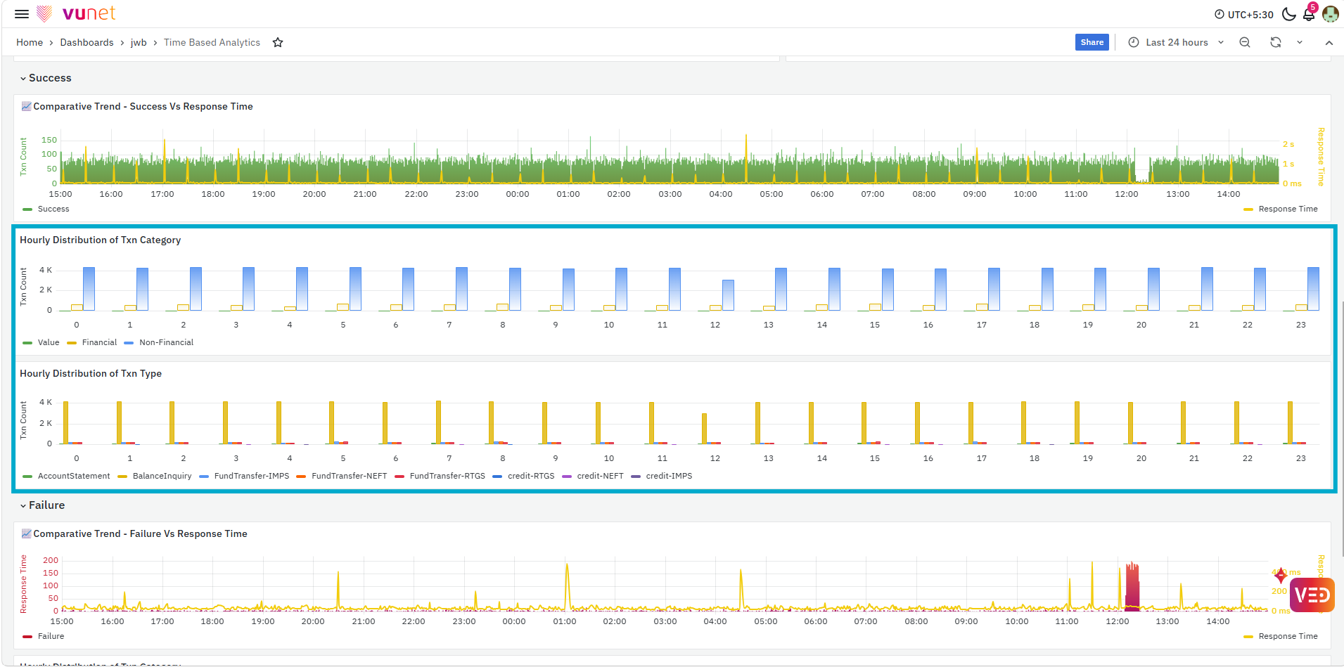
The next panels show the Hourly Distribution of Transaction Category and Hourly Distribution of Transaction Type. The category distribution helps users understand how successful transactions are distributed across categories such as Financial and Non-Financial, while the transaction-type distribution provides a more detailed view of the individual transaction types contributing to successful activity during each hour.
Failure
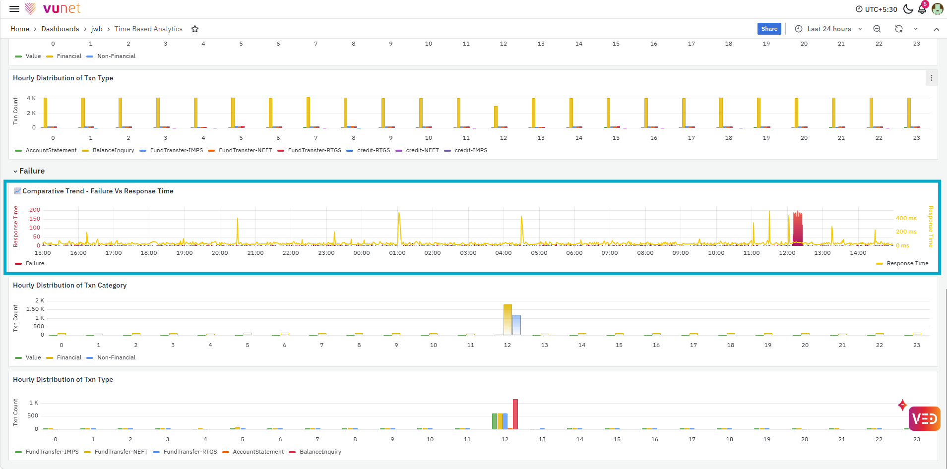
The Failure section provides the same time-based analysis for failed transactions. The first panel compares Failure with Response Time, helping users determine whether an increase in failures occurs during the same period as an increase or change in response time.
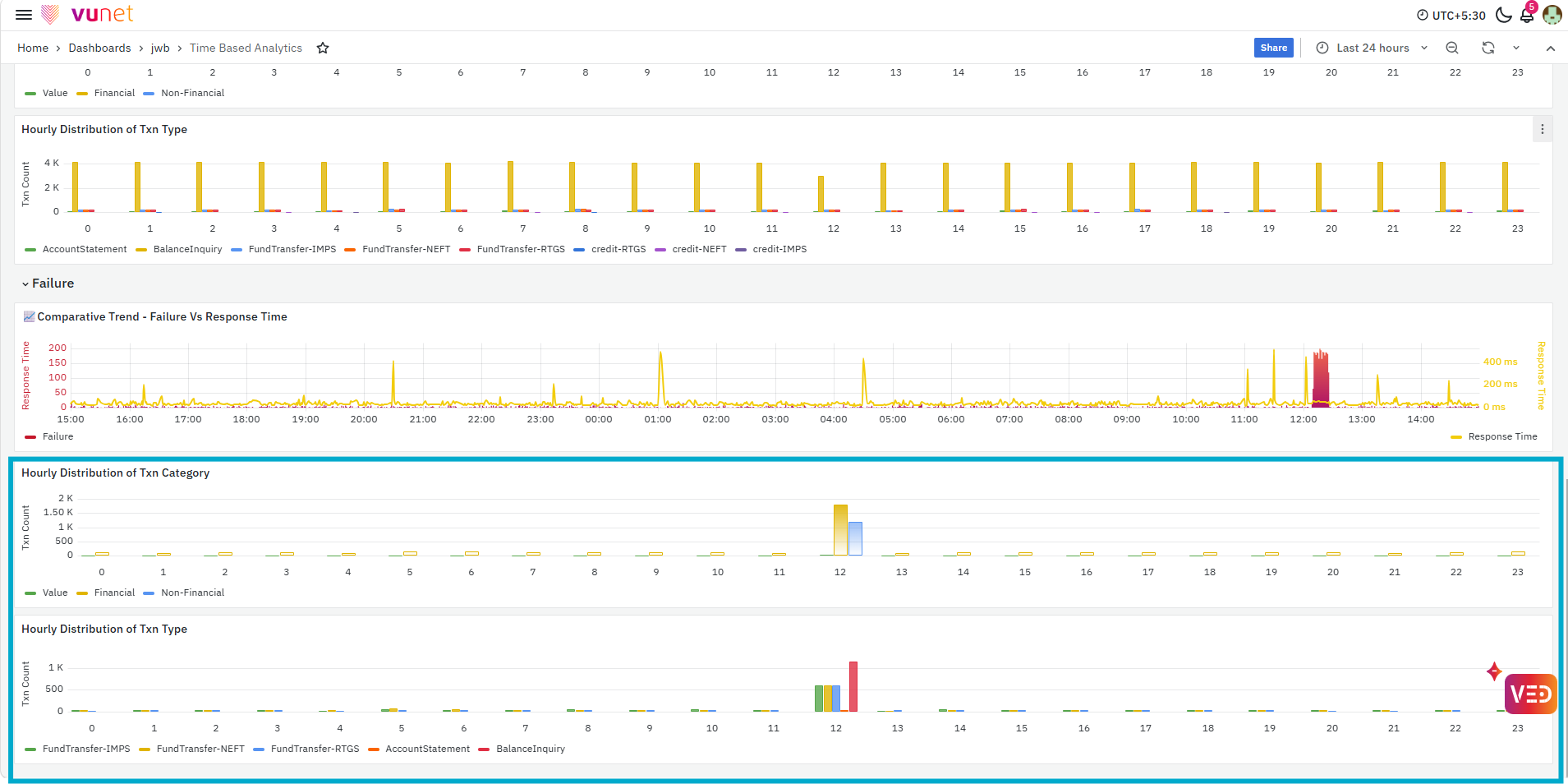
The last panels show the Hourly Distribution of Transaction Category and Hourly Distribution of Transaction Type for failed transactions. These panels help users identify which transaction categories and individual transaction types contribute to failures during specific hours, making it easier to narrow the analysis to the affected transaction activity.
Alerts
The Alerts section provides a consolidated view of active alerts associated with the selected journey. It helps users understand the current alert status across applications and supporting components and identify whether any operational issue requires attention.
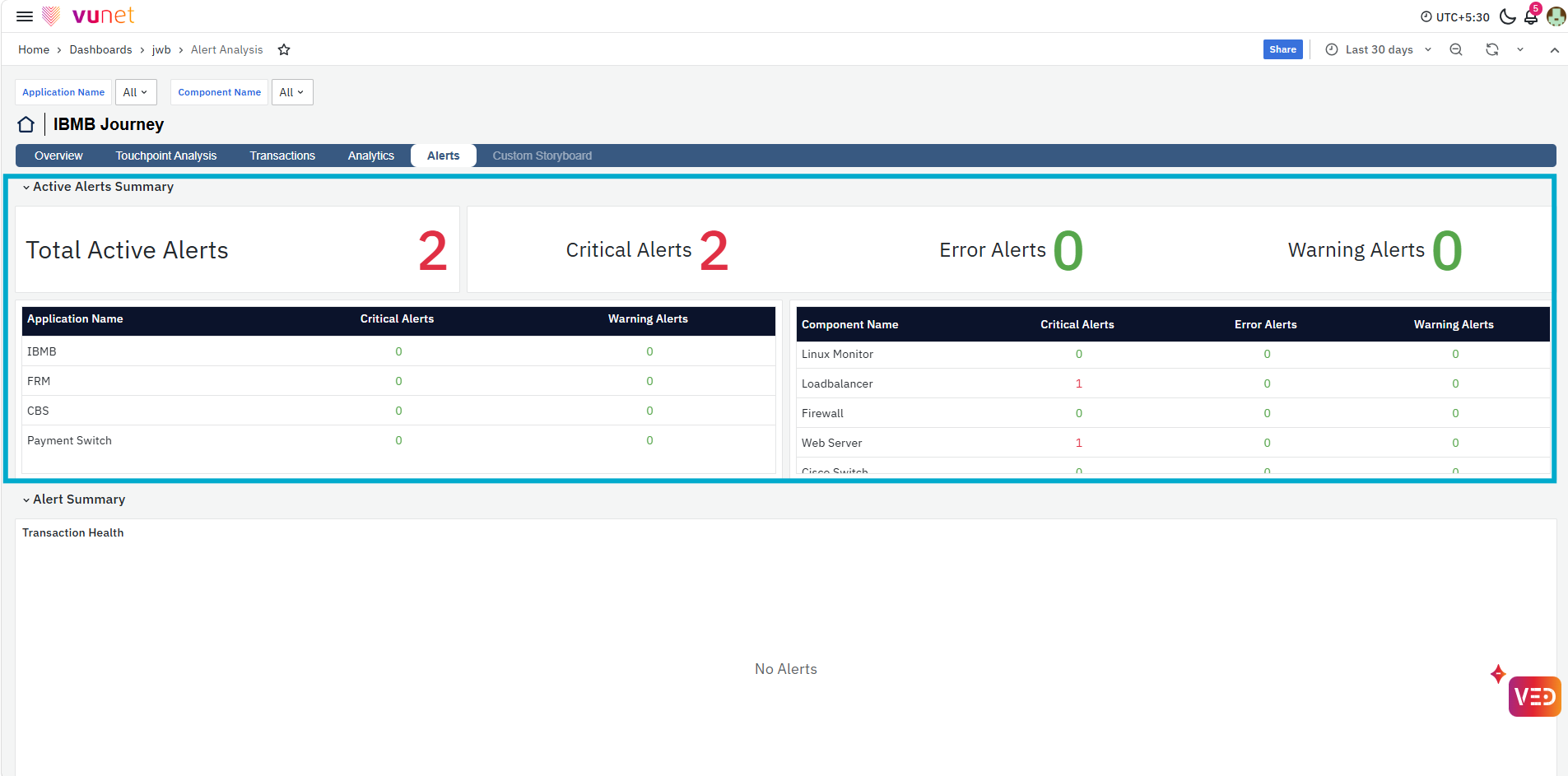
The first panel, Active Alerts Summary, shows the Total Active Alerts along with the number of Critical, Error, and Warning alerts. Below the summary, alerts are further grouped by Application Name and Component Name, allowing users to quickly identify which application or component is contributing to the active alerts and understand their severity.
Alert Summary
The Alert Summary section provides alert details for the different components supporting the journey. Each component is displayed separately, making it easier to identify where an active alert is present. When alerts are available, the table provides details such as Alert ID, Alert Name, App Name, Severity, Description, and Active Since. Components without any active alerts display No Alerts, helping users distinguish affected components from those currently operating without active alerts.
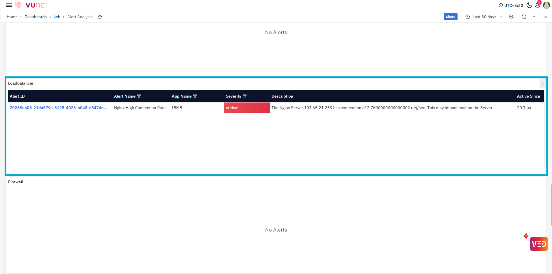
The Alert ID is clickable and supports further drill-down analysis. Selecting an Alert ID opens the corresponding Alert Overview in the Alert Console, where users can review the detailed alert information for further investigation.
Alert Distribution
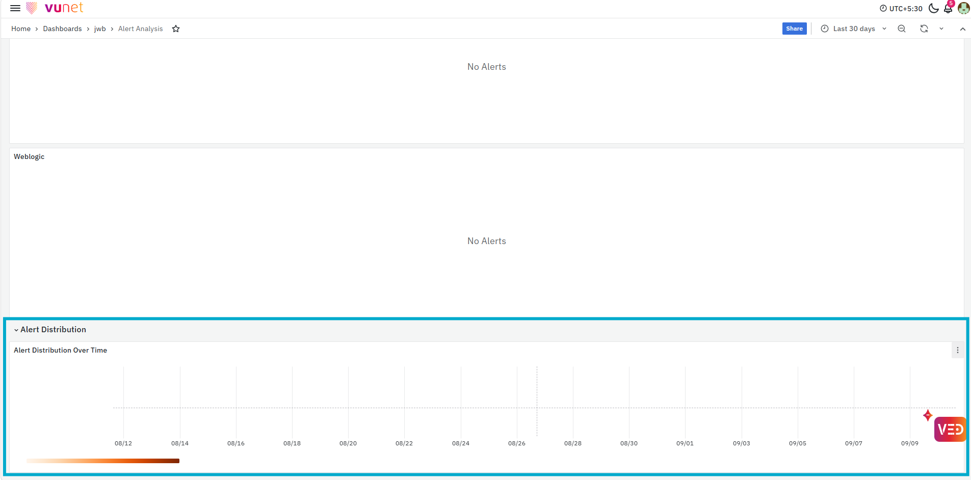
The last section provides Alert Distribution Over Time, showing how alerts occurred during the selected time range. This helps users understand when alerts were generated and identify periods with increased alert activity. Users can compare this timing with changes observed in journey performance, failures, or response time to understand whether the alerts occurred during the same period as the business or operational issue.
Custom Storyboards
Custom Storyboards allow users to extend the standard Journey Workbench storyboards with journey-specific views when additional information or analysis is required. Instead of modifying the predefined JWB storyboards, which are reused across multiple payment journeys, users can create separate custom storyboards based on their specific requirements. These storyboards can be integrated into the JWB navigation through the Custom Storyboard tab for seamless access alongside the standard storyboards.
Step-by-Step Instructions
Access and Review a Business Journey
- Open the Payment Journey Observability dashboard and select the required time range.
- Review the journey cards and identify any Stable or Unstable journey that requires attention.
- Open the required journey and review Journey State, UEI, Journey Health, Business Metrics, Trends & Patterns, and the End-to-End Transaction Journey Flow.
- Use Micro Journeys, KPIs By Host IP, and UTM for further analysis when required.
Investigate a Failure
- Open Touchpoint Analysis > Failure for the required touchpoint.
- Review failure summaries, trends, Technical Decline, Business Decline, and response-code details.
- Check failed transactions, transaction types, and Host IP analysis.
- Select a Request UUID or Trace ID for deeper investigation.
Investigate Increased Response Time
- Open Touchpoint Analysis > Response Time.
- Review the response-time distribution and 50P, 75P, and 95P trends.
- Compare successful and failed transactions and check slow transactions by Transaction Type and Host IP.
- Select the required transaction for further analysis in Transaction Trace.
Analyze a Response Code
- Open Touchpoint Analysis > Response Code and select the required response code.
- Review its trend, Day Vs Hour HeatMap, and 95P response time.
- Check the affected Transaction Types and Host IPs to identify the pattern.
Trace a Transaction
- Open Transactions and identify the required transaction using Request UUID or Trace ID.
- Open Transaction Trace and ensure the selected time range includes the transaction.
- Review the transaction flow, Stitched Transaction Log View, and Raw Transaction Log View.
Tips / Best Practices
- Begin with Payment Journey Observability before opening detailed dashboards. This provides the business context and helps identify which journey requires attention.
- Use the same time range while moving between Overview, Touchpoint Analysis, Transactions, Analytics, and Alerts so that the information being compared belongs to the same period.
- Review Yesterday and Last Week comparisons before treating a change as abnormal.
- Use End-to-End Transaction Journey Flow to narrow an issue to a touchpoint before moving into detailed Failure or Response Time analysis.
Troubleshooting
-
Issue: Journey shows an Unstable State
- Possible Cause: One or more journey indicators, such as Technical Decline or Response Time, may be affecting the overall journey performance.
- Solution: Review the message displayed with the Journey State and check the affected Business Metrics. Use the End-to-End Transaction Journey Flow to identify the affected touchpoint, and then continue with Failure or Response Time analysis as required.
-
Issue: Failures have increased, but the affected area is not clear
- Possible Cause: Failures may be associated with different response codes, transaction types, failed touchpoints, or Host IPs.
- Solution: Open Touchpoint Analysis > Failure and review the failure distribution, Technical Decline and Business Decline details, response codes, transaction-type analysis, and host-level analysis. Use the List of Failed Transactions to investigate individual failed transactions where required.
-
Issue: Response Time has increased
- Possible Cause: Slow response times may be associated with a particular transaction type, failure location, failed touchpoint, or Host IP.
- Solution: Open Touchpoint Analysis > Response Time and review the response-time distribution and percentile trends. Compare successful and failed transaction response times, and review the slowest transactions by transaction type and Host IP to narrow down the affected area.
FAQs
What is the purpose of the Payment Journey Observability page?
It provides a high-level view of the configured business journeys and their key indicators, allowing users to identify Stable and Unstable journeys before opening detailed storyboards.
What does UEI represent?
UEI provides a high-level indication of the overall user experience for the selected journey and time period. It can be reviewed together with the transaction distribution and recent trend before analyzing individual business metrics.
How can I determine which touchpoint is causing an issue?
Review the End-to-End Transaction Journey Flow in Overview. It displays the transaction KPIs for the individual touchpoints and helps identify the downstream touchpoint where the problem is visible.
Where can I investigate transaction failures?
Use Touchpoint Analysis > Failure to analyze failure categories, response codes, transaction types, hosts, trends, and individual failed transactions.
Where can I investigate slow transactions?
Use Touchpoint Analysis > Response Time. It provides response-time distribution and percentile trends together with slow transactions by transaction type and host.
How can I analyze a particular response code?
Open Touchpoint Analysis > Response Code and select the required response code. You can then review its trend, time distribution, response time, transaction types, and affected hosts.
What is the difference between Transaction Details and Transaction Trace?
Transaction Details provides lists of successful, Technical Decline, and Business Decline transactions. Transaction Trace provides detailed information for an individual transaction as it moves through the journey touchpoints.
What are Stitched Transaction Log View and Raw Transaction Log View?
The Stitched Transaction Log View presents the transaction information stitched for the selected transaction, while the Raw Transaction Log View provides the corresponding raw transaction information for detailed investigation.
