Table Visualization
The Table visualization displays data in a structured tabular format, enabling users to view, compare, and analyze detailed records and aggregated metrics. It is particularly useful for operational analysis, troubleshooting, alert monitoring, and reporting scenarios where precise values and detailed information are required. Table visualizations can be configured using the Query Builder, which allows users to define the data source, aggregation logic, filtering criteria, and result limits.
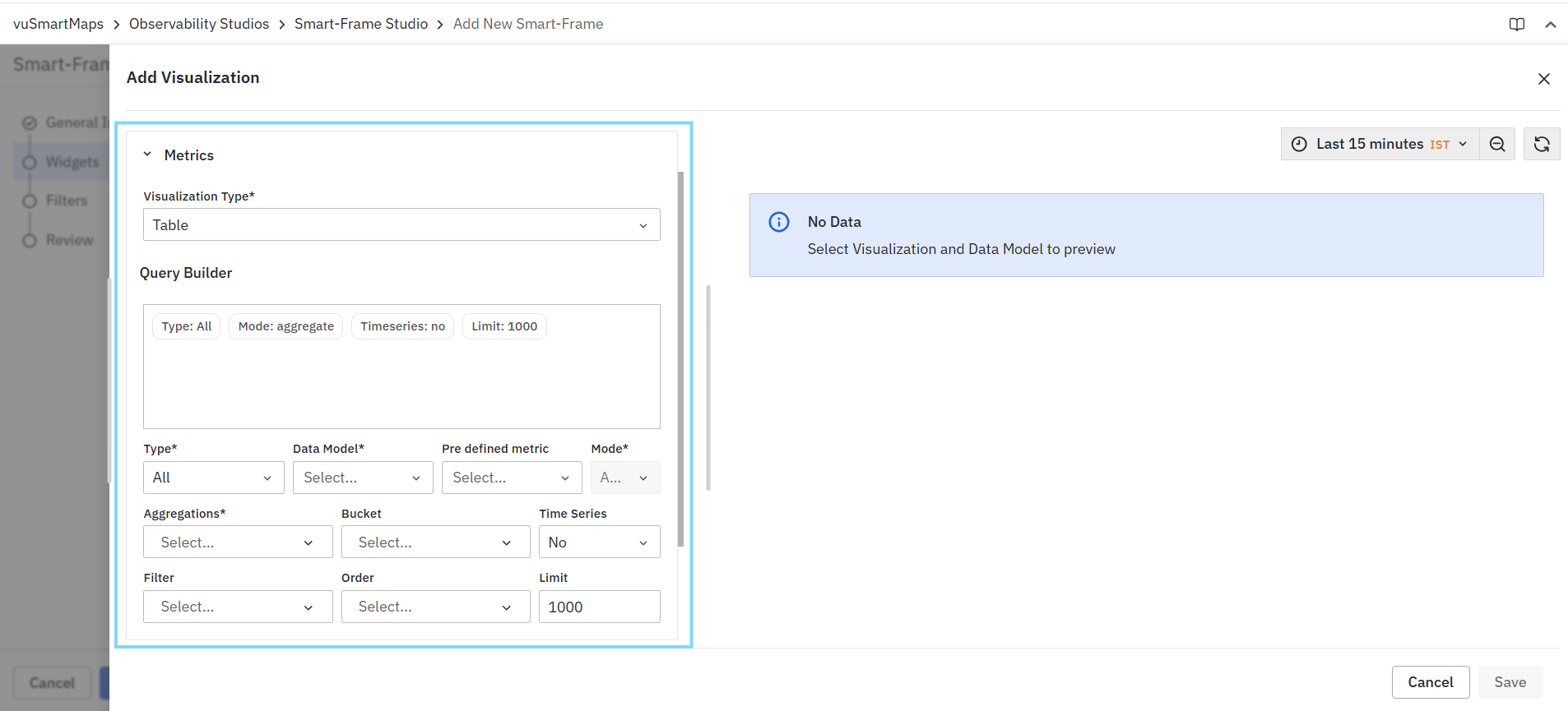
Creating a Table Visualization
To create a Table visualization:
- Select Table from the Visualization Type drop-down.
- Configure the query using the Query Builder.
- Review the generated query summary.
- Validate the results in the Preview panel.
- Configure optional customization settings if required.
- Click Save.
Query Configuration
Table visualizations use the standard Query Builder framework available in Smart-Frame Studio. The Query Builder allows you to:
- Select the data source.
- Choose a data model.
- Configure aggregations.
- Apply filters.
- Define sorting and result limits.
- Review query summaries before execution.
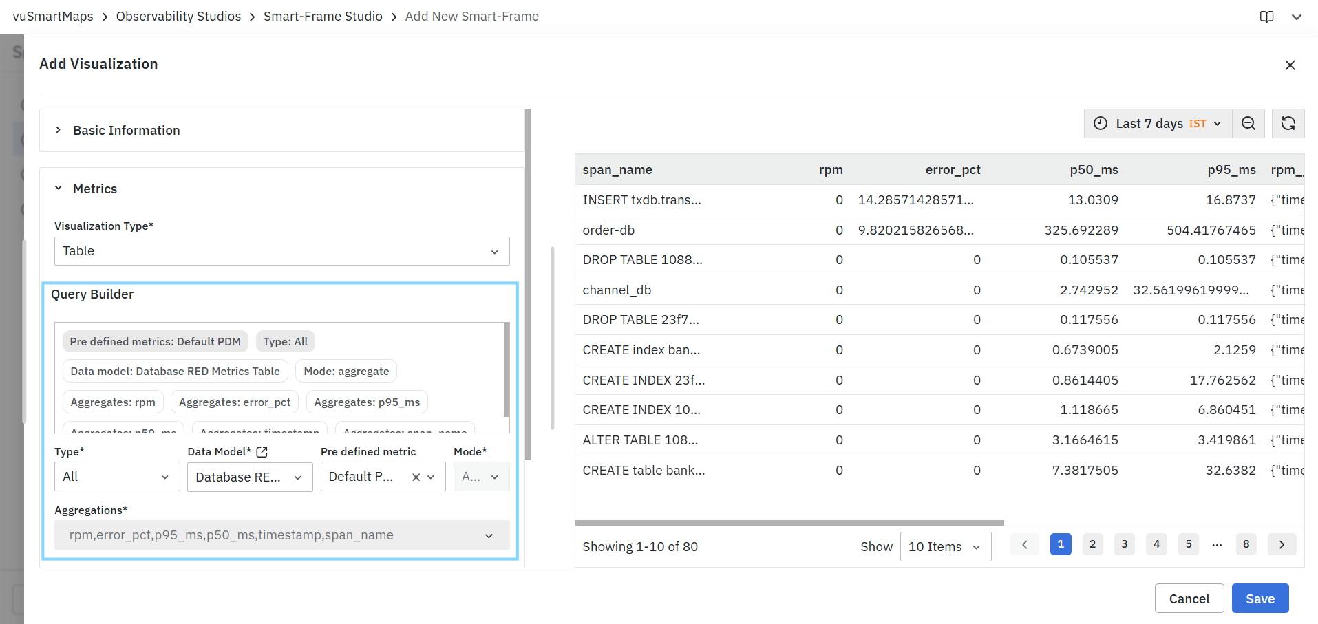
For detailed information about all Query Builder fields and configuration options, see Query Builder.
Preview Panel
The Preview Panel displays the output generated by the configured query. As configuration changes are applied, the preview updates automatically to reflect the latest query settings.
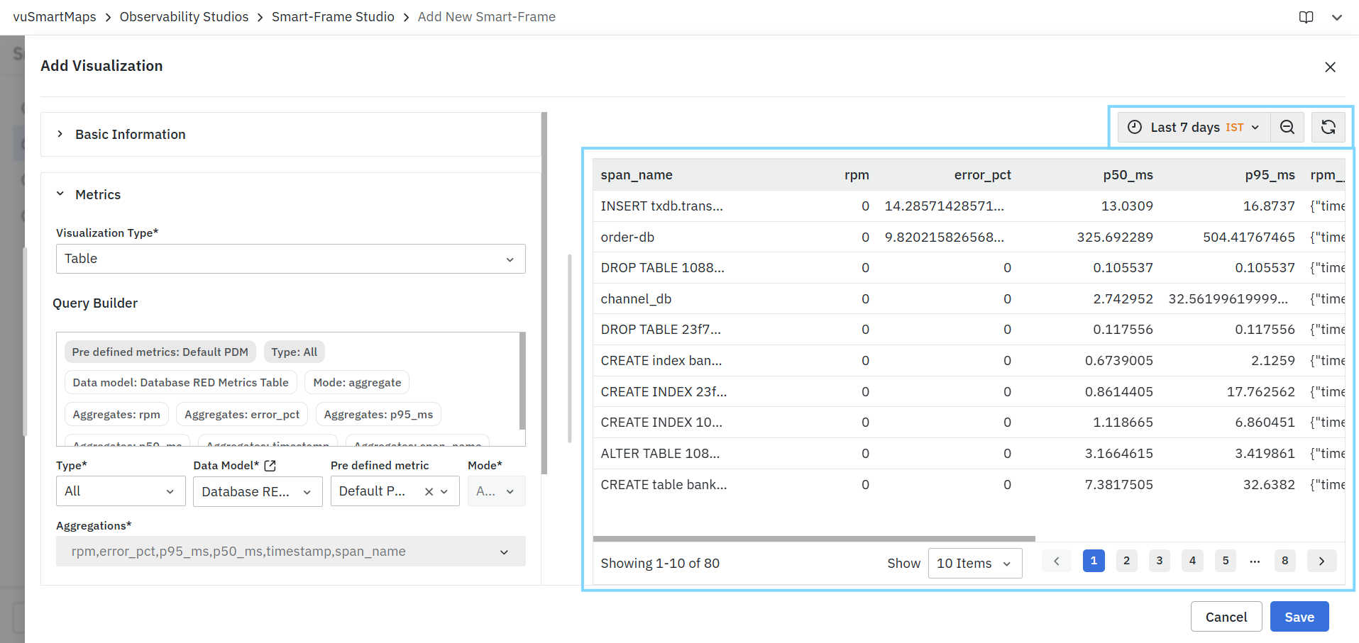
The preview can be used to:
- Validate query results
- Verify selected aggregations
- Confirm filtering criteria
- Review data before saving the visualization
If no data is returned, the preview displays a No Data message.
Table-Specific Characteristics
Table visualizations are designed to display:
- Detailed records.
- Aggregated metrics.
- Grouped datasets.
- Multi-column information.
- Operational and reporting data.
Common use cases include:
- Alert analysis.
- Service performance reporting.
- Infrastructure monitoring.
- Capacity planning.
- Troubleshooting and root-cause analysis.
Customizations
The Customizations (Optional) section allows users to enhance the appearance, behavior, and presentation of visualizations without modifying the underlying query configuration. These settings help tailor visualizations to specific reporting, monitoring, and analysis requirements. Customization options may vary depending on the selected visualization type. Only the settings supported by the selected visualization are displayed.
Customizations are organized into the following configuration modes:
- Manual: Provides user interface-based configuration options for customizing visualization behavior, appearance, and formatting.
- Advanced Configurations: Allows advanced users to define custom widget configurations using supported configuration syntax.
Depending on the visualization type, the following customization sections may be available:
- Units and Formatting
- Data Controls
- Historical Comparison
- Table Controls
- Axis Controls
- Legend Controls
- Color Controls
- Visualization-Specific Controls
Each customization section can be configured independently to meet visualization requirements.
Units and Formatting
The Units and Formatting section allows users to customize how values are displayed within a visualization. These settings improve readability and ensure that data is presented in a meaningful and consistent format without altering the underlying data.
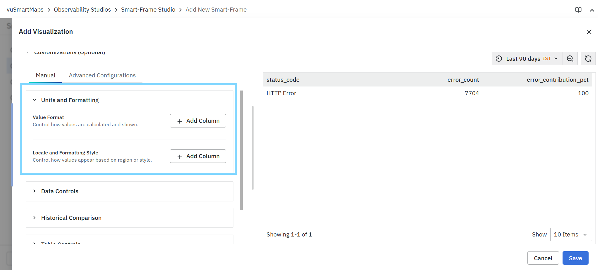
This section consists of the following components:
- Value Format
- Locale and Formatting Style
Users can configure formatting rules for one or more fields and preview the changes directly in the visualization.
Value Format
The Value Format option controls how values are calculated, formatted, and displayed for selected fields within a visualization.
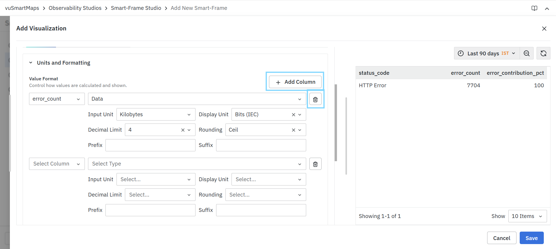
To configure value formatting:
- Click Add Column.
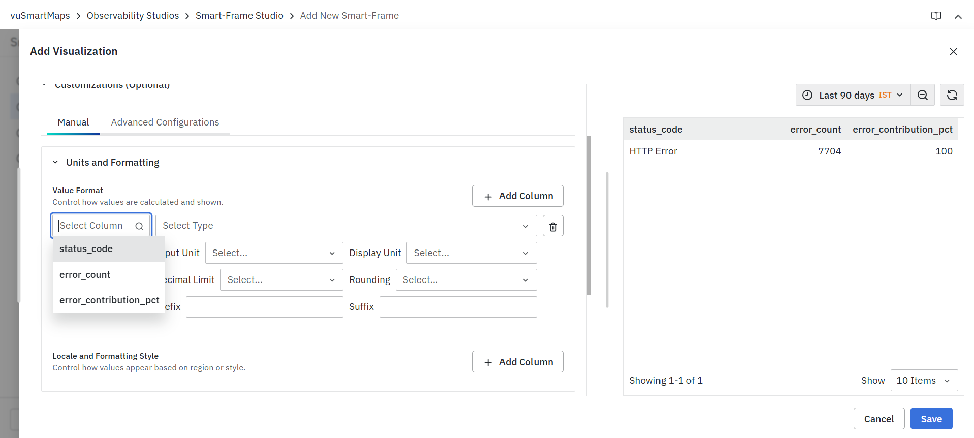
- Select the required field from the Select Column drop-down.
- Select the appropriate formatting type from the Select Type drop-down.
- Configure the available formatting options.
- Repeat the process for additional fields if required.
The formatting configuration is applied only to the selected field and affects the display of values within the visualization.
Column
- The Select Column field allows users to choose the field to which the formatting rule will be applied.
- Only fields included in the query result are available for selection.
Type
The Select Type field determines the formatting category applied to the selected field.
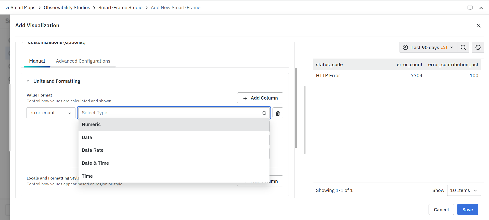
Depending on the nature of the data, available types may include:
- Numeric
- Data
- Data Rate
- Date & Time
- Time
Each type provides a different set of formatting options tailored to the selected data category.
Input Unit
The Input Unit field specifies the original unit of the data stored in the selected field.
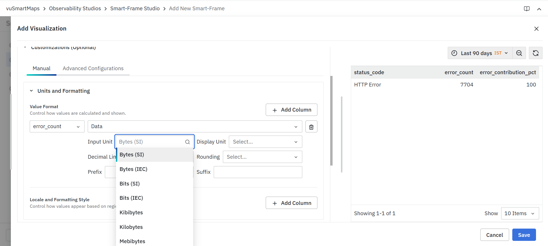
Available options vary based on the selected formatting type. Examples include:
- Bytes (SI)
- Bytes (IEC)
- Bits (SI)
- Bits (IEC)
- Kilobytes
- Kibibytes
- Megabytes
- Mebibytes
Additional units may be available depending on the selected format type.
Display Unit
The Display Unit field determines how values are presented within the visualization.
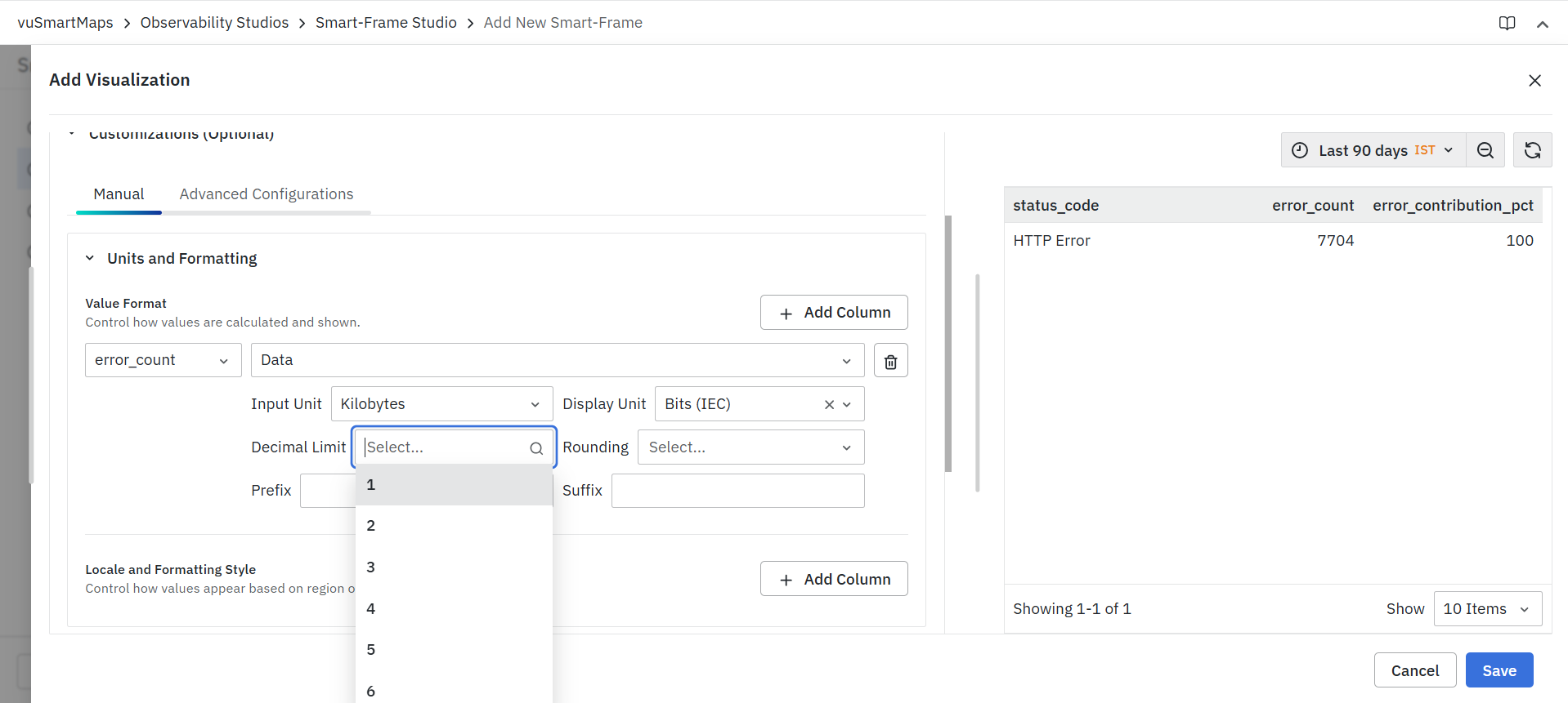
Users can:
- Select a specific display unit.
- Enable automatic scaling, allowing the system to select the most appropriate unit based on the value range.
This helps present large or small values in a more readable format.
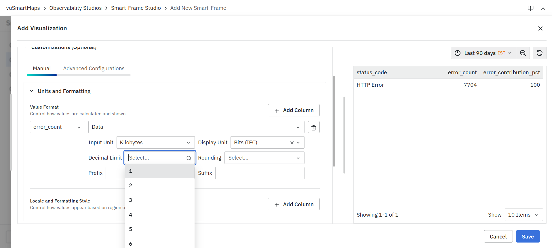
Decimal Limit
- The Decimal Limit field controls the number of decimal places displayed for the selected field.
- Adjusting decimal precision helps improve readability while maintaining the required level of accuracy.
Rounding
The Rounding field determines how decimal values are rounded before being displayed.
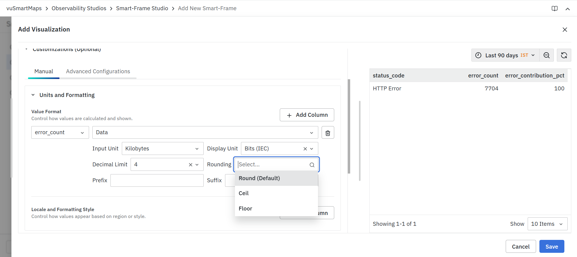
Available options may include:
- Round (Default)
- Ceil
- Floor
The selected option affects how formatted values are presented.
Prefix
The Prefix field allows users to add custom text before the displayed value.
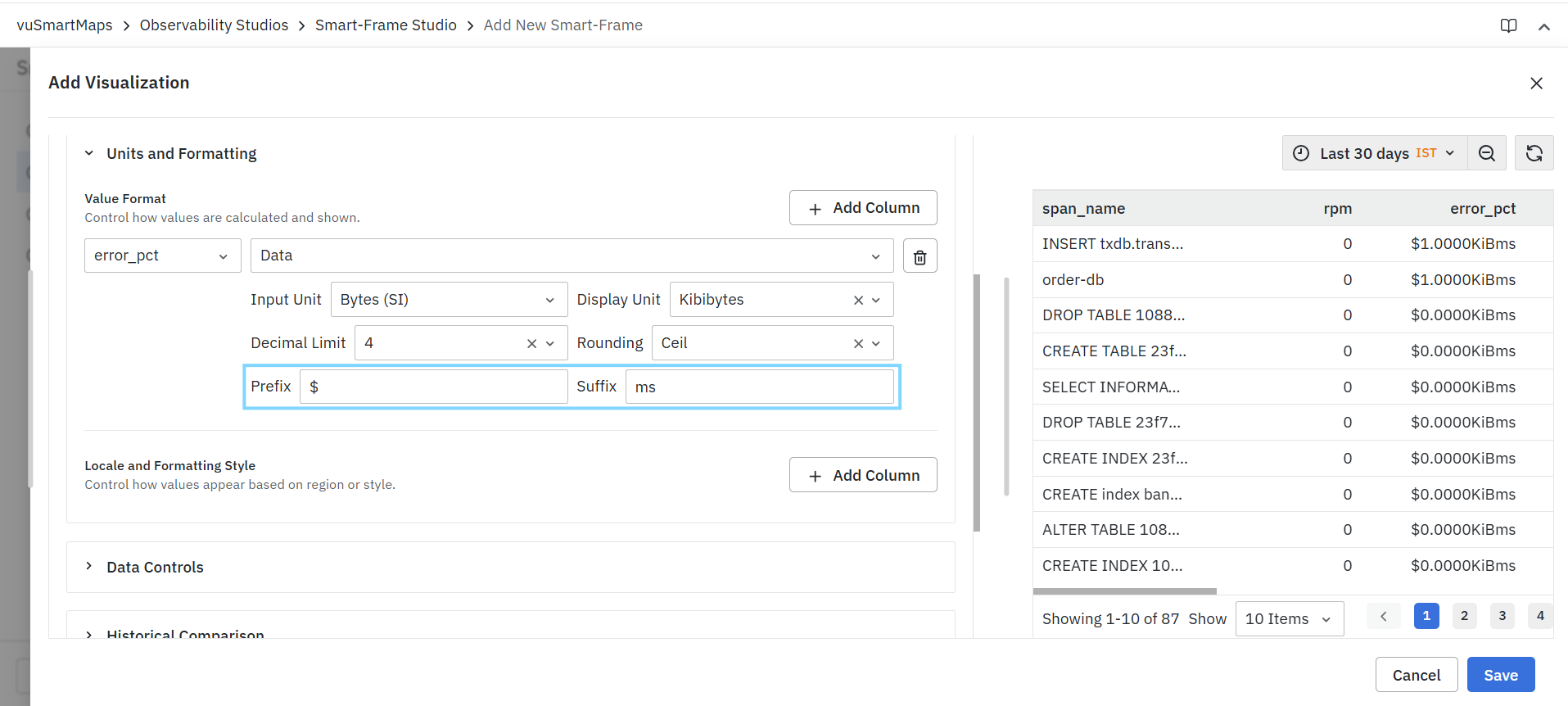
Example:
- Prefix: $
- Output: $100
Suffix
The Suffix field allows users to append custom text after the displayed value.
Example:
- Suffix: ms
- Output: 250 ms
Managing Multiple Formatting Configurations
Users can configure formatting for multiple fields within the same visualization.
- Click Add Column to create additional formatting configurations.
- Configure each field independently.
- Click the Delete icon to remove a configuration.
Each field can have its own units, precision settings, and display format.
Locale and Formatting Style
The Locale and Formatting Style section allows users to customize how values are displayed according to regional conventions and formatting preferences. These settings affect only the presentation of data and do not modify the underlying dataset.
This feature is particularly useful when displaying:
- Currency values
- Percentages
- Financial metrics
- Scientific notation
- Large numerical values
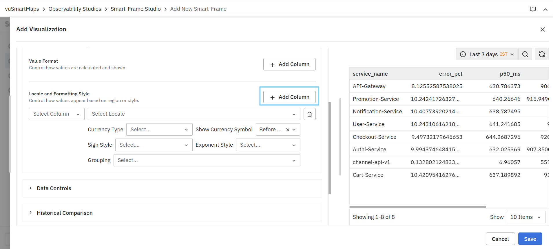
To configure locale-based formatting:
- Click Add Column.
- Select the required field from the Select Column drop-down.
- Select the desired locale.
- Configure the available formatting options.
- Preview the changes in the visualization.
- Repeat the process for additional fields if required.
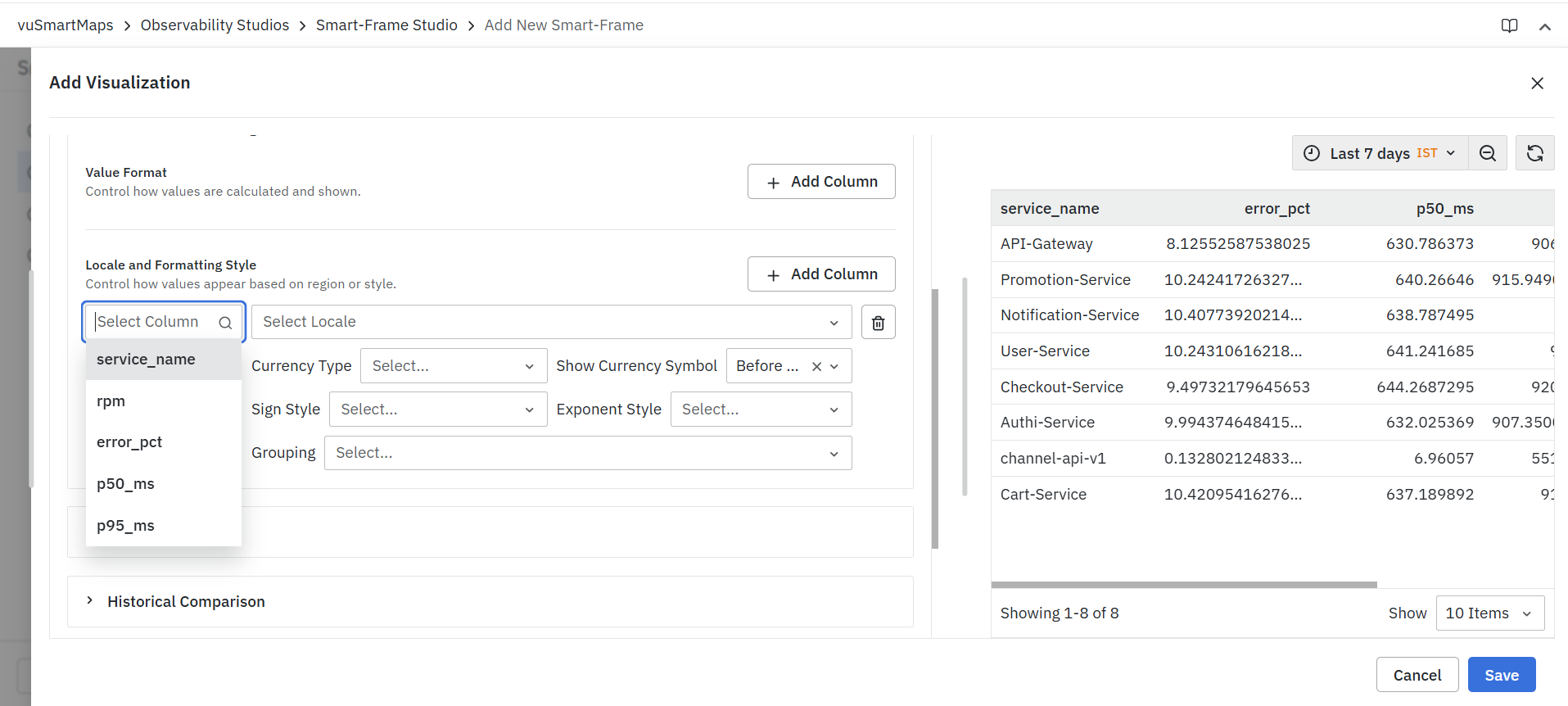
Column
- The Select Column field allows users to choose the field for which locale-based formatting will be applied.
- Only fields included in the query result are available for selection.
Locale
The Select Locale field determines the regional formatting standard used to display values.
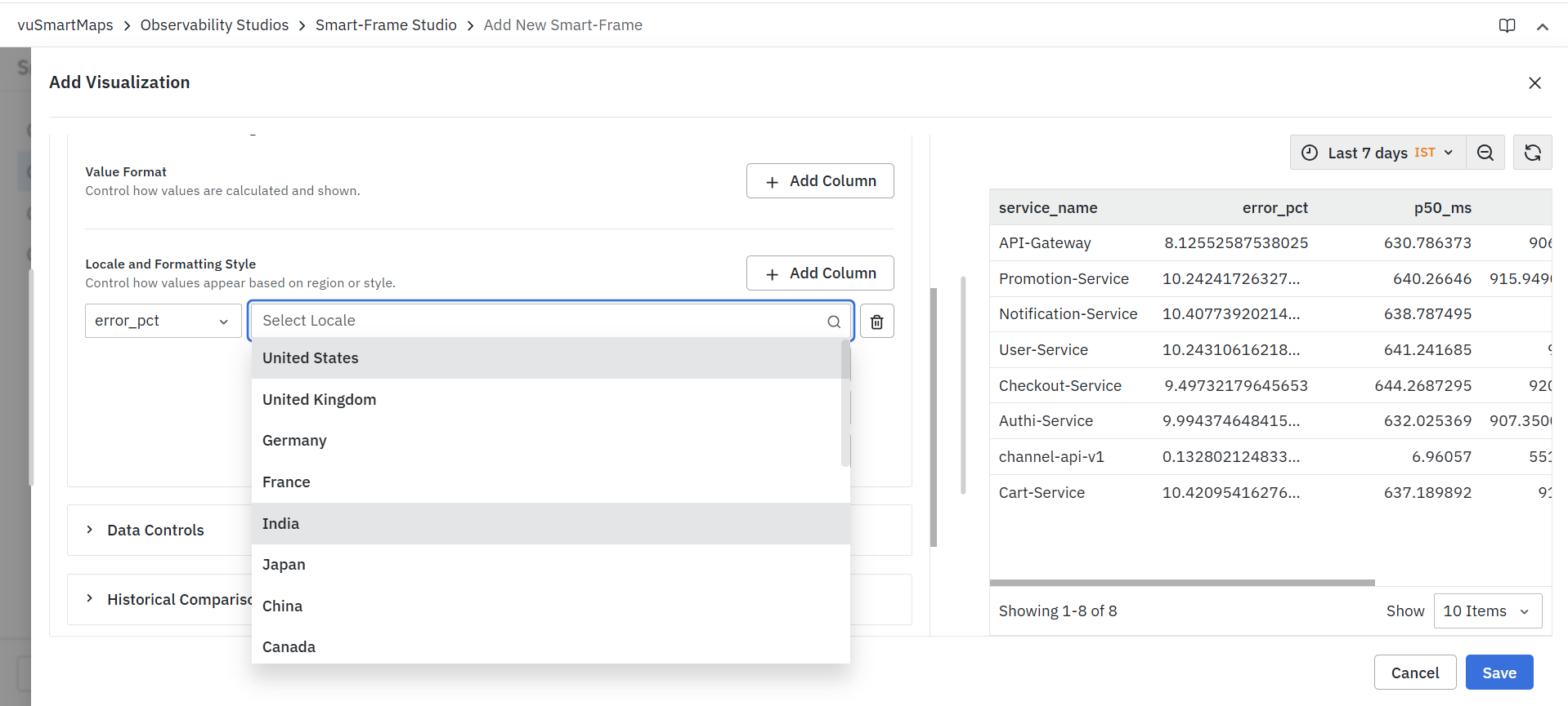
Examples include:
- United States
- United Kingdom
- Germany
- France
- India
- Japan
- China
- Canada
The available locales may vary depending on system configuration.
Currency Type
The Currency Type field specifies the currency symbol used when displaying values.

Examples include:
- Dollar ($)
- Euro (€)
- Pound (£)
- Indian Rupee (₹)
- Yen (¥)
This setting is useful when presenting financial or cost-related metrics.
Show Currency Symbol
Determines where the selected currency symbol appears relative to the displayed value.

Available options include:
| Option | Description |
|---|---|
| Before Value | Displays the currency symbol before the value. |
| After Value | Displays the currency symbol after the value. |
Examples:
| Setting | Output |
|---|---|
| Before Value | ₹100 |
| After Value | 100₹ |
Sign Style
The Sign Style option controls how positive and negative values are displayed. Available options include:
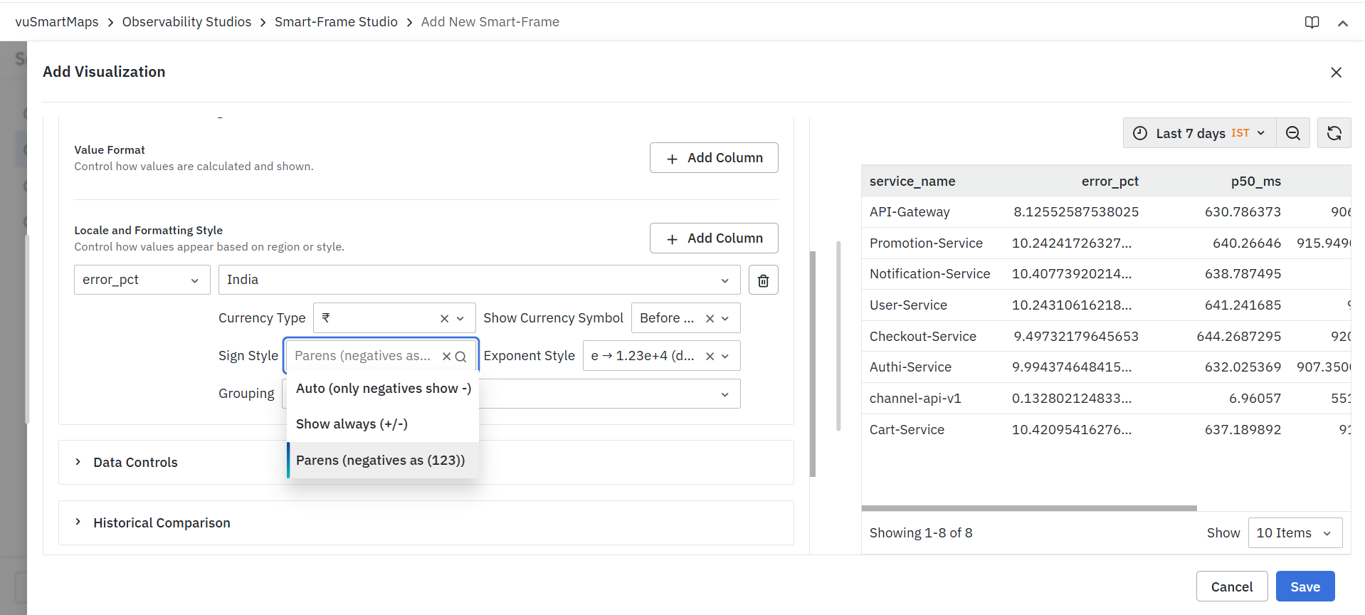
| Option | Description |
|---|---|
| Auto (Default) | Displays a minus sign only for negative values. |
| Show Always (+/-) | Displays a sign for both positive and negative values. |
| Parentheses for Negatives | Displays negative values within parentheses. |
Examples:
| Value | Auto | Show Always | Parentheses |
|---|---|---|---|
| 123 | 123 | +123 | 123 |
| -123 | -123 | -123 | (123) |
Exponent Style
The Exponent Style option controls how large or small numbers are displayed using scientific notation. Available options include:
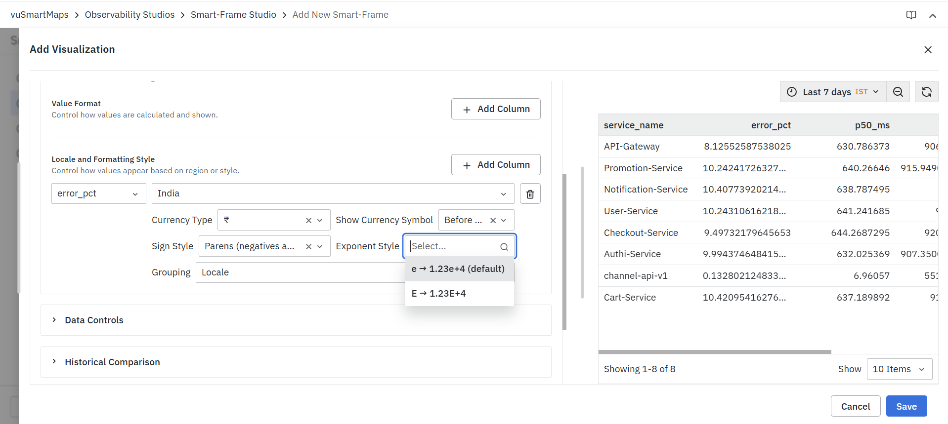
| Option | Example |
|---|---|
| Lowercase Exponent (Default) | 1.23e+4 |
| Uppercase Exponent | 1.23E+4 |
This option is useful when displaying metrics with very large or very small values.
Grouping
The Grouping option controls how digits are grouped within large numbers. Available options include:
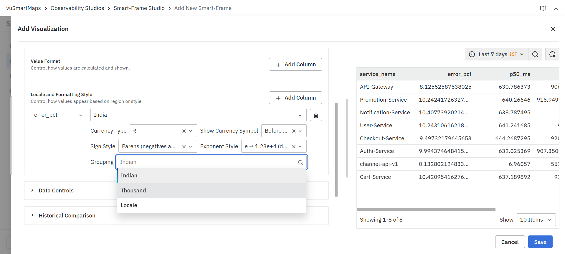
| Option | Description |
|---|---|
| Locale | Uses the grouping pattern defined by the selected locale. |
| Thousand | Groups digits in thousands. |
| Indian | Uses the Indian numbering system grouping format. |
Examples:
| Grouping Style | Output |
|---|---|
| Thousand | 1,234,567 |
| Indian | 12,34,567 |
| Locale | Based on the selected locale |
Managing Multiple Locale Configurations
Users can configure locale and formatting settings for multiple fields within the same visualization.
- Click Add Column to create additional locale formatting configurations.
- Configure each field independently.
- Click the Delete icon to remove a configuration.
This allows different fields within the same visualization to use different regional formats, currency styles, sign conventions, and grouping patterns.
Changes are reflected immediately in the visualization preview.
Data Controls
The Data Controls section allows users to control how data values are visually represented within a visualization. These settings help highlight important information, improve readability, and provide meaningful context without modifying the underlying dataset.
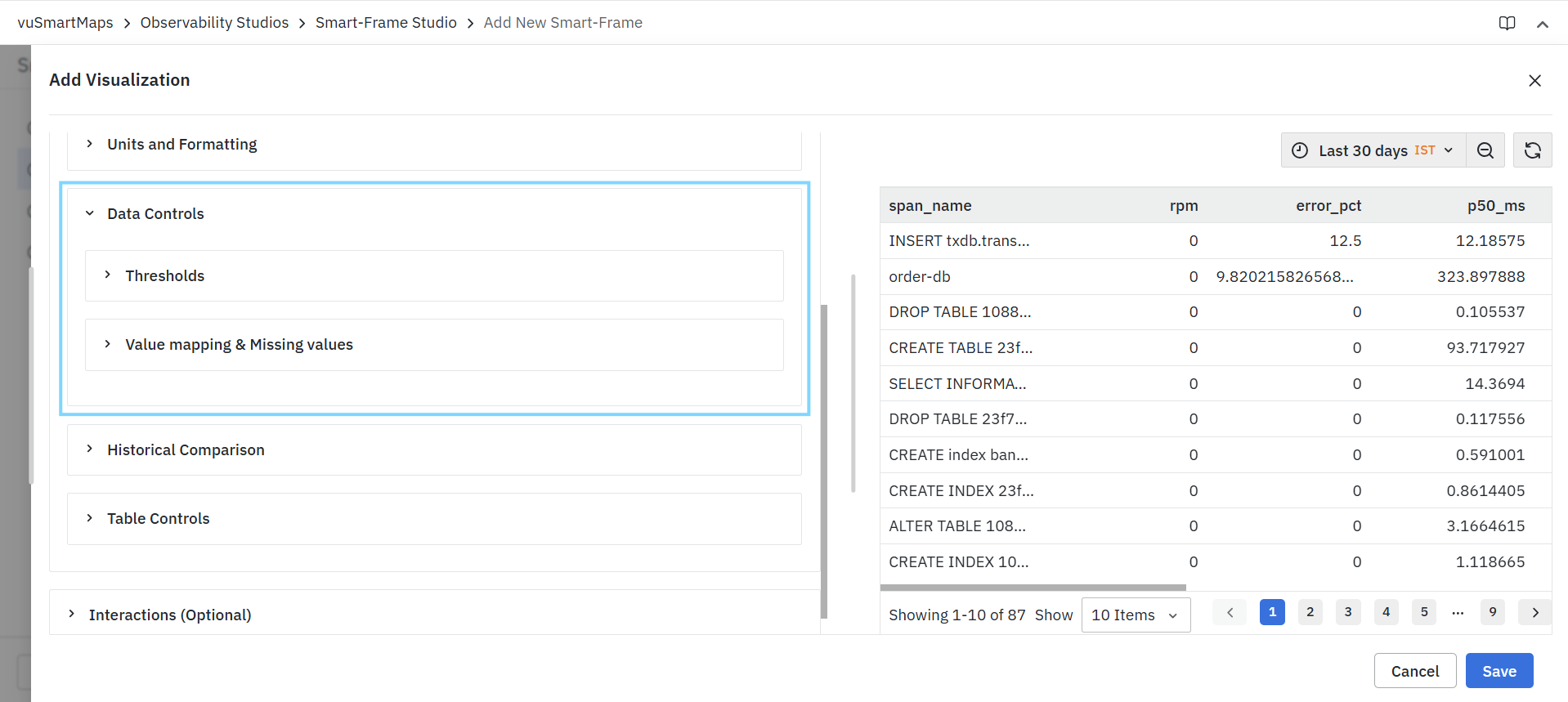
Data Controls can be used to:
- Highlight values that meet specific conditions.
- Apply conditional colors to text or backgrounds.
- Define custom display values.
- Replace missing or unavailable data.
- Improve visual interpretation of metrics and business indicators.
The Data Controls section consists of the following components:
- Thresholds
- Value Mapping & Missing Values
Each component can be configured independently based on visualization requirements.
Thresholds
Thresholds allow users to apply conditional formatting to visualization values based on predefined rules.
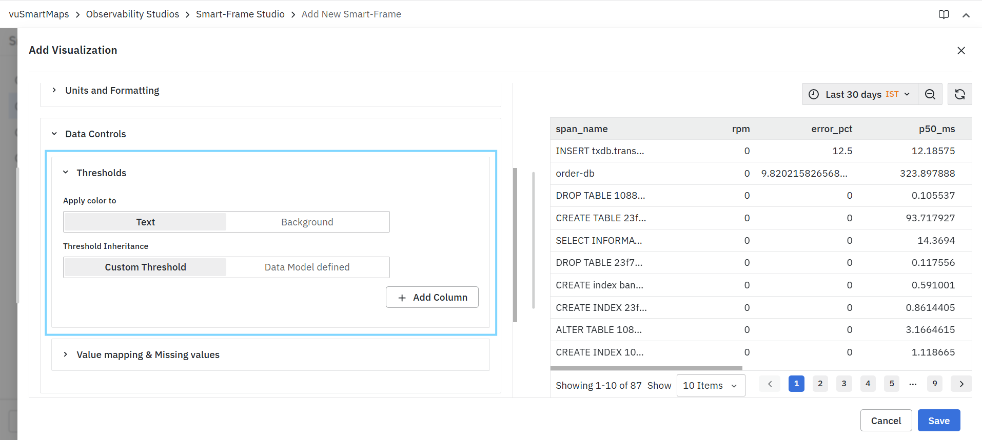
Thresholds help users quickly identify:
- Critical conditions
- Warning states
- Normal operating ranges
- Performance violations
- Business KPI exceptions
When a value satisfies a configured threshold condition, the selected color is applied automatically.
Thresholds can be applied to:
- Text values
- Background values
Changes are reflected immediately in the visualization preview.
Apply Color To
The Apply Color To option determines where threshold colors are displayed within the visualization.
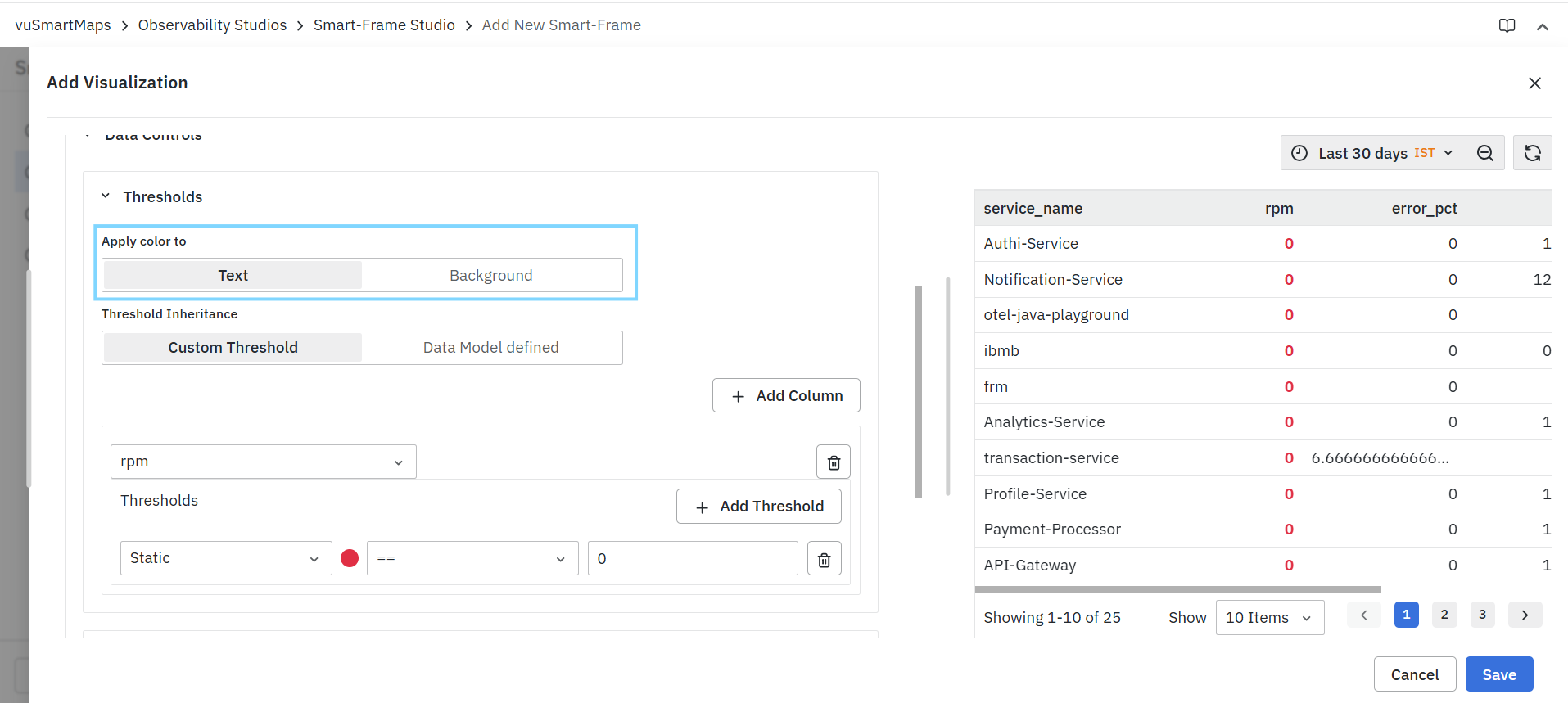
Available options include:
| Option | Description |
|---|---|
| Text | Applies threshold colors to the displayed value text. |
| Background | Applies threshold colors to the background behind the value. |
Threshold Inheritance
Threshold inheritance determines whether threshold definitions are created manually or inherited from the selected data model.
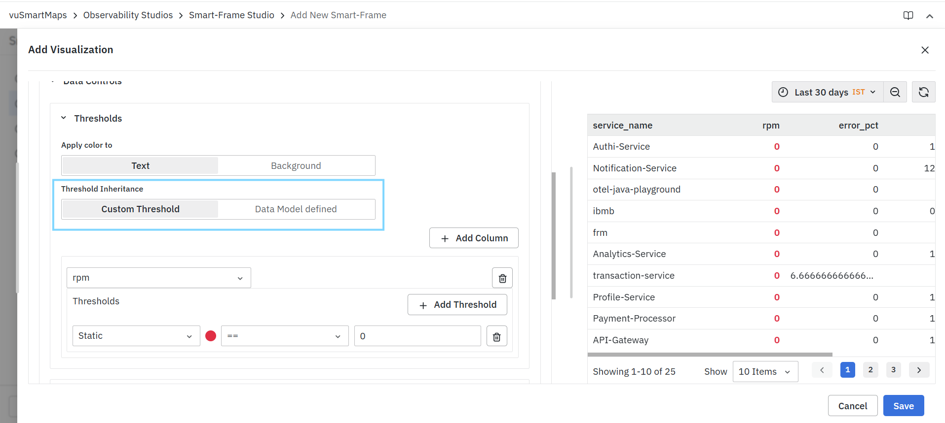
Available options include:
| Option | Description |
|---|---|
| Custom Threshold | Allows users to define threshold rules manually. |
| Data Model Defined | Uses threshold configurations defined within the selected data model. |
Add Column
Click Add Column to create threshold rules for an additional field. Each configured column maintains its own independent threshold definitions.
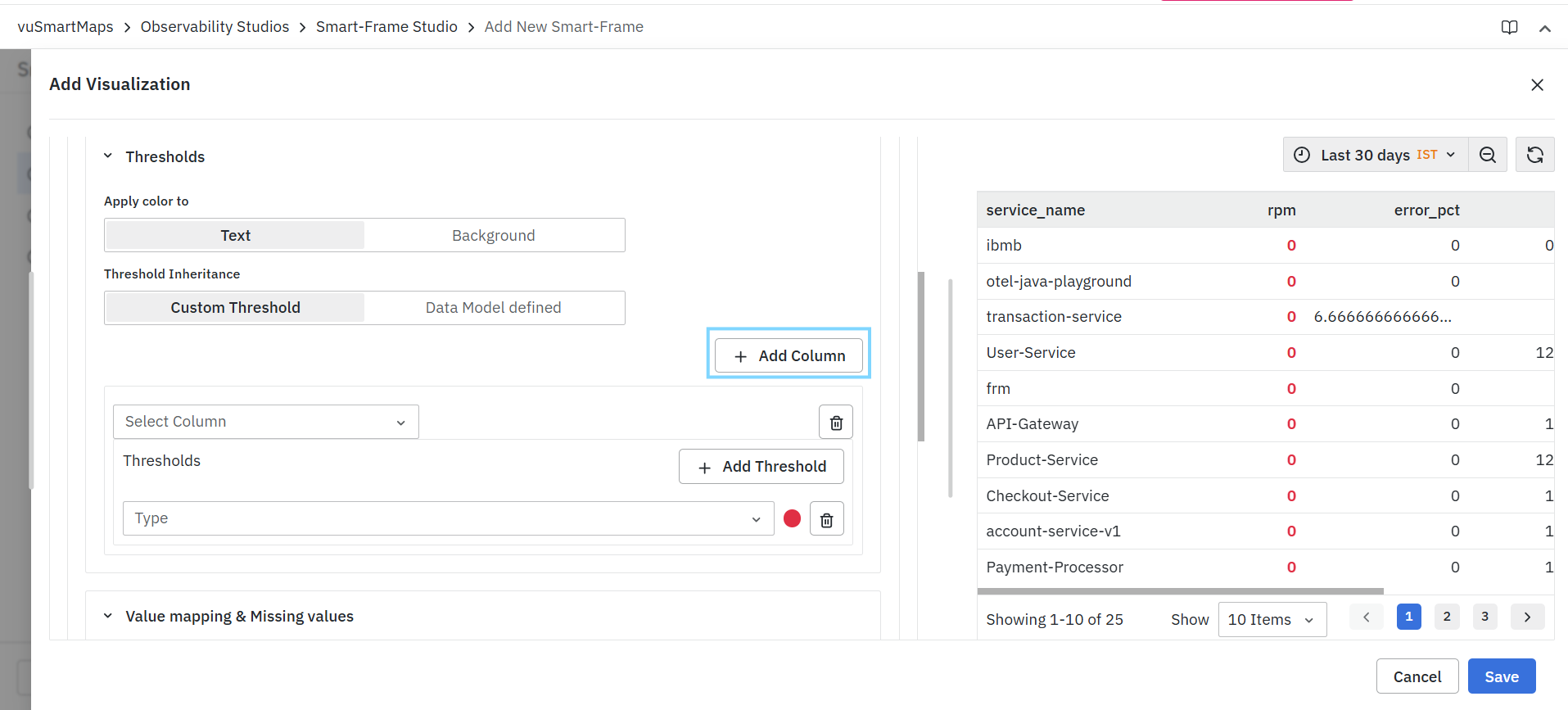
Example
Thresholds can be configured separately for:
- Response Time
- Error Percentage
- Request Rate
- CPU Utilization
- Memory Usage
Multiple columns can be monitored simultaneously within the same visualization.
Column Selection
The column selector determines the field on which threshold rules will be applied. Only fields returned by the configured query are available for selection.
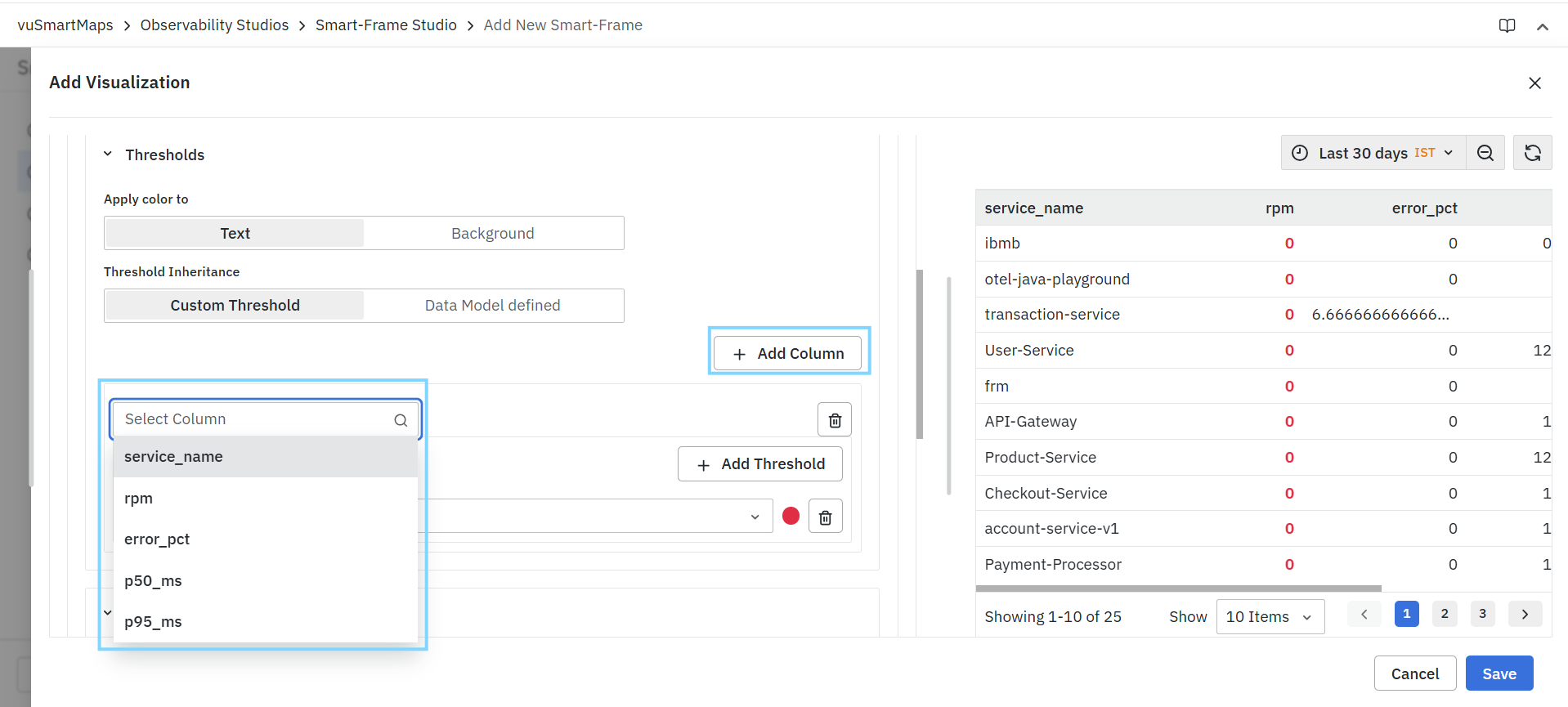
Example
Available fields may include:
- service_name
- rpm
- error_pct
Add Threshold
Click Add Threshold to create a new threshold rule for the selected column. Multiple threshold rules can be configured for a single column.

This enables the creation of multi-level severity indicators such as:
- Normal
- Warning
- Critical
Threshold Rule Components
Each threshold rule consists of:
- Type
- Color
- Operator
- Value
Type
The Type field determines how the threshold value is evaluated.
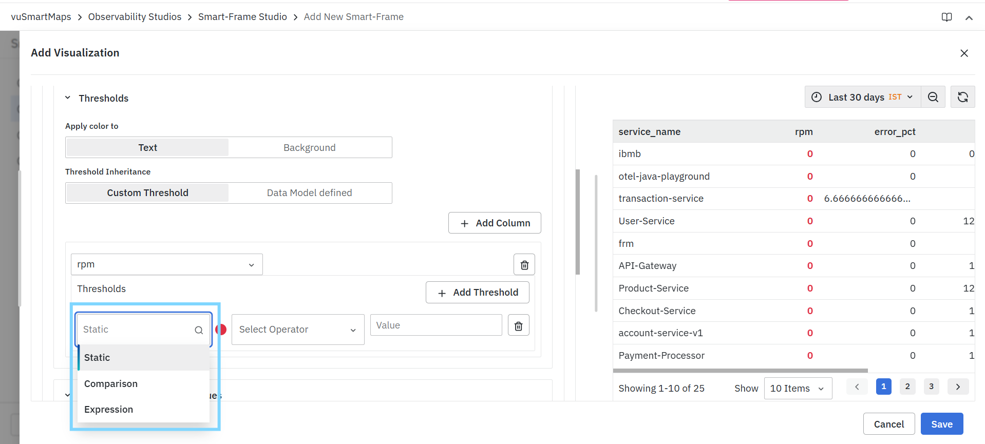
Available options include:
| Type | Description |
|---|---|
| Static | Compares values against a fixed numeric value. |
| Comparison | Compares values against another metric or field. |
| Expression | Evaluates values using a custom expression. |
Static
- Uses a fixed value for comparison.
Example:
error_pct > 5
Comparison
- Compares a metric against another field.
Example:
Current Value > Previous Value
Expression
- Evaluates values using a calculated expression.
- The available expression options depend on system capabilities.
Example:
(rpm / error_count) > 100
Color
The color selector determines the color applied when the threshold condition is satisfied.
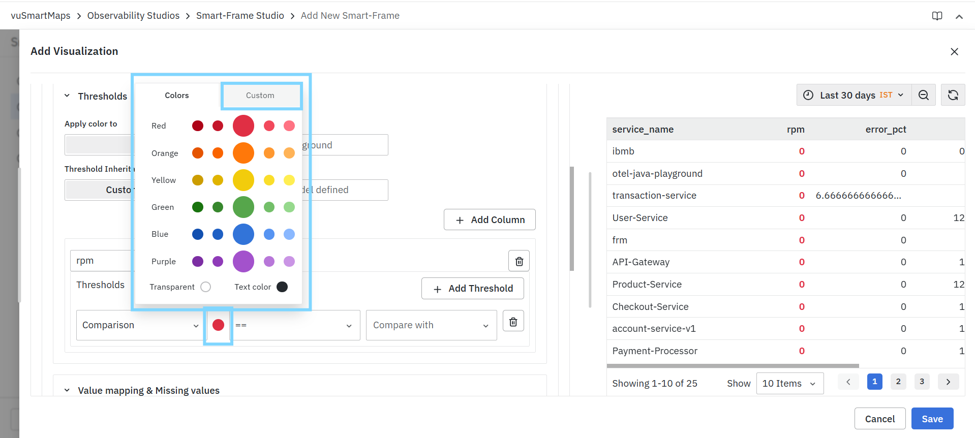
Users can:
- Select predefined colors.
- Choose different shades.
- Configure custom colors where supported.
Operator
The Operator field determines how the threshold value is evaluated.
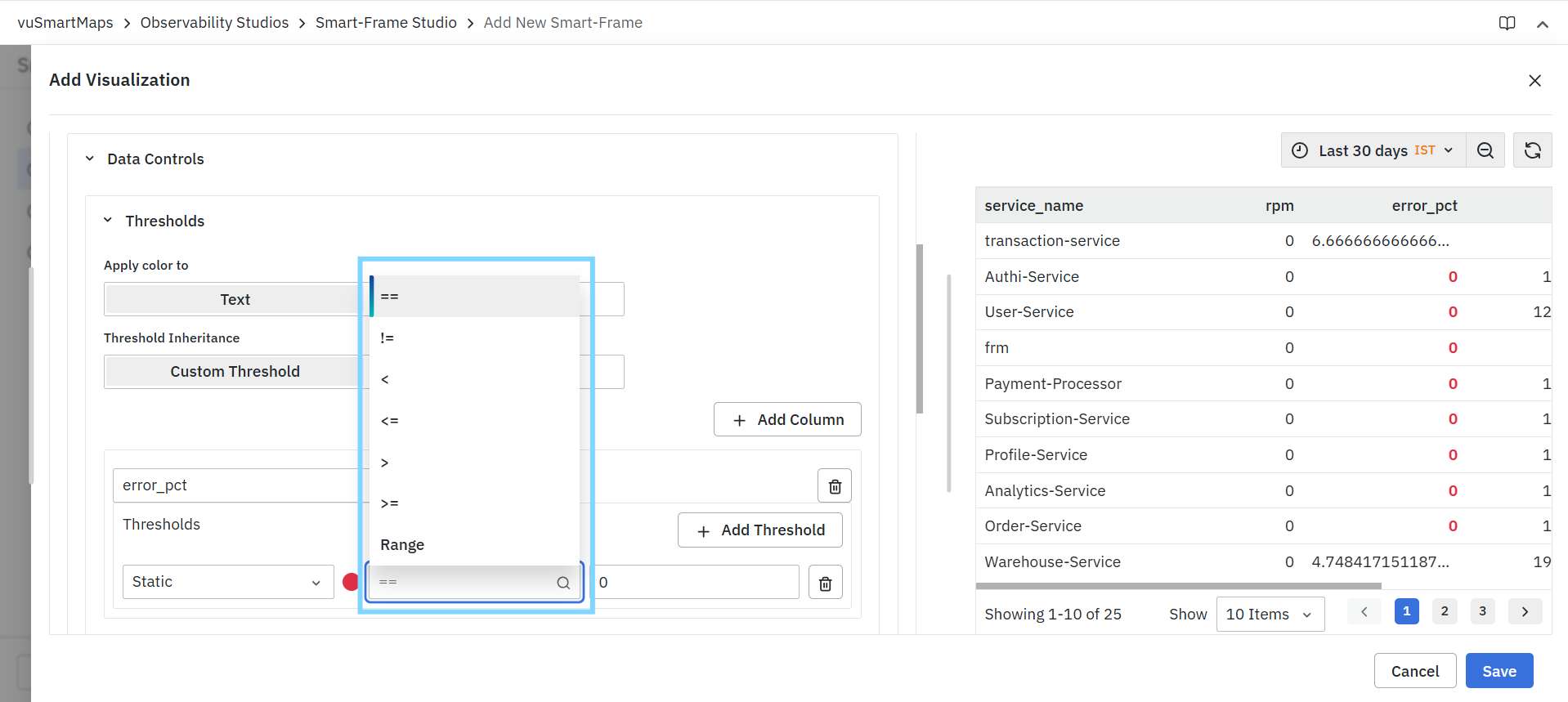
Available operators may include:
| Operator | Description |
|---|---|
| == | Equal To |
| != | Not Equal To |
| < | Less Than |
| <= | Less Than or Equal To |
| > | Greater Than |
| >= | Greater Than or Equal To |
| Range | Falls within a specified range |
Examples
rpm == 0
error_pct > 5
response_time >= 1000
Value
The Value field defines the threshold target used during evaluation. The configured value is evaluated using the selected operator.
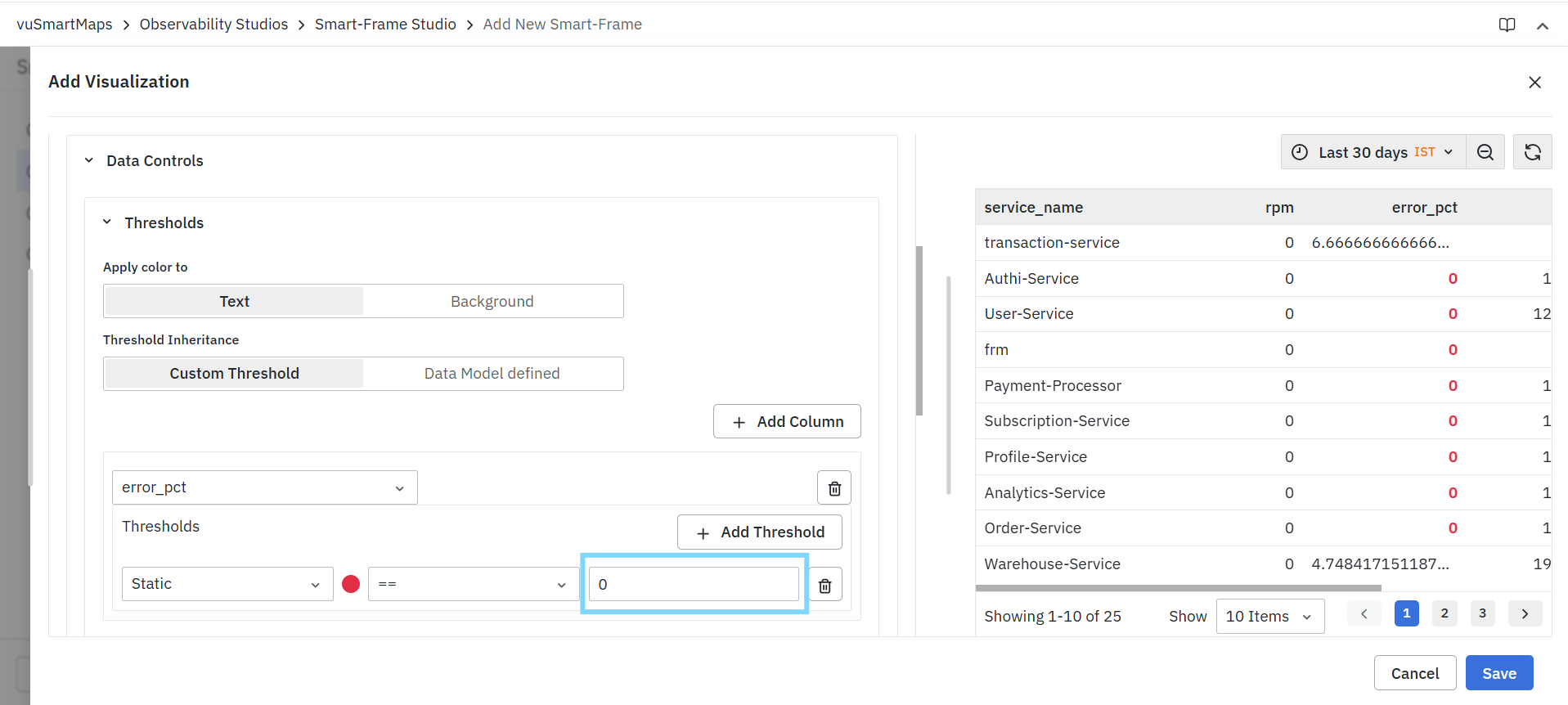
Managing Multiple Threshold Rules
Users can configure multiple threshold rules for the same column.
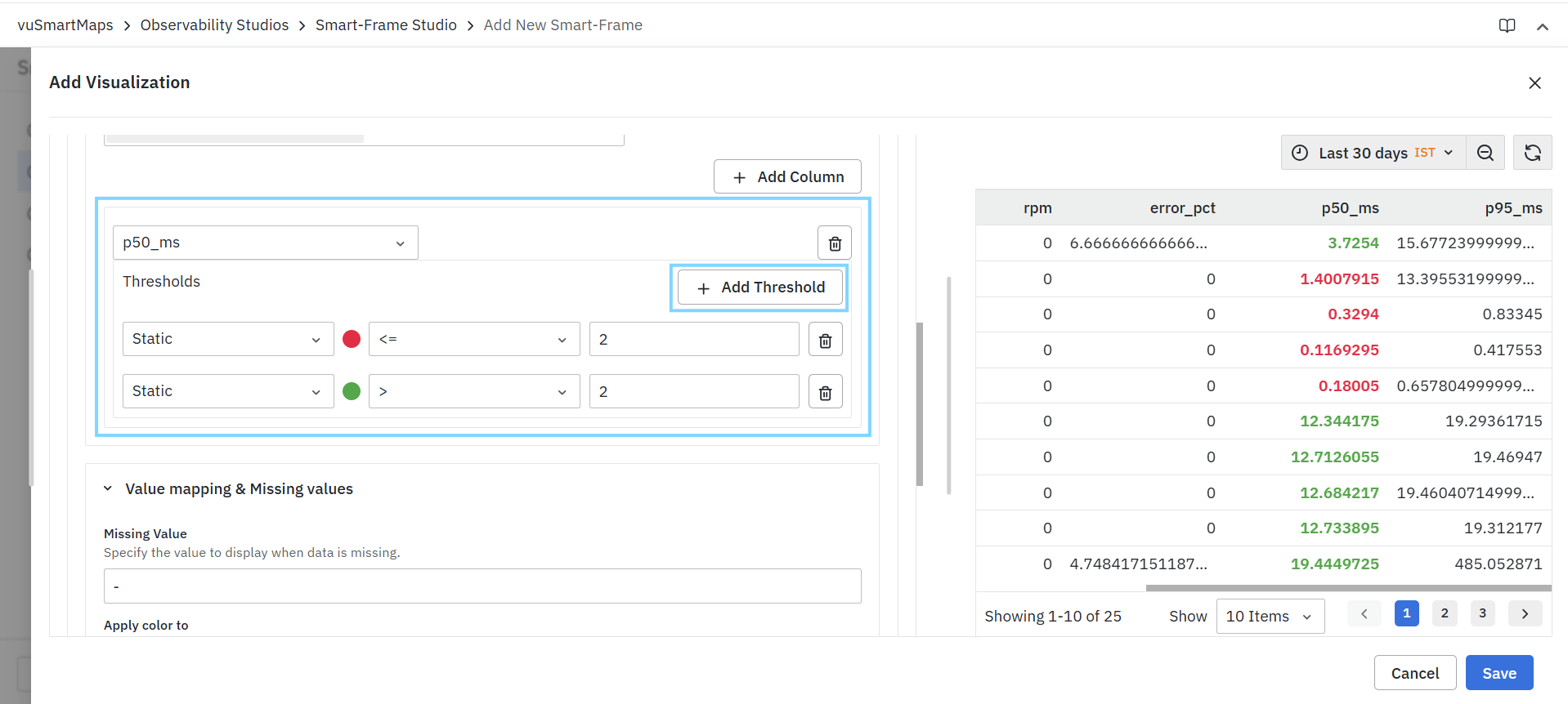
Example:
| Condition | Color |
|---|---|
| response_time < 500 | Green |
| response_time >= 500 | Orange |
| response_time >= 1000 | Red |
This allows visual representation of different severity levels.
Removing Threshold Rules
To remove a threshold rule:
- Locate the threshold entry.
- Click the Delete icon.
- Save the visualization.
The selected threshold rule is removed immediately.
Value Mapping & Missing Values
The Value Mapping & Missing Values section allows users to control how specific values are displayed within a visualization.
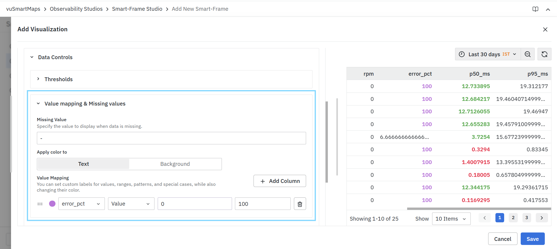
This functionality helps:
- Improve readability.
- Replace technical values with business-friendly labels.
- Highlight important conditions.
- Handle missing or unavailable data consistently.
Missing Value
The Missing Value field specifies the value displayed when data is unavailable or missing.
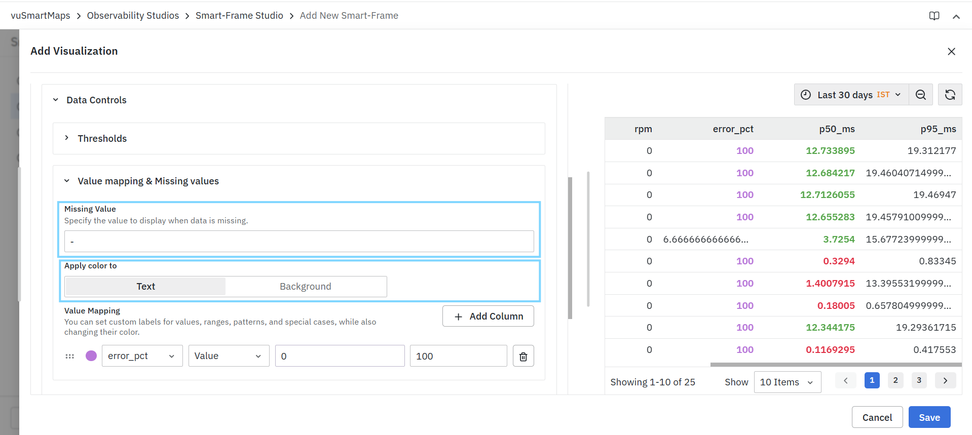
Examples
- Instead of displaying null or undefined
- Users can display -, N/A, No Data, Unavailable
- This improves visualization readability and user experience.
Apply Color To
The Apply Color To option determines where value-mapping colors are displayed. Available options include:
| Option | Description |
|---|---|
| Text | Applies colors to displayed text. |
| Background | Applies colors to the value background. |
Value Mapping
Value Mapping allows users to replace raw values with custom display values and colors.
Mappings can be created for:
- Exact values
- Value ranges
- Status indicators
- Business labels
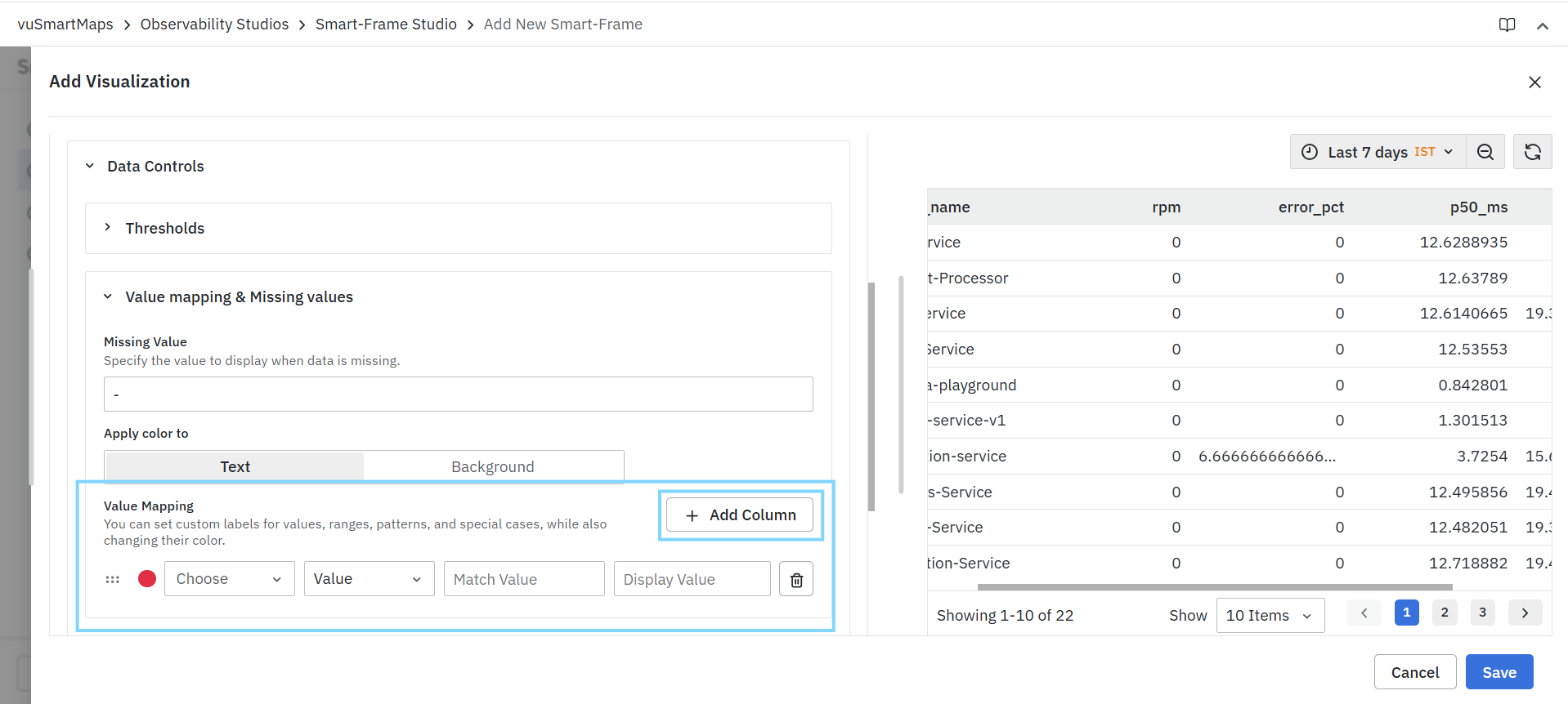
Add Column
Click Add Column to create value mappings for an additional field. Each field can maintain its own mapping configuration.
Mapping Configuration
Each mapping consists of:
Column
Select the field on which value mapping should be applied.

Examples:
- rpm
- error_pct
Mapping Type
Determines how values are matched.
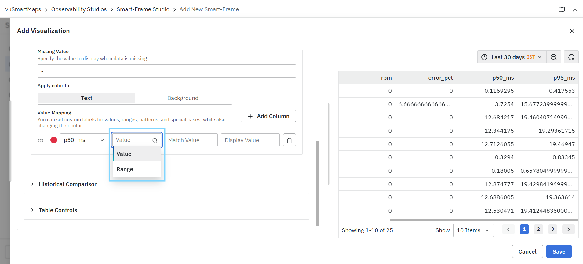
Available options include:
| Type | Description |
|---|---|
| Value | Maps an exact value. |
| Range | Maps values falling within a specified range. |
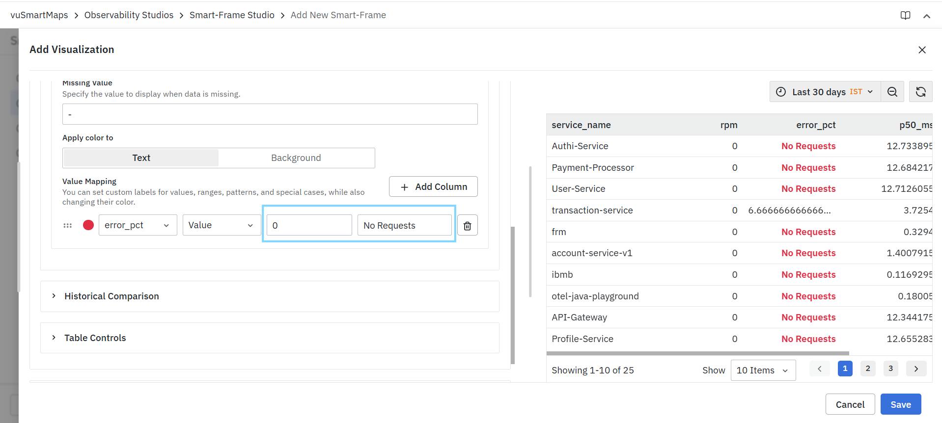
Value Mapping Example
| Match Value | Display Value |
|---|---|
| 0 | No Requests |
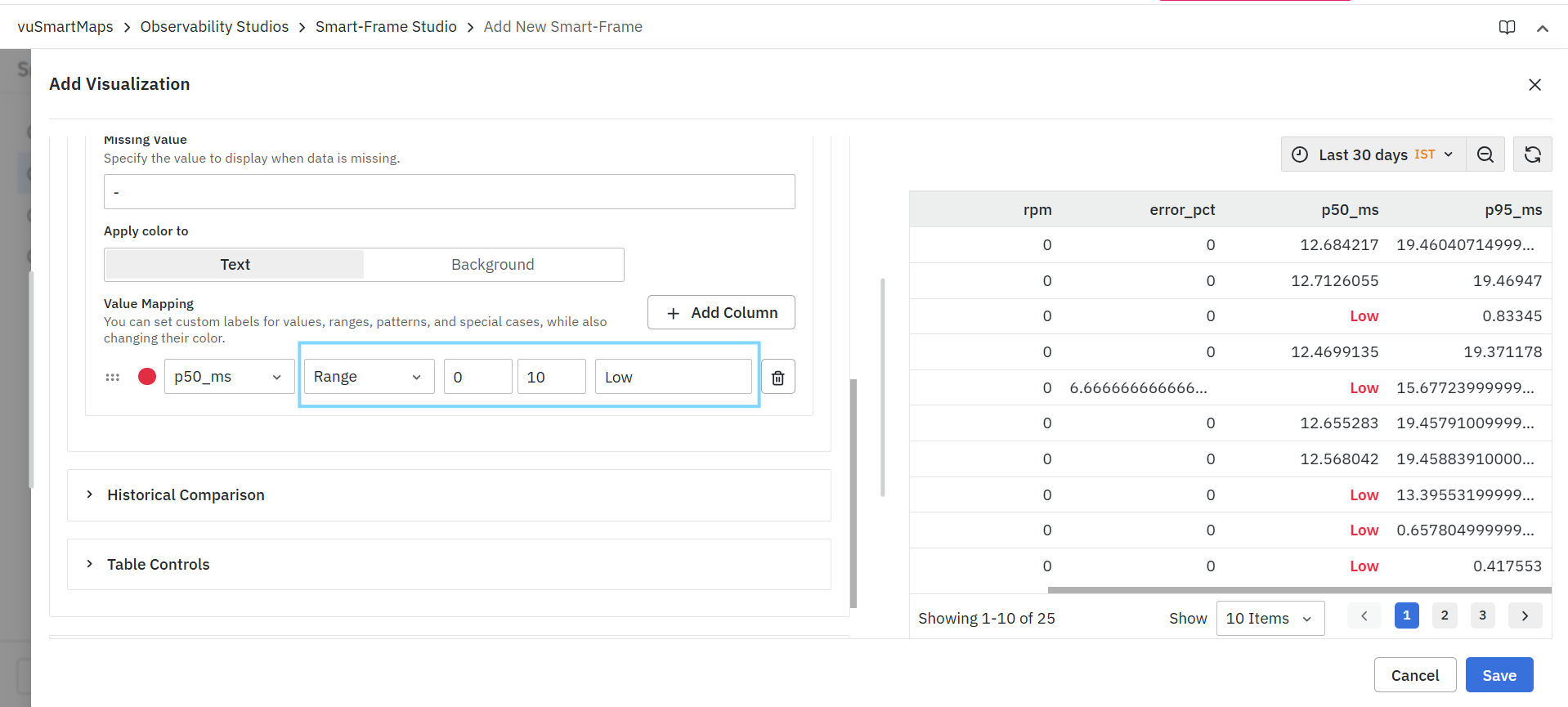
Range Mapping Example
| Range | Display Value |
|---|---|
| 0-10 | Low |
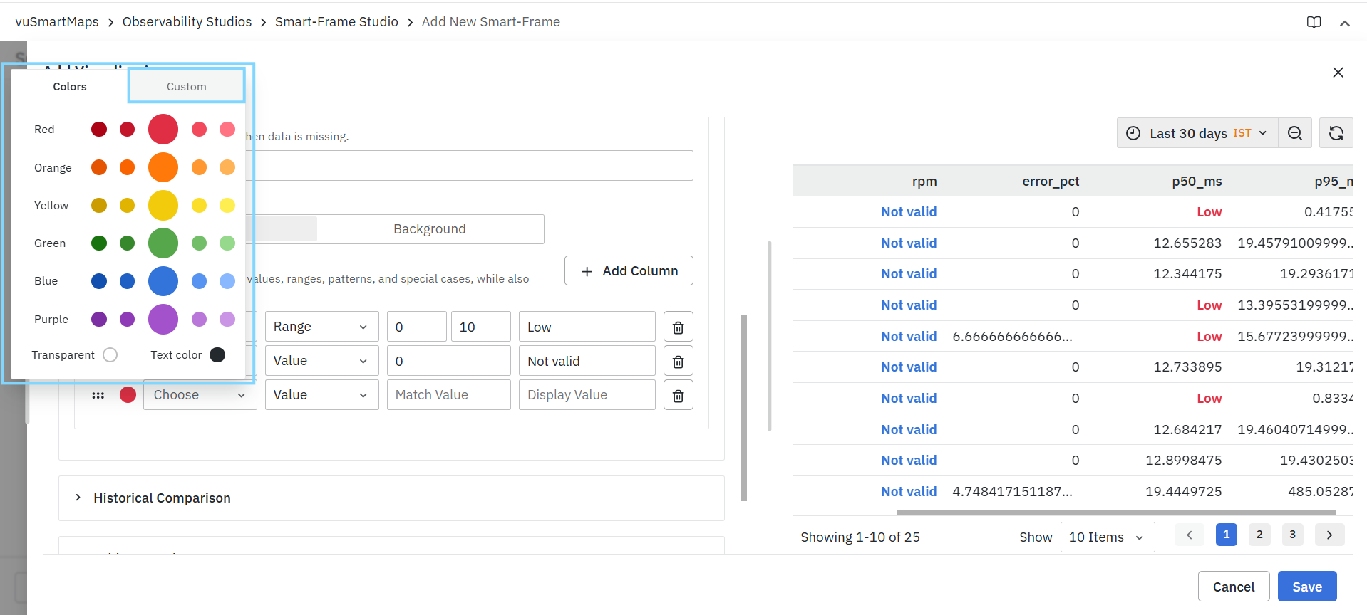
Color Mapping
Each value mapping can be associated with a color. The configured color is applied whenever the mapping condition is satisfied.
Managing Multiple Value Mappings
Users can create multiple mappings for the same field or different fields.
Examples:
- Status mappings for service health.
- Severity mappings for alerts.
- Range mappings for response times.
- Business labels for KPI values.
Multiple mappings can coexist within the same visualization.
Removing Value Mappings
To remove a mapping:
- Locate the mapping configuration.
- Click the Delete icon.
- Save the visualization.
The selected mapping is removed immediately.
The available threshold options, operators, mapping types, and color settings may vary depending on the selected visualization type and underlying data model.
Historical Comparison
The Historical Comparison section allows users to compare current metric values with historical data. This helps identify trends, measure changes over time, and analyze how metrics have evolved across different time periods.
Historical comparisons can be used to:
- Compare current performance against previous periods.
- Track metric trends over time.
- Analyze historical behavior of key metrics.
- Evaluate performance changes between different time ranges.
- Provide additional context for operational and business metrics.
Historical Comparison settings are applied on a per-column basis, allowing different metrics to be compared against different historical periods.
Configure Historical Comparison
To configure a historical comparison:
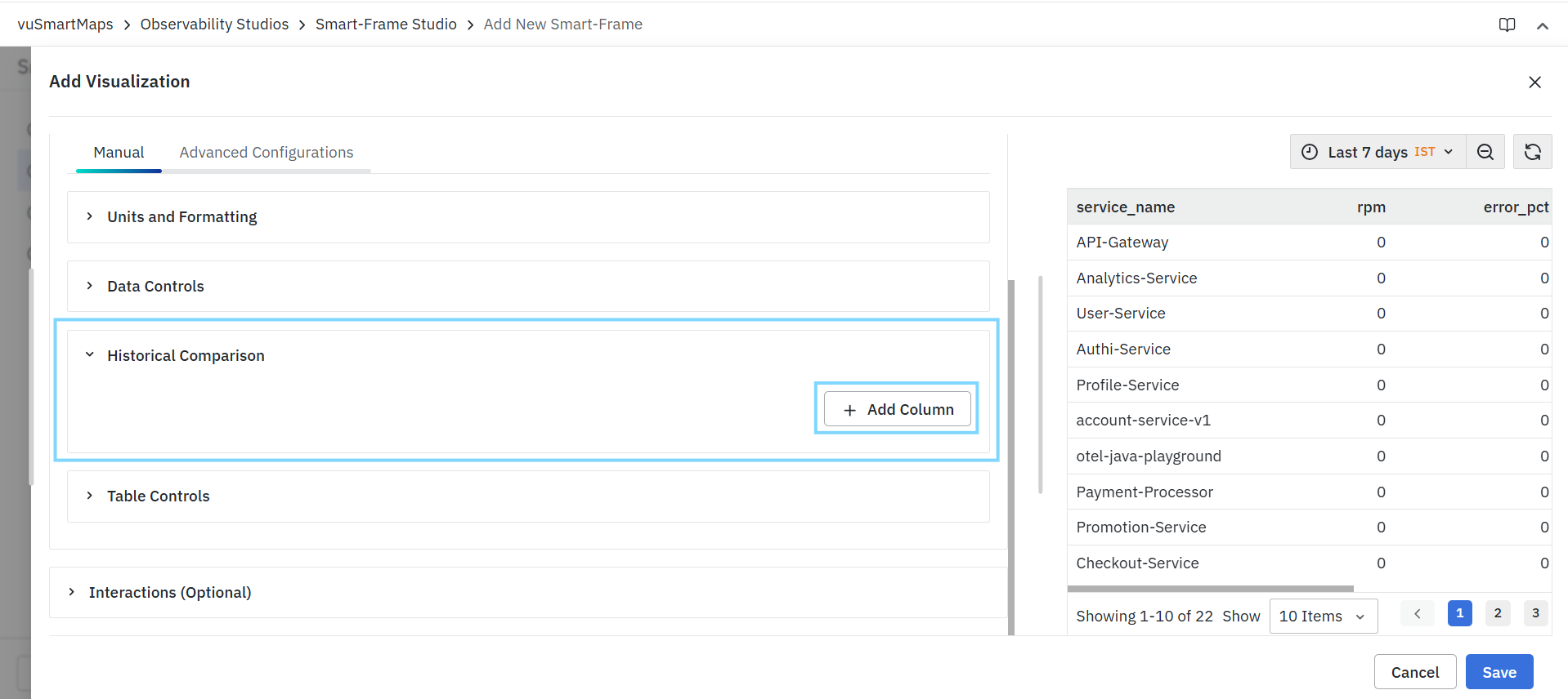
- Expand Historical Comparison.
- Click Add Column.
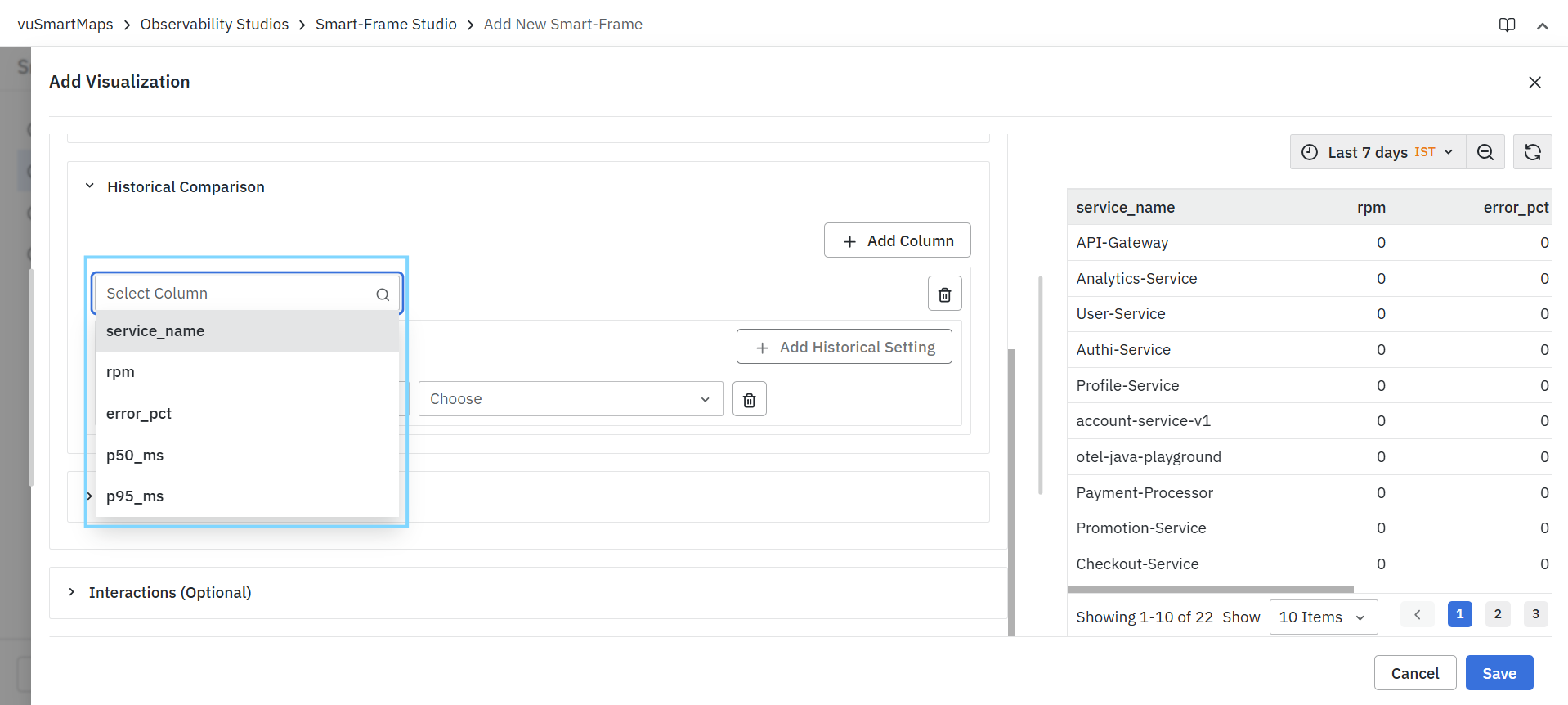
- Select the required column.
- Under Historical Settings, click Add Historical Setting.
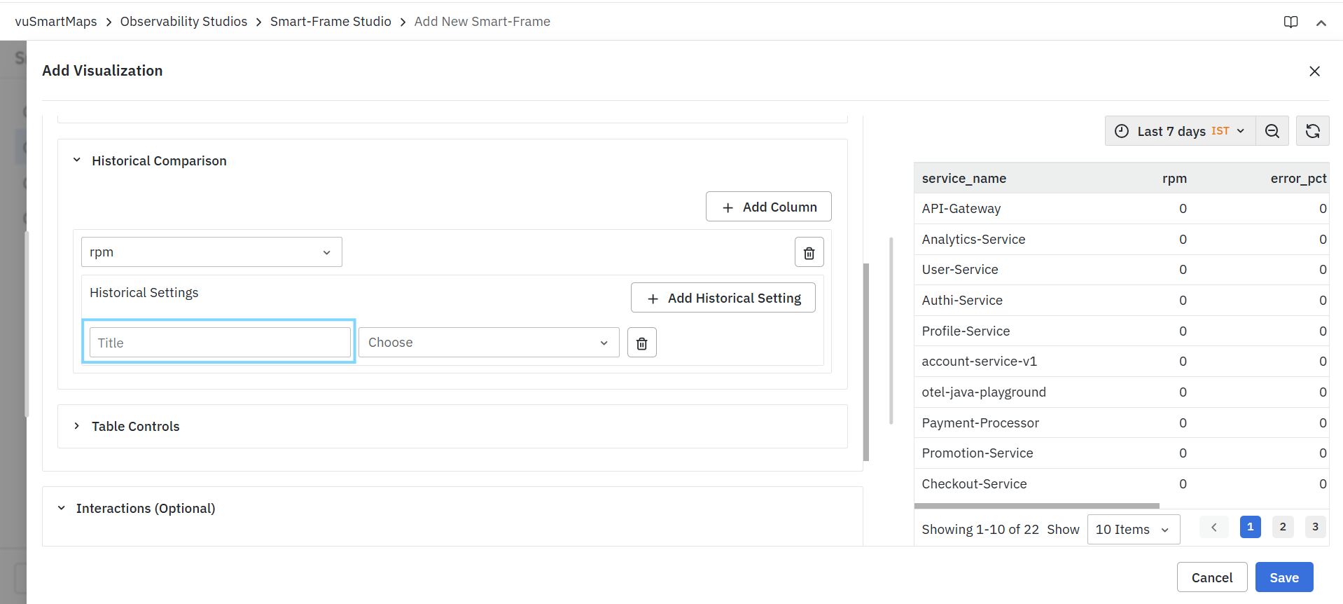
- Enter a title for the comparison.
- Select the comparison type.
- Configure the required historical time settings.
- Repeat the process to add additional historical comparisons if required.
- Save the visualization.
Add Column
Click Add Column to create a historical comparison configuration for a field. Each configured column maintains its own historical comparison settings.
Example
Historical comparisons can be configured separately for:
- rpm
- error_pct
Multiple columns can be configured within the same visualization.
Column Selection
The column selector determines the metric field for which historical comparisons are calculated. Only fields returned by the configured query are available for selection.
Historical Settings
Historical Settings define how historical values are calculated and displayed for the selected column.
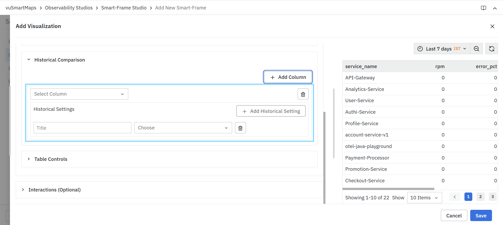
Each historical setting consists of:
- Title
- Comparison Type
- Time Configuration
Multiple historical settings can be created for the same column.
Title
The Title field specifies the label displayed for the historical comparison value. This title helps users easily identify the purpose of the comparison.
Comparison Type
The comparison type determines how historical data is selected for comparison.
Available options include:
| Option | Description |
|---|---|
| Historical Time | Compares the selected metric against a historical time period. |
| Absolute | Compares the selected metric against a user-defined absolute date and time range. |
Historical Time
The Historical Time option allows users to compare current data against a predefined historical time window. After selecting Historical Time, users can specify a time shift value.
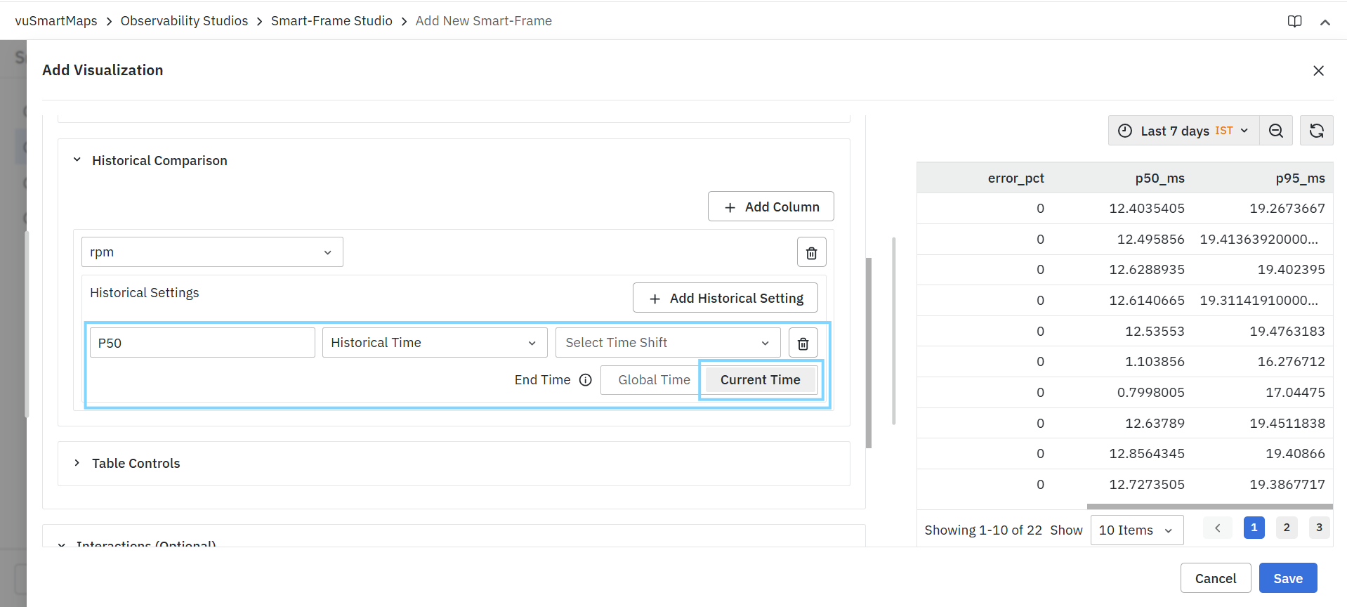
Time Shift
The Time Shift field determines the historical period used for comparison.
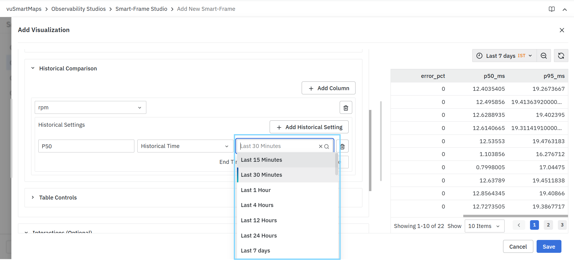
Additional time ranges may be available based on platform configuration.
End Time
When configuring a historical time comparison, users can choose how the comparison period is aligned.
Available options include:
| Option | Description |
|---|---|
| Global Time | Aligns the historical comparison with the dashboard or visualization time range. |
| Current Time | Aligns the historical comparison relative to the current time. |
Absolute
The Absolute option allows users to manually define a specific historical time range.
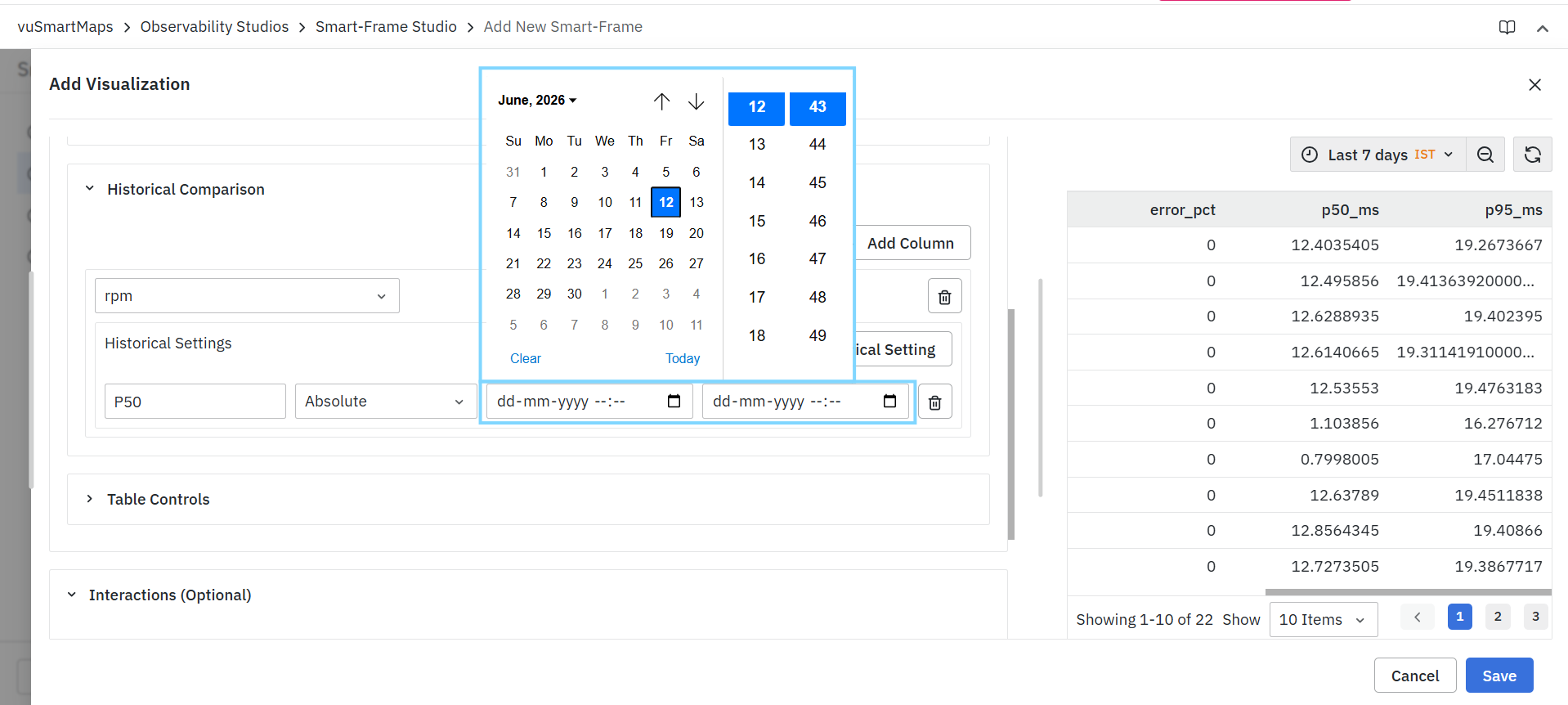
When selected, users can specify:
- Start Date and Time
- End Date and Time
The selected date range is used as the comparison period for the configured metric.
Add Historical Setting
Click Add Historical Setting to create an additional historical comparison for the selected column. Multiple historical settings can be configured simultaneously.
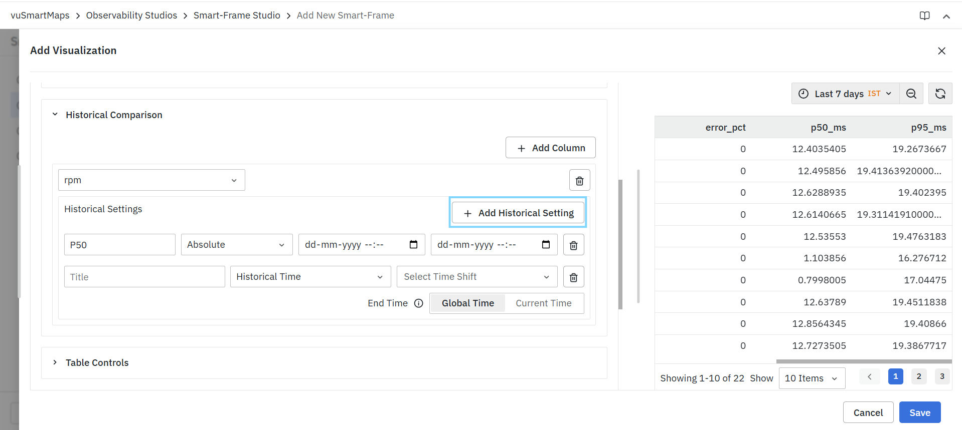
Example
A single metric can be compared against:
- Previous 30 Minutes
- Previous Day
- Previous Week
This allows users to analyze the same metric across multiple historical periods.
Managing Multiple Historical Comparisons
Users can configure:
- Multiple historical settings for a single column.
- Multiple historical settings across different columns.
- Different comparison types for different metrics.
This flexibility enables comprehensive historical trend analysis within a single visualization.
Removing Historical Comparisons
To remove a historical comparison:
- Locate the required historical setting.
- Click the Delete icon.
- Save the visualization.
The selected historical comparison is removed immediately.
The available columns, time-shift options, and historical comparison behaviors may vary depending on the selected visualization type, query configuration, and underlying data source.
Table Controls
Table Controls allow you to customize the appearance, behavior, layout, and presentation of table-based Smart-Frame visualizations. These settings help improve readability, highlight important metrics, and optimize how data is displayed to users.
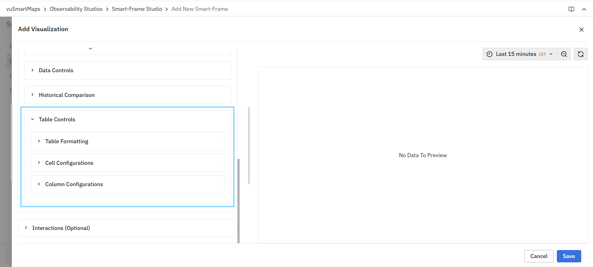
Table Controls are organized into the following sections:
- Table Formatting
- Cell Configurations
- Column Configurations
Table Formatting
The Table Formatting section controls the overall structure and behavior of the table.
Show Header
Displays the column headers at the top of the table.
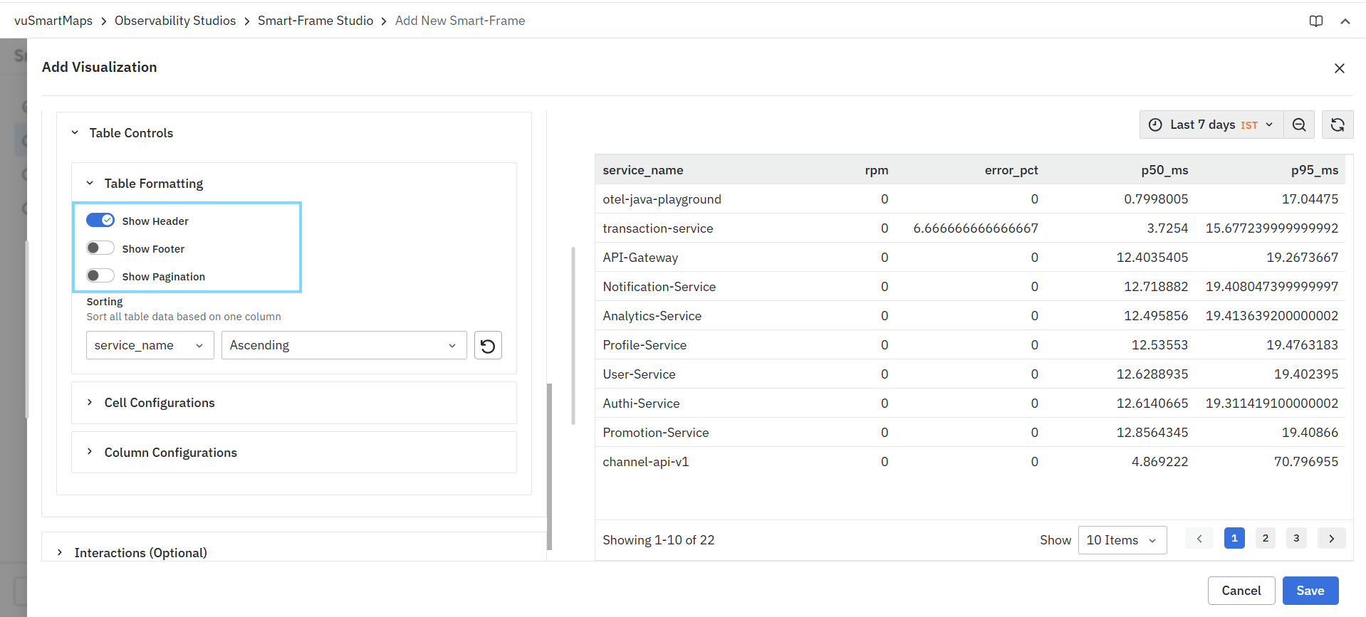
When enabled:
- Column names are displayed.
- Users can easily identify the data contained in each column.
- Sorting indicators are displayed on sortable columns.
When disabled:
- The table is displayed without column headers.
Show Footer
Displays a footer row at the bottom of the table containing calculated summary values.
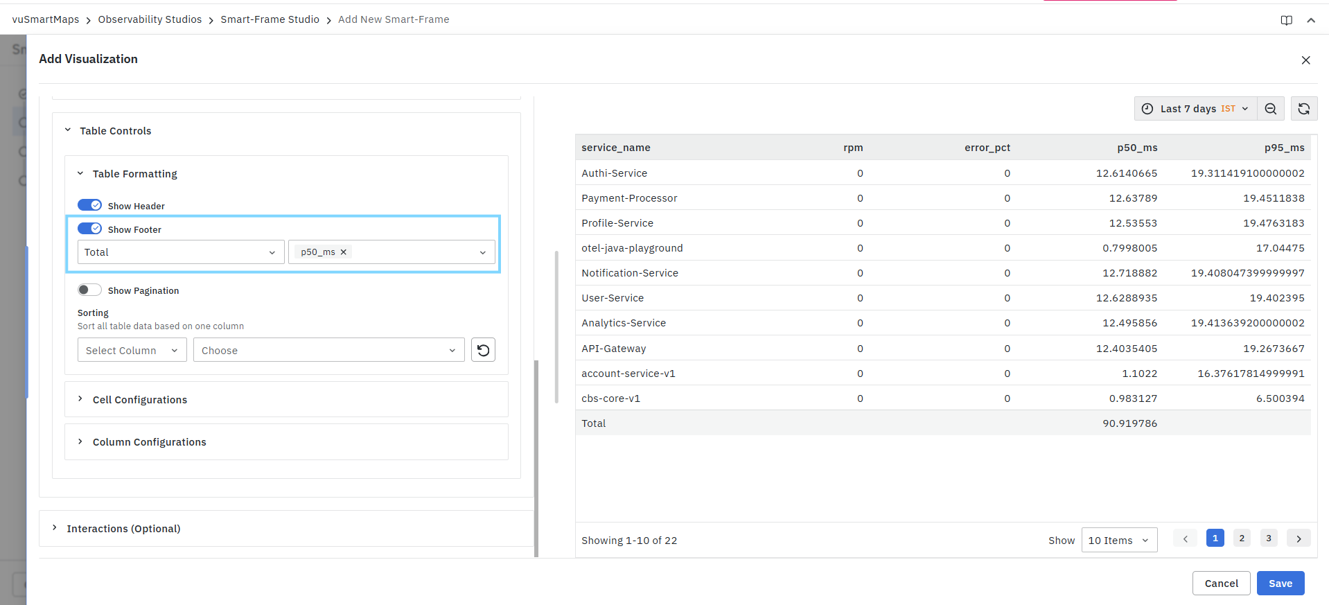
When enabled:
- Select a calculation method.
- Select one or more columns on which the calculation should be applied.
Show Pagination
Enables pagination controls for large datasets.
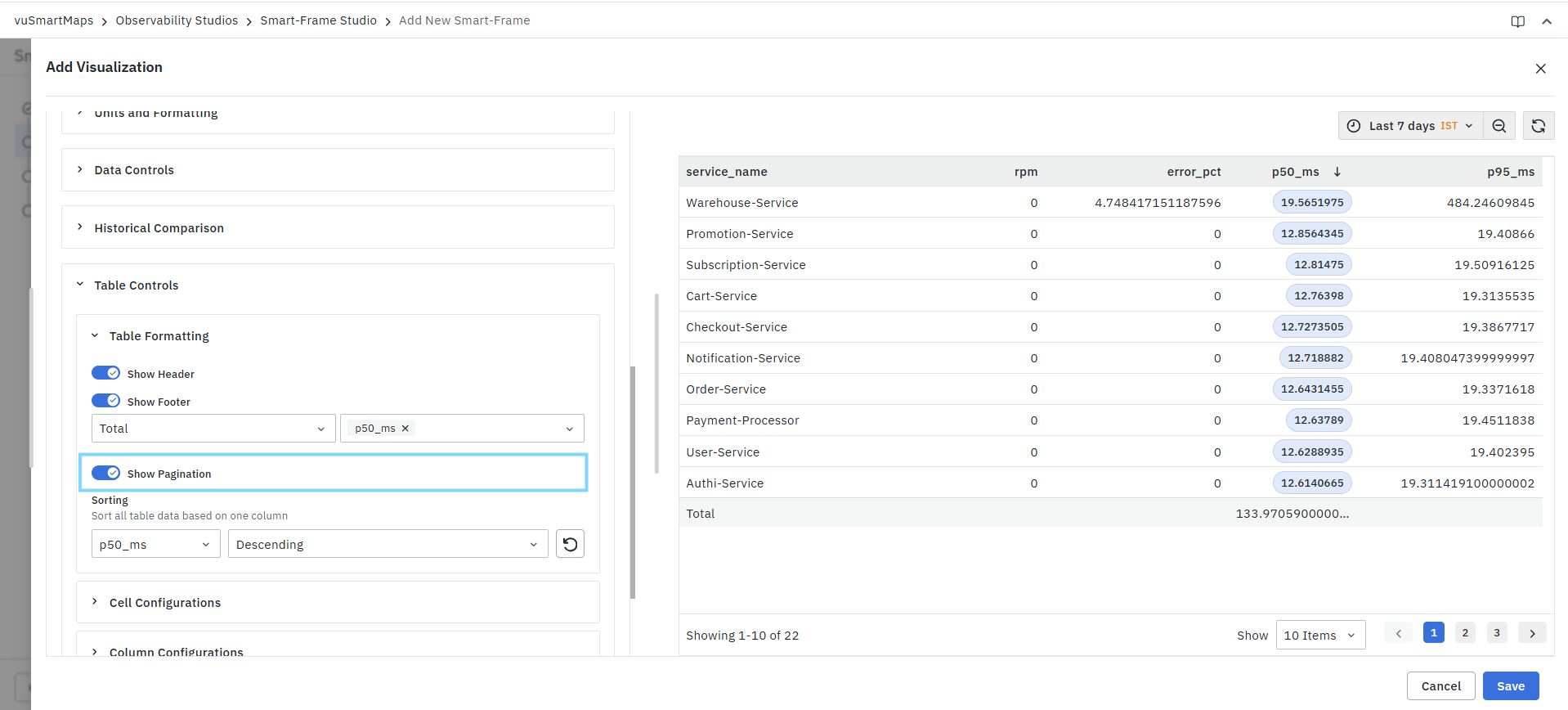
When enabled:
- Records are divided into pages.
- Navigation controls are displayed at the bottom of the table.
- Users can move between pages.
- Users can choose the number of rows displayed per page.
When disabled:
- Pagination controls are hidden.
- Data is displayed without page navigation.
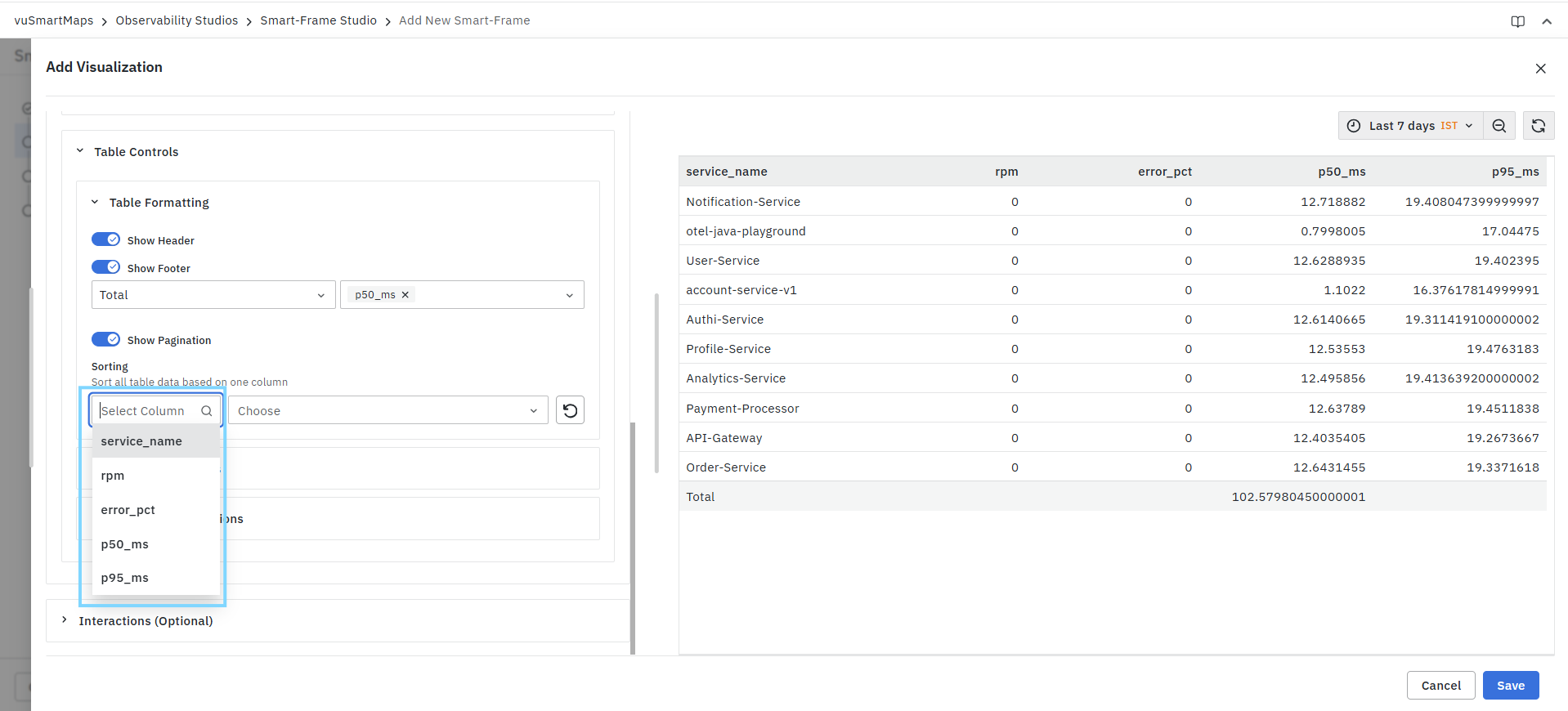
Sorting
Allows table data to be sorted based on a selected column.
Configuration Options
Select Column
Choose the column that should be used for sorting. Available columns depend on the columns returned by the query.
Sort Direction
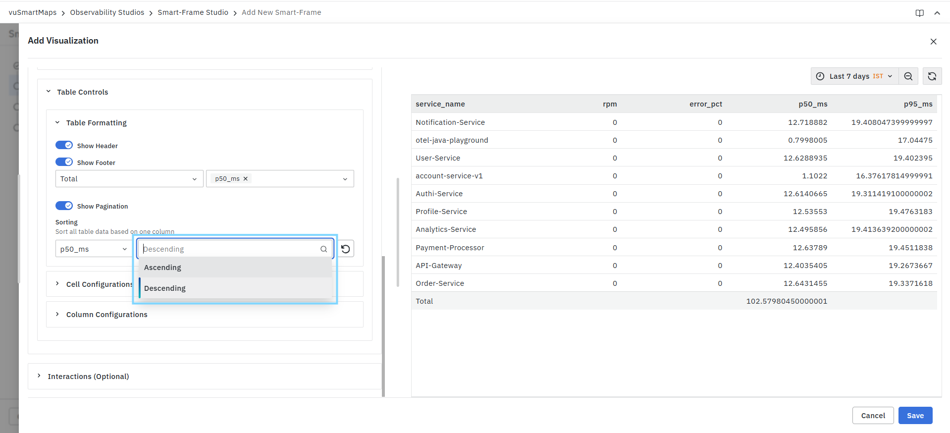
Choose the sorting order:
| Option | Description |
|---|---|
| Ascending | Sorts values from lowest to highest or A–Z. |
| Descending | Sorts values from highest to lowest or Z–A. |
Reset Sorting
Use the reset icon to clear the configured sorting and restore the default order.
Cell Configurations
The Cell Configurations section controls the alignment of values within table cells.
Cell Content Alignment
Controls how cell values are aligned.
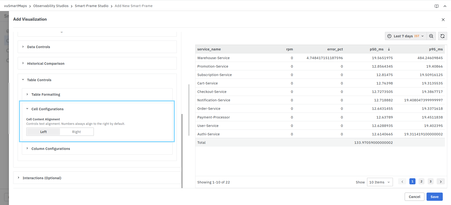
Left
Aligns cell contents to the left side of the cell.
Recommended for:
- Text fields
- Service names
- Labels
- Descriptive values
Right
Aligns cell contents to the right side of the cell.
Recommended for:
- Numeric values
- Counts
- Percentages
- Performance metrics
By default, numeric values are typically right-aligned.
Column Configurations
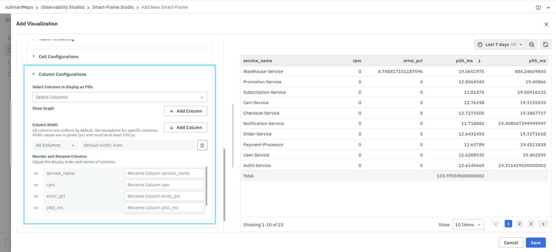
The Column Configurations section provides advanced formatting options for individual columns.
Select Columns to Display as Pills
Displays selected column values as pill-style labels.
Configuration
- Select one or more columns.
- The values in those columns are rendered as pill-shaped elements within the table.
This can be useful for:
- Status values
- Categories
- Tags
- Labels
- Highlighted metrics
Show Graph
Allows graphical indicators to be displayed inside table cells for selected columns.
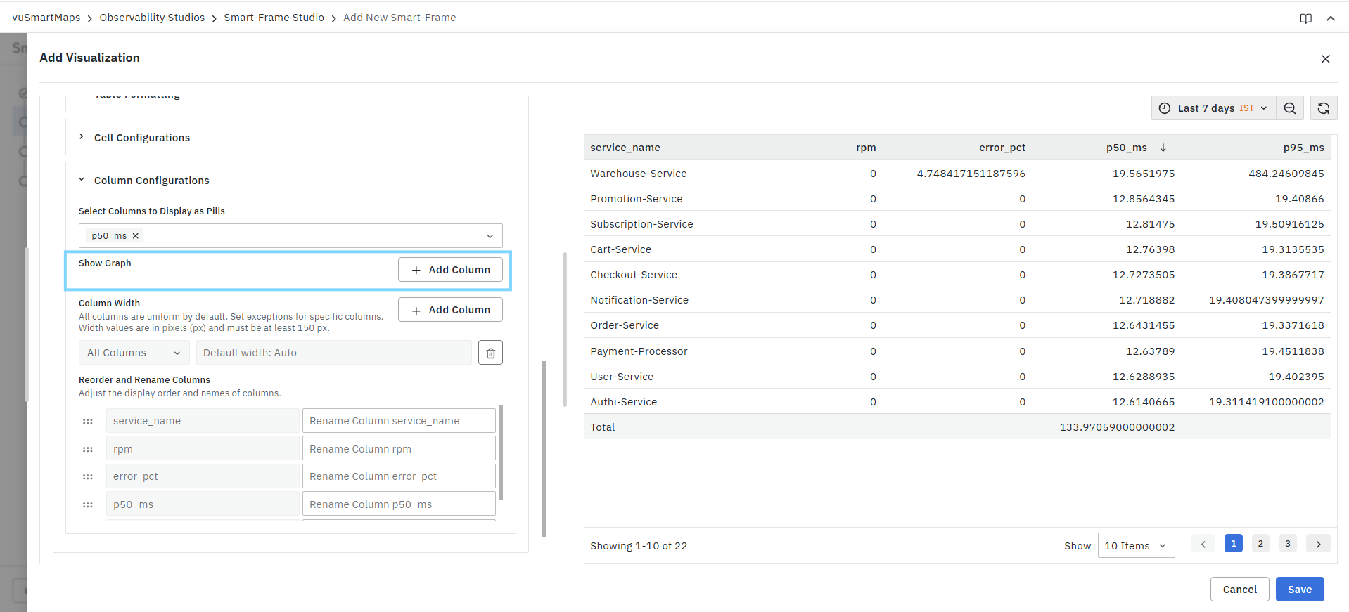
Add Column
Click Add Column to configure a graphical representation for a column.
For each configured column:
Select Column
Choose the column to visualize.
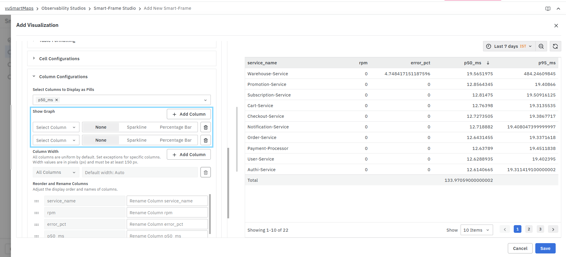
Display Options
None
Displays the column as a standard table value.
Sparkline
Displays values as a miniature trend graph within the table cell.
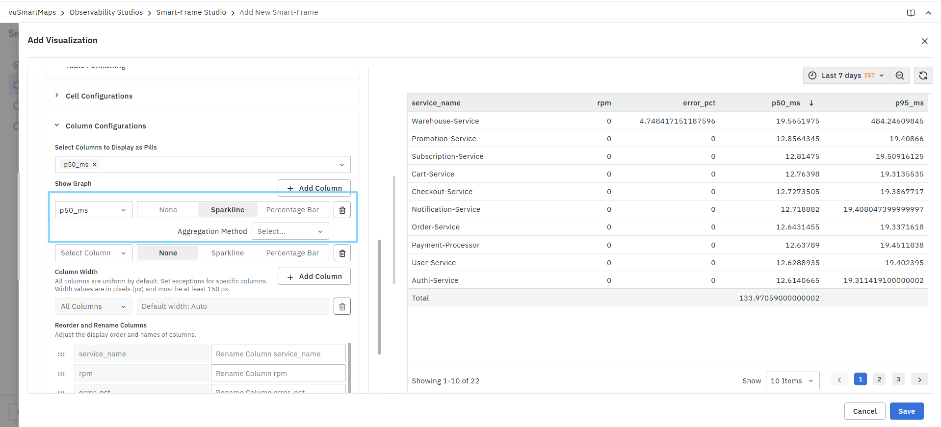
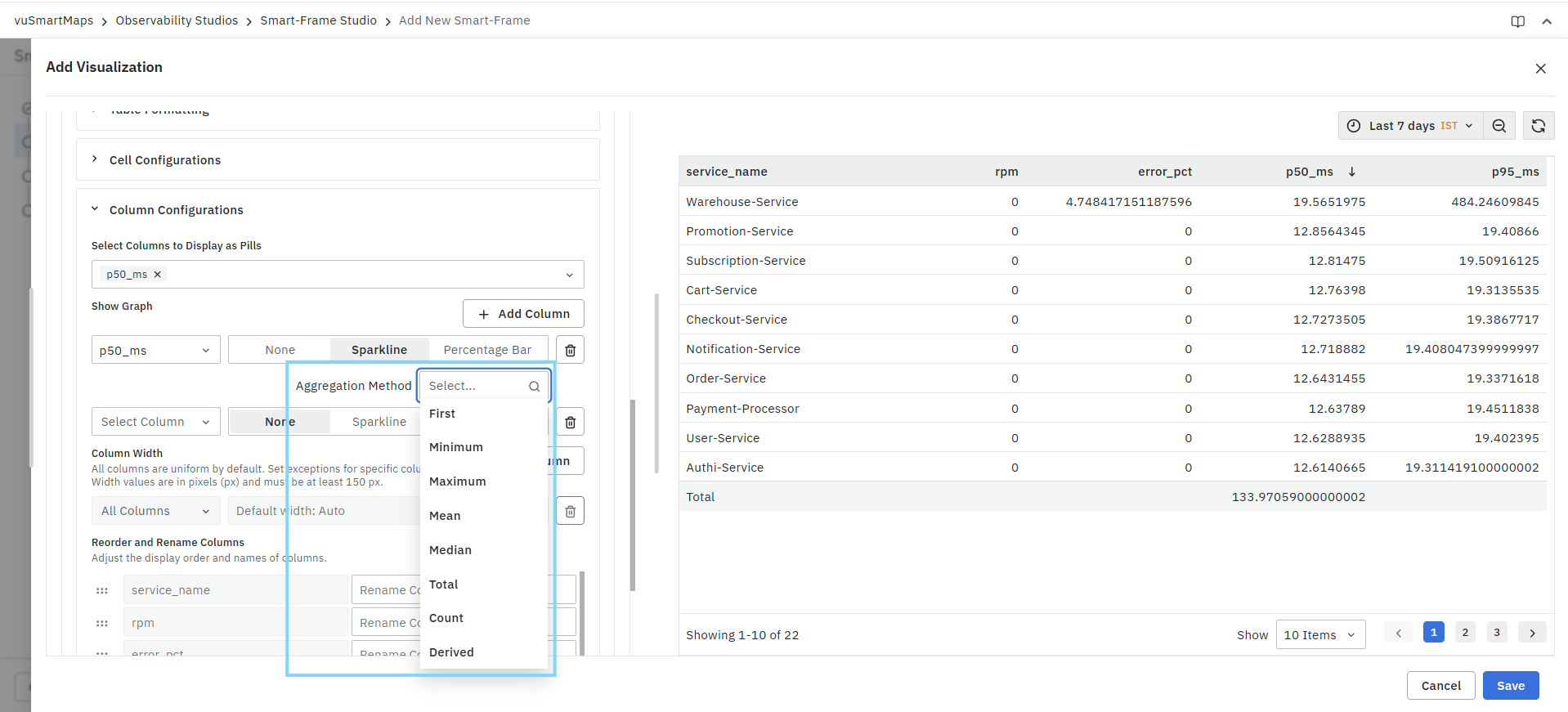
Additional configuration:
Aggregation Method
Choose how to aggregate values before generating the sparkline.
Percentage Bar
Displays values as proportional bars within the table cell, making it easier to compare values visually. The bar length represents the relative value compared to other rows in the column.
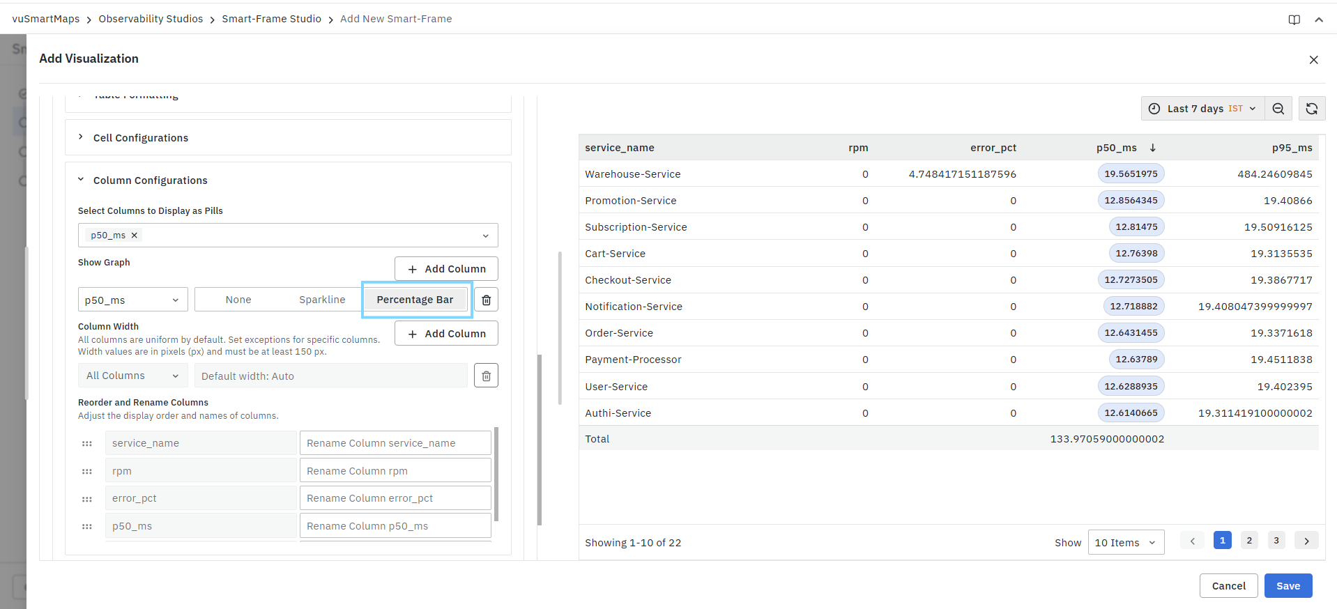
Delete Configuration
Use the delete icon to remove a graph configuration.
Column Width
Controls the width of individual columns.
Default Width
By default:
- All columns use automatic width allocation.
- Column widths adjust based on content.
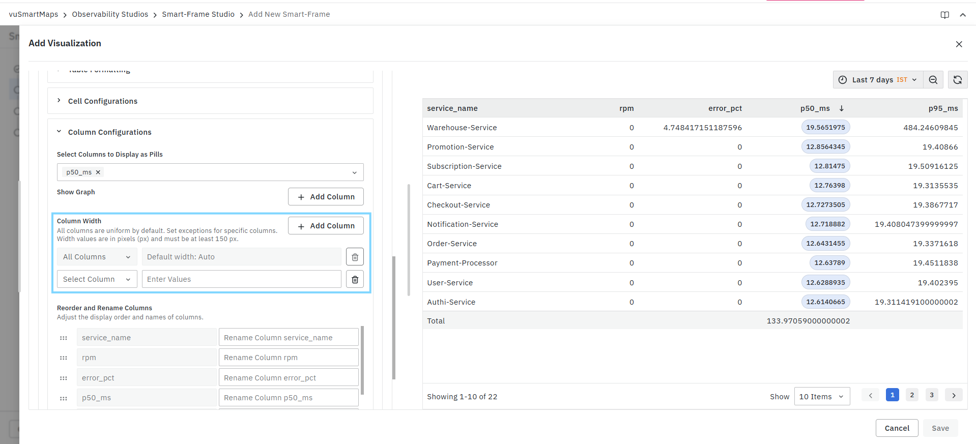
Custom Width Configuration
Click Add Column to configure a custom width.
Select Column
Choose the column whose width should be modified.
Enter Values
Specify the width in pixels (px).
Width values must be at least 150 px.
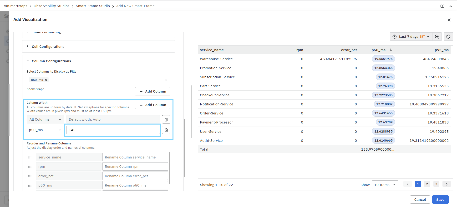
Custom widths can be used to:
- Prevent text truncation.
- Improve readability.
- Allocate more space to important columns.
- Reduce unused table space.
Delete Width Configuration
Use the delete icon to remove the custom width setting.
Reorder and Rename Columns
Allows customization of the display order and labels of table columns.
Reorder Columns
Use the drag handle beside a column to change its position within the table.
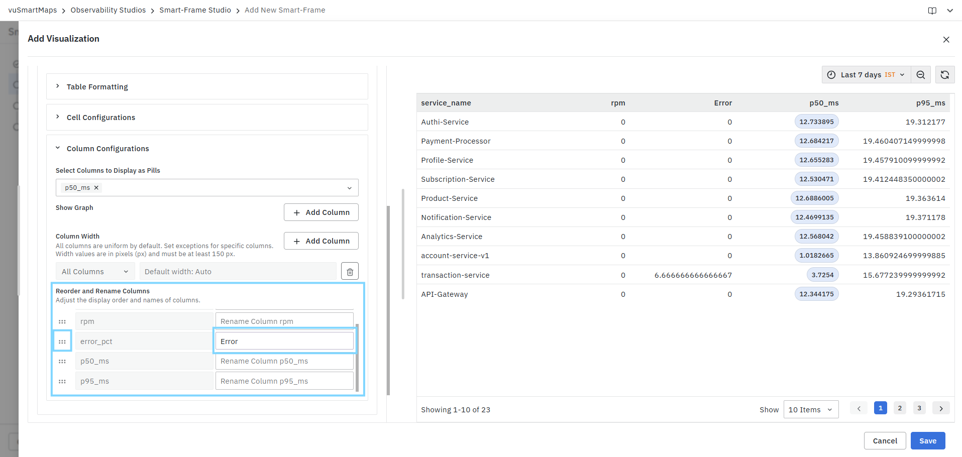
This allows you to:
- Prioritize important metrics.
- Improve table readability.
- Create a more meaningful column sequence.
Rename Columns
Provide a custom display name for any column. The new name is displayed in the table header while the underlying query field remains unchanged.
Example:
| Original Column | Custom Display Name |
|---|---|
| service_name | Service Name |
| p50_ms | P50 Latency (ms) |
| error_pct | Error |
This helps create more user-friendly dashboards and reports.
