Anomaly Explorer
Overview
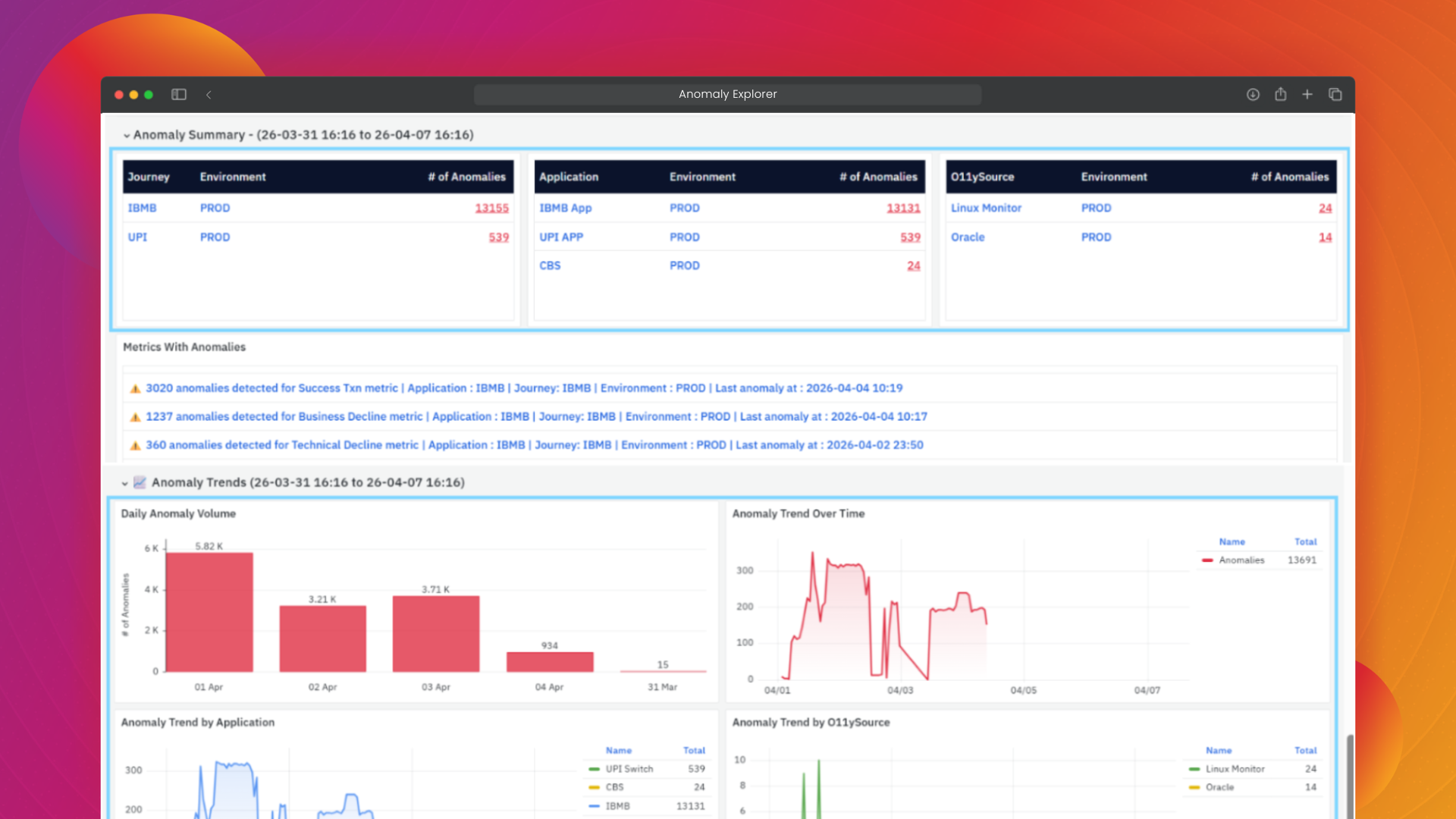
Anomaly Explorer in vuSmartMaps helps you analyze and understand detected anomalies through clear visualizations and contextual insights. Instead of simply listing anomalies, it enables you to explore patterns, compare behavior over time, and drill down into unusual activity across your applications, services, or infrastructure. This allows you to identify potential root causes, assess the impact of anomalies, and gain actionable insights for faster and more informed decision-making.
Accessing Anomaly Explorer
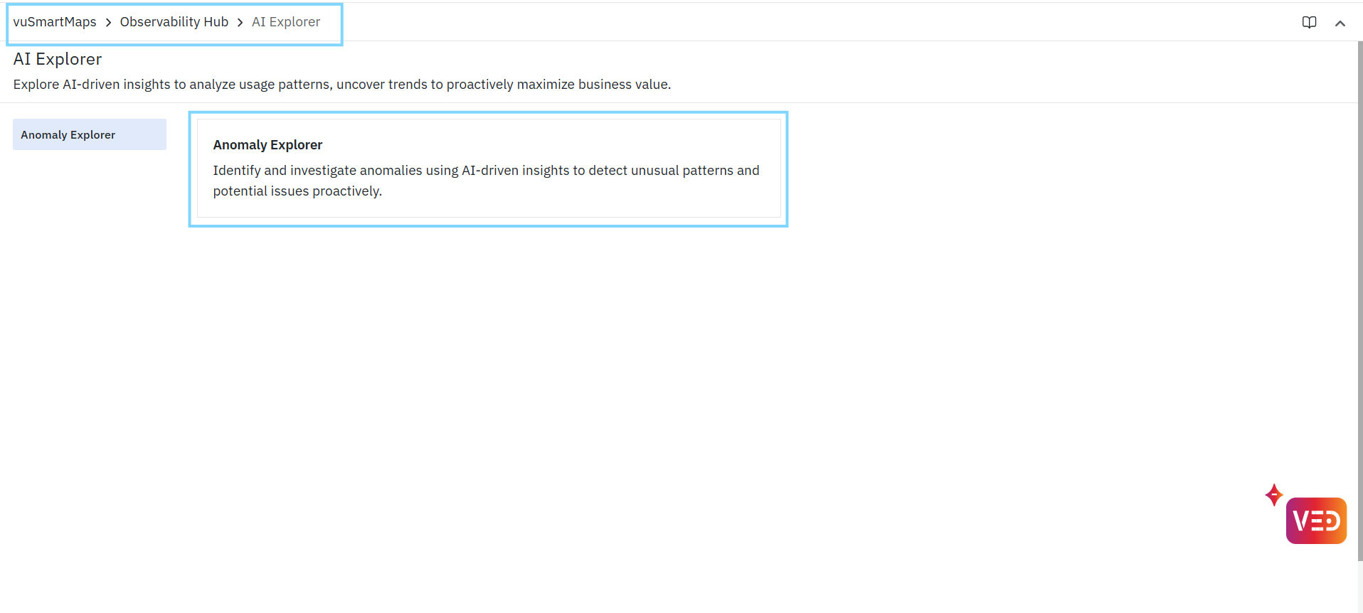
- The Anomaly Explorer workspace in vuSmartMaps can be accessed from the left navigation menu (Observability Hub > AI Explorer > Anomaly Explorer).
- Upon clicking Anomaly Explorer, you are taken to the Anomaly Summary landing page.
Anomaly Summary Explorer
The Anomaly Summary Explorer provides a consolidated, high-level view of anomalies detected across your system. It enables you to quickly assess system health, identify affected components, and navigate to detailed investigation views. This dashboard acts as the starting point for anomaly analysis, allowing you to move from summary-level insights to deep-dive investigations.
Top-Level Summary Metrics
The top section of the dashboard displays key indicators that summarize anomaly activity:
- Total Monitored Metrics: Represents the total number of metrics currently being monitored by anomaly detectors.
- Metrics With Anomalies: Indicates how many metrics have recorded at least one anomaly within the selected time range.
- Metrics Without Anomalies: Indicates how many metrics are behaving normally, with no detected anomalies.
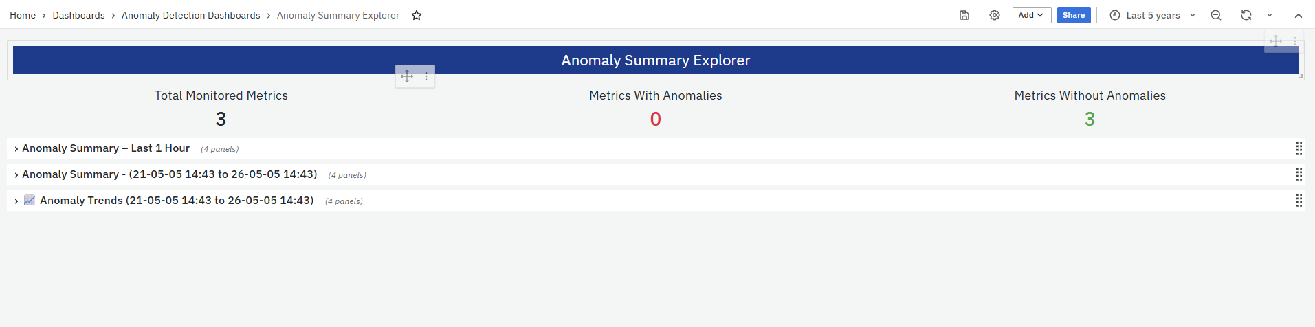
These metrics are automatically updated as new anomaly detection results become available, ensuring that the dashboard reflects the latest anomaly activity for the selected time range.
Anomaly Summary – Last 1 Hour
This section provides a near real-time view of anomaly activity within the most recent one-hour window.
- Displays anomaly summaries grouped across:
- Journey
- Application
- O11ySource
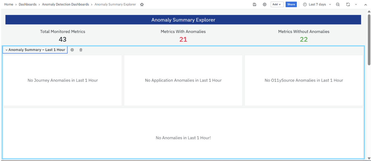
- Each panel highlights whether anomalies were detected in that category.
- If no anomalies are present, the system displays an empty state message indicating that no anomalies were detected in the last 1 hour.
This section is particularly useful for:
- Monitoring recent system behavior
- Detecting ongoing or newly emerging issues
Anomaly Summary – (Selected Time Range)
This section displays anomaly summaries based on the time range selected using the global time picker. The data is grouped into three primary panels:
Journey Panel
- Displays anomalies grouped by business journeys
- Shows:
- Journey name
- Environment
- Number of anomalies
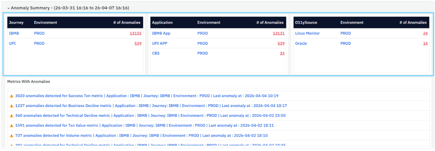
- Helps identify which business workflows or user journeys are impacted.
Application Panel
- Displays anomalies grouped by applications or services
- Shows:
- Application name
- Environment
- Number of anomalies
- Helps identify which applications are contributing most to anomalies.
O11ySource Panel
- Displays anomalies grouped by observability sources
- Shows:
- Source name (for example, Application, Linux Monitor, Oracle)
- Environment
- Number of anomalies
- Helps determine whether anomalies originate from:
- Application-level metrics
- Infrastructure-level monitoring
Behavior
- All values in these panels are clickable
- Clicking an entry navigates to the corresponding Anomaly Investigation view
- Panels update dynamically based on the selected time range
Metrics With Anomalies
This section provides detailed anomaly statements for each metric where anomalies have been detected.
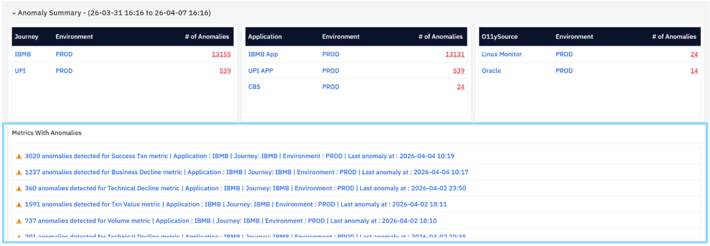
Each entry typically includes:
- Total number of anomalies detected
- Metric name
- Associated application and journey
- Environment
- Timestamp of the most recent anomaly
Purpose
- Helps identify which specific metrics are abnormal.
- Provides immediate context for investigation.
- Enables quick navigation to detailed analysis.
Each anomaly entry is clickable and opens the Anomaly Investigation by Metric view, where you can analyze the metric's behavior, review anomaly details, and compare actual values against expected ranges.
Investigation Guidance
When multiple anomaly entries are present, consider prioritizing metrics with more anomalies, more recent anomalies, or those associated with critical applications and business journeys. This helps focus investigation efforts on issues that may have the greatest operational or business impact.
Anomaly Trends
The Anomaly Trends section provides time-based visual insights into anomaly patterns and behavior.
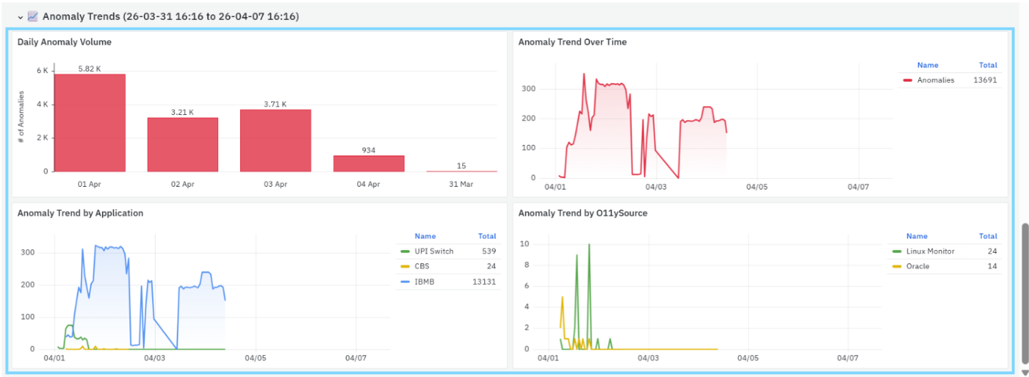
Daily Anomaly Volume
- Displays the number of anomalies aggregated per day
- Helps identify:
- Days with high anomaly activity
- Trends over multiple days
- Useful for understanding long-term anomaly distribution.
Anomaly Trend Over Time
- Displays anomaly counts over time within the selected range
- Helps identify:
- Spikes in anomalies
- Periods of instability
- Patterns in anomaly occurrence
- Useful for correlating anomalies with system events or incidents.
Anomaly Trend by Application
- Breaks down anomaly trends across different applications
- Each application is represented as a separate line in the chart
- Helps:
- Compare anomaly behavior across applications
- Identify which application is contributing most to anomalies over time
Anomaly Trend by O11ySource
- Breaks down anomaly trends across O11ySources
- Shows how anomalies are distributed across:
- Application monitoring
- Infrastructure monitoring
- Helps teams focus their investigation on the correct data source.
Interpretation Guidance
The anomaly trends can help identify operational patterns and potential issues:
- A sudden spike in anomalies may indicate a recent deployment issue, infrastructure problem, configuration change, or unexpected increase in workload.
- Consistent anomaly activity over multiple days may suggest an underlying performance bottleneck or recurring operational issue that requires further investigation.
- A spike limited to a single application may indicate an application-specific problem, whereas simultaneous spikes across multiple applications may point to a shared dependency or infrastructure-related issue.
- If anomalies are concentrated within a particular O11y Source, such as infrastructure monitoring, the issue may be related to resource utilization, system health, or platform components rather than application logic.
- These trends should be used alongside detailed investigation views to better understand the scope, impact, and potential root cause of detected anomalies.
Anomaly Investigation View – Metric
The Anomaly Investigation View – Metric provides a detailed analysis of anomalies for a specific metric. It helps you understand how the metric behaves over time, identify abnormal patterns, and compare actual values against expected ranges. This view is accessed when you click an anomaly statement or metric from the Anomaly Summary Explorer.
Trend of Selected Metric
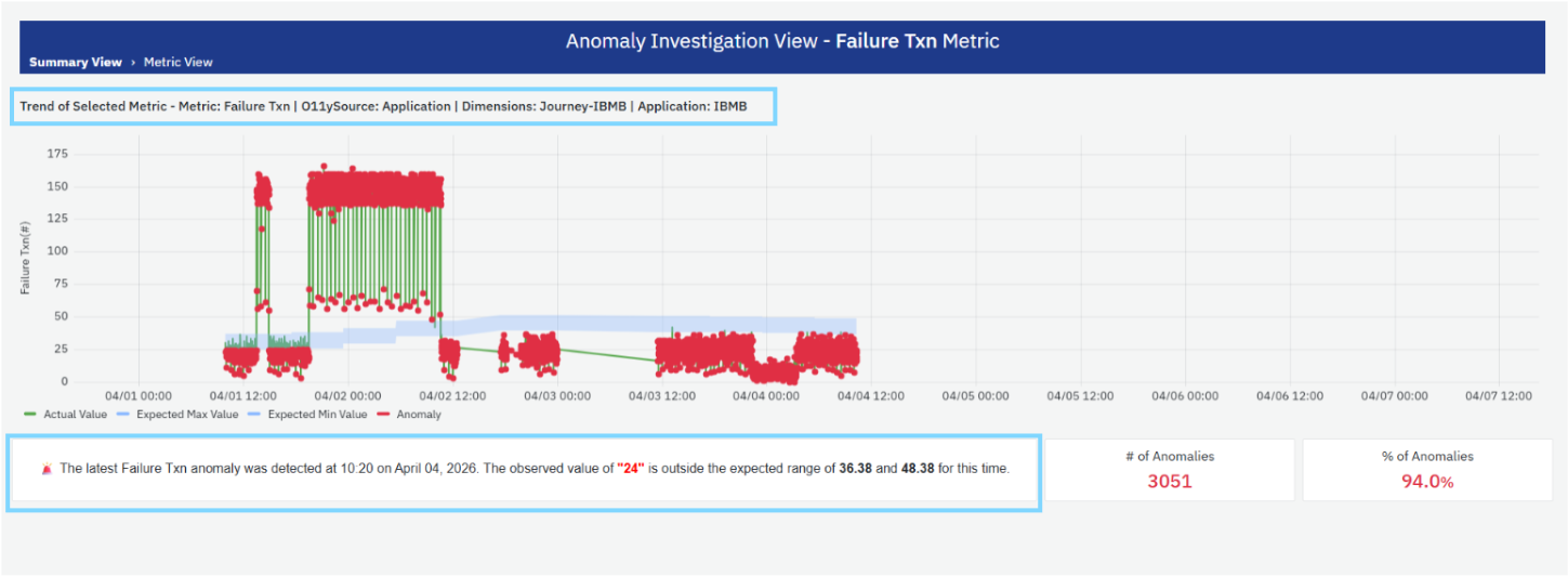
This section displays a time-series chart showing the behavior of the selected metric over the chosen time range.

The chart includes:
- Actual Value (Green line): Represents the actual observed values of the metric over time.
- Expected Min Value (Blue lower bound): Represents the lower bound of the expected range based on learned patterns.
- Expected Max Value (Blue upper bound): Represents the upper bound of the expected range.
- Anomalies (Red markers): Highlight data points where the actual value falls outside the expected range.
Behavior
- An anomaly occurs when the actual value is either:
- Greater than the expected maximum, or
- Lower than the expected minimum
- The shaded region between expected min and max represents the normal operating range.
This visualization helps you quickly identify:
- Sudden spikes or drops
- Pattern deviations
- Frequency of anomalies over time
Metric Context Information
Above the chart, additional context is displayed for the selected metric, including:
- Metric name
- O11ySource
- Dimensions (for example, Journey, Application)
This information helps identify the exact scope of the analysis.
Anomaly Insight Summary
Below the chart, a descriptive summary highlights the latest detected anomaly.
It includes:
- Timestamp of the latest anomaly
- Observed value at that point
- Expected range for that time
Example:
The latest Failure Txn anomaly was detected at 10:20 on April 04, 2026. The observed value of "24" is outside the expected range of 36.38 and 48.38 for this time.
This summary helps quickly understand:
- What went wrong
- When it occurred
- How far the value deviated from normal behavior
The significance of an anomaly depends on the metric being analyzed and its operational context. An anomaly may represent either an unexpected increase or decrease in a metric value. For example, a decrease in successful transactions may indicate a potential issue, whereas a decrease in response time may indicate improved application performance. Anomalies should therefore be interpreted in the context of the metric and the affected system behavior.
Key Metrics

On the right side, summary indicators provide quick insights:
- # of Anomalies: Displays the total number of anomalies detected for the selected metric within the chosen time range.
- % of Anomalies: Indicates the percentage of data points that are classified as anomalies.
These metrics help assess:
- Severity of the issue
- Frequency of abnormal behavior
Anomaly Investigation View – Journey
The Anomaly Investigation View – Journey provides a consolidated analysis of anomalies across all metrics associated with a specific business journey. It helps you understand how different metrics behave within that journey and identify patterns, correlations, and potential root causes. This view is accessed by clicking a Journey from the Anomaly Summary Explorer.
Overview of Metrics
This section displays a tabular summary of all metrics associated with the selected journey.
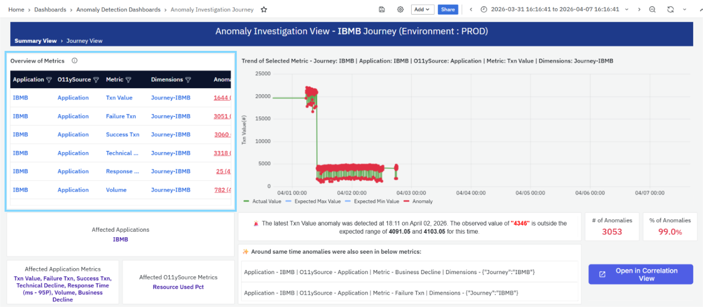
Each row represents a metric and includes:
- Application: The application associated with the metric.
- O11ySource: The observability source from which the metric is collected.
- Metric: The name of the metric (for example, Txn Value, Failure Txn, Success Txn).
- Dimensions: The dimension context applied (for example, Journey-IBMB).
- Anomalies: The total number of anomalies detected for that metric.
Behavior
- Each metric entry is clickable
- Selecting a metric navigates to the Anomaly Investigation View – Metric for detailed analysis
This section helps you quickly identify:
- Which metrics are affected
- Which metrics have the highest anomaly counts
Trend of Selected Metric
This section displays a time-series chart for the selected metric within the journey.
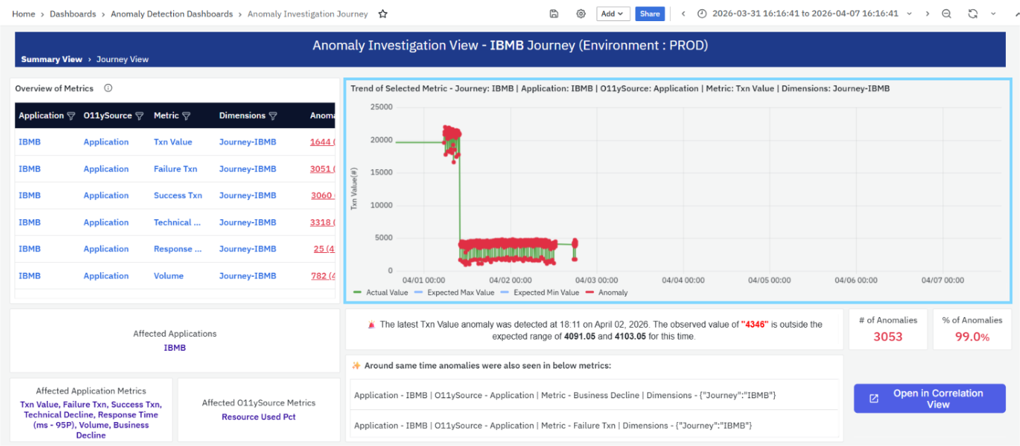
The chart includes:
- Actual Value (Green line): Represents the actual observed values of the metric.
- Expected Min Value (Blue lower bound): Lower limit of expected behavior.
- Expected Max Value (Blue upper bound): Upper limit of expected behavior.
- Anomalies (Red markers): Points where the actual value deviates from the expected range.
Behavior
- Anomalies occur when values fall outside the expected range
- The shaded region represents the normal operating range
This helps identify:
- Metric deviations
- Frequency of anomalies
- Behavior trends within the journey
Affected Applications
This section highlights the applications impacted within the selected journey.
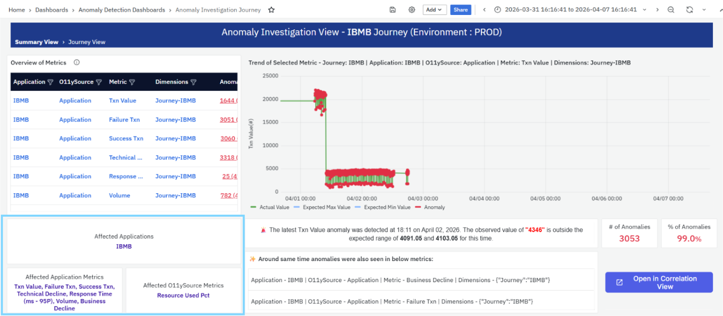
- Displays the application name(s) associated with detected anomalies
This helps you quickly understand:
- Which application is contributing to the anomaly
Affected Application Metrics
This section lists the key application-level metrics affected within the journey.
Examples include:
- Txn Value
- Failure Txn
- Success Txn
- Technical Decline
- Response Time
- Volume
- Business Decline
This helps identify:
- Which specific application metrics are abnormal
Affected O11ySource Metrics
This section highlights metrics from observability sources that are impacted.
Example:
- Resource Used Pct
This helps determine:
- Whether anomalies are related to infrastructure or resource usage
Anomaly Insight Summary
This section provides a descriptive summary of the latest anomaly for the selected metric.
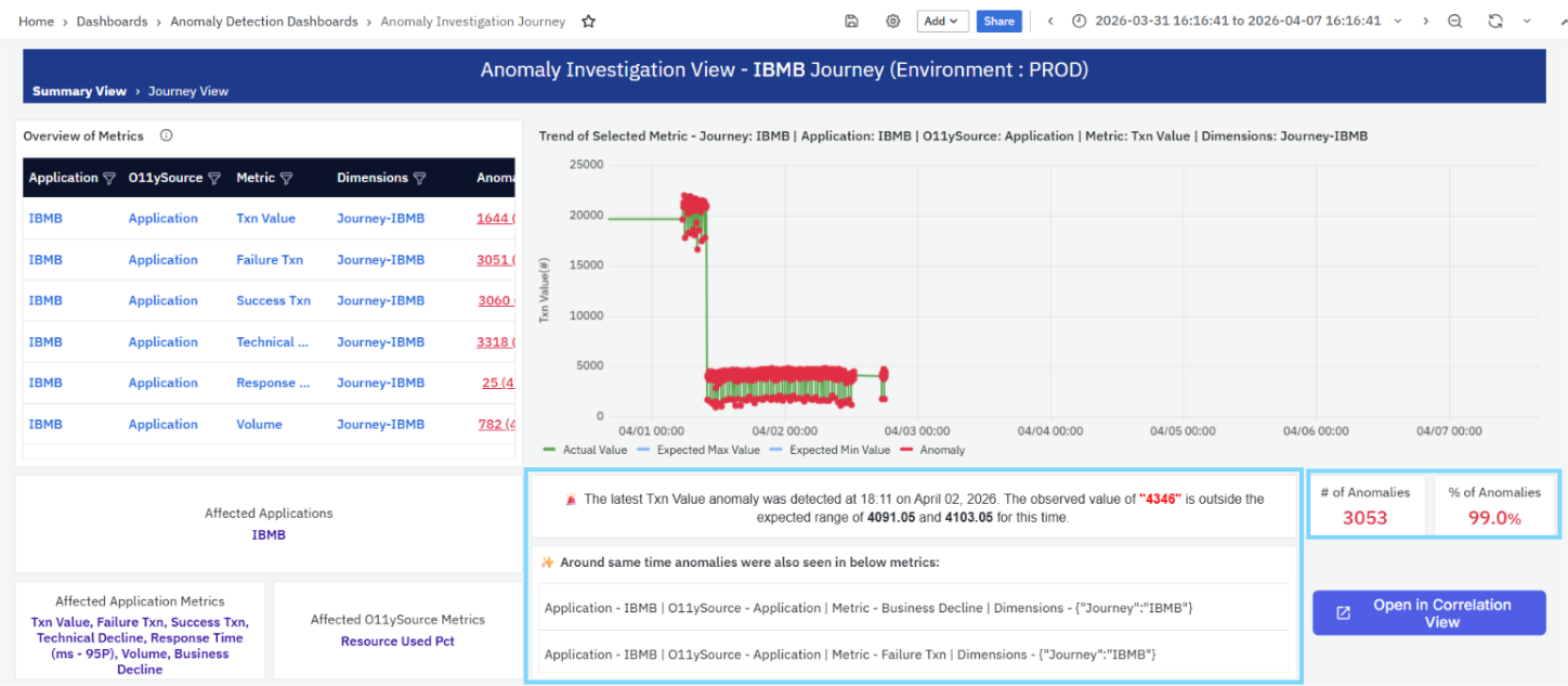
It includes:
- Timestamp of the anomaly
- Observed value
- Expected range
Example:
“The latest Txn Value anomaly was detected at 18:11 on April 02, 2026. The observed value of "4346" is outside the expected range of 4091.05 and 4103.05 for this time.”
This helps quickly understand:
- What deviation occurred
- When it occurred
- Severity of deviation
Related Anomalies
This section highlights anomalies that occurred around the same time in other related metrics.
Each entry includes:
- Application
- O11ySource
- Metric
- Dimension
This helps identify:
- Correlated anomalies
- Cross-metric impact
- Potential root causes
Key Metrics
This section provides summary indicators:
- # of Anomalies:
Total anomalies detected for the selected metric within the journey. - % of Anomalies:
Percentage of data points classified as anomalies.
These metrics help assess:
- Overall anomaly severity
- Frequency of abnormal behavior
Correlation View
- The Open in Correlation View option allows you to further analyze relationships between anomalies across different metrics and dimensions.
- For a detailed explanation, refer to the Correlation View section, which explains how to analyze relationships across multiple metrics.
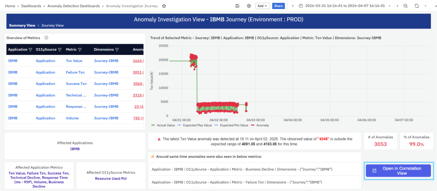
This enables deeper investigation into:
- Root cause analysis
- Cross-metric dependencies
Anomaly Investigation View – Application
The Anomaly Investigation View – Application provides a detailed analysis of anomalies across all metrics associated with a specific application. It helps you understand how different metrics behave within the application and identify abnormal patterns, correlations, and potential root causes. This view is accessed by clicking an Application from the Anomaly Summary Explorer.
Overview of Metrics
This section displays a tabular summary of all metrics associated with the selected application.
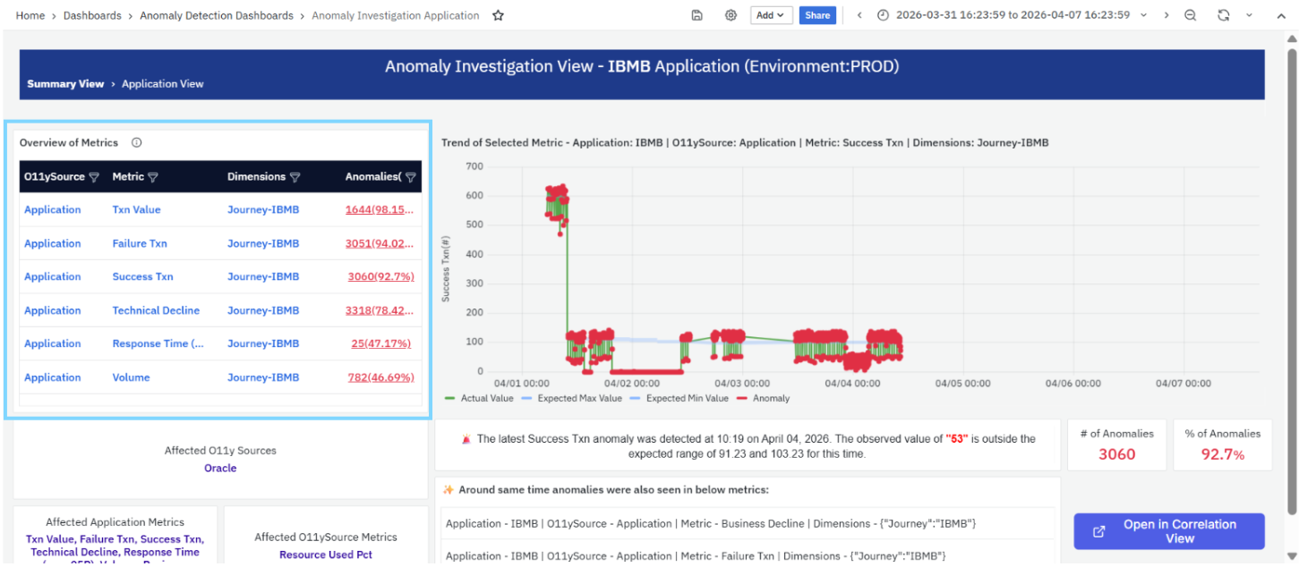
Each row includes:
- O11ySource: The observability source from which the metric is collected.
- Metric: The name of the metric (for example, Txn Value, Failure Txn, Success Txn).
- Dimensions: The dimension context applied (for example, Journey-IBMB).
- Anomalies: The total number of anomalies detected for that metric, along with the anomaly percentage.
Behavior
- Each metric entry is clickable
- Selecting a metric navigates to the Anomaly Investigation View – Metric
This section helps identify:
- Which metrics are affected within the application
- Which metrics have the highest anomaly impact
Trend of Selected Metric
This section displays a time-series chart for the selected metric within the application.
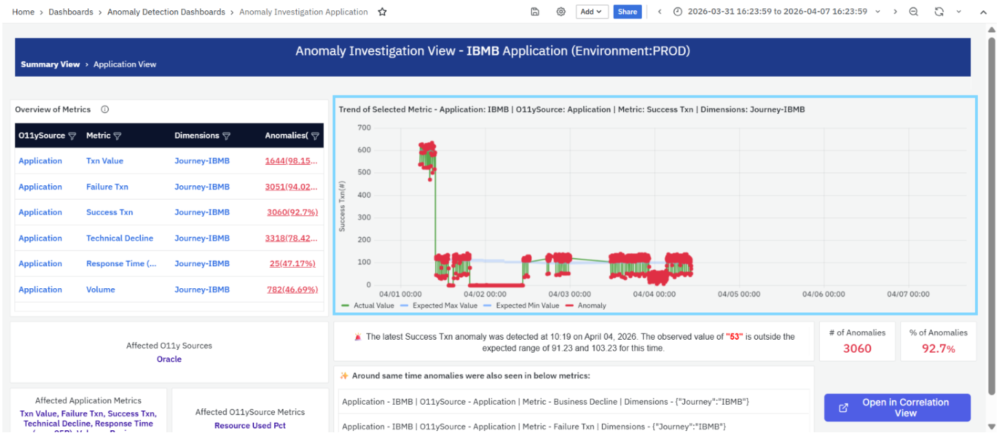
The chart includes:
- Actual Value (Green line): Represents observed metric values.
- Expected Min Value (Blue lower bound): Lower bound of expected behavior.
- Expected Max Value (Blue upper bound): Upper bound of expected behavior.
- Anomalies (Red markers): Points where actual values fall outside the expected range.
Behavior
- Anomalies occur when values deviate beyond expected bounds
- The shaded region represents the normal operating range
This helps identify:
- Spikes or drops in metric values
- Frequency and distribution of anomalies
- Behavioral patterns over time
Affected O11ySources
This section highlights the observability sources impacted within the selected application.
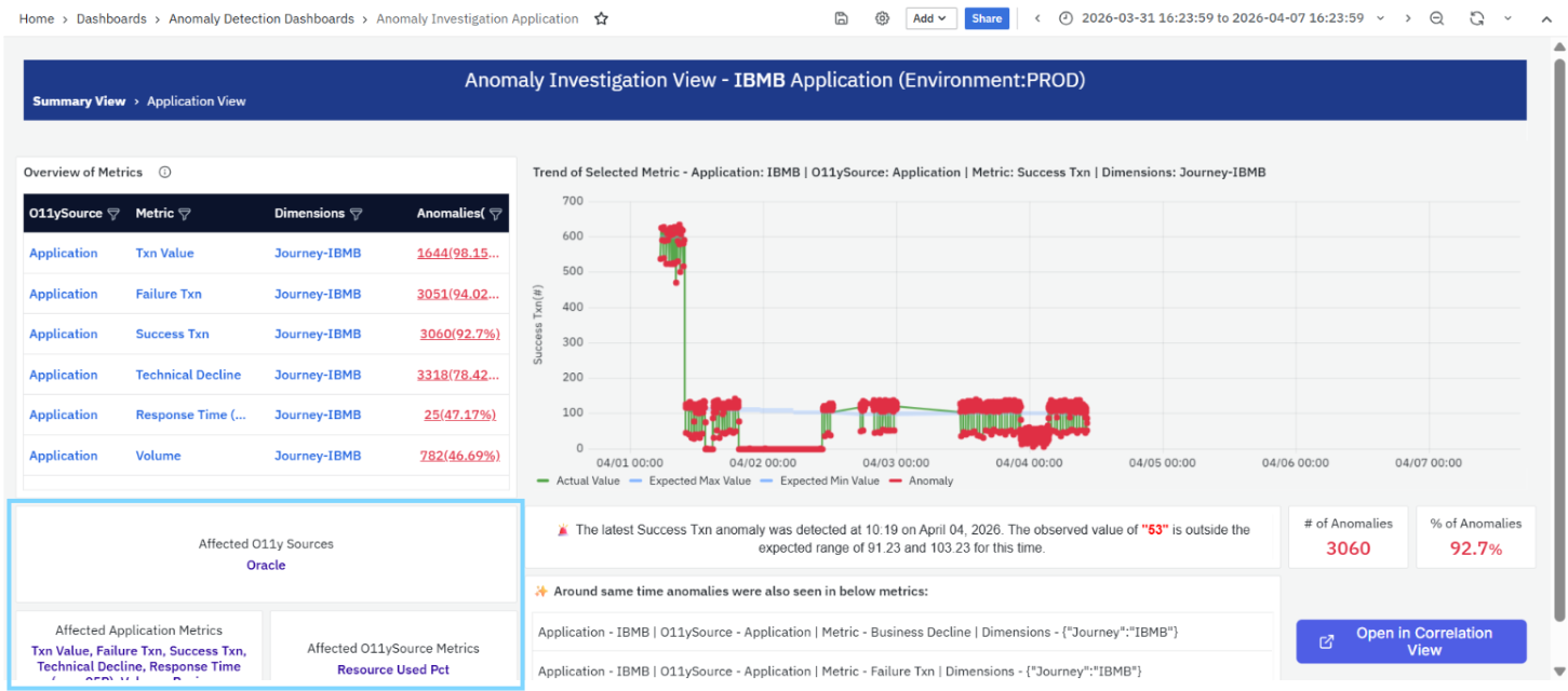
- Displays the source name (for example, Oracle)
This helps determine:
- Which data source is contributing to anomalies
Affected Application Metrics
This section lists key application-level metrics impacted within the selected application.
Examples include:
- Txn Value
- Failure Txn
- Success Txn
- Technical Decline
- Response Time
- Volume
This helps identify:
- Which specific application metrics are abnormal
Affected O11ySource Metrics
This section highlights metrics related to observability sources that are affected.
Example:
- Resource Used Pct
This helps determine:
- Whether anomalies are linked to infrastructure or resource utilization
Anomaly Insight Summary
This section provides a summary of the most recent anomaly detected for the selected metric.
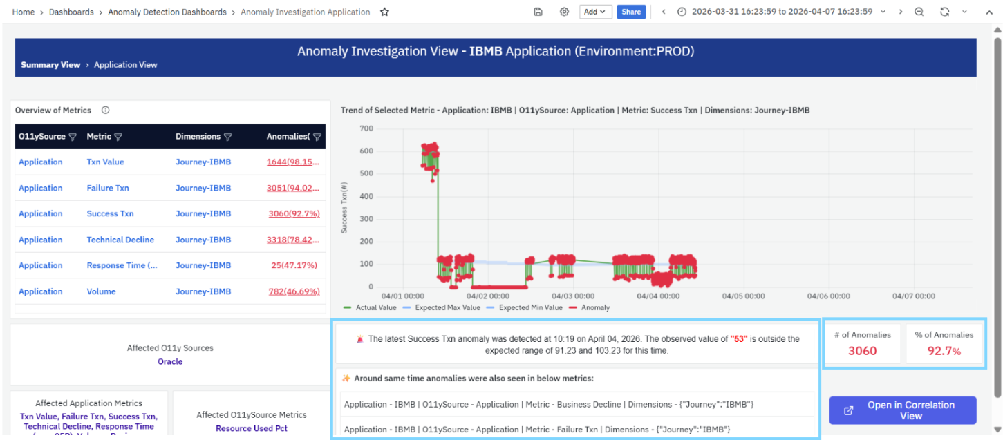
It includes:
- Timestamp of the anomaly
- Observed value
- Expected range
Example:
“The latest Success Txn anomaly was detected at 10:19 on April 04, 2026. The observed value of "53" is outside the expected range of 91.23 and 103.23 for this time.”
This helps quickly understand:
- When the anomaly occurred
- How much the value deviated
- Whether the deviation is significant
The significance of an anomaly depends on the metric being analyzed and its business context. For example, a decrease in successful transactions may indicate a potential issue, whereas a decrease in response time may indicate improved application performance. An anomaly indicates a deviation from expected behavior and should be interpreted in the context of the metric and the affected application.
Related Anomalies
This section highlights anomalies that occurred around the same time in other related metrics.
Each entry includes:
- Application
- O11ySource
- Metric
- Dimension
This helps identify:
- Correlated anomalies across metrics
- Broader impact within the application
- Potential root causes
Key Metrics
This section provides summary indicators:
- # of Anomalies: Total number of anomalies detected for the selected metric.
- % of Anomalies: Percentage of data points classified as anomalies.
These metrics help assess:
- Severity of anomalies
- Frequency of abnormal behavior
Correlation View
- The Open in Correlation View option allows you to further analyze relationships between anomalies across metrics and dimensions.
- For a detailed explanation, refer to the Correlation View section, which explains how to analyze relationships across multiple metrics.
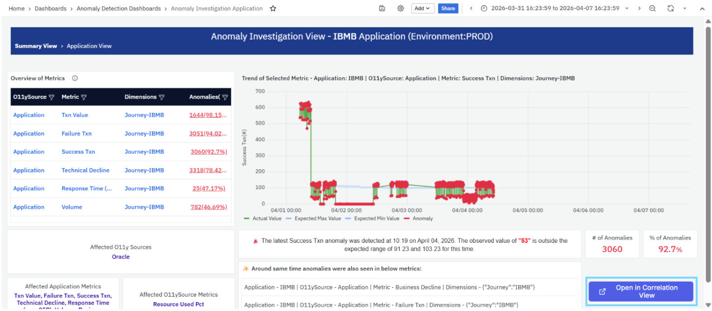
This enables deeper investigation into:
- Cross-metric dependencies
- Root cause analysis
Anomaly Investigation View – O11ySource
The Anomaly Investigation View – O11ySource provides a detailed analysis of anomalies originating from a specific observability source. It helps you understand how metrics collected from that source behave over time and identify abnormal patterns, deviations, and potential infrastructure or system-level issues. This view is accessed by clicking an O11ySource from the Anomaly Summary Explorer.
Overview of Metrics
This section displays a tabular summary of all metrics associated with the selected observability source.
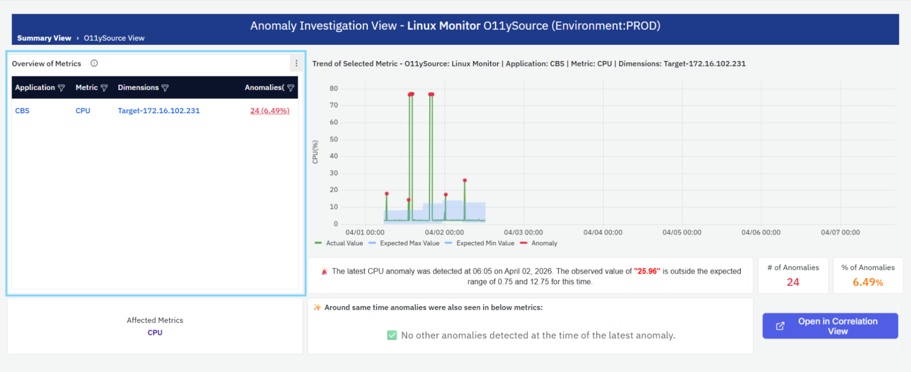
Each row includes:
- Application: The application associated with the metric.
- Metric: The name of the metric (for example, CPU).
- Dimensions: The dimension context applied (for example, Target-172.16.102.231).
- Anomalies: The total number of anomalies detected for that metric, along with the anomaly percentage.
Behavior
- Each metric entry is clickable
- Selecting a metric navigates to the Anomaly Investigation View – Metric
This section helps identify:
- Which metrics are affected within the observability source
- Which metrics have anomaly occurrences
Trend of Selected Metric
This section displays a time-series chart for the selected metric within the chosen observability source.
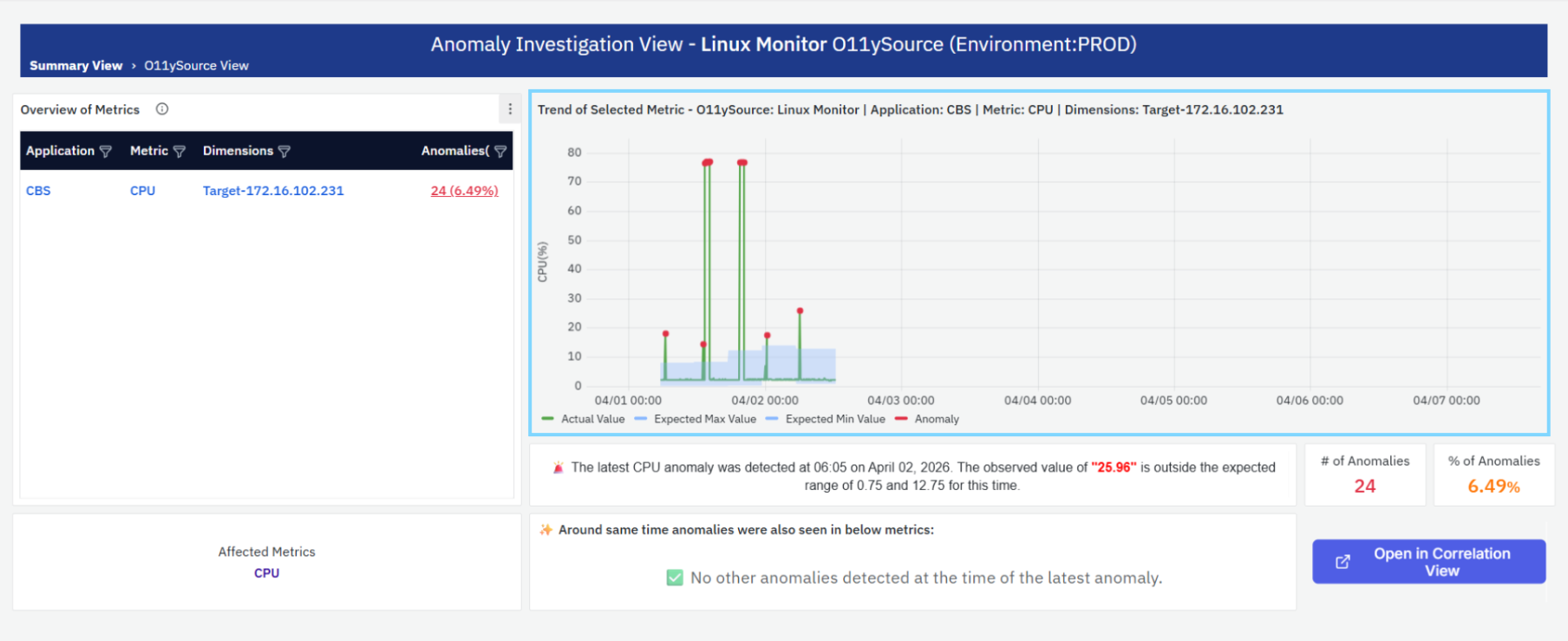
The chart includes:
- Actual Value (Green line): Represents observed metric values over time.
- Expected Min Value (Blue lower bound): Lower bound of expected behavior.
- Expected Max Value (Blue upper bound): Upper bound of expected behavior.
- Anomalies (Red markers): Points where actual values fall outside the expected range.
Behavior
- Anomalies occur when values exceed expected bounds
- The shaded region represents the normal operating range
This helps identify:
- Spikes or abnormal behavior
- Frequency of anomalies
- Trends in system performance
Affected Metrics
This section highlights the metrics impacted within the selected observability source.
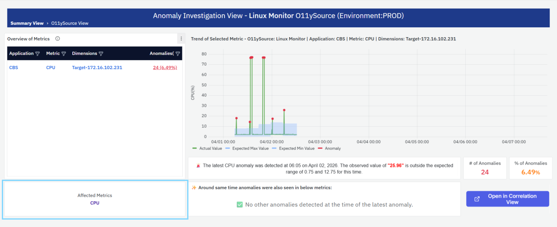
- Displays the metric name(s) (for example, CPU)
This helps identify:
- Which specific metrics from the source are affected
Anomaly Insight Summary
This section provides a summary of the most recent anomaly detected for the selected metric.
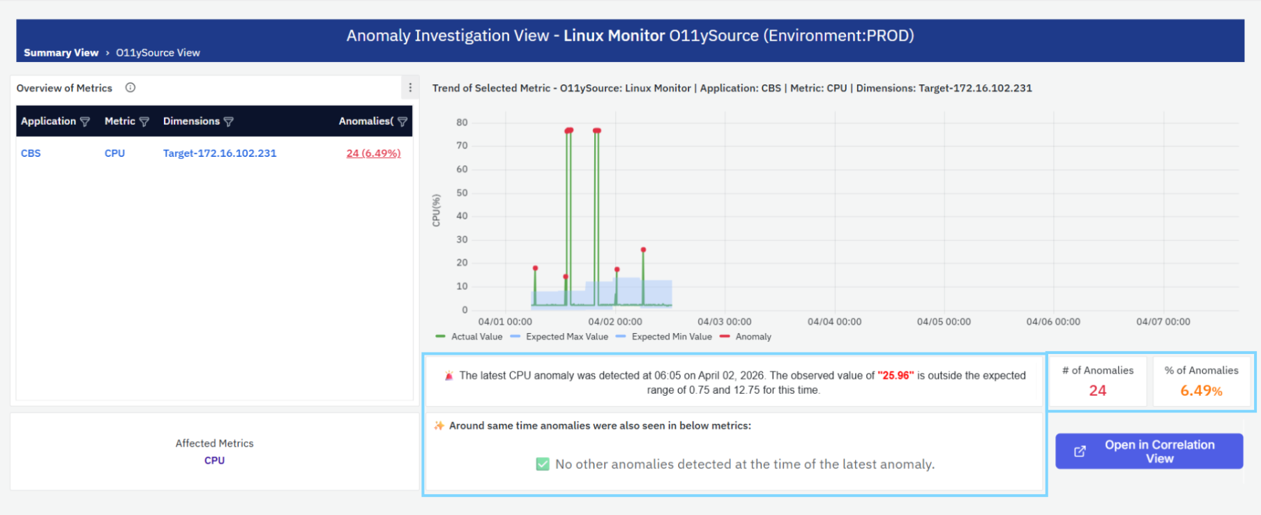
It includes:
- Timestamp of the anomaly
- Observed value
- Expected range
Example:
“The latest CPU anomaly was detected at 06:05 on April 02, 2026. The observed value of "25.96" is outside the expected range of 0.75 and 12.75 for this time.”
This helps quickly understand:
- When the anomaly occurred
- How much the value deviated
- Whether the deviation is significant
Related Anomalies
This section highlights anomalies that occurred around the same time in other related metrics.
- If no related anomalies are found, the system displays an informational message: “No other anomalies detected at the time of the latest anomaly.”
This helps identify:
- Whether the anomaly is isolated
- Or part of a broader system issue
Key Metrics
This section provides summary indicators:
- # of Anomalies: Total number of anomalies detected for the selected metric.
- % of Anomalies: Percentage of data points classified as anomalies.
These metrics help assess:
- Severity of anomalies
- Frequency of abnormal behavior
Correlation View
- The Open in Correlation View option allows you to further analyze relationships between anomalies across metrics and dimensions.
- For a detailed explanation, refer to the Correlation View section, which explains how to analyze relationships across multiple metrics.
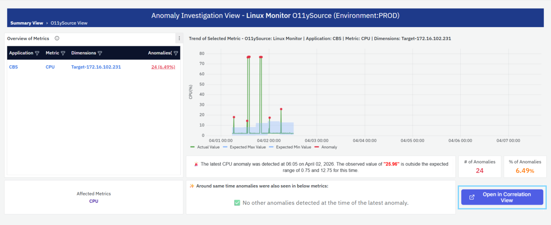
This enables deeper investigation into:
- Root cause analysis
- Cross-metric dependencies
Anomaly Investigation View – All Metrics (Correlation View)
The Anomaly Investigation View – All Metrics (Correlation View) provides a comparative analysis of anomalies across multiple metrics within the selected scope (Journey, Application, and O11ySource). It enables users to analyze how different metrics behave simultaneously and identify correlations, patterns, and potential root causes. This view is typically accessed via the “Open in Correlation View” option from other investigation pages.
Correlation View Layout
This view displays multiple metric charts in a grid format, where each panel represents a different metric.
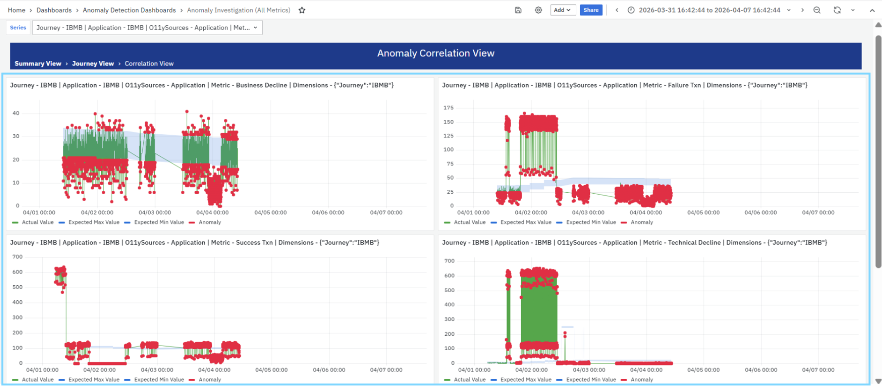
Each chart includes:
- Metric name and context (Journey, Application, O11ySource, and Dimensions)
- Time-series visualization showing metric behavior over the selected time range
Trend of Metrics (Multi-Metric View)
Each panel represents a single metric trend, allowing side-by-side comparison across metrics. Each chart includes:
- Actual Value (Green line): Represents the observed metric values over time
- Expected Min Value (Blue lower bound): Lower bound of expected behavior
- Expected Max Value (Blue upper bound): Upper bound of expected behavior
- Anomalies (Red markers): Data points where actual values fall outside the expected range
Behavior
- Each chart operates independently but shares the same time range and context
- Anomalies are highlighted per metric, making it easy to compare:
- When anomalies occur
- Which metrics are affected simultaneously
Correlation Analysis
This is the key purpose of this view. By observing multiple charts together, users can:
- Identify simultaneous anomalies across metrics
- Hypothesize potential cause-and-effect relationships between metrics.
- Understand whether anomalies are:
- Isolated to a single metric
- Spread across multiple metrics
Example Insights
- A spike in Failure Txn and drop in Success Txn at the same time
- Increase in Technical Decline along with changes in Txn Value
- Infrastructure-related metrics impacting application metrics
Metric Context
Anomaly Summary Explorer → Metric View → Related Anomalies → Correlation View
This workflow helps users move from high-level anomaly detection to detailed analysis and correlation of related anomalies for root cause investigation. Each chart includes full context:
- Journey
- Application
- O11ySource
- Metric name
- Dimensions
This ensures clarity while comparing multiple metrics.
Tips and Best Practices
- Ensure sufficient historical data is available before creating an anomaly detector to improve detection accuracy.
- Select the appropriate metric, data model, and dimension that best represent the behavior you want to monitor.
- Use the default detector settings for standard use cases and enable advanced configuration only when fine-tuning is required.
- Configure seasonality based on expected usage patterns, such as daily or weekly trends.
- Adjust sensitivity carefully to balance anomaly detection accuracy and alert noise.
- Match the configured data frequency with the actual metric collection interval.
- Regularly review detected anomalies in the Anomaly Explorer to identify recurring patterns and potential root causes.
- Integrate anomaly detectors with alert channels to receive timely notifications for critical anomalies.
- Periodically review detector configurations as application behavior and workloads evolve.
Troubleshooting
- Issue: No anomalies are detected.
- Possible Cause: Insufficient historical data or the detector is disabled.
- Solution: Ensure enough historical data is available and verify that the detector is enabled.
- Issue: Detector is not generating accurate results.
- Possible Cause: Incorrect metric, dimension, or seasonality configuration.
- Solution: Review the detector configuration and ensure the selected metric, dimension, and seasonality match the monitored data.
- Issue: Too many anomaly alerts are generated.
- Possible Cause: Detector sensitivity is configured too low.
- Solution: Increase the sensitivity threshold to reduce unnecessary anomaly detection.
- Issue: Expected anomalies are not detected.
- Possible Cause: Detector sensitivity is too high.
- Solution: Lower the sensitivity threshold to detect smaller deviations.
- Issue: Detector remains disabled after creation.
- Possible Cause: The detector was created but not enabled.
- Solution: Enable the detector from the Anomaly Detection listing page.
- Issue: Selected metric is not available.
- Possible Cause: The required data model or metric has not been configured.
- Solution: Verify the data model configuration and ensure the required metrics are available.
- Issue: Detector training takes longer than expected.
- Possible Cause: Large training period or insufficient historical data.
- Solution: Allow additional time for model training or adjust the configured training period.
- Issue: Anomaly Explorer does not display anomalies.
- Possible Cause: No anomalies have been detected within the selected time range.
- Solution: Verify the selected time filter and confirm that the detector has identified anomalies.
- Issue: Alerts are not triggered for detected anomalies.
- Possible Cause: Alert integration has not been configured.
- Solution: Configure the required alert channels and associate them with the anomaly detector.
- Issue: Correlation View is empty.
- Possible Cause: Related anomalies are not available for the selected metric.
- Solution: Select a different anomaly or expand the time range to identify correlated anomalies.
- Issue: Prediction results appear inaccurate.
- Possible Cause: Data frequency does not match the actual metric collection interval.
- Solution: Configure the correct data frequency to match the incoming metric data.
- Issue: Detector configuration cannot be saved.
- Possible Cause: Mandatory fields are missing or contain invalid values.
- Solution: Verify all required fields and complete the detector configuration before saving.
FAQs
What is the difference between Anomaly Detection and Anomaly Explorer?
Anomaly Detection is used to create and manage anomaly detectors, while Anomaly Explorer is used to analyze and investigate detected anomalies.
What happens after an anomaly is detected?
Detected anomalies become available in the Anomaly Explorer, where you can investigate trends, analyze affected metrics, perform correlation analysis, and identify potential root causes.
