HyperScale Analytics Dashboard
Introduction
The Hyperscale Analytics Dashboard is designed to help users monitor, analyse, and manage large-scale database environments in a simple and structured way. A similar concept can be seen in a smartphone storage and performance view, where users can review storage usage, application activity, resource consumption, and system health from one place. In the same way, the Hyperscale Analytics Dashboard brings together information related to data ingestion, table structure, cluster health, Keeper operations, query performance, merges, mutations, and guardrail violations. In banking and payment environments, large volumes of transaction data from systems such as UPI, payment gateways, and core banking applications are continuously generated and stored. Managing this data requires clear visibility into:
- Data availability and ingestion
- Table structure and storage usage
- ClickHouse host and Keeper health
- Kafka consumer activity
- Query execution and resource utilisation
- Merge and mutation operations
- Guardrail limits and violations
To provide this visibility, the platform includes the following integrated dashboards:
- Data Explorer Dashboard
- Table Explorer Dashboard
- Cluster Health Dashboard
- ClickHouse Keeper Overview Dashboard
- Kafka Table Ingestion Metrics Dashboard
- Read Query Metrics Dashboard
- Merges & Mutations Metrics Dashboard
- GuardRail Violations Dashboard
Each dashboard focuses on a specific area, while together they provide a connected view of the ClickHouse database environment.
Accessing the Hyperscale Management Dashboard
To access the Hyperscale Management Dashboard, navigate to the left navigation menu -> Dashboards
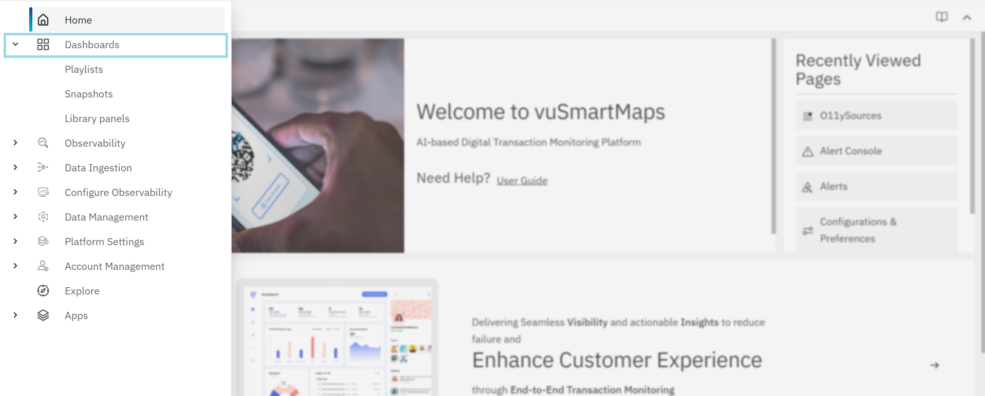
On clicking the Dashboards run the search for the Hyperscale.
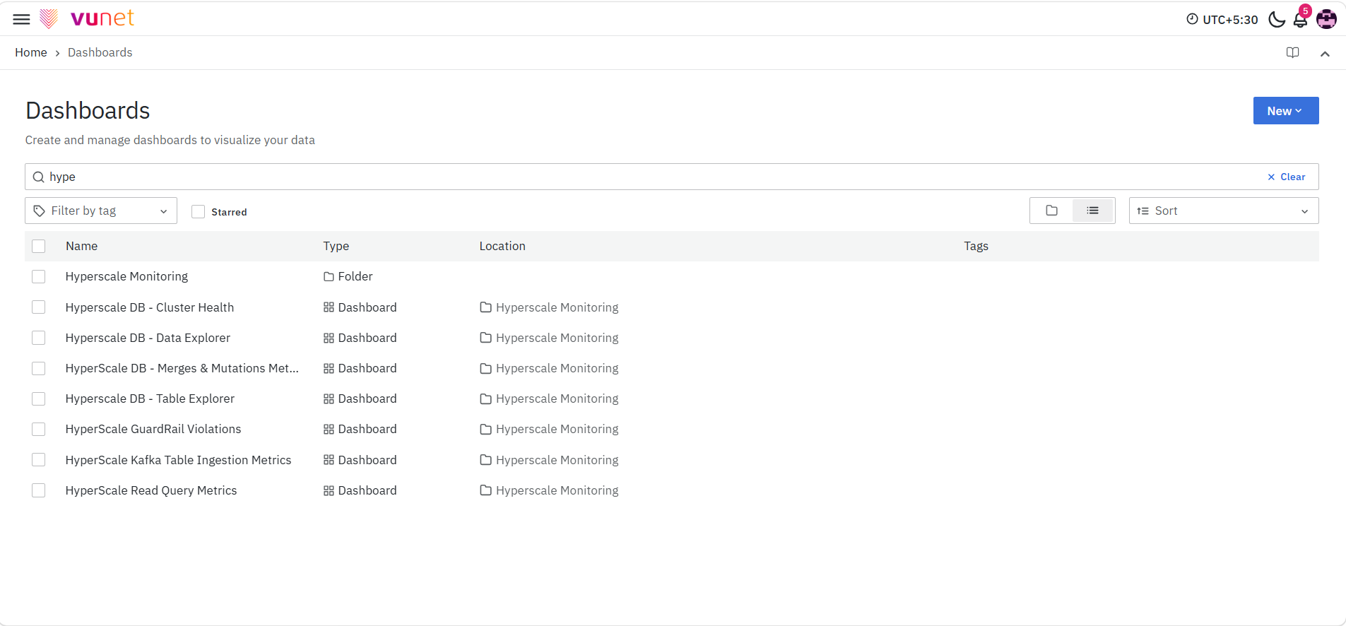
You will then see the eight available dashboards listed:
- Data Explorer
- Table Explorer
- Cluster Health
- ClickHouse Keeper Overview
- Kafka Table Ingestion Metrics
- Read Query Metrics
- Merges & Mutations Metrics
- GuardRail Violations
Clicking on any of these dashboards will take you directly to the respective dashboard interface. Now, let’s explore each of these dashboards in detail.
Data Explorer Dashboard
The Data Explorer Dashboard offers a quick and easy way to view table data with just a few clicks. It’s particularly useful for verifying whether a specific table is receiving the most recent data feed.
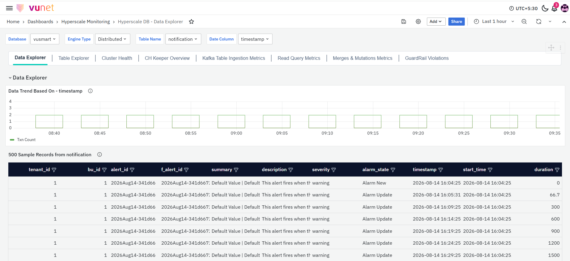
At the top of each dashboard filter are located:
-
Database: Allows you to select the database where the table to be verified exists. The default database is "vusmart." In most cases, this filter won't need to be changed, as all tables are created in the "vusmart" database by default.
-
Engine Type: Enables selection of the underlying table engine type, such as Distributed, Materialized View, etc. The default engine type is "Distributed." Typically, all tables will have a distributed table on top of the base table.
-
Table Name: Allows you to select the table you want to view. The list of tables shown in this filter depends on the selected "Engine Type." If the table you're searching for isn't listed, ensure that you've selected the correct table engine type.
-
Date Column: Lists all the "Date" type columns available in the selected table. By default, the "timestamp" column will be shown if it is available.
-
Hyperscale DS Instance: Allows you to select the Hyperscale DS instance that you want to monitor. The available options depend on the Hyperscale DS instances configured in the environment. The selected instance determines the ClickHouse data displayed in the dashboard panels.
The Data Explorer Dashboard includes Database, Engine Type, Table Name, and Date Column filters. The Table Explorer Dashboard provides similar filters, except for Date Column. The Cluster Health Dashboard includes Hyperscale DS Instance and Database filters.
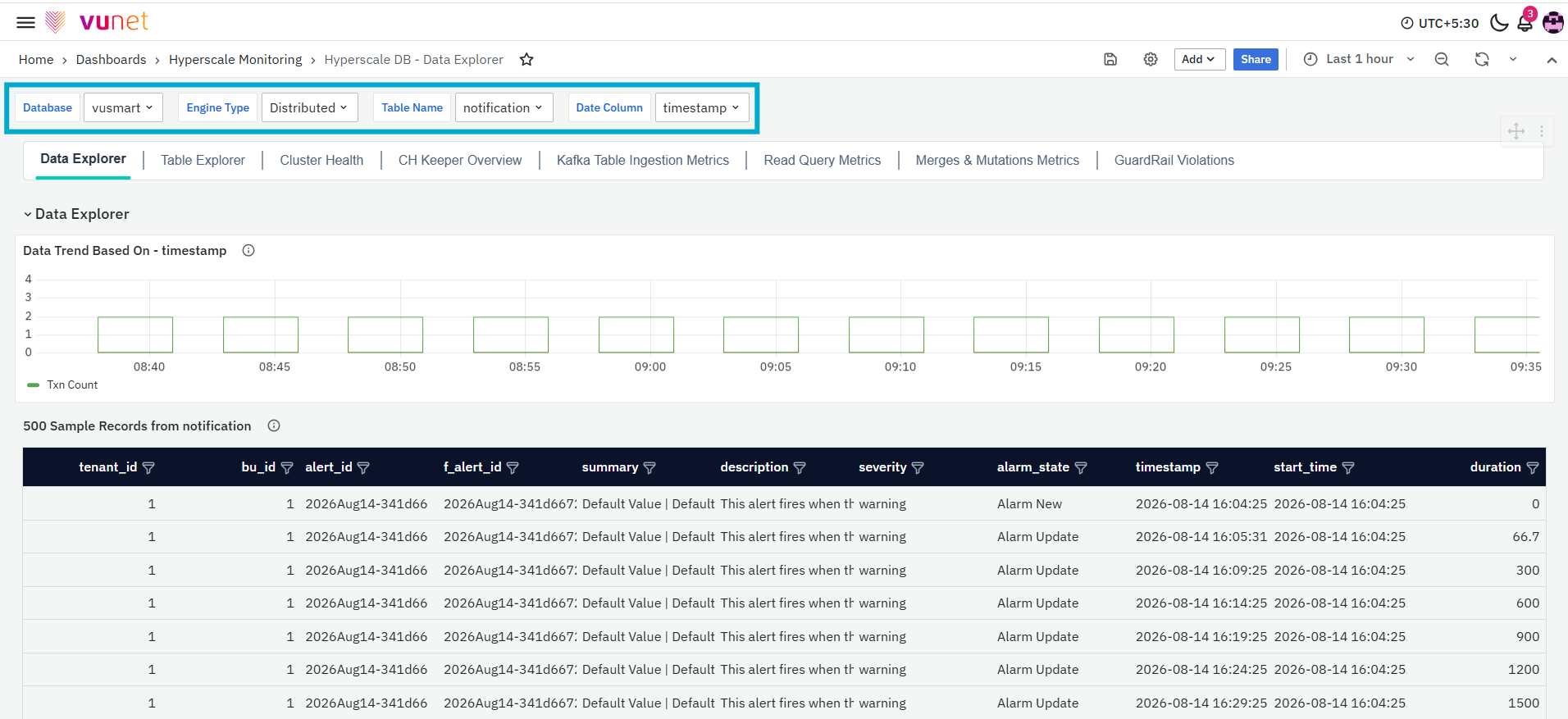
Using a stepper tab, you can switch between different dashboards.
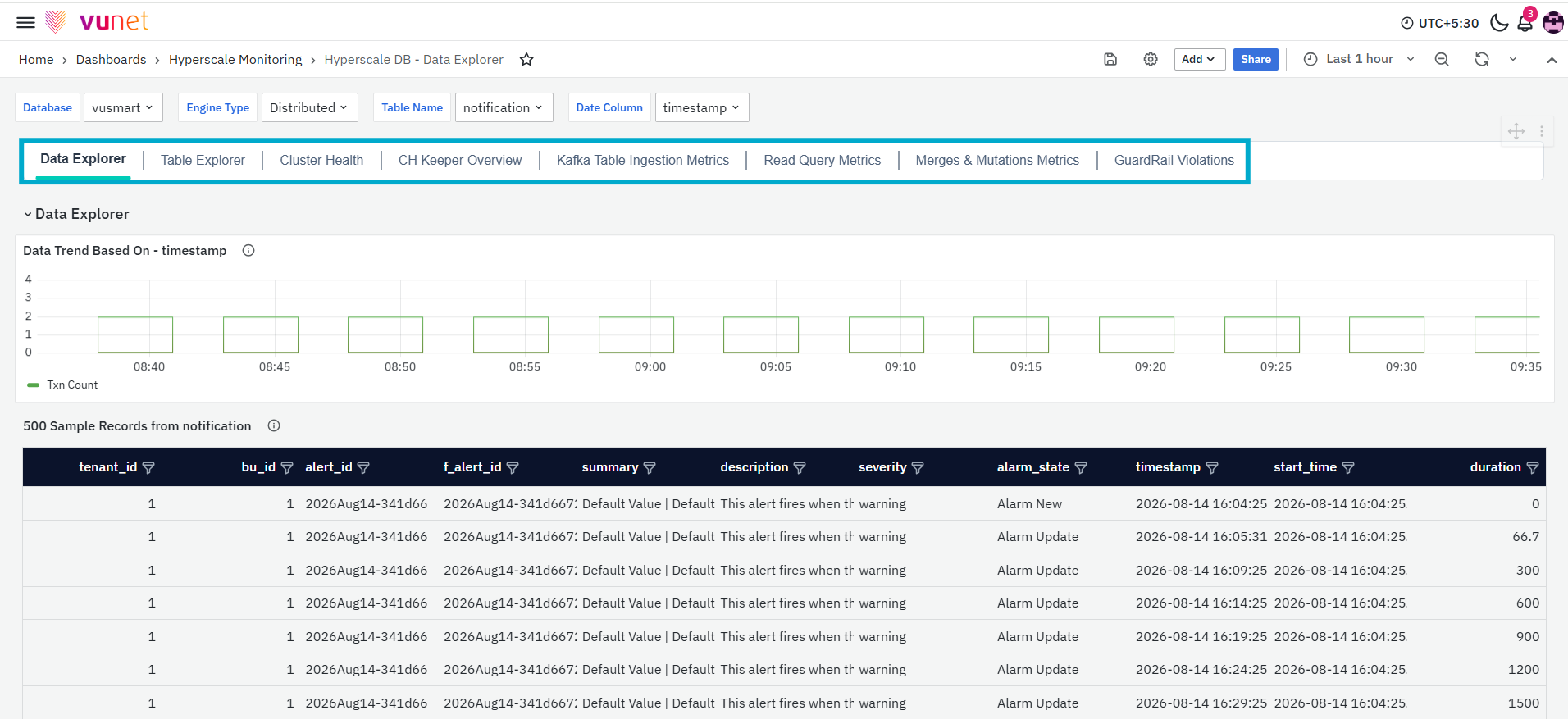
Data Explorer
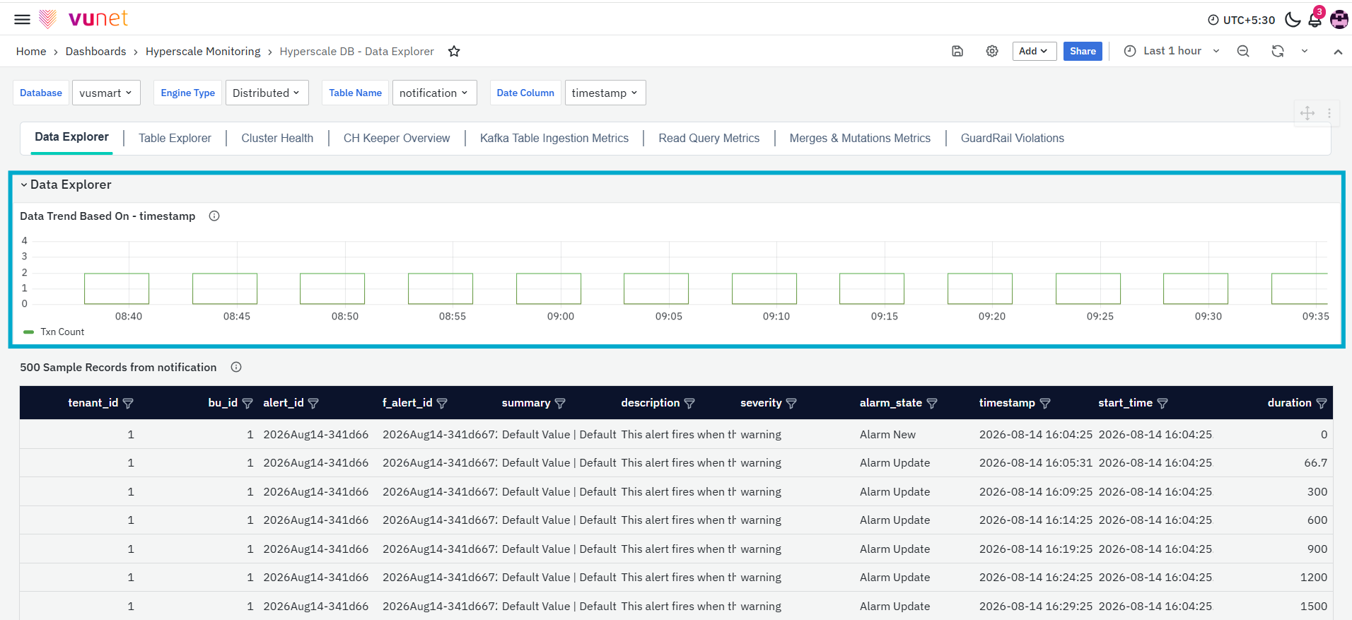
The first panel in the dashboard, Data Trend Based on-timestamp, visualizes trends based on the selected 'Date column’ from the dataset. It provides a quick overview of how data fluctuates over time. If no data is available in the selected object or the dataset lacks a valid date column, the trend cannot be displayed. This panel is key for identifying patterns or gaps in data over a chosen time period.
The second panel displays data from all available columns in the table, with a column-level filter that allows users to quickly focus on specific data. The data shown is limited to the top 500 records, determined by the 'ORDER BY' clause set for the table.
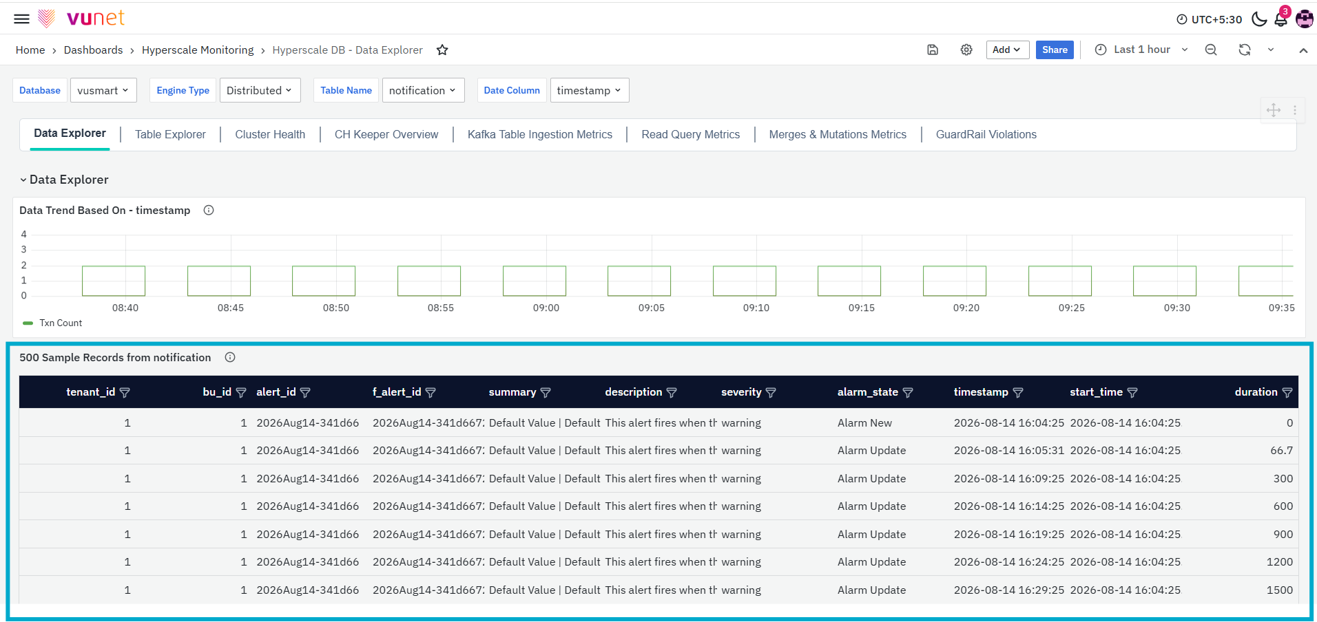
Table Explorer Dashboard
The Table Explorer Dashboard provides a comprehensive overview of a selected table's structure, including its columns and associated data types, as well as key sizing details. This dashboard is designed to give users a quick snapshot of table composition, helping to identify column properties, data distribution, and overall table size for effective database management
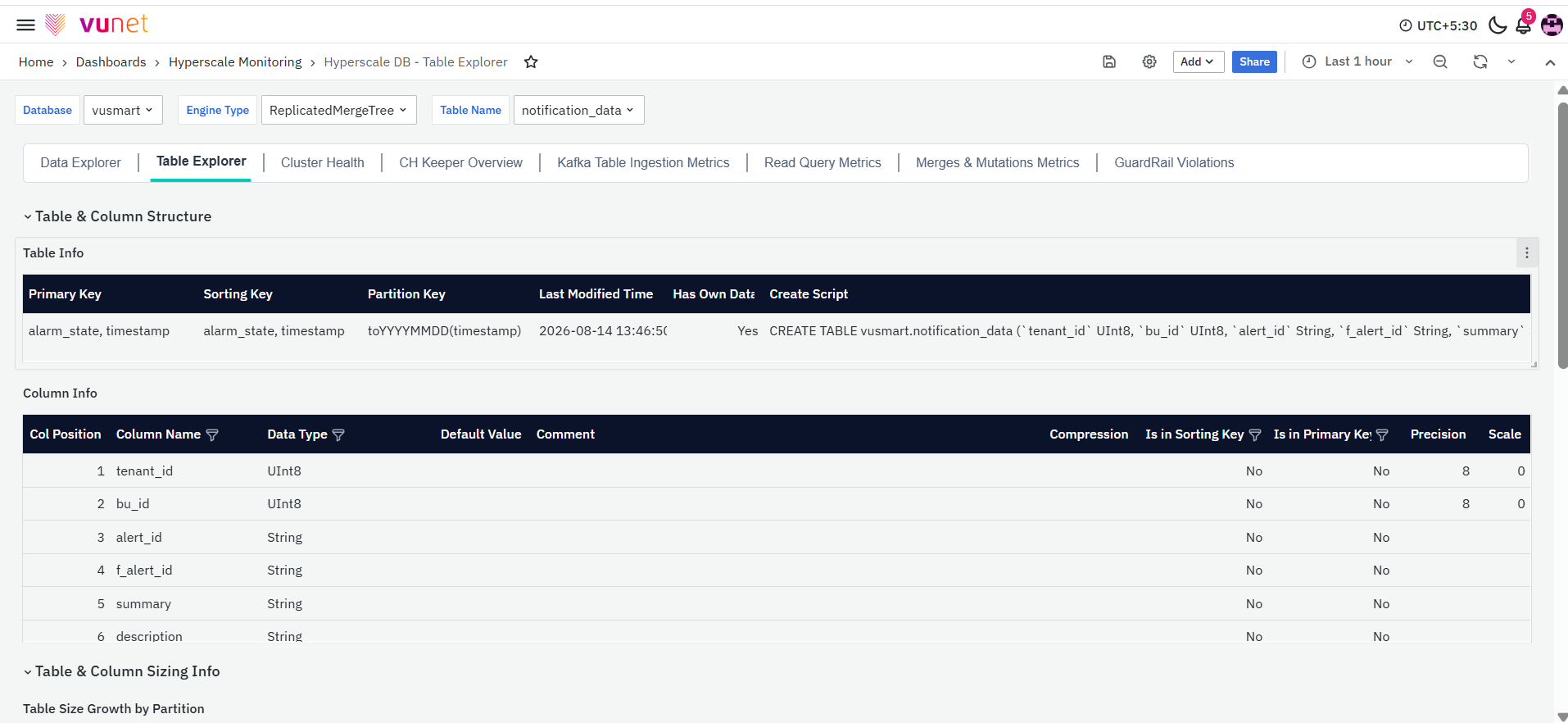
This Dashboard also has similar filters which are available in the “Data Explore” storyboard, with the exception of the Date Column filter.
Table & Column Structure
First section of dashboard is the Table & Column Structure
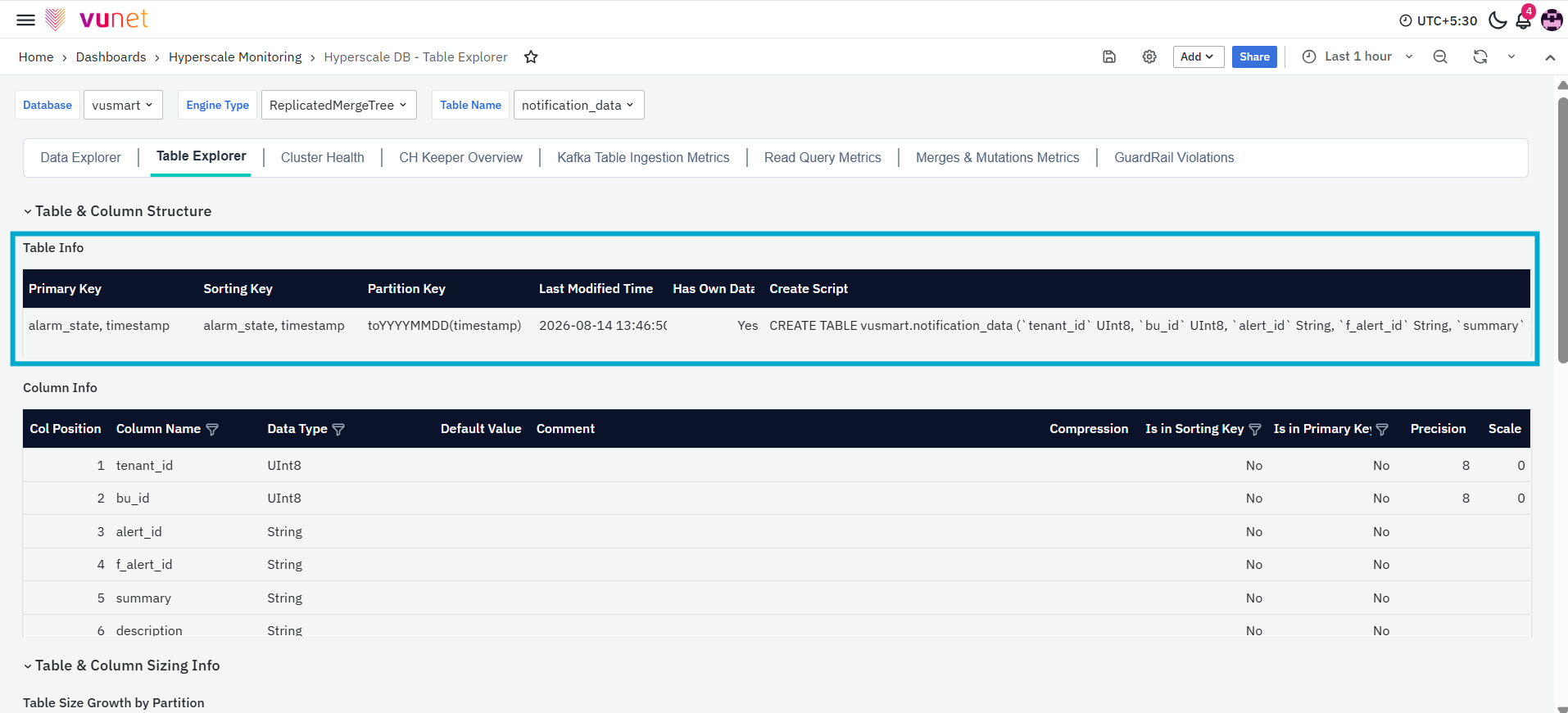
The Table Info panel within the Table and Column Structure provides essential metadata about the selected table. It includes the following columns:
- Primary Key: Identifies the unique key that distinguishes each row in the table.
- Sorting Key: Specifies the column(s) used to sort the data within the table for optimized querying.
- Partition Key: Displays the key used for partitioning the data, enhancing performance and scalability.
- Last Modified Time: Indicates the most recent timestamp when the table data was updated.
- Has Own Data: Shows whether the table contains its own data or if it's derived from another table or view.
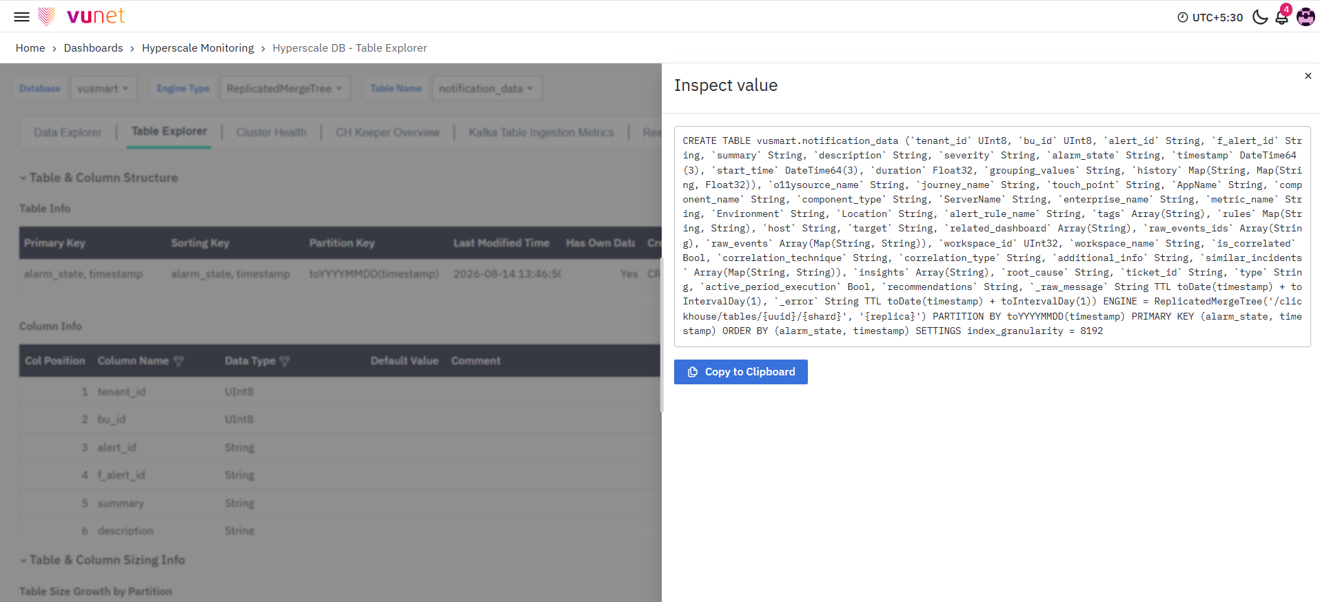
- Create Script: Provides access to the script used to create the table, allowing for review or replication of the table structure. You can also inspect the value by clicking on the eye button next to it.
The Column Info panel in the Table and Column Structure provides a detailed breakdown of the columns within the selected table.
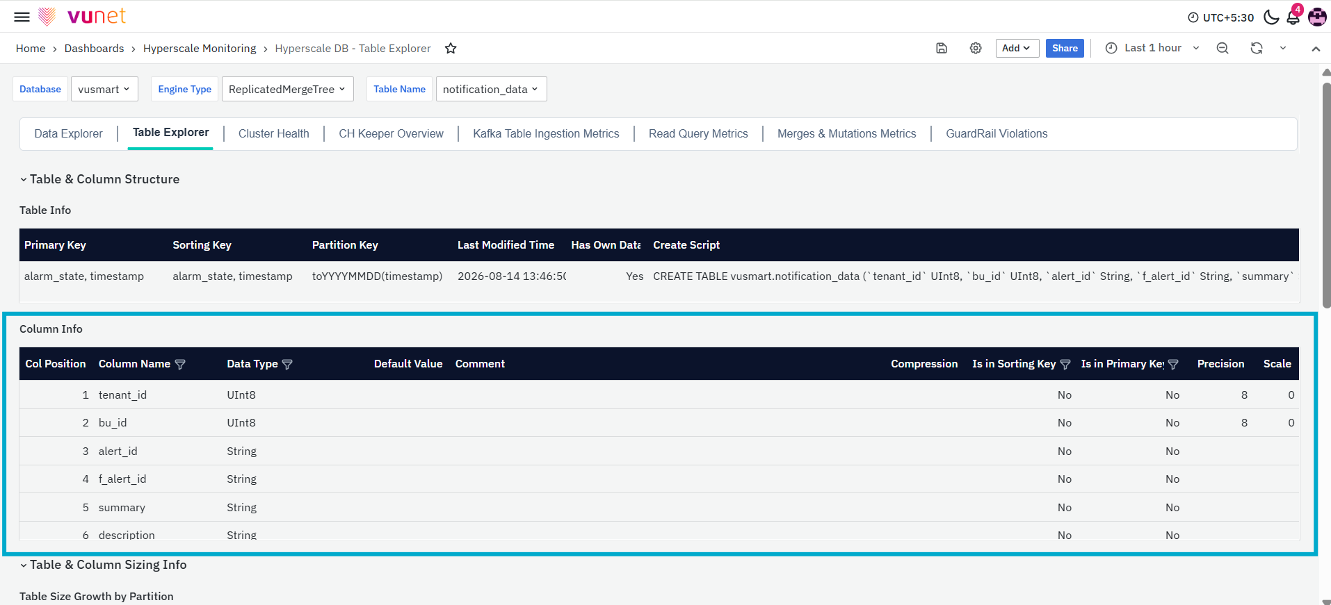
This section includes the following fields:
- Col Position: Displays the position of the column in the table, indicating its order.
- Column Name: Lists the name of each column in the table.
- Data Type: Specifies the data type for each column, helping to understand how the data is stored and used.
- Default Value: Shows any default value assigned to the column if a new record does not provide one.
- Comment: Provides any additional context or annotations regarding the column's purpose or usage.
- Compression: Indicates whether compression is applied to the column, which helps optimize storage.
- Is in Sorting Key: Identifies if the column is part of the sorting key used for efficient query operations.
- Is in Primary Key: Indicates whether the column is a part of the primary key, which uniquely identifies each row.
- Precision: For numeric data types, this shows the number of significant digits that the column can store.
- Scale: For numeric columns, this indicates the number of decimal places the column can store.
Table & Column Sizing Info
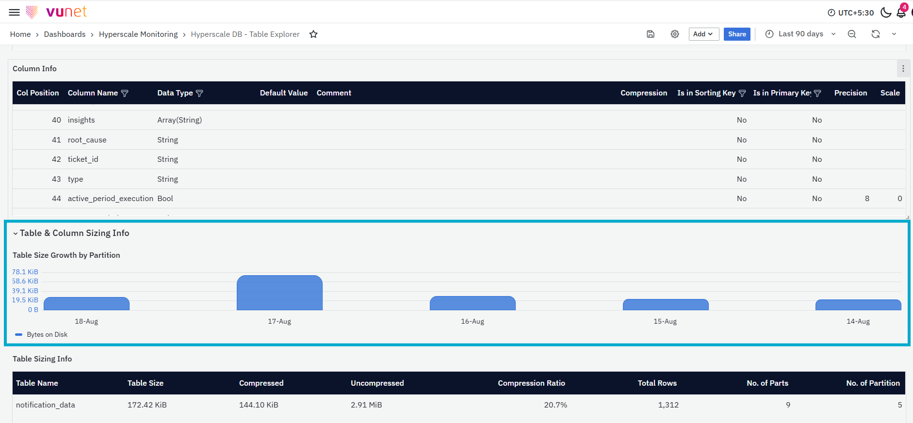
The next section of the Dashboard is Table & Column Sizing Info, that provides critical information on table and column sizing, aiding in understanding storage usage and data distribution across partitions. It is divided into four panels:
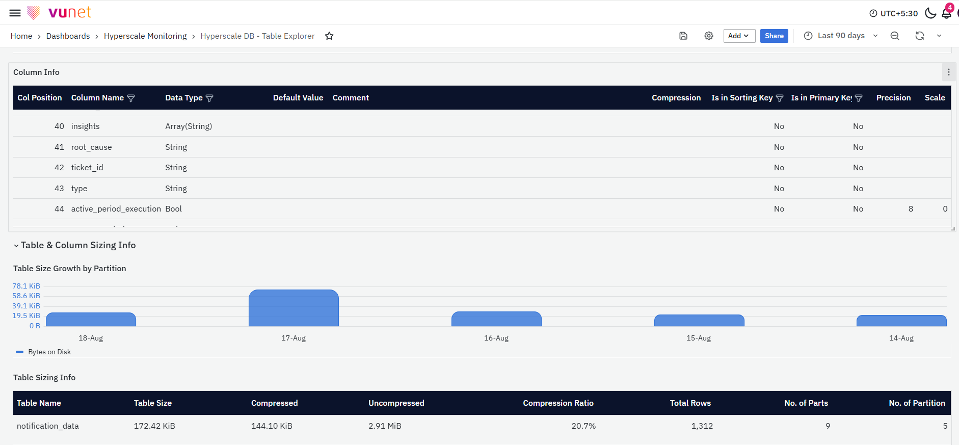
The first panel is the Table Size Growth by Partition, this panel presents details about the current size of the selected table, along with a trend showing size growth by partition key. If the selected table doesn’t have any partitions, the growth trend cannot be displayed.
The second panel is Table Sizing Info. This table presents an overview of the sizing details for each table.
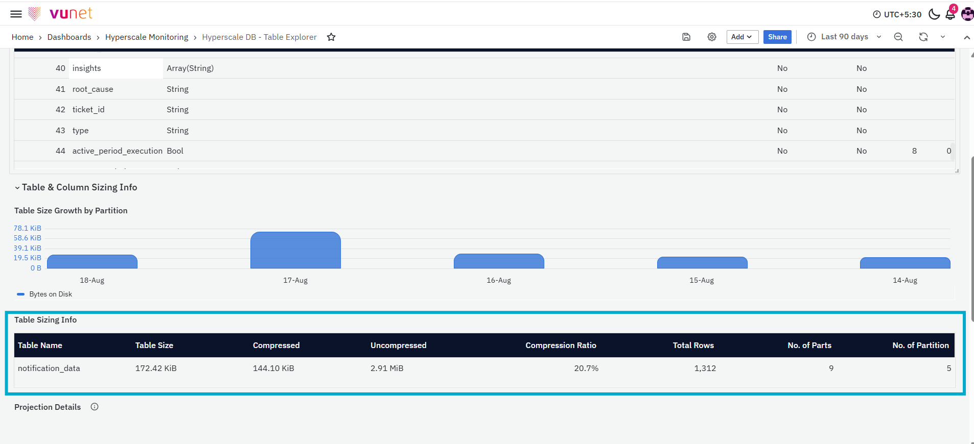
It includes the following columns:
- Table Name: Displays the name of the table.
- Table Size: Shows the total size of the table on disk.
- Compressed: Indicates the compressed size of the table.
- Uncompressed: Shows the size of the table before compression.
- Compression Ratio: Displays the ratio of compressed to uncompressed size.
- Total Rows: Shows the total number of rows in the table.
- No. of Parts: Displays the number of parts in the table.
- No. of Partitions: Indicates the number of partitions within the table.
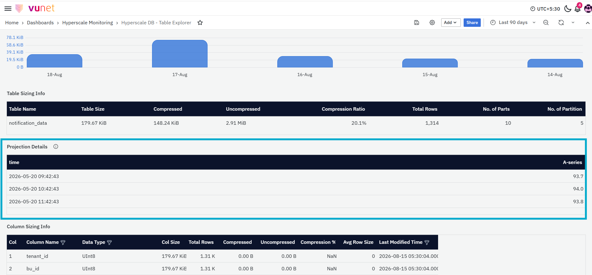
Third panel is the Projection Details. This panel provides sizing information for projections, if any are defined for the base table. It helps to understand how projections impact overall storage usage.
The last panel is Column Sizing Info. This table offers a detailed breakdown of each column's storage details.
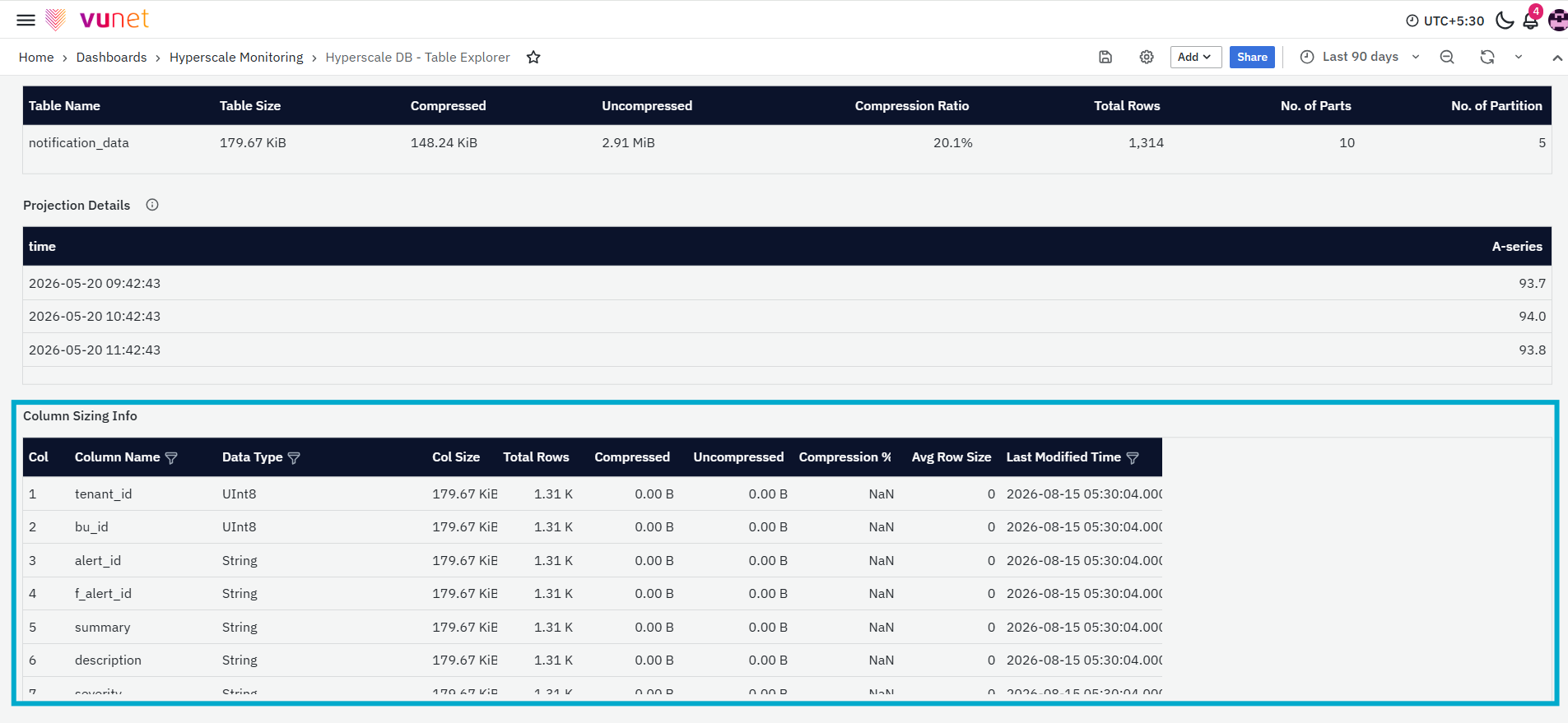
It includes the following columns:
- Col: Column position in the table.
- Column Name: Name of the column.
- Data Type: Data type of the column.
- Col Size: Total size of the column's data on disk.
- Total Rows: Number of rows contained in the column.
- Compressed: Compressed size of the column.
- Uncompressed: Uncompressed size of the column.
- Compression %: The percentage of compression achieved for the column.
- Avg Row Size: Average size of each row in the column.
- Last Modified Time: Timestamp of the last modification to the column's data.
These panels provide comprehensive insights into table and column storage, allowing for effective monitoring and management of database resources.
Cluster Health Dashboard
The Cluster Health Dashboard provides a detailed view of the health, storage usage, table information, and resource utilisation of the selected ClickHouse environment. It brings together host-level details, database storage information, table-level statistics, detached-part information, CPU and memory usage, connection activity, and wait-time metrics. This dashboard helps users understand the current condition of the ClickHouse host and identify changes in storage consumption, resource usage, or system activity that may require further investigation.
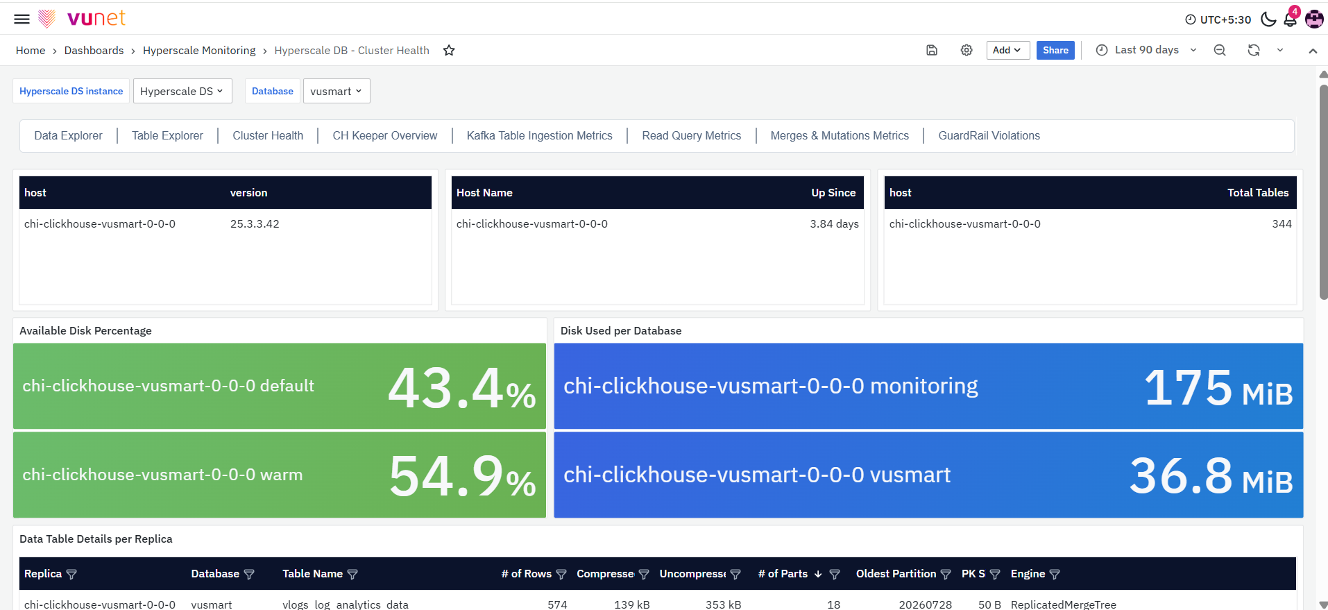
The first section provides a snapshot of the selected ClickHouse host. It contains panels that display the host name, ClickHouse version, host uptime, total number of tables, available disk capacity, database-level disk usage, and table-level information.
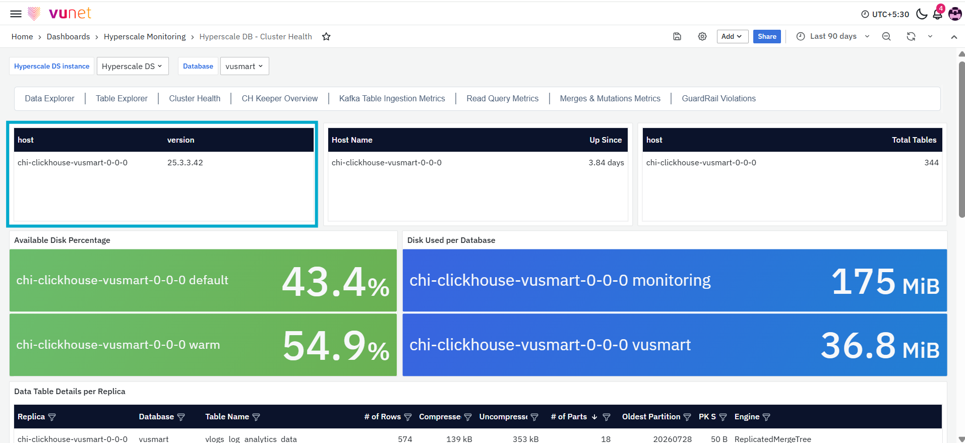
The first panel displays the host name and the ClickHouse version installed on the selected host. The table includes the following columns:
- Host: The name of the ClickHouse host being monitored.
- Version: The ClickHouse version currently running on the selected host.
The version information helps users verify the database version available in the monitored environment.
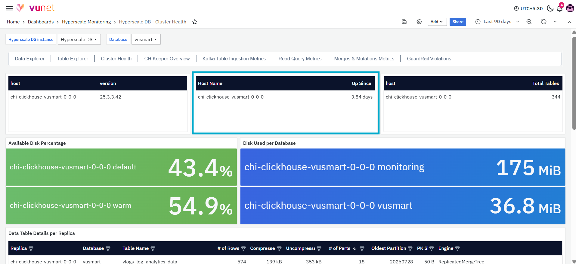
The next panel shows how long the selected ClickHouse host has been running. It helps users review the availability and continuity of the host. The table includes the following columns:
- Host Name: The name of the ClickHouse host being monitored.
- Up Since: The amount of time for which the host has been continuously running.
A change in the uptime value may indicate that the host or the ClickHouse service has recently restarted.
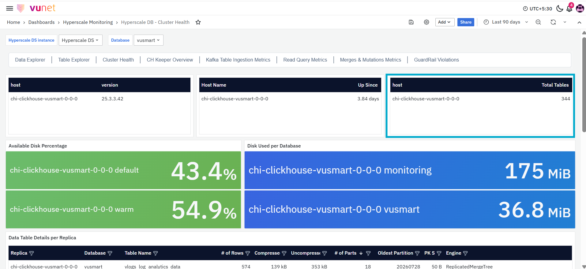
The Total Tables panel displays the total number of tables available on the selected ClickHouse host. The table includes the following columns:
- Host: The name of the ClickHouse host.
- Total Tables: The total number of tables available on the host.
This panel provides a quick understanding of the number of tables currently maintained in the selected ClickHouse environment.
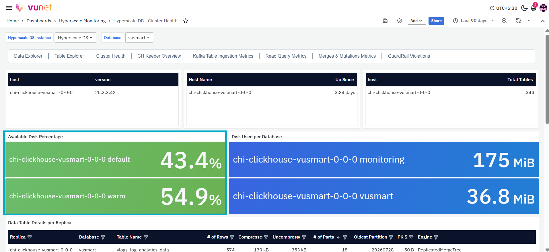
The Available Disk Percentage panel displays the percentage of disk space currently available on each configured disk for the selected ClickHouse host. Each disk is displayed separately along with its available capacity percentage. This panel helps users compare the remaining storage capacity across the configured disks. A lower available disk percentage indicates that a larger portion of the disk is already being used and may require further monitoring to avoid storage-related issues.
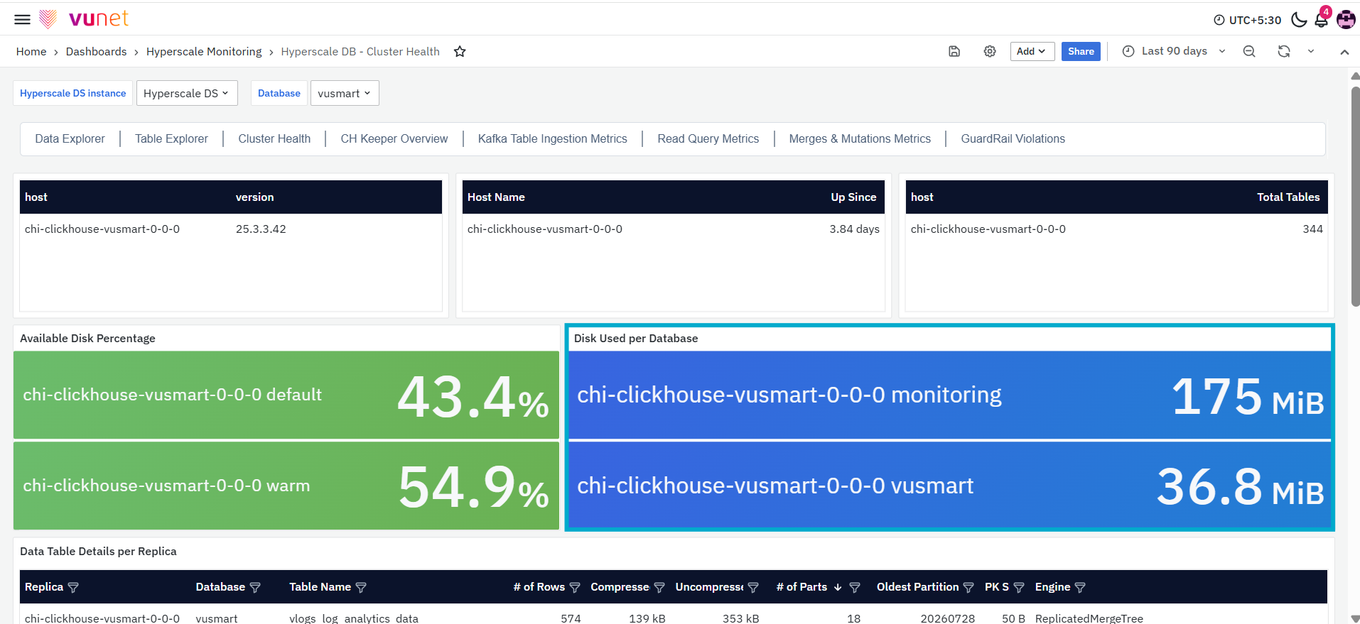
The next panel, Disk Used per Database, displays the amount of disk space used by each database on the selected ClickHouse host. The storage value is displayed in the applicable unit, such as MiB or GiB, based on the amount of data stored. This panel helps users compare storage consumption across databases and identify which database is occupying the largest amount of disk space.
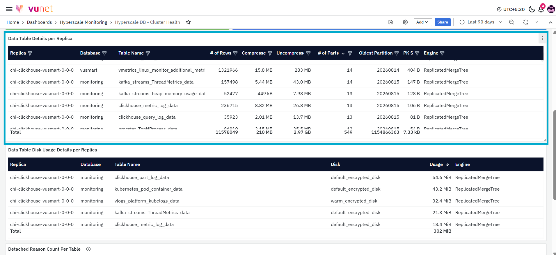
The Data Table Details per Replica panel provides detailed table-level storage and structural information for each ClickHouse replica.
The table contains the following columns:
- Replica: Displays the ClickHouse replica on which the table is available.
- Database: Displays the name of the database containing the table.
- Table Name: Displays the name of the table.
- # of Rows: Displays the total number of rows currently available in the table.
- Compressed: Displays the size of the table data after compression.
- Uncompressed: Displays the estimated size of the table data before compression.
- # of Parts: Displays the number of data parts currently associated with the table.
- Oldest Partition: Displays the identifier of the oldest partition available for the table.
- PK Size: Displays the storage size of the table’s primary key.
- Engine: Displays the ClickHouse table engine used by the table, such as
MergeTreeorReplicatedMergeTree.
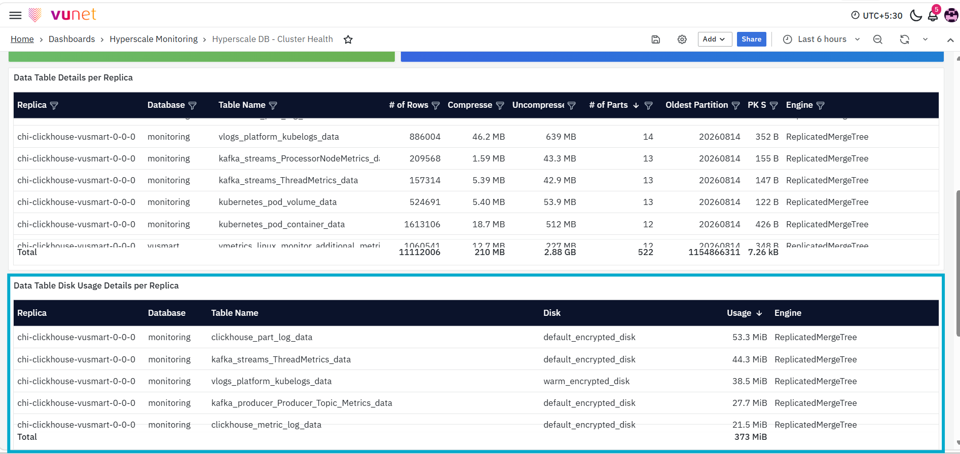
The next panel, Data Table Disk Usage Details per Replica, displays the amount of disk space used by individual tables on each ClickHouse replica.
The table contains the following columns:
- Replica: Displays the ClickHouse replica associated with the table.
- Database: Displays the database containing the table.
- Table Name: Displays the name of the table.
- Disk: Displays the configured disk on which the table data is stored.
- Usage: Displays the amount of disk space used by the table.
- Engine: Displays the storage engine used by the table.
This information can be used to compare table-level storage consumption and understand how data is distributed across the configured disks.
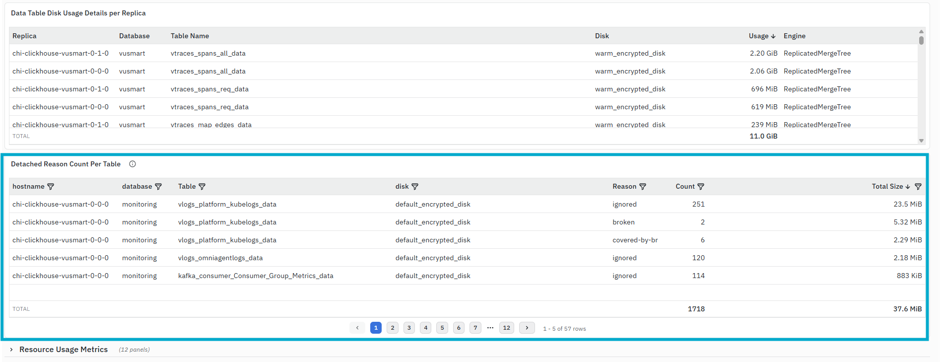
The Detached Reason Count per Table panel displays information about detached data parts associated with ClickHouse tables. Detached parts are listed separately from the active table data. The table contains the following columns:
- Hostname: Displays the ClickHouse host on which the detached parts are recorded.
- Database: Displays the database containing the affected table.
- Table: Displays the name of the table associated with the detached parts.
- Disk: Displays the disk on which the detached parts are stored.
- Reason: Displays the reason recorded for the detached parts.
- Count: Displays the number of detached parts recorded for the table and reason.
- Total Size: Displays the combined storage size of the detached parts.
The total row at the bottom of the panel displays the combined count and size across the records returned by the panel.
Resource Usage Metrics
The Resource Usage Metrics section provides information about CPU usage, memory usage, system load, pod-level resource usage, ClickHouse resource usage, network connections, and system wait times. These metrics help users understand how the selected ClickHouse host and pod are using the available resources.
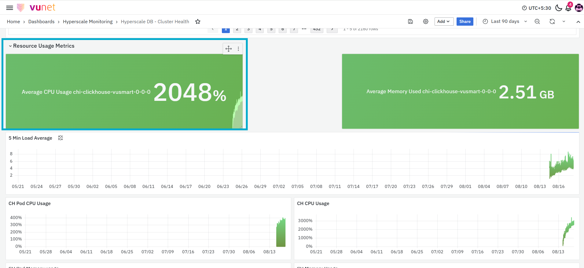
The first panel in this section, Average CPU Usage, displays the average CPU usage reported for the selected ClickHouse host. The panel presents the current value along with a trend showing how CPU usage changed during the selected time range. This panel provides a quick overview of processor utilisation. An increase in CPU usage can indicate higher processing activity on the host.
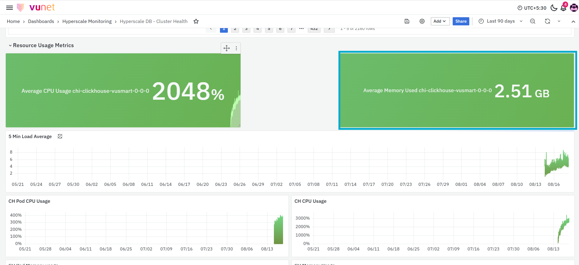
The next panel, Average Memory Used, displays the average amount of memory used by the selected ClickHouse host. The memory value is displayed using an applicable unit such as MB. This panel provides a quick summary of host-level memory consumption. An increase in average memory usage may indicate increased database activity or higher memory consumption by running operations.
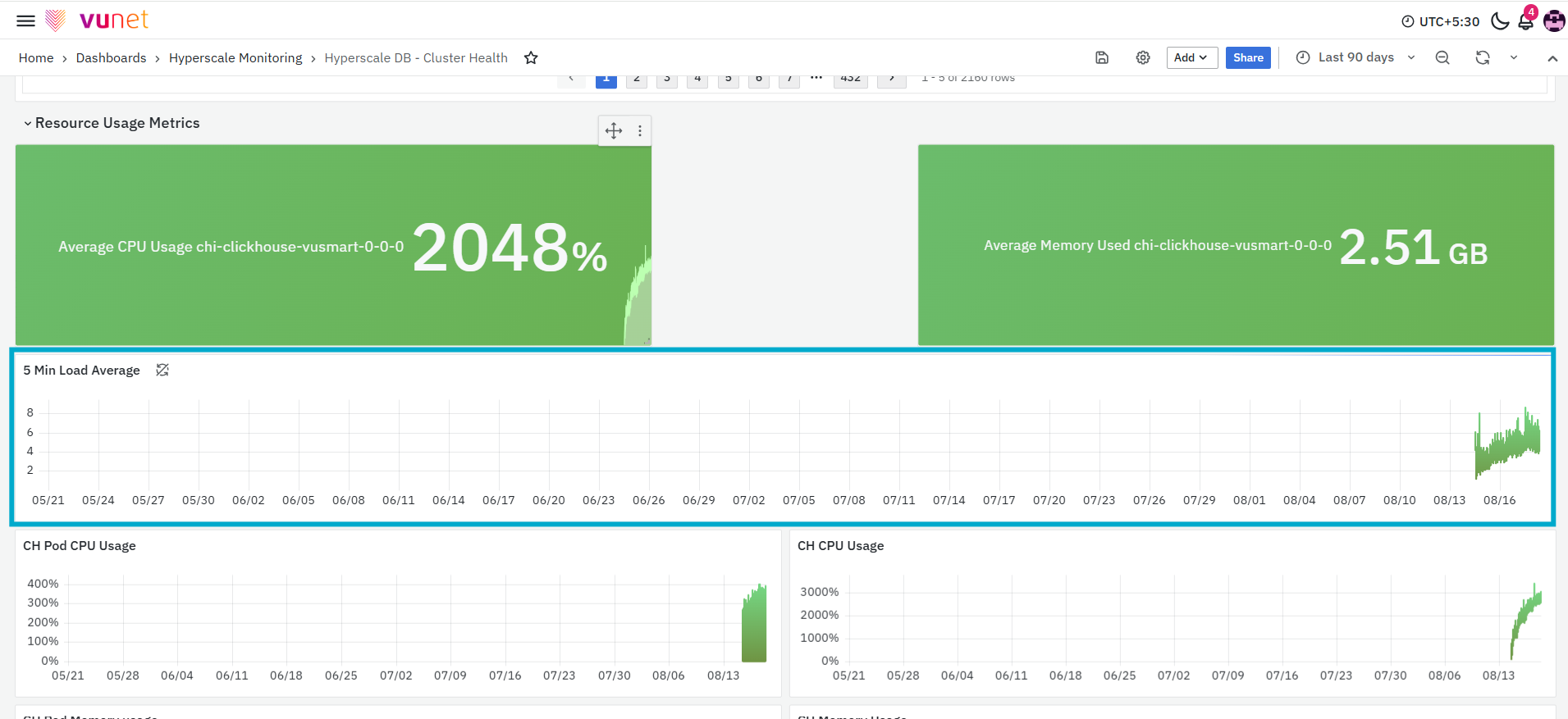
The 5 Min Load Average panel displays the average system load calculated over a five-minute interval. The graph shows how the system load changes over the selected time range. It also displays summary values such as the mean and maximum load recorded during the displayed period.
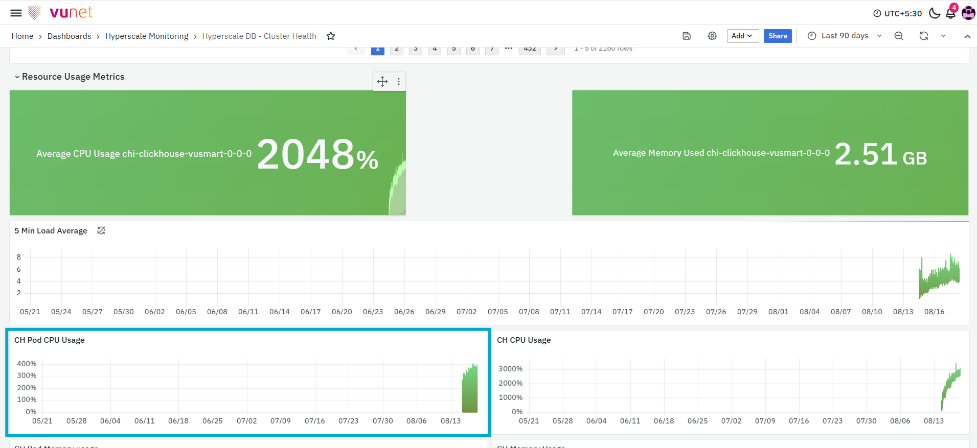
The next panel, CH Pod CPU Usage, displays the CPU usage of the ClickHouse pod over the selected time range. The graph shows changes in pod-level CPU consumption and displays summary values such as the mean and maximum CPU usage. This panel helps users understand how much CPU resource is being consumed by the ClickHouse pod. Spikes in the graph indicate periods when pod-level CPU activity increased.
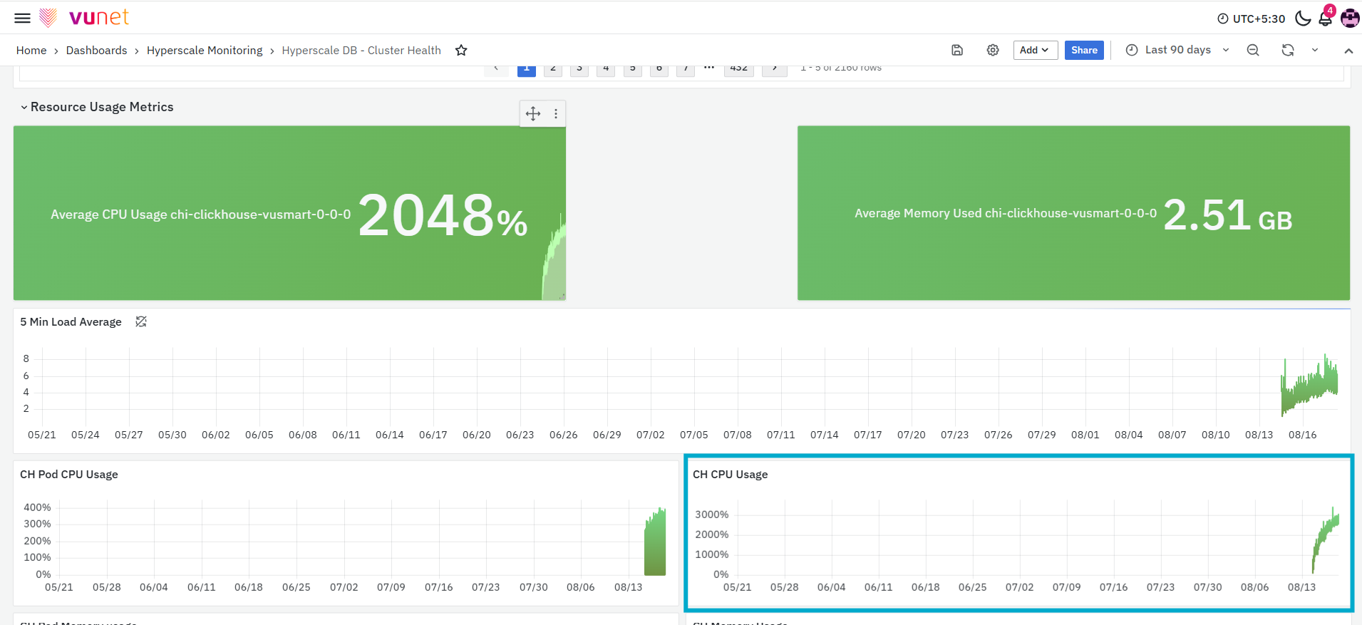
The CH CPU Usage panel displays the CPU usage reported for ClickHouse over the selected time range. The graph represents changes in ClickHouse CPU consumption and provides summary values such as the mean and maximum usage.
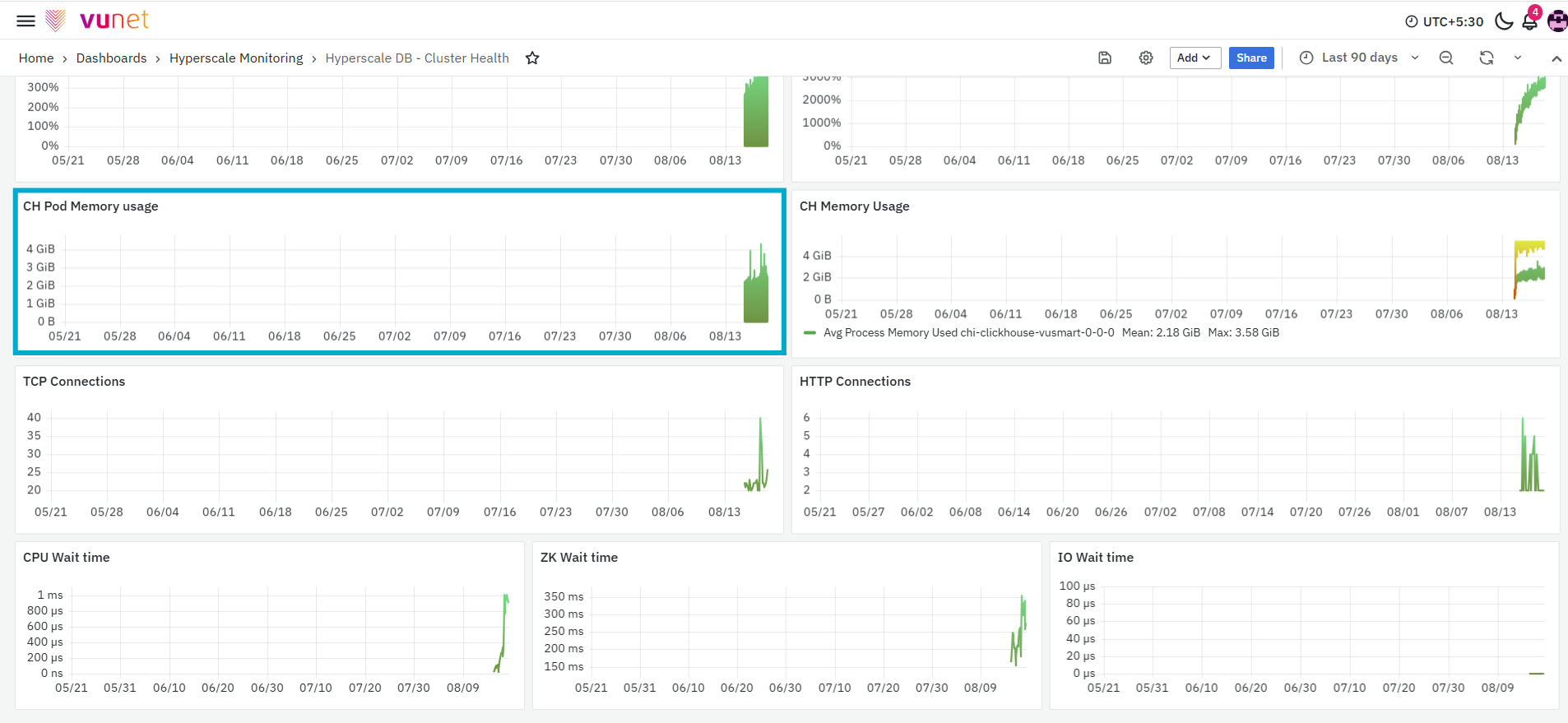
The CH Pod Memory Usage panel displays the amount of memory used by the ClickHouse pod. The graph shows how pod memory usage changes over the selected time range. It also provides summary values such as the mean and maximum memory usage.
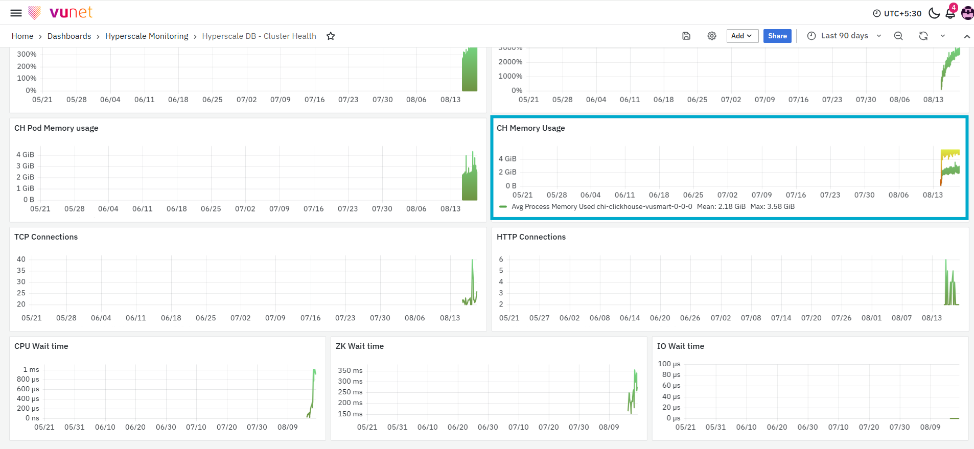
The CH Memory Usage panel displays the memory used by ClickHouse processes over the selected time range. The panel includes the following measurements:
- Average process memory used
- Maximum process memory used
The average value shows the general memory usage during the selected period, while the maximum value shows the highest recorded memory usage.
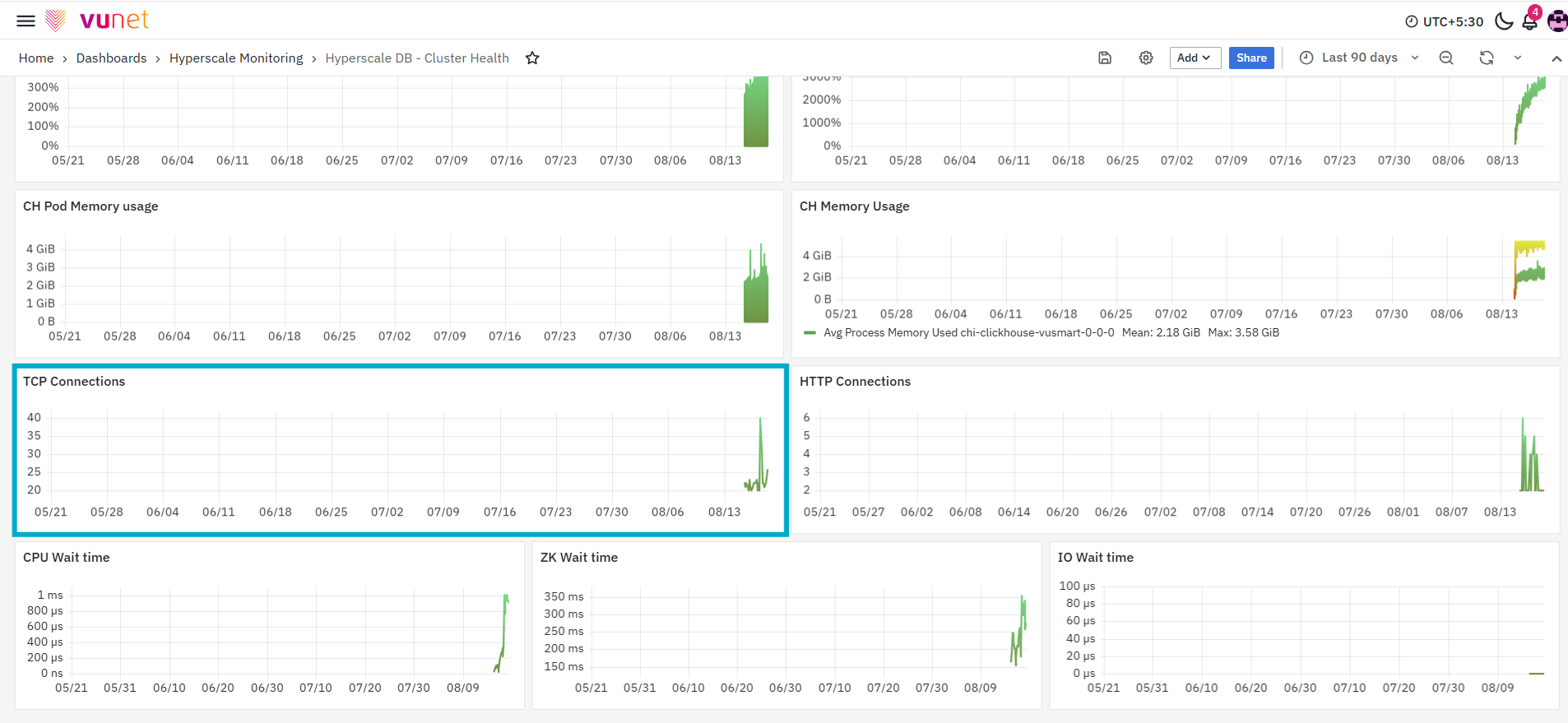
The next panel, TCP Connections, displays the maximum number of TCP connections recorded for the selected ClickHouse host over time. TCP connections represent network connections established with the ClickHouse host. This panel helps users monitor changes in connection activity. An increase in TCP connections may indicate increased communication with the database.
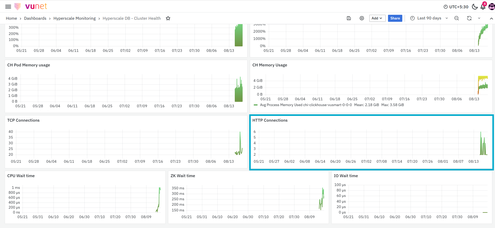
The HTTP Connections panel displays the maximum number of HTTP connections recorded for the selected ClickHouse host. This panel helps users monitor HTTP-based connection activity over the selected time range. An increase in HTTP connections may indicate increased requests being sent to the ClickHouse HTTP interface.
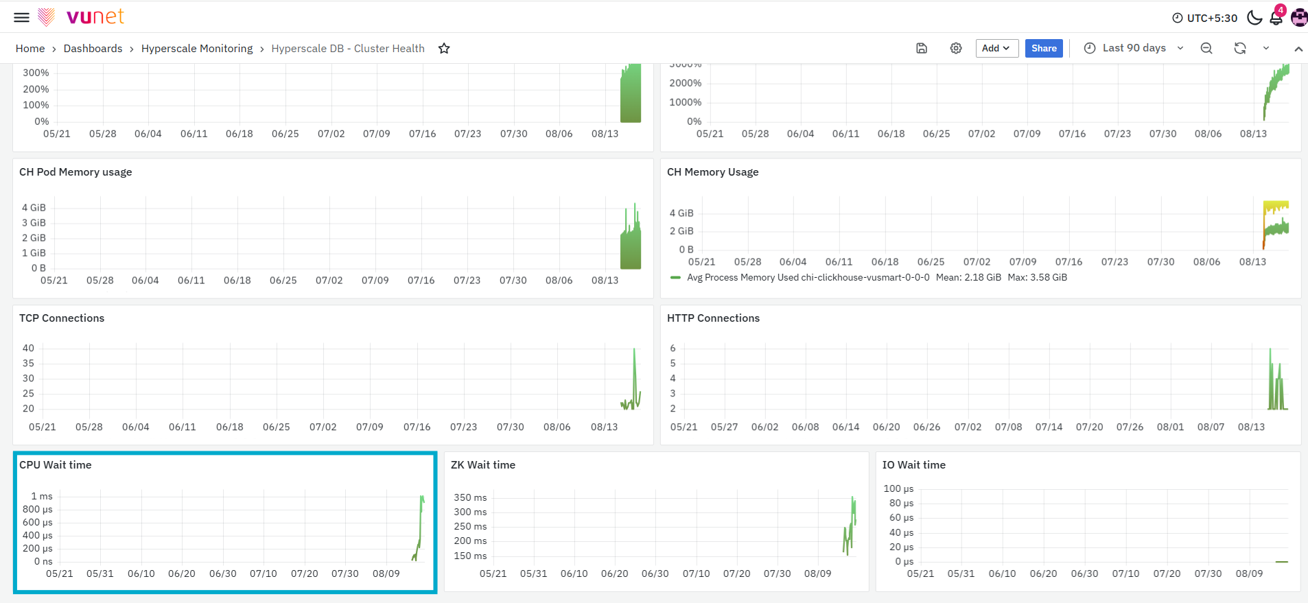
The CPU Wait Time panel displays the average amount of time recorded while processing waits for CPU resources. The graph tracks CPU wait time for the selected ClickHouse host over the selected time range. An increase in CPU wait time may indicate that processes are waiting longer for CPU resources. This may affect the time required to complete database operations.
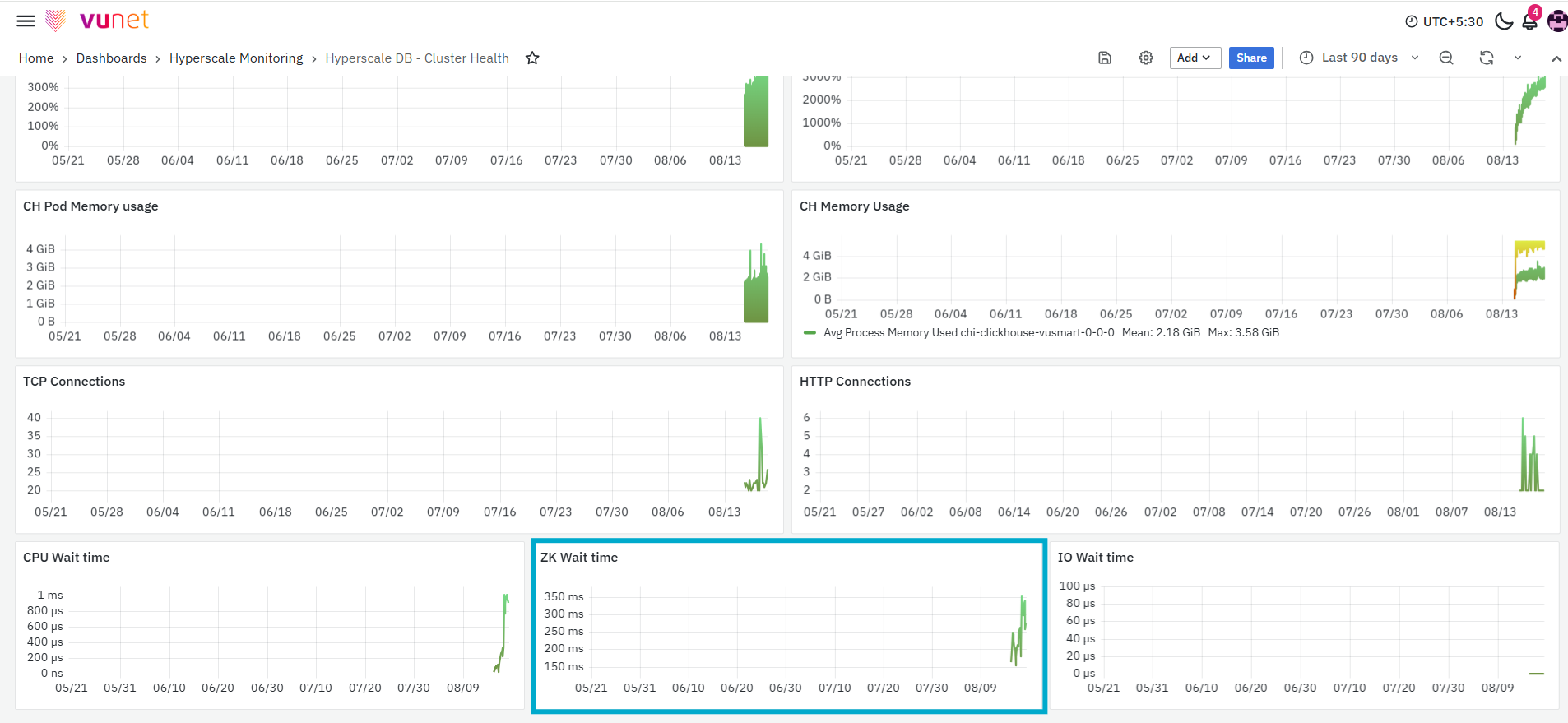
The ZK Wait Time panel displays the average wait time associated with ZK operations for the selected ClickHouse host. The graph shows how the wait time changes over the selected period. An increase in ZK wait time may indicate delays in coordination-related operations.
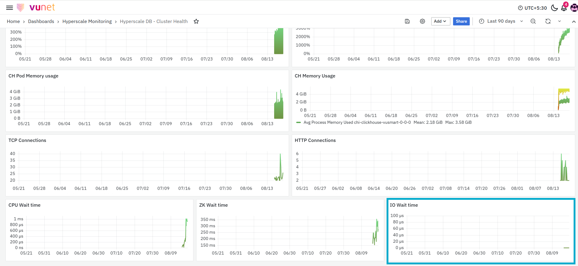
The final panel, IO Wait Time, displays the average amount of time the system waits for input/output operations to complete. Input/output operations include activities related to reading data from or writing data to storage. High I/O wait time may indicate that database operations are waiting longer for disk-related activity to complete. This can affect query execution, ingestion, merges, and other database operations.
ClickHouse Keeper Overview Dashboard
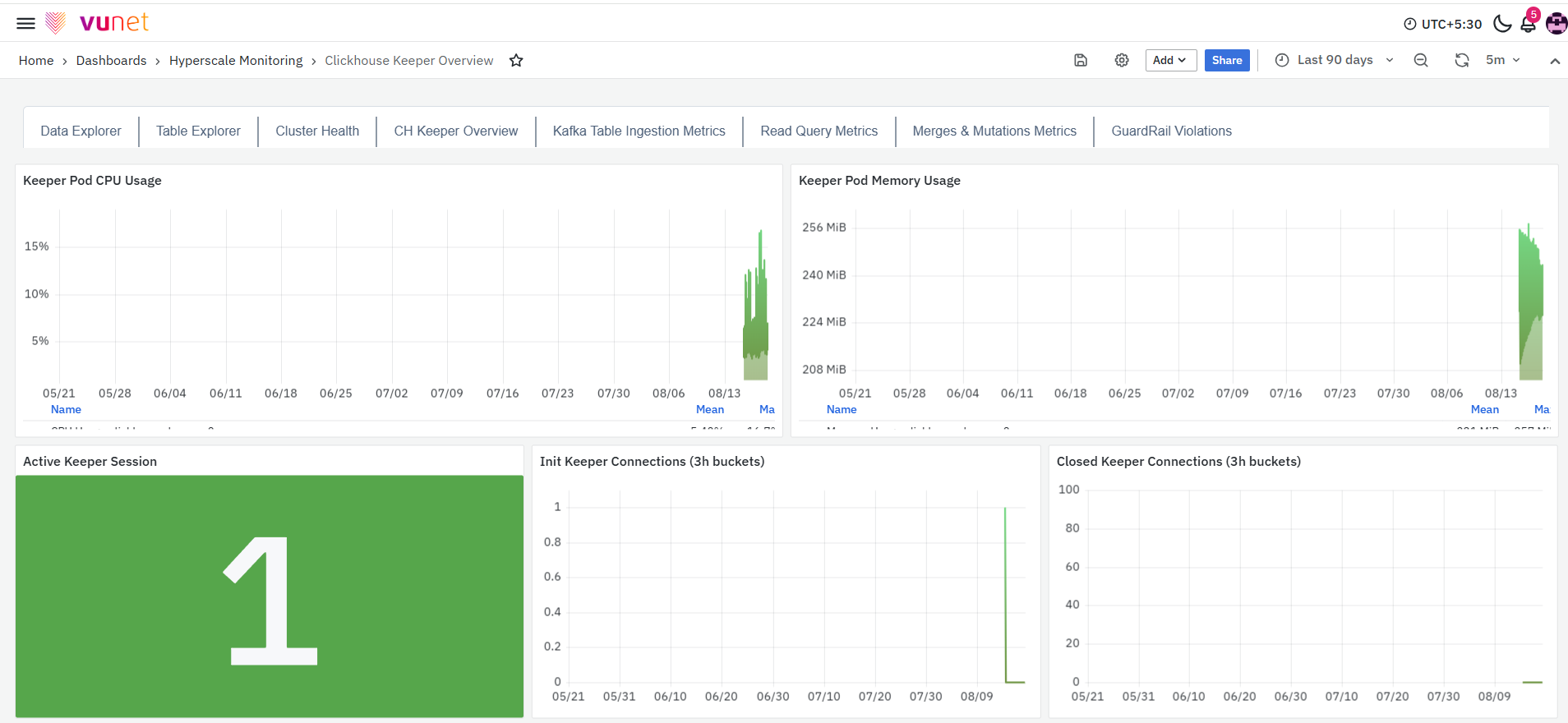
The ClickHouse Keeper Overview Dashboard provides a detailed view of ClickHouse Keeper resource utilisation and operational activity. It brings together pod CPU and memory usage, active sessions, connection activity, exceptions, requests, response wait time, network traffic, session expiry, node errors, packet activity, and latency-related metrics. This dashboard helps users understand the current behaviour of the ClickHouse Keeper pod and identify changes in resource usage, requests, connections, exceptions, or response times that may require further investigation.
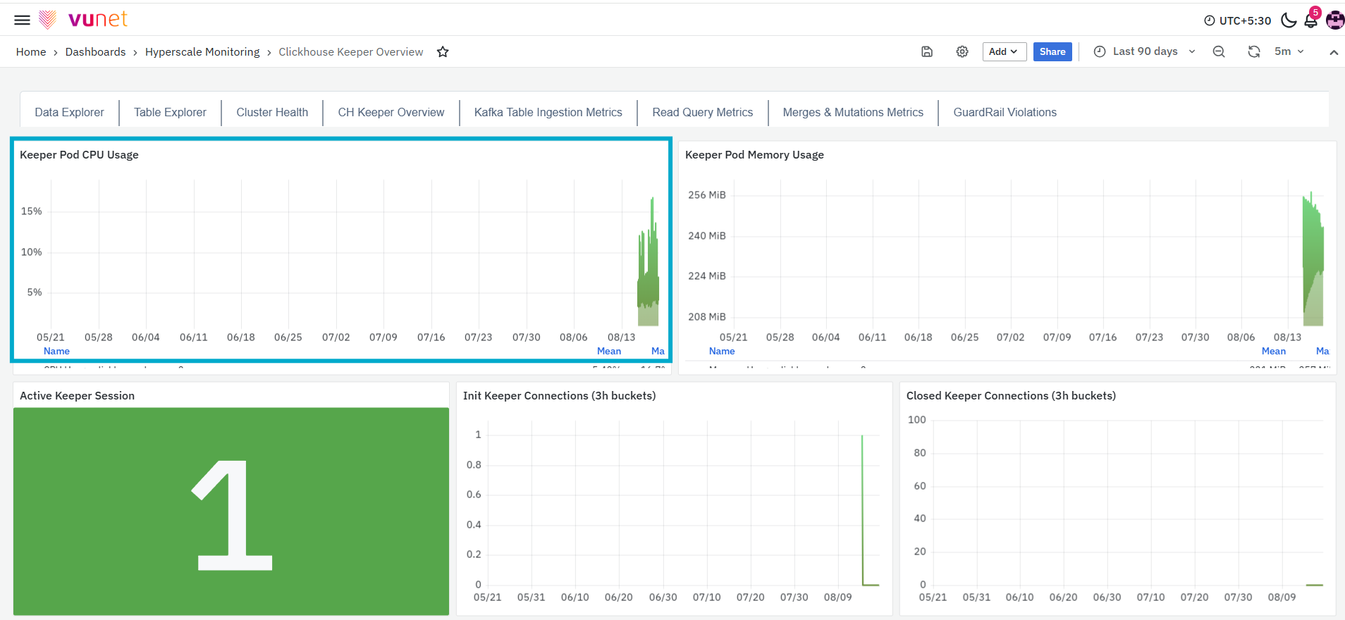
The first panel, Keeper Pod CPU Usage, displays the CPU usage of the ClickHouse Keeper pod over the selected time range. The graph shows changes in CPU consumption and displays summary values such as the mean and maximum CPU usage. This panel helps users understand how much CPU resource is being consumed by the Keeper pod. Spikes in the graph indicate periods when Keeper pod CPU activity increased.
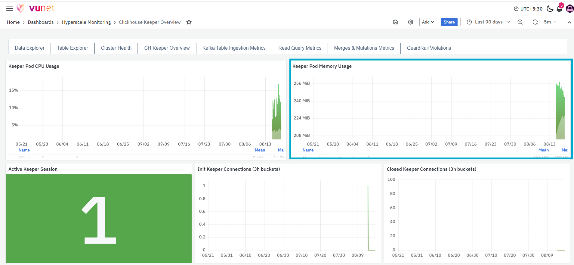
The next panel, Keeper Pod Memory Usage, displays the amount of memory used by the ClickHouse Keeper pod over the selected time range. The memory value is displayed using the applicable unit, such as MiB. The graph shows changes in pod-level memory consumption and displays summary values such as the mean and maximum memory usage. This panel helps users determine whether Keeper pod memory usage remains stable or increases during a particular period.
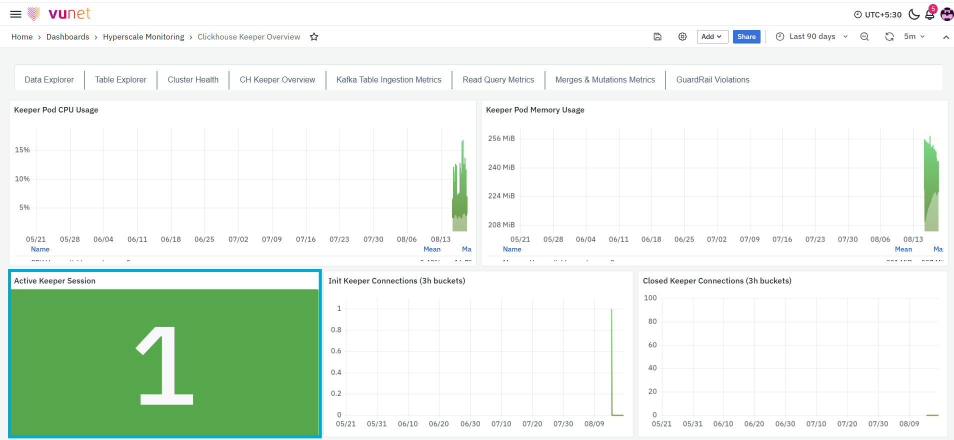
The Active Keeper Session panel displays the current number of active Keeper sessions. A Keeper session represents an active session established with the ClickHouse Keeper service. This panel provides a quick view of the number of sessions currently active in the monitored environment. A change in the displayed value indicates that sessions have been established or closed.
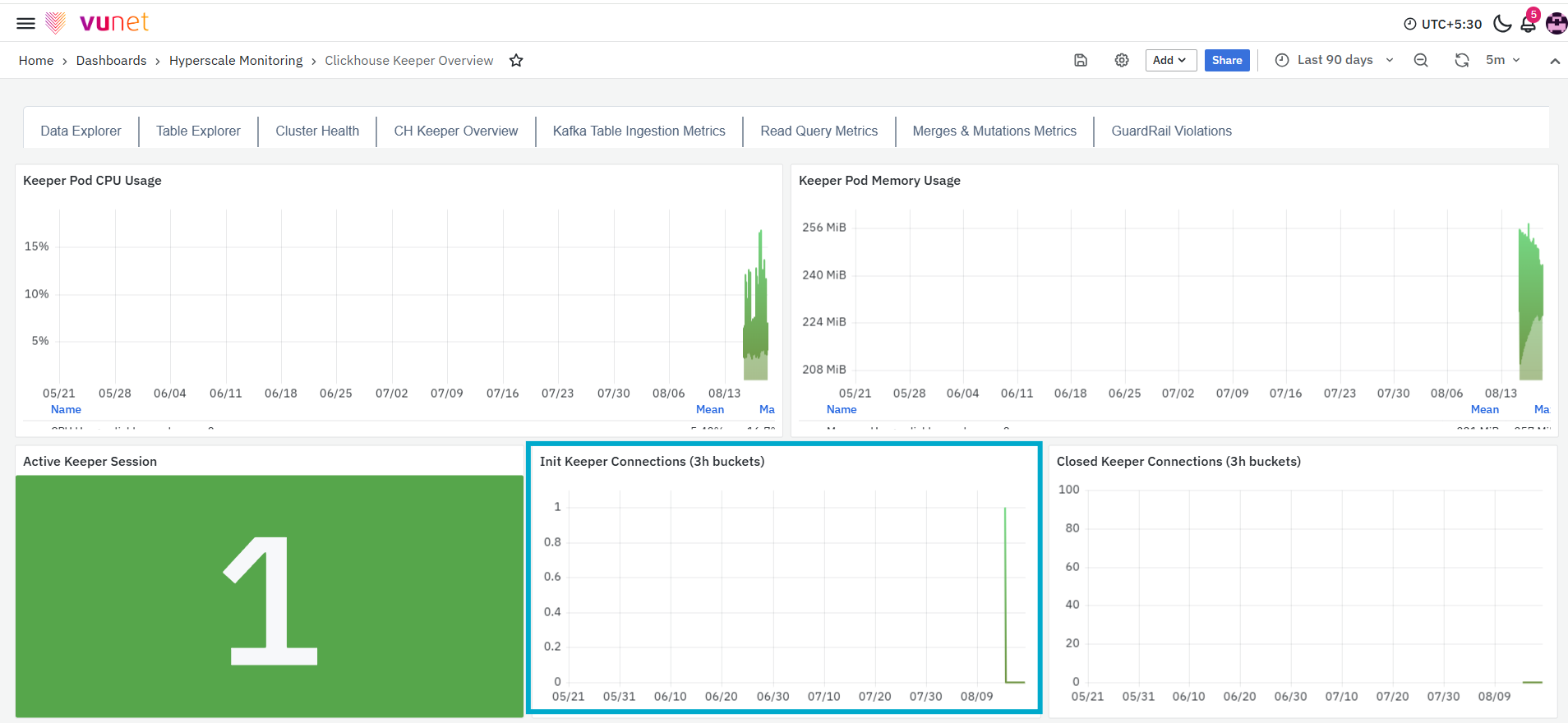
The Init Keeper Connections panel displays the number of Keeper connections initiated during each three-hour interval. The graph helps users monitor how frequently new connections are established with the Keeper service. An increase in the displayed value indicates that more Keeper connections were initiated during the corresponding interval.
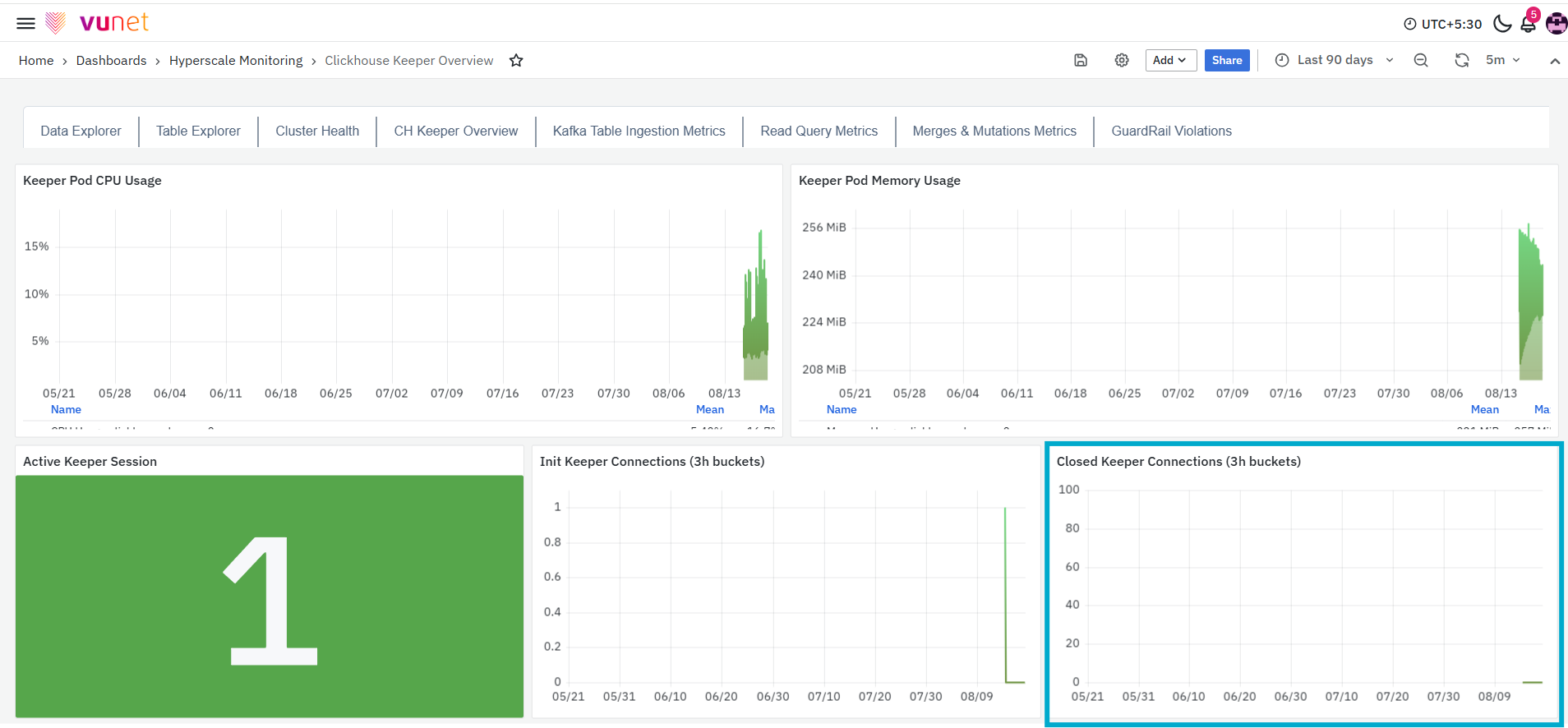
The Closed Keeper Connections panel displays the number of Keeper connections closed during each three-hour interval. This panel helps users monitor connection closure activity over the selected time range. An increase in closed connections indicates that more existing connections were terminated during the corresponding interval.
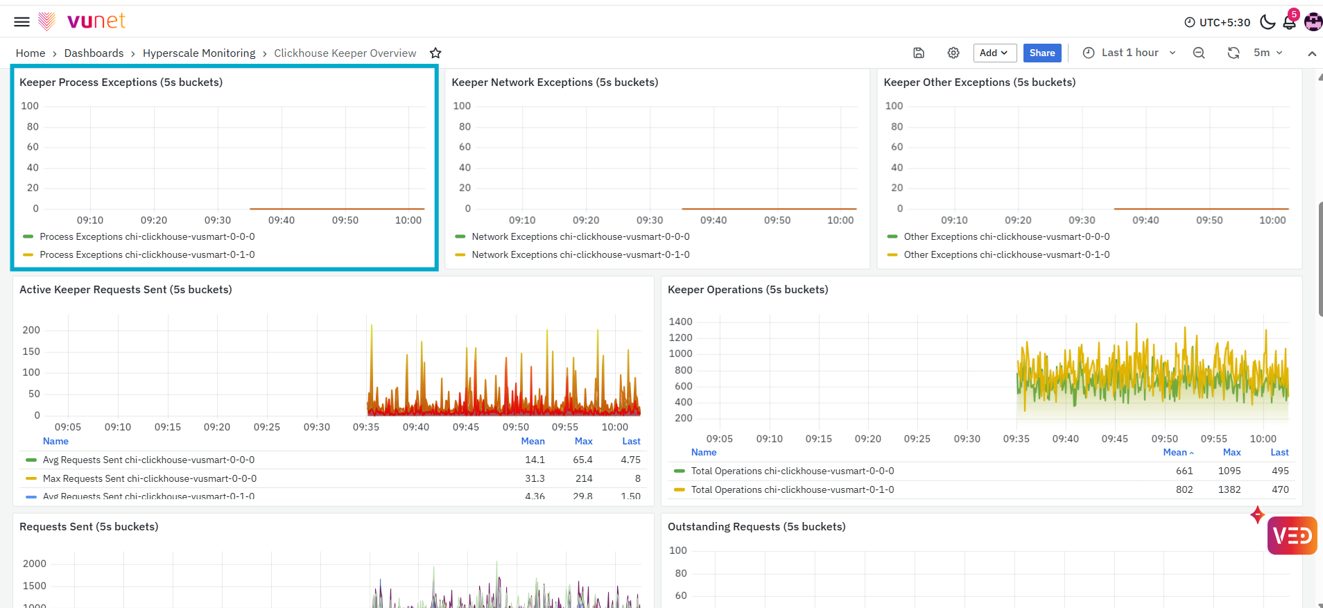
The next panel, Keeper Process Exceptions (3h buckets), displays the number of process-related exceptions recorded for the selected ClickHouse Keeper host during each three-hour interval. The graph helps users identify periods in which process exception activity increased. A spike or continuous increase in the displayed value indicates that more process-related exceptions were recorded during that period.
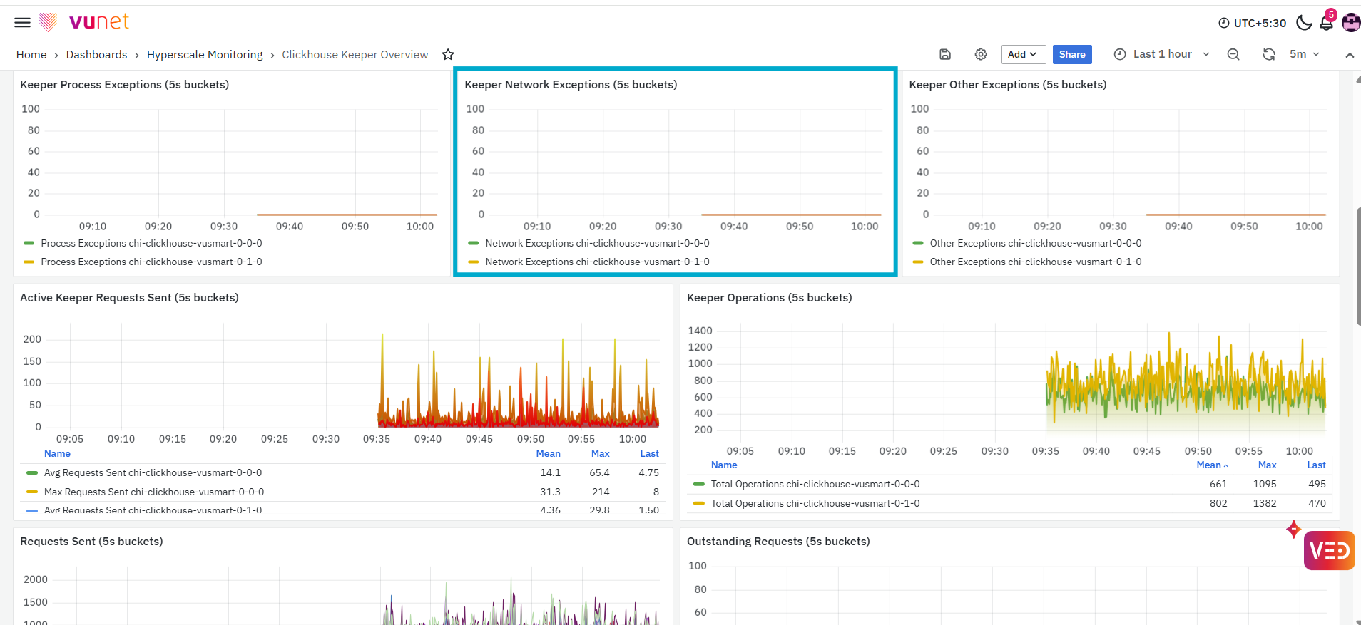
The Keeper Network Exceptions panel displays the number of network-related exceptions recorded for the selected Keeper host during each three-hour interval. This panel helps users monitor exceptions associated with Keeper network activity. An increase in the displayed value indicates that more network exceptions were recorded during the corresponding interval.
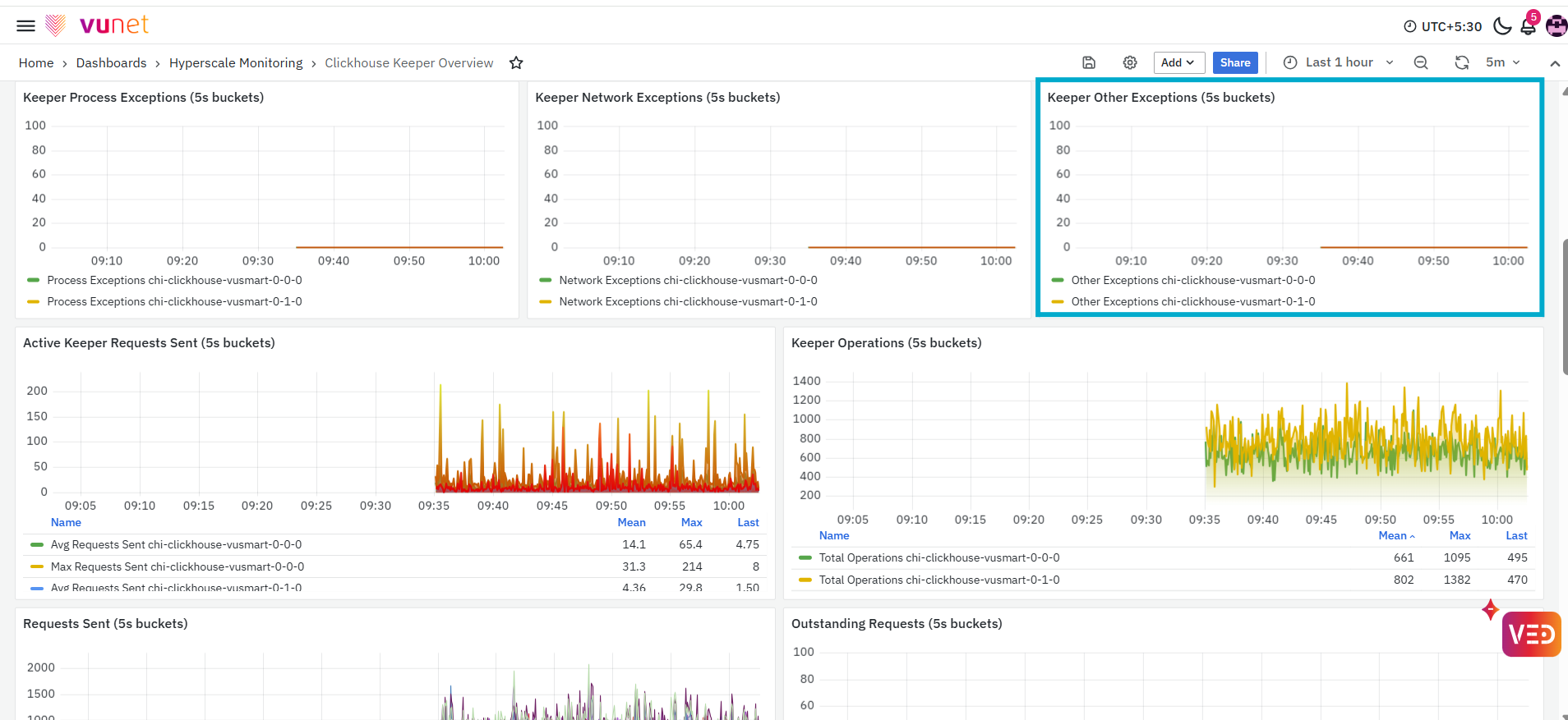
The Keeper Other Exceptions panel displays the number of Keeper exceptions that are categorised separately from process and network exceptions. The graph shows how the number of these exceptions changes across three-hour intervals. An increase in the displayed value indicates that more other exceptions were recorded during that period.
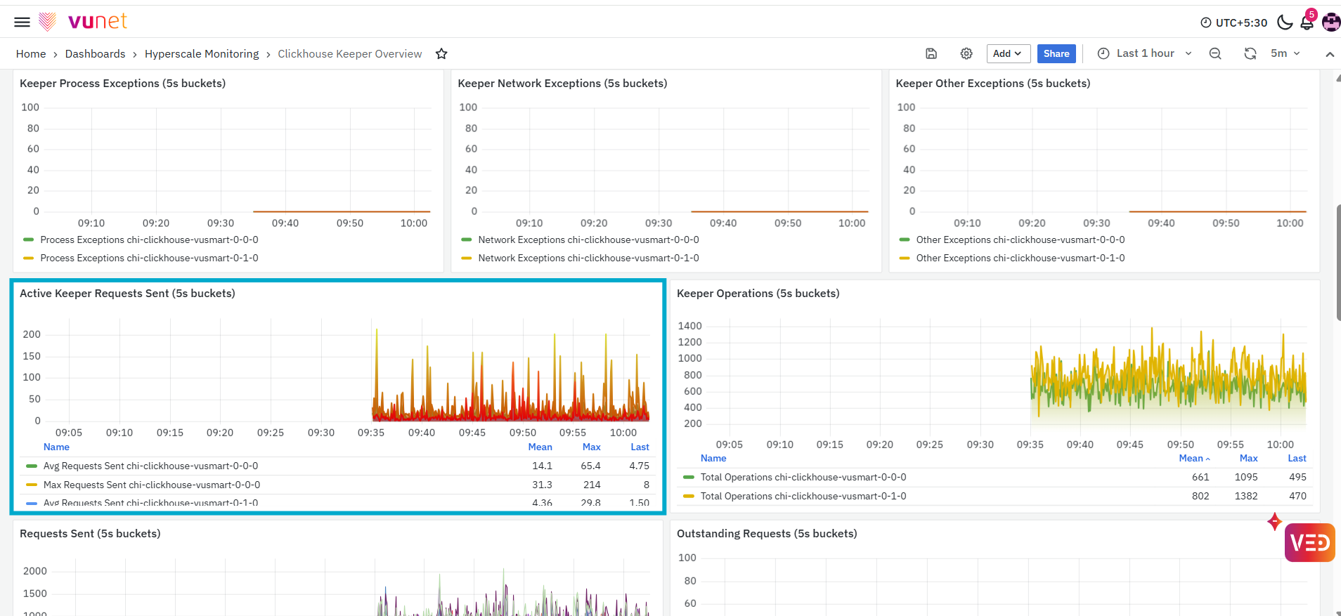
The Active Keeper Requests Sent panel displays the request activity recorded for the selected Keeper host during each two-hour interval. The panel includes the following measurements:
- Average Requests Sent: Displays the average number of active requests sent during the interval.
- Maximum Requests Sent: Displays the highest number of active requests sent during the interval.
The graph helps users compare normal request activity with the highest recorded activity. Spikes in the maximum value indicate periods when a larger number of requests were sent.
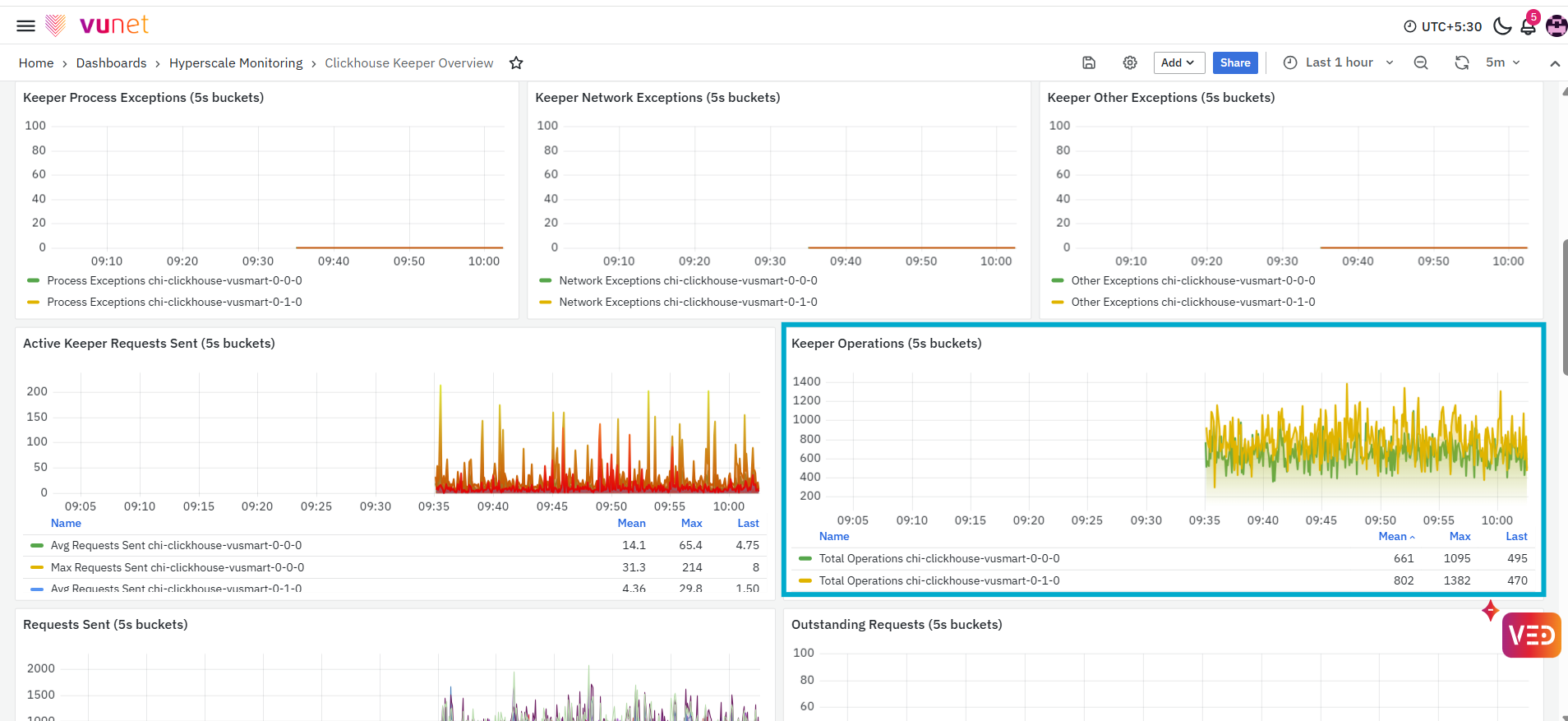
The Keeper Operations panel displays the total number of Keeper operations recorded during each two-hour interval. The graph helps users understand the volume of operational activity handled by ClickHouse Keeper. An increase in the displayed value indicates that more Keeper operations were performed during the corresponding interval.
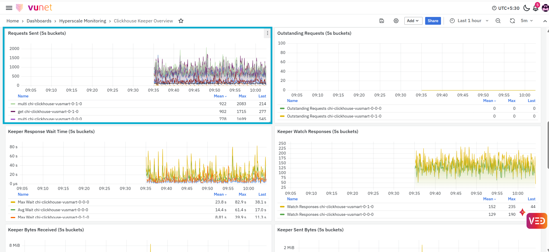
The Requests Sent panel displays the number of requests sent to Keeper during each two-hour interval. The graph separates the request activity based on the available request operation types. This panel helps users understand which request operations contribute to the overall Keeper request volume. A spike in a particular series indicates increased activity for the corresponding request operation.
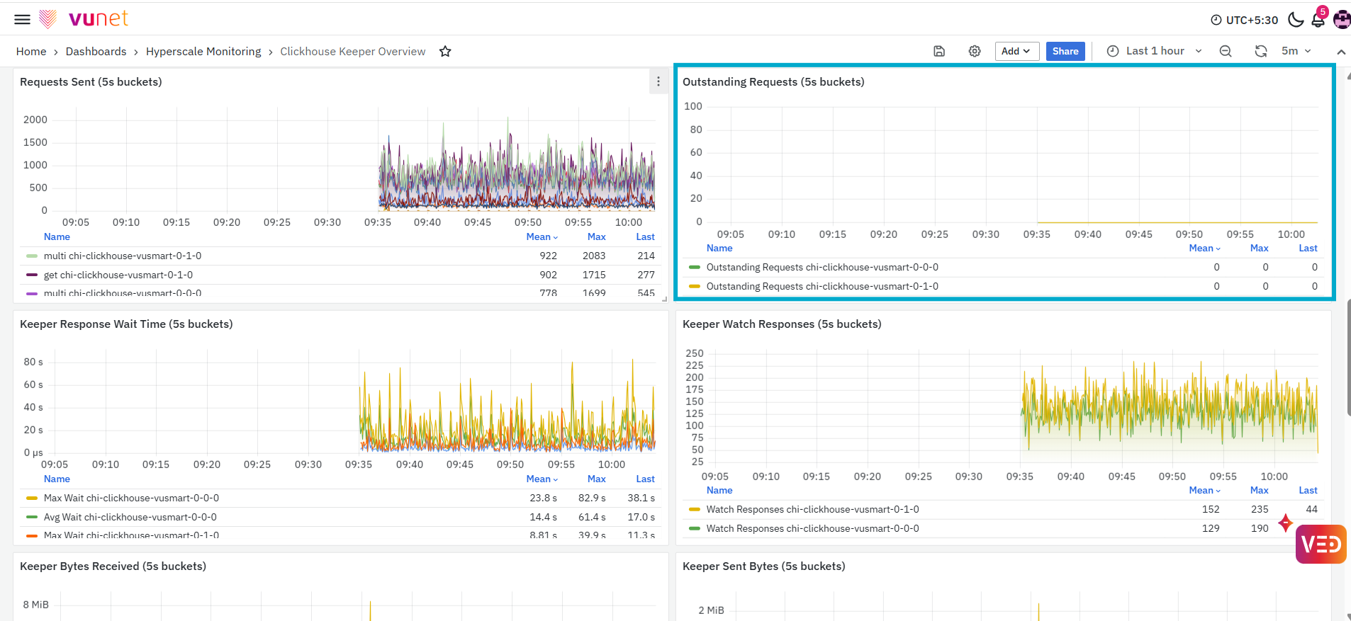
The Outstanding Requests panel displays the number of Keeper requests that remained outstanding during each two-hour interval. Outstanding requests are requests that have been sent but have not yet completed at the time the metric is recorded. This panel helps users identify periods in which requests were waiting to be processed.
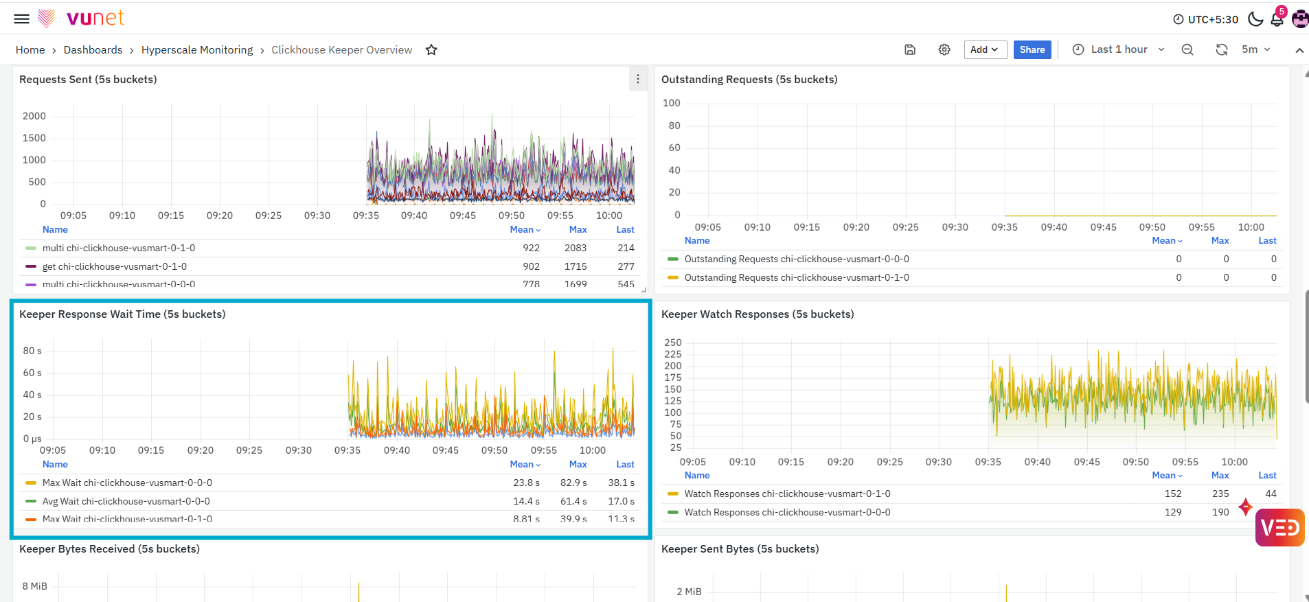
The Keeper Response Wait Time panel displays the amount of time spent waiting for Keeper responses during each two-hour interval. The panel includes the following measurements:
- Average Wait: Displays the average response wait time.
- Maximum Wait: Displays the highest response wait time recorded during the interval.
The graph helps users compare the typical response wait time with the maximum wait time. A spike in the maximum value indicates that one or more Keeper responses took longer during the corresponding interval.
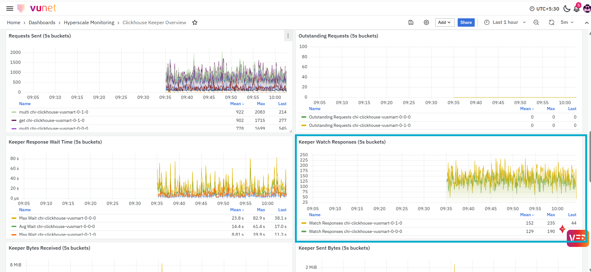
The Keeper Watch Responses panel displays the number of watch responses recorded for the selected Keeper host during each two-hour interval. The graph shows how watch-response activity changes over the selected period. An increase in the displayed value indicates that more watch responses were generated during the corresponding interval.
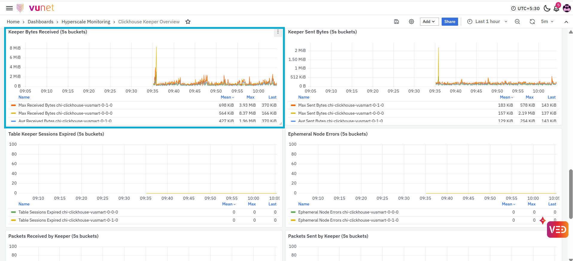
The Keeper Bytes Received panel displays the amount of data received by the selected Keeper host during each two-hour interval. The panel includes the following measurements:
- Average Received Bytes: Displays the average amount of data received.
- Maximum Received Bytes: Displays the highest amount of data received during the interval.
The values are displayed using an applicable data-size unit, such as KiB or MiB. This panel helps users understand inbound Keeper network traffic.
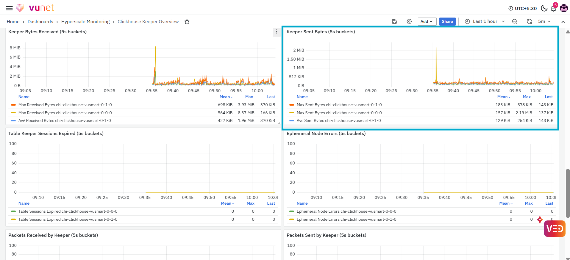
The Keeper Sent Bytes panel displays the amount of data sent by the selected Keeper host during each two-hour interval. The panel includes the following measurements:
- Average Sent Bytes: Displays the average amount of data sent.
- Maximum Sent Bytes: Displays the highest amount of data sent during the interval.
This panel helps users monitor outbound Keeper network traffic. An increase in sent bytes indicates that a larger volume of data was transmitted by Keeper during the corresponding interval.
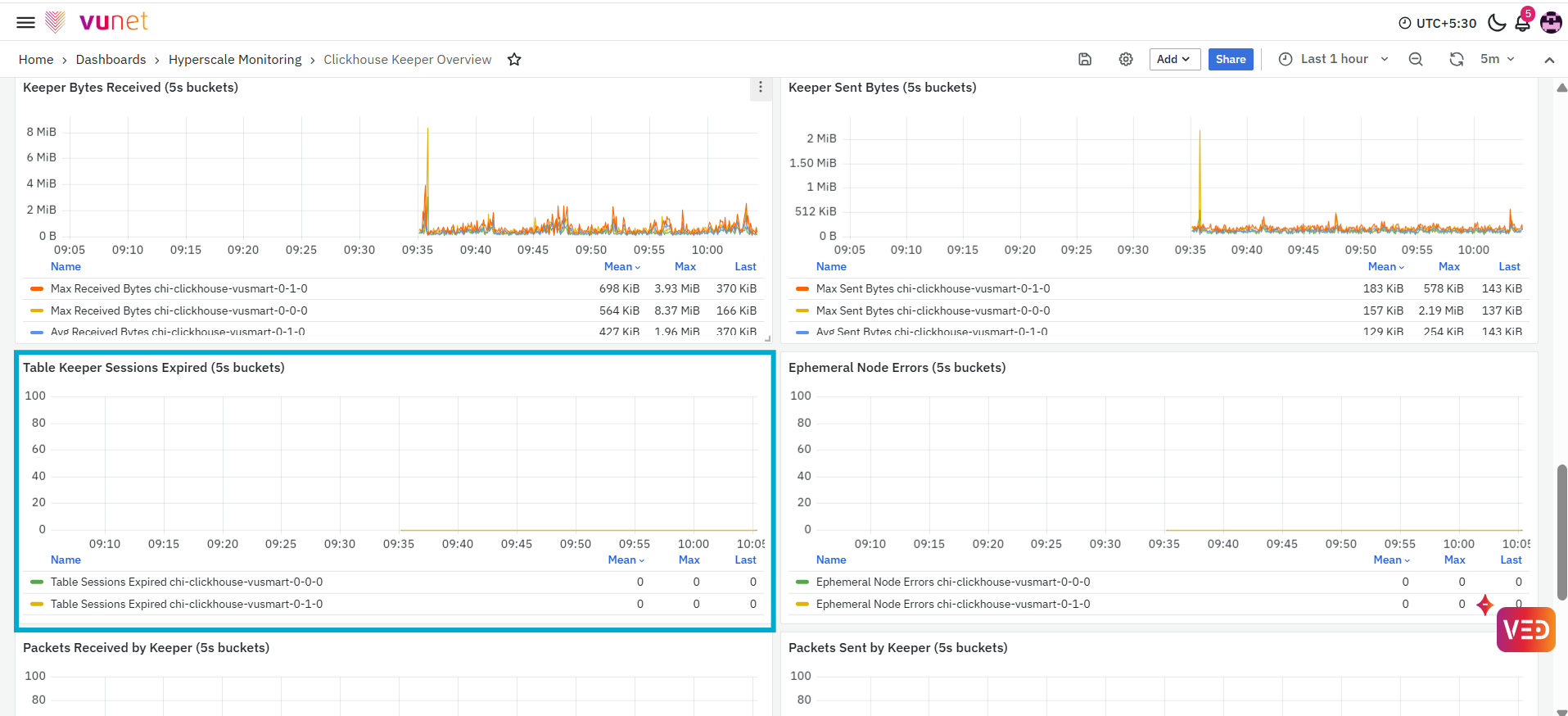
The Table Keeper Sessions Expired panel displays the number of Keeper sessions recorded as expired during each two-hour interval. This panel helps users identify whether Keeper sessions expired during the selected time range. An increase in the displayed value indicates that more sessions were recorded as expired during that interval.
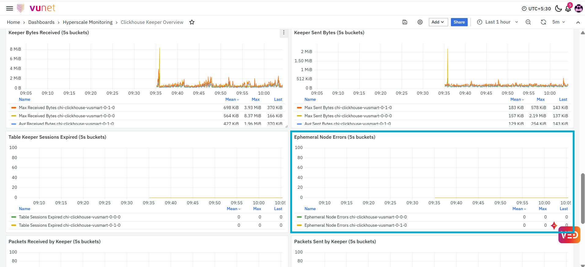
The Ephemeral Node Errors panel displays the number of errors associated with ephemeral nodes during each two-hour interval. The graph helps users identify whether ephemeral-node-related errors were recorded during the selected period. An increase in the displayed value indicates that more such errors occurred during the corresponding interval.
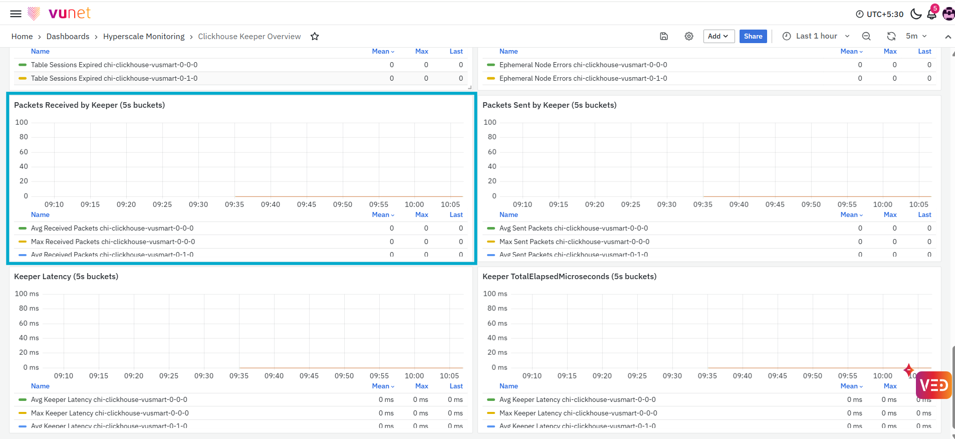
The Packets Received by Keeper panel displays the number of network packets received by the selected Keeper host during each two-hour interval. The panel includes the following measurements:
- Average Received Packets: Displays the average number of packets received.
- Maximum Received Packets: Displays the highest number of packets received during the interval.
This panel helps users monitor inbound packet activity. An increase in received packets indicates higher incoming network activity for the Keeper host.
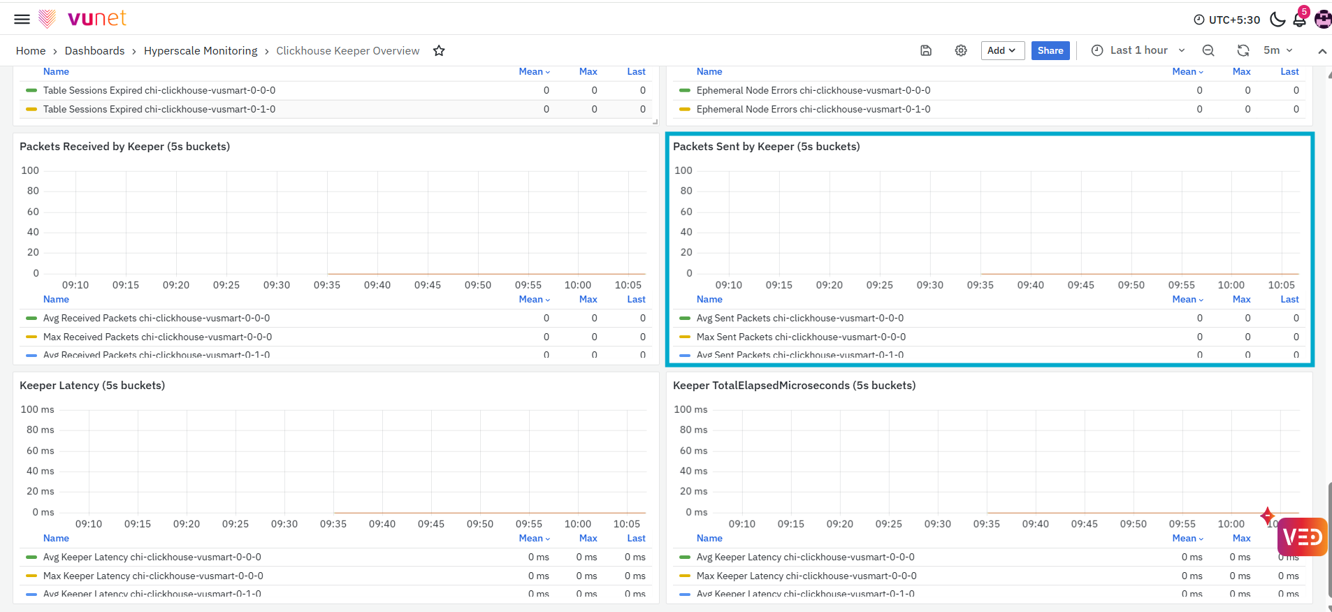
The Packets Sent by Keeper panel displays the number of network packets sent by the selected Keeper host during each two-hour interval. The panel includes the following measurements:
- Average Sent Packets: Displays the average number of packets sent.
- Maximum Sent Packets: Displays the highest number of packets sent during the interval.
This panel helps users monitor outbound packet activity. An increase in sent packets indicates higher outgoing network activity from the Keeper host.
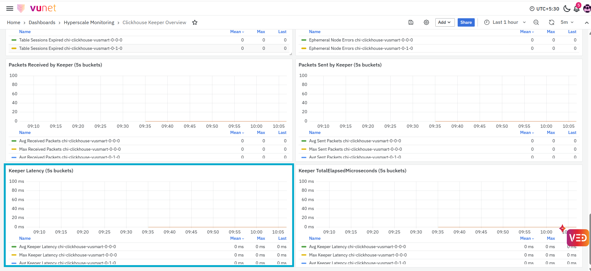
The Keeper Latency panel displays the latency recorded for the selected Keeper host during each two-hour interval. The panel includes the following measurements:
- Average Keeper Latency: Displays the average latency recorded during the interval.
- Maximum Keeper Latency: Displays the highest latency recorded during the interval.
The graph helps users compare the general Keeper response latency with the highest recorded latency.
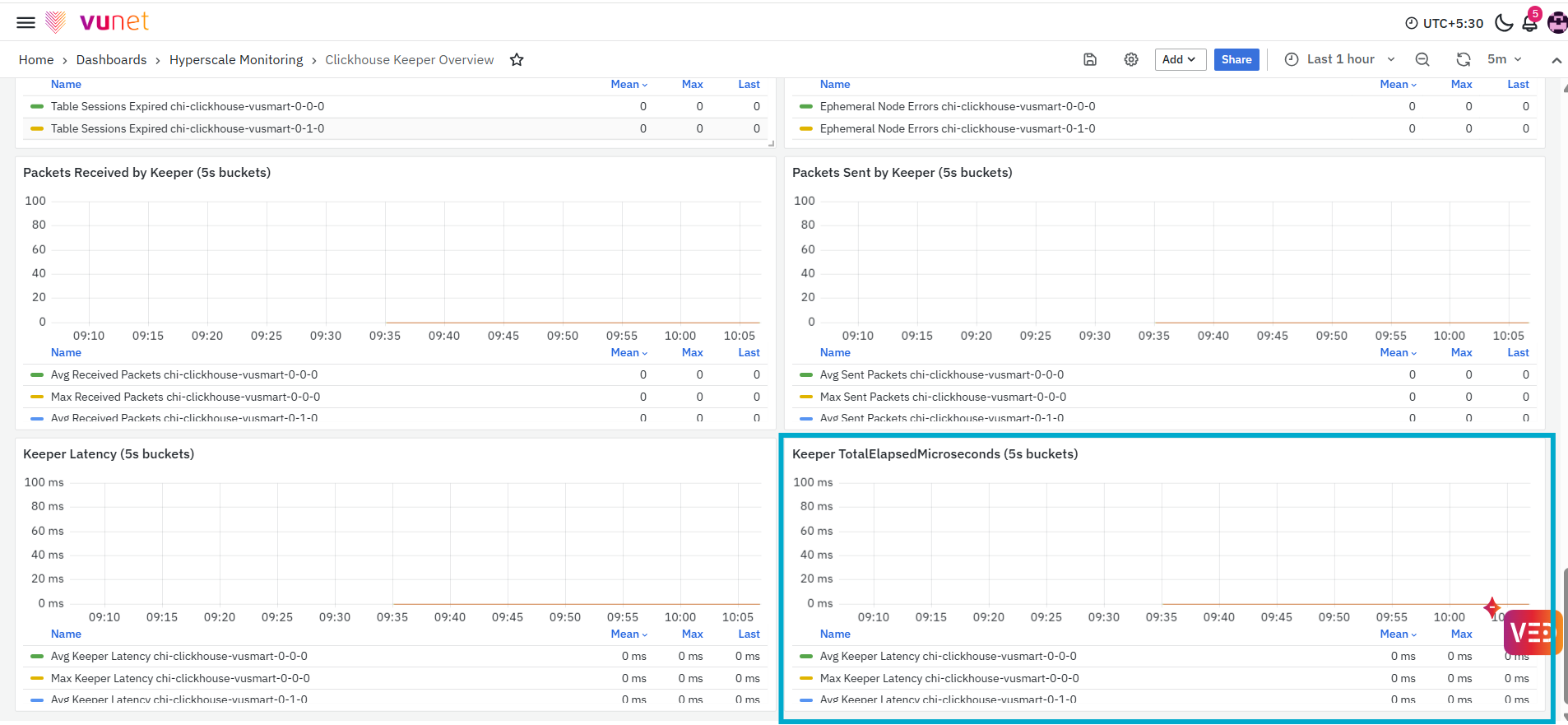
The final panel, Keeper TotalElapsedMicroseconds (2h buckets) panel is intended to display elapsed-time information for the selected Keeper host during each two-hour interval. Based on the panel title, the metric represents total elapsed time recorded for Keeper activity. Monitoring this panel can help users identify changes in the time spent completing Keeper-related operations.
Kafka Table Ingestion Metrics Dashboard
The Kafka Table Ingestion Metrics Dashboard provides a detailed view of Kafka consumer status and Kafka table ingestion activity within the selected ClickHouse environment. It brings together active and inactive consumer counts, Kafka table details, subscribed topics and partitions, polling activity, exception information, consumer rebalances, message activity, insert rate, and new-part creation metrics.
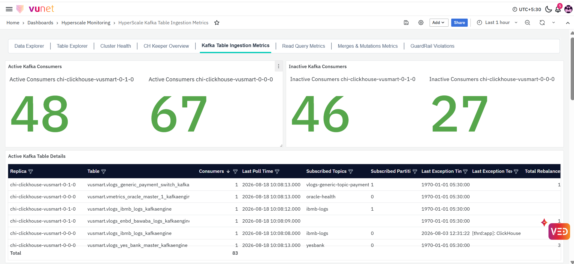
This dashboard helps users verify whether Kafka consumers and Kafka tables are actively processing data and identify changes in consumer activity, polling, exceptions, message volume, insert rate, or table-part creation that may require further investigation.
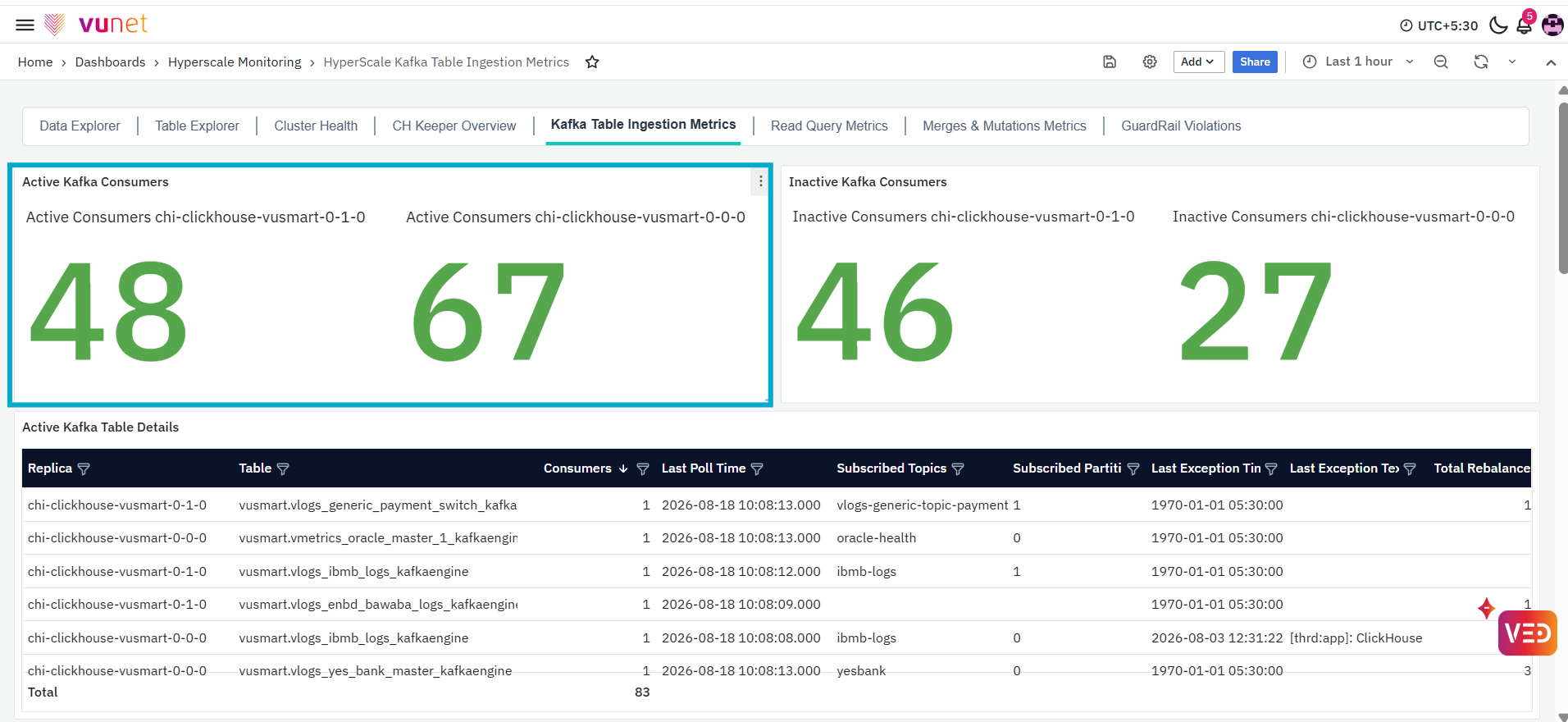
The first panel, Active Kafka Consumers, displays the number of Kafka consumers currently reported as active for the selected ClickHouse replica. This panel provides a quick view of the active Kafka consumer count in the monitored environment. A change in the displayed value indicates that the number of consumers reported as active has increased or decreased.
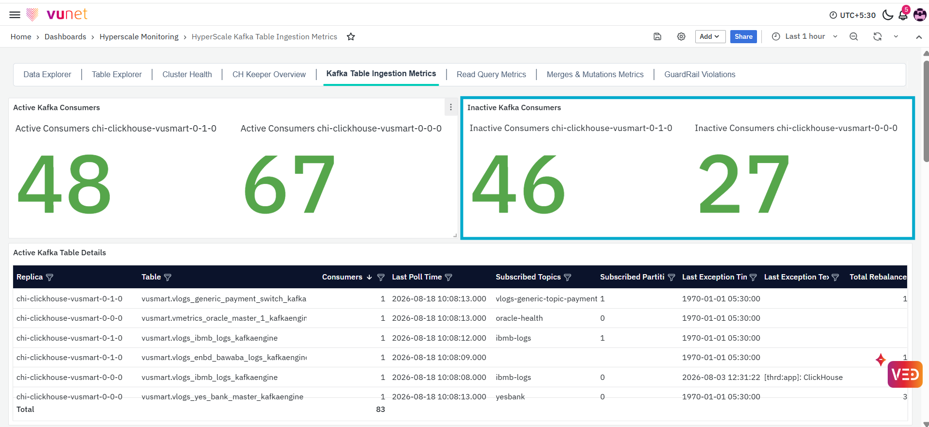
The Inactive Kafka Consumers panel displays the number of Kafka consumers currently reported as inactive for the selected ClickHouse replica. This panel helps users identify whether any Kafka consumers are not active in the monitored environment. An increase in the displayed value indicates that more consumers are being reported as inactive.
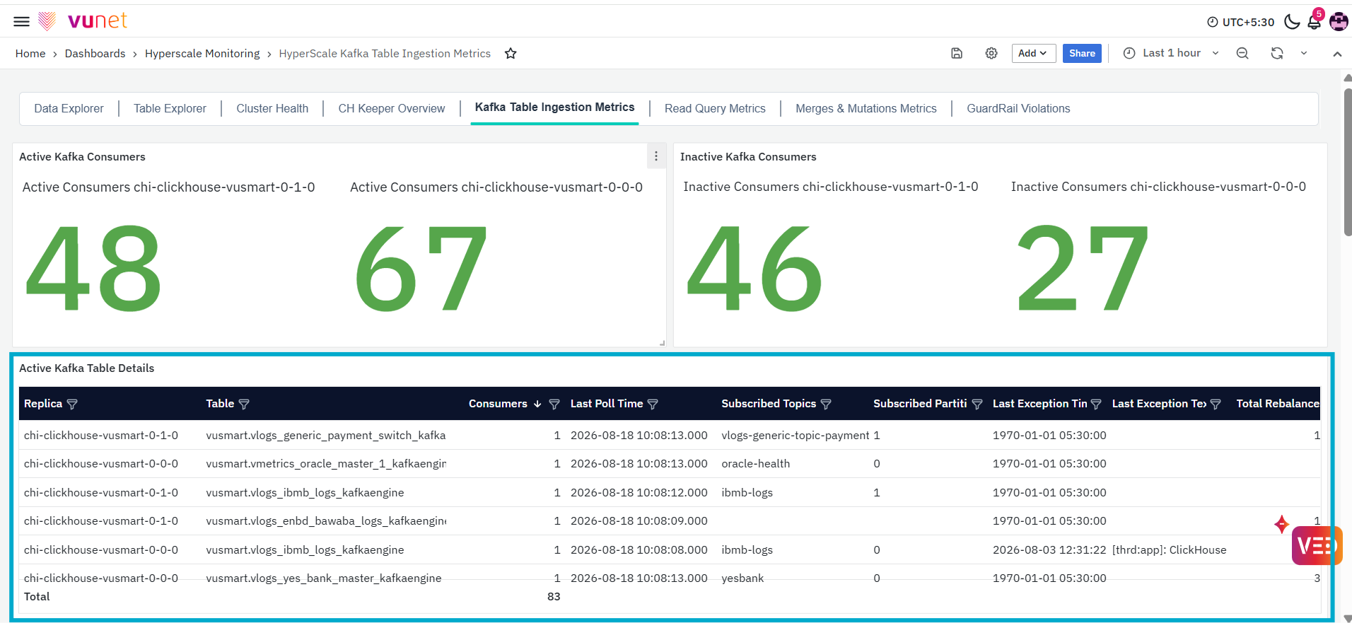
The Active Kafka Table Details panel provides detailed information about Kafka tables whose consumers are reported as active. The table contains the following columns:
- Replica: Displays the ClickHouse replica on which the Kafka table is available.
- Table: Displays the name of the Kafka table.
- Consumers: Displays the number of consumers associated with the Kafka table.
- Last Poll Time: Displays the most recent time at which the consumer polled Kafka for messages.
- Subscribed Topics: Displays the Kafka topic or topics subscribed to by the consumer.
- Subscribed Partitions: Displays the Kafka partitions assigned or subscribed to by the consumer.
- Last Exception Time: Displays the time at which the most recently recorded exception occurred.
- Last Exception Text: Displays the details of the most recently recorded exception.
- Total Rebalances: Displays the total number of consumer rebalances recorded for the Kafka table.
The Total row at the bottom displays the combined consumer count across the records returned by the panel.
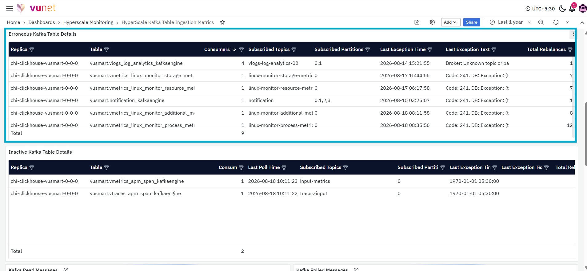
The Erroneous Kafka Table Details panel displays Kafka tables for which exception information has been recorded. The table contains the following columns:
- Replica: Displays the ClickHouse replica on which the Kafka table is available.
- Table: Displays the name of the Kafka table associated with the exception.
- Consumers: Displays the number of consumers associated with the table.
- Subscribed Topics: Displays the Kafka topic or topics subscribed to by the consumer.
- Subscribed Partitions: Displays the Kafka partitions associated with the consumer.
- Last Exception Time: Displays the time at which the latest exception was recorded.
- Last Exception Text: Displays the recorded exception details.
- Total Rebalances: Displays the total number of consumer rebalances recorded for the table.
The Total row at the bottom displays the combined consumer count across the returned records.
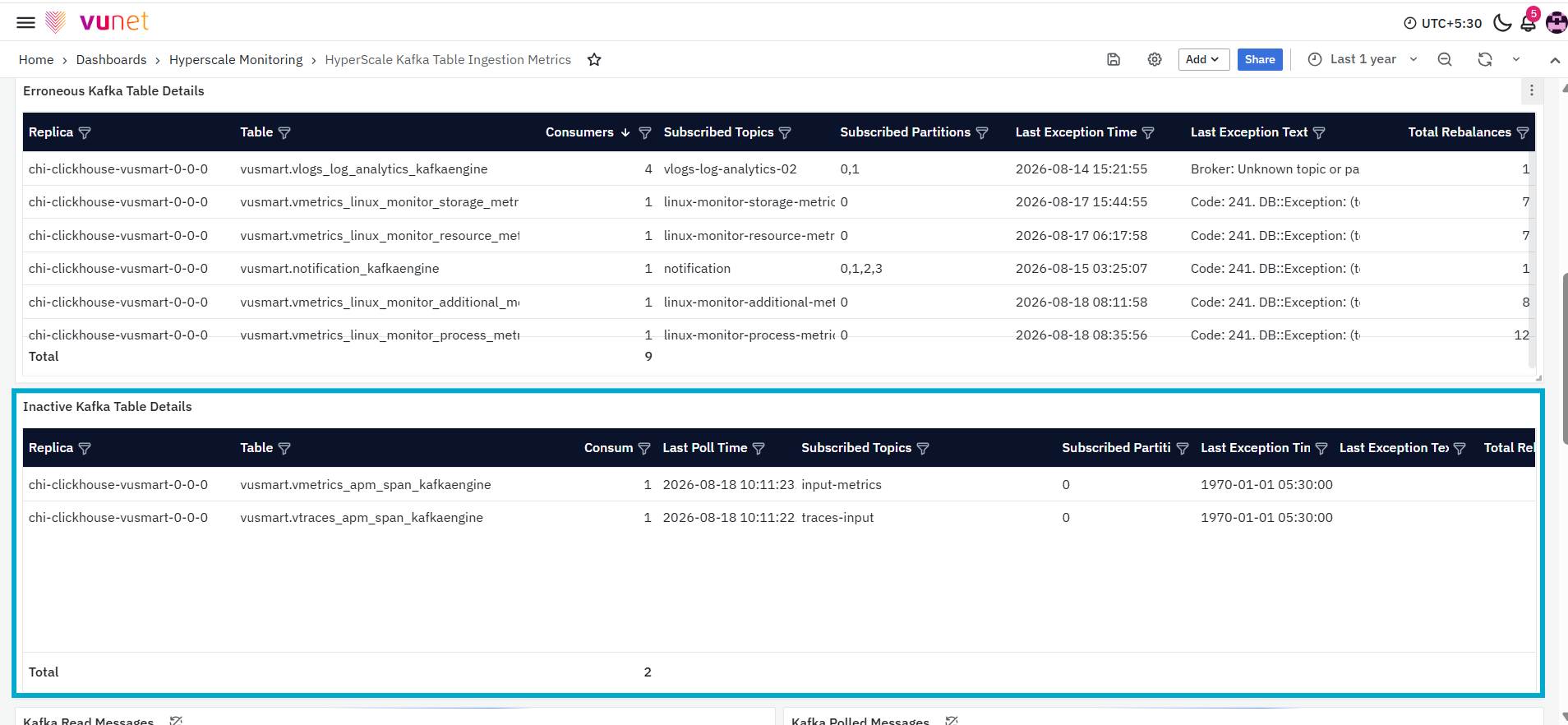
The Inactive Kafka Table Details panel provides detailed information about Kafka tables whose consumers are reported as inactive. The table contains the following columns:
- Replica: Displays the ClickHouse replica on which the Kafka table is available.
- Table: Displays the name of the inactive Kafka table.
- Consumers: Displays the number of consumers associated with the table.
- Last Poll Time: Displays the most recent time at which the consumer polled Kafka for messages.
- Subscribed Topics: Displays the Kafka topic or topics subscribed to by the consumer.
- Subscribed Partitions: Displays the Kafka partitions associated with the consumer.
- Last Exception Time: Displays the time of the most recently recorded exception.
- Last Exception Text: Displays the details of the most recently recorded exception.
- Total Rebalances: Displays the total number of consumer rebalances recorded for the table.
The Total row at the bottom displays the combined consumer count across the returned records.
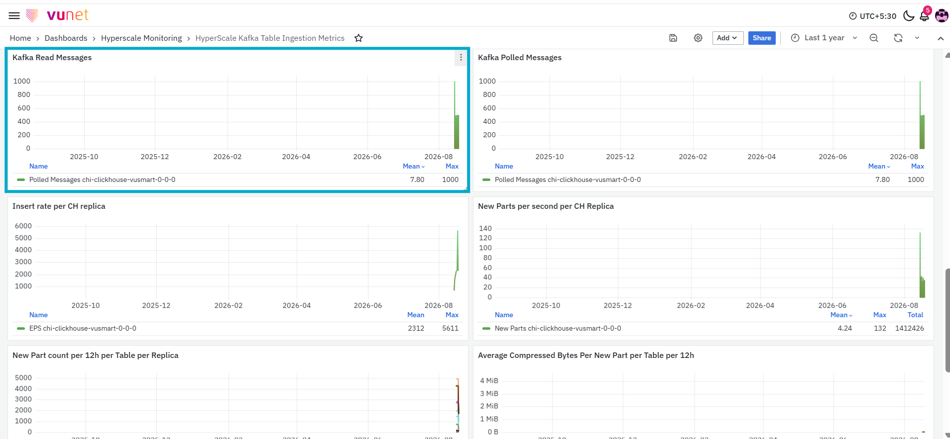
The Kafka Read Messages panel displays the Kafka message-reading activity recorded for the selected ClickHouse replica over the selected time range. The graph shows how the number of messages changes over time and displays summary values such as the mean and maximum value. This panel helps users identify increases, decreases, or gaps in Kafka message activity.
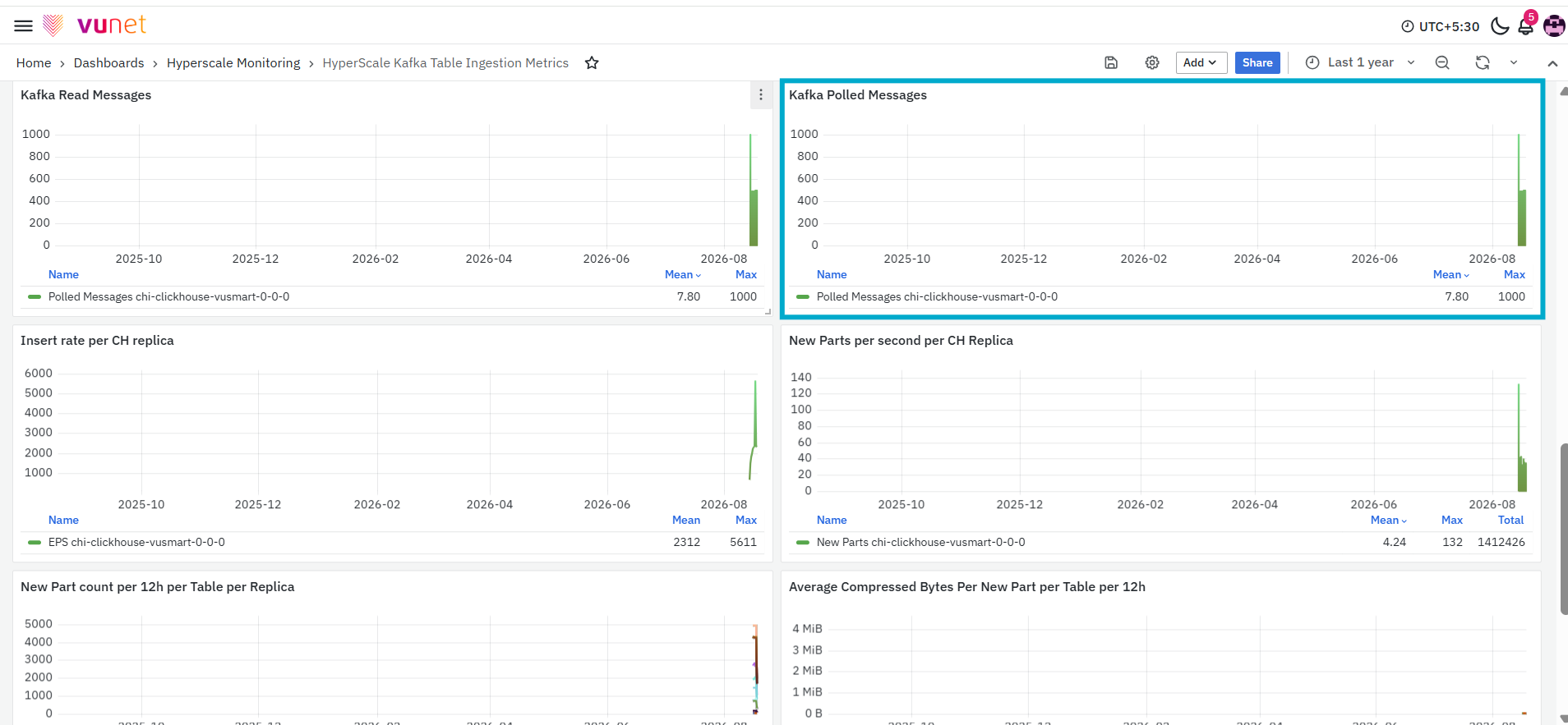
The Kafka Polled Messages panel displays the number of messages polled by Kafka consumers for the selected ClickHouse replica over the selected time range. The graph shows changes in message-polling activity and displays summary values such as the mean and maximum number of messages. This panel helps users monitor how frequently messages are being retrieved from Kafka.
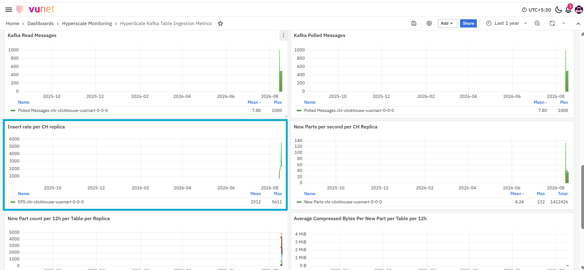
The Insert Rate per CH Replica panel displays the rate at which data is inserted into ClickHouse for each replica. The graph shows changes in the insert rate over the selected time range and displays summary values such as the mean and maximum rate. This panel helps users understand the volume of data being inserted into the ClickHouse replica.
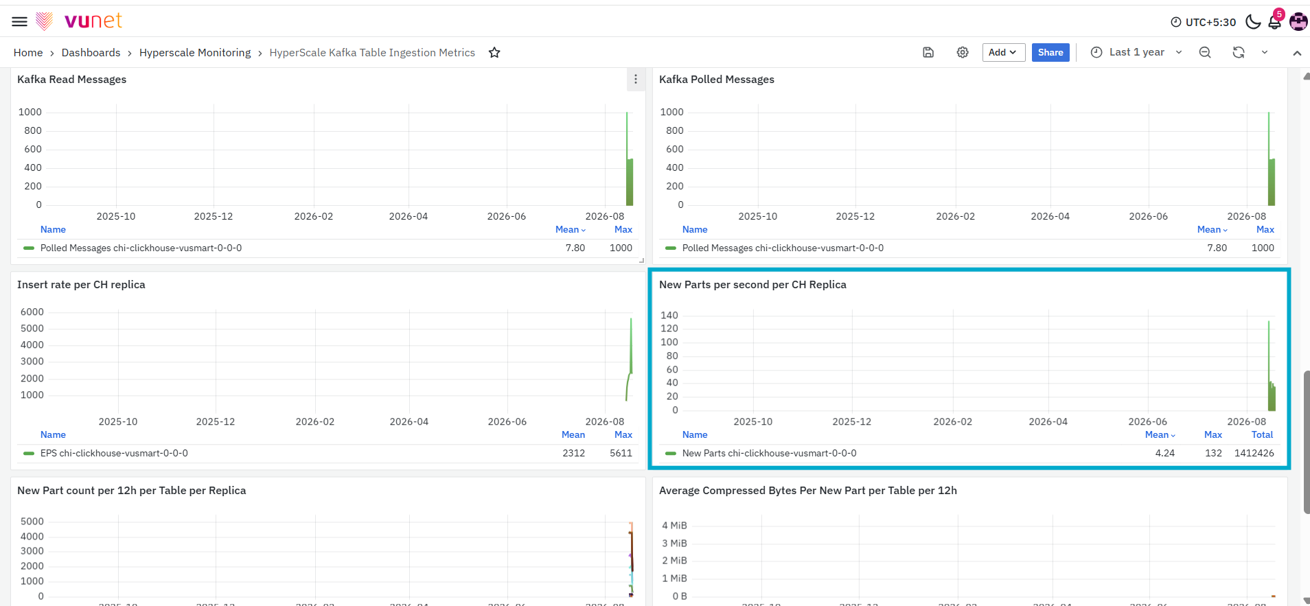
The New Parts per Second per CH Replica panel displays the rate at which new ClickHouse data parts are created for each replica. ClickHouse stores inserted data in parts. The graph shows how frequently new parts are created over the selected time range and displays summary values such as the mean and maximum rate.
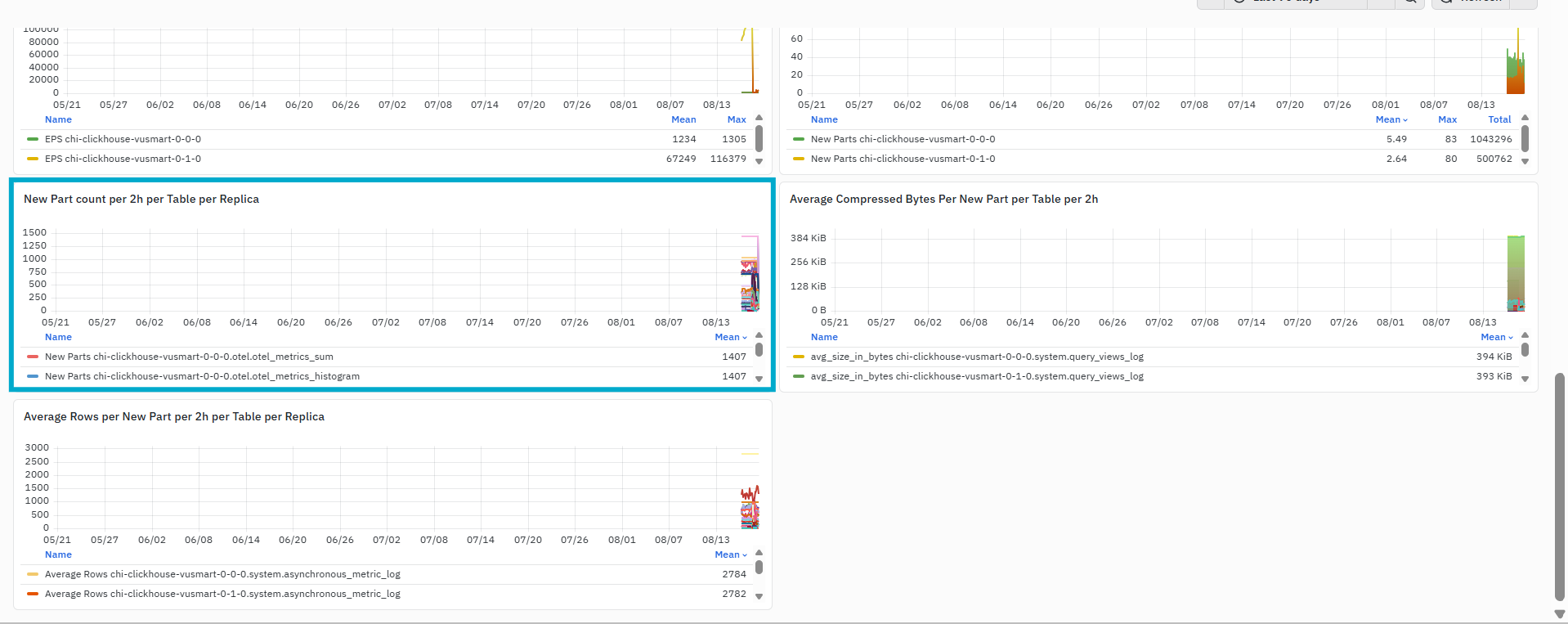
The New Part Count per 2h per Table per Replica panel displays the number of new data parts created for each table and ClickHouse replica during every two-hour interval. Each series in the graph represents a table associated with the selected replica. This allows users to compare new-part creation across different tables. A higher count indicates that more parts were created for the corresponding table during the interval.
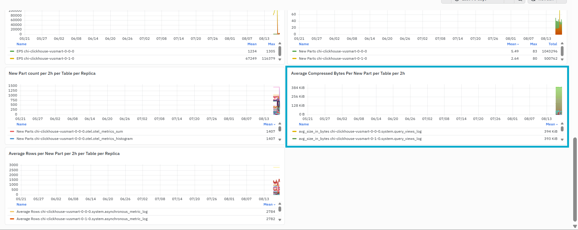
The Average Compressed Bytes per New Part per Table per 2h panel displays the average compressed size of newly created data parts for each table during every two-hour interval. Each series represents an individual table. The values are displayed using an applicable data-size unit, such as MiB. A higher value indicates that the newly created parts for the corresponding table contain a larger amount of compressed data on average.
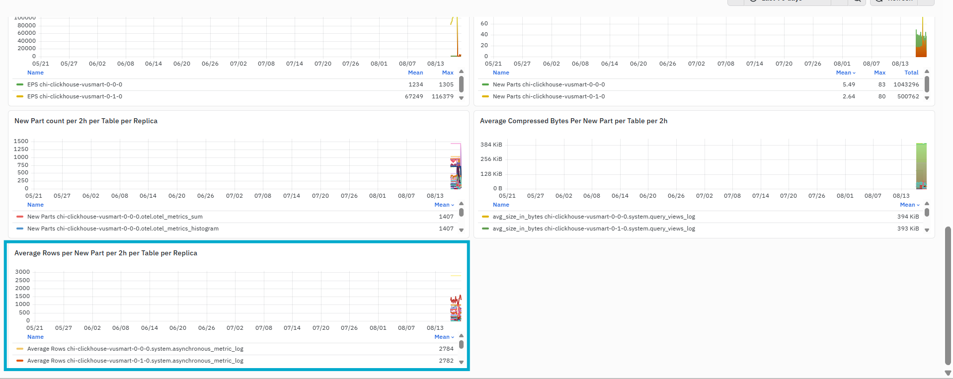
The final panel, Average Rows per New Part per 2h per Table per Replica, displays the average number of rows contained in each newly created data part for each table and ClickHouse replica during every two-hour interval. Each series represents a table associated with the selected replica. The graph helps users compare how many rows are contained in newly created parts across different tables. A higher value indicates that the new parts created for the corresponding table contain more rows on average. A lower value indicates that smaller row groups are being written into new parts.
Read Query Metrics Dashboard
The Read Query Metrics Dashboard provides a detailed view of query execution and resource utilisation within the selected ClickHouse environment. It brings together running query counts, memory-intensive queries, slow queries, query throughput, failed queries, memory usage, query duration, filtered rows, CPU usage, and CPU-slot allocation metrics.
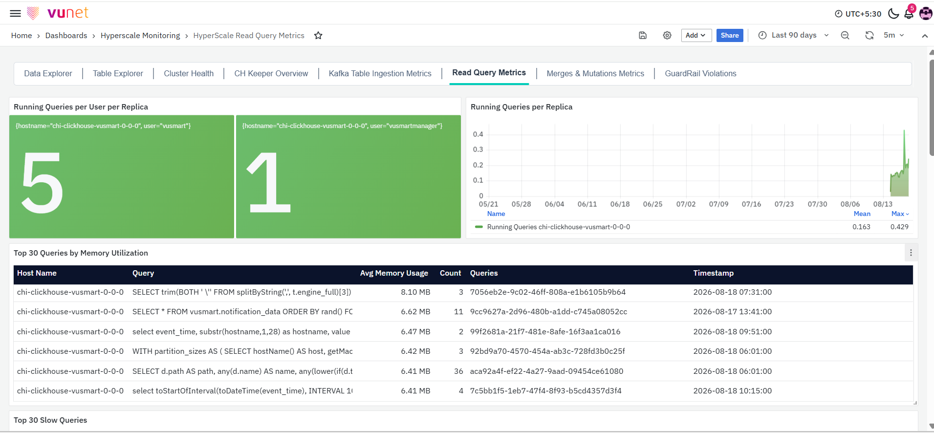
This dashboard helps users understand how queries are being processed across ClickHouse replicas and identify changes in query volume, execution time, memory consumption, CPU usage, query failures, or resource availability that may require further investigation.
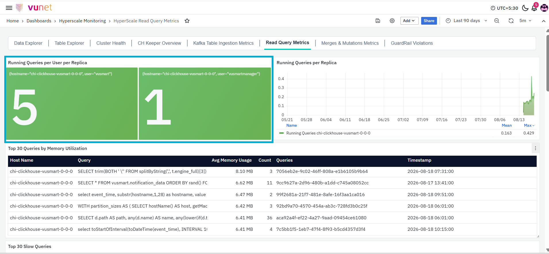
The first panel, Running Queries per User per Replica, displays the current number of running queries for each user on the selected ClickHouse replica. The panel also displays the host name and user associated with the running query count. This provides a quick view of the number of queries currently being executed by a particular user on a specific replica.
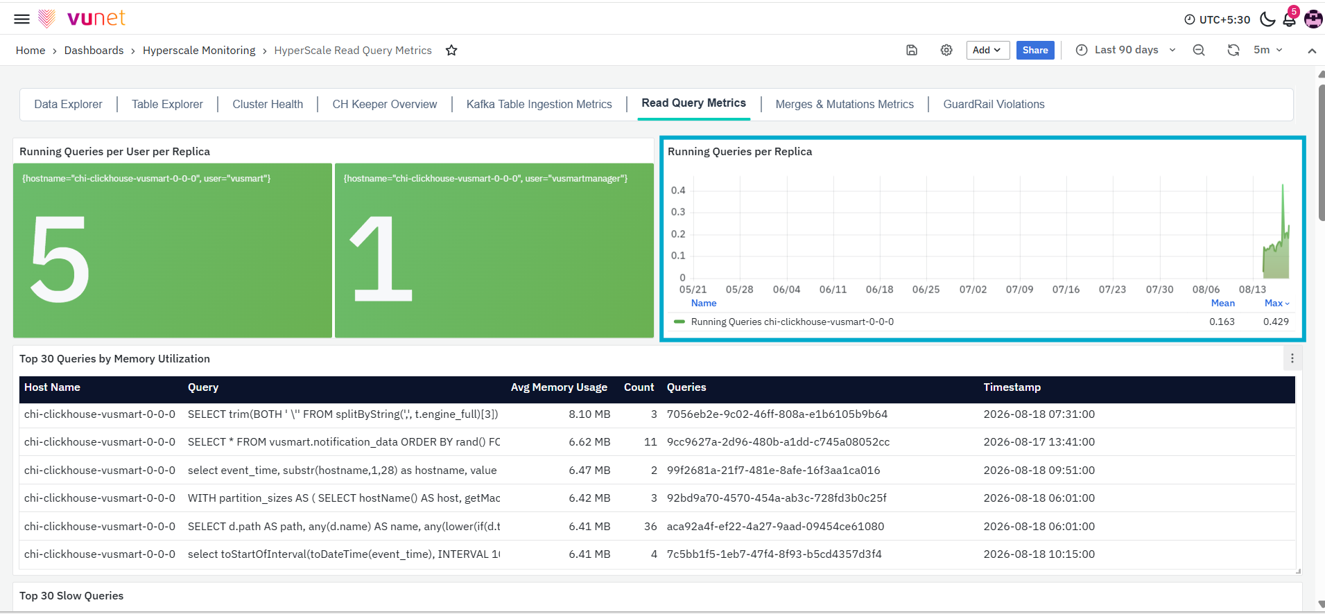
The Running Queries per Replica panel displays the number of running queries for each ClickHouse replica over the selected time range. The graph shows how the running query count changes over time and displays summary values such as the mean and maximum count.This panel helps users identify increases, decreases, or spikes in query activity. A higher value indicates that more queries were running on the replica during the corresponding period.
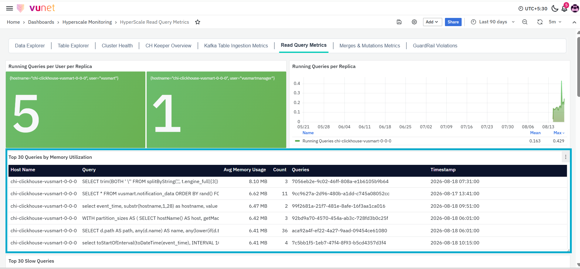
The Top 30 Queries by Memory Utilization panel lists the queries with the highest average memory usage. The table contains the following columns:
- Host Name: Displays the ClickHouse host on which the query was executed.
- Query: Displays the SQL query associated with the memory usage.
- Avg Memory Usage: Displays the average amount of memory used by the query.
- Count: Displays the number of query records associated with the entry.
- Queries: Displays the query identifiers associated with the query.
- Timestamp: Displays the timestamp recorded for the query entry.
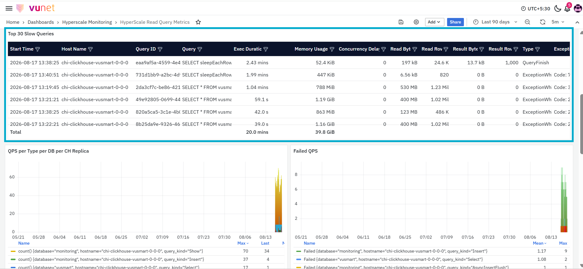
The Top 30 Slow Queries panel lists the queries with the longest execution duration. The table contains the following columns:
- Start Time: Displays the time at which query execution started.
- Host Name: Displays the ClickHouse host on which the query was executed.
- Query ID: Displays the unique identifier assigned to the query.
- Query: Displays the SQL query that was executed.
- Exec Duration: Displays the amount of time taken to execute the query.
- Memory Usage: Displays the amount of memory used during query execution.
- Concurrency Delay: Displays the concurrency delay recorded for the query.
- Read Bytes: Displays the amount of data read while executing the query.
- Read Rows: Displays the number of rows read during query execution.
- Result Bytes: Displays the size of the query result.
- Result Rows: Displays the number of rows returned by the query.
- Type: Displays the query execution event, such as when the query started, completed successfully, failed before starting, or failed while processing. These events are recorded as QueryStart, QueryFinish, ExceptionBeforeStart, and ExceptionWhileProcessing.
- Exception: Displays exception information recorded for the query.
The total row displayed at the bottom of the panel provides combined values for applicable fields, such as execution duration and memory usage, across the returned records.
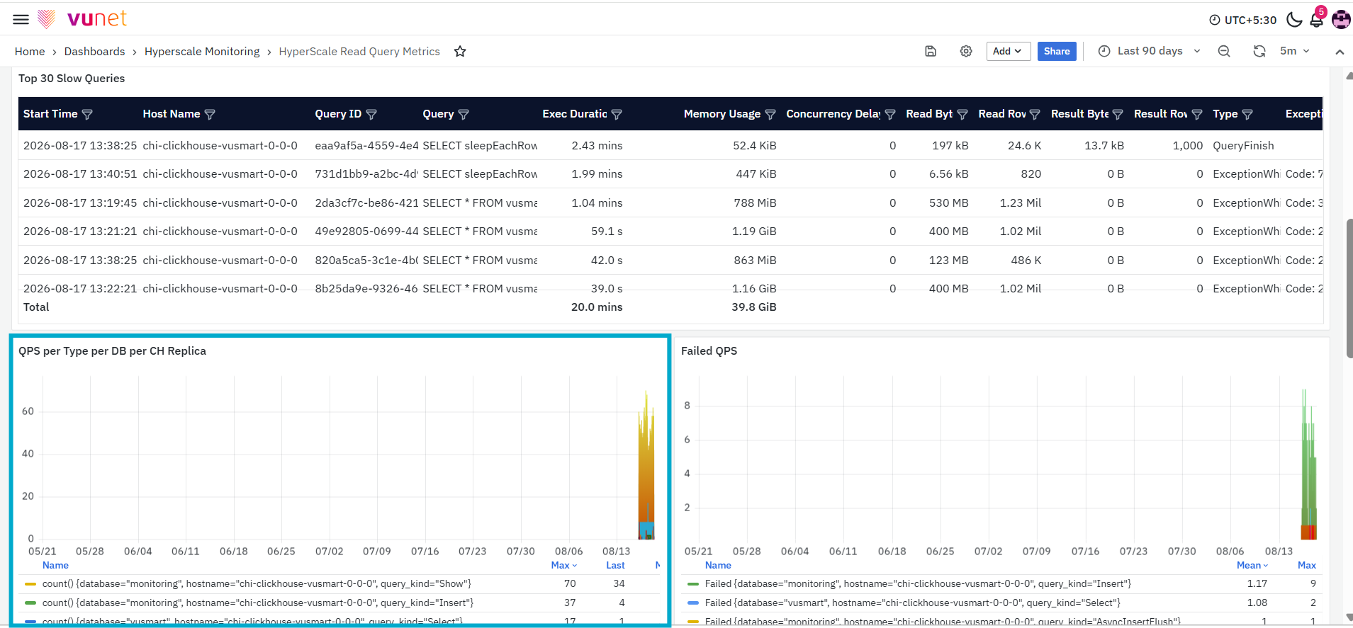
The QPS per Type per DB per CH Replica panel displays the number of queries processed per second, grouped by query type, database, and ClickHouse replica. Each series in the graph represents a query type associated with a particular database and host. The graph displays summary values such as the maximum, latest, and mean QPS for each series.
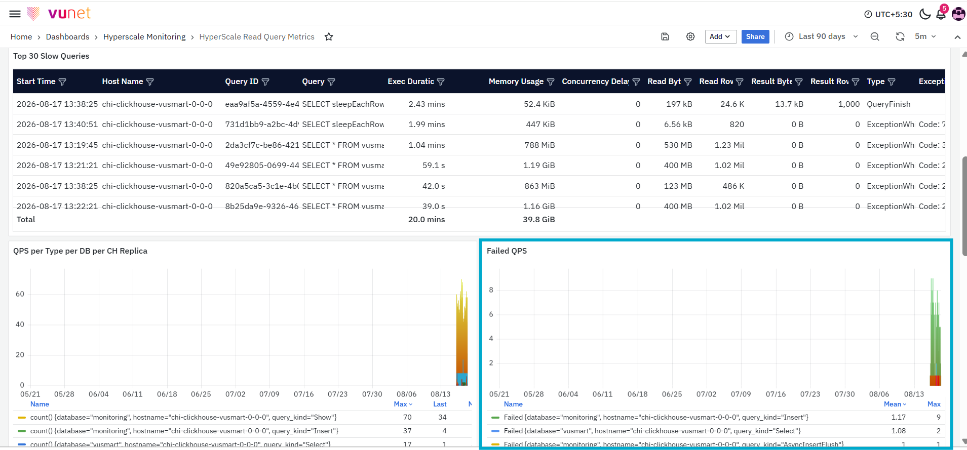
The Failed QPS panel displays the number of failed queries per second over the selected time range. Each series represents failed queries associated with a database, ClickHouse host, and query type. The graph displays summary values such as the mean and maximum failure rate.
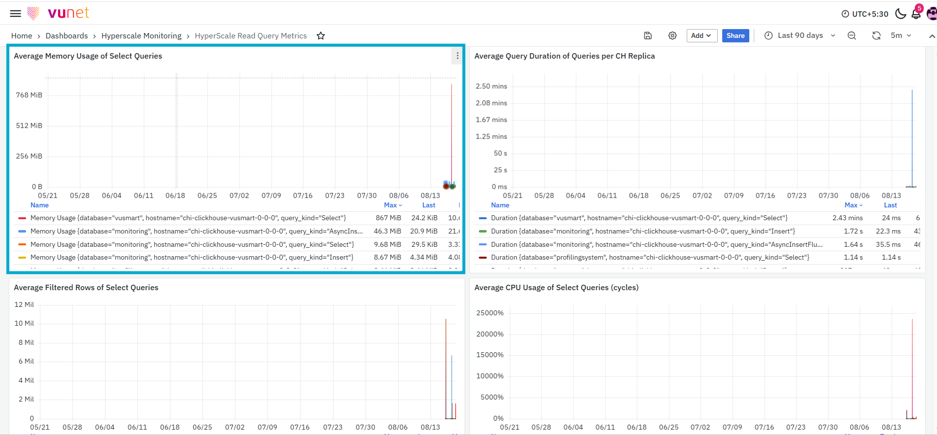
The Average Memory Usage of Select Queries panel displays the average memory usage recorded for the query series returned by the panel. Each series is grouped using information such as the database, ClickHouse host, and query type. The values are displayed using an applicable memory unit, such as MiB. The graph also displays summary values such as the maximum, latest, and mean memory usage for each series.
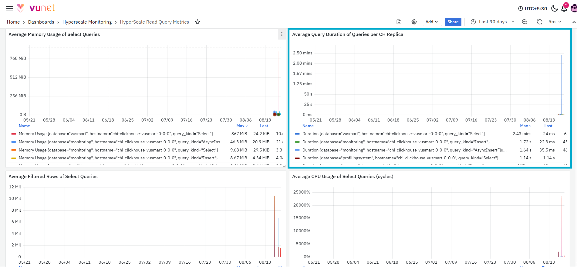
The Average Query Duration of Queries per CH Replica panel displays the average amount of time taken to execute queries on each ClickHouse replica. Each series is grouped by information such as the database, host, and query type. The graph displays query duration using an applicable time unit, such as milliseconds or seconds. The panel also displays summary values such as the maximum, latest, and mean query duration.
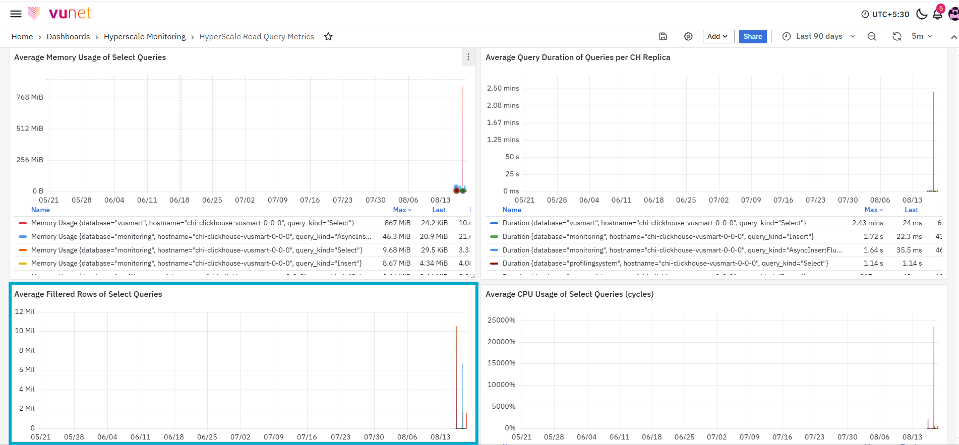
The Average Filtered Rows of Select Queries panel displays the average number of rows filtered during query processing. Each series is grouped using information such as the database, ClickHouse host, and query type. The graph displays summary values such as the maximum, latest, and mean number of filtered rows.
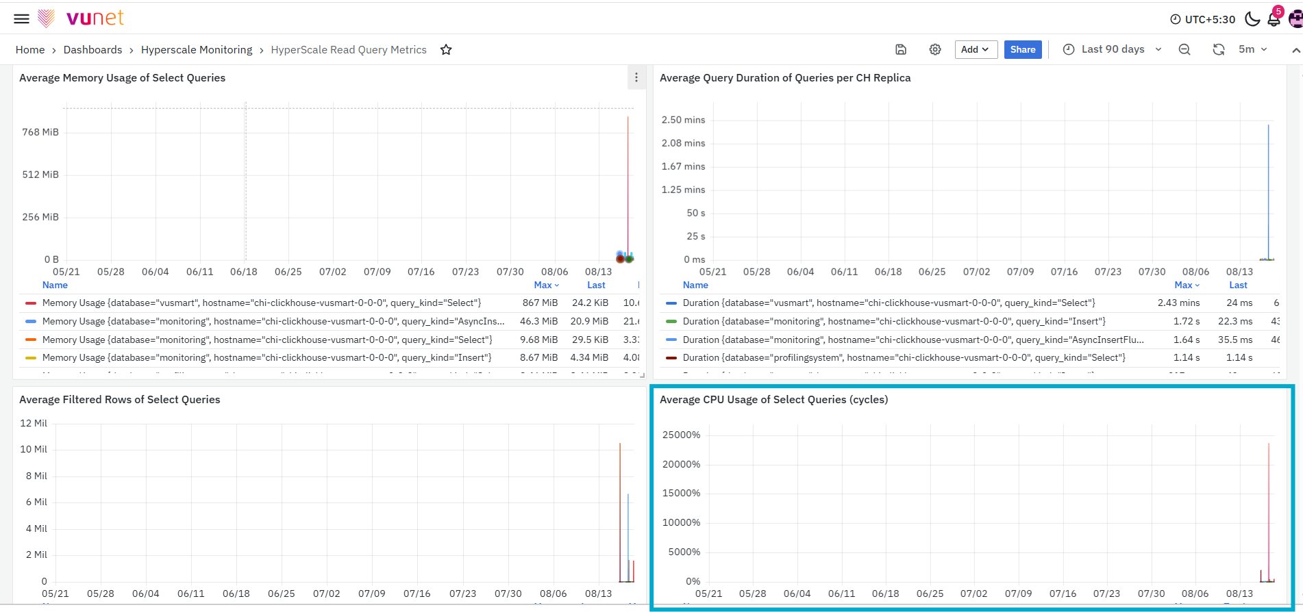
The Average CPU Usage of Select Queries (cycles) panel displays the CPU usage associated with query execution. Each series is grouped using information such as the database, ClickHouse host, and query type. The graph displays summary values such as the maximum, total, and mean CPU usage for each series.
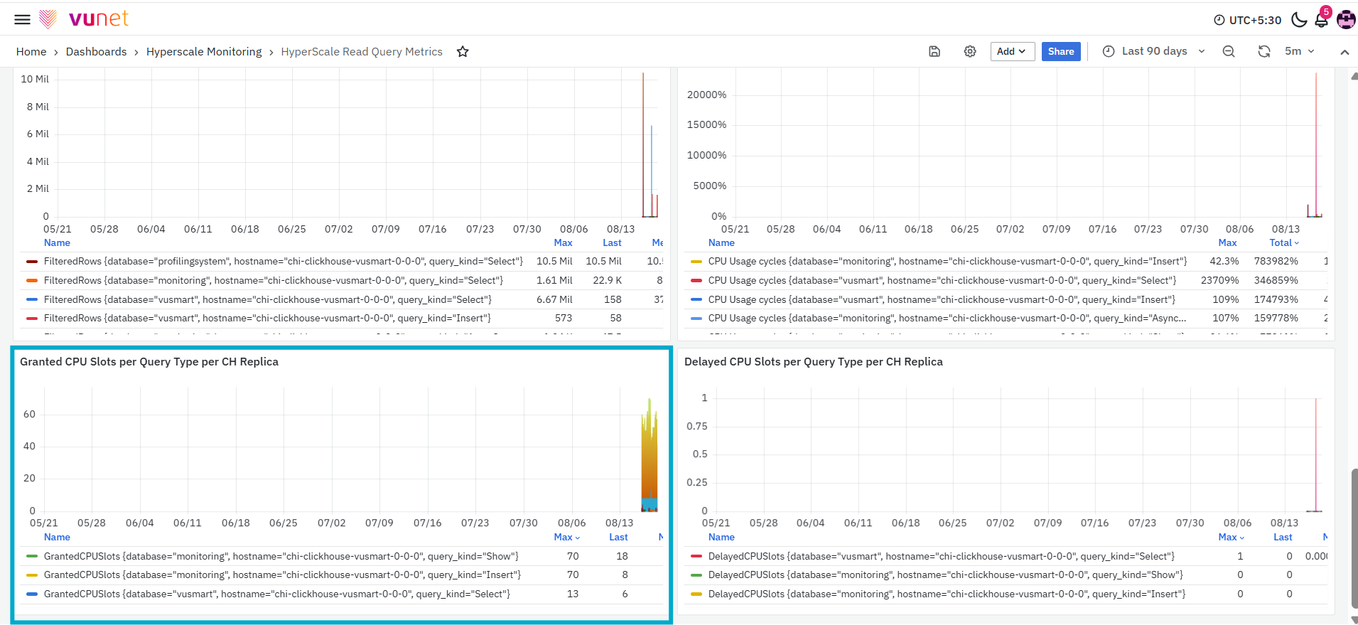
The Granted CPU Slots per Query Type per CH Replica panel displays the number of CPU slots granted to queries, grouped by query type and ClickHouse replica. Each series represents the CPU slots granted for a particular query type, database, and host. The graph displays summary values such as the maximum, latest, and mean number of granted slots.
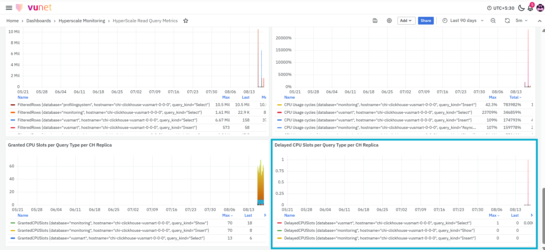
The final panel, Delayed CPU Slots per Query Type per CH Replica, displays the number of CPU slots recorded as delayed, grouped by query type and ClickHouse replica. Each series represents delayed CPU-slot activity associated with a database, host, and query type. The graph displays summary values such as the maximum, latest, and mean number of delayed slots.
Merges & Mutations Metrics Dashboard
The Merges & Mutations Metrics Dashboard provides a detailed view of merge and mutation activity within the selected ClickHouse environment. It brings together the total number of MergeTree parts, failed merge counts, merge-related CPU and memory usage, table-level merge results, merge errors, launched merges, scheduled parts, merge duration, and mutation activity.
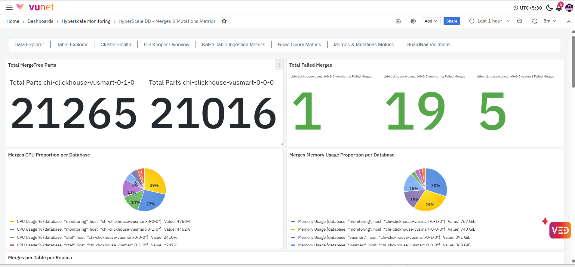
This dashboard helps users understand how merge and mutation operations are progressing across ClickHouse replicas and tables. It also helps identify changes in merge volume, failed operations, resource usage, processing duration, or mutation activity that may require further investigation.
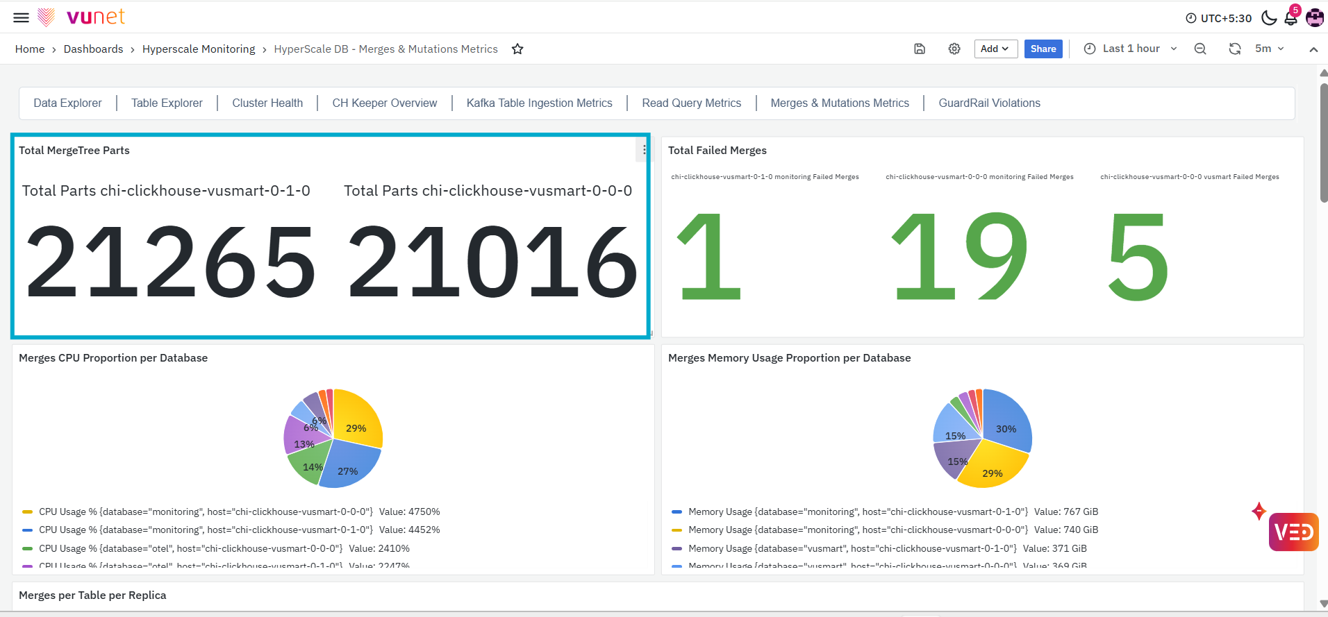
The first panel, Total MergeTree Parts, displays the total number of MergeTree data parts available for the selected ClickHouse host. ClickHouse stores table data in individual parts. As data is inserted, new parts are created and later combined through merge operations.
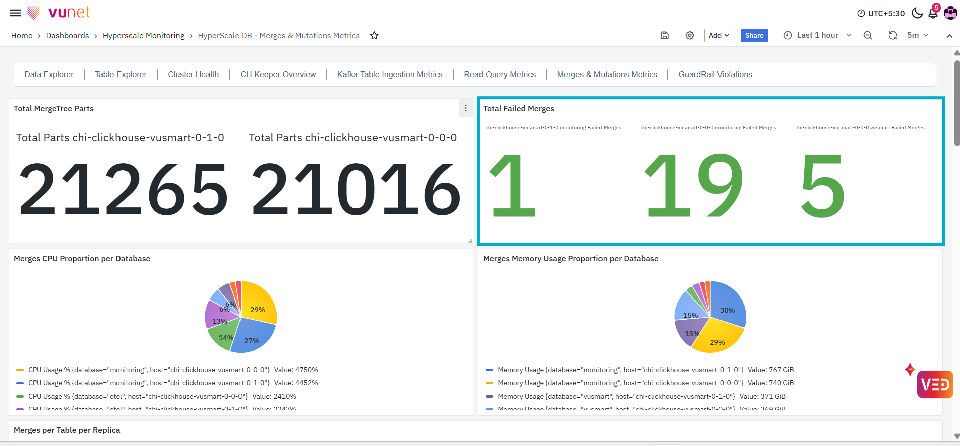
The Total Failed Merges panel displays the total number of failed merge operations recorded for the selected ClickHouse environment. This panel provides a quick indication of whether any merge failures are present. An increase in the displayed value indicates that additional merge operations have failed.
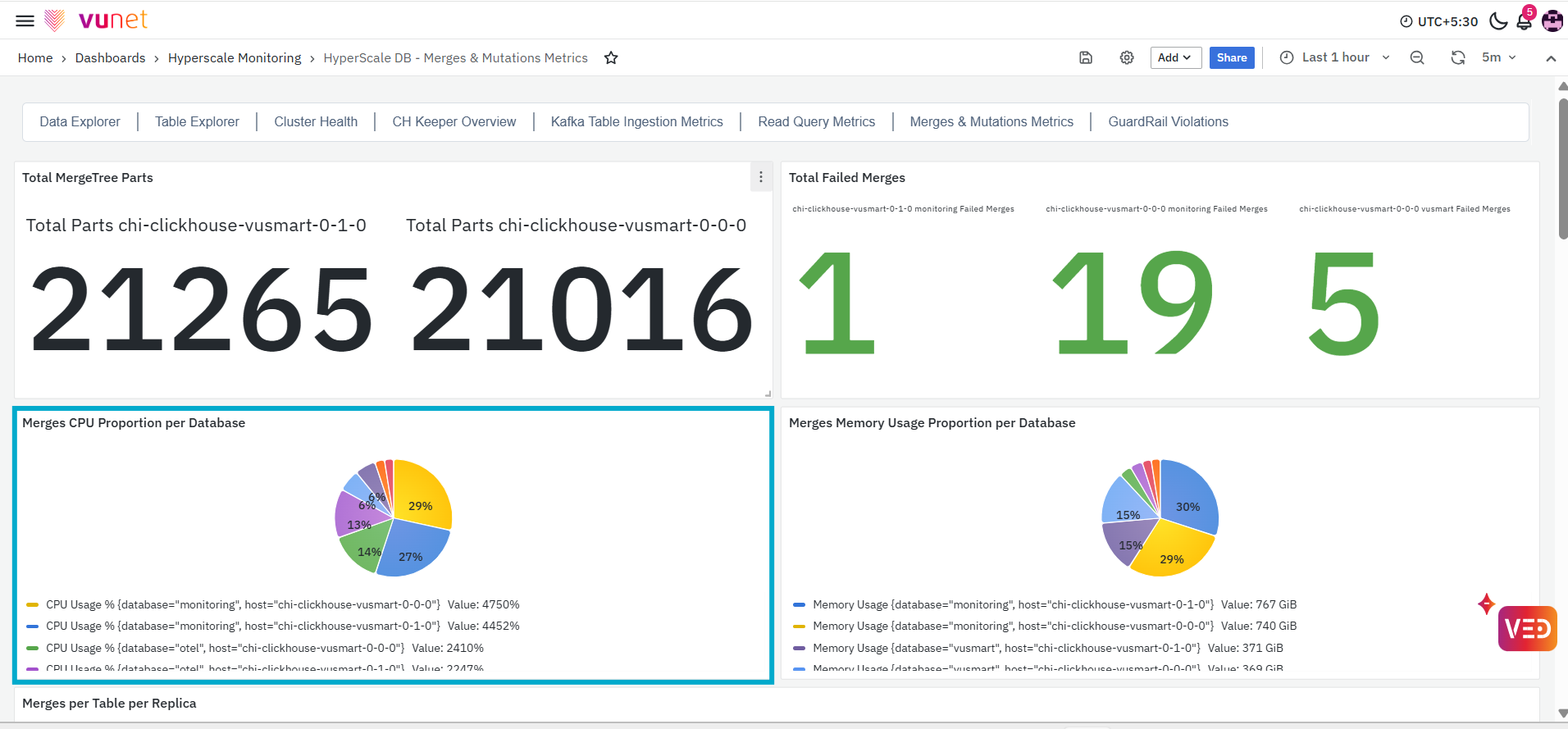
The Merges CPU Proportion per Database panel displays the distribution of CPU usage associated with merge activity across databases. Each section of the pie chart represents merge-related CPU usage for a database on the selected ClickHouse host. The percentage displayed in each section shows its proportion relative to the other database values returned by the panel.
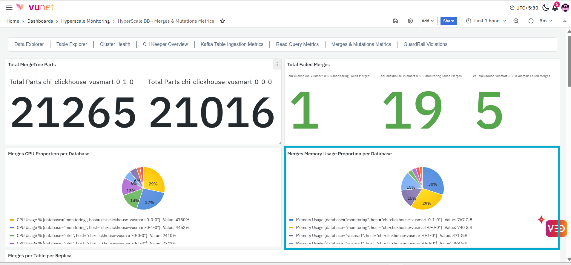
The Merges Memory Usage Proportion per Database panel displays the distribution of memory usage associated with merge activity across databases. Each section of the pie chart represents merge-related memory usage for a database on the selected ClickHouse host. The percentage displayed in each section shows its proportion relative to the other databases returned by the panel.
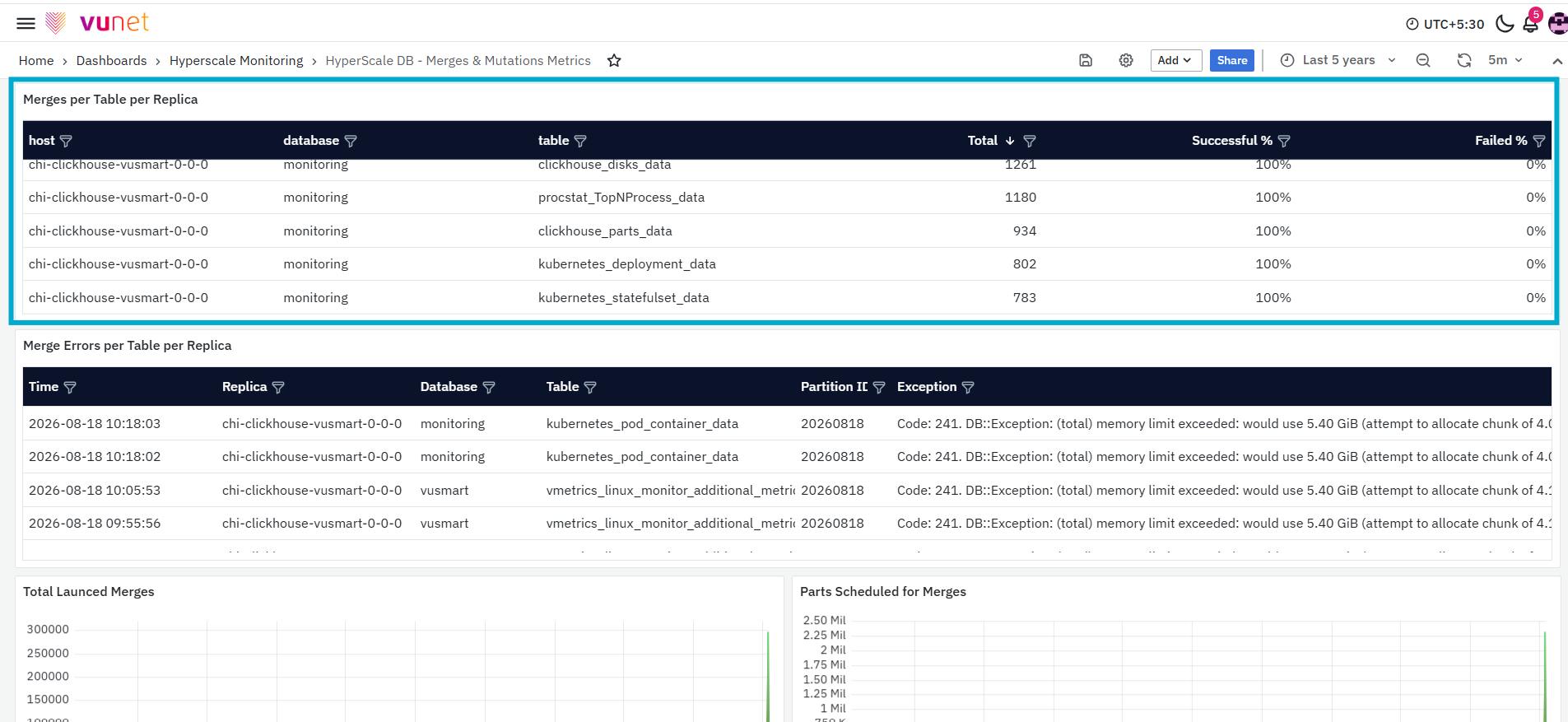
The Merges per Table per Replica panel provides table-level information about merge operations recorded for each ClickHouse replica. The table contains the following columns:
- Host: Displays the ClickHouse host on which the merge operations were recorded.
- Database: Displays the database containing the table.
- Table: Displays the name of the table associated with the merge operations.
- Total: Displays the total number of merge operations recorded for the table.
- Successful %: Displays the percentage of merge operations that completed successfully.
- Failed %: Displays the percentage of merge operations that failed.
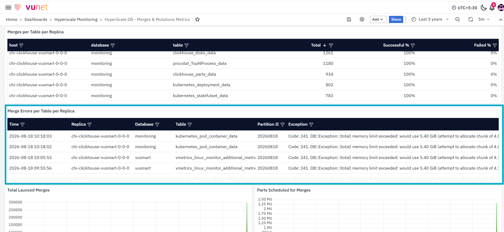
The Merge Errors per Table per Replica panel displays detailed information about merge errors recorded for individual tables and replicas. The table contains the following columns:
- Time: Displays the time at which the merge error was recorded.
- Replica: Displays the ClickHouse replica on which the merge error occurred.
- Database: Displays the database containing the affected table.
- Table: Displays the name of the table associated with the error.
- Partition ID: Displays the identifier of the partition involved in the failed merge.
- Exception: Displays the exception information recorded for the merge failure.
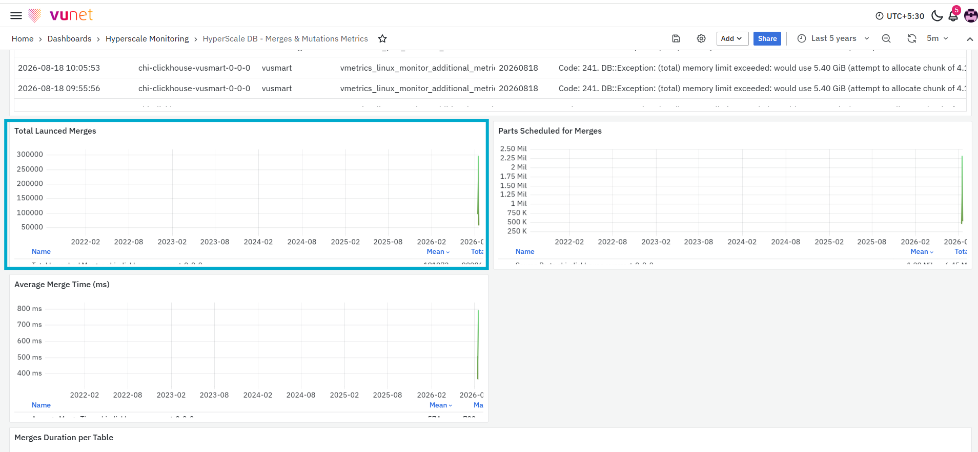
The Total Launched Merges panel displays the number of merge operations launched on the selected ClickHouse host over the selected time range. The graph shows how launched merge activity changes over time and displays summary values such as the mean and total number of launched merges.
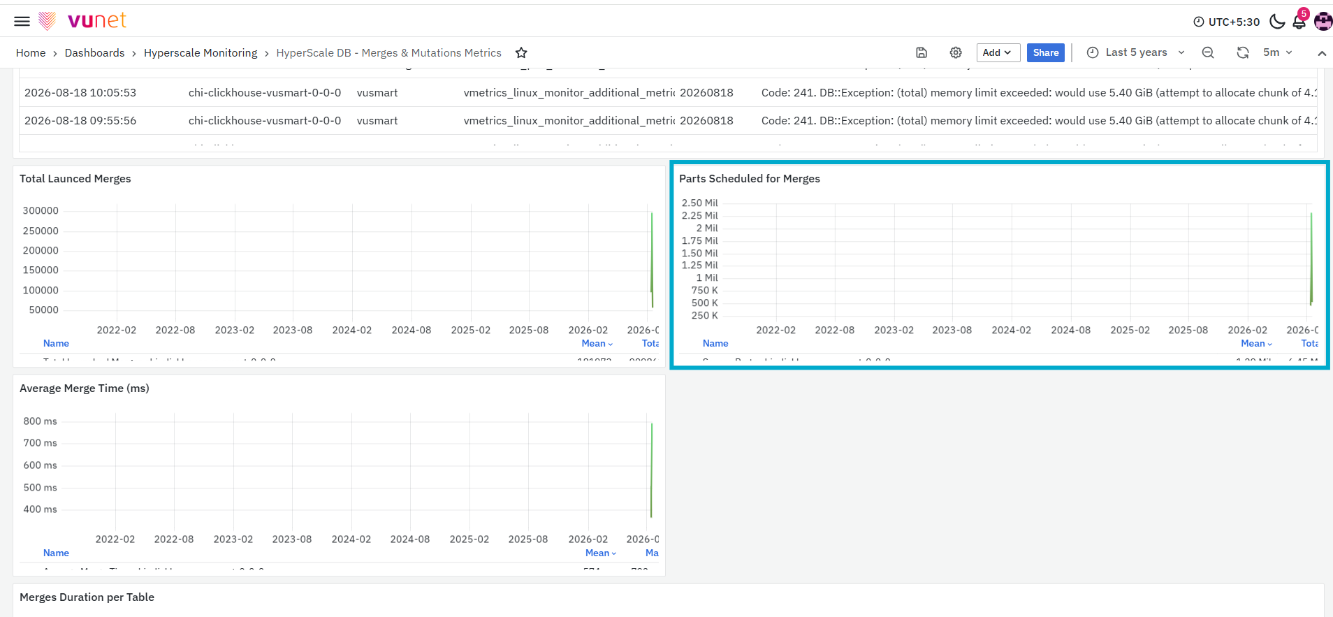
The Parts Scheduled for Merges panel displays the number of data parts scheduled for merge operations on the selected ClickHouse host. The graph shows how the number of scheduled parts changes over the selected time range. It also displays summary values such as the mean and total number of scheduled parts.
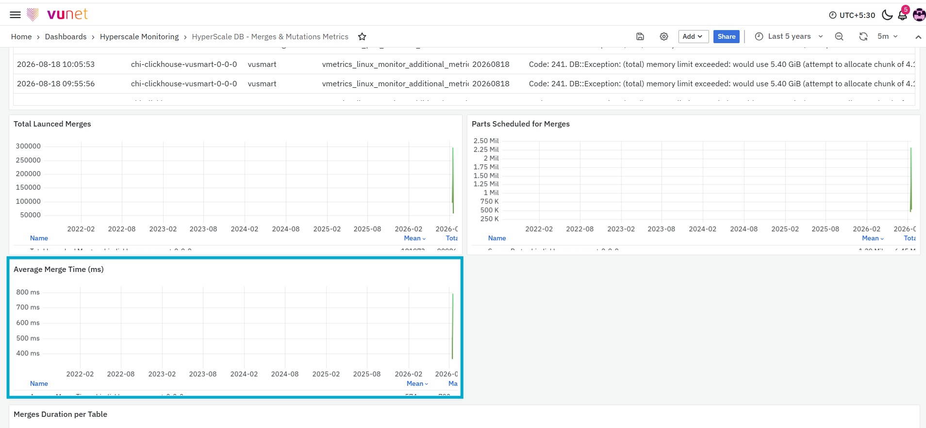
The Average Merge Time panel displays the average time taken to complete merge operations on the selected ClickHouse host. The graph shows changes in merge time over the selected time range and displays summary values such as the mean and maximum duration.
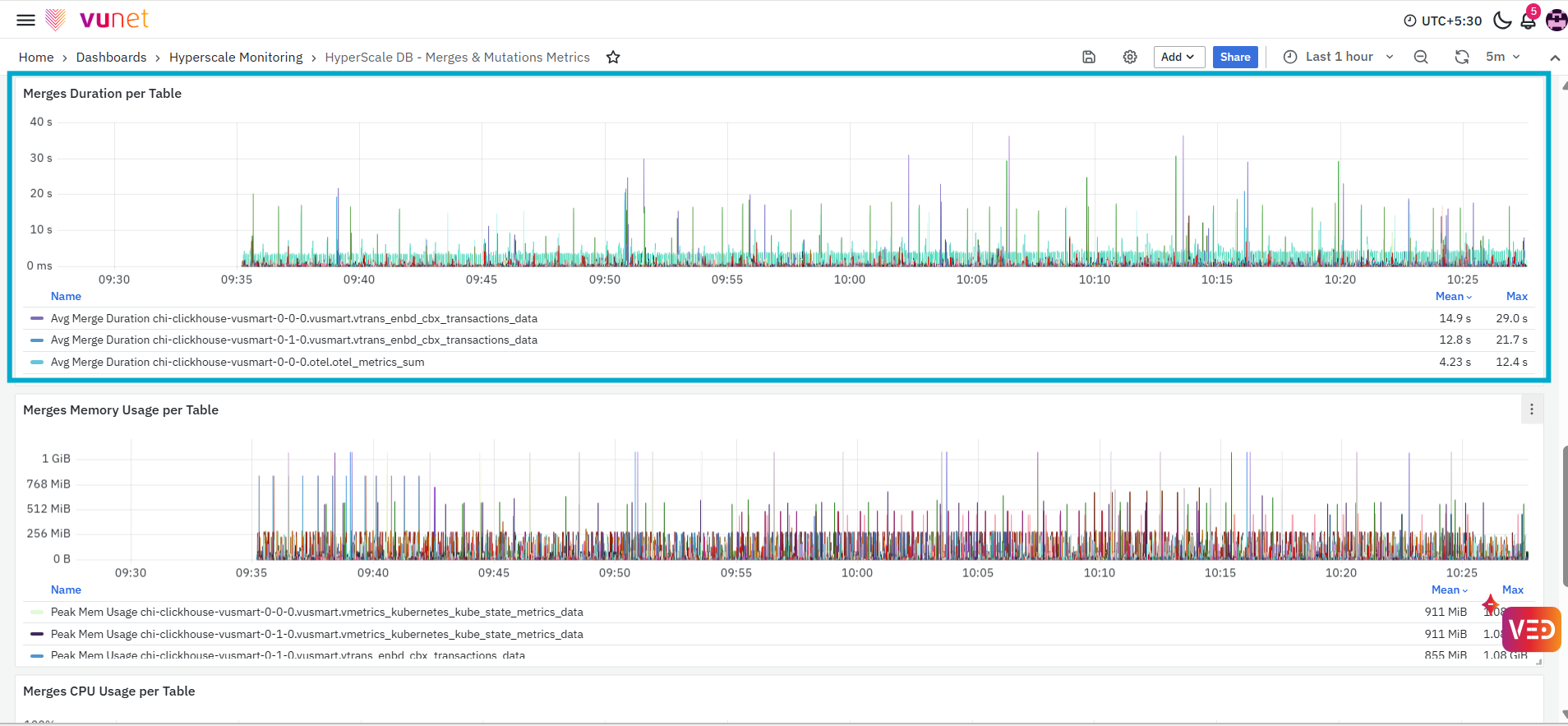
The Merges Duration per Table panel displays the average duration of merge operations for individual tables. Each series in the graph represents a table on the selected ClickHouse host. The graph allows users to compare merge duration across different tables and displays summary values such as the mean and maximum duration for each series.
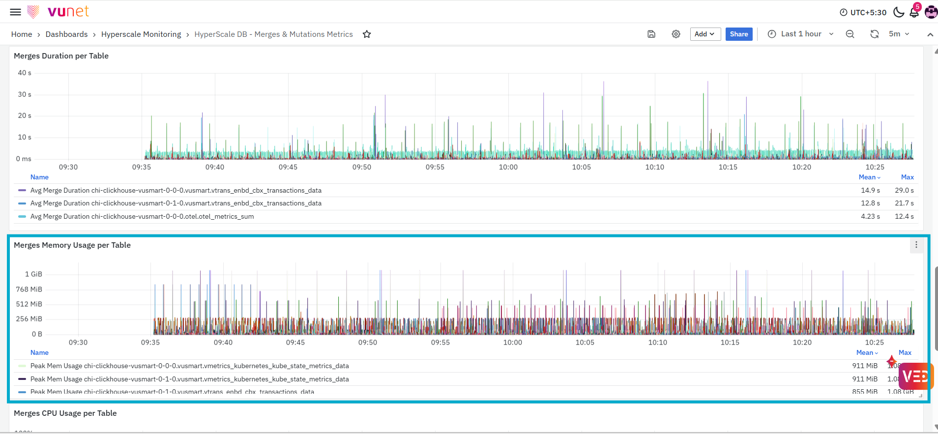
The Merges Memory Usage per Table panel displays the peak memory used by merge operations for individual tables. Each series represents a table on the selected ClickHouse host. The values are displayed using an applicable memory unit, such as MiB or GiB. The graph displays summary values such as the mean and maximum memory usage for each table.
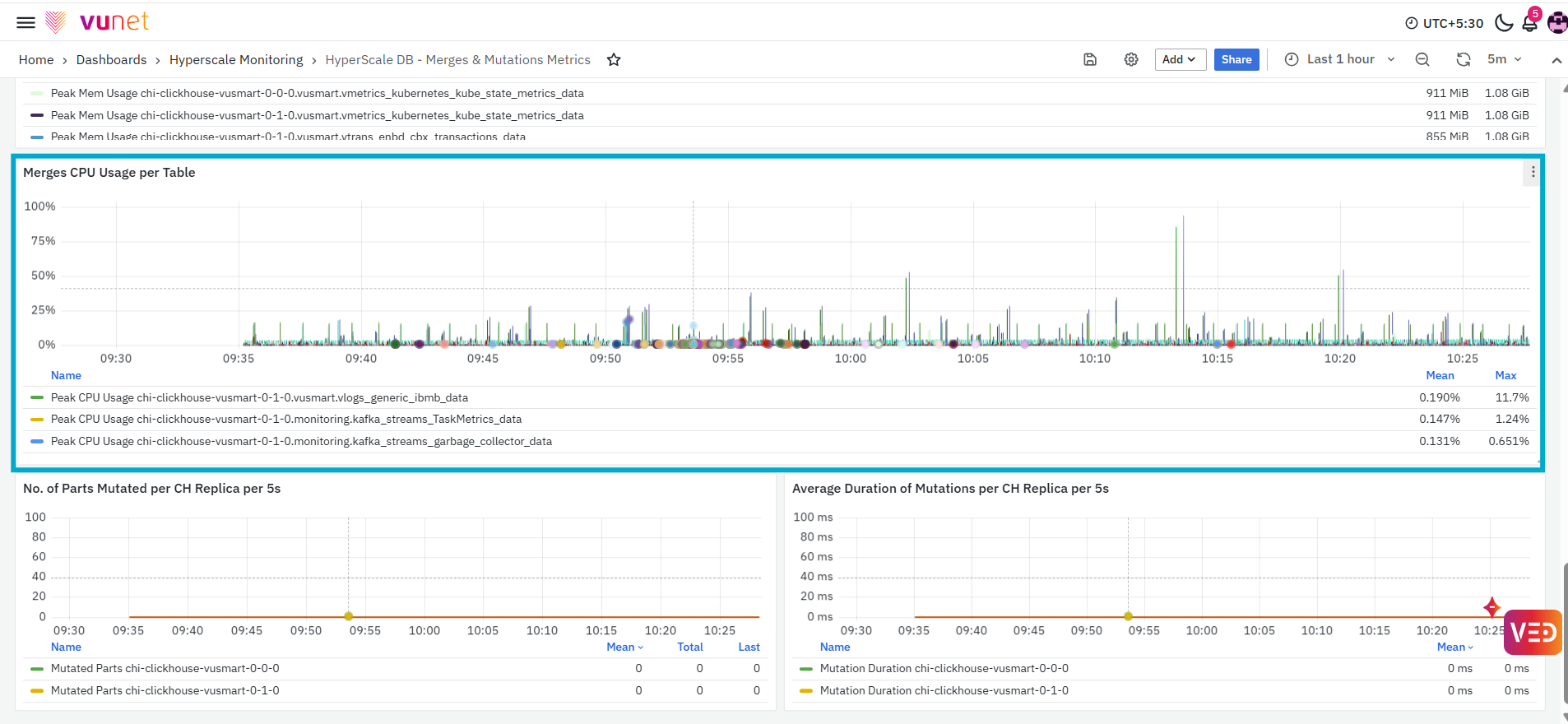
The Merges CPU Usage per Table panel displays the peak CPU usage associated with merge operations for individual tables. Each series represents a table on the selected ClickHouse host. The graph shows how table-level merge CPU usage changes over the selected time range and displays summary values such as the mean and maximum usage.
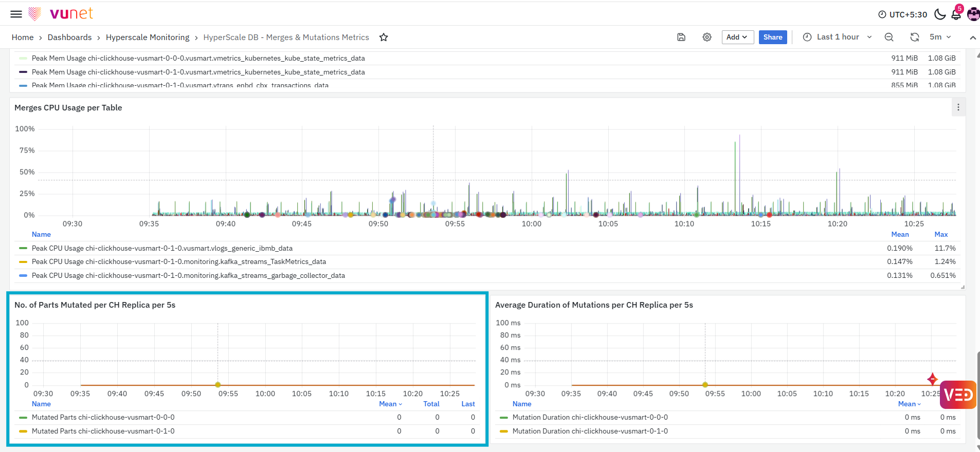
The No. of Parts Mutated per CH Replica per 2h panel displays the number of data parts affected by mutation operations for each ClickHouse replica during every two-hour interval. Mutations represent changes applied to existing table data. The graph shows how mutation activity changes over the selected time range. The panel also displays summary values such as the mean, total, and latest number of mutated parts.
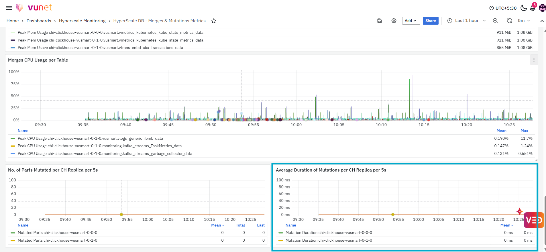
The final panel, Average Duration of Mutations per CH Replica per 2h, displays the average time taken to process mutation operations for each ClickHouse replica during every two-hour interval. The graph shows how mutation duration changes over the selected time range and displays summary values such as the mean and maximum duration.
GuardRail Violations Dashboard
The GuardRail Violations Dashboard provides a detailed view of the query guardrails configured for the selected ClickHouse environment. It brings together the current limits, current usage, violation counts, and query-level details for memory usage, execution time, and result-row limits.
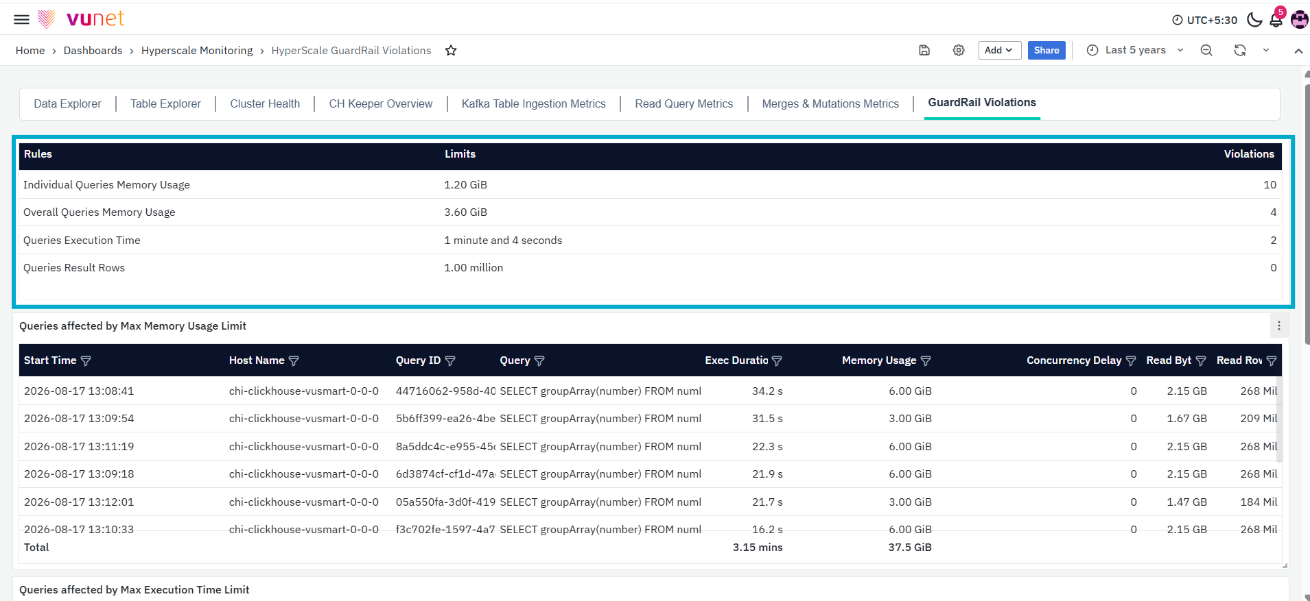
This dashboard helps users identify queries associated with the configured guardrails and review their execution duration, memory usage, concurrency delay, and data-read information. The first table provides a summary of the query guardrails displayed in the dashboard. It shows the configured limit, current usage, and number of violations recorded for each rule.
The table contains the following columns:
- Rules: Displays the name of the guardrail rule.
- Current Limits: Displays the configured limit for the rule.
- Violations: Displays the number of violations recorded for the rule.
The table displays the following guardrail rules:
- Individual Queries Memory Usage: Represents the memory-usage limit configured for an individual query.
- Queries Execution Time: Represents the execution-time limit configured for queries.
- Queries Result Rows: Represents the limit configured for query result rows.
- Overall Queries Memory Usage: Represents the memory-usage limit configured for overall query activity.
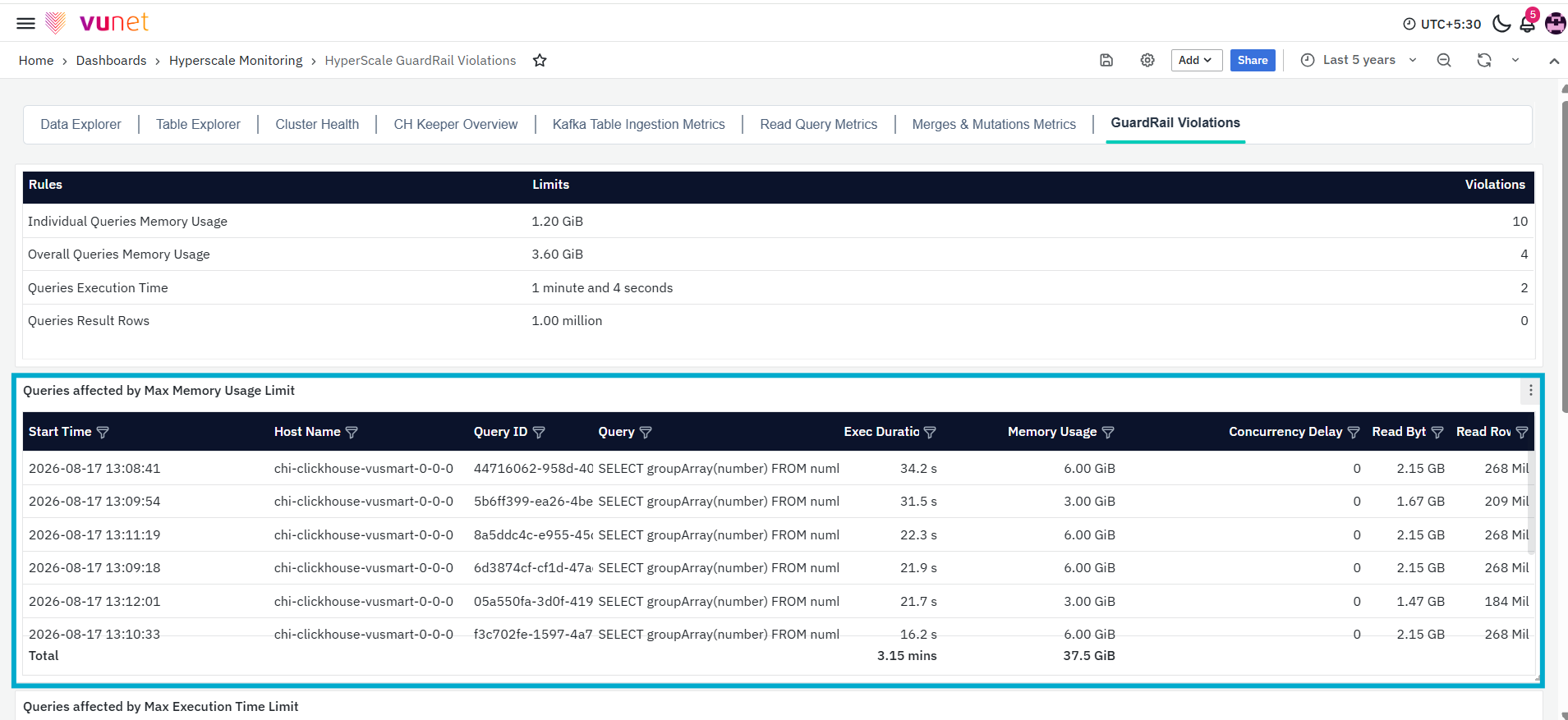
The Queries affected by Max Memory Usage Limit panel displays query-level details associated with the maximum memory-usage limit. The table contains the following columns:
- Start Time: Displays the time at which the query execution started.
- Host Name: Displays the ClickHouse host on which the query was executed.
- Query ID: Displays the unique identifier assigned to the query.
- Query: Displays the SQL query that was executed.
- Exec Duration: Displays the amount of time taken to execute the query.
- Memory Usage: Displays the amount of memory used during query execution.
- Concurrency Delay: Displays the concurrency delay recorded for the query.
- Read Bytes: Displays the amount of data read while executing the query.
- Read Rows: Displays the number of rows read during query execution.
The Total row at the bottom of the panel displays combined values for applicable fields, such as execution duration and memory usage, across the returned query records.
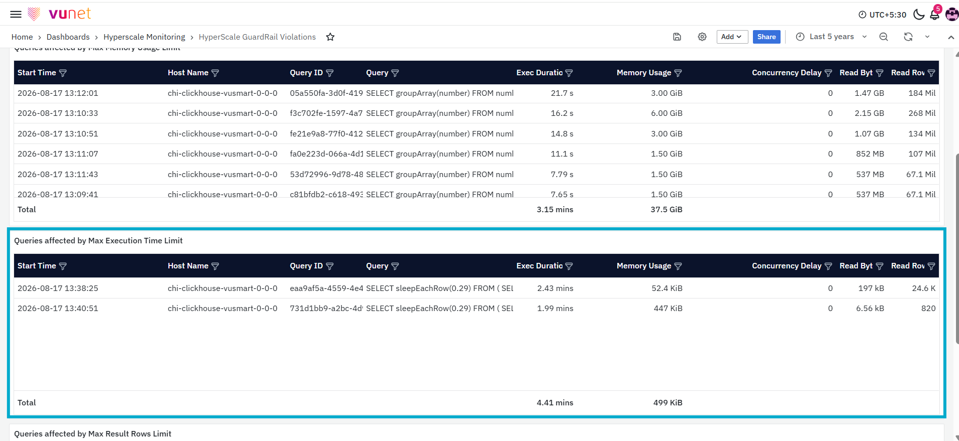
The Queries affected by Max Execution Time Limit panel displays query-level information associated with the maximum execution-time limit. The table contains the following columns:
- Start Time: Displays the time at which query execution started.
- Host Name: Displays the ClickHouse host on which the query was executed.
- Query ID: Displays the unique identifier assigned to the query.
- Query: Displays the SQL query that was executed.
- Exec Duration: Displays the recorded query execution duration.
- Memory Usage: Displays the amount of memory used by the query.
- Concurrency Delay: Displays the concurrency delay associated with the query.
- Read Bytes: Displays the amount of data read during query execution.
- Read Rows: Displays the number of rows read by the query.
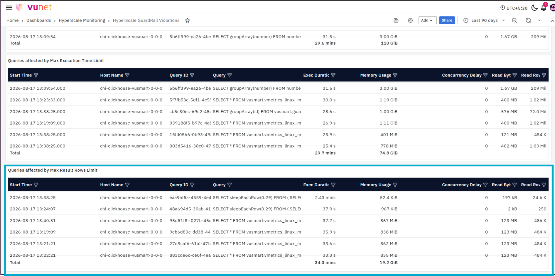
The final panel, Queries affected by Max Result Rows Limit, displays query-level information associated with the maximum result-row limit. The table contains the following columns:
- Start Time: Displays the time at which query execution started.
- Host Name: Displays the ClickHouse host on which the query was executed.
- Query ID: Displays the unique identifier assigned to the query.
- Query: Displays the SQL query that was executed.
- Exec Duration: Displays the amount of time taken to execute the query.
- Memory Usage: Displays the amount of memory used during query execution.
- Concurrency Delay: Displays the concurrency delay recorded for the query.
- Read Bytes: Displays the amount of data read while executing the query.
- Read Rows: Displays the number of rows read during query execution.
FAQs
What is the purpose of the Hyperscale Analytics Dashboard?
The Hyperscale Analytics Dashboard provides a connected view of the ClickHouse database environment. It helps users review data ingestion, table structure, storage usage, cluster health, Keeper activity, Kafka ingestion, query performance, merges, mutations, and guardrail violations.
Which dashboards are available in Hyperscale Analytics?
Hyperscale Analytics includes Data Explorer, Table Explorer, Cluster Health, ClickHouse Keeper Overview, Kafka Table Ingestion Metrics, Read Query Metrics, Merges & Mutations Metrics, and GuardRail Violations dashboards.
How do I access and navigate between the dashboards?
Go to Dashboards from the left navigation and search for Hyperscale. Open the required dashboard and use the dashboard tabs at the top to navigate between the available dashboards.
Which filters are available in the dashboards?
The available filters depend on the selected dashboard. These include Database, Engine Type, Table Name, Date Column, and Hyperscale DS Instance. The selected filter values determine the information displayed in the panels.
How can I verify whether a table is receiving data?
Use the Data Explorer Dashboard to review the data trend and sample records from the selected table. The trend helps identify changes or gaps over time, while the sample-record panel allows users to inspect the available data.
Why is the data trend not displayed in the Data Explorer Dashboard?
The trend cannot be displayed when the selected table contains no data or does not have a valid date-type column. Verify the selected Table Name, Date Column, and time range.
What information does the Table Explorer Dashboard provide?
The Table Explorer Dashboard displays table structure, column details, keys, creation script, storage size, compression information, partitions, projections, and column-level sizing.
How can I monitor ClickHouse host and Keeper health?
Use the Cluster Health Dashboard to review host, storage, CPU, memory, connection, and wait-time metrics. Use the ClickHouse Keeper Overview Dashboard to review Keeper pod resources, sessions, connections, exceptions, requests, network activity, and latency.
How can I monitor Kafka ingestion and query performance?
Use the Kafka Table Ingestion Metrics Dashboard to review consumers, Kafka tables, topics, partitions, polling, message activity, insert rate, and new-part creation. Use the Read Query Metrics Dashboard to identify running, slow, failed, or resource-intensive queries.
How can I review merge, mutation, and guardrail activity?
Use the Merges & Mutations Metrics Dashboard to review merge operations, failures, resource usage, duration, and mutation activity. Use the GuardRail Violations Dashboard to review configured limits, current usage, violation counts, and associated query details.
